I once spent an entire Saturday at a paint store, chip in hand, going back and forth between two shades of white.
Not beige versus blue. White versus white. I left with nothing, went home, and repainted the wall gray six months later just to stop thinking about it. That was the last time I let the options run the show.
If you are the kind of person who thinks too much before making a call, this is for you.
No fluff, no color theory lectures. Just a clear process on how to choose a paint color and actually commit to it.
What Makes it Difficult to Choose a Paint Color When You Are an Overthinker?
Most people assume picking a color is quick. You like blue, you buy blue. But for overthinkers, it rarely works that way.
Every shade opens a new question, every option feels like a potential mistake, and the decision keeps getting pushed to tomorrow.
And sometimes the bigger question is not even which color, but whether it is the right time to paint at all?
Overanalyzing Shades, Undertones, and Lighting
Once you start noticing that “white” comes in over 200 variations, or that a gray can look purple under certain lights, the options stop feeling like freedom and start feeling like a trap.
Undertones, finish types, and lighting conditions are real factors that deserve attention, but they can also become rabbit holes that stall your decision completely.
Fear of Making the “WRONG” Choice
Paint feels permanent. Even though it is not, repainting a room takes time, money, and effort.
That fear of getting it wrong can make even the most decisive person pause.
For someone who already spends extra time weighing choices, the stakes feel even higher with something as visible as a wall color.
Getting Lost in Too Many Options Online or in-Store
Browsing paint options online feels helpful at first.
Then you have 47 tabs open and a Pinterest board with 200 pins, and you are somehow more confused than when you started.
Paint stores can feel the same way. The more you look, the harder it gets to trust any single choice.
First Comes First: Stop Asking Friends for Their Opinions
Before you start the actual steps, there is one thing worth saying clearly: stop crowdsourcing your paint decision.
Asking friends and family what they think seems like a good idea. It is not. Everyone has their own taste, their own lighting, and their own associations with color.
Your sister might love dusty blue because of her bedroom growing up. Your coworker might steer you toward greige because it worked in their home. None of that applies to your space, your furniture, or your light conditions.
Opinions from others add noise. They do not add clarity. The more you collect them, the further you move from your own instinct, which is usually the best starting point you have.
Take in ideas from design resources when needed, but the final call should come from you. Your home, your gut.
How to Choose a Paint Color: A Complete Process
Step 1: Reflect on the Mood You Want
Before you even look at a color chip, ask yourself, “How do I want to feel in this room?”.
That question sounds soft, but it is actually the most practical place to start. Color psychology gives us a useful framework here.
- Cool tones like soft blues and greens tend to create a calm, restful feeling.
- Warmer tones like terracotta, soft yellows, and warm whites tend to feel more lively and welcoming.
- Neutrals in the greige family sit in the middle and pair well with a wide range of furniture and decor.
Think about what you actually do in the room. A bedroom used for sleep and winding down probably does not need the same energy as a kitchen where you cook and move around in the morning.
Matching the color mood to how you use the space is a simple filter that cuts the options down quickly.
Step 2: Consider Room Size
Color has a direct effect on how a space feels physically. It does not change the square footage, but it does change how the room reads to the eye.
Lighter shades reflect more natural light, which can make a smaller room feel less closed in. This is why off-whites, soft creams, and pale tones are a common choice for compact spaces.
Darker colors absorb light and bring walls closer visually, which can actually be a good thing in a large room that feels too open or cold.
Natural light matters here more than artificial light.
A pale gray can look fresh and airy on a north-facing wall in a sun-filled room but feel flat and cold in a space with limited windows.
Before committing to a lighter color in a small room, check how much natural light you actually get throughout the day.
Step 3: Pay Attention to Undertones
Undertones are the reason a beige can look pink, a gray can read purple, and a white can feel yellow in certain rooms.
They are the secondary colors sitting underneath the main one, and they shift depending on what surrounds them.
When choosing a paint color, look at what is already in the room: your flooring, furniture, and fixed elements like countertops or tile.
If your sofa has warm brown tones, a cool-toned gray wall may clash in a way that is hard to pinpoint but easy to feel.
Matching undertones with the existing pieces in the room creates a more cohesive look without requiring everything to be a perfect match.
A simple way to test this:
Hold a paint chip next to your sofa or flooring and look at it in natural daylight. If the chip pulls the warmth or coolness of the room in an odd direction, that is a sign the undertone is off.
Step 4: Find Inspiration
Now is a good time to look outward, but with a purpose.
Gather ideas from a few sources: design magazines, Pinterest, rooms in hotels or restaurants you have genuinely liked, or even colors found in nature.
The goal is not to copy a room wholesale. It is to notice patterns in what draws your eye. If you keep returning to the same soft sage green in five different rooms, that tells you something.
If every dark room you save feels moody in a way you love, that is useful information too.
Creating a simple mood board, even a folder of saved images on your phone, helps you see your own preferences more clearly.
It moves the process from abstract (“I like blue”) to specific (“I like this particular dusty blue in rooms with natural wood floors”).
Step 5: Use the 60-30-10 Rule
The 60-30-10 rule is a basic design principle that helps create visual balance in a room. Here is how it works:
- 60 percent of the color in a room comes from the walls (and sometimes the ceiling or large rugs)
- 30 percent comes from secondary elements like upholstery, curtains, or larger furniture
- 10 percent comes from accents: throw pillows, artwork, small decor, and plants
When you are choosing a paint color, you are choosing the 60 percent.
That means your wall color sets the foundation, and everything else either supports it or contrasts it in a controlled way.
This rule is helpful for overthinkers because it gives structure.
Instead of asking, “Does this color go with everything?” you can ask, “Does this color work as a base for the other pieces I already have?” That is a much easier question to answer.
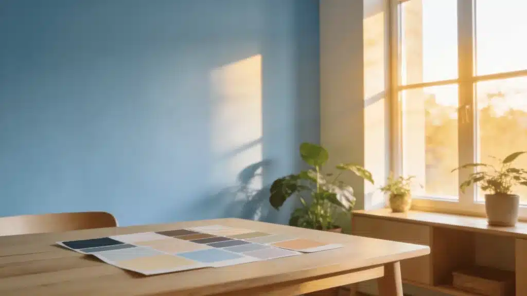
Step 6: Test Small Samples
This step is non-negotiable, especially for overthinkers.
Buy sample pots of your top two or three choices and paint large swatches directly on the wall.
Aim for a section at least 12 by 12 inches, ideally bigger. Small chips at the paint store cannot show you how a color will actually behave at scale.
Observe each swatch at different times of day: morning with natural light, midday, late afternoon, and at night under your artificial lighting.
Colors shift significantly between these periods. A color that looks exactly right at noon can feel completely different at 8pm under warm bulbs.
Leave the swatches up for at least two or three days before deciding. Give yourself time to live with the options before committing.
Final Steps Before Painting

Once you have chosen your color, a few practical checks before you open a full can.
Check the color one more time under different lighting conditions in the actual room. What looked right on the swatch board may look slightly different once it is on all four walls.
Consider paint quality. A higher-quality paint typically covers better in fewer coats and holds up longer, especially in high-traffic areas or rooms with humidity.
Buying two coats’ worth of a mid-to-high-quality paint is usually more cost-effective than buying cheap paint and needing three or four coats.
Prepare the room before you start. Fill small holes, sand rough patches, tape edges carefully, and use a primer.
Preparation has a bigger impact on the final result than you expect.
What Color Should I Paint My Room?
If you too got shot by this very same question, then let me tell you, my friends, it totally depends, but not in the vague way that phrase usually means.
Start with your lighting.
Natural light is the single biggest factor in how a color reads. A south-facing room with good sun can handle deeper tones that would feel heavy in a dim north-facing space.
Then factor in your mood goal and your existing furniture.
If you have warm wood floors and a cream sofa, a cool-toned wall color can work beautifully as contrast, but a very cold blue-gray may feel disconnected.
Personal style matters too. Trends are useful for inspiration, but paint colors are something you live with daily.
If you have never loved a color in real life, do not paint your walls with it because it is popular this year.
Trust your instincts. After doing the research, testing the samples, and thinking through the factors, your gut reaction to a color after a few days is usually right.
Tips to Choose the Right Paint Color for Specific Rooms – Quick Checklist
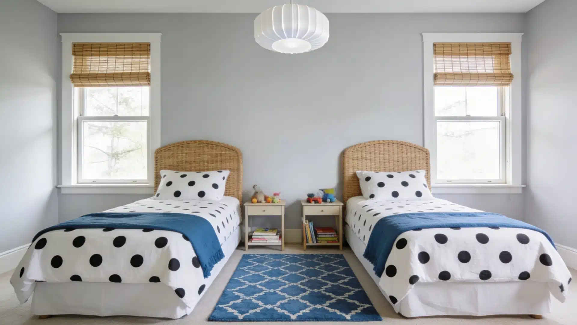
- Bedroom (calming shades): Soft blues, muted greens, and warm neutrals work best. These tones help the room feel restful without being flat.
- Living Room (warm neutrals or welcoming tones): Warm whites, soft taupes, and earthy tones hold up well in shared spaces and feel comfortable over long periods.
- Kitchen (bright and energizing colors): Soft yellows, sage greens, and warm whites keep the space feeling lively. Avoid very dark shades if natural light is limited.
- Bathroom (fresh and clean tones): Pale blues, soft grays, and crisp whites feel open and clean. A single darker accent wall can add character in a small bathroom without making it feel cramped.
Conclusion
You close the last tab. You stop texting friends for opinions. You pick up the sample pot and go home.
That is actually where learning how to choose a paint color really starts.
Not the scrolling, not the mood board, not the poll. The wall in front of you, the light in your room, and the color that feels right after a few days of living with it.
When you focus on that, the decision stops feeling like a gamble.
A process beats a hundred opinions every time. Trust the steps, trust your gut, and put those samples on the wall this weekend.
Frequently Asked Questions (FAQs)
1. How Do I Know if a Paint Color Will Look Good in My Room?
Paint a large sample swatch on your wall and observe it at different times of day before deciding.
2. Should I Always Follow Color Trends?
No. Use trends for ideas, but choose based on your space, lighting, and what you actually like living with.
3. Can Small Rooms Handle Dark Colors?
Yes. Balance dark walls with lighter furniture and good natural light. A single accent wall is a safe starting point.