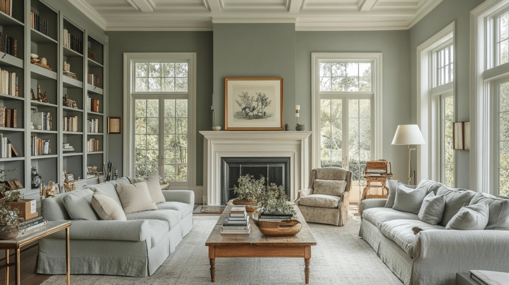
My living room needed a color that wasn’t beige, and I didn’t want something that was forcefully trendy.
That was the problem I faced when choosing paint for my living room. Something softer than a deep green felt like a good idea so I looked into the shades. When I came across Saybrook Sage by Benjamin Moore, it quickly became one of my favourite colors.
But there were always some drawbacks because it can look cooler, deeper, or grayer depending on the lighting.
So, is Saybrook Sage worth buying? This review covers its LRV, undertones, advantages, drawbacks, coordinating colors, finishes, pricing, and best uses.
Short answer: yes, but light and room direction change how it looks more than most reviews mention.
Saybrook Sage Specs at a Glance
- Color family: Muted sage green
- LRV: 45
- Undertones: Gray with a slight blue cast, shifting from green in morning light to a cooler gray-green by evening
- Best use: Interior walls, cabinets, doors, built-ins, and furniture
- Exterior suitability: Workable on facades and shutters, particularly on farmhouse and cottage-style exteriors, but it reads noticeably cooler and grayer in full shade than it does indoors. Get a large exterior sample board before committing a whole house to it.
- Cabinet and trim finish: Satin or semi-gloss for better durability and easier cleaning.
- Coordinating colors: Cream, terracotta, muted navy, warm beige, natural wood, and soft brown.
Test the shade on more than one wall before buying a full can. Check it in morning light, afternoon light, and under your usual indoor lighting, since rooms with less natural light will show it as deeper and grayer than a bright, south facing room will.
The Saybrook Sage by Benjamin Moore Color Description
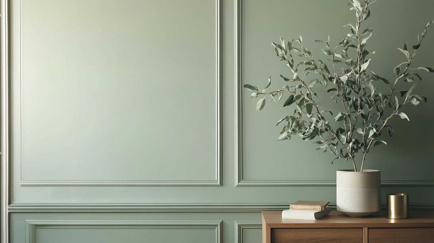
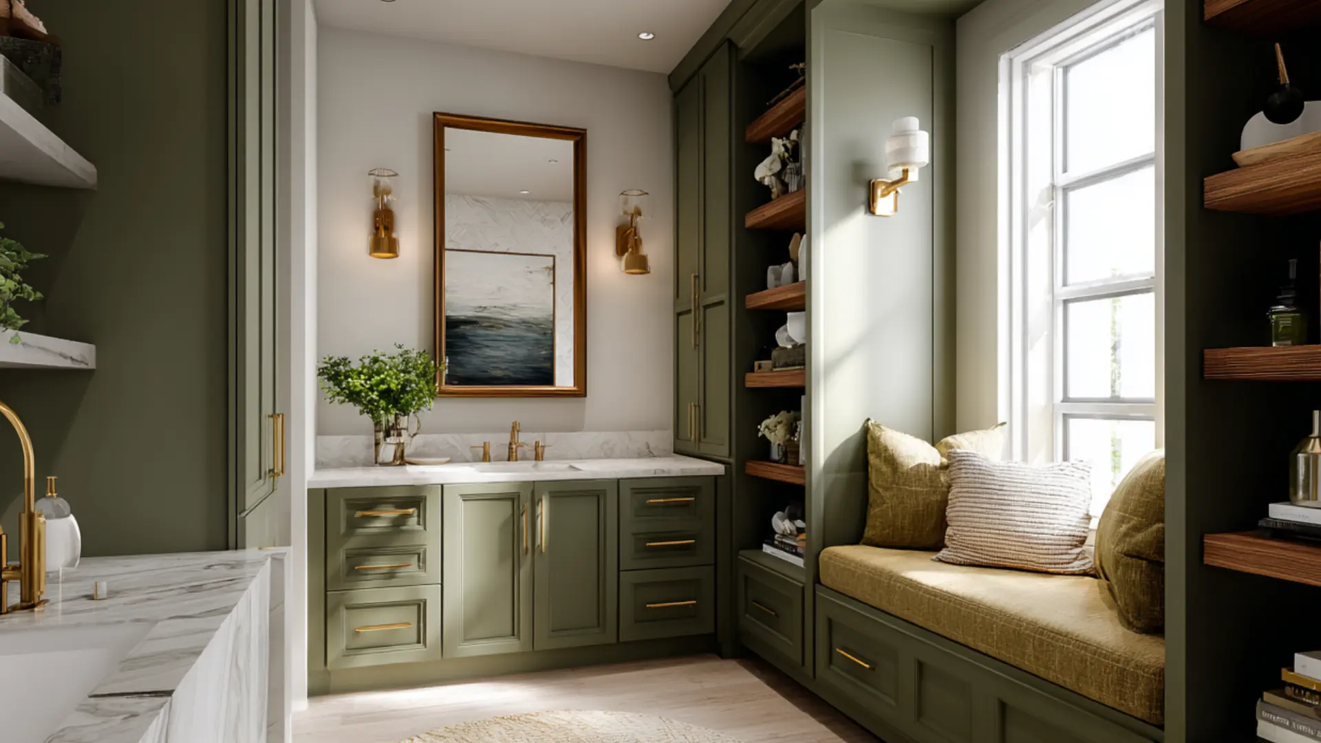
Saybrook Sage (HC-114) is a muted, earthy green with subtle gray undertones that shifts throughout the day.
In morning light, it leans into its green heritage, while evening shadows bring out its cosmopolitan gray side. This chameleon-like quality makes it incredibly versatile for different spaces and design styles.
Orientation matters more than most guides tell you.
- In a north-facing room with one window, Saybrook Sage tends to read bluer and flatter, since it’s only getting indirect light.
- In a west-facing room, expect it to go a bit darker and grayer by late afternoon.
- South and east-facing rooms look the best, holding onto the green side of the color for most of the day.
What makes Saybrook Sage special is its depth. Unlike trendy greens that a person gets bored of quickly, this color has staying power.
It’s got this timeless quality that reminds me of vintage botanical prints or the weathered sage plants in my grandmother’s garden.
| Feature | Details |
|---|---|
| Color Family | Green/Gray |
| LRV (Light Reflectance Value) | 45 |
| Undertones | Gray, slight blue |
| Best Rooms | Living room, bedroom, kitchen |
| Complementary Colors | Cream, terracotta, navy |
| Finish Recommendation | Eggshell or matte |
The LRV of 45 puts it squarely in the medium range, meaning it won’t make your room feel too dark or too bright. It’s that sweet spot that creates a cozy atmosphere without sucking all the light out of a space.
I’ve found it works beautifully in rooms that get decent natural light but can feel a bit heavy in already dark corners.
What LRV actually means: It just tells you how much light a color bounces back into the room, the higher the number, the brighter the paint will feel on your wall.
Where to Apply the Saybrook Sage Benjamin Moore
Saybrook Sage is one of those rare colors that seem to work almost everywhere.
I’ve spent the last few months experimenting with this versatile shade in different spots around my home, and I’m constantly surprised by how it adapts to each space.
If this shade feels too muted or cool for your space, comparing sage green paint colors for in home styles can help you find a closer match.
Living Room
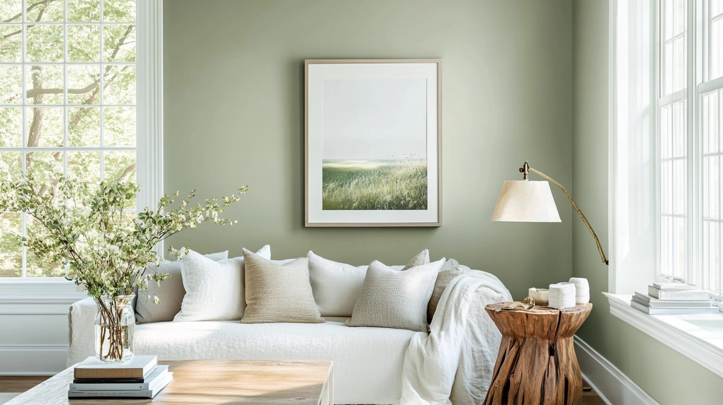
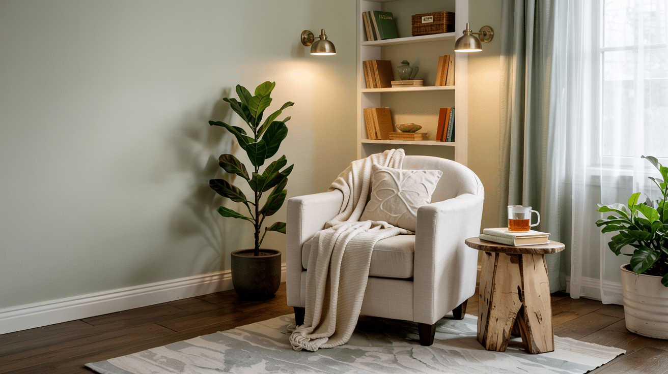
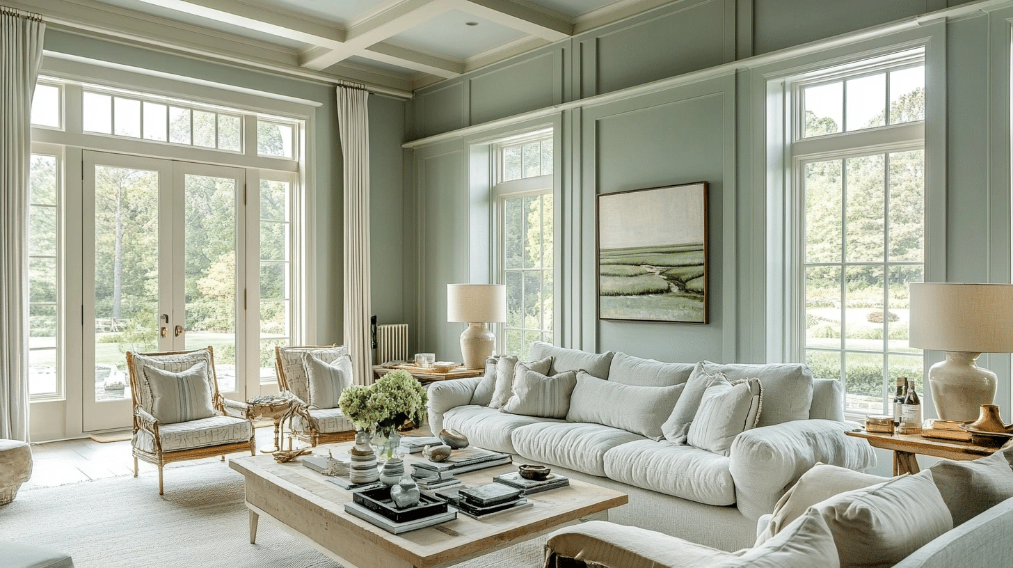
In the living room, Saybrook Sage creates this incredible cozy vibe without feeling dark or heavy.
I painted all four walls and was amazed at how it made my white trim and ceiling pop without trying too hard.
The color shifts beautifully throughout the day, looking more green when the morning light hits it and settling into a cosmopolitan gray-green by evening.
Main Door
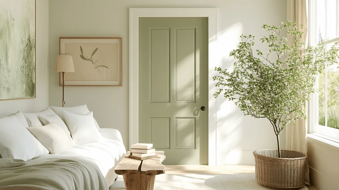
The main door was honestly a game-changer. I was hesitant about using Saybrook Sage here – worried it might be too subtle – but it turned out to be perfect.
It’s especially gorgeous when paired with brass hardware, which brings out the warm undertones.
Plus, it’s neutral enough to complement both the interior and exterior color schemes, creating a smooth transition between outdoors and in.
If you’re weighing whether to take it further and use it on the whole exterior, know that a single door gets far more reflected light than a full facade does, so don’t assume the two will look identical.
Kitchen Cabinets
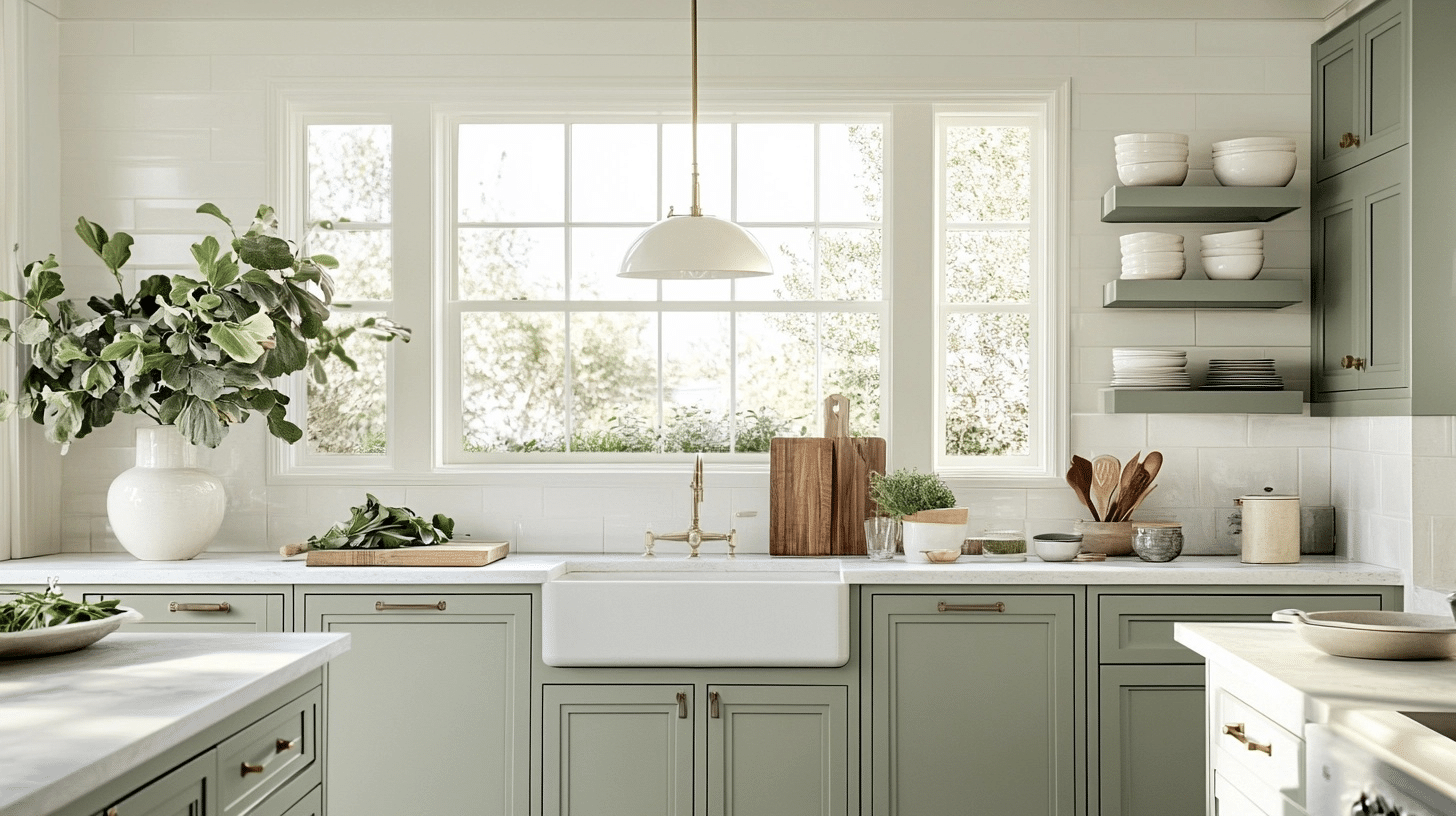
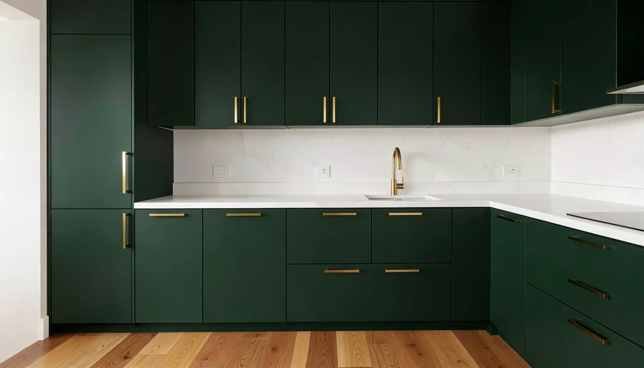
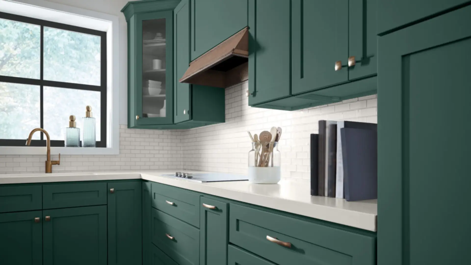
Don’t even get me started on how good this color looks on kitchen cabinets!
I painted my cabinets Saybrook Sage while keeping the upper walls and backsplash white, and the combination is simply stunning.
The color has enough body to hide minor smudges and cooking splatters, which is practical for a busy kitchen. It also somehow makes my small kitchen feel larger and more cohesive.
The subtle gray undertones work beautifully with both my marble countertops and stainless appliances.
Bedroom Walls
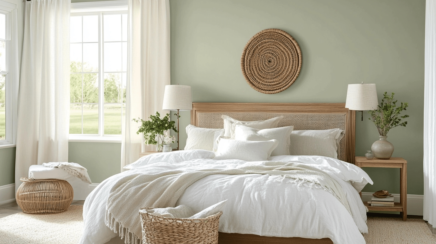
In the bedroom, this color absolutely converts the space. It creates a restful atmosphere that honestly helps me sleep better.
I’ve found it pairs wonderfully with crisp white bedding, creating a hotel-like vibe that feels both luxurious and deeply comfortable.
It also provides a beautiful backdrop for artwork, making everything pop without competing for attention.
Tip: In a north-facing room with limited windows, it can lean bluer and flatter than the paint chip suggests, so warm up the room with honey or oak-toned wood furniture if that’s your setup.
Home Office
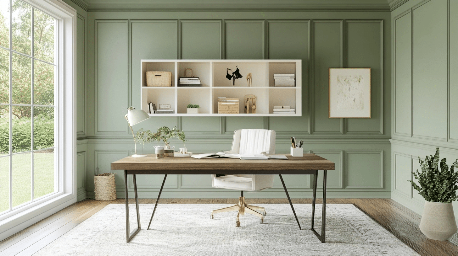
I last tried this color in my cousin’s home office, and it creates such a focused, productive environment without feeling boring like many office colors.
The color looks particularly striking against dark wood desk.
My cousin has also noticed less eye strain after long workdays, which is always a huge plus point to have.
Saybrook Sage Pros and Cons
Pros
- Muted enough to work as a neutral, but still has real color
- Shifts naturally with the light instead of looking flat all day
- Works across living rooms, bedrooms, kitchens, and cabinetry
- Pairs with both cool tones like navy and warm tones like terracotta
- Part of Benjamin Moore’s Historical Collection, a lineup with decades of steady use behind it
Cons
- Can read dull in rooms with limited natural light
- Looks noticeably different depending on room orientation, so the paint chip is only a starting point
- Some sage greens run warmer and brighter, so it is worth comparing before you commit
- On a single dark wall with no natural light, it can feel heavier than expected.
Is Saybrook Sage Benjamin Moore a Good Choice for Exteriors?
Like I mentioned above, this color reads grayer and cooler outdoors than it does inside – so you have to be really careful.
Indoor lighting is warmer and more controlled, so the green side of Saybrook Sage shows up more.
Outside, especially under an overcast sky or a covered porch, it leans harder into gray-green. On a full sun exposure, it holds its color better and shows more of its warmth.
If you’re using it on siding, go with an exterior-grade formula like Benjamin Moore’s Aura Exterior or Regal Select, both of which hold up better against sun fading than a standard exterior line.
A satin or low-sheen finish works well on siding, while semi-gloss is worth it on doors and shutters for durability and easy cleaning.
And before you buy in bulk, I will recommend getting a large exterior sample board and look at it against your actual roofline, brick, or stone in both direct sun and shade.
What Readers Keep Asking About This Color
A handful of questions come up in the comments on this piece often enough that they’re worth answering directly. Let me clear out the queries I get the most.

What white pairs best with it for trim?
White Wisp is the pairing that shows up most in my own house, since its warmth keeps the sage from feeling cold. If you want something crisper and don’t mind a slightly more clinical look, Soft Chamois is worth sampling too.
Will it read too dark in a low-light basement or a north-facing room with one small window?
Likely yes, at least somewhat. A mid-40s LRV is not a light color, and a room with limited natural light will pull it toward gray-green rather than the softer sage you see in a bright photo.
If the room already looks dark, pair it with lighter cabinetry, warm wood tones, or bump the trim to something brighter to keep it from feeling heavy.
How does it compare to October Mist?
They’re close enough that people often mix them up. October Mist, Benjamin Moore’s 2022 Color of the Year, reads cooler and more silvery-gray at a similar depth, while Saybrook Sage holds onto more warmth and green.
…And if you have got any more questions or doubts – feel free to ask in the comments!
Saybrook Sage Vs Other Similar Shades
LRVs below are approximate and can shift slightly by source, so confirm current numbers with the manufacturer before ordering.


I still think Saybrook Sage holds up better than most of the alternatives above.
Sea Salt reads more pastel and coastal. Dried thyme looks darker and more brown in most rooms.
Painting it Up
Saybrook Sage quietly converts your home into something more refined. How I am so sure? Every friend who visits asks about my walls.
If you’re on the fence, grab a sample and watch it through different times of day.
You’ll notice how it shifts from soft green to cosmopolitan gray, never landing in that dreaded “mint” territory that dates so many spaces.
Frequently Asked Questions (FAQs)
1. Does Saybrook Sage Work with Red Brick?
Yes. Its muted green complements earthy red brick, especially when paired with cream trim, black accents, and warm wood details.
2. Is Saybrook Sage Suitable for an Open Floor Plan?
Yes, provided adjoining rooms share related neutrals, woods, or accent colors that create a consistent flow throughout the connected space naturally.
3. Should I Prime Before Painting with Saybrook Sage?
Primer helps when covering dark colors, stains, glossy surfaces, or repaired areas, creating a smoother and more even final result.
4. How Many Coats of Saybrook Sage Are Usually Needed?
Two coats generally provide even coverage, though darker walls, porous surfaces, or major color changes may require an additional coat.