A bad exterior palette costs you real money at resale, and a mediocre one chips away at curb appeal every day you live with it. Paint is cheap; the decision it locks in is expensive.
The question most homeowners wrestle with isn’t which single color to pick. It’s how four fixed elements (siding, trim, roof, and front door) are supposed to agree with each other. Two schools of thought dominate, and they lead to very different houses.
Start From the Roof, or Start From the Siding
The roof is the one piece almost nobody repaints on a whim. It’s expensive, it’s permanent-ish, and its color sets an undertone the rest of the house has to live with. One camp says anchor every other choice to it.
The other camp starts from siding. If you’re residing anyway, the roof becomes the constraint you work around instead of the hero of the composition. Both approaches are valid.
The deciding factor is simple: which element are you changing right now? Build your palette around what’s staying, not what’s leaving.
Siding Carries the House; Everything Else Reacts to It
Siding is the largest surface on the house, so its undertone drives how every other color reads. A warm greige with a brown base will make a cool slate roof look blue. A cool greige with a gray base will make the same roof look neutral.
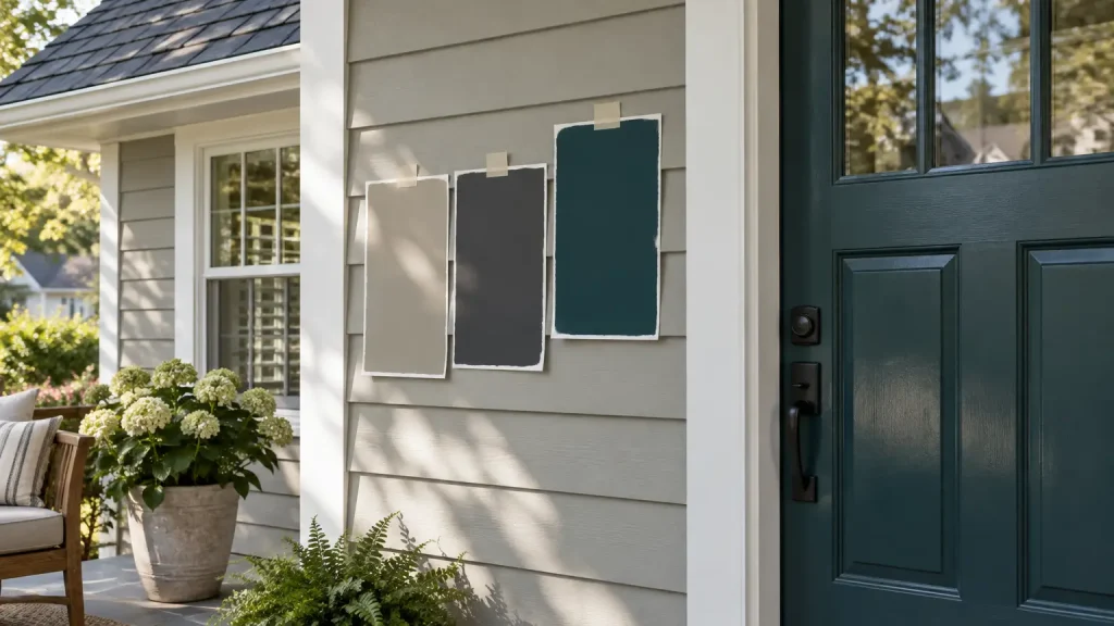
Hold a siding sample against the roof in direct sun before you commit, not under the showroom lights.
This is also where the stakes jump from paint money to real money. If you’re replacing material rather than painting over it, booking expert siding installation is the moment to lock in your palette, because the color is baked into the product and the trim profiles. Decide the whole scheme before the first panel is ordered.
Trim Can Match or Contrast, and the Choice Changes the House
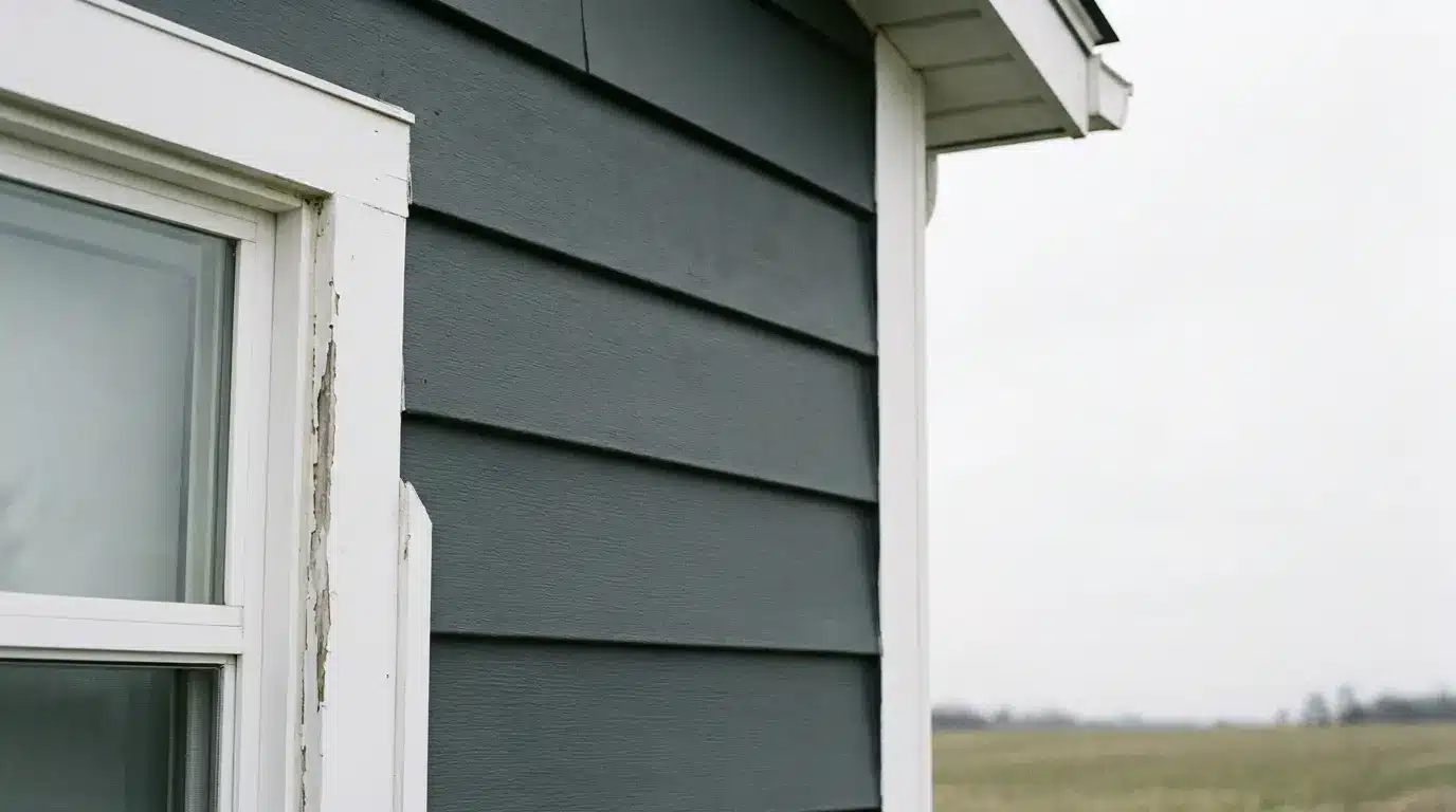
Trim is where restraint and drama trade places. Match trim closely to siding and the house reads calm, modern, and architectural.
Contrast it sharply (think crisp white against charcoal, or deep bronze against warm cream) and the house reads traditional, detailed, and framed.
- Match for mass. Low-contrast trim lets the shape of the house do the talking. Good for modern farmhouses, contemporary builds, and anything with strong rooflines you want to emphasize.
- Contrast for detail. High-contrast trim shows off window grids, corner boards, and porch columns. Colonials, Victorians, and Craftsman homes were designed around this.
- Mind the LRV. A bright white trim with a very high light reflectance value can glare in full sun. For whites on exteriors, a slightly softer white usually sits better against siding than a chalky, maximum-brightness one.
The Front Door Is the One Place to Take a Risk
Siding and roof decisions reward caution. The door rewards nerve. It’s one of the smallest painted surfaces on the house and among the easiest to redo, which makes it the right place to try a color you’d never commit to across an entire elevation of lap siding.
Finish matters as much as color here. Consumer Reports recommends semi-gloss for front doors and exterior trim because it wipes clean and reads as a deliberate contrast against flatter siding. A saturated door in a dead-flat finish looks tired within a season; the same color in semi-gloss looks intentional for years.
Muted Palettes Age Better; Saturated Ones Date Faster
Trend colors sell paint. They don’t usually suit the house they land on. A deeply saturated siding color (forest green, navy, oxblood) can look spectacular on day one and distinctly of-its-moment five years later.
A muted, slightly complex neutral tends to carry further because the eye doesn’t tire of it.
The practical rule: keep the two largest surfaces (siding and roof) in the subtler half of the spectrum, and spend your saturation budget on the two smallest (door and, if you have them, shutters).
That’s how a bold palette stays legible instead of shouting. A yellow house, famously, tends to lose money at resale. A yellow door rarely does.
Test Before You Commit
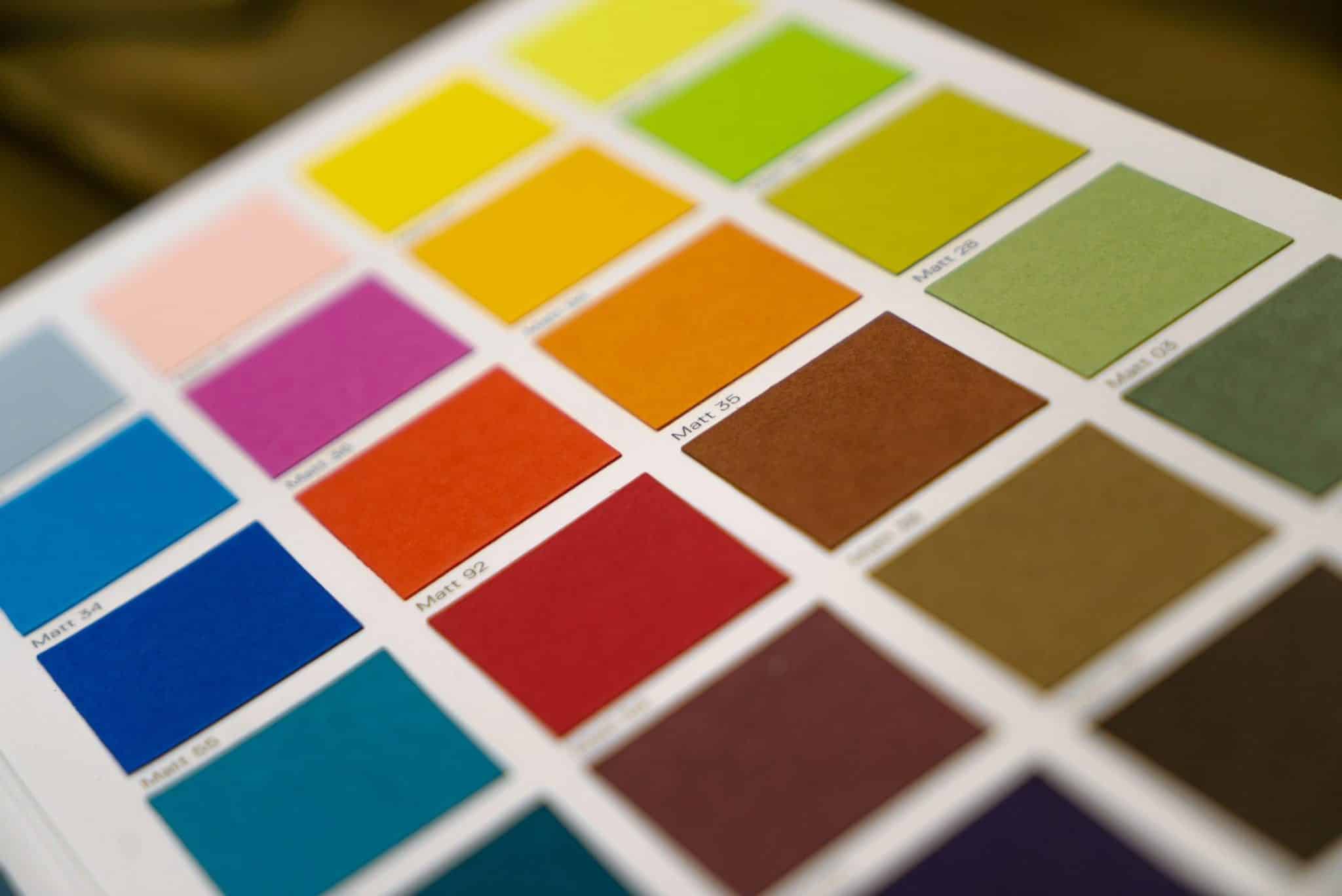
Paint chips lie. They’re small, they’re flat, and they’re viewed under store lighting that bears no resemblance to the sun hitting your north elevation at 4 p.m. in October. Order large peel-and-stick samples or paint 2-by-2 boards and move them around the house across a full day.
- Check all four elevations. A color that glows on the south face can go muddy on the north. Look at every side before you decide.
- View samples next to the roof and existing hardscape. Driveway, walkway, and stone veneer all pull undertones out of siding you didn’t know were there.
- Live with it for a week. Morning light, overcast light, and evening light each tell you something different. If you still like it on day seven, order the paint.
A palette that holds together isn’t an accident of taste. It’s four decisions made in the right order, with the fixed elements respected and the small ones used to carry the personality.