Here’s something that changed my decorating game: split complementary colors.
It sounds fancy, but it’s actually a simple trick designers use to create rooms that pop without the chaos. Instead of matching everything perfectly or going wild with rainbow combinations, this method gives you a foolproof way to pick three colors that just work together.
Once you understand how this color scheme works, you’ll spot it everywhere – from magazine spreads to your favorite coffee shops.
And I am here to show you exactly how to use this color scheme in your own space.
Let’s get started.
Starting Off – What Exactly are Split Complementary Colors?
Let me break this down in the simplest way possible. Split complementary colors start with one main color, then you grab the two colors sitting on either side of its opposite on the color wheel.
Think of it like making a Y-shape on the wheel.
Here’s what I mean: Pick blue as your main color. Its opposite is orange. But instead of using orange, you take the two neighbors – yellow-orange and red-orange.
Now you’ve got three colors that play nicely together: blue, yellow-orange, and red-orange.
This combo gives you the best of both worlds. You get contrast because these colors are almost opposites, so they create energy and interest.
But since you’re not using direct opposites, the look stays balanced and easy on the eyes.
Interior designers love this trick because it creates rooms that feel vibrant without being chaotic. You get enough pop to keep things interesting, but everything still feels like it belongs together.
This natural balance stops any single color from taking over the room.
Here’s How These Colors Differ from Other Color Schemes
Let me show you how split complementary stacks up against other popular color schemes.
Complementary colors use two direct opposites, like blue and orange. Sure, they create bold contrast, but in a room? They can feel too intense. I tried this in my first apartment, and it felt like the walls were shouting at each other.
Analogous colors sit next to each other on the wheel – think blue, blue-green, and green. These create super calm, peaceful rooms. But sometimes they’re too calm. My bedroom felt flat until I added some contrast.
Triadic colors form a perfect triangle on the wheel, like red, yellow, and blue. This works great for kids’ playrooms, but it’s tricky to balance in adult spaces without looking like a circus.
Here’s how they compare:
| Color Scheme | Colors Used | Contrast Level | Best For |
|---|---|---|---|
| Complementary | 2 opposites | Very high | Bold accent walls |
| Analogous | 3 neighbors | Low | Calm bedrooms |
| Triadic | 3 evenly spaced | High | Playful spaces |
| Split Complementary | 1 + 2 near-opposites | Medium-high | Any room |
Let me tell you, I’ve tried all these schemes, and split complementary is the only one where I’ve never had to repaint. Even my clients agree.
The colors naturally harmonize while keeping things lively.
Why Use Split Complementary Colors in Home Decor?
I’ve decorated five different homes over the years, and split complementary colors have saved me from costly mistakes every single time.
The emotional and visual payoff is real.
Split complementary colors create visual interest because your eye naturally moves between the three different hues.
But since two colors share warm or cool undertones, they ground each other. This prevents that jarring feeling you get when colors clash.
This color scheme adapts to any decorating style you love:
- Modern spaces: Use muted versions like charcoal, dusty rose, and terracotta. The subtle contrast keeps things sophisticated while the three-color mix prevents that sterile look modern rooms sometimes get.
- Bohemian interiors: Go bold with jewel tones like emerald, magenta, and golden yellow. The near-opposite colors create that collected-over-time vibe boho lovers want.
- Coastal homes: Try soft blue with peachy-pink and warm sand tones. You get the ocean feel plus sunset warmth that makes coastal rooms cozy, not cold.
Most Loved Split Complementary Color Schemes
Here are the split complementary combinations that work beautifully in real homes:
1. Navy + Coral + Yellow-Orange – Classic and cheerful, perfect for living spaces
2. Forest Green + Blush Pink + Terracotta – Earthy meets romantic, great for bedrooms
3. Charcoal Gray + Peach + Soft Yellow – Sophisticated with warmth, ideal for modern homes
4. Teal + Rust + Cream – Rich and balanced, works in any room
5. Burgundy + Sage Green + Olive – Moody and mature, perfect for dining rooms
6. Royal Purple + Yellow + Lime Green – Bold and creative, great for studios or kids’ rooms
7. Dusty Blue + Apricot + Salmon – Soft look, beautiful in bedrooms
8. Emerald + Magenta + Golden Yellow – Jewel-toned luxury, stunning in powder rooms
9. Chocolate Brown + Sky Blue + Periwinkle – Grounded yet airy, perfect for home offices
10. Deep Plum + Amber + Chartreuse – Rich, makes dining rooms memorable
11. Sage Green + Lavender + Pink – Garden-inspired calm, lovely for nurseries
12. Midnight Blue + Copper + Burnt Orange – Warm and cozy, ideal for dens
13. Olive + Rose Gold + Dusty Rose – Trendy yet timeless, works everywhere
Want a Color Palette for Your Home? Here’s how to Create One Exactly According to Your Needs
Last month, I helped my sister create a split complementary color palette starting with her terracotta tiles, and her kitchen transformation was incredible.
I’ll walk you through the exact process I use every time I redecorate.
Step 1: Pick your starting color
Choose the color you love most or already have in your space. Maybe it’s your navy sofa or that green accent wall you painted last year. This becomes your anchor.
Step 2: Find the opposite color
Look directly across the color wheel from your starting point. If you picked blue, you’re looking at orange. Green? You’re finding red.
Don’t worry – you won’t actually use this color.
Step 3: Grab the two neighbors
Here’s the main part.
Take the two colors sitting right next to that opposite. So if orange was across from your blue, you’ll use yellow-orange and red-orange instead. These become your accent colors.
Step 4: Test your combination
Before committing, grab paint samples or fabric swatches in these three colors. Put them together in the room where you’ll use them.
Natural light changes everything; what looks good in the store might feel different at home.
Step 5: Decide your proportions
I use the 60-30-10 rule for my split complementary color palette for home decor. Your main color covers 60% (walls or large furniture), one accent takes 30% (curtains, rugs), and the third adds 10% (pillows, artwork).
Step 6: Adjust the intensity
Not every color needs to scream. Try different saturations, maybe soft sage instead of bright green, or dusty rose rather than hot pink.
The relationship between colors stays the same, but the mood shifts completely.
Split Complementary Color Scheme Ideas for Each Room (Real Life Examples)
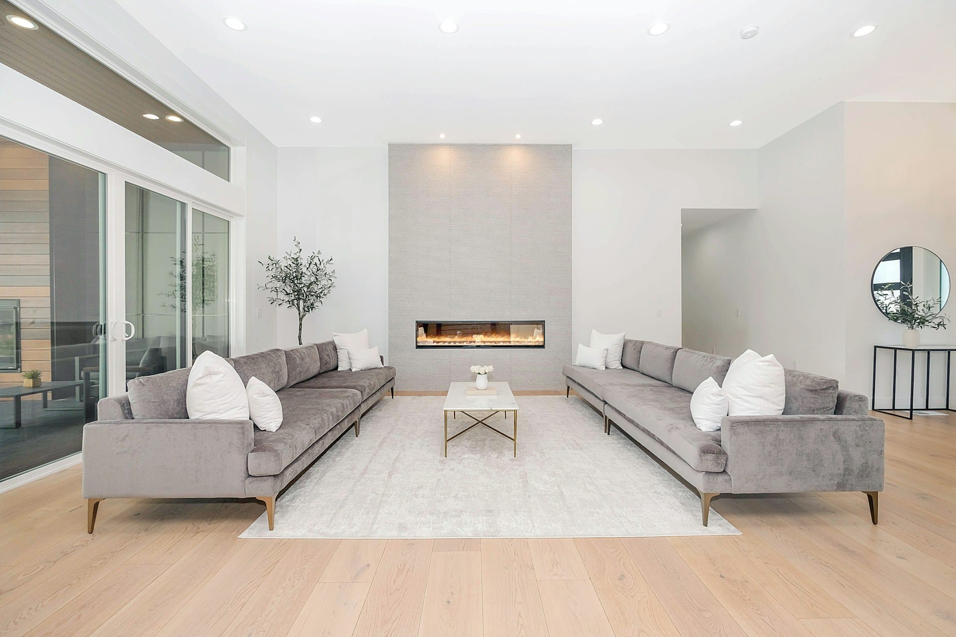
1. Living Room
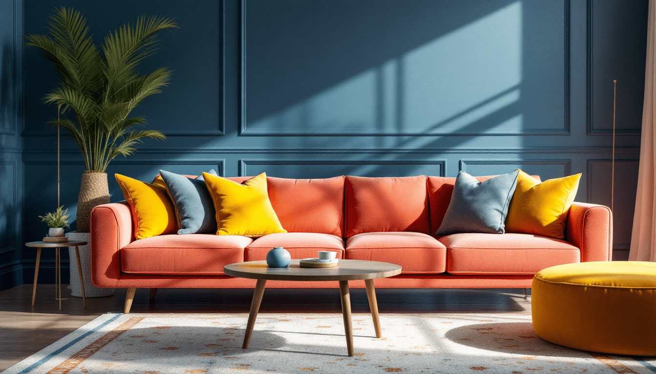
The living room needs to work hard; it’s where we relax, entertain, and live most of our lives. And let me tell you, these palettes handle it all.
Navy, coral, and soft yellow
- Navy walls create drama and depth
- Coral sofa becomes the showstopper
- Yellow throw pillows and artwork add pops of sunshine
- Why it works: Dark walls make warm colors pop without feeling childish
Forest green, blush pink, and terracotta
- Green walls bring nature inside
- Blush curtains soften the bold green
- Terracotta leather chairs or clay pots add earthiness
- Why it works: Creates an indoor-outdoor flow that feels fresh yet cozy
Balancing tip: Use your boldest color on one big element – walls or sofa. Scatter the other two colors in textiles and accessories. A patterned rug with all three colors ties everything together.
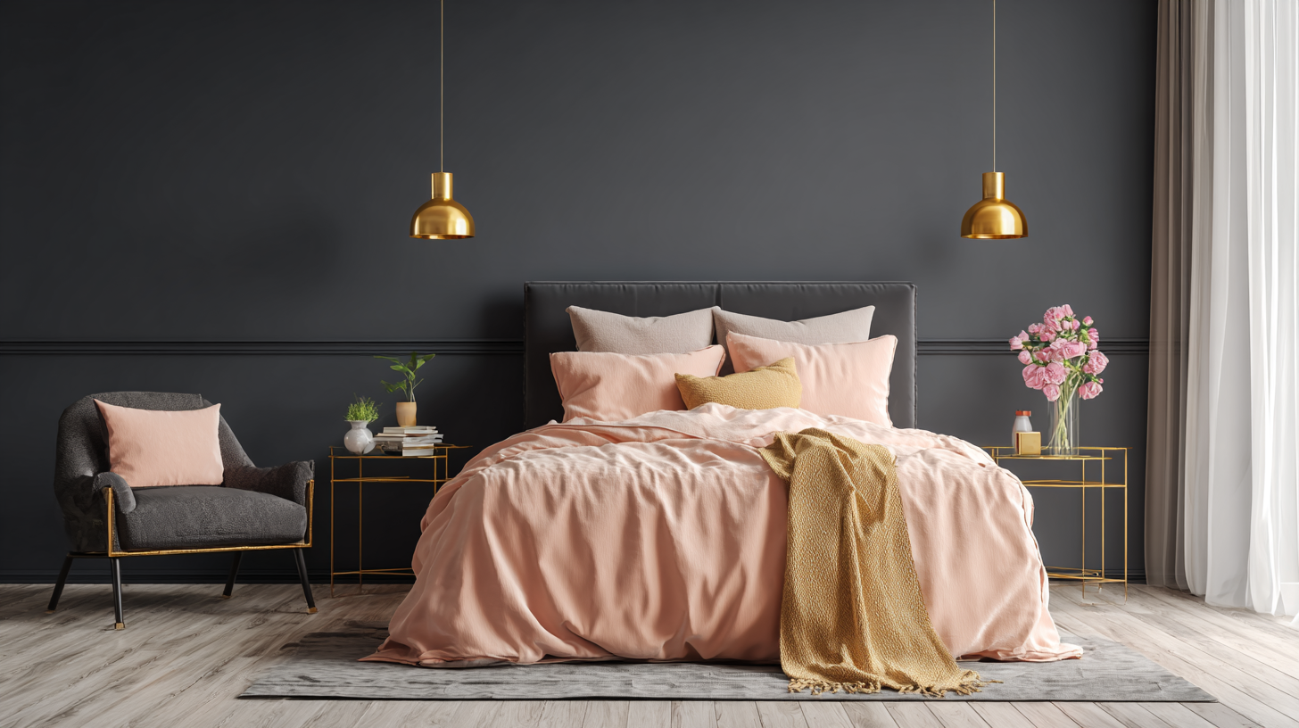
2. Bedroom
These combinations stay calm while keeping things interesting.
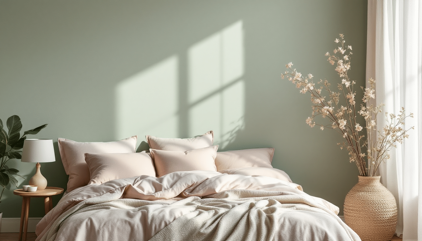
Sage green, blush, and peach
- Sage walls create a cocoon effect
- Blush bedding adds romance
- Peach accents in artwork or throw blankets
- Why it works: Feels like sleeping in a garden
Soft lavender, mint, and butter yellow
- Lavender walls for tranquility
- Mint in curtains and pillows
- Butter yellow in a reading chair or lamp
- Why it works: Cool tones relax, while yellow makes mornings easier
Lighting tip: Warm bulbs enhance cozy colors at night. Sheer curtains filter daylight through these soft hues for a dreamy morning glow.
3. Kitchen
Kitchens thrive on energy, but too much chaos makes cooking stressful.
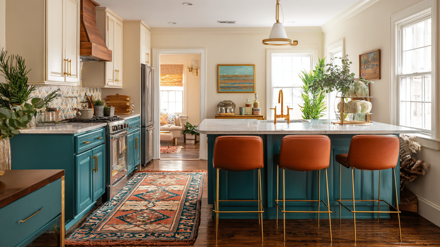
Teal, rust, and cream
- Teal lower cabinets make a statement
- Cream walls and counters keep it bright
- Rust bar stools or vintage runner
Charcoal gray, peachy-pink, and golden yellow
- Gray cabinets look expensive
- Peachy-pink subway tile backsplash
- Golden yellow through brass fixtures
White, sage, and terracotta
- White cabinets stay timeless
- Sage island or accent wall
- Terracotta in dishware and planters
Smart placement hack: Bold colors go on changeable elements – backsplashes, cabinet interiors, or accessories. Save neutrals for expensive items like countertops.
4. Dining Room
The dining room sets the mood for every meal. These combinations make people want to linger.
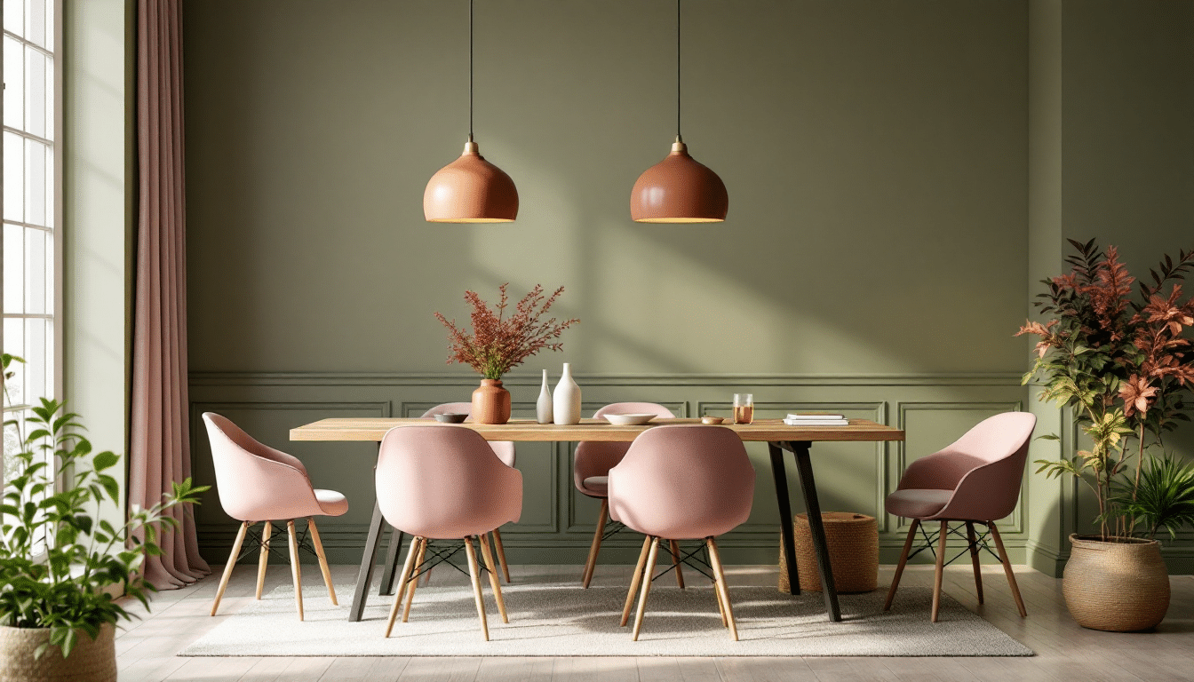
Olive green, terracotta, and soft rose
- Olive walls feel sophisticated
- Terracotta statement light fixture
- Soft rose upholstered chairs
- Bonus: These warm undertones actually make food look more appetizing
Deep plum, golden amber, and sage
- Plum accent wall creates intimacy
- Golden amber in wood furniture or metallic accents
- Sage table linens ground the drama
Psychology at work: Warm colors like terracotta and rose stimulate appetite and conversation. Cool it down with sage or olive to prevent overstimulation.
Accent ideas that work:
- Table runners incorporating all three colors
- Wall art that echoes your palette
- Statement chandelier in one accent color
- Chair cushions that can change with the seasons
Perfecting that Split Complementary Look
Getting your three colors right is just the beginning. Here’s how I make those colors truly work together.
Layering textures and patterns
This prevents color overload.
I use smooth surfaces for my boldest color (painted walls), nubby textures for the second (linen curtains), and soft textures for accents (velvet pillows).
For patterns, I start with one that includes all three colors, then add smaller patterns that share the palette. This creates depth without chaos.
Adding metallics or neutrals
This gives your eyes places to rest. Brass warms cool palettes, silver cools warm ones, and copper bridges both beautifully. I stick to one metallic finish to avoid competition.
White trim lifts heavy colors, gray softens bright ones, and beige grounds bold choices in reality.
Using color psychology
Warm colors energize social spaces, while cool colors calm bedrooms. North-facing rooms need warm accents to counter gray light. South-facing spaces handle more cool tones.
My favourite part? You can shift any room’s mood just by swapping accessories; no repainting needed.
- Feeling stressed? Add more of your cool color through pillows or throws
- Room feels flat? Punch up the warm accent color
- Too stimulating? Bring in more neutrals to calm things down
Things to Look Out For
Overusing strong hues without neutral balance turns rooms into circus tents.
I learned this after painting three walls in three bold colors – a total chaos. Now, if my colors are intense, at least 40% of the room stays neutral through white ceilings, wood floors, or beige furniture.
Ignoring undertones and lighting conditions sabotages everything. That sage green might have yellow undertones that clash with your pink’s blue undertones.
Always check paint chips in the actual room at different times. Morning light is cool, afternoon warm, and LEDs change everything again.
Not keeping consistent saturation levels creates visual chaos. Mixing pale mint with electric coral and deep mustard feels wrong.
Either go all bold, all muted, or all pastel. When I want variety, I adjust the amounts instead.
Wrapping Up
You’ve learned how to pick your three colors, balance them with textures and neutrals, and apply them to any room in your home.
This color scheme works because it creates enough contrast to keep things interesting without the clash that direct opposites bring.
Now it’s your turn to try this in your own space.
Which room will you transform first with split complementary colors?
I’d love to hear about your color combinations and see how you make this technique work in your home. Share your results in the comments below!