I’ll never forget the day I confidently picked bright white grout for my dark subway tiles, thinking it would look “classic.”
Three months later, I was scrubbing those grout lines like my life depended on it. That’s when I learned that grout color isn’t just about what looks good. It’s about practicality, too.
Get it right, and your space looks effortlessly pulled together. Get it wrong, and you’ll be living with a constant reminder of that hasty decision every single day.
After years of trial, error, and plenty of grout cleaning, I’ve figured out which tile and grout color combinations work in real life. Let me save you from making the same mistakes I did.
Decide What Tile and Grout Color Combinations to Choose
The first thing I always tell people is to consider their lifestyle before thinking about Pinterest. If you’ve got kids, pets, or live an everyday, messy life, that pristine white grout is going to haunt you.
Your room’s lighting also plays a significant role, and I want to emphasize this point. I always recommend getting sample tiles and grout, then placing them in your actual space and looking at them throughout the day.
Finally, consider if you want your grout to blend in or stand out. Matching grout creates a seamless, continuous look that makes your space feel larger, while contrasting grout turns each tile into its little piece of art.
I’ve seen both approaches work beautifully, but it depends on the vibe you’re going for and the size of your space.
Best Color Combinations that Always Look Immaculate
Even though everyone has their own preferences, some tile and grout color combinations are timeless and do not require too much thinking. I’ve mentioned a few of them below:
1. White Subway Tiles with Light Gray Grout
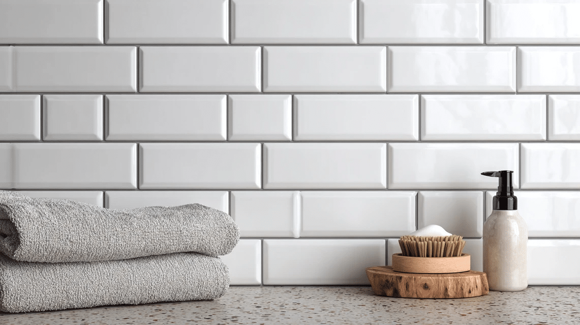
This combination gives you that classic subway tile look without the maintenance nightmare of white grout. The light gray is forgiving with dirt and stains while still looking clean and fresh.
Why it works: The subtle contrast adds definition without being too bold, and it complements virtually any decor style, from farmhouse to modern.
Tips to remember: Choose a warm gray rather than cool to avoid looking sterile, as this combo shows fingerprints less than white grout and works beautifully in both small and large spaces
Complementary decor elements: Stainless steel fixtures, white cabinets, natural wood accents, and black or bronze hardware
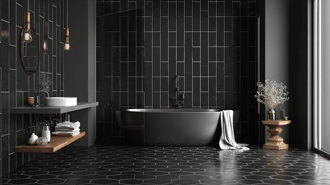
2. Charcoal Tiles with Black Grout
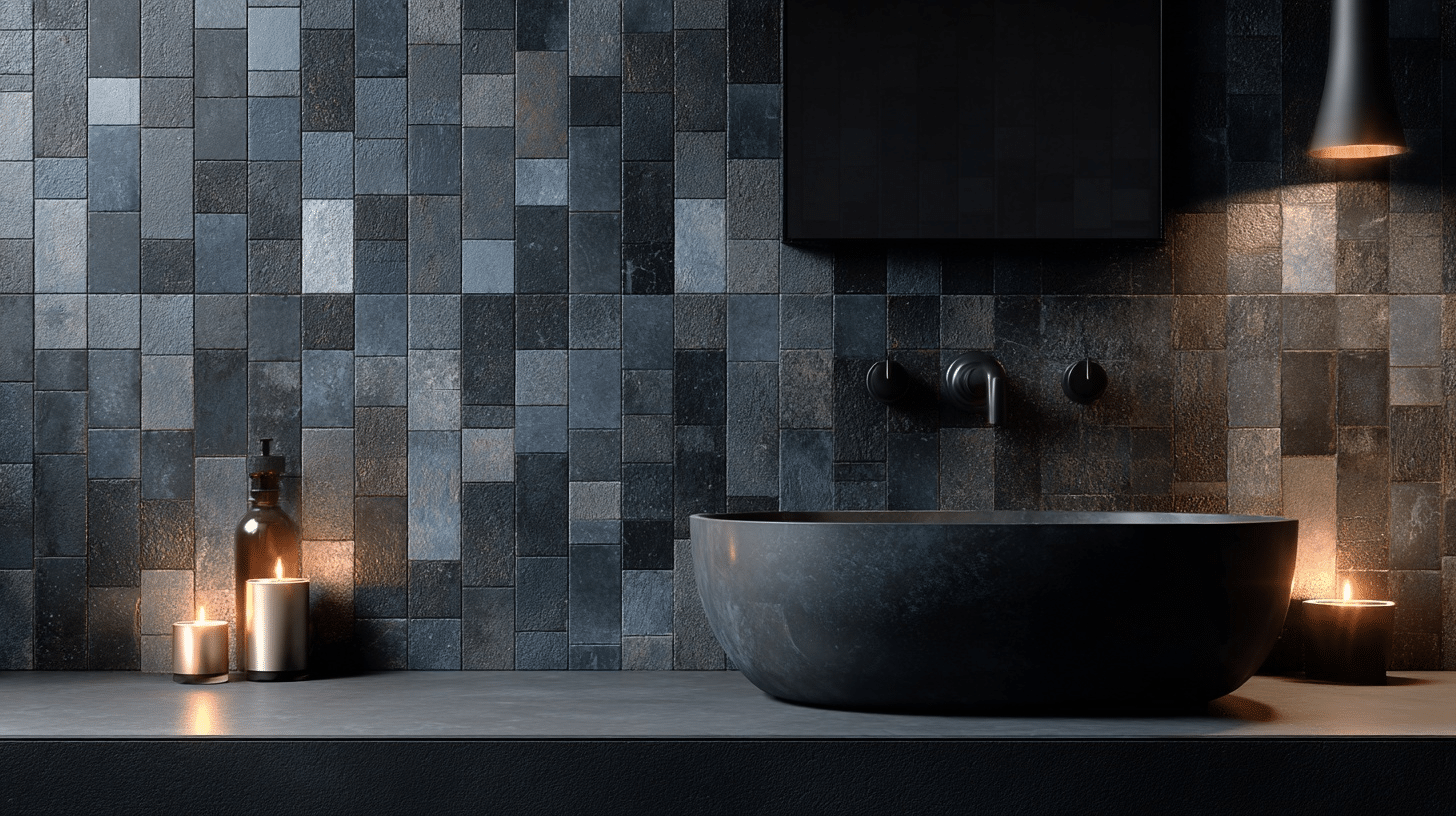
This is my go-to recommendation for anyone who wants drama without high maintenance. The monochromatic look feels classy and hides absolutely everything.
Why it works: The tonal matching creates a seamless, luxurious appearance that makes the tile pattern the star rather than individual tiles.
Tips to remember: Perfect for busy households with kids and pets, and can make small spaces feel cozy rather than cramped. Looks incredible with metallic accents
Complementary decor elements: Gold or brass fixtures, white countertops, light wood vanities, and crisp white towels
3. Beige Travertine with Cream Grout

This natural stone combination brings warmth and texture while maintaining that timeless, spa-like feeling. I’ve used this in three different bathrooms and it never disappoints.
Why it works: The slight color variation mimics natural stone patterns, creating depth without being busy or overwhelming.
Tips to remember: Seal both tile and grout to prevent staining, as the cream grout helps hide the natural variations in travertine
Complementary decor elements: Oil-rubbed bronze fixtures, natural wood elements, earth-tone accessories, and plants
4. Navy Blue Tiles with White Grout
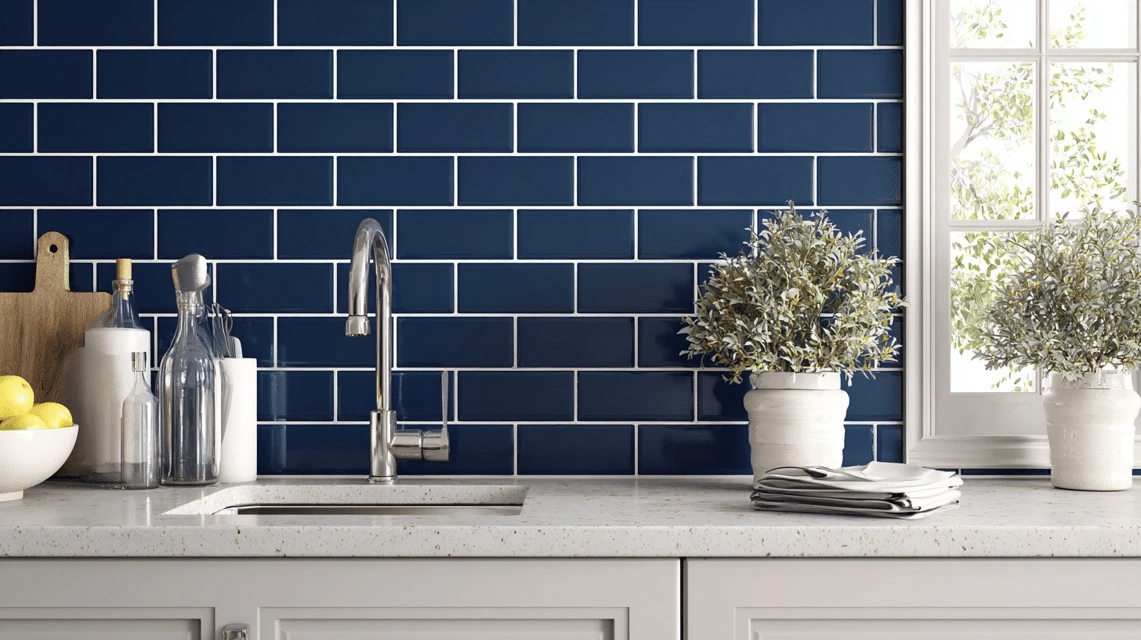
This combination brings coastal charm and works beautifully in both traditional and contemporary settings. The contrast is bold but not overwhelming.
Why it works: The white grout brightens the dark tiles, creating a crisp, nautical feel that’s both timeless and on-trend.
Tips to remember: White grout requires more maintenance, but the look is worth it. Use in well-lit spaces to prevent the room from feeling too dark
Complementary decor elements: Brass or chrome fixtures, white cabinetry, rope or wicker accessories, and coral accents
5. Marble Look Tiles with Matching Gray Grout
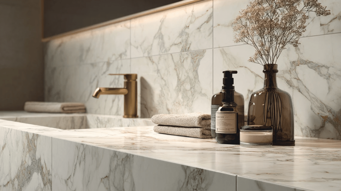
I love this combination because you get the luxury look of marble with the practicality of porcelain, and the matching grout keeps the focus on the beautiful veining.
Why it works: The grout disappears into the tile pattern, creating that seamless marble slab appearance at a fraction of the cost.
Tips to remember: Choose grout that matches the lightest color in your tile, as this combo works in any size space
Complementary decor elements: Chrome or brushed nickel fixtures, white or gray cabinetry, crystal accessories, and monochromatic color schemes
6. Hexagon White Tiles with Charcoal Grout
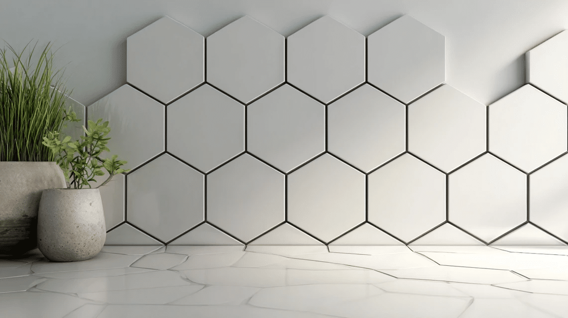
This is probably my favorite combination for adding personality without going too crazy. The geometric shape gets highlighted by the dark grout lines.
Why it works: The contrasting grout turns the hexagon pattern into artwork while the white tiles keep things bright and clean.
Tips to remember: The dark grout is very forgiving with stains and dirt, and works beautifully on floors and walls
Complementary decor elements: Black fixtures, white cabinets, geometric accessories, and bold accent colors
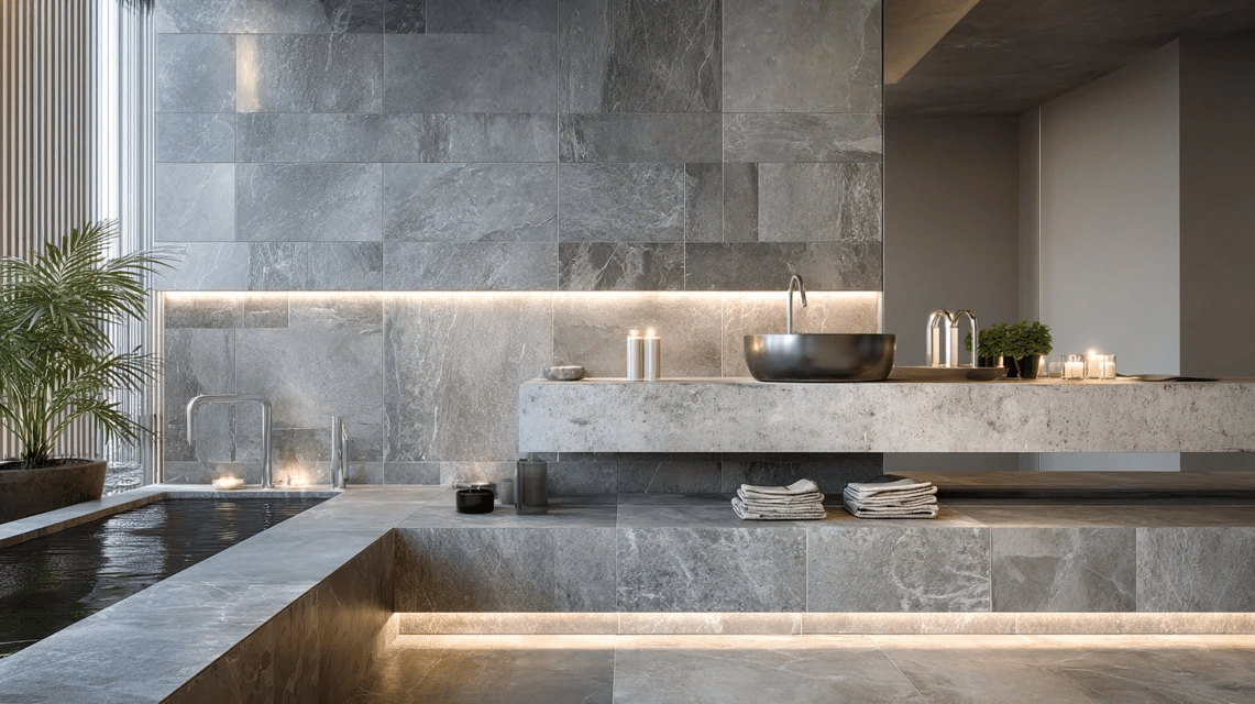
7. Warm Gray Tiles with Darker Gray Grout

This tonal combination feels modern and demure, yet incredibly practical for everyday living. I’ve recommended this to countless clients who want something current but not trendy.
Why it works: The subtle contrast adds depth without being too bold, and the color palette works with warm and cool accent colors.
Tips to remember: Choose grout two shades darker than your tile, as it hides dirt better than lighter combinations
Complementary decor elements: Matte black fixtures, white trim, natural wood, and colorful artwork or accessories
Interested in grey tiles, check out another blog: The Best Answer to What Color Grout to Use with Gray Tile to know all your options.
8. Cream Tiles with Soft Brown Grout
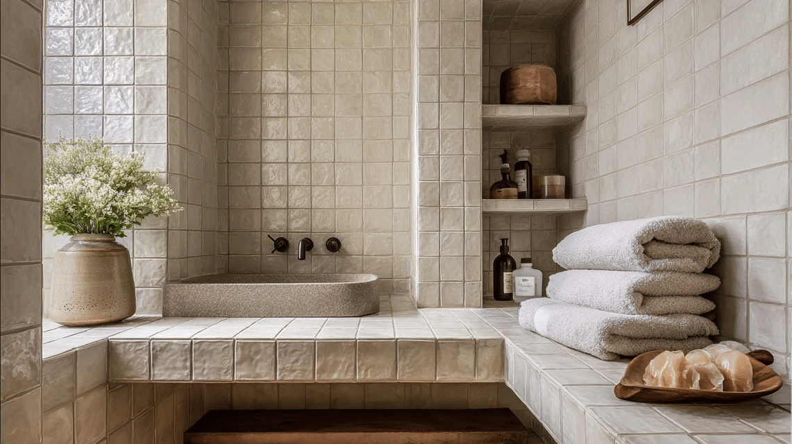
This warm combination brings coziness to any space and works particularly well in traditional or transitional designs. It’s like a warm hug for your walls.
Why it works: The brown grout adds richness without competing with the tile, creating a cohesive, inviting appearance.
Tips to remember: This combo can make spaces feel smaller, so use it in well-lit areas; it’s perfect for creating a cozy, intimate atmosphere.
Complementary decor elements: Bronze or copper fixtures, wood vanities, woven baskets, and warm lighting
9. Large Format Gray Tiles with Minimal White Grout
When you want the tile to be the star, this combination delivers. The thin, white grout lines barely register, allowing the beautiful gray tile to take center stage.
Why it works: Minimal grout lines create a sleek, contemporary look that makes spaces feel larger and more open.
Tips to remember: Use the thinnest grout lines possible for this look, as white grout requires regular maintenance
Complementary decor elements: Sleek chrome fixtures, floating vanities, minimal accessories, and plenty of white space
10. Mosaic Tiles with Matching Grout
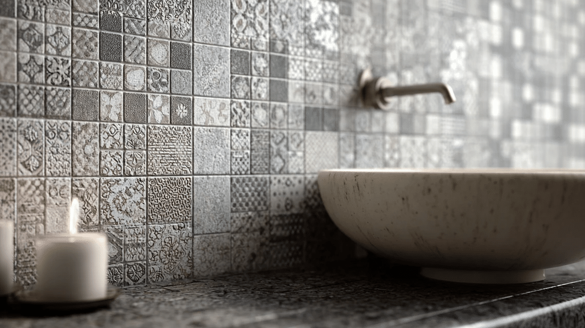
No matter if it’s glass, stone, or ceramic mosaics, matching the grout to the predominant tile color creates a unified, textural surface that’s stunning.
Why it works: The matching grout lets the mosaic pattern and texture shine without competing grout lines interrupting the flow.
Tips to remember: This works best with natural color variations in the mosaic, but can be overwhelming in large spaces, so use it as an accent.
Complementary decor elements Include Simple fixtures that don’t compete, solid-colored accessories, and ample negative space.
11. Black Tiles with White Grout
This high-contrast combination is bold and graphic, making it perfect for creating a statement in powder rooms or as an accent wall. It’s not for the faint of heart, but when done right, it’s spectacular.
Why it works: The stark contrast creates a checkerboard effect that’s both classic and contemporary, depending on your tile choice and room styling.
Tips to remember: Use in small doses for maximum impact. White grout shows everything, so be prepared for maintenance.
Complementary decor elements: Gold or brass fixtures for warmth, plenty of white space, and minimal accessories to let the tile combination shine
Tips to Remember While Selecting Your Tile and Grout Color Combinations
- Always test your combination in your actual space with your actual lighting.
- Consider your maintenance tolerance when choosing between white and light grout.
- Matching grout makes spaces feel larger, and contrasting grout adds character.
- Seal your grout, especially in areas prone to moisture, such as showers and around sinks.
- When in doubt, go one shade darker with grout than you initially think.
- Large-format tiles with minimal grout lines appear more modern.
- Small tiles with contrasting grout create more visual interest.
The Bottom Line
Here’s what I’ve learned after years of tile projects, grout disasters, and happy accidents: there are no “wrong” tile and grout color combinations if it works for your lifestyle and makes you smile every time you see it.
Sure, some combinations are easier to live with than others, and yes, white grout will always require more maintenance than darker options. But at the end of the day, you’re the one who has to look at your choices every single day.
Trust your instincts, consider your practical needs, and don’t let anyone talk you out of a combination you love just because it’s not what everyone else is doing. Your space should reflect you, not the latest design magazine.