Whatare summer colors?
Most of us struggle with color choices. We end up wearing the same old outfits and living in boring spaces.
It’s frustrating when you know something’s off but can’t figure out what.
Summer has a specific color palette that works every time.
I’m talking about shades that instantly make you look fresh, and your home feel cool. Let’s get into it.
Characteristics of Summer Colors
The following are some characteristics of Summer Colors that will help you identify them:
1. Cool Undertones
Summer colors typically have cool blue undertones rather than warm yellow ones. This gives them a refreshing quality, like the difference between a cool ocean breeze and the hot desert sun.
Think of soft lavenders, cool pinks, and slate blues that feel gentle rather than intense.
2. Fragile Softness
There’s an inherent softness to summer colors they appear slightly muted or grayed down. This softness makes them incredibly wearable and versatile.
Unlike spring’s clear, bright tones, summer colors have a whisper of gray that makes them appear more classy and less childlike.
3. Medium Contrast Levels
Summer palettes maintain a balanced, medium level of contrast. They’re neither as high-contrast as winter palettes nor as low-contrast as autumn ones.
This creates a harmonious, easy-on-the-eyes quality that feels natural and balanced.
4. Watercolor Quality
Summer colors often appear as if they’ve been slightly diluted, like watercolors on paper. This quality gives them a romantic, dreamy feel.
Think of faded denim blues, rose quartz pinks, and seafoam greens that feel like they’ve been gently kissed by the sun.
5. Complementary Coordination
Summer colors naturally coordinate with each other, making them perfect for creating cohesive palettes.
There’s an inherent harmony between summer colors that makes mixing and matching effortless, whether in fashion, home décor, or graphic design.
Understanding: What are Summer Colors
I’ve spent years studying color theory, and True Summer’s palette still charms me with its distinctive, extraordinary, muted quality.
These colors are consistently cool-toned with medium saturation. They are not bright, not deeply muted, but existing in a beautiful middle ground.
Their subtle blue undertones run through everything, even warmer-looking pinks and purples.
You’ll find soft periwinkle blues, lavenders, cool rose pinks, sage greens, and blue-greys dominating, while golden yellows, orange-reds, and warm browns are notably absent.
Don’t worry if you do not fit into any one of the categories, summer colors can be your color too, you just have to try and test.
The following are the list of summer colors:
1. Core Summer Colors
Core Summer Colors are the foundation of any summer palette, featuring mid-tone blues like cornflower, soft blue, dusty pinks, and Powder Blue.
| Color Name | Hex Code | Suitable Skin Color | Suitable Eye Color | Color Preview |
|---|---|---|---|---|
| Soft Blue | #AEC6CF | Light to medium skin with cool undertones | Blue, grey, soft hazel | 
|
| Cool Lilac | #B9AEDC | Fair skin with pink undertones | Blue, green | 
|
| Misty Aqua | #A3D5D3 | Light to medium skin with neutral to cool undertones | Hazel, green | 
|
| Lavender Grey | #C4C3D0 | Fair skin with rosy undertones | Grey, blue | 
|
| Sky Blue | #87CEEB | Light skin with cool undertones | Blue, grey | 
|
Mint Green | #98FF98 | Light skin with neutral undertones | Blue, hazel | 
|
| Pale Mauve | #E0B0FF | Fair to light olive skin | Green, grey | 
|
| Powder Blue | #B0E0E6 | Light to medium skin with cool undertones | Blue, green | 
|
2. Light Summer Shades
Light Summer Shades take the True Summer palette and add a touch of spring’s brightness.
| Color Name | Hex Code | Suitable Skin Color | Suitable Eye Color | Color Preview |
|---|---|---|---|---|
| Icy Pink | #F8BBD0 | Very fair to light skin with cool undertones | Blue, grey, light green | 
|
| Light Periwinkle | #C3CDE6 | Fair skin with pink or neutral undertones | Grey, blue | 
|
| Baby Blue | #BFEFFF | Very light skin with cool undertones | Blue, soft hazel | 
|
| Pale Mint | #D0F0C0 | Light to fair skin with cool undertones | Grey, green | 
|
| Seafoam Green | #9FE2BF | Light skin with neutral or cool undertones | Blue, hazel | 
|
| Ice Lavender | #E6E6FA | Very fair skin with cool undertones | Blue, green | 
|
| Silver Mist | #C9C9C9 | Fair to light skin with cool or neutral undertones | Grey, blue | 
|
3. Soft Summer Hues
Soft Summer Hues lean slightly toward autumn’s softness, incorporating more gray to create subdued versions of classic summer colors.
| Color Name | Hex Code | Suitable Skin Color | Suitable Eye Color | Color Preview |
|---|---|---|---|---|
| Dusty Plum | #A3989D | Fair to light olive skin with cool undertones | Green, grey | 
|
| Slate Blue | #6A5ACD | Cool-toned skin, fair to medium | Blue, grey | 
|
| Soft Moss Green | #A8C3BC | Neutral to cool skin tones | Green, hazel | 
|
| Blue-Grey | #6699CC | Cool to neutral fair skin | Grey, blue | 
|
| Ash Lavender | #B497BD | Light skin with pink or neutral undertones | Green, grey | 
|
| Stone Grey | #8B8C89 | Neutral skin tones | Grey, hazel | 
|
| Heather Mauve | #D8BFD8 | Fair skin with cool or neutral undertones | Blue, green | 
|
4. Accent Colors for Summer
Accent Colors for Summer provide those perfect pops of interest while still maintaining harmony.
| Color Name | Hex Code | Suitable Skin Color | Suitable Eye Color | Color Preview |
|---|---|---|---|---|
| Teal Blue | #367588 | Fair to light olive skin with neutral undertones | Blue, hazel | 
|
| Cool Navy | #3B5998 | Cool-toned fair to medium skin | Blue, grey | 
|
| Ocean Green | #48BF91 | Light to medium skin with cool or neutral undertones | Green, grey | 
|
| Denim Blue | #1560BD | Fair skin with cool undertones | Blue, hazel | 
|
| Charcoal Grey | #36454F | Neutral to cool skin tones | Grey, blue | 
|
| Pale Turquoise | #AFEEEE | Very fair to light skin with cool undertones | Blue, green | 
|
How to Know Which Summer Color Are You?
I always start by looking at my skin’s undertone. Hold a white paper next to your face in natural light.
If your skin looks pink or bluish, then you’re cool-toned. If it looks yellowish or peachy, then that’s a warm undertone.
Next, I check my veins. Blue or purple veins mean cool undertones. Green veins suggest warmth.
Try holding different summer shades near your face. Cool roses and soft blues will make cool skin glow.
Light-skinned people usually love pastels. Medium tones can handle richer shades like raspberry or teal.
Trust your instincts. The right color makes you look fresh and bright.
You can also check out our blog, “How Do I Decide What Colors Look Best on Me?” This blog offers detailed suggestions for every undertone; it will be your personal styling guide.
OutfitInspirations with Summer Colors
I love putting together outfits with summer colors. They’re so easy to mix and match. Here are my favorite combinations that actually work in real life.
Morning Coffee Run

I love Baby Blue and Teal Blue because they reflect sunlight rather than absorb heat. Ash Lavender adds a soft contrast that won’t clash with my skin’s summer glow.
These cool tones keep me looking fresh when temperatures rise early.
Casual Brunch
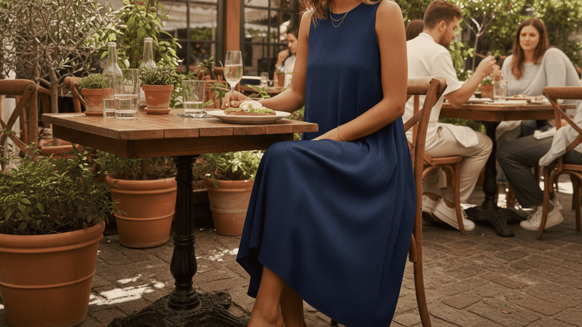
Choose cool navy because it feels polished without trying too hard for midday meals.
This shade works in both restaurants and outdoor patios with equal ease.
Cool Navy also transitions well if my brunch plans turn into afternoon shopping or an unexpected evening hangout with friends.
Weekend Grocery Trip
I pick heather mauve because it hides minor sweat marks better. White creates a calming effect that makes my errands feel less rushed.
Teal Blue sneakers ground my outfit without adding weight in hot weather.
Beach Day
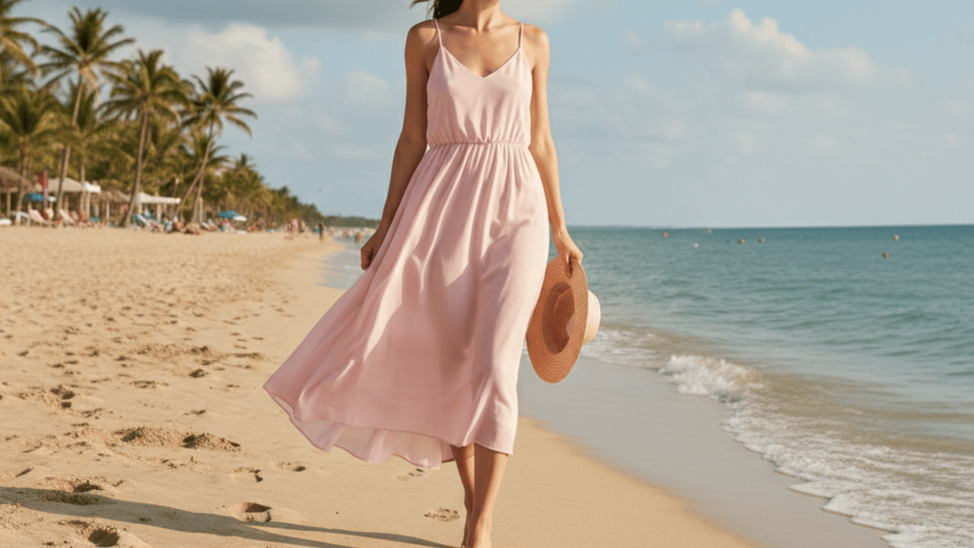
I reach for Icy Pink because it doesn’t absorb as much heat as darker shades do.
This color reflects the bright seaside light beautifully and photographs well against blue water.
Icy Pink also hides sand better than pure white, making cleanup easier after a long day at the shore.
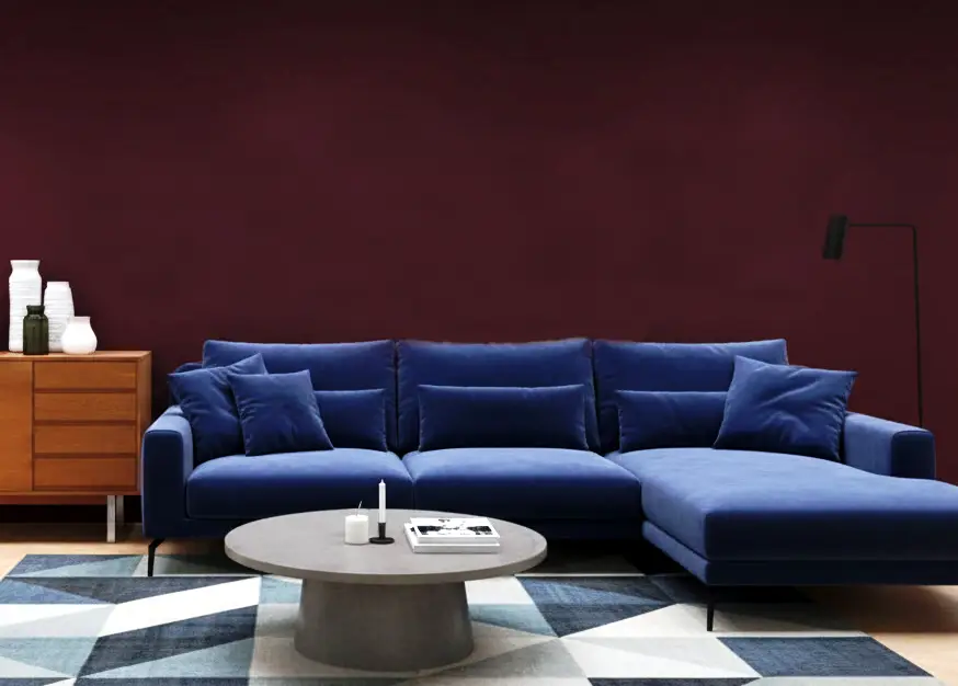
Popular Summer Color Combinations in Interior Design
I’ve found that some of the most effective summer color pairings in interior design combine soft blue-grays with gentle blush pinks for a serene, cooling effect.
The following are some Popular Summer color combinations in Interior design to upgrade your home decor.
1. Sky Blue & Soft Coral
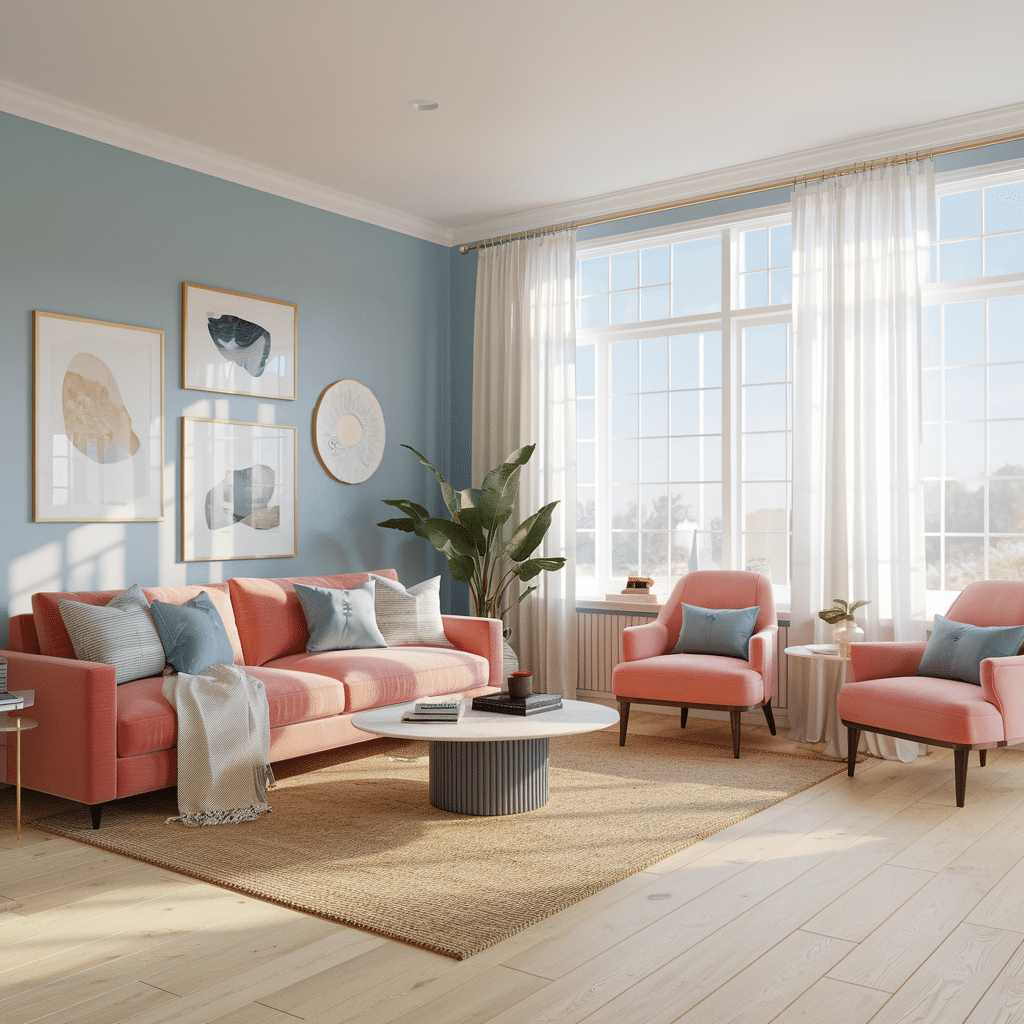
This living room is a fresh blend of sky-blue walls paired with soft coral furniture, creating a cheerful yet relaxing vibe.
Natural light floods the room through large windows, highlighting the warmth of the light wood flooring.
- Trend: Beachy & breezy vibes
- Why it works: The coolness of sky blue balances the warmth of coral, giving off a relaxed yet energizing summer mood.
- Accent colors: Powder blue, ivory, sandy beige
- Other recommended summer colors: Seafoam
Sage Green is one of the famous colors that complements soft coral. Check out out collection of sage green paint colors.
2. Mint Green & Butter Yellow
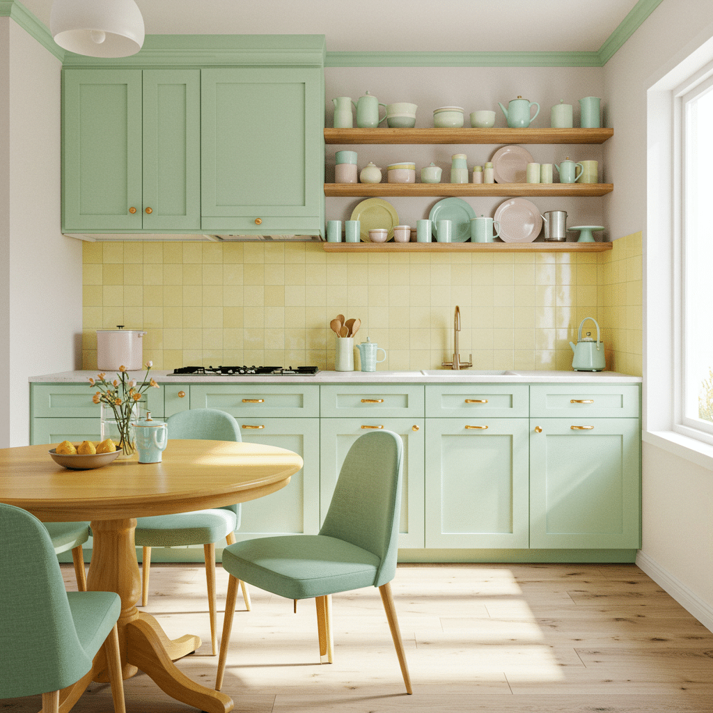
This kitchen is a delightful nod to retro charm with a modern twist. Mint green cabinetry sets a soft tone, complemented by butter yellow backsplash tiles.
Open wooden shelves display pastel dishware, reinforcing the lighthearted, summer-ready theme.
The natural-wood dining table and chairs with mint upholstery blend seamlessly with the cabinetry, creating a cohesive palette.
- Trend: Soft sorbet pastels
- Why it works: These muted tones offer a sweet, refreshing aesthetic great for daytime outfits or airy interiors.
- Accent colors: Peach, soft teal, warm white
- Other recommended summer colors: Lemon cream and turquoise mist
3. Baby Blue & Lemon Sorbet
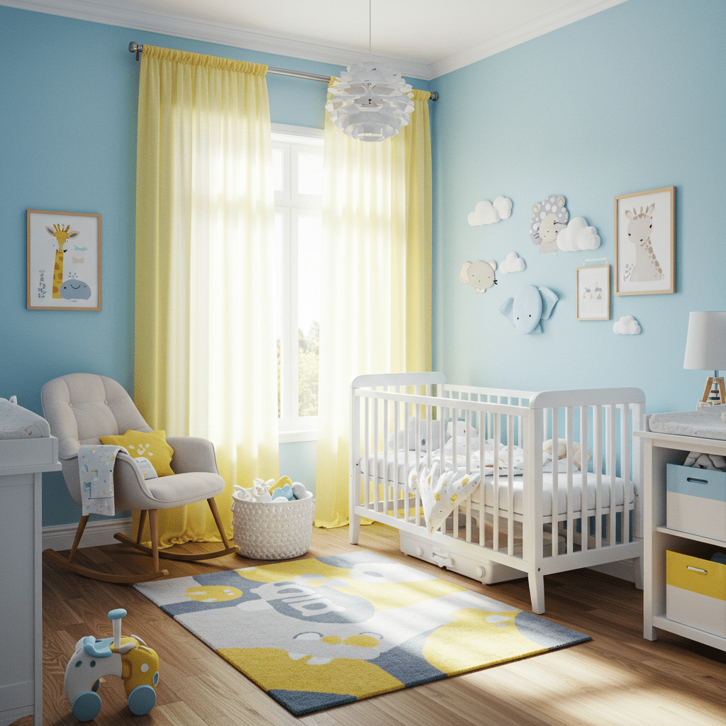
This nursery feels like a dreamy summer sky, with baby-blue walls and pops of lemon sorbet in the curtains, rug, and pillows.
White furniture pieces, such as the crib and changing table, keep the room feeling bright and open.
Wall décor featuring clouds and cute animals enhances the whimsical atmosphere.
Natural wood tones ground the palette without overpowering it.
- Trend: Ice cream palette
- Why it works: Light and fun, this pairing is perfect for youth-centric styles or minimalist summer branding.
- Accent colors: White, dove gray, soft yellow
- Other recommended summer colors: Seafoam green and white snow
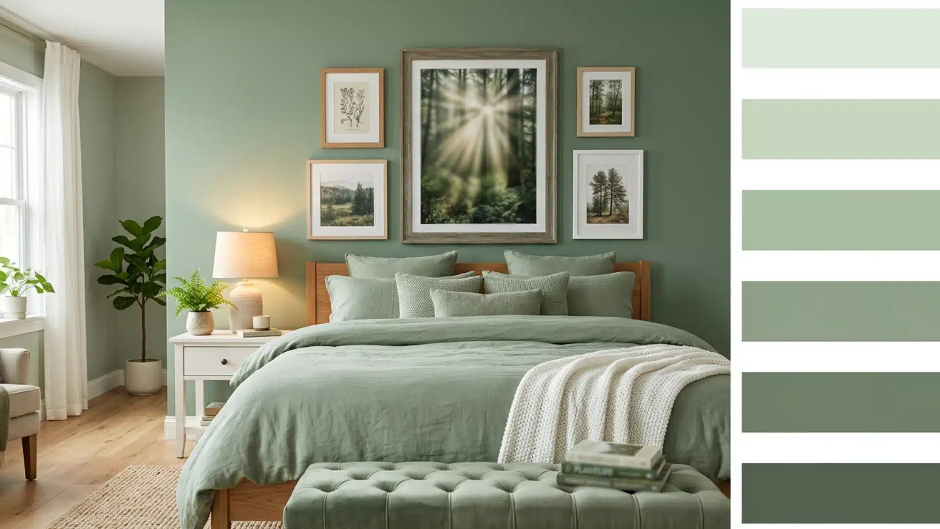
4. Seafoam Green & Pale Pink Bedroom
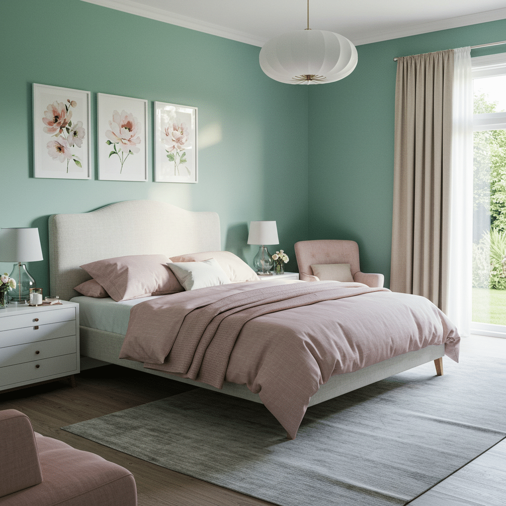
This bedroom pairs a serene seafoam-green wall with blush-pink bedding and soft beige curtains, creating a calming and classy retreat.
- Trend: Coastal chic
- Why it works: A calming, soft duo that evokes ocean water and blush sunsets is great for both decor and summer weddings.
- Accent colors: Cream, rose quartz, soft gray
- Other recommended summer colors: Dusty lavender
5. Icy Lavender & Cool Navy Home Office

The classy balance of cool tones and warm metallics gives the space a regal, productive atmosphere.
Floor-length blue curtains and a navy rug ground the space while keeping it stylish.
- Trend: Classy cool
- Why it works: Lavender adds a whimsical edge, while navy grounds the palette with style and depth.
- Accent colors: Champagne gold, slate blue, blush pink
- Other recommended summer colors: Pale coral and Frosty white
6. Pale Mint & Heather Mauve Reading Nook
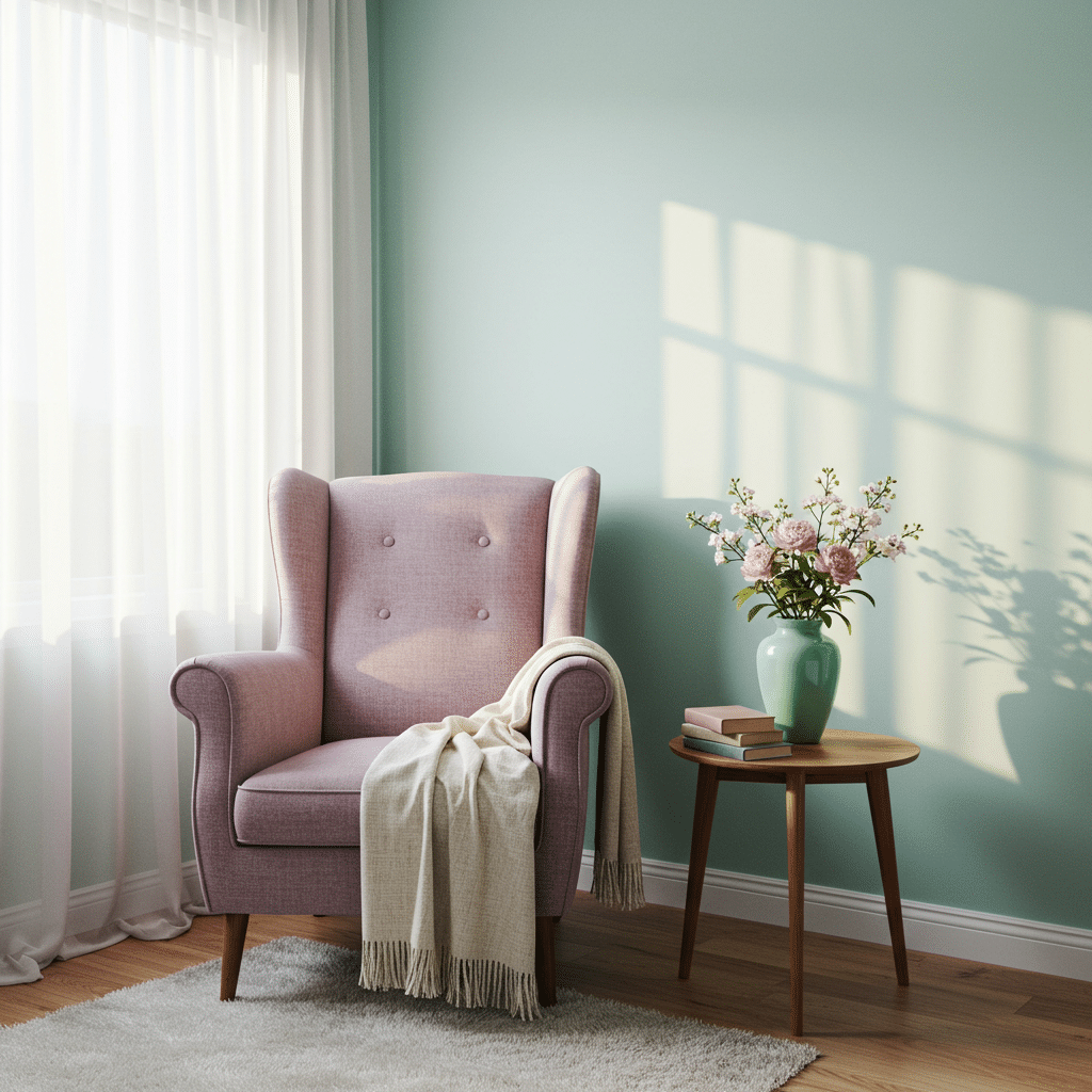
This cozy corner showcases a pale mint backdrop complemented by a heather mauve armchair. The soft rug, sheer white curtains, and warm wood side table complete the inviting look.
Fresh flowers in a mint vase and a soft throw blanket add charm and comfort to the scene.
- Trend: Understated style
- Why it works: A harmonious blend of pastel green and soft purple tones that look polished but never overpowering.
- Accent colors: Linen white, soft rose, honeywood
- Other recommended summer colors: Breeze blue
7. Light Periwinkle & Charcoal Grey Bedroom
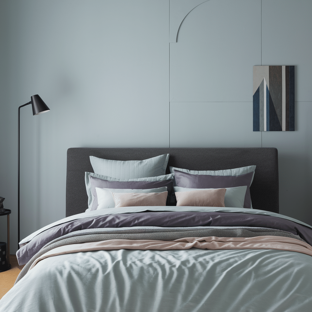
This minimalist modern bedroom features soft-contrast light periwinkle walls that meet charcoal grey bedding and furniture, with accents in blush pink and muted lilac.
- Trend: Modern minimalism
- Why it works:Perfect for summer office wear or branding, fresh yet professional.
- Accent colors:Dusty rose, lavender ash, slate
- Other recommended summer colors:Fog, mist, and pale blush
8. Raspberry & Mushroom Taupe Living Room
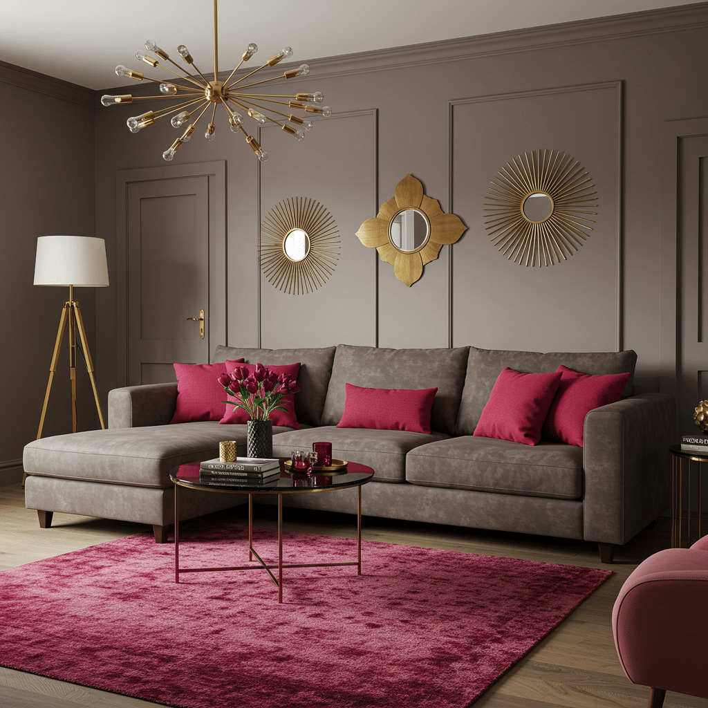
This bold yet balanced living room features mushroom taupe walls and a sofa paired with colorful raspberry accents in pillows and the rug.
Gold details in the mirrors and light fixture add style, while the plush textiles keep it feeling luxe and grounded.
- Trend: Bold meets soft
- Why it works: Raspberry brings energy, while taupe calms it down, great for statement pieces or accent walls.
- Accent colors: Gold, cranberry, dusty mauve
- Other recommended summer colors: Baked terracotta
9. Ocean Green & Slate Blue Bathroom
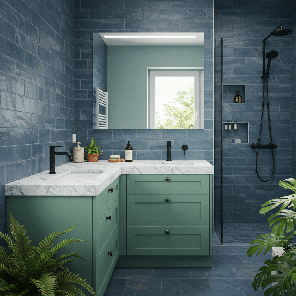
This bathroom merges natural freshness with a moody style.
Ocean green cabinets topped with white marble contrast beautifully with slate blue tiled walls.
Matte black fixtures and leafy green plants add modern flair and a spa-like quality to the space.
- Trend: Nature-inspired cool
- Why it works: This combo draws from the sea and sky, grounding your palette in the serenity of the natural world.
- Accent colors: Matte black, ivory, forest green
- Other recommended summer colors: Driftwood
Comparison Table of Summer vs Spring vs Autumn vs Winter
Each season has its own color personality, and the differences between them help you choose shades that truly work for you.
If you’re drawn to bright, cheerful hues with golden undertones, check out the warm spring palette for more details
| Feature | Summer | Spring | Autumn | Winter |
|---|---|---|---|---|
| Undertone | Cool | Warm | Warm | Cool |
| Key Colors | Soft blue, dusty rose, lavender | Coral, peach, warm yellow | Rust, olive, burnt orange | Pure white, black, jewel tones |
| Best Metals | Silver, white gold | Gold, brass | Bronze, copper | Silver, platinum |
| Typical Hair | Ash blonde, soft brown | Golden blonde, strawberry | Auburn, chestnut, red | Black, dark brown, silver |
| Typical Eyes | Blue, grey, soft hazel | Blue, green, warm brown | Hazel, amber, deep green | Dark brown, bright blue, grey |
| Makeup Style | Soft blush, cool-toned lips, subtle shimmer | Light coverage, glossy finish, fresh glow | Medium coverage, matte finish, warm contour | Full coverage, bold lips, defined eyes |
Colors to Avoid in Summer Palettes
When working with summer color palettes, not every shade will harmonize with that characteristic cool, muted quality.
Some colors simply clash with summer’s gentle aesthetic, creating discord rather than harmony.
The following are the colours that people often mistake for summer colors, but they clash with the summer palettes aesthetic:
1. Warm Orange
This highly saturated, warm-toned color overwhelms the fragile balance of a summer palette.
Its yellow undertones create visual tension against summer’s blue-based colors, making both look less refined.
When placed next to true summer colors, warm orange appears jarring rather than complementary.
2. Bright Tomato Red
The intense warmth and high saturation of tomato red fights against summer’s cool undertones.
This colorful, yellow-based red creates too much contrast when paired with summer’s muted tones, making layouts or outfits appear unbalanced and visually exhausting rather than harmonious.
3. Harsh Black
True black creates excessive contrast against summer’s medium-value colors, appearing too heavy and dominant.
Summer palettes thrive on subtlety and flow, while harsh black creates abrupt visual stops. Charcoal gray or navy blue offer better dark anchor points within summer schemes.
4. Neon Yellow
The extreme brightness and warm undertones of neon yellow completely overpower summer’s refined softness.
This color’s intense luminosity creates a visual shouting match with summer’s whisper-quiet tones, making compositions feel unbalanced and chaotic rather than cohesive.
5. Mustard
This earthy, golden-yellow tone contains brown and yellow undertones that fundamentally clash with summer’s cool base.
Mustard belongs firmly in autumn’s territory and appears muddy and discordant when forced into summer color schemes.
6. Olive Green
The yellow and brown undertones in olive green conflict with summer’s blue-based foundation.
This earthy, muted green reads as murky and dull rather than sophisticated when paired with true summer colors, creating an unintentional clash of warm versus cool.
7. Warm Beige
The yellow and orange undertones in warm beige create subtle but persistent discord with summer’s cool base.
While neutral in theory, warm beige appears jarringly golden when placed against summer’s blue-leaning colors, making both appear less intentional and harmonious
The Bottom Line
Working with summer colors has completely transformed my approach to design. Understanding the cool, muted nature of this palette opens up possibilities that feel both fresh and timeless.
Remember, loving summer colors isn’t about strict rules; it’s about harmony. When you avoid those clashing warm tones like orange and mustard, you’ll find your summer palette naturally flows together with effortless style.
I’ve found that summer colors work beautifully across seasons, not just during the warmer months. They bring a certain tranquility to any space or outfit.
Let us know what you think of summer colors in the comments. Which summer color suits you the best?
Frequently Asked Questions (FAQs)
1. Is Summer Gold or Silver?
Summer is silver. Cool undertones in summer colors pair better with silver jewelry and white gold than warm-toned metals like yellow gold.
2. Is Ginger a Summer Color?
No, ginger isn’t a summer color. It’s too warm and earthy. Summer works best with cool, muted shades rather than warm, spicy tones.
3. Is Olive a Summer Color?
No, olive isn’t a summer color. It has warm undertones. Summer prefers cool greens like sage, mint, or soft moss green instead.
FrequentlyAsked Questions (FAQs)
1. Is Summer Gold or Silver?
Summer is silver. Cool undertones in summer colors pair better with silver jewelry and white gold than warm-toned metals like yellow gold.
2. Is Ginger a Summer Color?
No, ginger isn’t a summer color. It’s too warm and earthy. Summer works best with cool, muted shades rather than warm, spicy tones.
3. Is Olive a Summer Color?
No, olive isn’t a summer color. It has warm undertones. Summer prefers cool greens like sage, mint, or soft moss green instead.