Emerald green gets its name from the emerald gemstone, one of the rarest stones on earth.
That same richness you see in the gem? It lives in the color, too.
Just as a gemstone needs the right setting to shine, it requires the proper setting to truly shine.
People treat it like any other green. That’s where things go wrong.
Emerald green sits between cool blue and warm yellow on the color wheel, which means it responds differently to colors than olive, sage, or forest green ever would.
Pair it right, and the whole space or outfit clicks. Pair it wrong, and even expensive pieces look cheap.
Understanding Emerald Green Before Pairing it
Emerald is not like other greens. Sage green is soft. Olive is muted.
Emerald green (#50C878) demands attention the moment it enters a room.
High green, moderate blue, low red. That mix is what gives it its cool, rich, deep tone. It sits between pure green and pure yellow on the color wheel. It’s a cool color but not a cold one.
It carries a lot of pigment. That means it’s stronger than most colors you’ll place next to it.
One more thing. Light changes it. Morning sun pulls out its heat. Evening light brings out its cool blue side.
That’s why the same emerald green wall can look different at noon and at night.
An Approach to Choosing Colors that go with Emerald Green
Color pairing isn’t guesswork. It follows rules, and emerald green makes those rules easy to work with.
Start with the color wheel. Colors sitting directly opposite emerald green are called complementary colors. They create contrast and make each other stand out.
Colors sitting beside it are analogous. They blend and feel calm together.
Then there are neutrals. They don’t compete; they balance.
A few quick pointers to keep in mind:
- Warm colors add energy next to emerald green.
- Cool colors keep things calm and collected.
- Neutrals let emerald green do all the talking.
Pick your pairing based on the mood you want to create.
Reliable Neutral Pairings that Ground Emerald Green
Neutrals don’t compete with emerald green; they let it breathe. The right neutral keeps the look grounded without dulling the color.
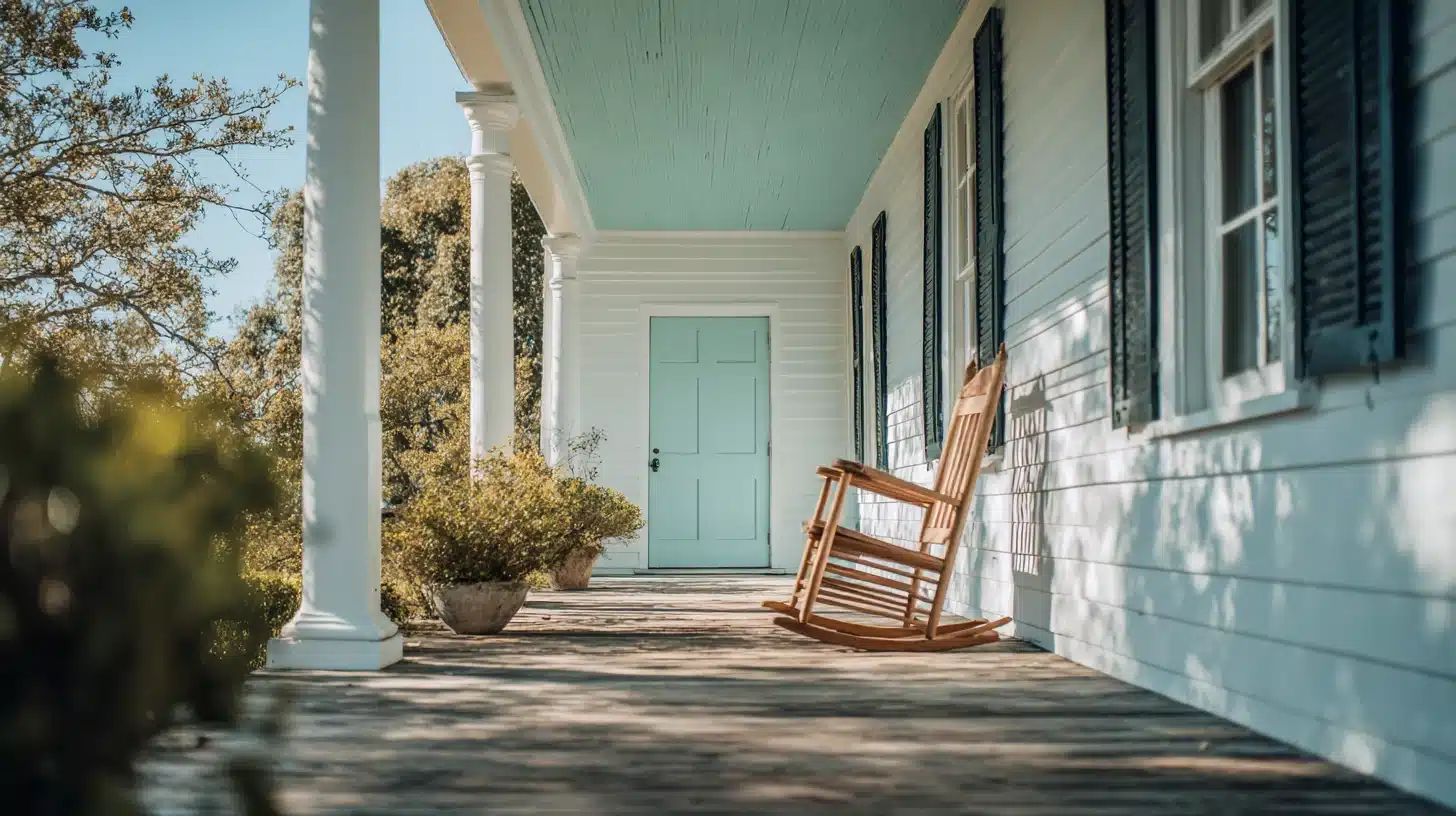
1. White
White creates a clean, sharp contrast against emerald green.
- Why it Works: Creates a sharp, clean contrast that stops emerald green from feeling heavy.
- Best Use Tip: Use white as the base and emerald green as the accent for a balanced finish.
- Where it Fits: Kitchens, bathrooms, bedroom walls.
2. Greige (Gray-Beige)
Greige balances cool and warm, softening emerald green without dulling it.
- Why it Works: Adds softness alongside emerald green without pulling attention away from it.
- Best Use Tip: Keep beige on larger surfaces and let emerald green lead in smaller accents.
- Where it Fits: Living rooms, dining spaces, soft furnishings.
Not sure if it works? Test with one cushion first. A small piece confirms faster than any screen.
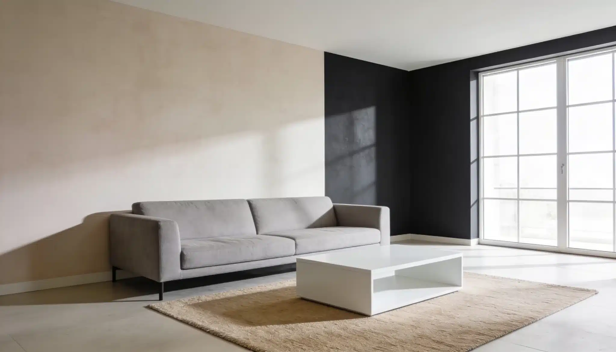
3. Soft Gray
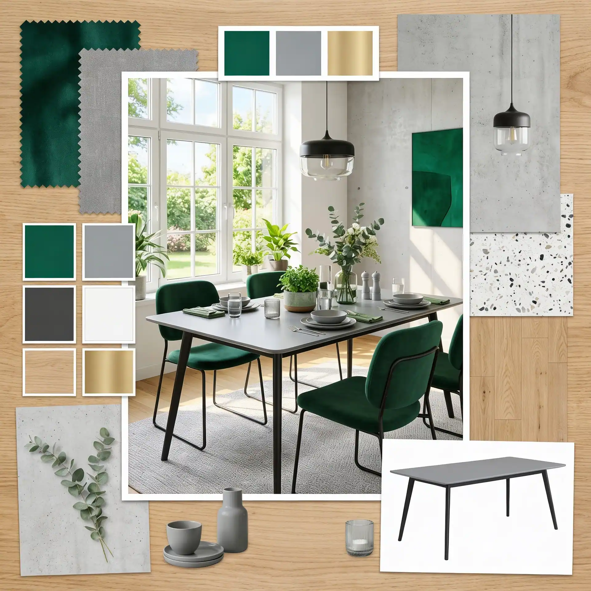
Gray keeps things modern and clean. It doesn’t clash or compete; it lets emerald green take center stage.
- Why it Works: Walks the line between cool and warm, toning down emerald green just enough.
- Best Use Tip: Works best on walls when emerald green appears in furniture or accessories.
- Where it Fits: Open-plan spaces, larger rooms, feature walls.
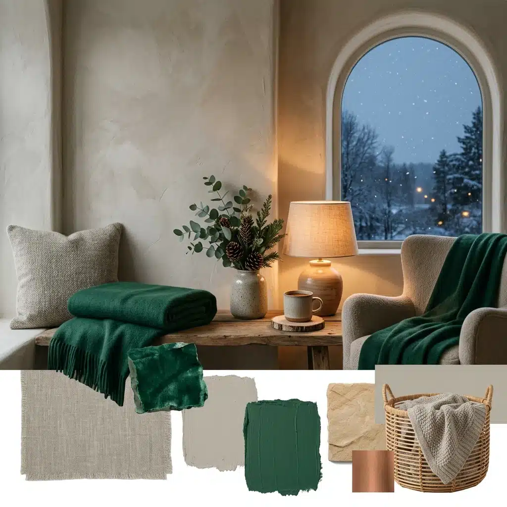
Rich Pairings that Improve Emerald Green’s Depth
Some colors don’t just sit beside emerald green; they pull out its richness.
These pairings work because they match its intensity without crushing it.
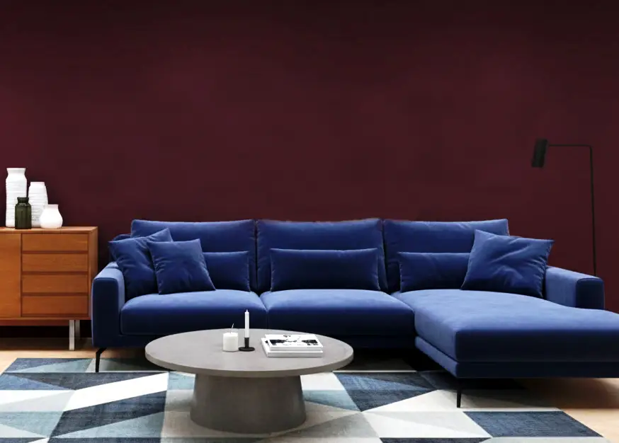
4. Deep Navy
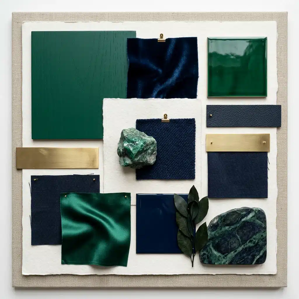
Navy and emerald green share cool undertones. Together, they feel collected and intentional.
Use navy as a dominant color with emerald green as an accent. Avoid using both in equal amounts; one needs to lead for the pairing to feel deliberate and well thought out.
Let the navy lead, and emerald green follow. Equal amounts of both will throw the whole look off.
5. Burgundy
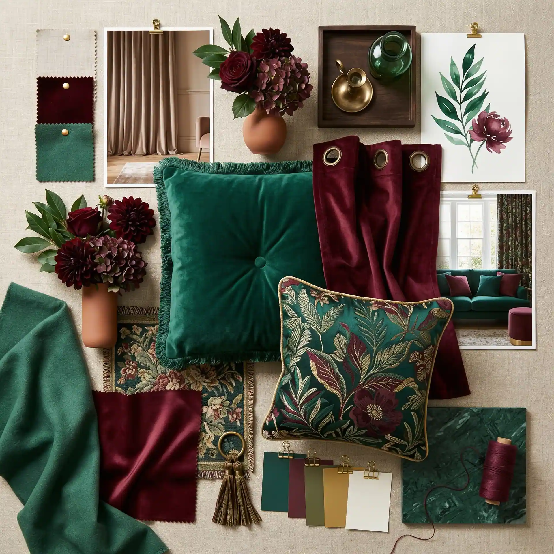
Burgundy brings heat and depth. Its red-wine tone contrasts beautifully with emerald green without fighting for attention or looking overdone.
Use it in textiles and soft furnishings instead of on walls, creating a rich pairing without closing the space.
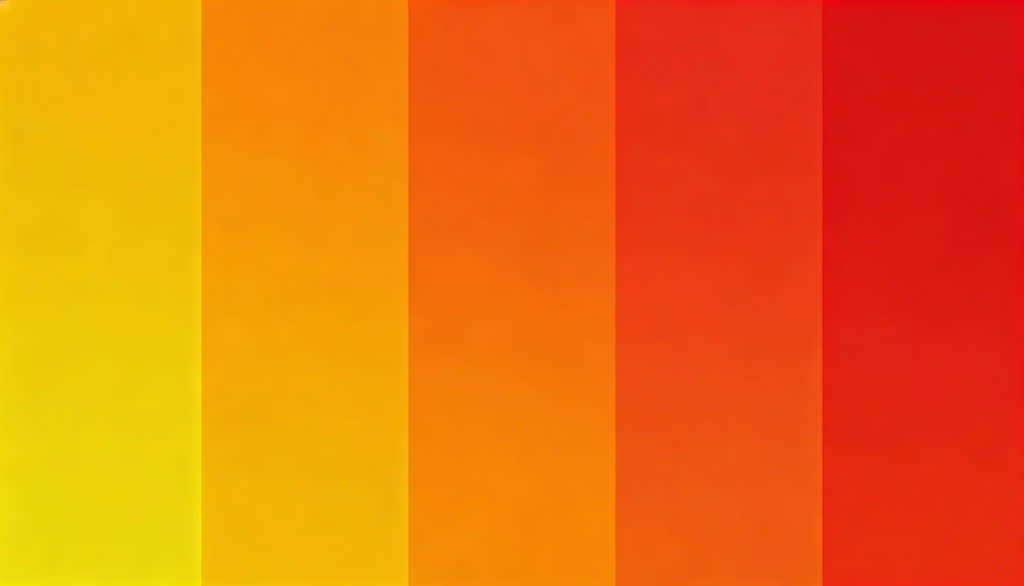
6. Burnt Orange
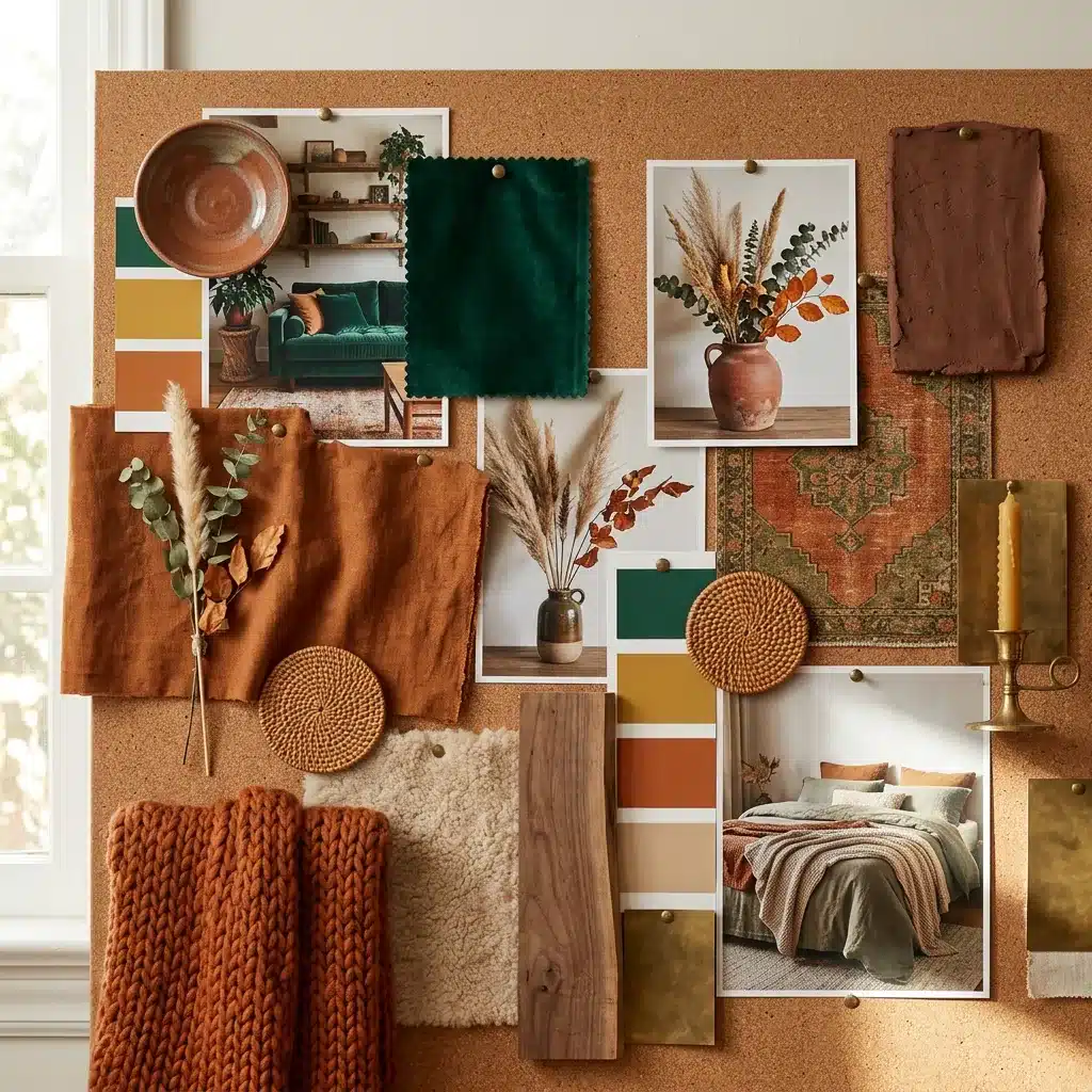
Burnt orange sits opposite green on the color wheel, making it a natural complement.
It adds heat and a grounded earthiness, preventing emerald green from feeling cold. Small doses work best.
A single burnt orange cushion or vase can do the job without overwhelming the space.
Lighter Accent Colors that Balance Emerald Green
Not every pairing needs to be bold. Sometimes a lighter touch does more.
These colors soften emerald green without washing it out completely.
7. Dusty Rose
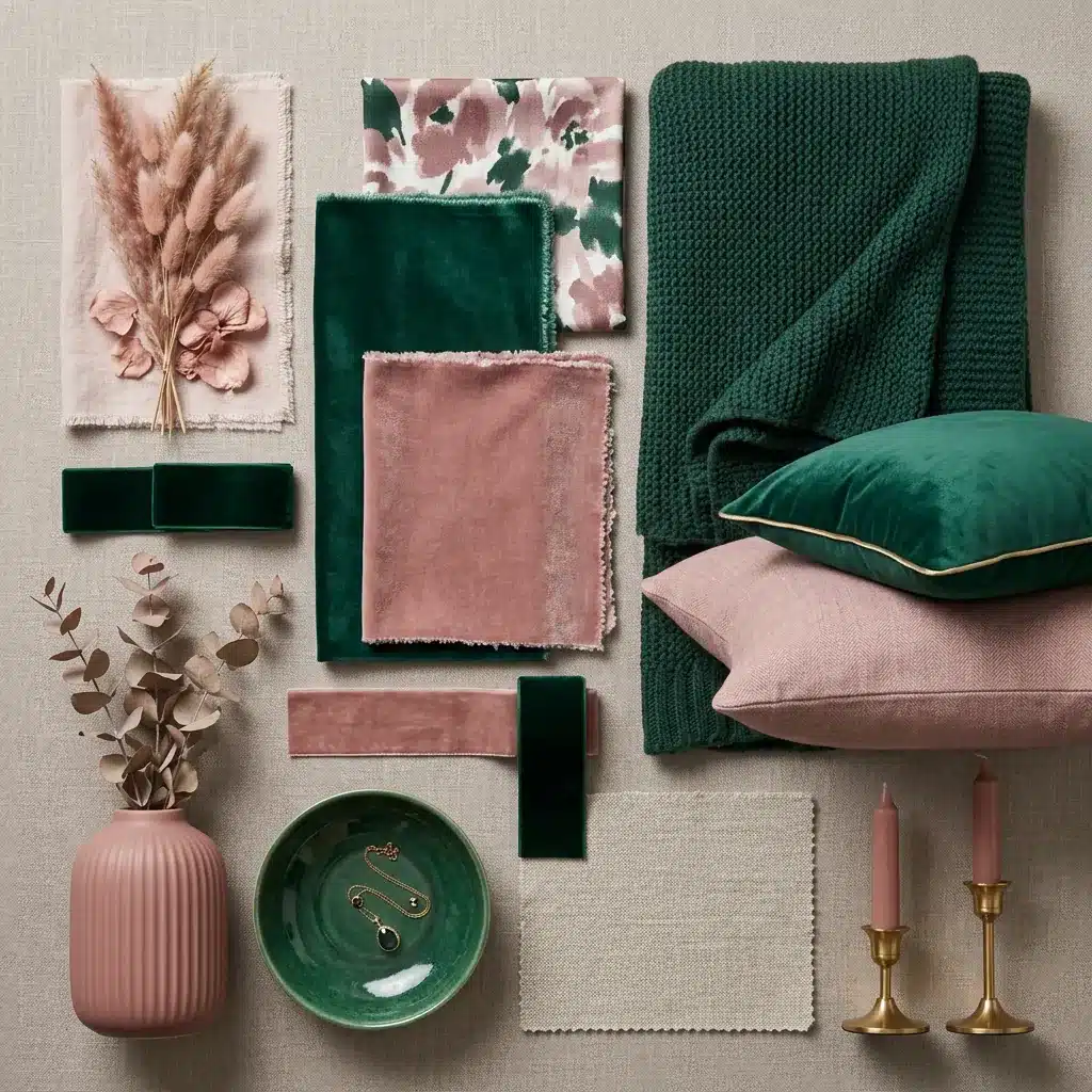
Quietly warm and muted gives the eye a soft place to rest in bold spaces.
- Best Placement: Bedroom textiles, feature walls, and soft furnishings in emerald-heavy rooms.
- How Much to Use: Can handle slightly more presence than blush, up to 20% of the overall color in a space.
8. Soft Gold
Soft gold catches light and adds a gentle richness.
- Best Placement: Frames, light fixtures, cabinet handles, and decorative accessories.
- How Much to Use: Less is more. Gold works as a finish detail, not a dominant color.
9. Cream
Calm, natural, and quietly warm keep the space feeling settled and easy.
- Best Placement: Bedding, natural wood rooms, and neutral base layers throughout the space.
- How Much to Use: Can be used generously as a base; it won’t overpower emerald green at any amount.
10. Pale Terracotta
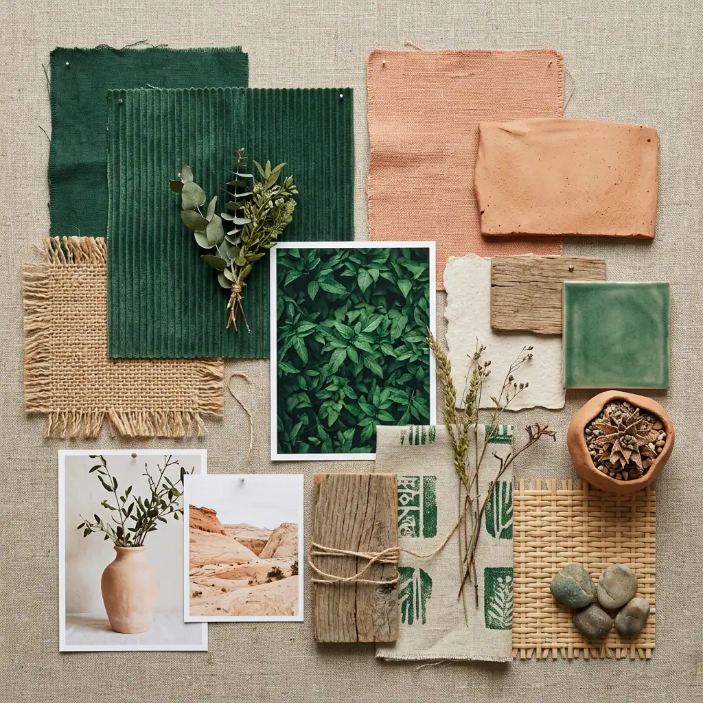
Organic and natural feel, as they effortlessly belong alongside emerald green.
- Best Placement: Spaces with indoor plants, rattan furniture, linen textiles, and earthy accessories.
- How Much to Use: Works well in moderate amounts, enough to feel present but not enough to compete.
What Color Goes with Emerald Green in Interior Decor
Emerald green works differently depending on the room.
The size, light, and purpose of each space change how the color behaves and which colors work best alongside it.
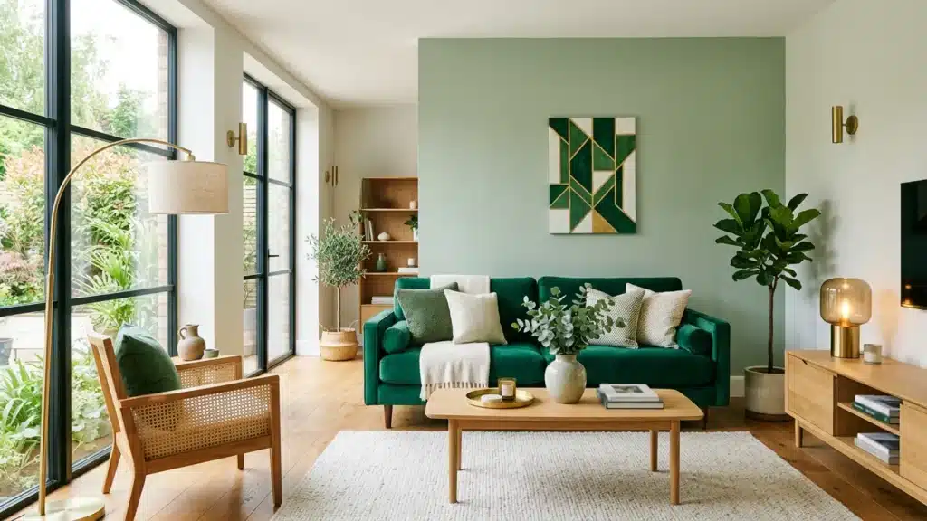
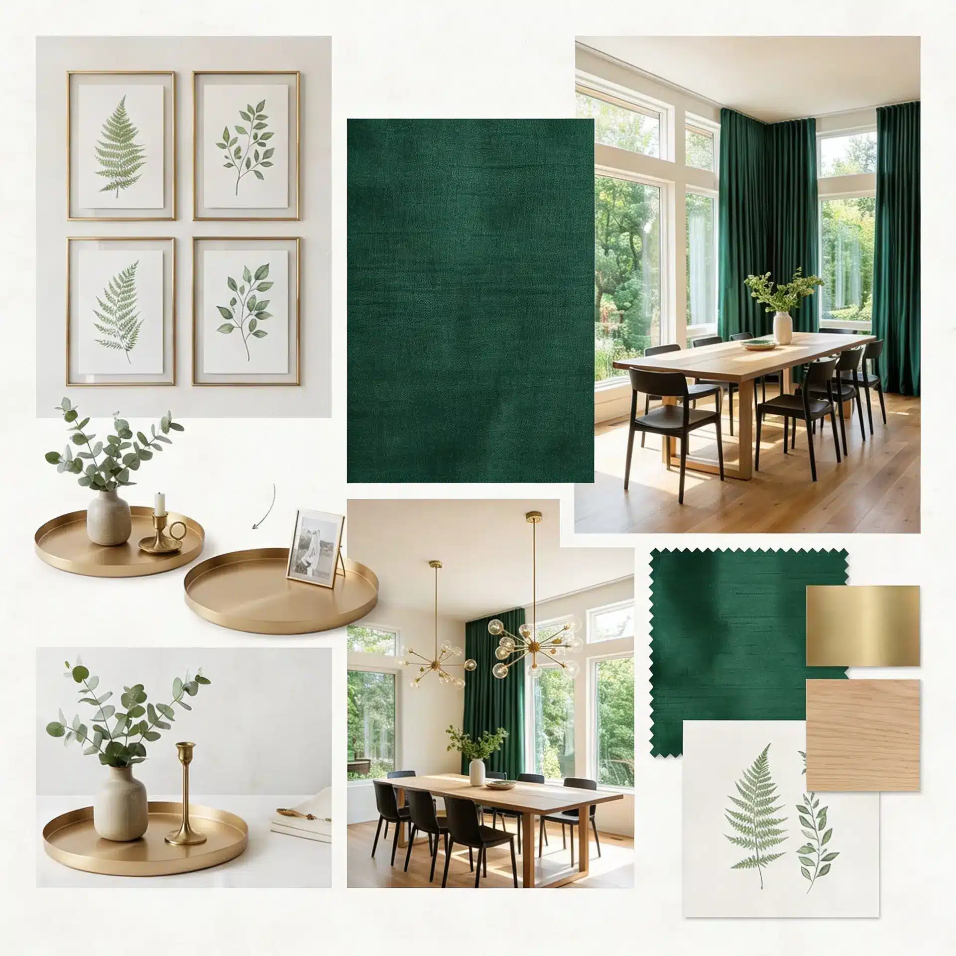
11. Living Room
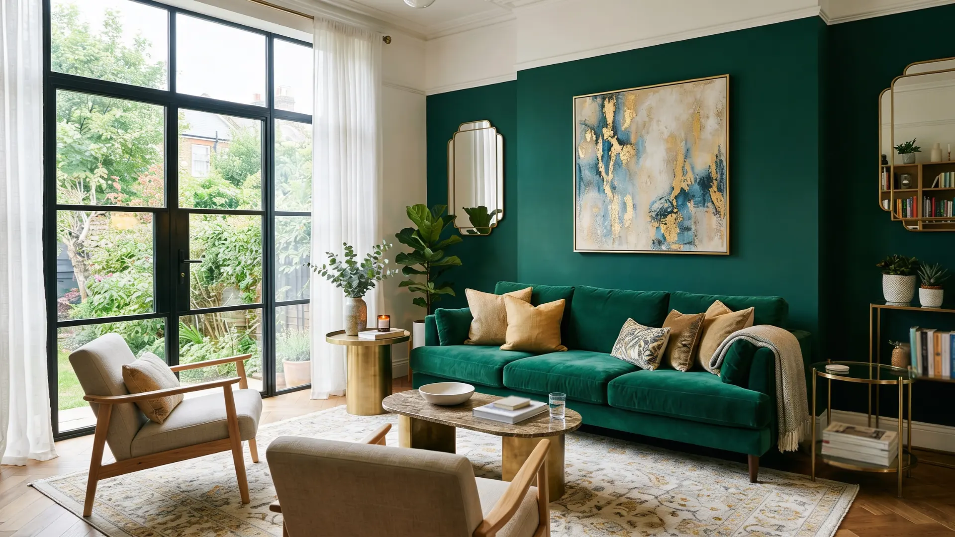
The living room is where emerald green gets to show off. Use it on a feature wall or a large sofa.
It fills the space with color without needing much help. Pair it with warm brass tones in lighting or side tables to keep things feeling inviting.
Step back to the doorway before deciding. What looks right up close doesn’t always hold across a full room.
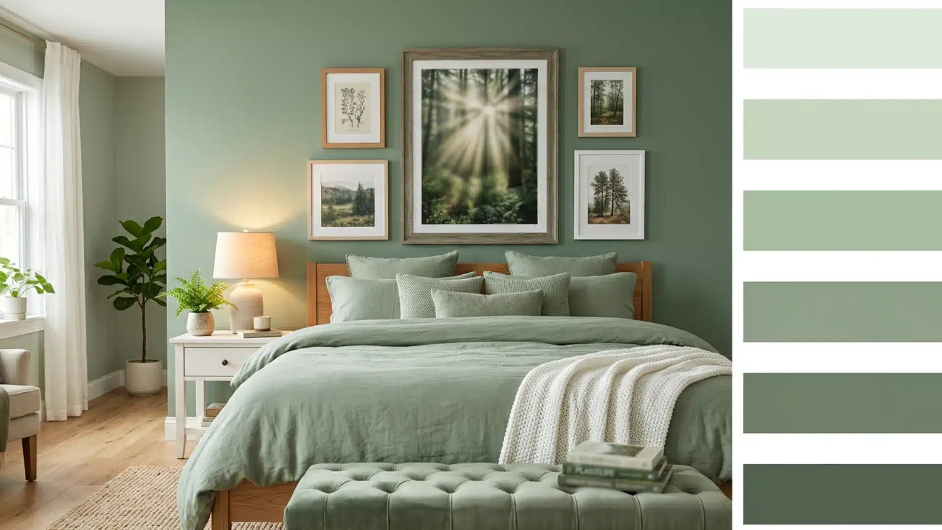
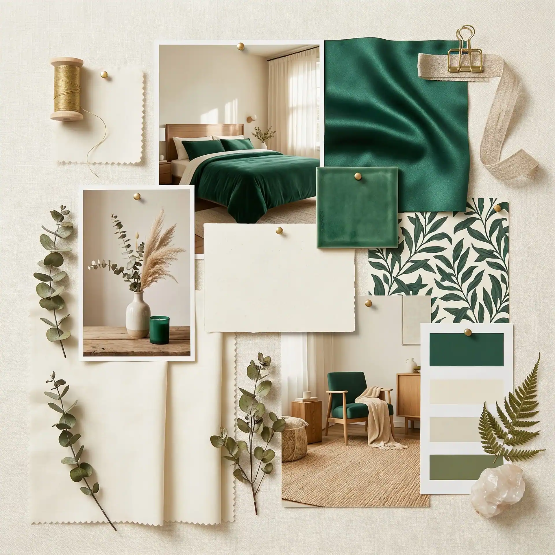
12. Bedroom
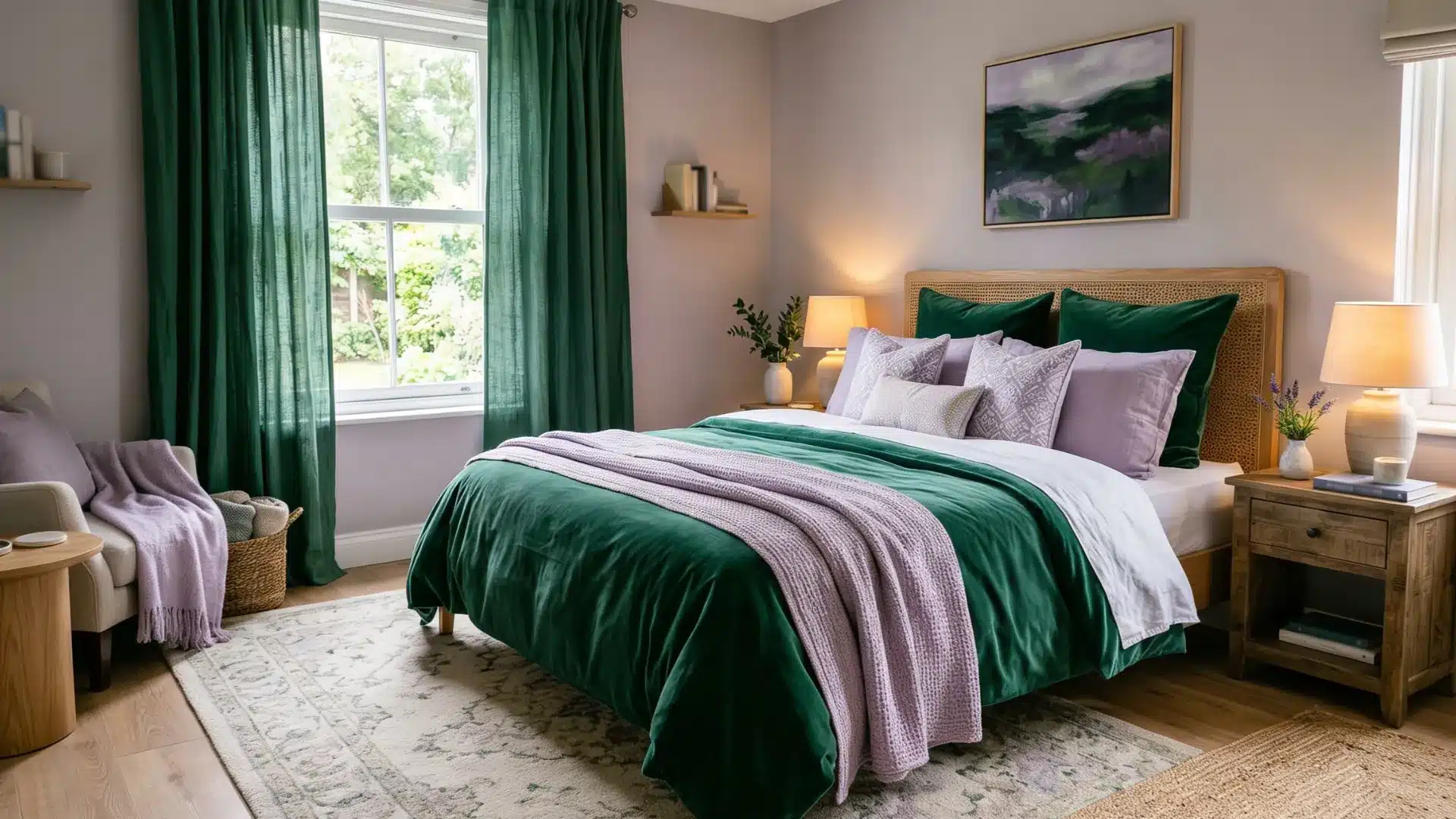
In a bedroom, emerald green works best in measured amounts.
Too much and the space feels restless. Use it in bedding, a headboard, or curtains.
Pair it with soft lavender to bring a calm, restful quality to the room without losing heat.
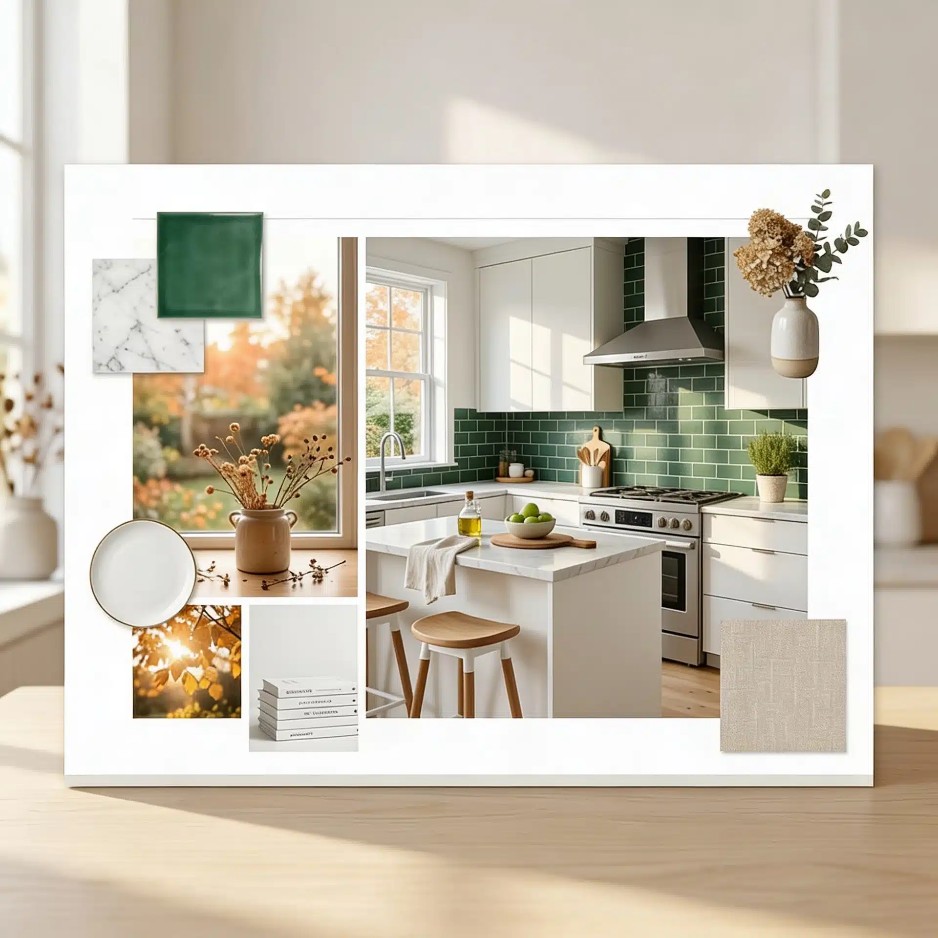
13. Kitchen
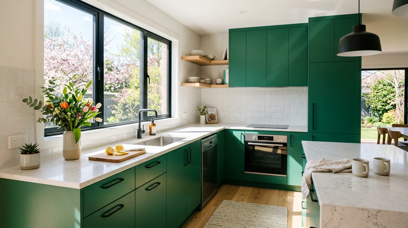
Emerald green in a kitchen feels fresh and considered.
Cabinet doors in this color make an immediate statement. Keep countertops and walls lighter to balance things out.
Matte-black hardware alongside emerald-green cabinets gives the kitchen a sharp, clean finish.
14. Bathroom
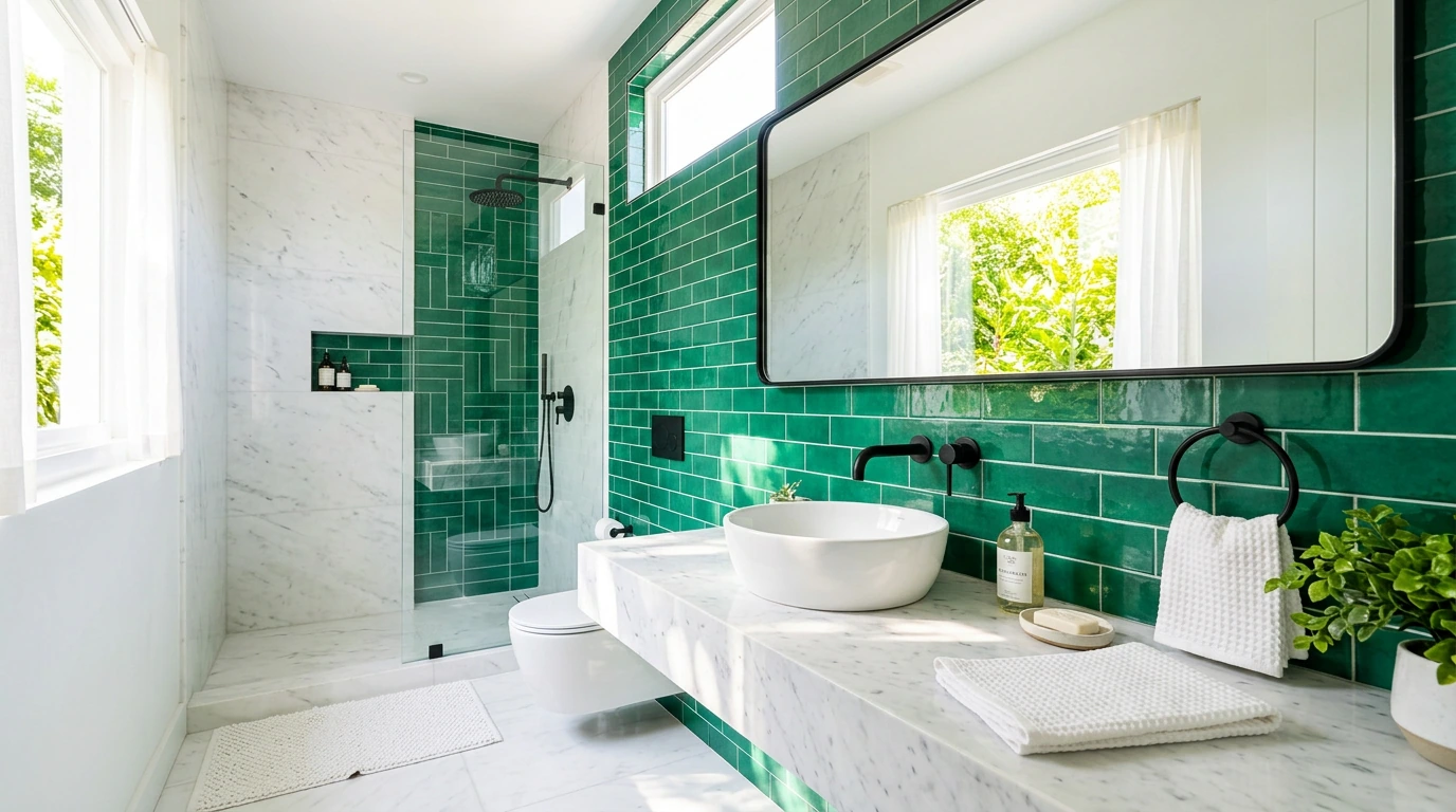
Small spaces like bathrooms can handle emerald green well, sometimes better than larger rooms.
It adds depth without needing much square footage.
Pair it with cool marble white on tiles or surfaces to keep the space feeling clean and well-lit.
15. Home Office
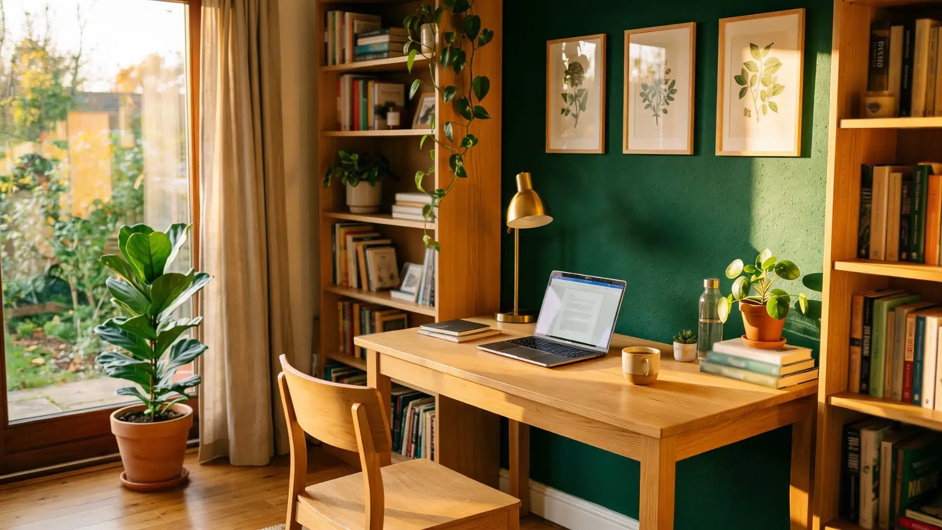
A home office benefits from emerald green on one wall behind the desk.
It adds focus without making the room feel closed in.
Pair it with light oak-toned furniture, and the natural heat of oak helps the space feel more inviting.
16. Dining Room
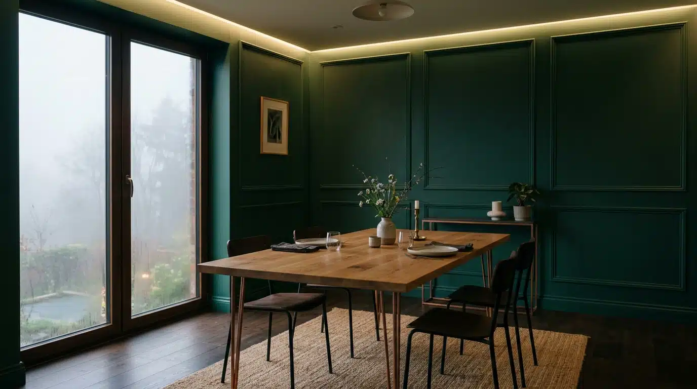
The dining room is one of the best places for emerald green.
It suits the mood of a space meant for gathering and good food. Use it on walls or in upholstered dining chairs.
Aged copper in light fixtures or candle holders pairs naturally and adds quiet character.
What Color Goes with Emerald Green in Fashion
Emerald green isn’t just a home color; it works just as hard in a wardrobe.
The key is knowing what to pair it with and how much of it to wear at once.
Emerald Green and Camel
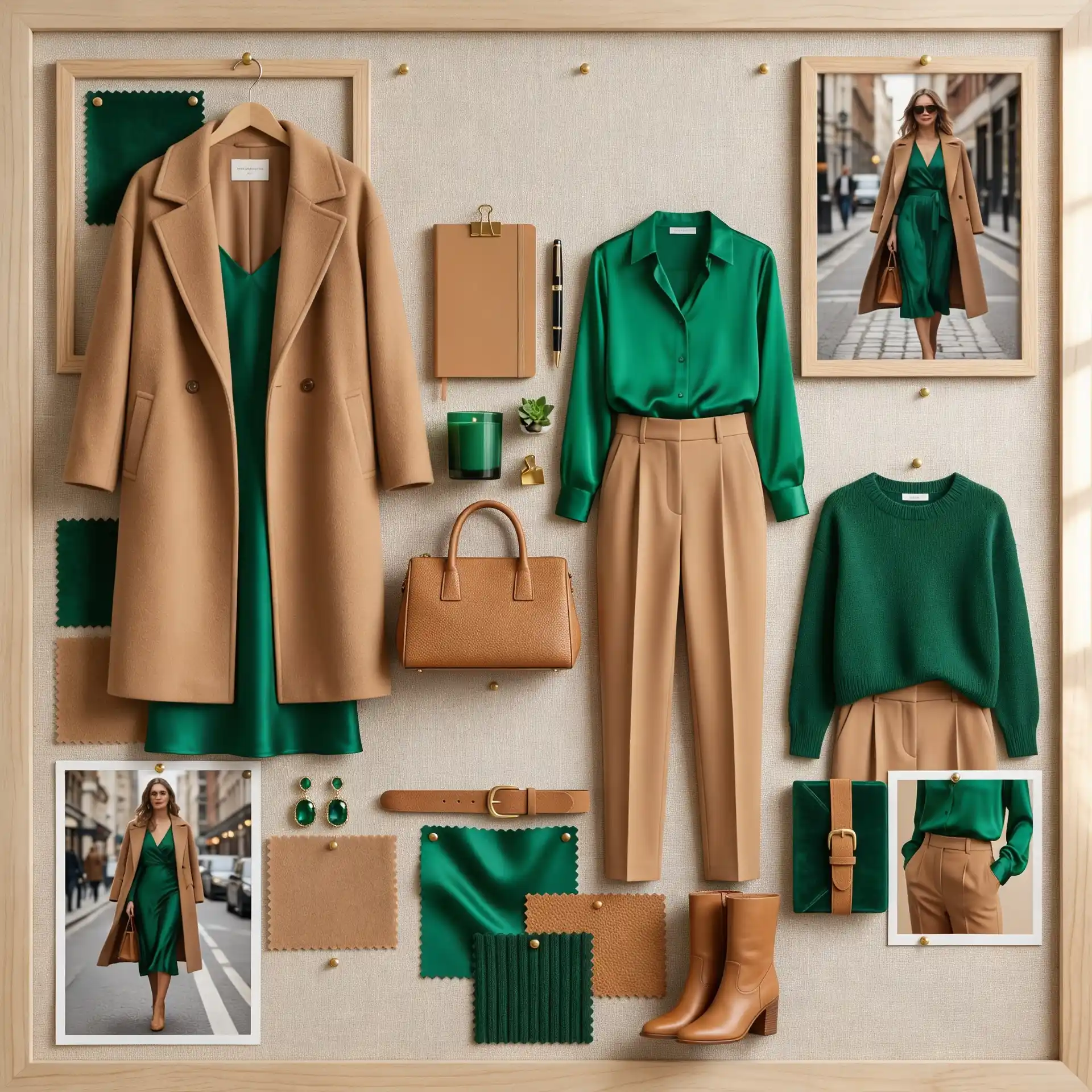
Camel is one of those colors that works with almost everything, and emerald green is no exception.
The heat of camel tones down the boldness of emerald green without dulling it.
- A camel coat over an emerald green dress is a classic combination.
- Camel trousers with an emerald green blouse keep things balanced.
- Camel shoes or a belt can tie an all-emerald outfit together effortlessly.
Together, they feel put together and grown-up.
Start with one camel accessory before going all in. A belt or shoes see the pairing without a full outfit change.
Emerald Green and Ivory
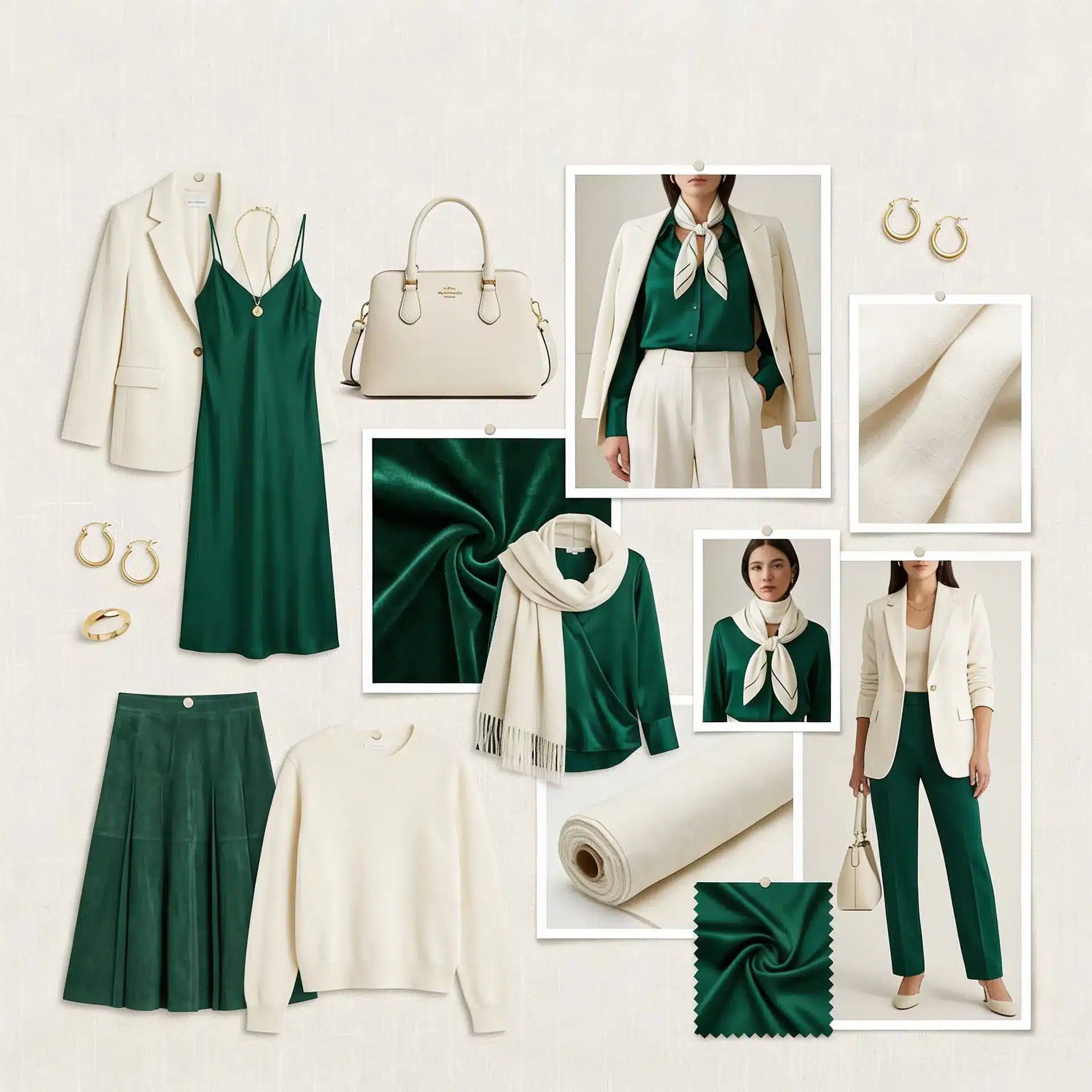
Ivory is more generous than white and softer than cream.
Next to emerald green, it feels polished without trying too hard. The contrast is noticeable but never harsh.
- An ivory blazer over emerald green trousers works well for smart-casual occasions.
- Ivory accessories a bag or a scarf lighten an emerald-green outfit without overpowering it.
Emerald Green and Chocolate Brown
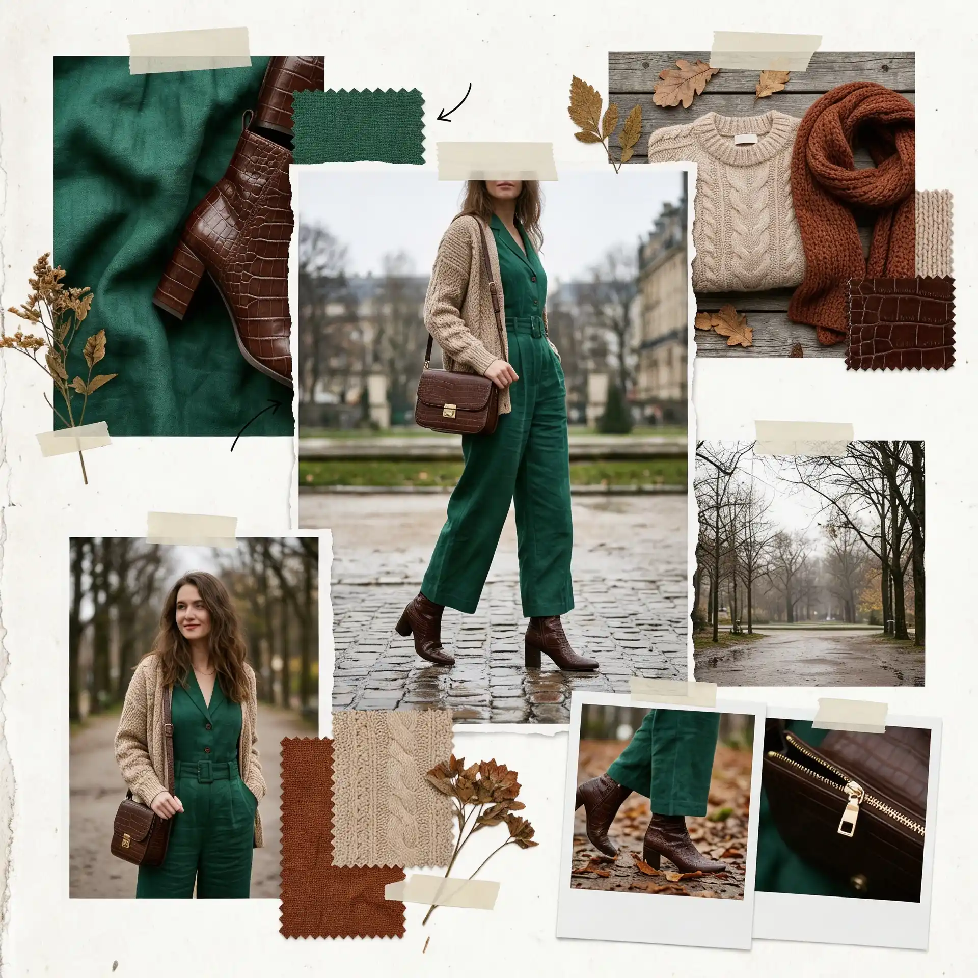
Brown and green exist together naturally, think of forests, earth, and bark. Chocolate brown, in particular, brings out the richness in emerald green.
It feels grounded and confident.
- Chocolate brown boots with an emerald green midi skirt or jumpsuit are a strong autumn look.
- A brown leather bag adds heat to an emerald green outfit without competing with it.
- Brown tortoiseshell accessories complete the pairing subtly and well.
Check undertones before pairing. Warm browns match, but reddish browns may clash with emerald green.
Emerald Green and Charcoal
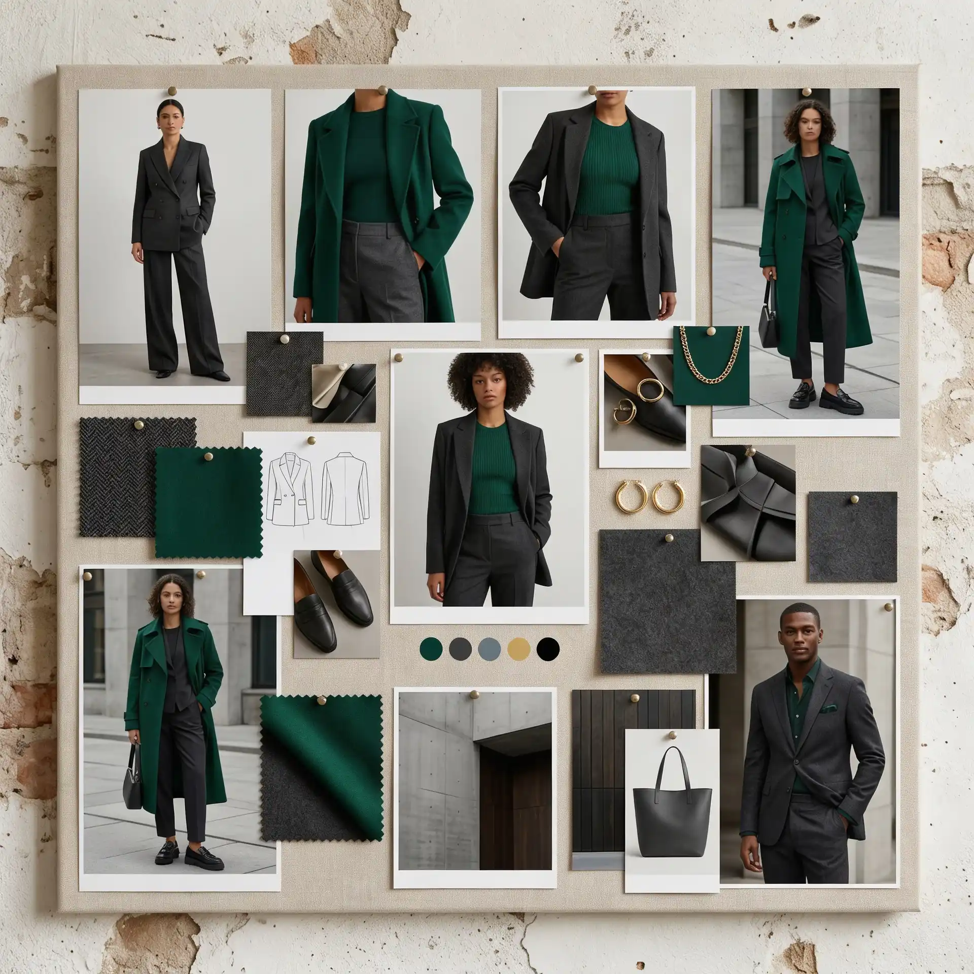
Charcoal is a step softer than black and a step warmer than gray.
It gives emerald green a strong, structured base without the harshness that true black can sometimes bring.
- Charcoal-tailored trousers with an emerald green top are a sharp office look.
- A charcoal coat over an emerald green outfit keeps the overall look serious and well-considered.
- Charcoal works in both casual and formal settings alongside emerald green.
Emerald Green and Off-White Denim
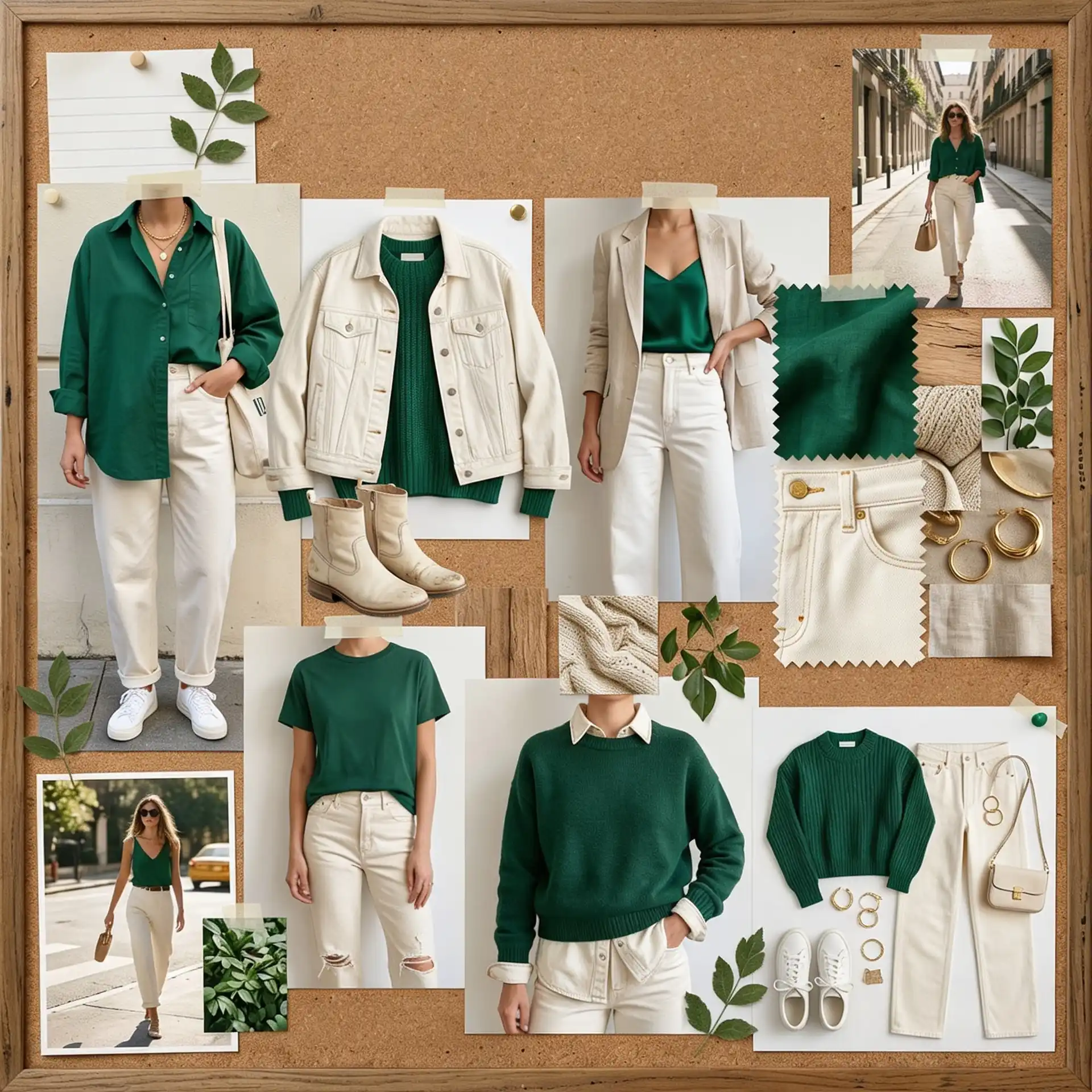
Off-white denim is relaxed and easy, and it pairs with emerald green in a way that feels completely effortless.
It keeps things casual without looking unintentional.
- Off-white jeans paired with an emerald-green fitted top is a clean, everyday combination.
- An off-white denim jacket over an emerald green outfit softens the look without losing its shape.
How to Test and Finalize Your Color Pairing
Picking a color pairing on screen is one thing. Seeing it in real life is another. These steps help you confirm your choice before committing to it fully.
Step 1: Start with a Small Swatch
Never buy a full tin of paint or a large fabric sample first.
Get a small swatch and place it directly next to your emerald green. Live with it for a day or two before deciding.
Step 2: Test it in Natural and Artificial Light
Colors shift depending on the light in the room.
Hold your swatch up in daylight, then check it again under your evening lights.
A pairing that works at noon can look completely different at night.
Step 3: Check the Undertones
Every color has an undertone: warm, cool, or neutral. Make sure your chosen pairing shares or deliberately contrasts with emerald green’s undertone.
Mismatched undertones are usually why a pairing feels slightly off.
Step 4: Use the 60-30-10 Rule
This is a simple but reliable manual.
Use your dominant color for 60% of the space, your secondary color for 30%, and emerald green or your accent for the remaining 10%. It keeps things balanced.
Step 5: Look at it from a Distance
Step back and look at the pairing from across the room. What looks good up close doesn’t always read well from a distance. Give yourself a full view before making a final call.
Step 6: Get a Second Opinion
Fresh eyes catch what yours miss. Show the pairing to someone else, a friend, a family member, anyone.
You don’t have to take their advice, but a second perspective often confirms or corrects your instinct.
Step 7: Commit and Adjust in Layers
Once you’re happy, start small.
Add one piece at a time rather than changing everything at once. This gives you room to adjust without undoing all your work if something doesn’t sit right.
Wrap Up!
Emerald green rewards those who pair it with purpose.
The right color next to it doesn’t just complete a look, it changes the entire feel of a space or outfit.
Start simple. Pick one pairing from this blog and test it on a small scale.
A cushion, a frame, a scarf. See how it sits before going further.
The more you work with emerald green, the more confident your choices become. Once you find a combination that clicks, you’ll wonder why it took so long.
Got a pairing that worked for you? Share it in the comments below.
Frequently Asked Questions (FAQ’s)
1. What Colors Make Green Look Rich?
Gold, burgundy, deep navy, and chocolate brown bring out emerald green’s depth best.
2. What Clashes with Emerald Green?
Neon yellow, bright red, and hot pink fight emerald green rather than complement it.
3. Which 3 Color Combinations are Best for Home Decor?
Emerald green with cream and warm brass. Navy, emerald, and soft gold. Emerald, white, and matte black.
4. What Accessories to Pair with Emerald Green?
Gold frames, aged-copper fixtures, camel-leather bags, and matte-black hardware all work well.