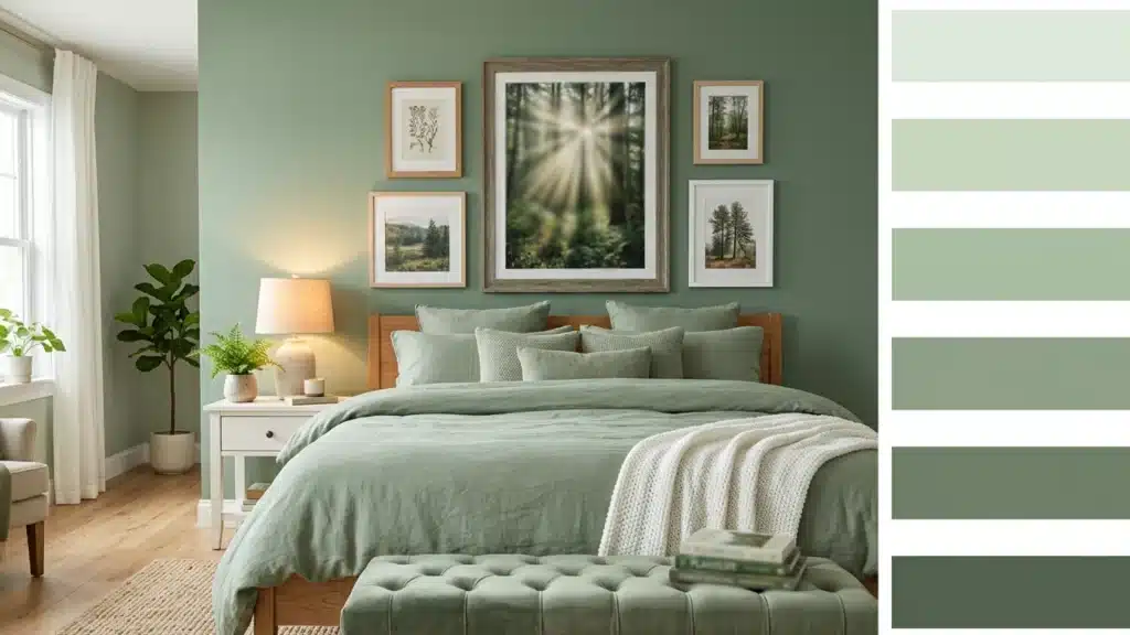
Sage green is the one color I’ve seen work in a cramped rented flat and a sprawling open-plan kitchen without changing a single thing except the walls.
That’s not common.
Where people go wrong is treating it like any other green and pairing it with whatever seems close.
Billy Baldwin once said, “Be faithful to your own taste because nothing you really like is ever out of style.” and thats what I totally agree with.
But getting the sage green color palette right can pull a whole space together.
This blog breaks down exactly which colors work with it and why.
What is Sage Green Color and Why Does it Work so Well
Sage green sits somewhere between grey and green, with a hint of earthy brown underneath.
It gets its name from the herb, and, like the plant, it feels natural and calming.
It is neither bright green nor dark.
That mid-tonal position means it reads as neutral in most lighting, which is why it doesn’t fight your flooring or furniture the way bolder greens do.
It plays well with wood, stone, linen, and metal. Light shifts its mood, too; in the morning, it leans warm, and in the evening, it cools.
That’s rare for a color, and it’s why so many people keep choosing it.
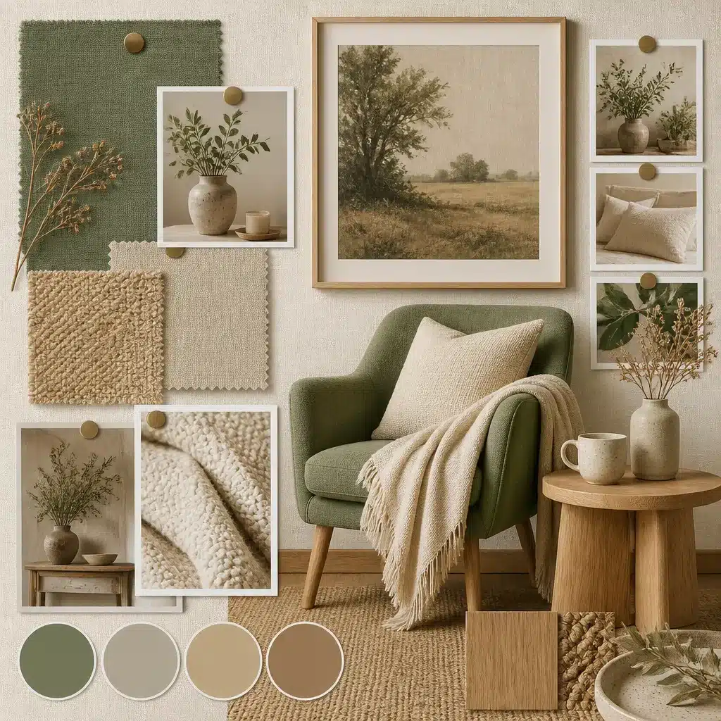
What Goes with Sage Green Color?
Sage green pairs well with more colors than most people expect.
It sits in a neutral zone, so it can go warm or cool depending on what you put next to it.
A few pairings that work really well:
- Warm white: softens the look without washing it out.
- Terracotta: adds heat and a natural, grounded feel. This is the pairing that photographs best in south-facing rooms.
- Dusty pink: brings in softness without going too sweet.
- Charcoal grey: the contrast works well, especially in rooms that don’t get much natural light.
- Cream or off-white: softer than white, and it makes sage feel warmer in the evenings.
- Burnt orange: bold but surprisingly balanced against sage.
This is one of those colors that just works. Pair it right, and your space feels calm, put-together, and easy on the eye.
Give it a try; you might not want to change it for a long time.
Classic Sage Green Color Palette Combinations
Not every space needs to play it safe. Sometimes you want sage green to be the first thing people notice.
These pairings are bolder and make a greater impact.
1. Sage Green and Gold
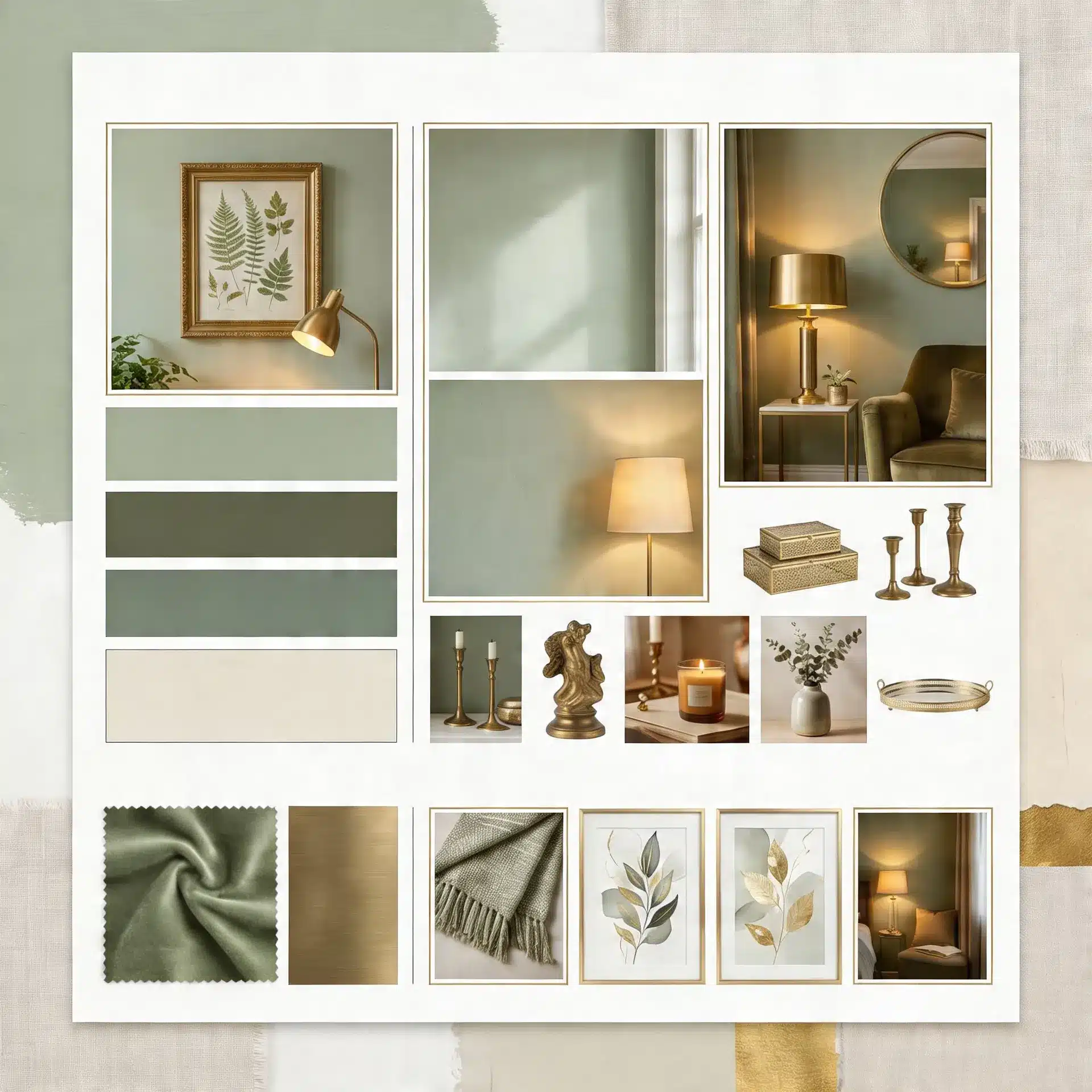
A matte sage wall with brushed gold hardware or a pendant lamp photographs well, which is probably why you keep seeing this combination on design accounts.
The heat of gold improves the muted tone of sage, giving it a more polished look.
Best for: Feature walls, living rooms, and dining spaces with warm lighting.
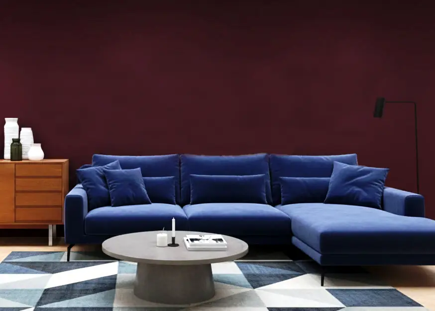
2. Sage Green and Deep Burgundy
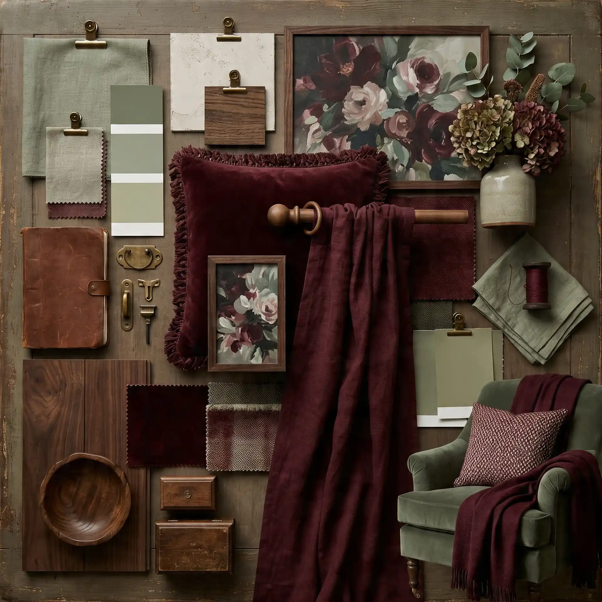
Burgundy is bold, and sage green keeps it from feeling too heavy.
Together, they create a strong, moody contrast that works really well in cooler months.
Best for: Dining rooms, bedrooms, and other spaces that call for a dramatic feel.
3. Sage Green and Cobalt Blue
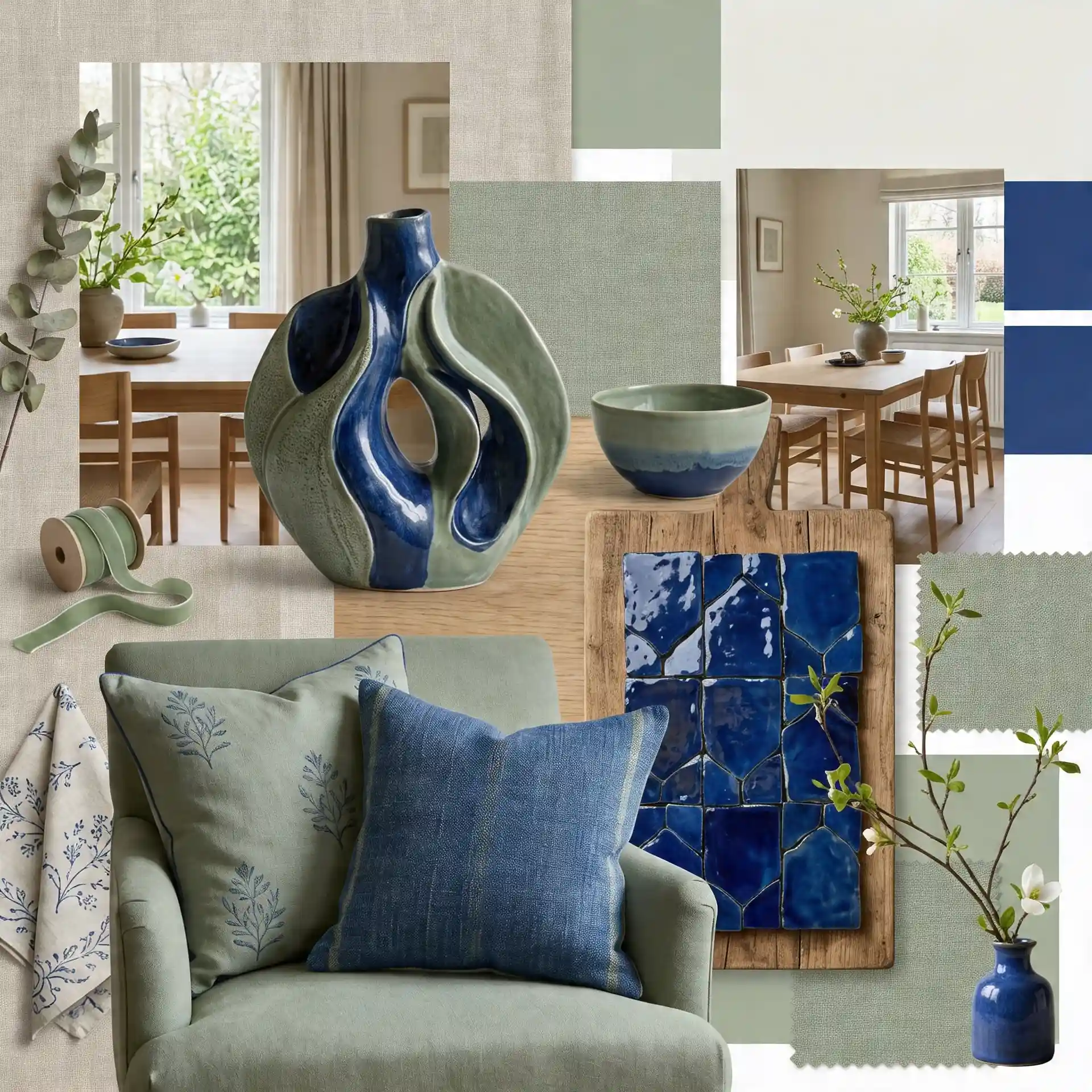
Cobalt is bright and confident next to sage green.
It’s an unexpected pairing, but it works; the two colors balance each other out without competing.
Best for: Accent pieces, cushions, artwork, and tiled spaces.
4. Sage Green and Wood Tones
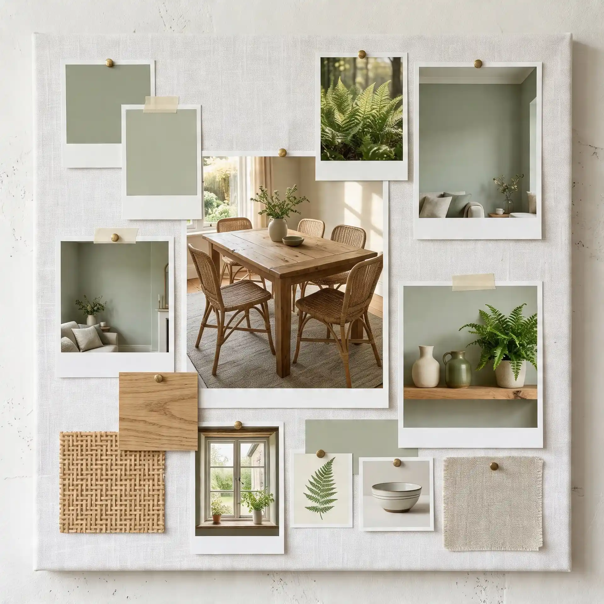
Natural wood and sage green feel like they belong together. The heat of the wood balances the coolness of the green really well.
Together, they bring an organic, lived-in feel to any space.
Best for: Living rooms, dining areas, and open-plan spaces.
Designer note: William Morris’s idea of keeping only what is useful or beautiful works especially well here. Sage green and wood tones feel strongest when the room is not crowded with unnecessary decor.
5. Sage Green and Cream
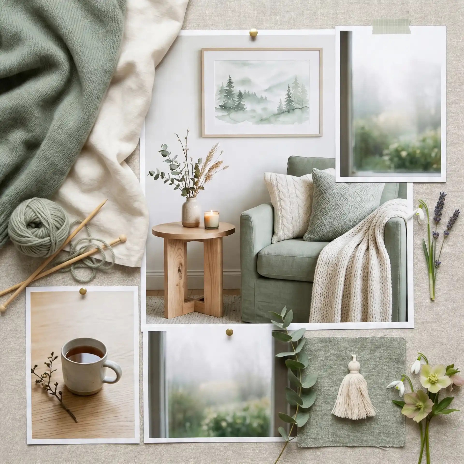
Cream is softer than white and gives sage green a warmer, cozier feel.
Great for bedrooms and living spaces where you want to feel relaxed. It’s a gentle combination that is easy to live with every day.
Best for: Bedrooms, reading nooks, and cozy sitting rooms.
6. Sage Green and Terracotta
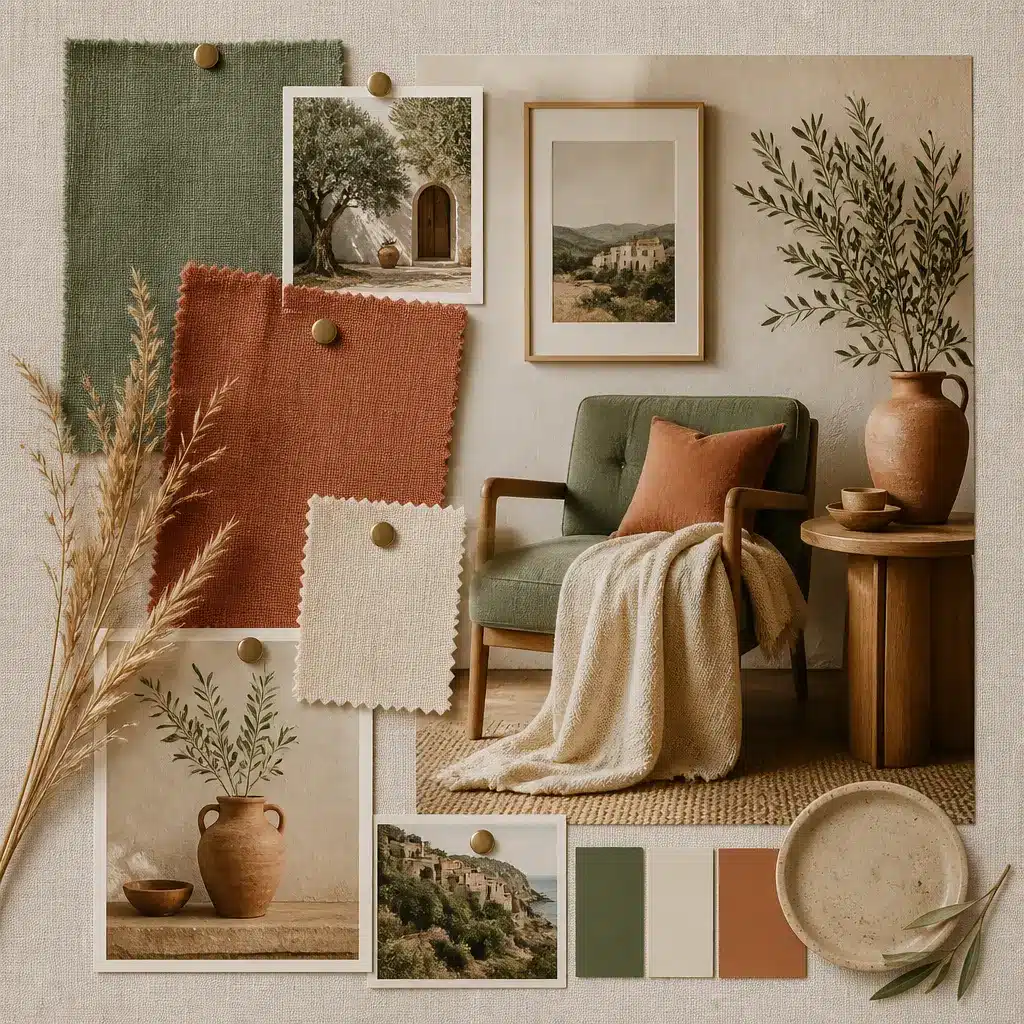
Terracotta brings earthiness and depth to sage green. This combination feels natural, grounded, and slightly rustic without looking old-fashioned.
Use terracotta through clay pots, tiles, cushions, rugs, or painted accents.
Best for: Kitchens, patios, dining rooms, sunrooms, and Mediterranean-inspired spaces.
7. Sage Green and Dusty Pink
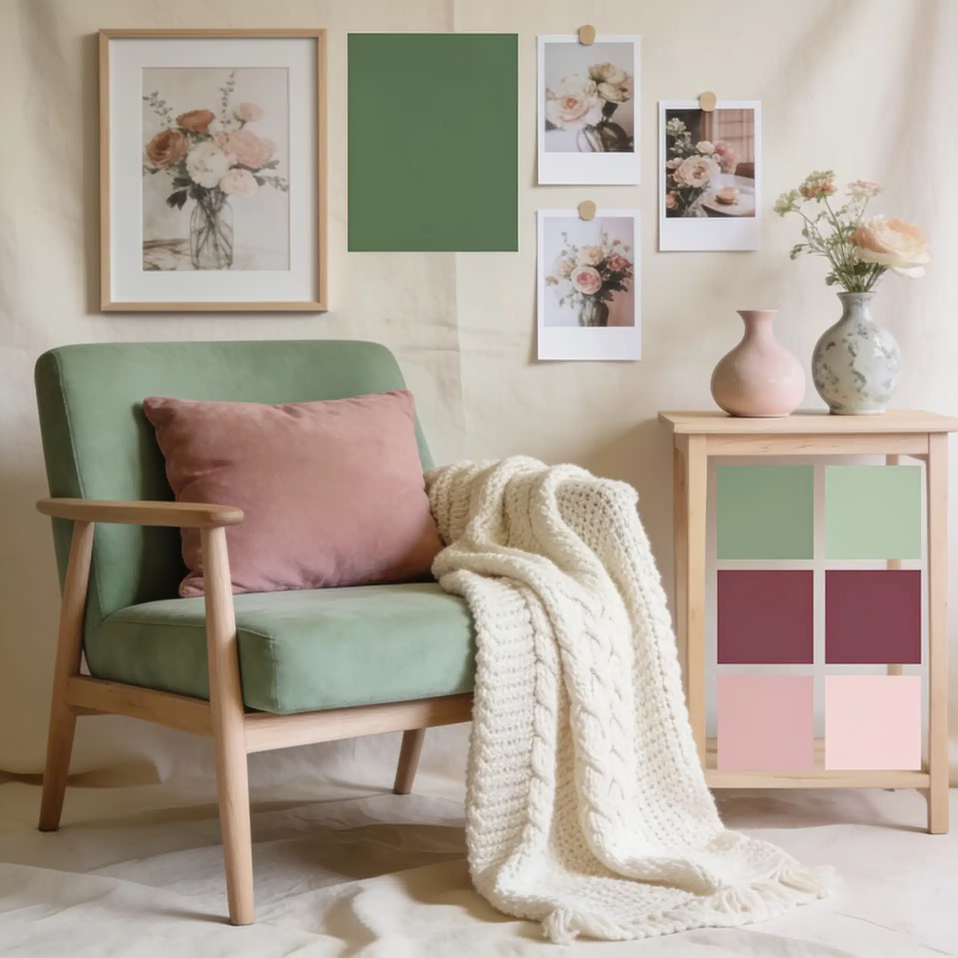
Dusty pink softens sage green without making the space look overly sweet.
The muted quality of both colors keeps the palette grown-up and balanced. This combination works best with cream, brass, or pale wood added in the background.
Best for: Bedrooms, dressing areas, soft living rooms, guest rooms, and feminine decor schemes.
8. Sage Green and Charcoal Grey
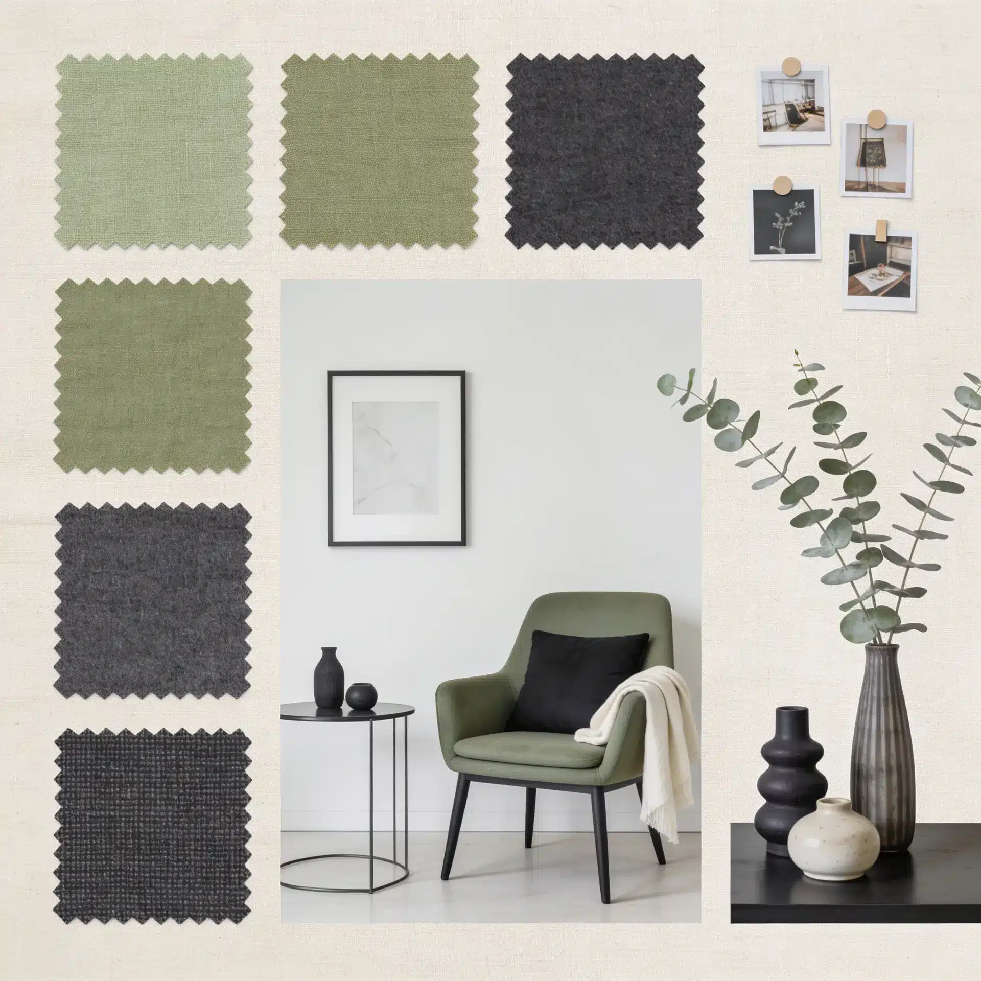
Charcoal grey gives sage green a sharper and more modern edge.
The dark contrast helps sage feel more defined, especially in spaces that need structure. Keep the rest of the room lighter with cream, stone, or warm wood so it does not feel too heavy.
Best for: Entryways, bathrooms, modern kitchens, home offices, and exterior trims.
9. Sage Green and Warm Beige
Warm beige makes sage green feel softer and more natural.
This is a safe but beautiful combination for people who want a calm palette without using plain white.
It works especially well with stone flooring, jute rugs, woven baskets, and oak furniture.
Best for: Living rooms, bedrooms, hallways, rental homes, and open-plan spaces.
10. Sage Green and Navy Blue
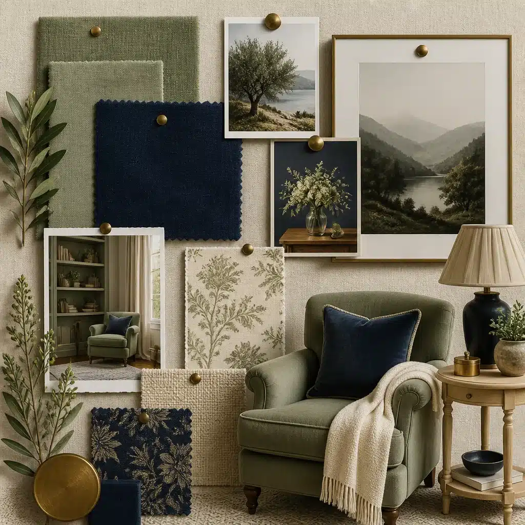
Navy blue adds depth to sage green while still feeling classic. This pairing works better than bright blue when you want contrast without too much visual noise.
Add white trim, brass hardware, or walnut furniture to make the palette feel complete.
Best for: Shutters, bedrooms, living rooms, built-ins, cabinetry, and formal spaces.
11. Sage Green and Soft Black
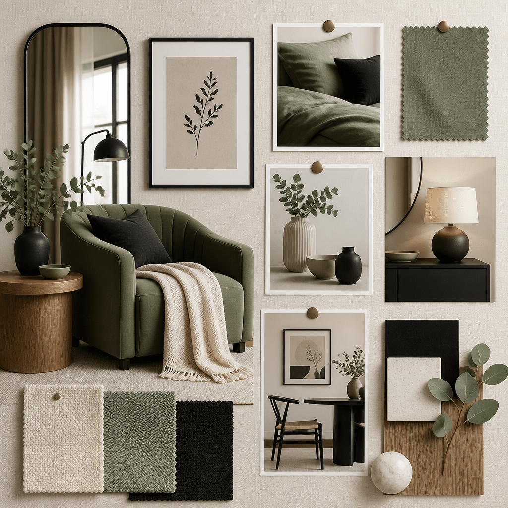
Soft black gives sage green a clean, designed look without the harshness of pure black.
Use it on window frames, thin furniture legs, lighting, mirrors, or cabinet pulls. The key is to keep black as an accent, not the main color.
Best for: Modern farmhouse spaces, bathrooms, kitchens, entryways, and exterior details
Sage Green Color Palette for Different Rooms
This color works differently depending on the room. The key is choosing the right colors to go alongside it.
Here’s how it plays out room by room.
Living Room
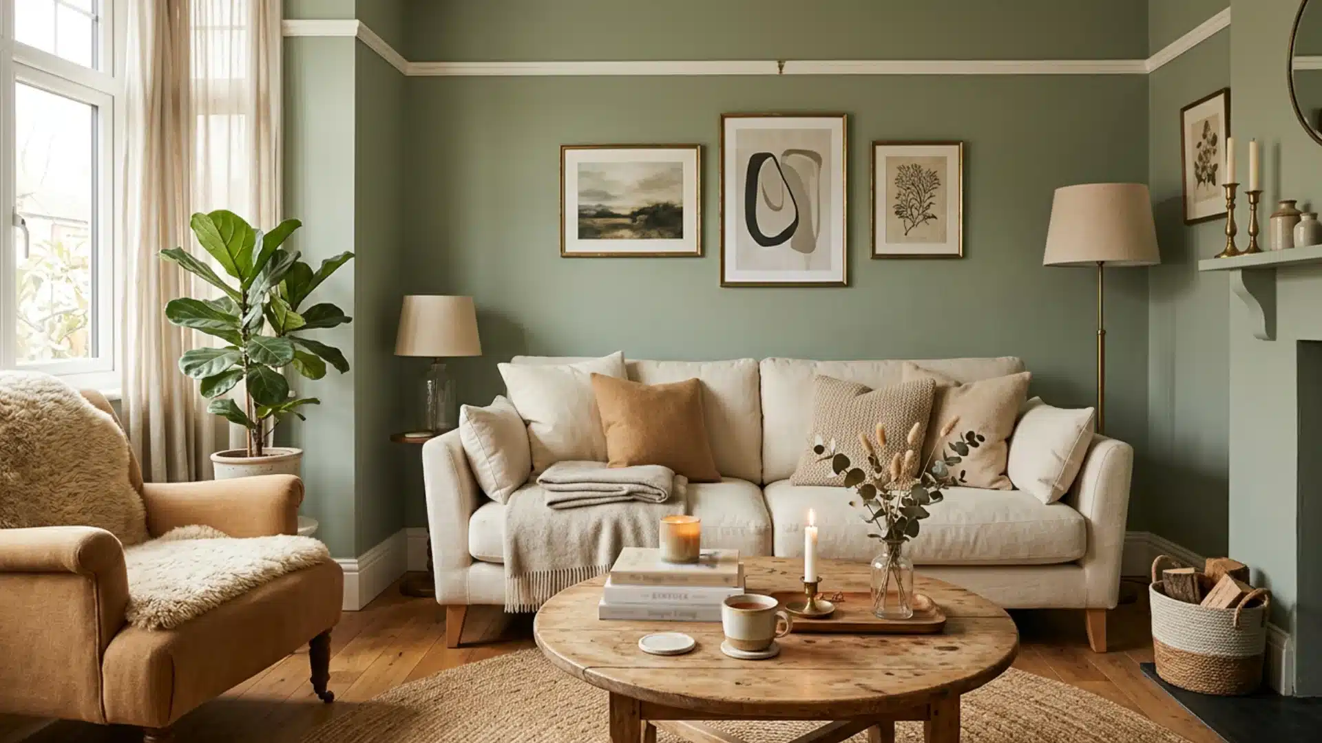
Pair sage green walls with warm beige, soft camel, and touches of brass.
This combination feels relaxed and put-together at the same time. Add a cream-colored sofa, and maybe curtains and a wooden coffee table to ground the space.
It creates a room that feels comfortable to sit in for hours without feeling overdone.
Paint Suggestions
- Farrow & Ball: Mizzle No.266
- Benjamin Moore: Saybrook Sage HC-114
Bedroom
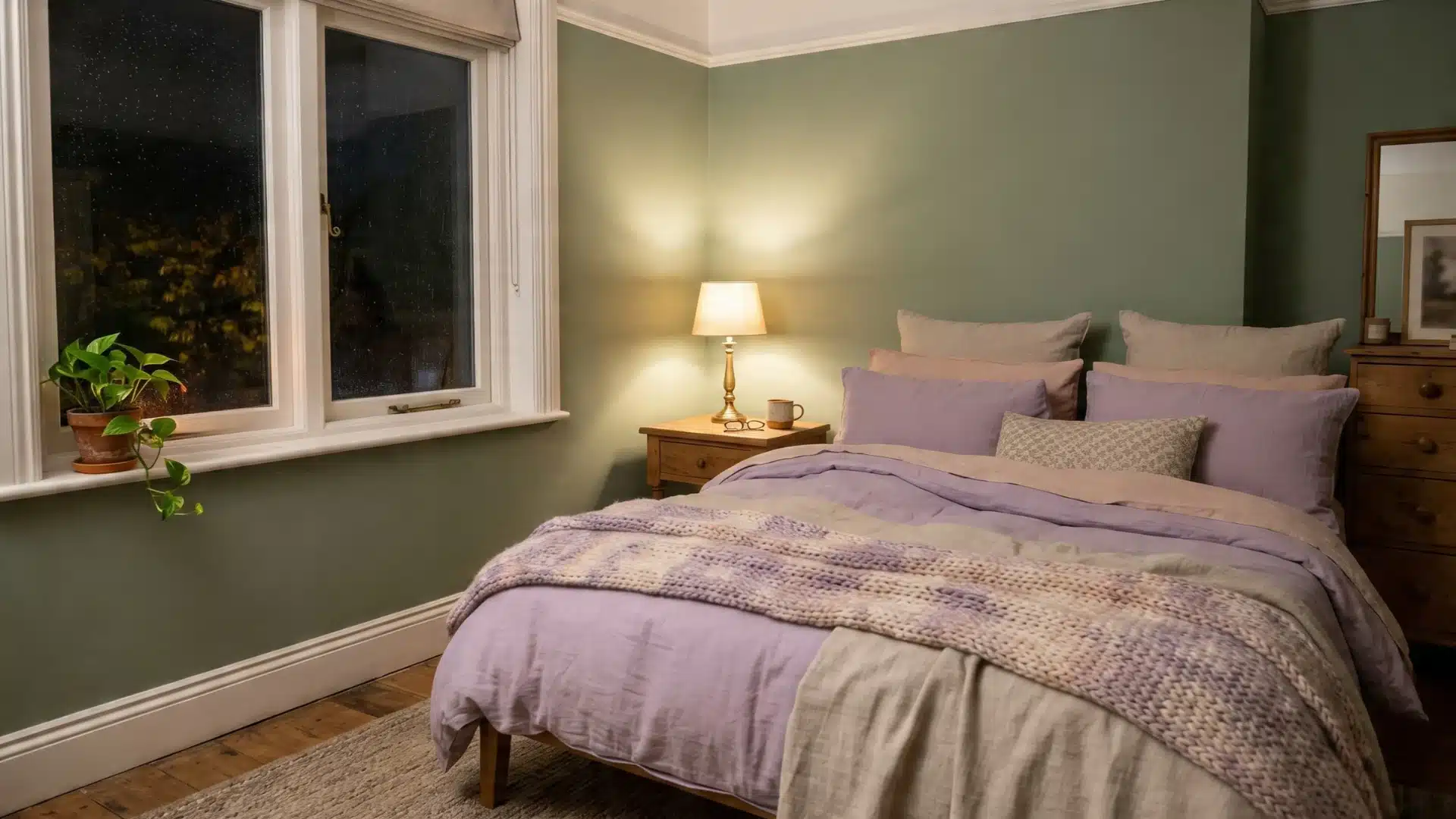
In the bedroom, sage green works beautifully with lavender, soft blush, and warm linen tones.
These colors keep the space feeling calm and easy to rest in.
Layer cotton, linen, and wool in these shades to add depth without introducing too many competing colors.
Paint Suggestions
Sherwin-Williams: Softened Green SW 6177
Kitchen
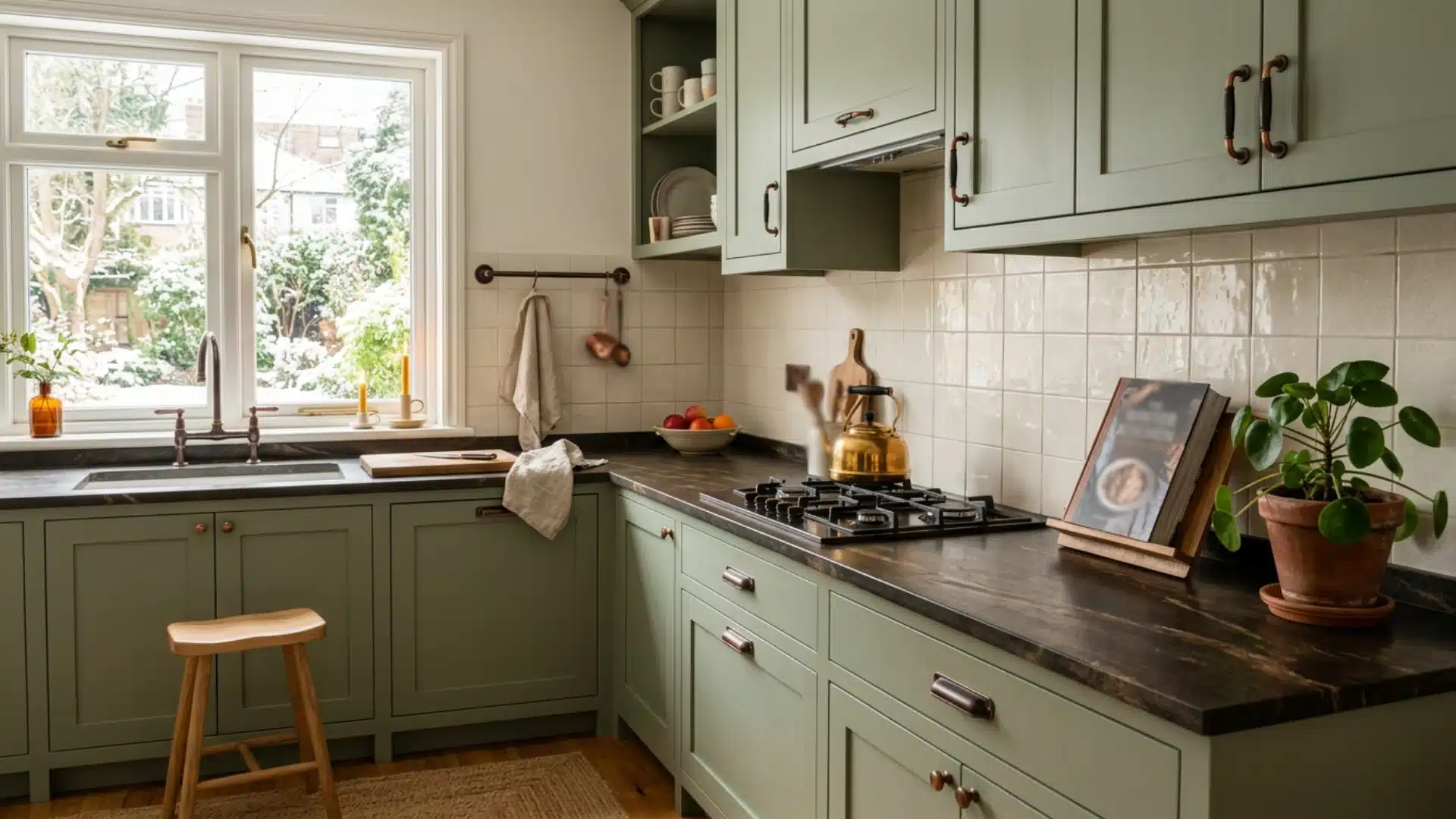
The kitchen is where sage green really shines.
Pair it with warm stone countertops, matte copper fixtures, and soft ivory tiles.
This combination feels fresh but grounded. It avoids the coldness that some kitchens suffer from and brings a natural, homely quality to a space that is often purely functional.
Paint Suggestions
Benjamin Moore: Rosemary Sprig
Bathroom
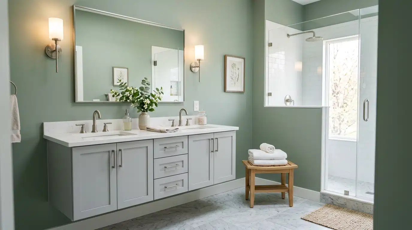
In the bathroom, try sage green with cool marble, soft grey, and brushed silver. The combination feels clean and spa-like without trying too hard.
Keep accessories to a minimum: a few white towels and a wooden stool are all you need to complete the look.
Paint Suggestions
- Farrow & Ball: Saxon Green No.80
- Sherwin-Williams: Clary Sage SW 6178
Home Office
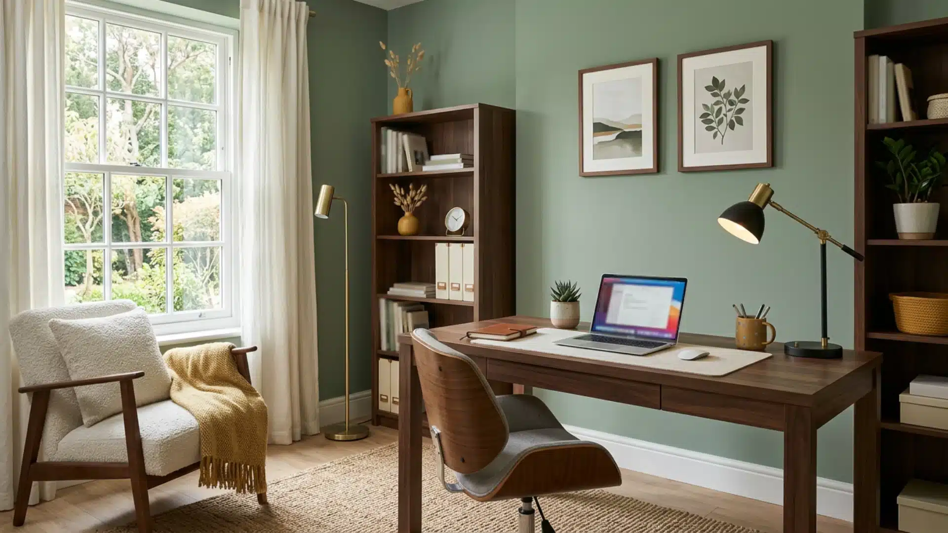
Sage green in a home office pairs well with deep walnut, off-white, and muted mustard yellow.
The walnut adds seriousness, the off-white keeps things bright, and the mustard adds just enough warmth.
Together, they create a space that feels focused but not cold or clinical.
Paint Suggestions
Farrow & Ball: Card Room Green No.79
Dining Room
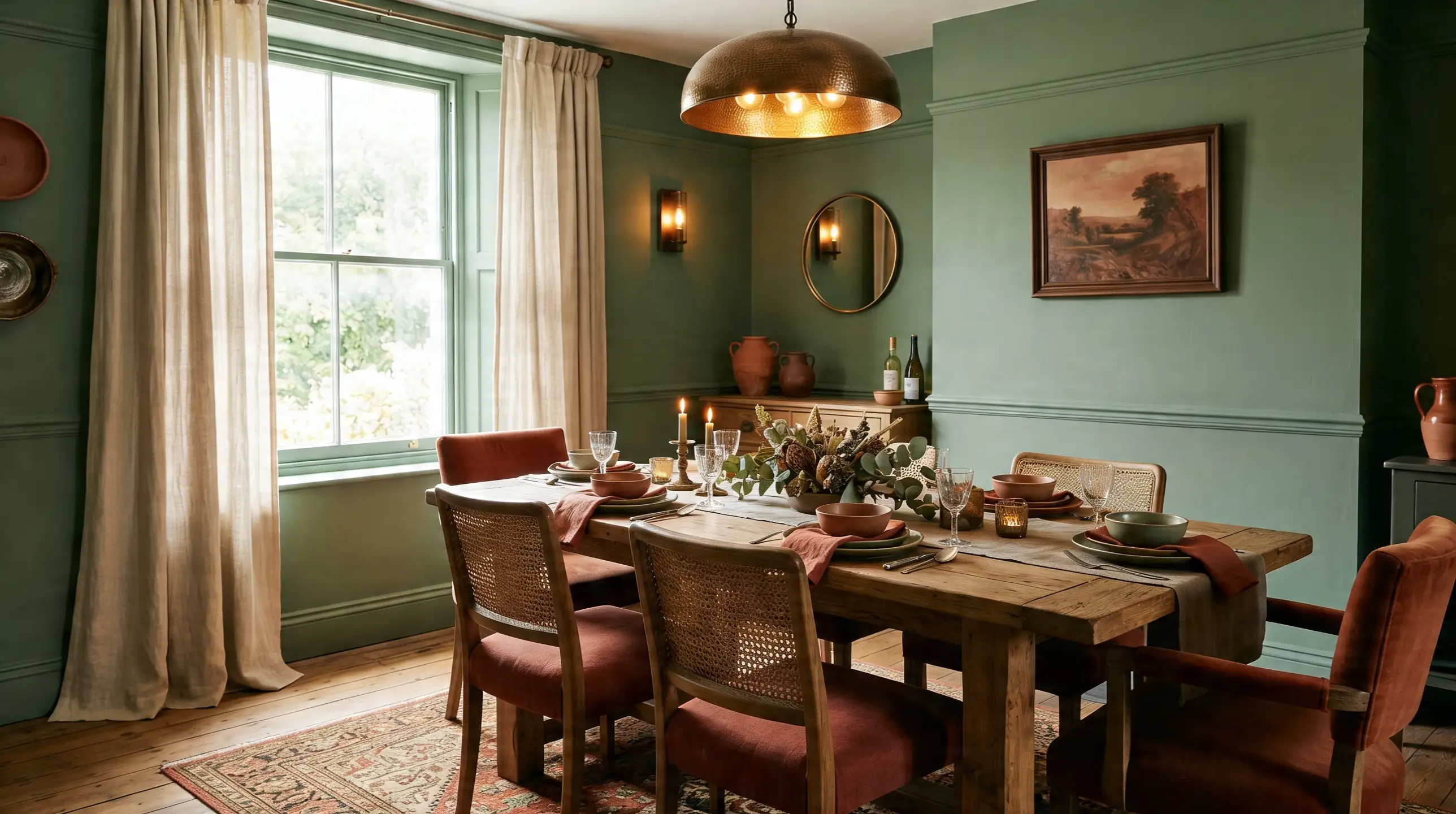
In the dining room, sage green pairs well with deep terracotta, warm sand, and brushed bronze.
These tones create a space that feels inviting and unhurried, exactly the mood you want around a dining table.
Add natural linen curtains and a wooden table to unify the look without overcomplicating it.
Paint Suggestions
Sherwin-Williams: Retreat SW 6207
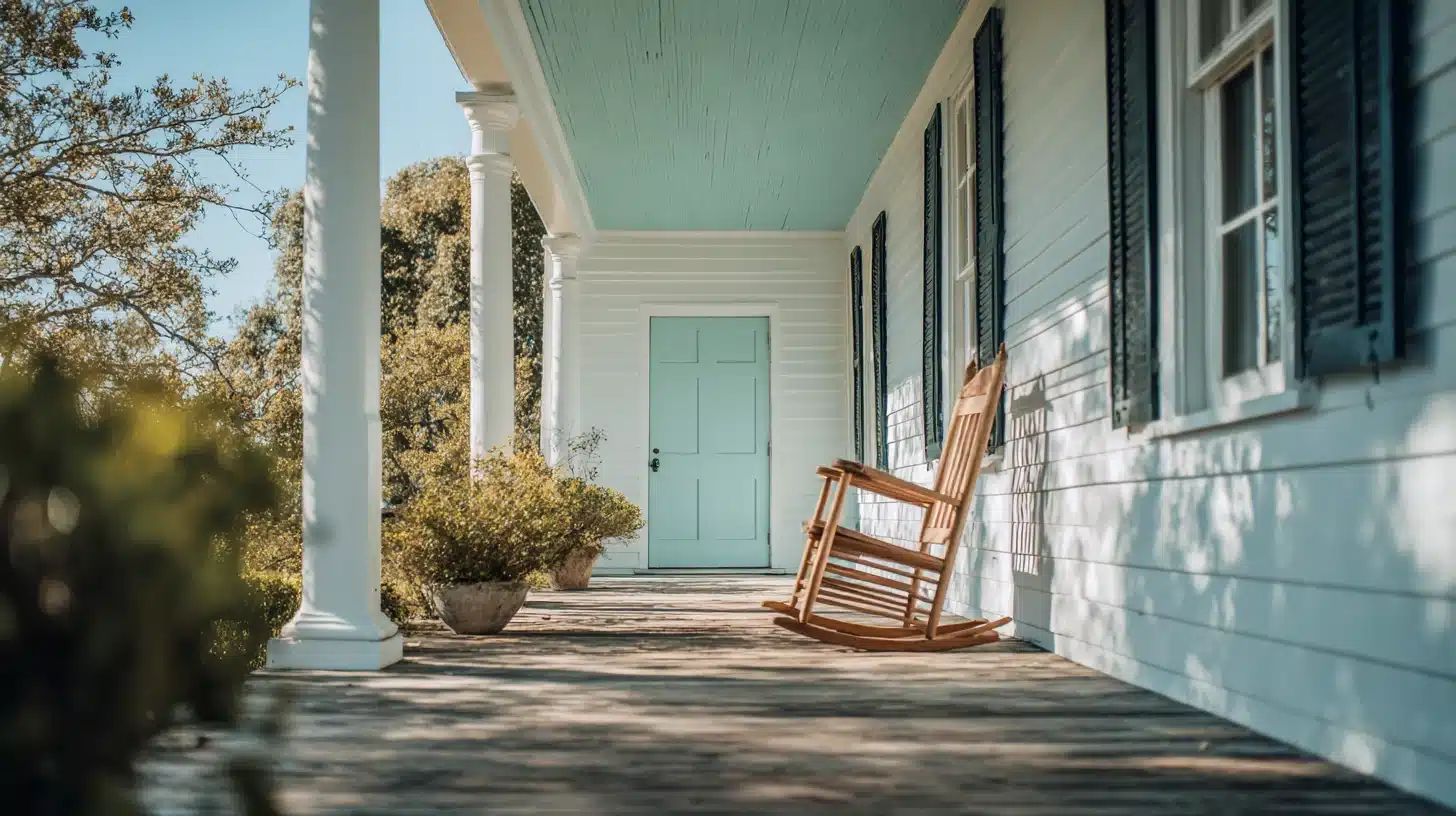
Entryway
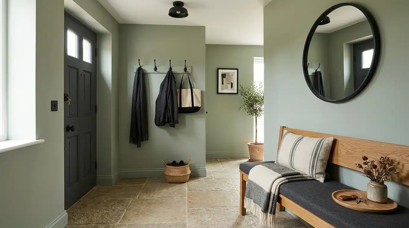
The entryway sets the tone for the rest of the home.
Sage green here works best alongside charcoal, warm stone flooring, and matte black fixtures. It feels inviting without being loud.
Keep the palette tight, two or three colors at most, so the space feels considered rather than cluttered.
Paint Suggestions
- Farrow & Ball: Vert De Terre No.234
- Benjamin Moore: Salisbury Green HC-139
Sage Green Color Palette for Exterior Use
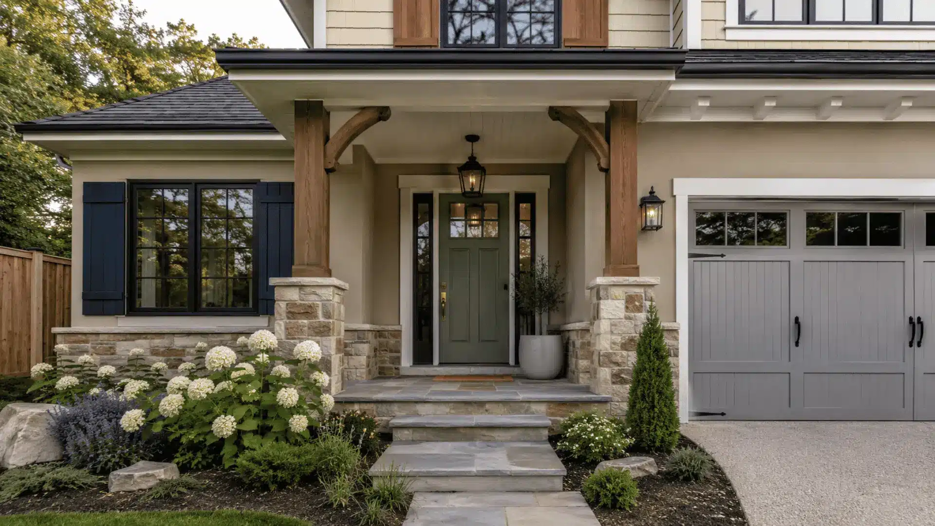
It works just as well outdoors as indoors. Here’s a quick look at how to pair it on different parts of a home’s exterior.
| Exterior Area | Sage Green Paired With | Effect |
|---|---|---|
| Front Door | Crisp white trim, brass hardware | Warm and inviting without being loud |
| Exterior Walls | Sandy beige, warm stone accents | Natural and grounded, blends with surroundings |
| Window Frames | Deep charcoal, matte black | Sharp contrast, clean and defined finish |
| Garage Door | Soft grey, white trim | Subtle and cohesive with the main exterior |
| Garden Fence | Warm wood, earthy brown | Relaxed, organic feel that suits outdoor spaces |
| Roof Trim | Slate grey, off-white | Balanced and understated, it ties the exterior together |
| Shutters | Navy blue, dark walnut | Bold contrast that adds character to the facade |
| Porch Ceiling | Pale cream, natural wood beams | Light and airy, it extends the outdoor living feel |
Best Paint Finishes for Sage Green Walls
The finish you choose affects how sage green looks just as much as the shade itself. A poor finish can make even the best color look flat or cheap.
Here’s what works best:
- Matte finish: Absorbs light, giving sage green a soft, chalky look. Great for bedrooms and living rooms.
- Eggshell finish: A slight sheen that is easy to clean and works well in kitchens and hallways.
- Satin finish: More reflective and holds up well in high-traffic areas like entryways.
- Semi-gloss: Best saved for trims, doors, and window frames rather than full walls.
Avoid high-gloss on large walls. It makes the color look harder and less natural than it actually is.
How to Choose the Right Sage Green Shade
Not all sage greens are the same. Some lean warm with yellow or brown undertones.
Others pull cool and grey. Before committing to a shade, test it on the wall first. Natural light changes it completely throughout the day. A shade that looks perfect in the morning can feel flat by evening.
Think about what else is in the room: flooring, furniture, and fabrics all affect how the green reads.
Pick a shade that complements what you already have, not clashes with it.
Common Mistakes to Avoid when Using Sage Green
Sage green is forgiving, but a few mistakes can throw the whole look off.
Using too many colors alongside it is the biggest one; it gets lost quickly.
Sage next to a saturated cobalt or a cherry red gets overpowered immediately. The muted undertones just disappear. If you want contrast, stay in the muted register: navy, terracotta, or charcoal.
Going too dark with the shade in a small room makes the space feel closed in. Skipping a test patch before painting is a gamble not worth taking.
Keep the palette simple and let sage green do the work.
Styling Tips to Improve a Sage Green Color palette
Getting the color right is only half the job. How you style around it makes the real difference. Here are some clear tips:
- Stick to natural materials like wood, rattan, and linen to complement sage green.
- Use odd numbers when grouping decorative objects; three or five items always look more natural.
- Bring in plants. Their natural greens sit comfortably alongside sage without clashing.
- Layer different textures in neutral tones to add depth without adding more color.
- Keep metallic accents warm, brass and copper work better than chrome or steel.
- Use soft, warm lighting to stop sage green from feeling too cool in the evenings.
- Limit patterns. If you use them, keep them small-scale and in complementary tones.
- Let one element stand out: a chair, a rug, or a cushion, and keep everything else quiet.
End Note!
Sage green is not a trend. It’s a color that holds up over time and works across different spaces, styles, and budgets.
The key is keeping things simple, the right shade, a clean palette, and materials that feel natural. If it’s a bedroom wall, a kitchen cabinet, or a front door, sage green has a way of making a space feel calm and considered.
Start small if you’re unsure. A single wall or a few key pieces are enough to see what it can do.
Once you see it in your space, the rest usually falls into place.
Frequently Asked Questions (FAQ’s)
1. Is Sage Green Still in Style in 2026?
Yes, sage green remains a popular color in 2026.
2. What Colors Do Not Go with Sage Green?
Bright neon shades, cool purples, and stark cool greys clash badly with sage green.
3. Is Sage Green Outdated?
No, its muted and natural tone keeps it relevant across many design styles.
4. What is a Good Complementary Color for Sage Green?
Warm cream, terracotta, and dusty pink complement sage green really well.
5. What is the Trend Green in 2026?
Olive green and moss green are among the most popular green tones this year.