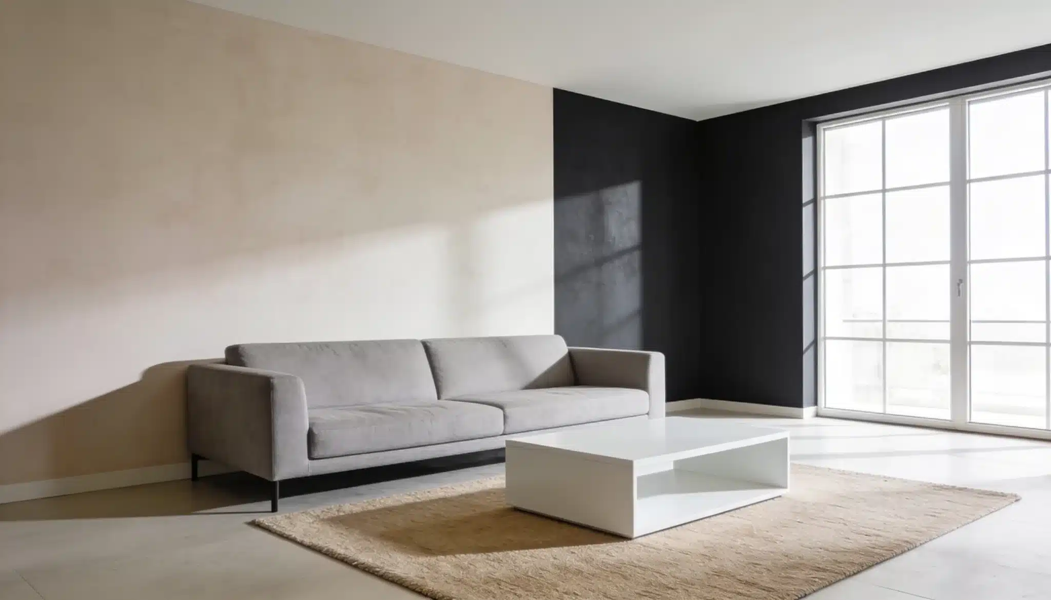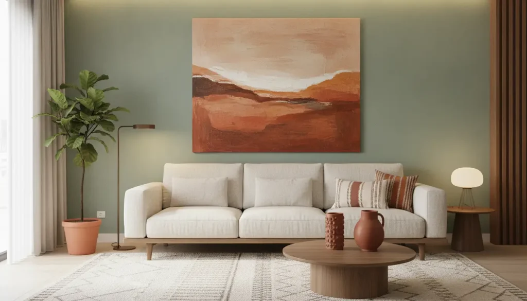
You painted the walls a shade you love, hung a piece of art you also love, and somehow the two are quarreling. It happens constantly. The problem is rarely the art or the paint on their own. It is that they were chosen in isolation. Picking art that works with your existing wall color is less about luck and more about a few repeatable rules.
Start With the Wall, Not the Art
When a room is already painted, the smart move is to treat that color as fixed and shop for art around it. That means looking past the obvious hue and paying attention to undertones. A gray might lean blue, green, or violet, and a beige might read pink or yellow depending on the time of day.
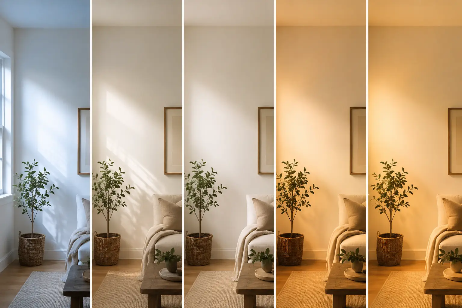
Those undertones shift with the light, which is why a canvas that looked perfect in the store can feel off once it’s hanging on your wall. The direction your windows face and the bulbs you use both change how a color reads, so it’s worth holding a piece against the actual wall before you commit. Live with it for a day and watch how it behaves from morning to night.
Let the Color Wheel Do the Heavy Lifting
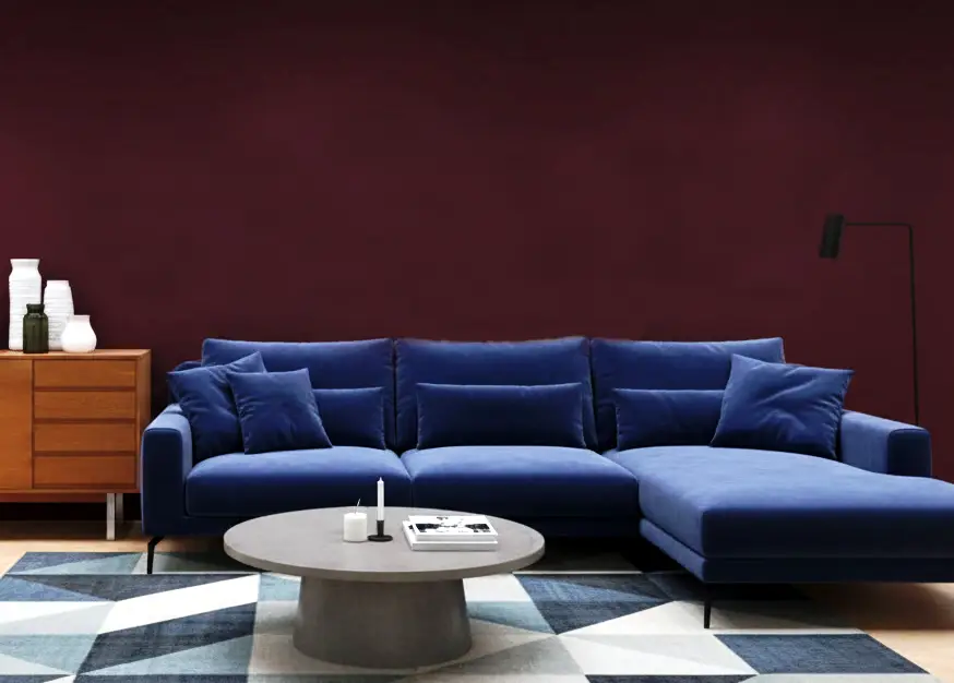
Once you know your wall’s true color, the color wheel tells you what kind of art will get along with it. The two relationships worth memorizing are complementary and analogous, and they sit at opposite ends of the effect spectrum: complementary colors face each other on the wheel and create contrast, while analogous colors sit side by side and create calm.
If your walls are a muted sage and you want the art to pop, a piece with rust or terracotta, sage’s rough opposite, will command attention. If you’d rather the room feel serene, learning how to buy art online can help you choose the right piece with confidence. Monochromatic art, meaning different shades of the wall color itself, is the safest route when you want the piece to blend rather than announce itself.
Once you’ve decided whether you want contrast or harmony, finding the piece is the easy part. A quick check of dimensions, framing options, and seller details helps ensure the canvas that shows up looks like the one you fell for on screen.
Give Every Piece a Job in the Room
A common mistake is treating art as decoration you tack on at the end. In a well-balanced room, art has an assigned role. The 60-30-10 rule for balancing a palette is a useful frame here: roughly 60 percent of the room is your dominant color in the walls and large furniture, 30 percent is a secondary color, and 10 percent is your accent. Art usually lives in that final 10 percent.
That makes your artwork the ideal place to introduce an accent you can echo elsewhere. Pull one color from the piece, a slash of ochre or a band of deep blue, and repeat it two or three times around the room in a cushion, a vase, or the spine of a book. That repetition is what makes a space read as curated instead of coincidental.
Match the Undertones, Not Just the Colors
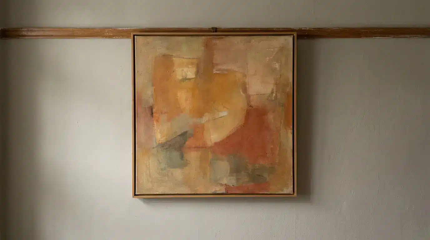
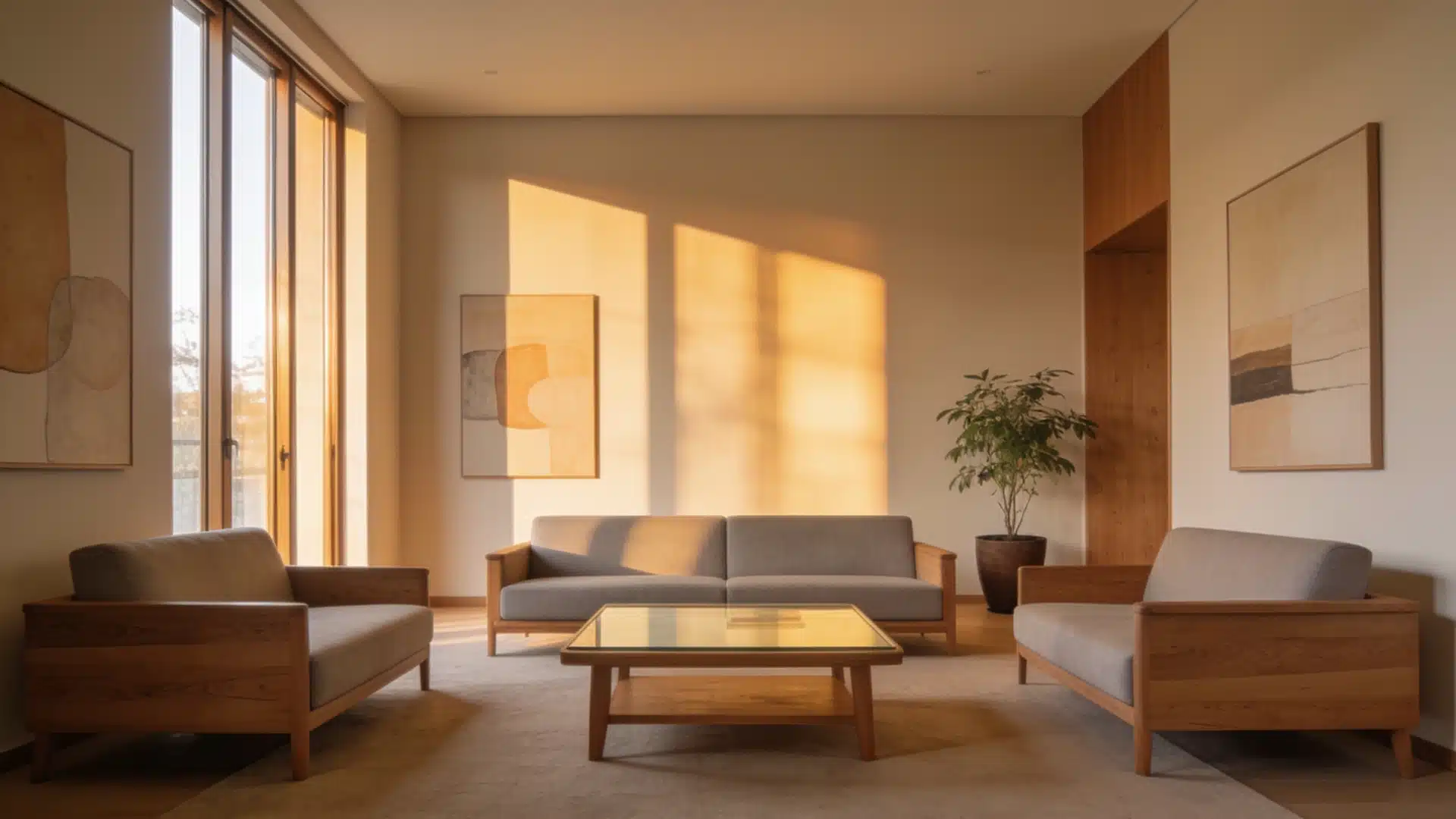
Colors that share an undertone almost always cooperate, even when the hues themselves are different. Warm walls, the ones with yellow, red, or orange in them, sit comfortably with art built on warm tones, while cool walls want cooler art. If you want a shortcut, the fundamentals of color harmony come down to art and paint sharing either a temperature or a common spot on the wheel. The same undertone logic that guides pairing wall colors with your furniture applies just as neatly to what you hang above it.
Neutral walls give you the most freedom. A soft white or warm greige acts as a gallery backdrop, letting bold or colorful art take the lead without a fight. If your walls are already saturated, do the opposite and let the art stay quieter, so the room isn’t shouting from every direction at once.
Don’t Forget the Frame and the Finish
The frame is part of the color match, not an afterthought. A frame either extends the palette or interrupts it, and the finish you choose does real work:
- Black frames add definition and hold up against almost any wall color
- Natural oak warms up cooler, grayer palettes without competing
- White frames brighten a piece and modernize a traditional room
- Metallic frames tie back to brass, nickel, or bronze finishes elsewhere
Sheen matters too. A high-gloss wall next to a glossy framed print can set off competing reflections, while a matte wall paired with a textured canvas reads softer and more grounded. If your walls carry a sheen, a matte or heavily textured piece gives the eye somewhere calm to land.
Protect the Match From Changing Light
Even a perfect pairing falls apart if you ignore light. Direct sunlight slowly fades both wall paint and artwork, and the damage is permanent because light damage is cumulative and cannot be reversed. A piece hung in a sunny window will fade unevenly over a few years, quietly breaking the color relationship you worked to build.
Keep pieces you care about out of direct sunlight, and if a bright wall is the only spot, UV-filtering glass blocks most of the harmful wavelengths. Steady, indirect lighting also keeps the art’s colors true, which means the match you see on day one is the match you’ll still see years later.
Bringing It All Together
Choosing art that matches your paint colors comes down to working outward from the wall: read the undertone, decide whether you want contrast or calm, give the piece a defined role, and protect it from the light that would undo your work. Do that, and the art won’t simply match the room. It will look like it was always meant to hang there.