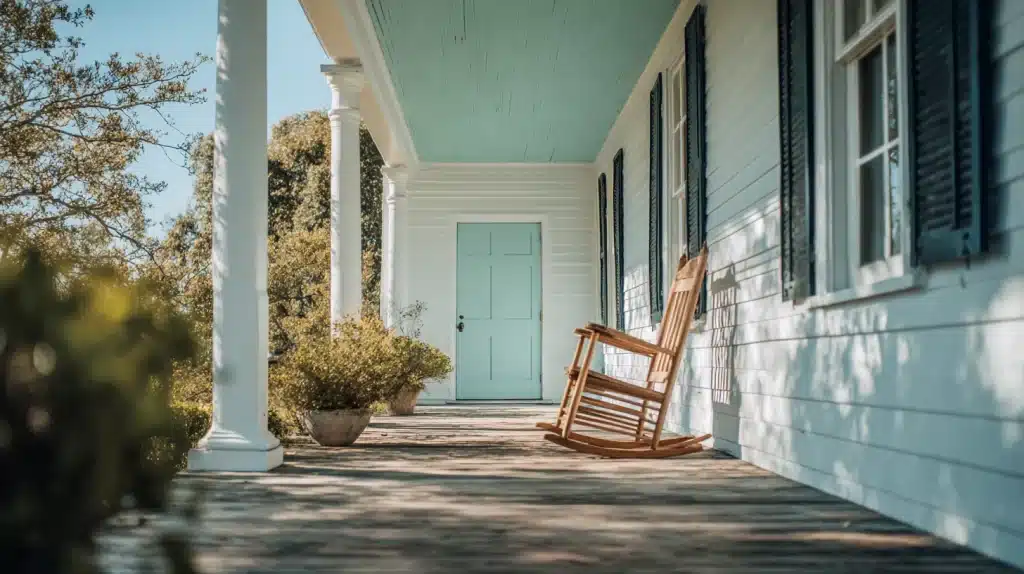
Have you ever wandered around a Southern porch with a soft blue-green ceiling and wondered, “That’s one eye pleasing color choice?”
But did you know that there’s more to it than a good choice?
You’ll be amazed to know the rich history hiding behind that familiar haint blue paint. And it does not run back to just a few years.
It’s a story that goes back hundreds of years, rooted in Gullah Geechee culture and Southern tradition.
A Brief History of Haint Blue Paint
The word “haint” is a Southern term for an evil spirit or ghost. And that word alone is what makes the origin story of this paint interesting.
According to Gullah Geechee folklore, spirits cannot cross water.
So, to keep the spirits away, people started painting porch ceilings, doors, and window trim in this blue-green shade to trick haints into thinking it was water or sky.
This belief widely worked as a form of spiritual protection for the home.
In old times, talk of spirits and ghosts used to be of significance, and thus this belief adopted by the people, which gave the paint its popularity beyond Southern regions.
What Color is Haint Blue Exactly?
The name can sound a bit confusing, and it might make you wonder what exactly it means.
Well, it isn’t a single color. It sits somewhere between blue, green, and gray. Think of a pale sky just after sunrise or the soft color of still water on a cloudy day.
Some versions carry a slight gray undertone that makes them feel calm and muted.
It is soft and never too bright or too bold. That in-between texture is exactly what makes it stand apart from the normal shades.
Haint Blue Color Tone Variations
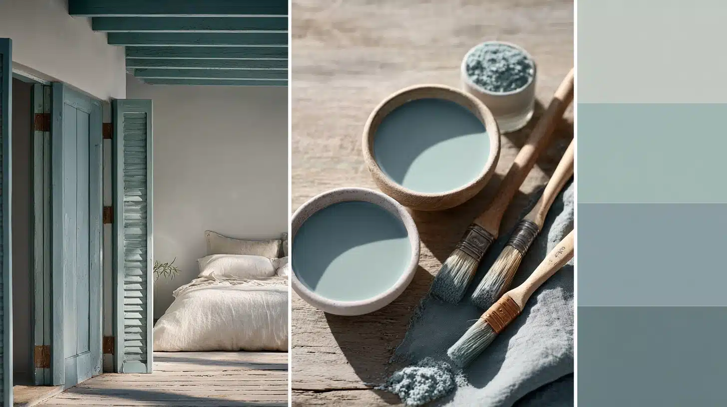
Before you start, picking the right shade matters more than you think.
The wrong tone can look too bold or too dull for your space, but the right shade ties your home’s look together beautifully.
Soft Aqua Tones
Soft aqua is one of the most loved shades.
It feels fresh, light, and calming. This tone works best on porch ceilings and sunrooms where natural light pours in.
It gives your space an open, airy feel, making any outdoor sitting area look welcoming.
Muted Blue-Green Shades
Muted blue-green is a classic choice for haint blues.
It sits right between blue and green without leaning too far either way. This shade works well on exterior trims, porch ceilings, and shutters.
It pairs nicely with white, beige, or gray home exteriors without looking too loud or out of place.
Gray-Blue Variations
Gray-blue is a more modern take on haints blues.
It feels sophisticated and understated. This shade works well in interior spaces, such as bedrooms and living rooms.
For best results use Gray-Blue variations on homes with darker brick or wood siding.
Haint Blue Porch Ceiling
The porch ceiling is the most traditional place for this paint.
It connects your home to Southern history and folklore. And on top of that, it also makes your porch feel cooler and more open on sunny days.
1. Sherwin-Williams Comfort Gray (SW 6205)
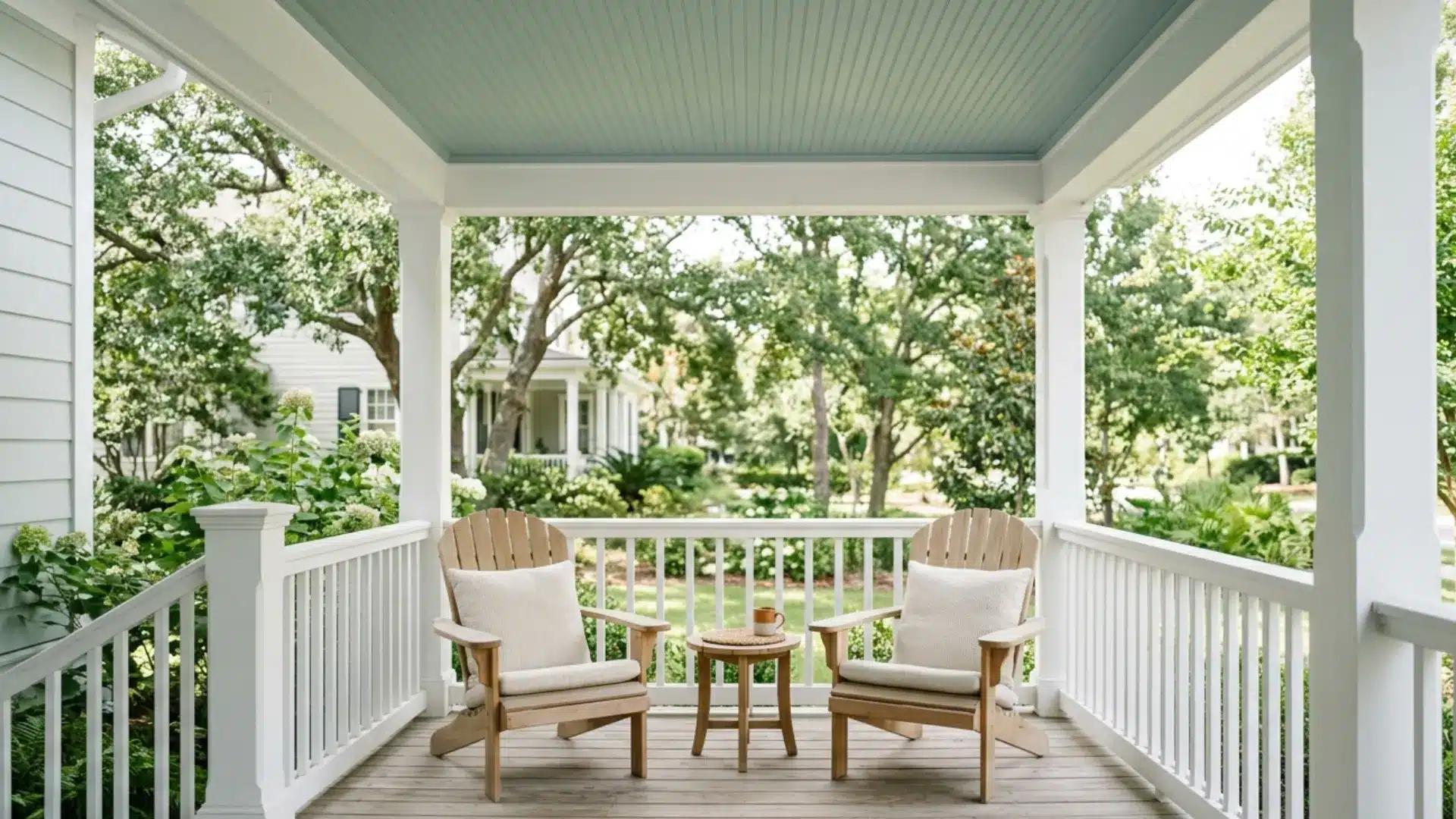
Comfort Gray is a soft, muted blue-green that works beautifully on porch ceilings.
This one is popular for the calm and easy feel on the eyes.
Its undertones feature a subtle blue that grounds the green-gray base. While a flat or matte finish gives a traditional look, a satin finish is often preferred for outdoor durability.
Avoid it on north-facing porches, as it can look dull and lifeless without enough natural sunlight hitting the ceiling directly.
2. Benjamin Moore Wythe Blue (HC-143)
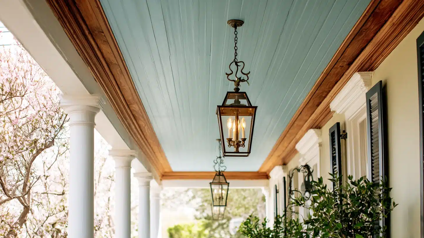
Wythe Blue is an “always in trend” dusty blue-green haint blue paint shade loved by many homeowners.
It pairs well with white trims and wooden porch details.
Its distinct gray undertone prevents the color from looking too bright in direct sunlight, and to ensure it holds up to the elements, opt for an exterior satin finish.
It keeps the color soft and even while resisting moisture and dirt.
Avoid using it on very dark or heavily shaded porches, as the muted tone tends to disappear and loses its charm in low-light conditions.
3. Farrow & Ball Dix Blue (No. 82)
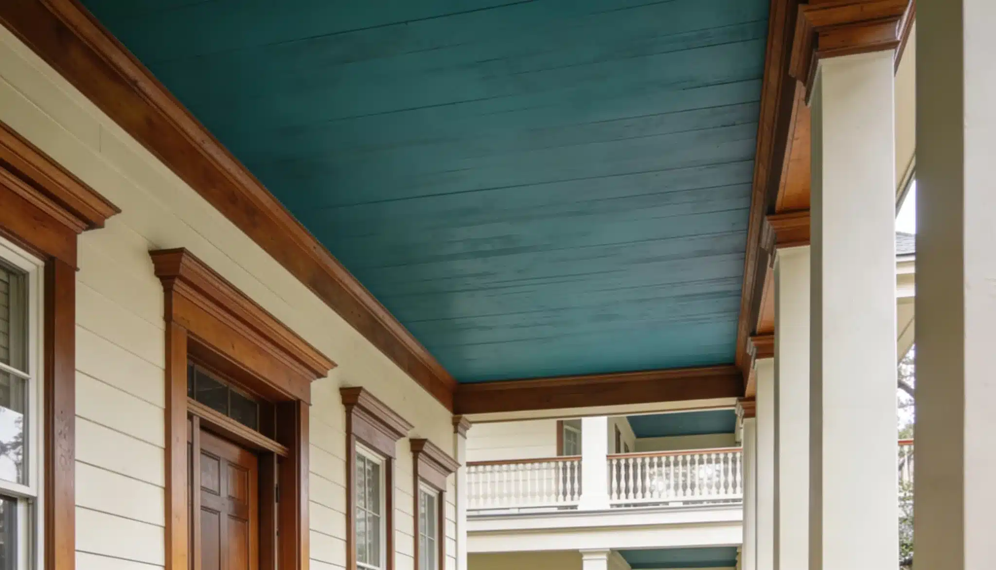
Dix Blue is a rich, sophisticated blue-green with a slight gray undertone.
This one is a crowd-favorite for adding depth and character to any porch ceiling.
Its heavy gray undertone gives it a beautifully aged, chalky quality. For exterior ceilings, opt for Farrow & Ball’s Exterior Eggshell finish.
It keeps the sheen minimal and soft while offering the weather protection that flat paint lacks.
Avoid it if your porch exterior has very bold or dark wall colors, it can clash and make the overall look feel heavy and unbalanced.
Front Doors and Window Trim
Front doors and window trim are two of the most eye-catching parts of your home’s exterior.
Using haint blues here makes a strong first impression. It adds a touch of Southern character without going overboard.
4. Sherwin-Williams Tidewater (SW 6477)
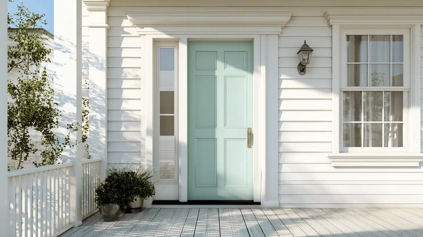
Tidewater is a soft, cool blue-green that looks stunning on front doors and window trim.
It pairs beautifully with white or cream exteriors.
Tidewater’s undertone is a bright, luminous aqua entirely free of gray, which keeps the color looking clean and watery even in full sun.
For the finish, a satin or semi-gloss exterior paint is the common go-to.
It provides the durable, scrub-resistant performance needed for doors and trim while adding a subtle sheen that catches the light.
Avoid it on homes with cool-toned gray walls, the similar undertones can make the door blend in rather than stand out.
5. Benjamin Moore Buxton Blue (HC-149)
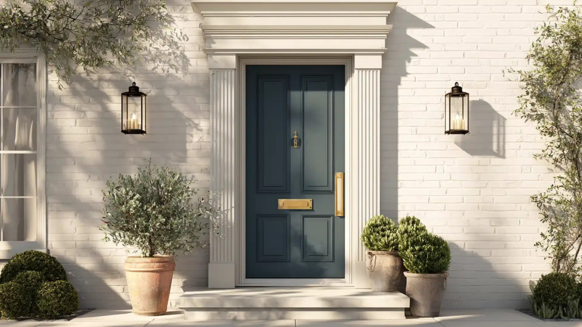
Buxton Blue is a deep, classic blue-green that brings a bold yet refined look to front doors.
It works well with brick, stone, or white-painted homes.
Buxton’s undertone is a smoky slate-gray, which anchors the blue and gives it a muted, historical character.
For a front door, a semi-gloss finish is perfect for bringing out the richness of the shade.
Avoid using it on window trim of smaller windows, the deep tone can make them look even smaller and visually heavy.
Haint Blue Bedroom or Interior Ceilings
Bedrooms and interior ceilings are a less traditional but equally beautiful place for haint blue paint.
The soft blue-green tones create a calm, restful atmosphere in your home.
Many homeowners are now bringing this Southern tradition indoors. It works especially well in spaces where you want to feel relaxed and at ease.
6. Sherwin-Williams Rainwashed (SW 6211)
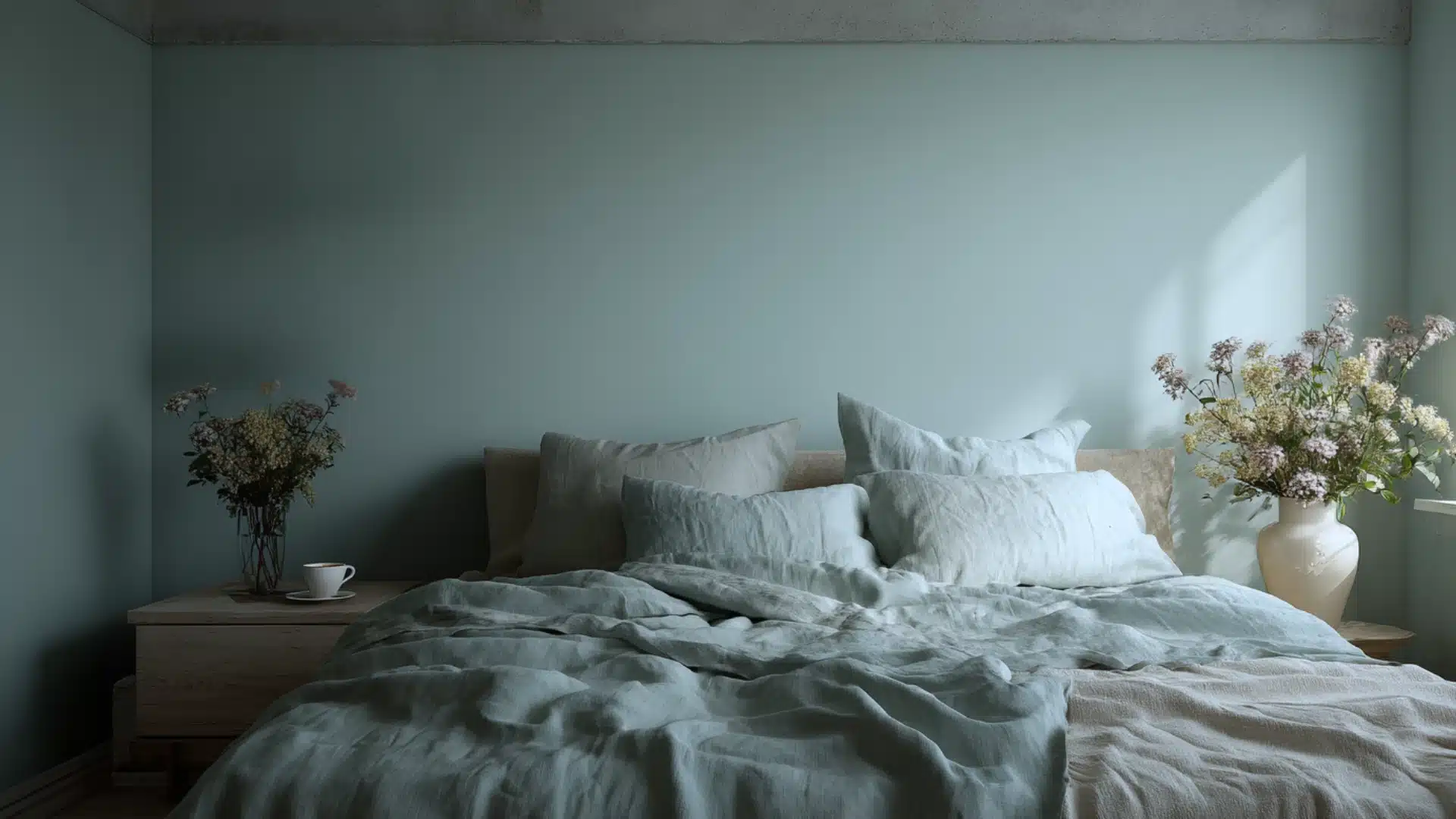
Rainwashed is a soft, dreamy blue-green that feels light and calming on bedroom walls and ceilings.
It creates a peaceful, restful mood in any room.
Its undertone is a soft gray, which mutes the green-blue base and keeps it from looking too bright or minty in natural light.
And for the finish, use an eggshell finish on the walls to provide a gentle, wipeable glow.
Avoid it in rooms with very little natural light, it can take on a cold, washed-out appearance that feels uninviting and flat.
7. Benjamin Moore Icy Blue (2057-70)
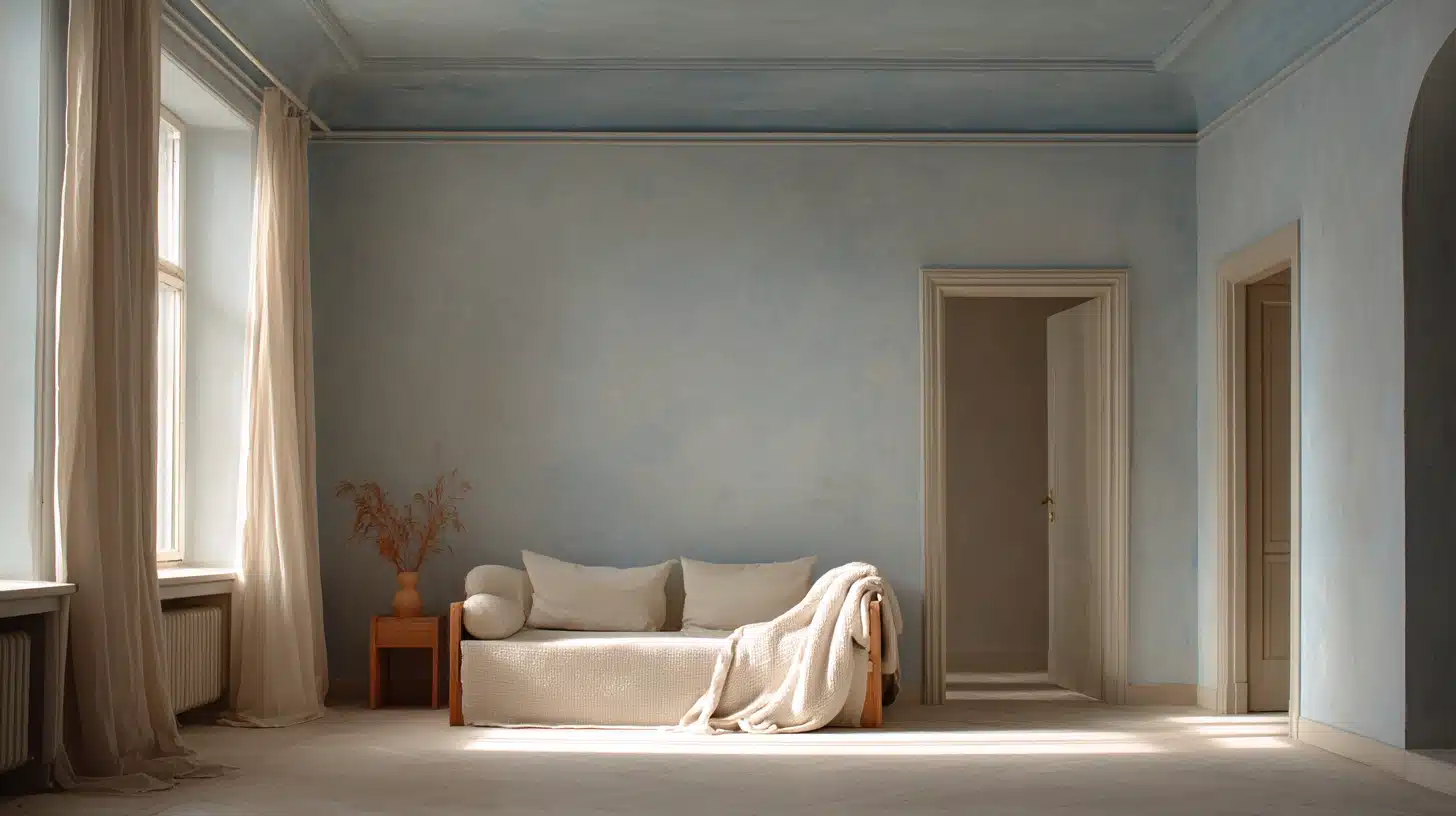
Icy Blue is a pale, whisper-soft shade that works beautifully in the bedroom.
While its high reflectivity gives it a white-washed appearance, its true undertones are a mixture of cool gray and a faint hint of green.
And for the finish, go for matte which will maintain its airy feeling without adding glare.
Avoid using it in bedrooms with high ceilings, though the very light tone can feel too thin and weak, making the ceiling look bare and unfinished.
8. Farrow & Ball Pale Powder (No. 204)
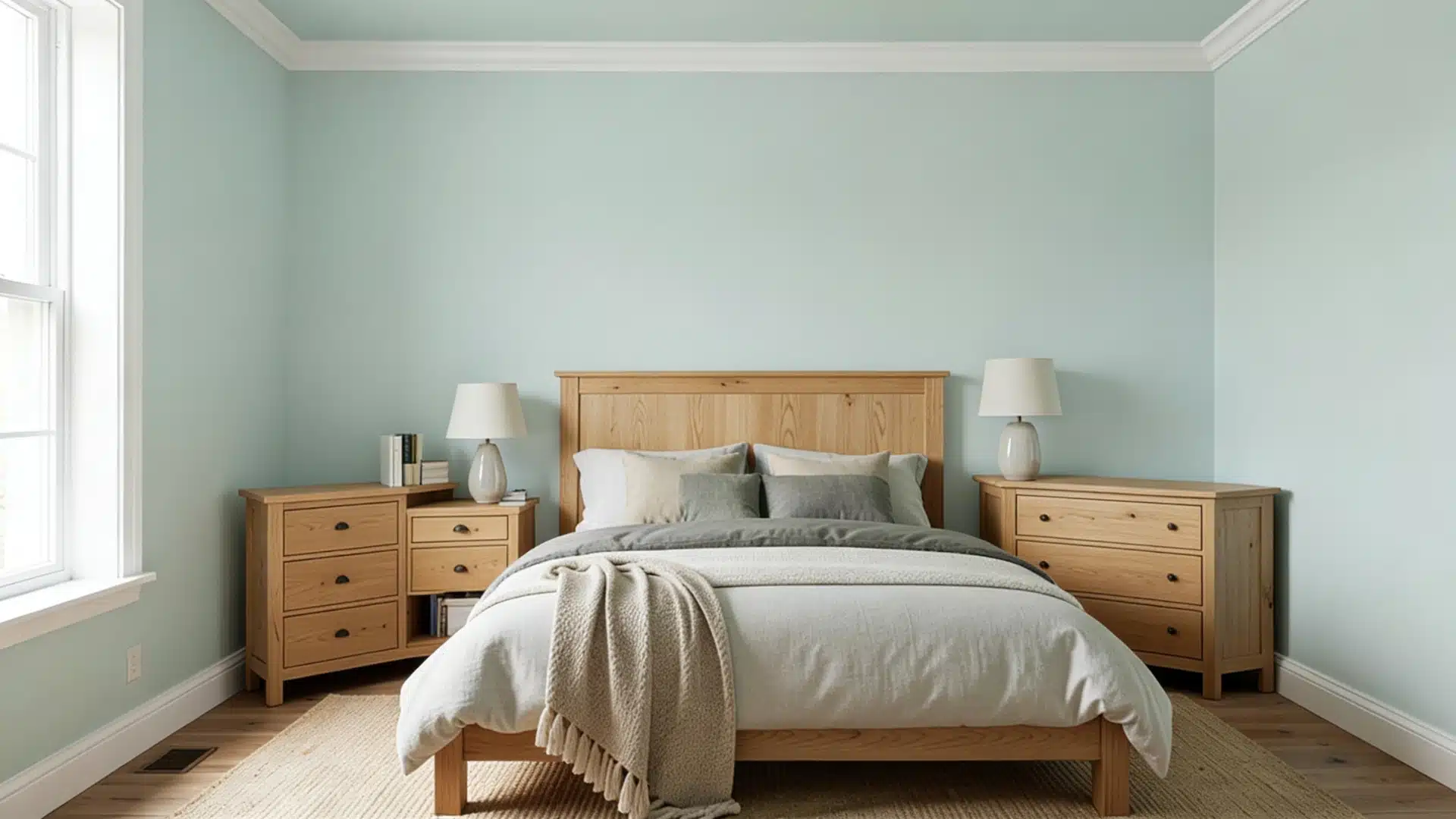
Pale Powder is a soft, airy blue-green with a hint of gray that suits bedroom walls and ceilings perfectly.
It pairs well with white trims and natural wood furniture.
Pale Powder’s true undertone is a subtle mix of chalky white and gray, which mutes the green-blue base.
And to preserve its soft look, use Farrow & Ball’s dead-flat Estate Emulsion.
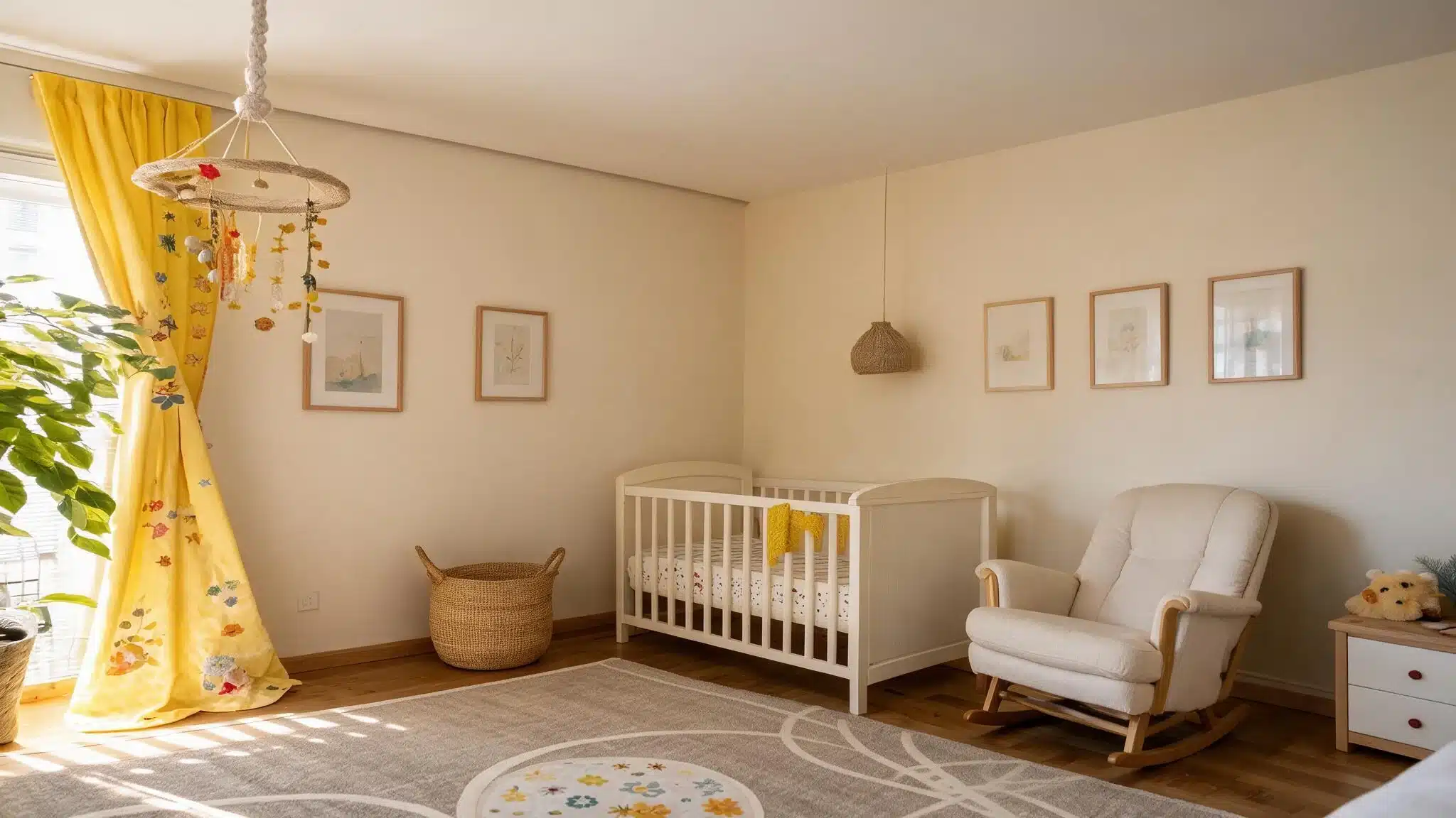
Avoid it in kids’ rooms because the muted, grown-up tone can feel too quiet and understated for lively interiors.
Are There Any Benefits of Using This Color?
Sure, the color looks all fun and pretty, but you might wonder if it’s just about looks or if it has any actual advantages.
It creates a calm, relaxing atmosphere in any room or porch. It also works well with a wide range of home styles and exterior color schemes.
Traditionally, people also believe that the blue-green tone naturally discourages wasps and bugs from nesting on porch ceilings.
And on top of all that, its rich cultural story always adds real significance.
When Haint Blue Paint is Not for You
Just like every coin has two sides, despite its benefits, haint blue paint is not the right fit for every home.
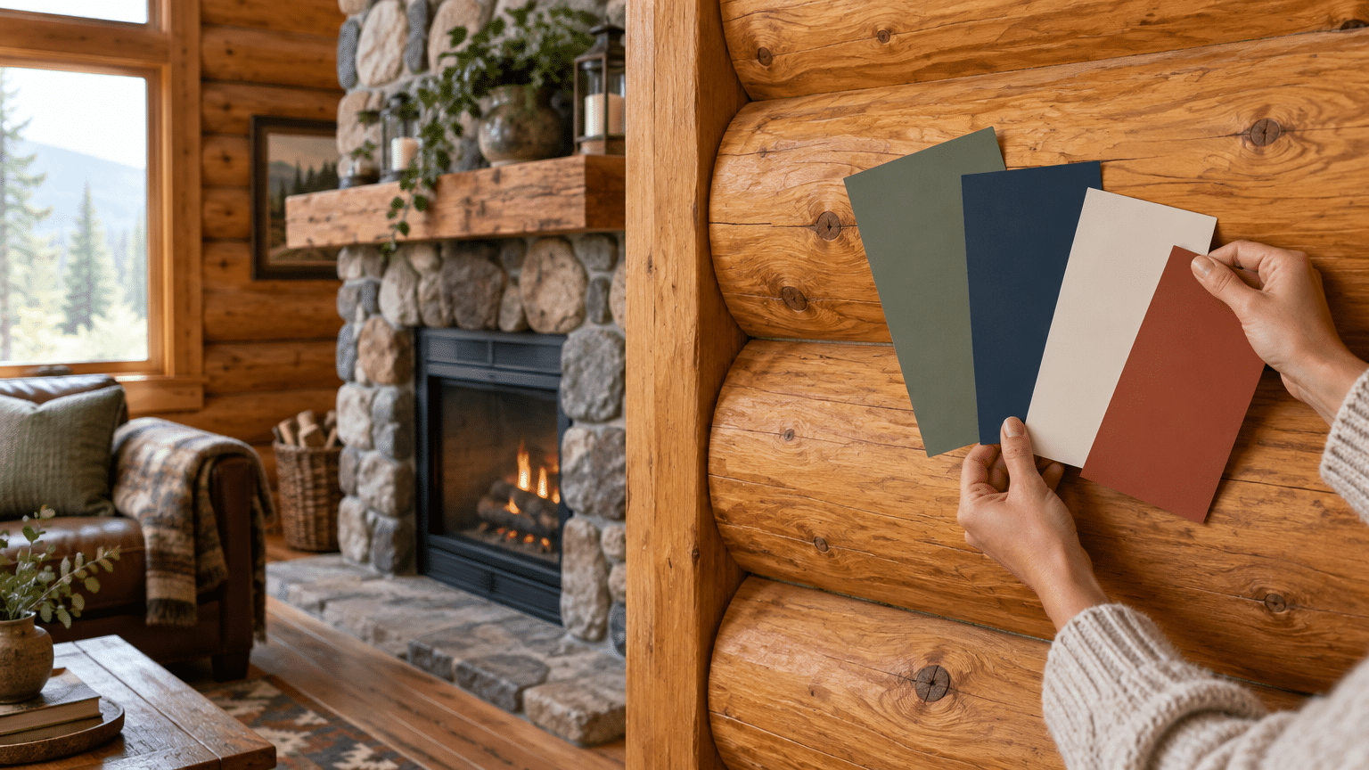
If your home has a very modern or industrial style, this color can feel out of place.
It works best with traditional, coastal, or farmhouse-style architecture. If your exterior walls are already dark or very bold in color, it may clash rather than complement.
North-facing rooms and porches with little natural light are also poor choices for this shade.
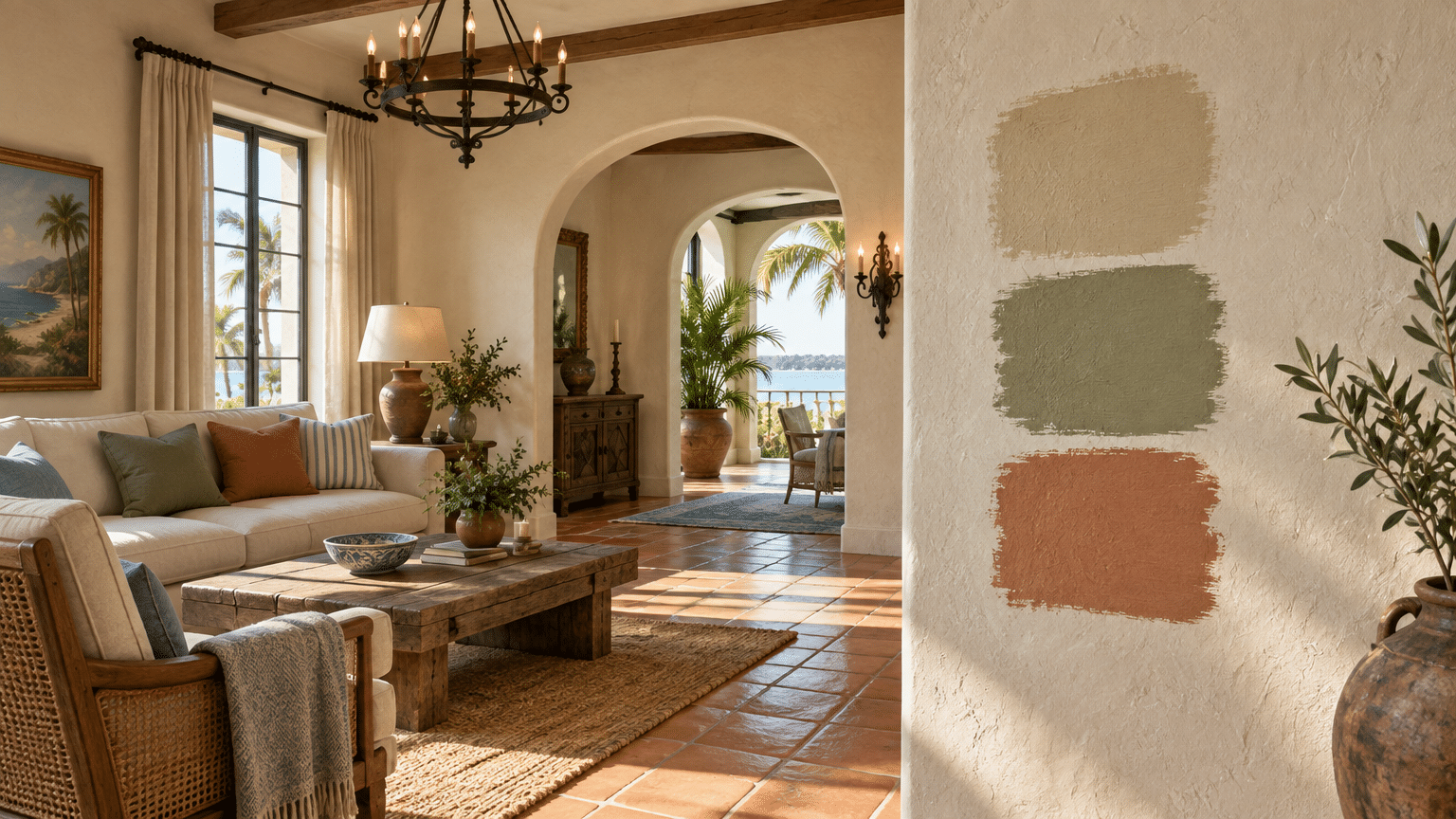
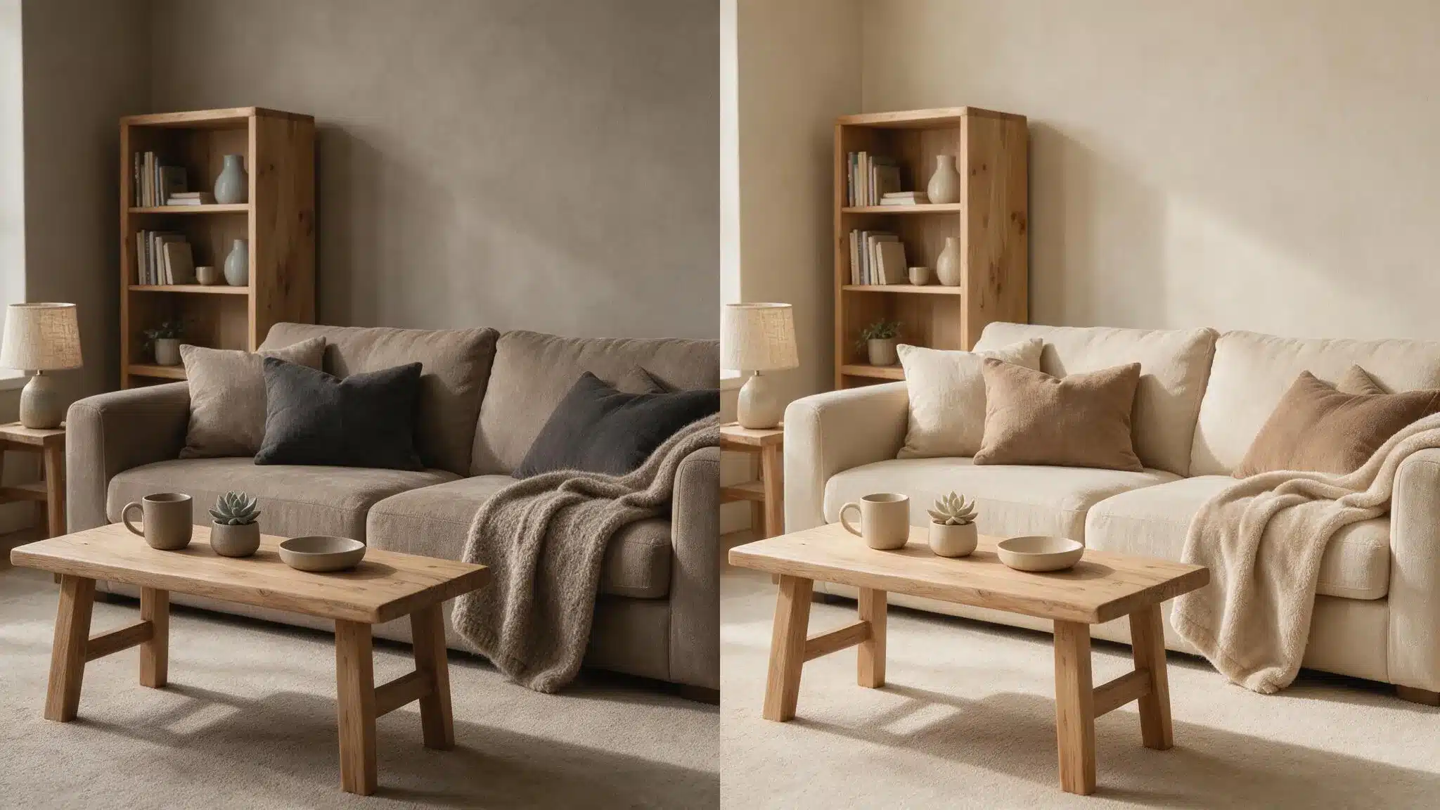
It can especially turn out to be a disaster if you prefer earthy tones throughout your home, as the cool blue-green quality may simply feel disconnected from your style.
Conclusion
Haint blue paint has a story worth knowing.
And today, it brings calm, charm, and a deep sense of history to any home. It works on porch ceilings, front doors, bedrooms, and more.
There are many shades to choose from, and the right one can do wonders for your house.
Just keep in mind when not to use it, choose the right tones, and it will turn out to be a perfect choice for your home.
Frequently Asked Questions (FAQs)
1. What Paint Company Makes Haint Blues?
No single company owns haint blues. Sherwin-Williams, Benjamin Moore, and Farrow & Ball all offer popular shades of it.
2. Can I Paint My Front Door in Haint Blues?
Yes, absolutely. It looks great on front doors and adds a touch of Southern charm to your home’s exterior.
3. What are the Three Colors Not to Paint Your Porch Ceiling?
Avoid bright white, deep red, and stark black. White shows dirt easily, red feels too bold, and black makes the space feel heavy and closed in.