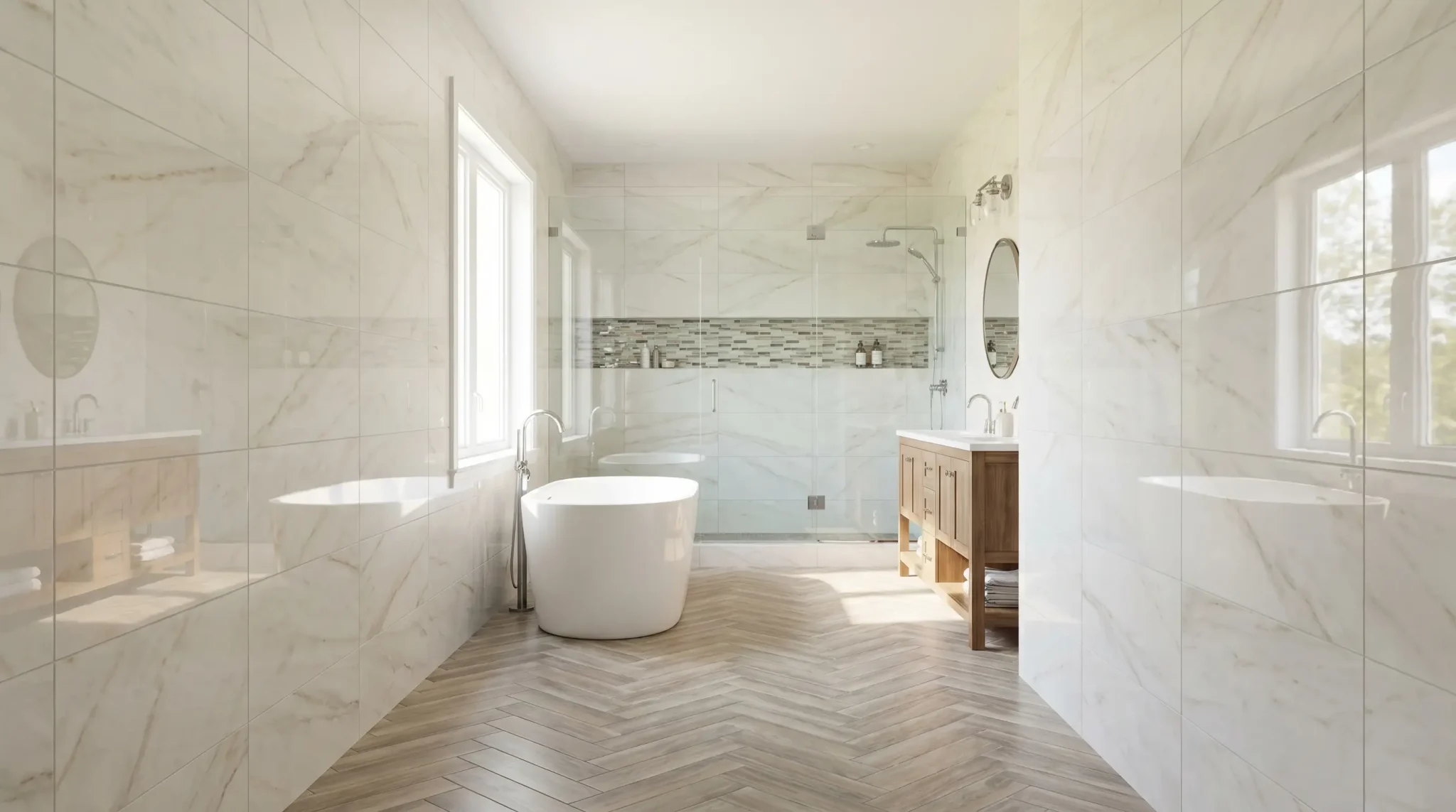
There’s a mistake that happens in almost every bathroom renovation. It happens quietly, before a single tile is laid or a single tap is fitted. You fall in love with a vanity unit. You order it, it arrives, and then, only then, you start looking for tiles to go with it.
That sequence feels logical. It isn’t.
People spend hours comparing different vanity units for bathroom renovations before realising that the surrounding tile choice will ultimately control how spacious, warm, bright, or balanced the room feels
When you choose tiles to match a bathroom vanity unit, you’re designing in the wrong direction. You’re letting one element dictate everything else, without first asking what the room itself needs. And the room always has an opinion.
The right order is: read the room first. Then choose a tile. Then choose vanity, or at least confirm it still makes sense.
Here’s what that actually looks like, across seven of the most common vanity styles.
The Single Basin Vanity
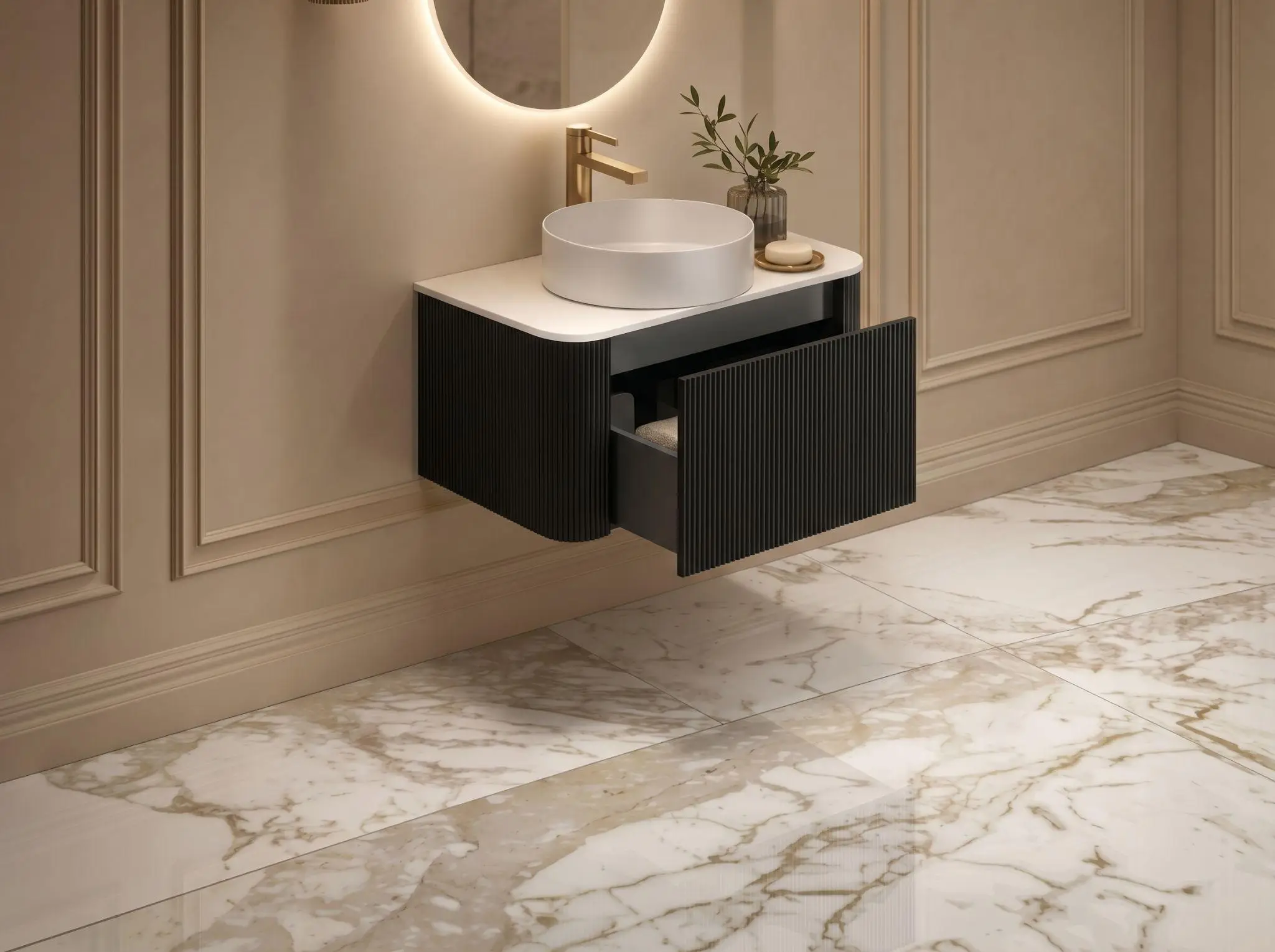
A single vanity is the most common starting point and the most commonly over-tiled.
The instinct, especially in a smaller bathroom, is to get busy. But a single vanity already dominates a small space. It’s a box, usually front-and-centre, with a mirror above it. Add too much tile variation and the room becomes restless.
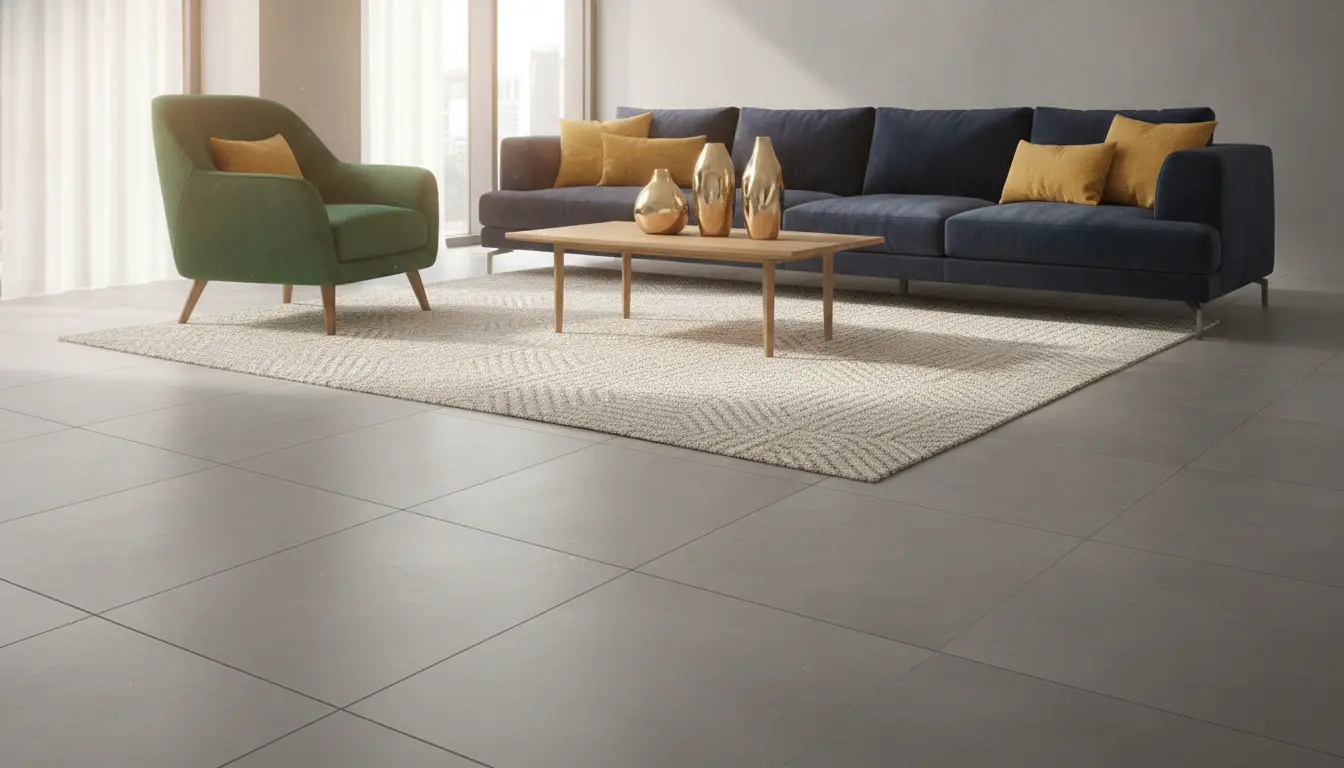
What actually works: choose a large-format floor tile in a neutral tone, warm stone, cool concrete, or soft white, and let the vanity carry the character.
If your vanity is simple and plain, you can afford a more textured tile. If you have a fluted vanity unit and an interesting finish, keep the tile quieter.
The Double Sink Vanity Unit
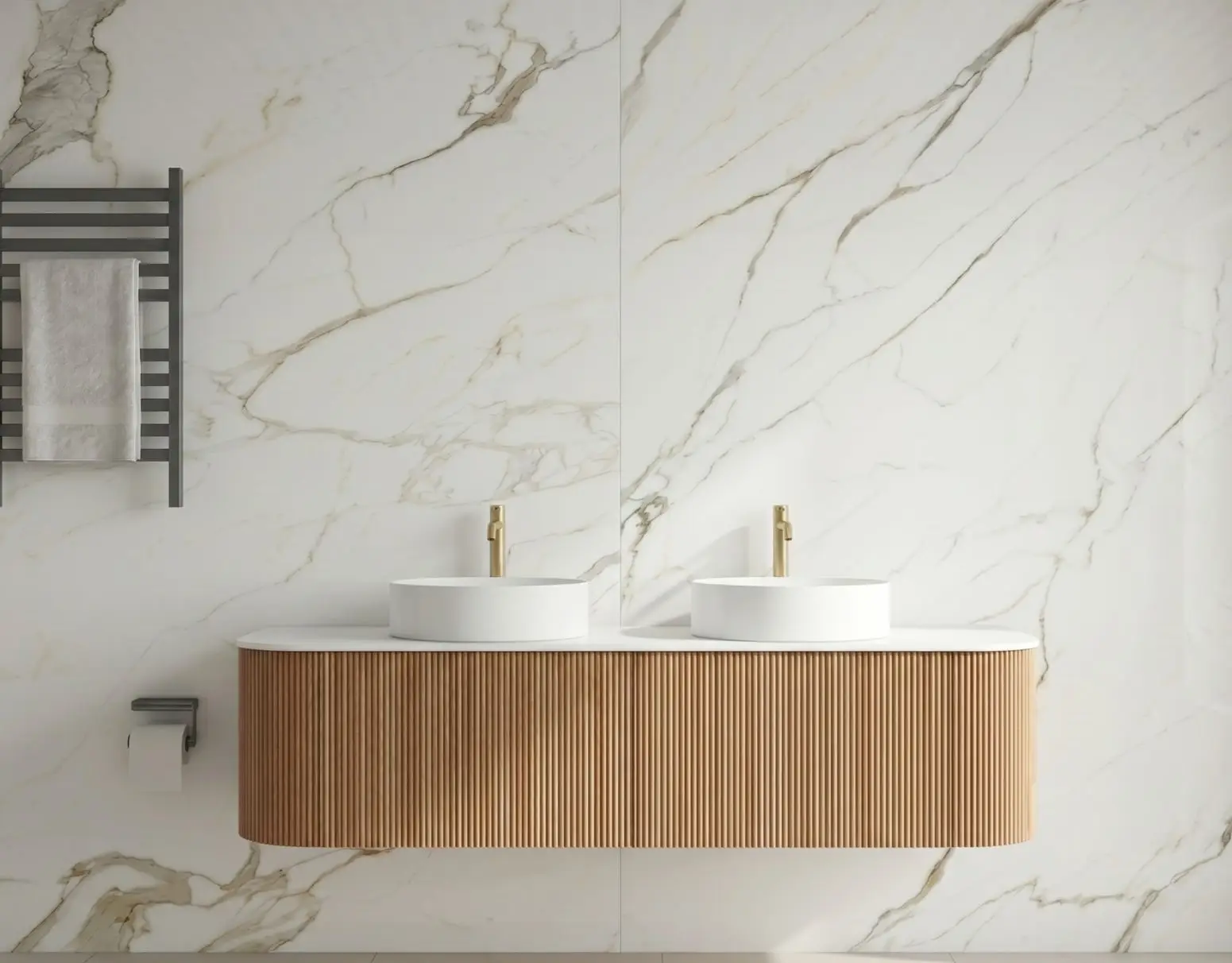
Double vanities signal intention. That’s exactly why the tile choice matters more here, not less.
A double vanity unit creates a wide horizontal band across the room. The floor tile needs to handle that width without making the space feel like a corridor.
Avoid small mosaic tiles on the floor in these rooms. They create visual noise at exactly the wrong scale. Instead, a 600×1200mm rectified tile gives the floor the kind of quiet authority that lets the double vanity breathe.
For the wall, keep it simple behind the vanity unit. The mirror or mirrors will do the heavy lifting. A matte-finished large-format wall tile keeps the eye moving rather than stopping.
At this scale, material selection becomes especially important, which is why many modern bathroom layouts rely on carefully chosen porcelain surfaces that balance durability with design clarity. Royale Stones offers a curated selection of bathroom floor tiles and vanity unit combinations designed for both compact and larger family bathrooms, making it easier to match proportions without compromising on style.
The Floor-Standing Vanity
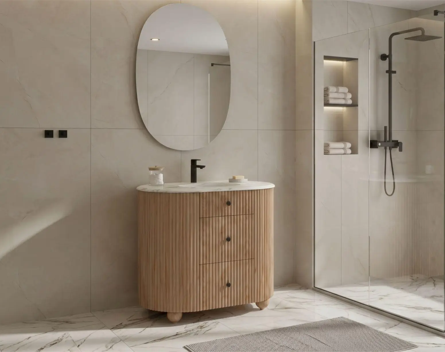
Floor-standing vanity units expose what wall-hung units hide: the floor beneath them.
Because the tile continues under and around a floor-standing unit, the floor becomes a much more visible design element. A tile that looks fine in isolation can look completely different when it’s surrounding a large piece of furniture.
Test the tile swatch against the base of the vanity unit, specifically, not just against the door fronts or the worktop. The colour temperature of the floor tile, caught in the shadow beneath the unit, will shift. What reads as warm white in daylight reads as yellow in shadow.
Light-toned bathroom floor tiles work particularly well here. They push light back into the room rather than absorbing it, which helps open up the floor plan visually.
The Cloakroom or Corner Vanity
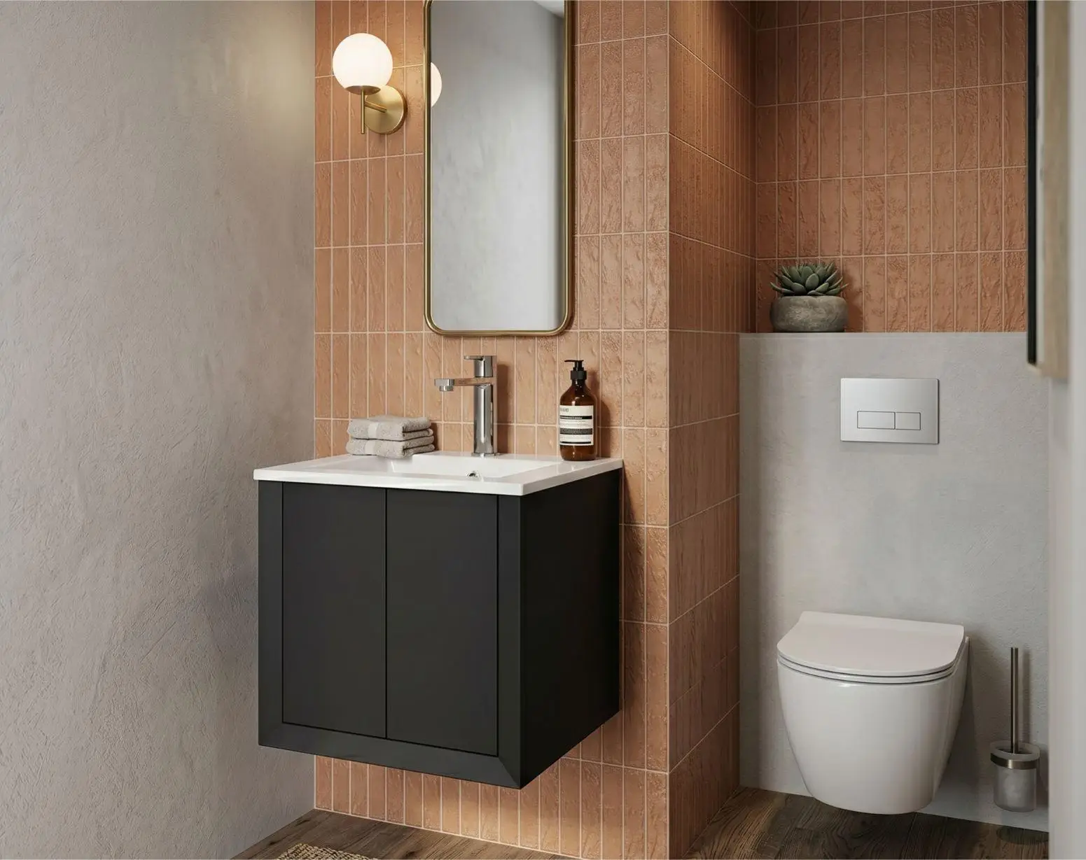
Cloakrooms are the one space where the usual rules loosen.
The room is small enough that you’re not trying to create a cohesive environment; you’re creating a moment. That’s permission to go darker, more textural, more interesting.
A corner vanity, by necessity, becomes a secondary element. The eye doesn’t land on it the way it would in a full bathroom. Which means the tile can do more of the talking.
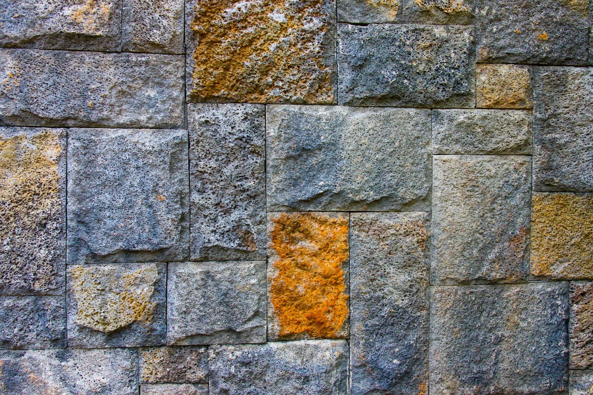
This is where you can consider a wall tile with movement; a marble-effect porcelain, a subtly veined stone-look, or even a dark slate format that you’d never use in a larger bathroom. In a cloakroom, a wall tile that runs floor to ceiling in a single tone and texture will make the space feel complete rather than cramped.
Keep the floor tile simple and light. Let the walls carry the drama.
The Wooden Fluted Vanity
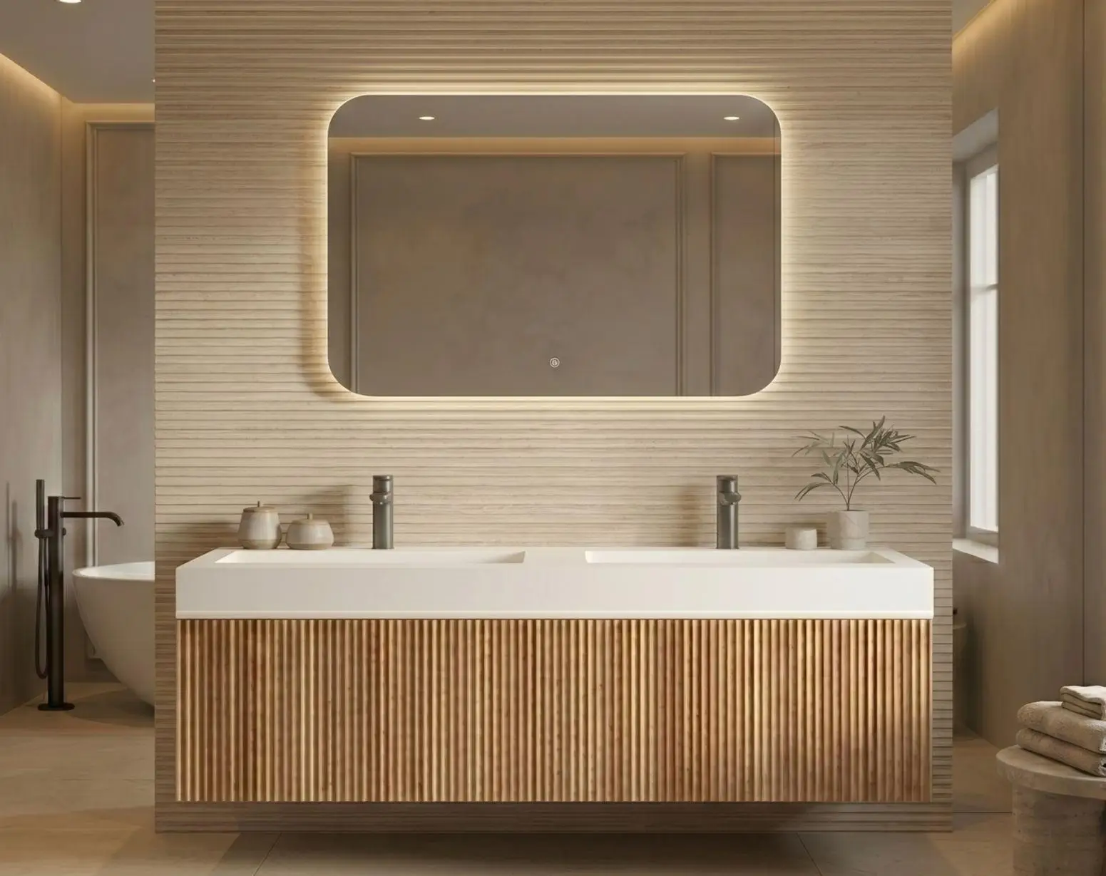
The fluted wood vanity has had its moment, and it’s staying. The vertical ribbing adds texture without pattern, warmth without weight. It’s one of the easier vanity styles to tile around, because it does something most furniture doesn’t: it gives you a rhythm.
A long-format tile laid in a stacked vertical pattern will echo the fluting without copying it. A horizontal brick bond on the floor creates contrast that grounds the ribbed vertical of the unit.
What to avoid: a very busy stone-effect tile alongside a fluted wood front. Two textures competing for attention in the same visual zone, the floor-to-knee area, will exhaust the eye. One of them needs to stand down.
The fluting already earns the attention. Let it.
The Marble-Top Vanity
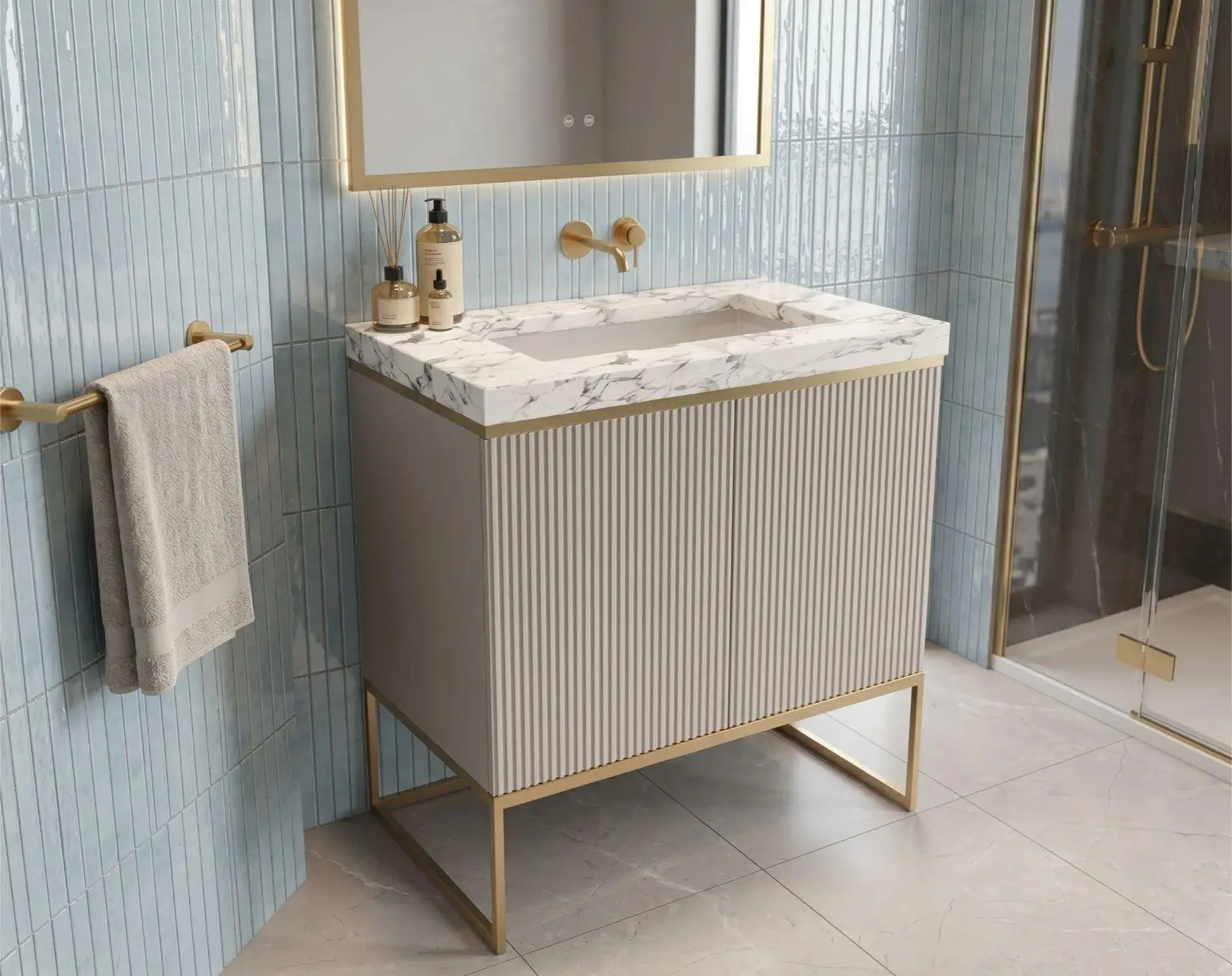
Real or engineered marble at the basin brings a natural variation that most tiles can’t match, and most tiles shouldn’t try to match.
The mistake here is doubling down. Marble vanity top plus marble-effect floor tile creates a room that looks like a showroom, not a home.
Marble works best when it’s singular. Give it a plain, matte-finish tile in a complementary tone, a warm greige, a cool linen, a soft taupe, and the marble becomes the centrepiece it’s supposed to be. You’re not hiding the rest of the bathroom. You’re framing the focal point correctly.
If the marble has warm undertones, go warmer on the tile. If it’s cool and grey-veined, cool the tile to match. Don’t cross the temperature lines; that’s where the room starts to feel unresolved.
The Double Sink on a Shared Unit
Different from a standard double vanity, this is two basins set into a long run of cabinetry, typically seen in larger family bathrooms or master en-suites.
The design challenge is proportion. A long vanity unit running wall-to-wall creates a very strong horizontal line. The tile selection needs to interrupt that horizontal at some point, or the room will feel low and wide rather than tall and airy.
One approach: run the wall tile above the vanity all the way to the ceiling in a vertical format. It draws the eye up and counteracts the horizontal pull of the cabinetry.
For the floor, consistent large-format tiles, laid on the diagonal if the space allows, add geometry without adding clutter. The diagonal cuts across both the horizontal of the vanity and the vertical lines of the walls, giving the room movement.
The Part You Do First
None of the above works unless you’ve answered three questions before you commit to anything:
1. How much natural light does this room get?
Light changes everything: tile colours, grout tones, the apparent weight of a vanity unit. A tile that looks crisp in a showroom can look flat and dull in a north-facing bathroom.
2. How tall is the ceiling?
Low ceilings need vertical emphasis. High ceilings can handle horizontal runs and large-format floors without feeling oppressive.
3. What’s the room actually for?
A cloakroom for guests is a different brief to a family bathroom used twice a day by three people. One should feel interested. The other should feel durable, calm, and easy to clean.
Get those answers first. Then look at the tile. Then, and only then, confirm your vanity choice fits what you’ve decided.
That’s the right order.