

Have you ever finished painting a room, stepped back, and realized the color still did not feel right?
That is often what leads people to search for a neutral that sits between gray and beige without looking dull or dated.
Benjamin Moore Collingwood is a popular choice for that reason. It appears in plenty of paint samples and room photos, but those images rarely show how much the shade can change in real light.
It has been on the walls of my guest bedroom for two years, through bright summer mornings and darker winter afternoons.
In this paint color review, we will see how it shifts throughout the day, the colors it pairs with, and where it works best.
Collingwood Benjamin Moore Color Description – What it Looks Like
Collingwood OC-28 is a warm gray that sits comfortably in the neutral family without leaning too far in any direction. It’s not quite gray, not quite beige, it’s somewhere wonderfully in between.
It is one of Benjamin Moore’s best-selling colors (part of the Benjamin Moore’s Off-White Collection), and it really makes sense.
With an LRV of 62.14, it is not too light to lack substance and not too dark to close in a space. It offers a soft look that works as a fantastic whole-home color option.
I’ve noticed more and more designers turning to Collingwood when they need a color that bridges the gap between cool and warm.
Complete color details:
| Spec | Value |
|---|---|
| LRV | 62 |
| Hex | #D3CDC4 |
| RGB | 211, 205, 196 |
| Undertone | Violet-gray with a soft greige base |
| Color Family | Warm Gray / Greige |
| Collection | Benjamin Moore Off-White Collection |
Perfect Interior Spaces for Collingwood Benjamin Moore
This soft, warm gray effortlessly adapts to living rooms, bedrooms, kitchens, and other spaces.
Living Rooms

In living rooms, Collingwood stays out of the way. It’s a quiet background that lets furniture stand out. When paired with wood and linen, it reads lived-in rather than staged.
It stays bright during the day, then the undertone warms things up once the sun goes down.
Bedrooms
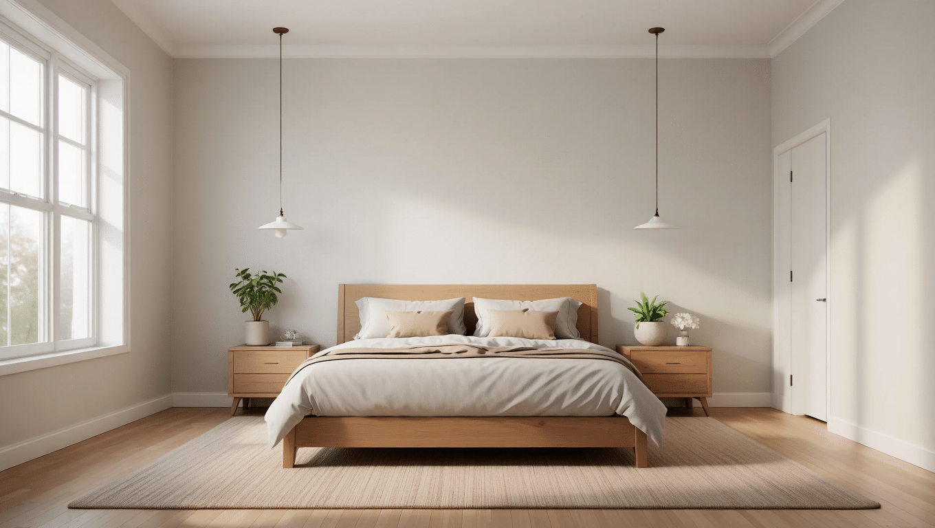
For bedrooms, Collingwood offers a sense of calm that helps turn your space into a true retreat.
I love how it never feels too cool or sterile, which is a common problem with many grays. Instead, it provides a gentle hue that recedes into the background, letting your bedding and personal items the center stage.
It works wonderfully with crisp white linens or deeper, richer bedding colors for a more dramatic look.
Kitchens & Cabinetry
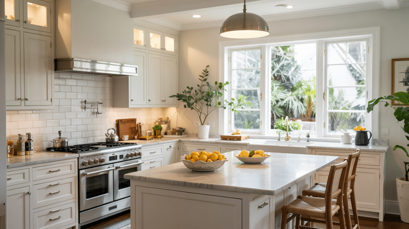
In kitchens, Collingwood provides just the right amount of contrast when used with white countertops or appliances. For cabinetry, it offers a fresh take on the painted-cabinet trend without the boldness of darker colors.
It pairs well with marble countertops, stainless steel fixtures, and both brushed nickel and brass hardware.
It’s light enough to keep the kitchen feeling clean and bright, but has enough depth to hide the inevitable kitchen splatters better than a true white.
Bathrooms
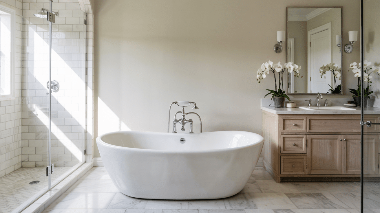
Bathrooms painted in Collingwood can take on a lovely spa-like quality, especially with the right lighting.
The warm undertones help counter the cool surfaces often found in bathrooms, such as tile and porcelain.
It works well in small powder rooms, where the lighter LRV helps the space feel less closed in, as well as in master bathrooms, where it looks more like a luxury greige color than a plain gray shade.
You can always pair it with plush white towels for a hotel-inspired look.
Home Offices
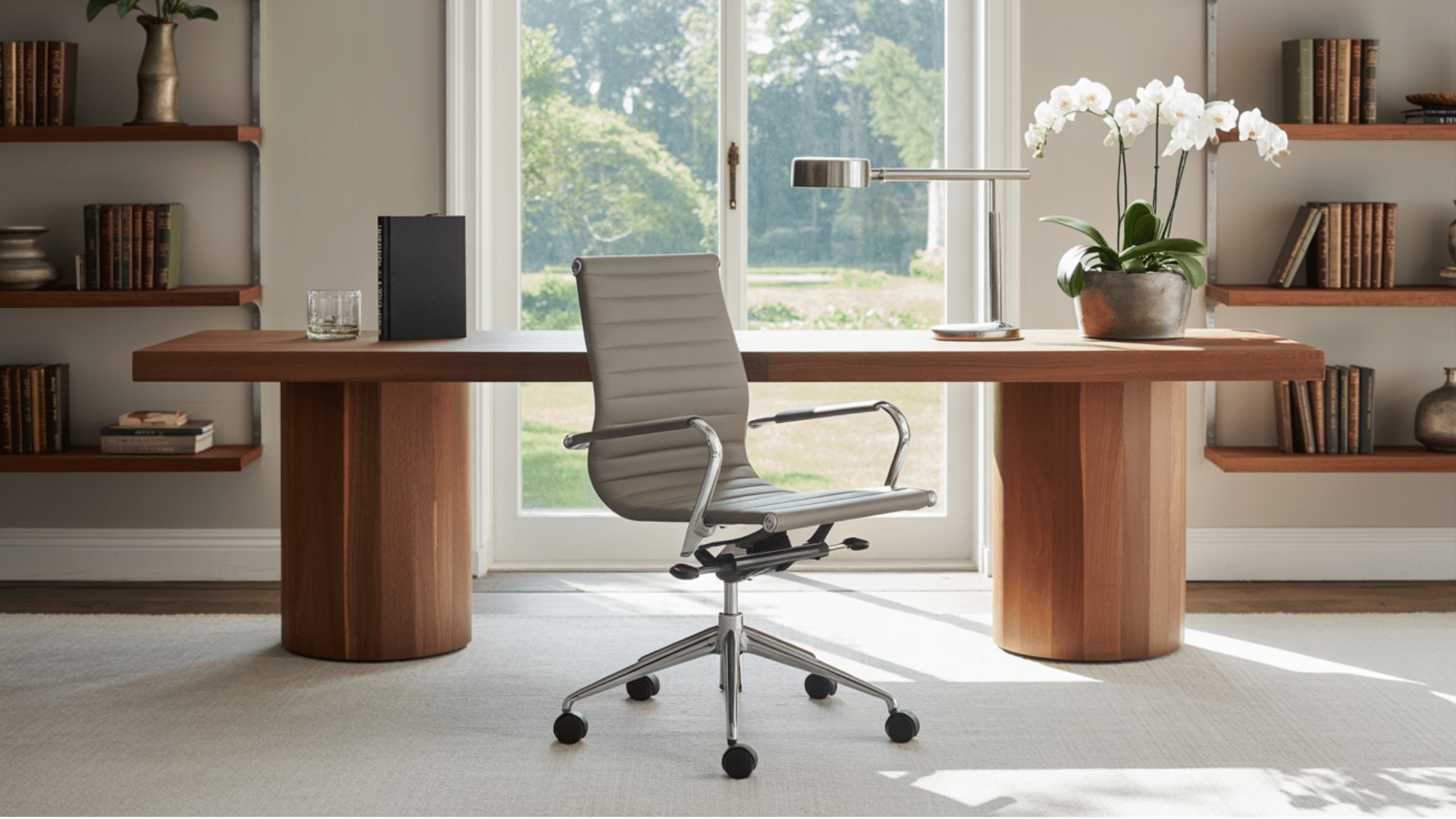
Unlike stark whites or true grays that can feel too institutional, Collingwood benjamin moore provides a warm, focused environment to home offices without feeling boring.
It’s neutral enough to serve as a backdrop for video calls without distraction, yet warm enough to create a space you’ll want to spend time in.
It works particularly well with wood desks and leather office chairs.
On Exteriors, Collingwood Looks Lighter and Cooler Than it Does Indoors
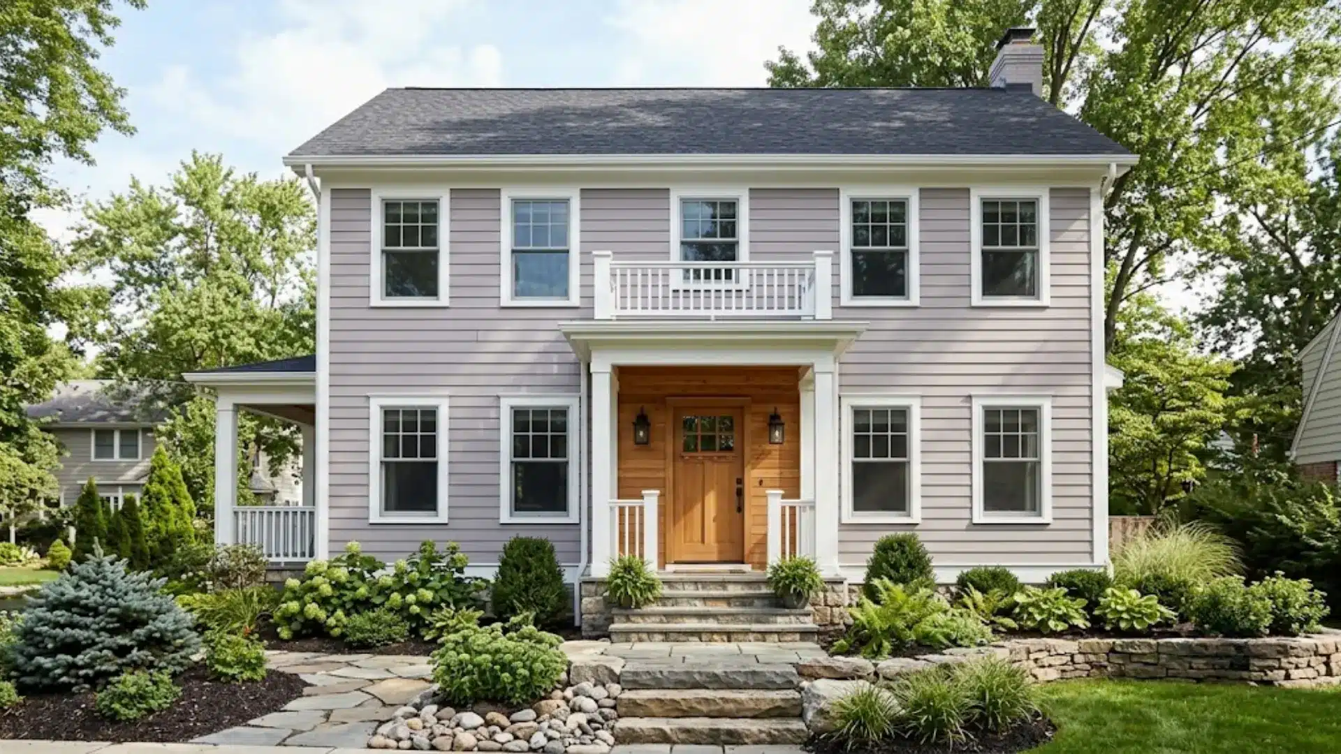
Outdoors, that same violet undertone behaves differently than it does inside.
Natural light usually makes it look brighter and more neutral than it does inside. In shaded areas, the gray may appear cooler, while warmer sunlight can bring out its softer side.
Since the undertone can shift across different sides of a house, it is best to test a large sample before painting.
Collingwood works well with crisp white trim, natural wood, stone, deep gray, navy, and muted green accents.
It is a good exterior choice for anyone who wants a pale gray that feels soft without looking too cold or too beige
Collingwood vs. Other Neutrals (Revere Pewter vs. Balboa Mist vs. Edgecomb Gray)
If you’re stuck between these four, the undertone is really what decides it for you.
Go with Collingwood if your room gets mixed light throughout the day and you want a gray that can lean either cool or cozy depending on the hour. It’s the safest middle ground of the three.
Go With Revere Pewter
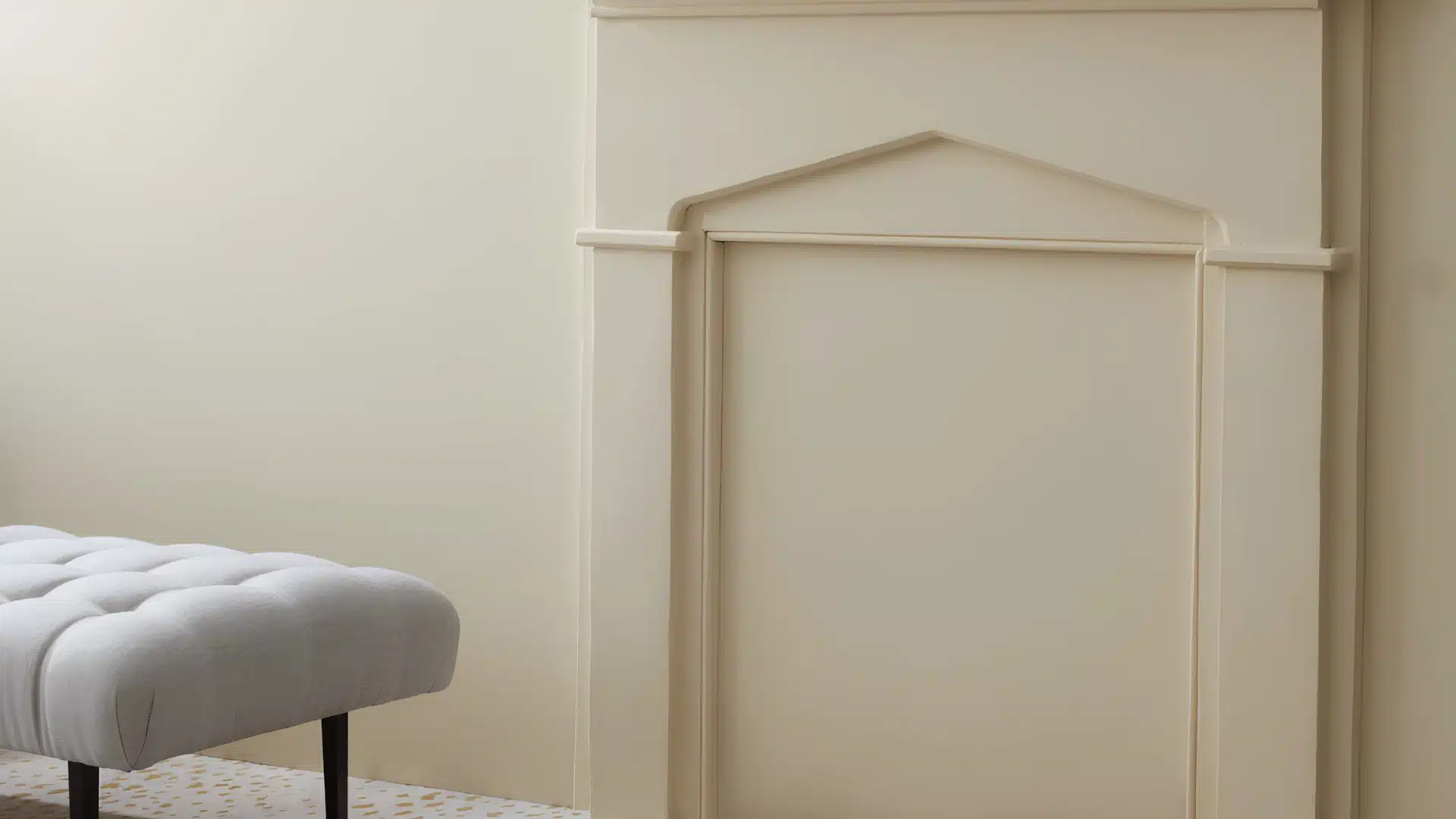
This is if you want something grounded and a touch darker.
Revere Pewter runs a lower LRV, in the mid-50s, and its green undertone pairs nicely with wood floors and brass fixtures, and it hides scuffs better than the others since it sits lower on the LRV scale.
Go With Balboa Mist
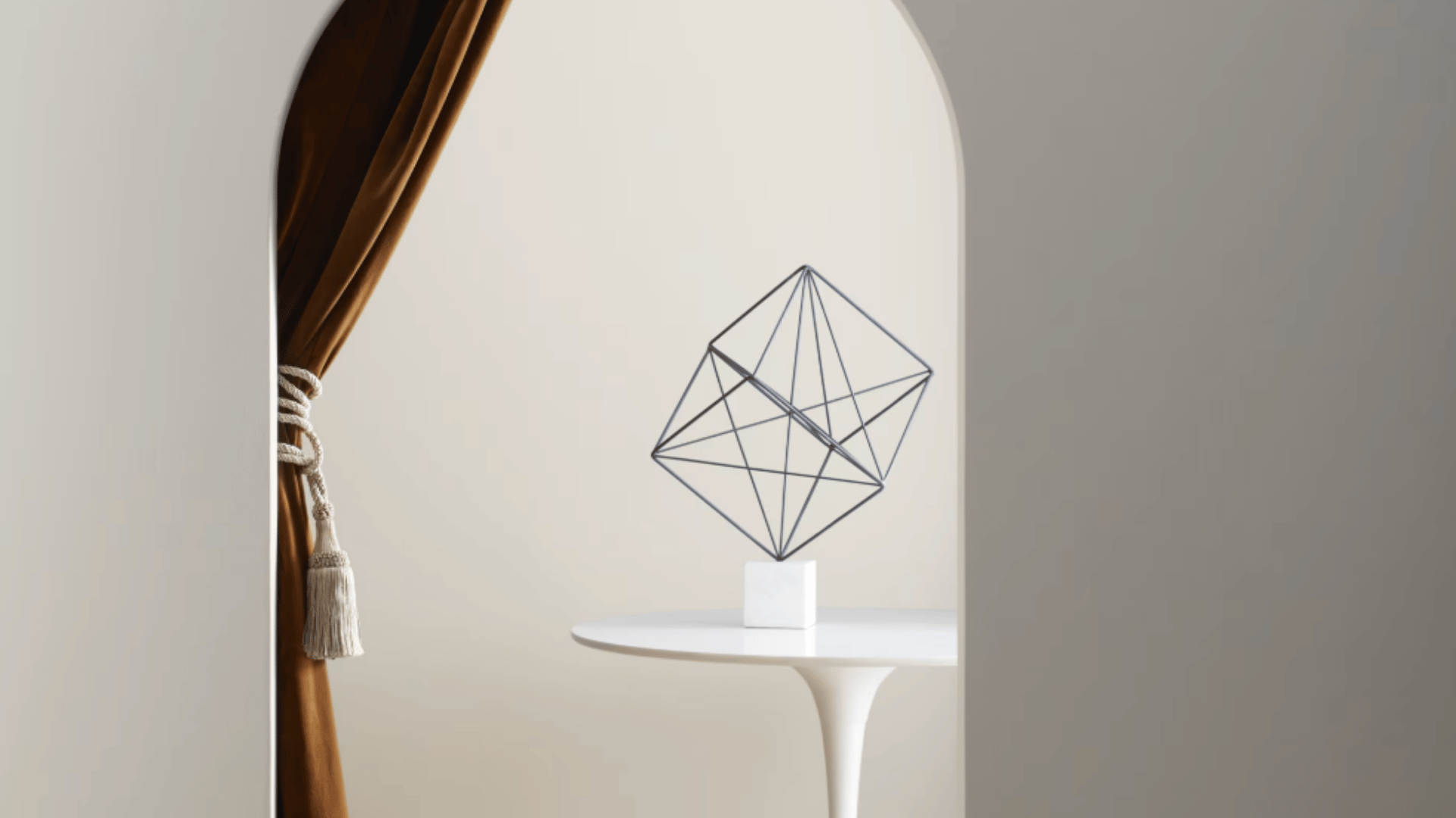
If your room is naturally bright and you don’t mind a softer, more pink-toned gray.
It reads lighter on the wall than Collingwood and can turn almost lavender in north-facing rooms, so test it first if a purple cast worries you.
It’s best when you want the lightest option of the all.
Go With Edgecomb Gray
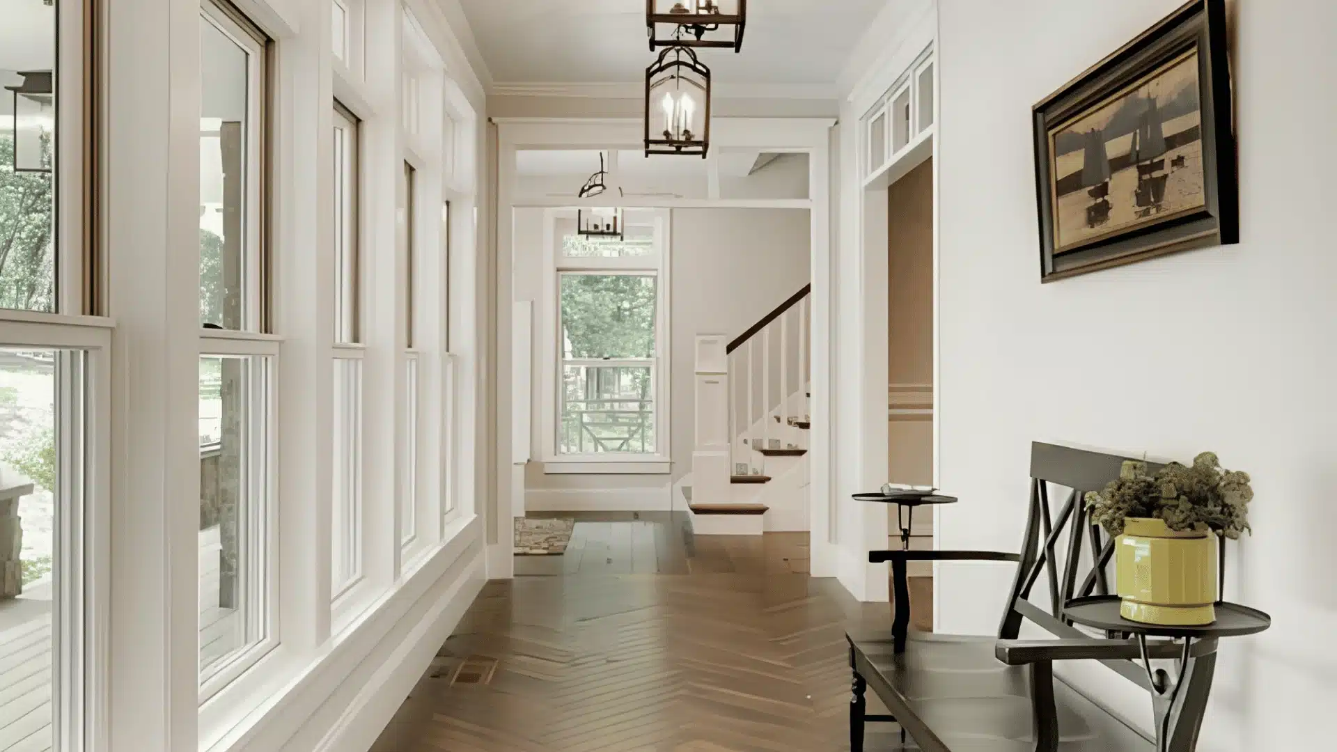
This is if you want the beige side of the greige spectrum instead of the gray.
Edgecomb Gray shares a similar LRV with Collingwood, but its undertone leans warmer and more tan, so side by side, Collingwood looks gray and Edgecomb Gray looks distinctly beige.
We’ve covered it in more depth in our full Edgecomb Gray review, including which rooms and lighting conditions bring out the beige side most.
How Light Changes Collingwood, Room by Room
North-facing rooms make Collingwood look cooler, while south-facing rooms bring out its warmer, softer side. East-facing spaces feel warmer in the morning, and west-facing rooms become warmer later in the day.
Warm bulbs (2700–3000K) give it a cozy greige look, while cooler bulbs (3500–4100K) make it appear grayer.
For the most balanced look, use 3000–3500K lighting.
For trim, Benjamin Moore White Dove (OC-17) is a great pairing idea since its warmth mirrors Collingwood and keeps it from looking cold.
And if you want more contrast, Chantilly Lace (OC-65) works in rooms that already get plenty of natural light.
Beyond trim, Collingwood also pairs well with muted greens, navy, and terracotta shades. Avoid stark blue-whites and strong beiges, which fight with the undertone instead of complementing it.
Conclusion: Is Collingwood Right for Your Space?
So where does that leave you with Collingwood Benjamin Moore OC-28?
If you’ve read this far and still can’t quite picture it on your own walls, that’s completely normal.
Paint almost never looks the same on a screen as it does in your actual room, under your actual light.
That’s really the only test that matters here. Grab a sample, tape it up in two or three spots, not just one, and check it in the morning, in the afternoon, and again at night.
That’s the best way before making a big decision.
People Also Ask
1. Does Collingwood Pair Well with Dark Hardwood Floors?
Yes. The gray undertone plays off dark wood nicely, keeping the floor and walls from competing with each other.
2. Is Collingwood a Good Ceiling Color Too?
Usually not. Most people pair it with a soft white ceiling so the room still feels open and bright above.
3. Can Collingwood Work in a Nursery?
Yes. It’s calm and gentle enough for a nursery, and it pairs easily with soft lighting and pastel accents.
4. Does a Neutral Like Collingwood Help with Resale Value?
Neutral grays tend to appeal to more buyers, so a color like Collingwood can help a home show better.
5. Is Collingwood a Good Choice for Kitchen Cabinets?
Yes, especially on lower cabinets or an island where you want warmth without going as dark as navy or charcoal. Pair it with white uppers or a light stone counter so the cabinets don’t read heavy in a smaller kitchen.








One Response
Hi,
I was wondering about the first photo in this article. Is the wall color Collingwood or is the cabinet color Collingwood? Do you know what color the cabinets are in that top photo?
Thank you!