I’ve stood in the paint aisle feeling like my brain was melting. Hundreds of colors, all looking similar, all making me doubt everything.
The truth is that this decision is genuinely hard.
First, there are too many options. Paint companies offer thousands of shades. Your brain freezes when comparing 30 whites that look identical.
Then there’s lighting. That perfect gray in the store looks purple at home. It changes throughout the day, too. I painted a room beige once, and it turned pink by noon.
Colors also play tricks based on what’s around them. The same paint looks darker next to white trim, lighter next to dark floors.
That’s why this feels so overwhelming. It’s not you. It’s a genuinely tough decision.
Key Principles to Follow When Choosing Paint Colors
Look, I’ve learned these the hard way. After repainting rooms multiple times, here’s what actually works.
1. Start with your lighting
Check how much natural light your room gets. North-facing rooms need warm colors because they get cold, bluish light.
South-facing rooms can handle cooler tones. This one rule saves you from major mistakes.
2. Test on the actual wall
Paint a big square, at least 2 feet by 2 feet. Live with it for a few days.
Watch how it looks in morning light, afternoon sun, and evening lamplight. Those tiny chips don’t tell you anything useful.
3. Consider what’s already in the room
Your floor color matters. Your furniture matters. That big rug you love? It’s going to change how the wall color looks.
I learned this when my new gray paint clashed with my brown couch.
This single rule can completely change how you choose paint colors for tricky spaces.
4. Work with undertones, not just the main color
Every paint has an undertone. That “white” might lean pink, blue, or yellow.
Those undertones pop out once it’s on your wall. Hold samples next to your trim and floors to spot them.
5. Go lighter than you think
Colors look way more intense on four walls than on a sample. That medium blue you love? It’ll feel darker and bolder once it’s surrounding you. I always pick one shade lighter now.
6. Stick to three colors max for your whole space
One main color, one accent, maybe a third for trim. More than that starts feeling chaotic.
How to Pick Paint Colors for Different Rooms (Best Interior Paint Colors by Room)
Different rooms need different approaches. Trust me on this.
Living Rooms
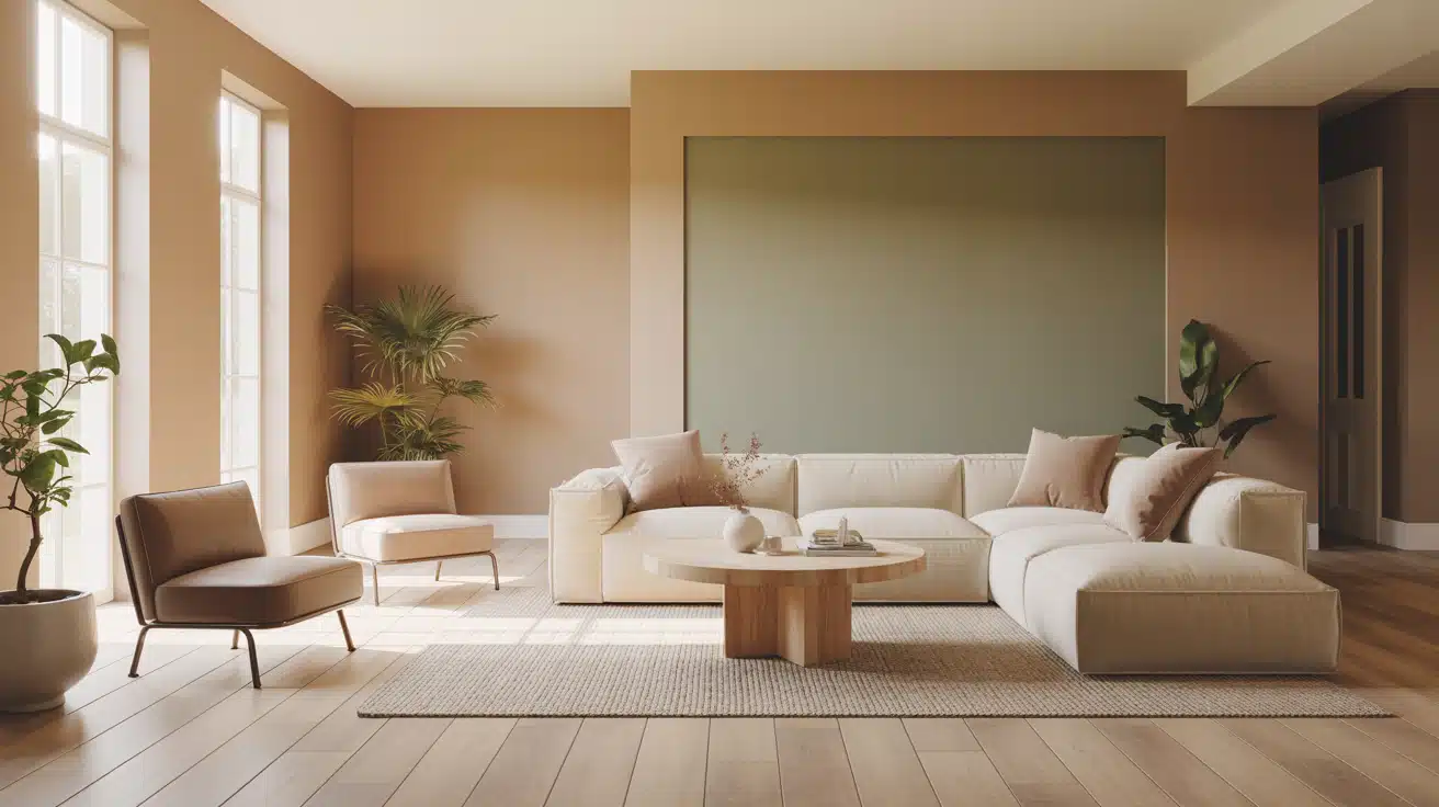
Stick with neutrals – warm grays, beiges, or greiges. They work with any furniture and last through style changes.
Lots of natural light? Cooler grays work fine. Less light? Go warmer with beiges.
Your living room likely connects to other spaces, so pick a color that flows. Bold colors work best as accent walls – one wall only, not all four.
Bedrooms
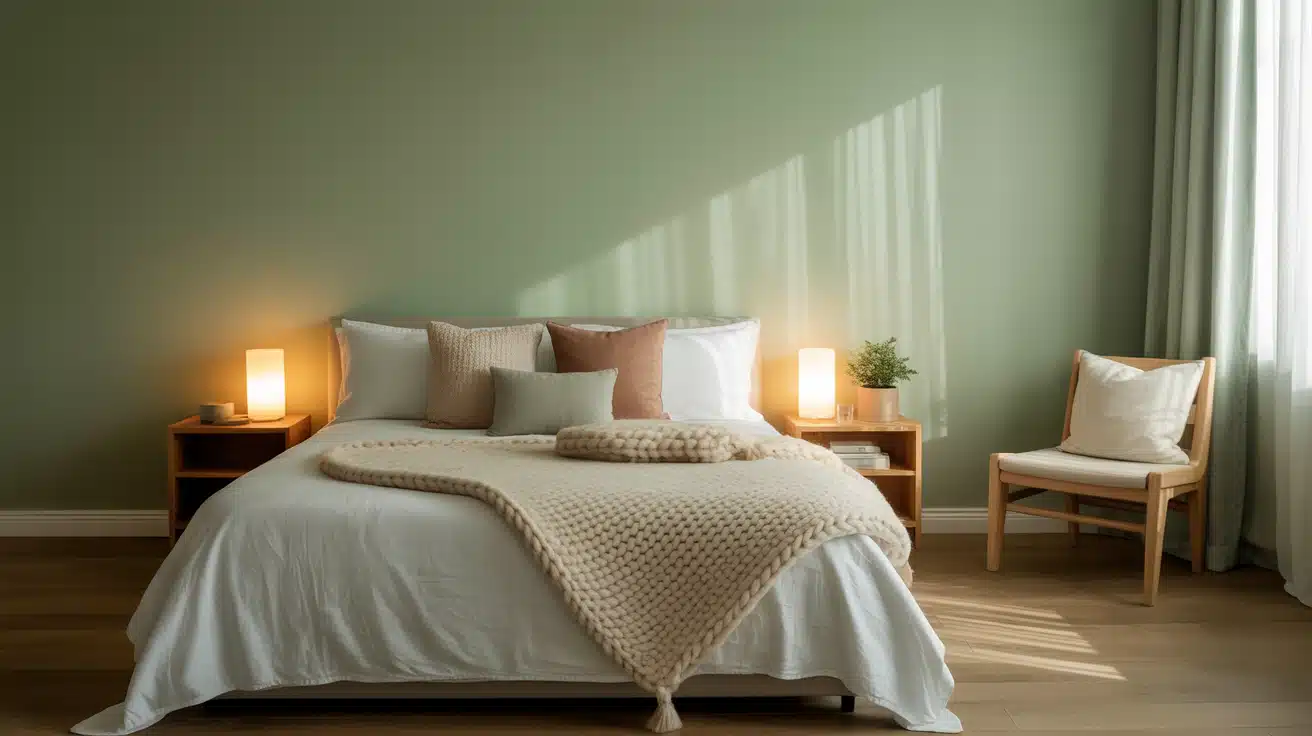
Soft blues, gentle greens, and warm taupes create calm spaces. Blues actually lower your heart rate – real science backs this up.
Avoid reds, bright oranges, or hot pinks. They increase energy and make sleep harder.
I painted a bedroom sunny yellow once and couldn’t sleep well for weeks. Warm neutrals are safe bets if you’re unsure.
Kitchens
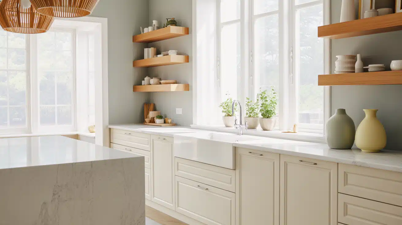
Whites, soft grays, and light blues feel clean and fresh. Test everything next to your cabinets, countertops, and backsplash first.
I painted a kitchen sage green without checking – it clashed horribly with my oak cabinets.
Light colors make small kitchens feel bigger. Dark colors can work in large kitchens with lots of windows.
Bathrooms
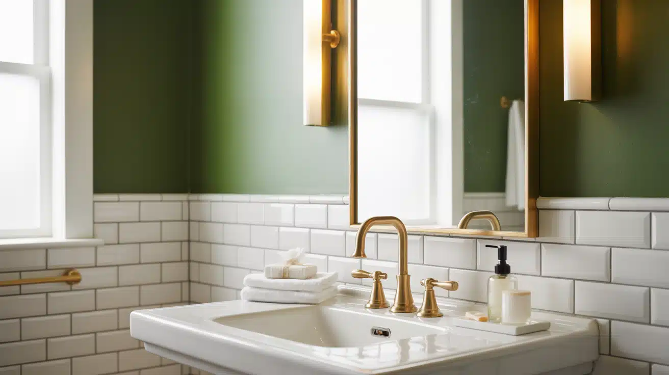
Small spaces can handle bold choices. Deep blues, rich greens, even charcoal gray work well. Light colors are safer for tiny bathrooms under 40 square feet or ones without windows.
Consider your tile and fixtures – you’re not replacing those anytime soon. Everything needs to work together.
Home Offices
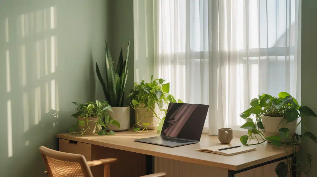
Blues and soft greens boost focus. Blue helps concentration. Green reduces eye strain from screens. Stick with mid-tone shades – not too dark, not too light.
Avoid reds and oranges. They’re too stimulating for focused work.
Hallways and Entryways
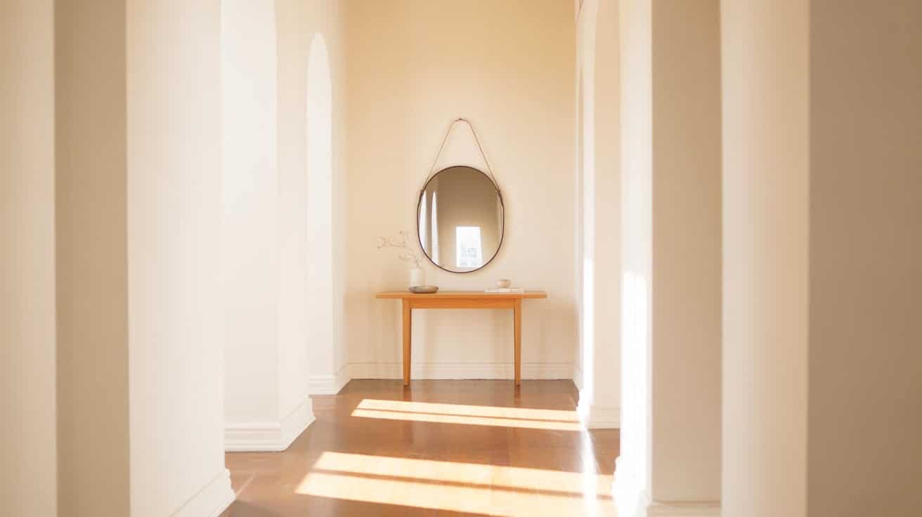
Go lighter since hallways rarely have windows. Dark hallways feel cramped.
Pick something that flows with your living spaces – usually a shade lighter than your main rooms works.
Dining Rooms
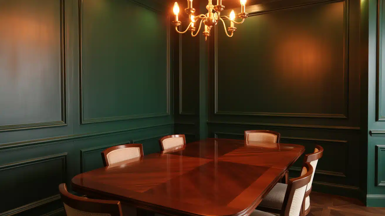
You can go dramatic here. Navy, forest green, or burgundy create intimate spaces perfect for evening meals.
Balance deep colors with white trim and add good lighting – darker walls absorb light.
Kids’ Rooms
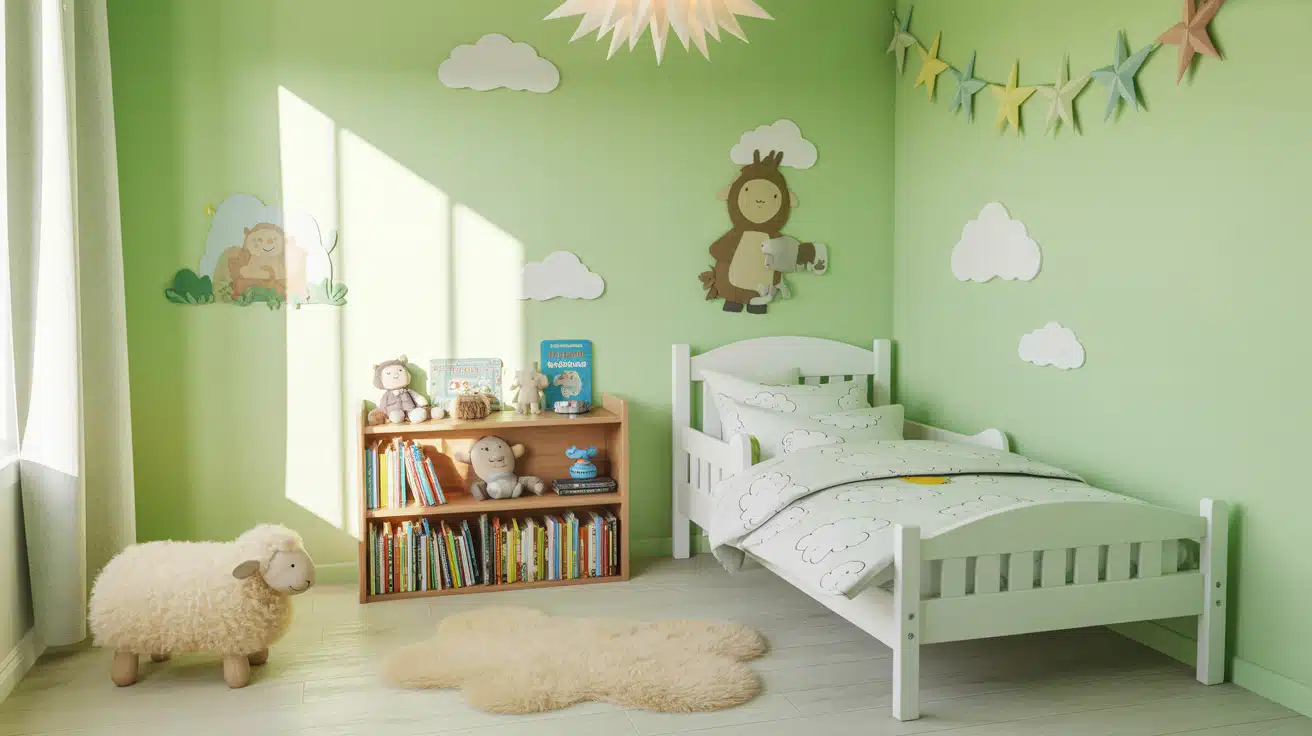
Skip bright primary colors. They’re too stimulating and kids outgrow them fast. Softer versions last longer – pale pink, soft blue, mint green, or lavender.
Let your kid pick from 2-3 pre-approved options. Gives them control without the risk of neon orange walls.
Think about what you do in each room, how much light it gets, and what’s already in there. Pick colors that support the room’s purpose.
Sample & Test Before You Commit
This is the step most people skip when learning how to choose paint colors that actually work in real lighting.
I used to grab a paint chip and buy five gallons. Big mistake. Those tiny squares lie.
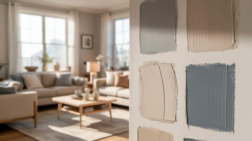
Buy sample pots – around $5 each. Paint a 2-foot square on the wall. Test different areas since that dark corner looks different than the bright window wall.
Then wait three days. Watch how the color looks in morning light, afternoon sun, and evening lamplight. That gray might look perfect at noon and turn purple at night.
Check it next to your furniture, floors, and trim. Colors change based on what’s around them.
If you’re torn between two colors, test them side by side. The right one becomes obvious.
Yes, this takes time. But it’s way less time than repainting your entire living room.
Helpful Tools to See Paint Colors Before You Commit
I’ve learned that guessing from tiny paint chips almost never works; what looks perfect under store lighting can feel completely different once it’s on your wall.
If you’re still unsure how to choose paint colors with confidence.
Thankfully, there are great tools that help you preview colors before you commit.
Most major paint brands offer free online visualizers that let you upload a photo of your room or use your camera to test colors in real time. Here are a few worth trying:
- Sherwin-Williams ColorSnap® Visualizer – Upload your own photo or use live view to see how shades look instantly.
- Benjamin Moore Personal Color Viewer – Compare multiple colors side by side and preview them in sample rooms or your own photos.
- Dulux Visualizer App – Uses augmented reality to project colors directly onto your walls for a realistic preview.
If you want broader inspiration, tools like Pinterest or Canva’s Color Palette Generator can also help you find matching tones and create mood boards.
Common Mistakes to Avoid
Most people make the same errors when figuring out how to choose paint colors, I’ve made all of them myself.
- Buying paint before testing it: This is the biggest one. I’ve wasted hundreds of dollars on paint that looked perfect in the store and terrible on my walls. Always test samples first.
- Only looking at tiny paint chips: Those small squares lie. Paint a 2-foot square minimum to see how the color actually looks at scale.
- Ignoring your lighting: That gray might turn purple under your LED bulbs. Test in morning, afternoon, and evening light before committing.
- Forgetting about undertones: Every color has hidden tones – pink, blue, green, or yellow. I painted a “white” room that turned peachy pink because I missed the undertone.
- Going too dark in small spaces: Dark colors make rooms feel smaller. I painted a tiny bathroom navy and it felt like a cave.
- Using too many colors throughout your home: Stick to three colors max. More than that feels chaotic and unplanned.
- Rushing the decision: Live with your samples for at least three days. The right color becomes obvious when you stop rushing.
Quick Checklist for How to Choose Paint Colors (and Pick with Confidence)
Choosing the right paint colour can completely uplift a space, but it often feels overwhelming with so many options available.
This free PDF checklist is designed to simplify that process.
It helps you plan, test, and select paint colors with confidence by focusing on the most important steps, from understanding lighting to checking undertones and choosing the right finish.
Use it as a practical guide while exploring colour samples or planning your next home refresh.
It’s not about following strict rules, it’s about helping you fin out what feels right for your space and style.
This guide is for general information only. Always test paint samples in your space, as lighting and surfaces can affect results. For expert advice, consult a professional designer or painter.
The Bottom Line
Choosing paint colors doesn’t have to feel impossible.
Test big samples. Live with them for a few days. Trust what you see in your actual lighting.
You don’t need to be a designer. Just slow down and do it right. And if you mess up? It’s just paint. You can fix it.
Now go test those samples.