Color does more for a kitchen than almost any other choice you make. It sets the mood the moment you walk in, ties the cabinets and countertops together, and decides whether the room feels bright and breezy or warm and cozy. If you are hunting for kitchen color ideas, whether you are repainting tired cabinets over a weekend or planning a new kitchen from the ground up, here are ten palettes worth pinning, along with the kind they suit best.
1. Warm Whites and Creams
A white kitchen never really goes out of style, but the trick is to skip the cold, clinical whites and reach for something warmer. Creams, ivories, and soft off-whites keep the airy, open feel while adding a little comfort. They pair beautifully with natural wood, brass hardware, and a stone backsplash for a look that feels timeless rather than stark.
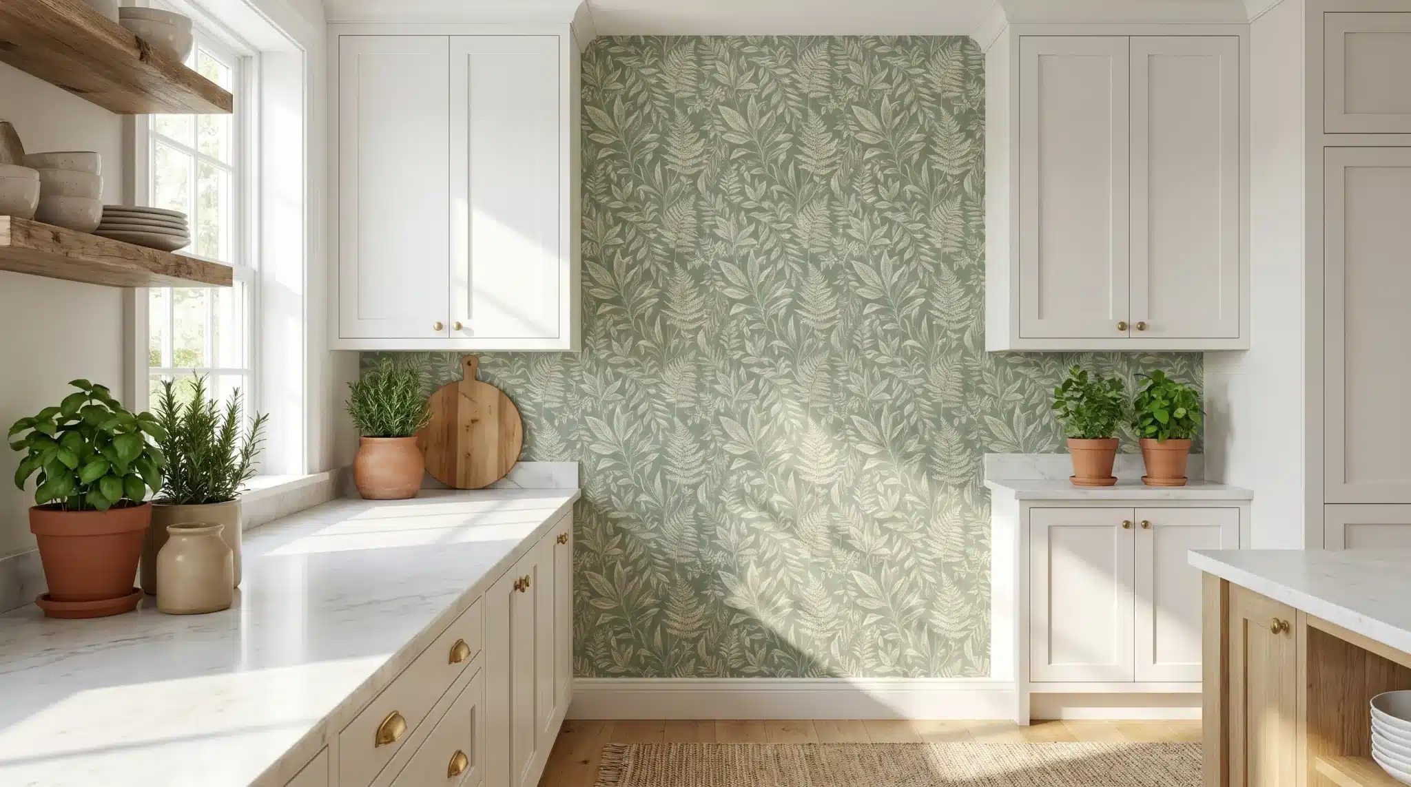
2. Soft Sage Green
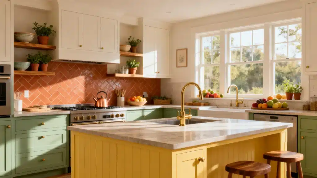
Sage has become a modern classic for good reason. It is calm, a little earthy, and works as well on cabinets as it does on walls. Set against white countertops and warm wood floating shelves, sage gives you color and personality without overwhelming the space. It is a great middle ground if a bold color feels like too big a commitment.
3. Navy Blue Cabinets
For drama with staying power, navy is hard to beat. Deep blue lower cabinets paired with white uppers feel rich and grounded, especially with gold or brass faucets and pulls. Navy reads as elegant in a formal kitchen and crisp in a coastal one, which is part of why it has stuck around.
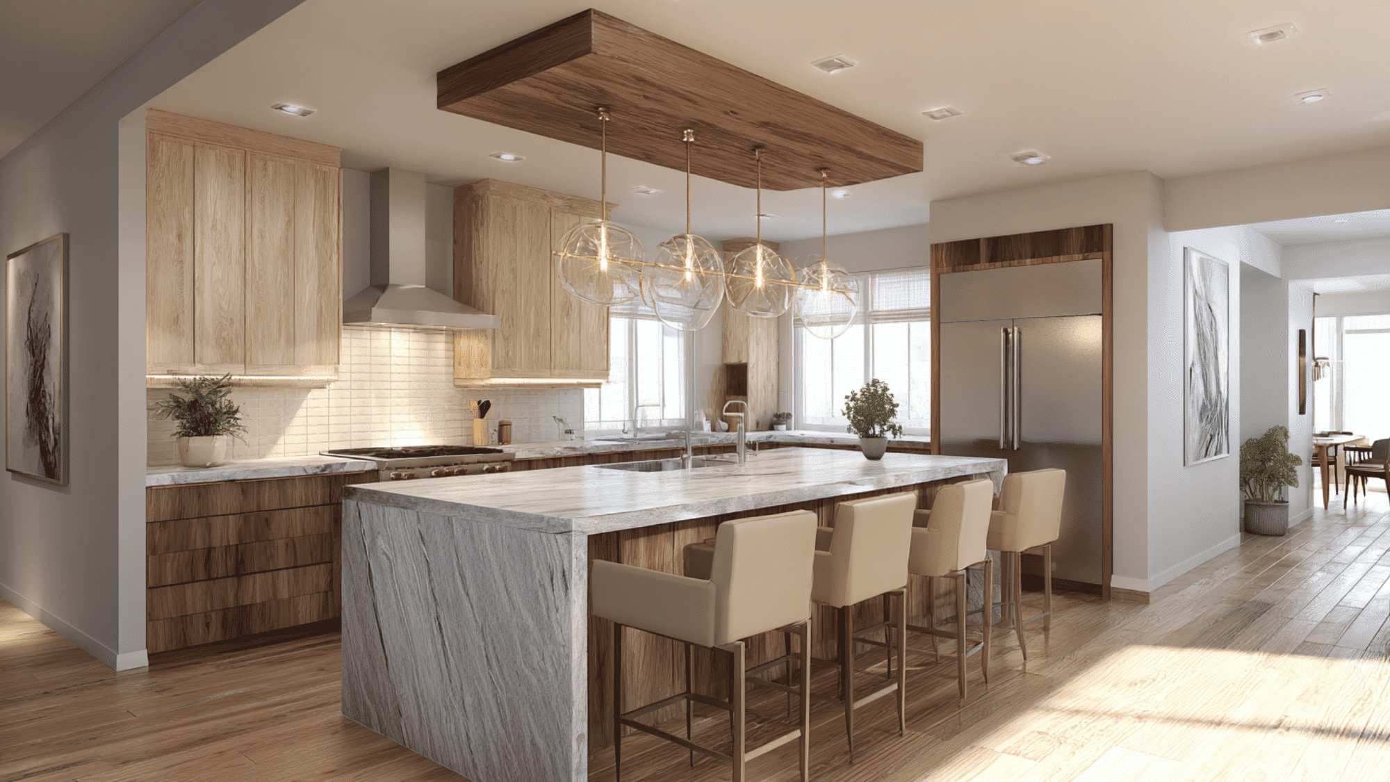
4. Two-Tone Cabinets
You do not have to pick just one color. Two-tone kitchens, with one shade on the lower cabinets and another up top or on the island, add depth and let you experiment. A popular combination is a darker base with lighter uppers, which keeps the room feeling tall and open while anchoring it visually.
5. Earthy Terracotta and Clay
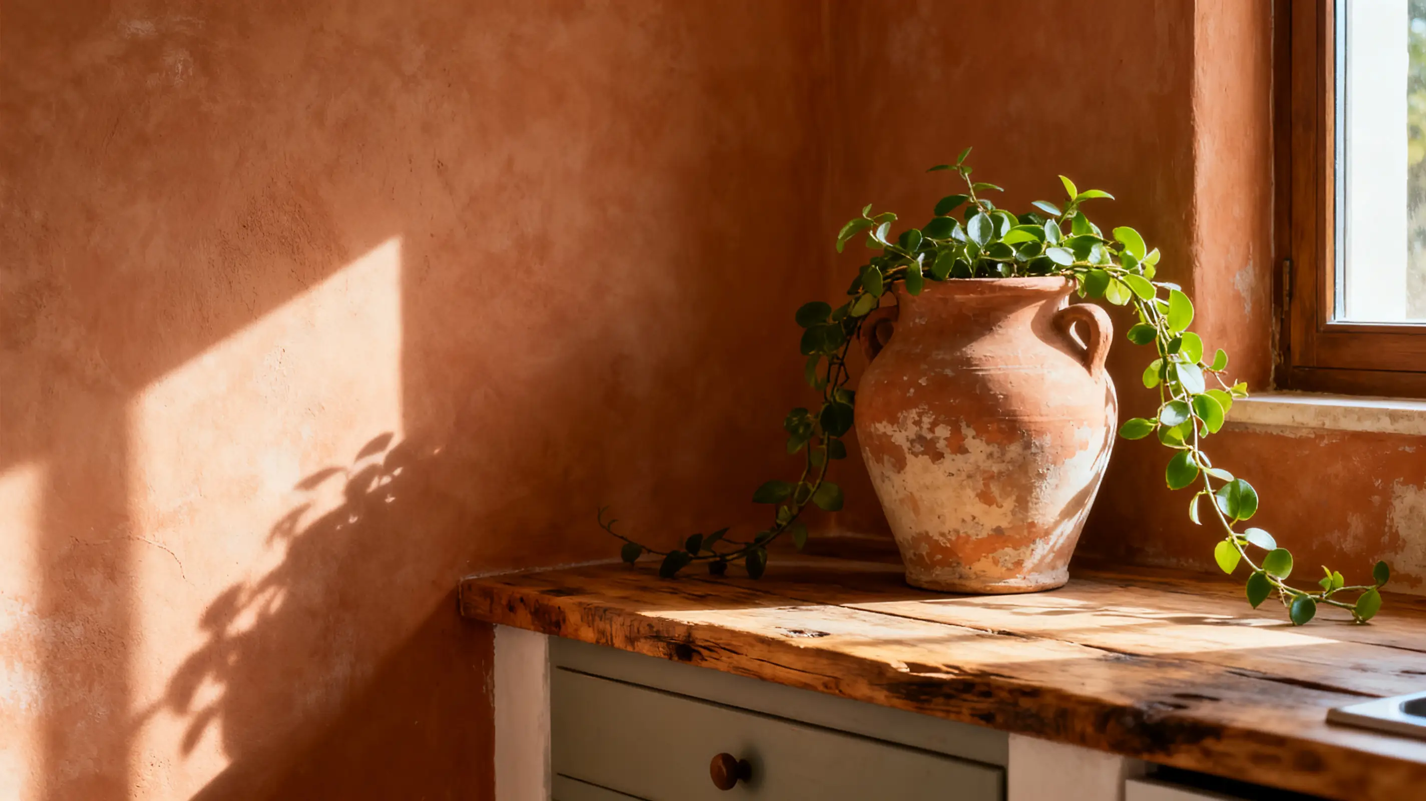
Warm, sun-baked tones like terracotta, clay, and rust bring a welcoming, lived-in feel. They work especially well in Mediterranean, Southwestern, and farmhouse kitchens, layered with natural materials, woven textures, and plenty of greenery. Use them as an accent wall or on a single piece if a whole room feels like a lot.
6. Greige and Warm Gray
Gray got a bad reputation for feeling cold, but warm grays and greige (that gray-beige hybrid) are a different story. They are endlessly versatile, flattering in almost any light, and pair with nearly any accent color. If you want a neutral backdrop you will not tire of, this is a safe and stylish bet.
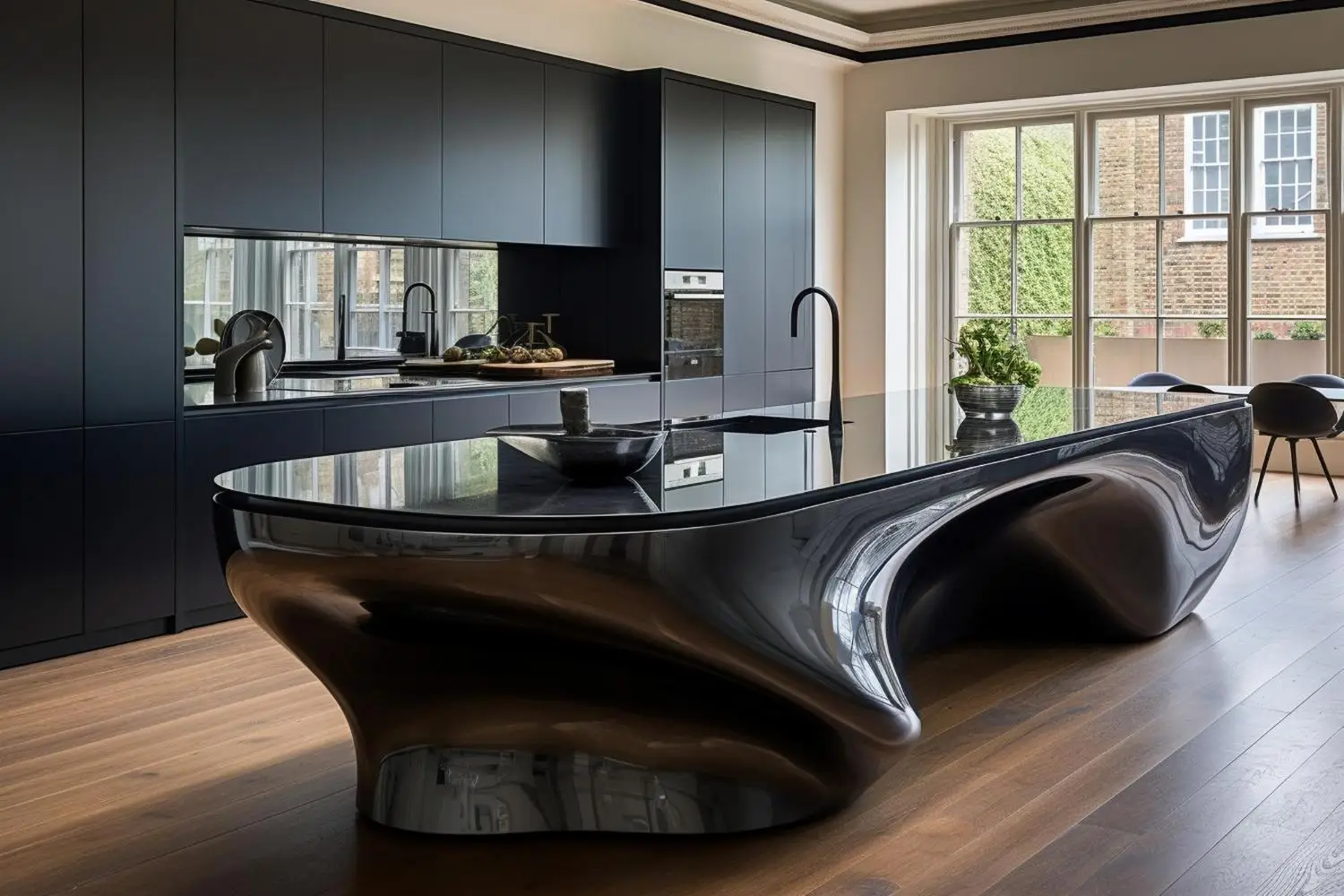
7. Matte Black Accents
A little black goes a long way. Matte black hardware, a black faucet, or a single black island can add contrast and a modern edge without darkening the whole room. It is one of the easiest ways to make a mostly neutral kitchen feel intentional and current.
8. Buttery Yellow
Yellow brings instant cheer, and softer, buttery shades keep it from feeling overpowering. It is a lovely choice for breakfast nooks and cottage-style kitchens, especially with white trim and natural light pouring in. Yellow has a way of making a space feel sunny even on a gray morning.
9. Deep Forest Green
If sage feels too soft, forest green delivers the same nature-inspired calm with far more impact. Rich and saturated, it looks stunning on cabinetry alongside warm wood and matte black or brass details. It is moody in the best way and pairs surprisingly well with both modern and traditional finishes.
10. Soft Blush and Muted Pink
Pink in the kitchen is more grown-up than it sounds. Dusty, muted blush tones read as warm neutrals rather than candy colors, and they bring a gentle, welcoming softness. Used on cabinets or an island, blush is unexpected and quietly sophisticated.
How to Choose the Right Kitchen Color
Once you have a few favorites, a little planning saves you from a color you regret. Keep these in mind:
- Test real samples on the wall or cabinet doors before committing, never trust the tiny chip.
- Check the light at different times of day, since north-facing rooms skew cooler and south-facing ones warmer.
- Work around what stays, like flooring, countertops, and the backsplash, so everything plays nicely together.
- Follow a loose 60-30-10 rule, with a dominant color, a secondary one, and a small pop of accent.
- Think long term, because trends move fast and a remodel does not.
That last point matters most. As the design-and-build team at Heritage Build Group put it, the best kitchen color is one that “still feels right years down the line, not just on the day it goes in.” Choosing a shade you genuinely love, rather than the color of the moment, is what keeps a kitchen feeling fresh long after the paint dries.
Whichever direction you lean, start with the feeling you want in the room and let the palette follow. Get the color right and the heart of your home will reward you every single day.