Ever stood in your kitchen and felt like the cabinets, the benchtop and the floor all came from different rooms? You picked each one because you liked it. Together, they just don’t quite click. I’ve been there.
The good news: a kitchen that reads as one palette isn’t luck, and it doesn’t mean spending more. It comes down to the order you choose things in, and how you test them together. Here’s how I’d pull your finishes into one scheme.
Start by Choosing One Hero Surface
Five surfaces chosen at once is five decisions pulling against each other. So pick one to lead, and let everything else answer to it.
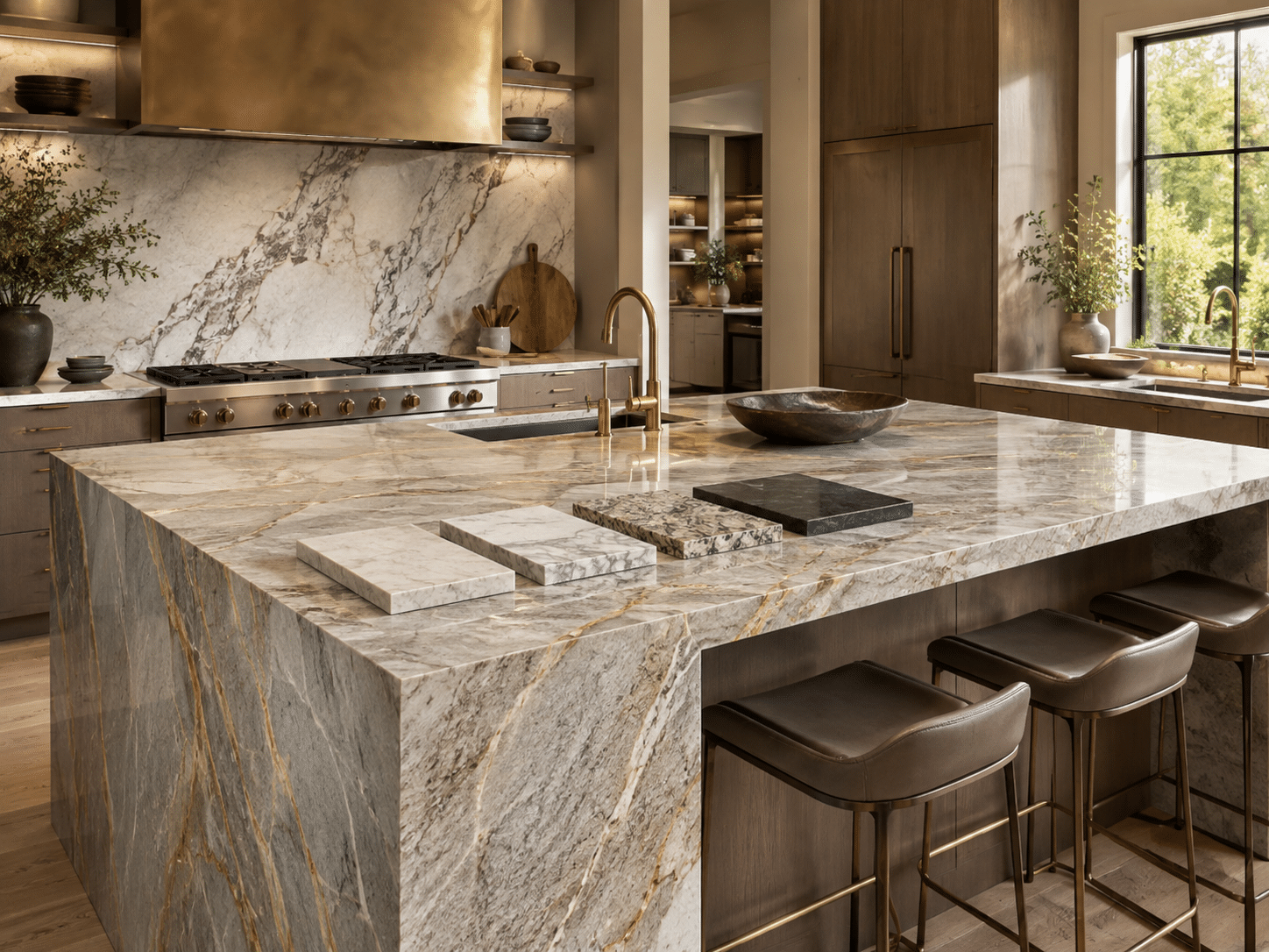
For most kitchens, the benchtop is the natural hero. It’s the most expensive thing to get wrong. It usually carries the strongest pattern or veining, and it sits right at eye level. If instead you’ve fallen for a particular stone or a timber floor you can’t live without, that becomes your anchor.
Once you’ve got your hero, you stop asking “do I like this splashback?” in a vacuum. You start asking “does this splashback work with my benchtop?” Every choice after that has something to measure against.
Match Your Cabinet Fronts to the Benchtop’s Tone
This is where a lot of kitchens quietly go wrong. People match the cabinet colour to a paint chip or a Pinterest photo, not to the actual benchtop sitting a metre away.
Two things to look at:
- The undertone. Stone and timber aren’t simply “white” or “grey.” They lean warm or cool. A benchtop with warm, creamy veining will fight a cabinet front that’s a cold blue-grey white. Hold the two together and you’ll see it straight away.
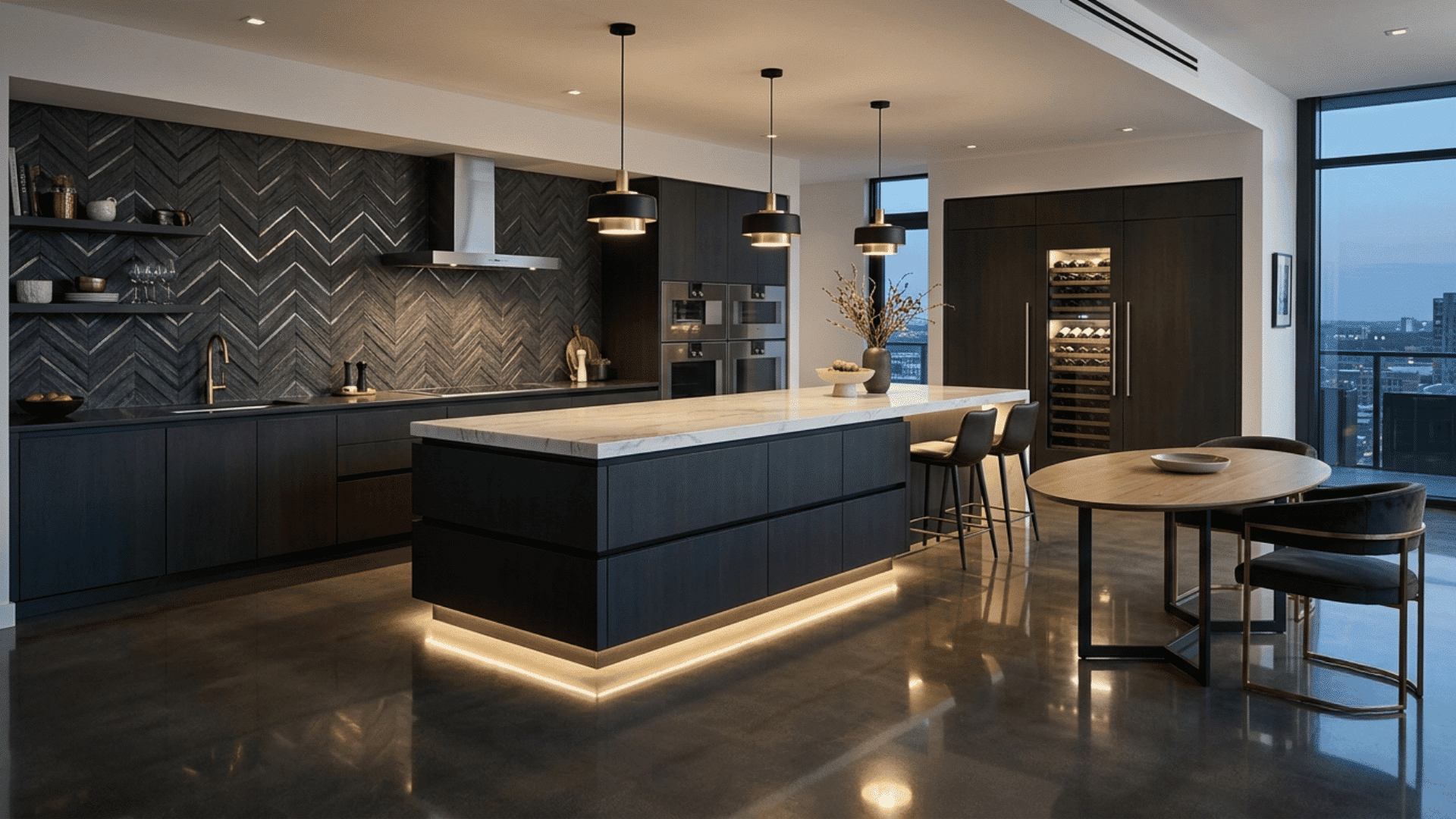
- The contrast level. Decide whether you want your cabinets to blend with the benchtop or stand against it. Blending reads calm and quiet. Contrast reads sharper and a little more dramatic. Both are fine choices. The trap is landing halfway by accident, where the two are almost the same but not quite, so it looks like a mistake rather than a decision.
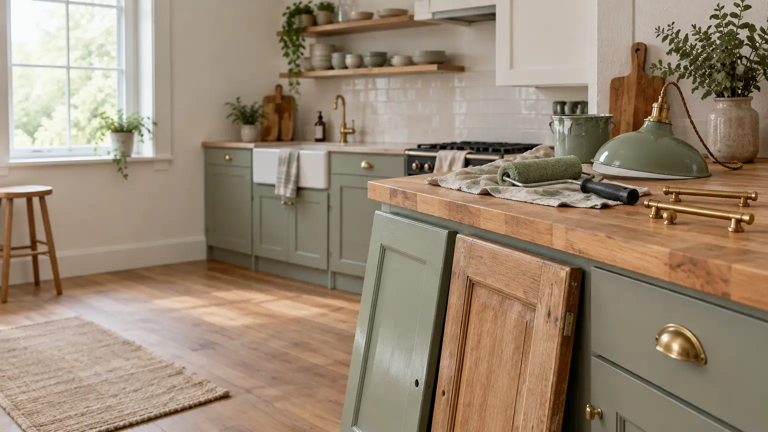
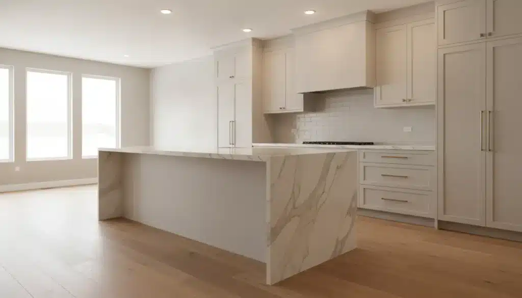
Doing two-tone cabinets, upper and lower in different colours? Let one tone echo the benchtop and the other pick up your flooring. That ties the top and bottom of the room together without it feeling matchy.
Choose a Splashback That Bridges the Two
Your splashback is the peacemaker. It sits between the benchtop and the cabinets, so its job is to connect them rather than introduce a third unrelated idea.
The most foolproof move is to pull your splashback tone straight from the benchtop’s veining. If your stone has a soft grey vein running through a white base, a warm grey or greige tile picks that thread up and carries it across the wall. Suddenly the whole zone reads as one family.
Want the splashback to be a feature instead of a blender? Keep it in the same temperature as everything else. A bold zellige or a coloured tile can absolutely sing, as long as a warm scheme gets a warm tile and a cool scheme gets a cool one. Change the colour all you like. Just don’t change the temperature.
Pick Hardware and Flooring That Tie It All Together
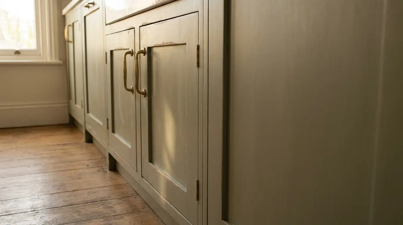
Hardware is small, so people treat it as an afterthought. Don’t. Handles and tapware are the jewellery, and they’re the easiest place to add a repeating note.
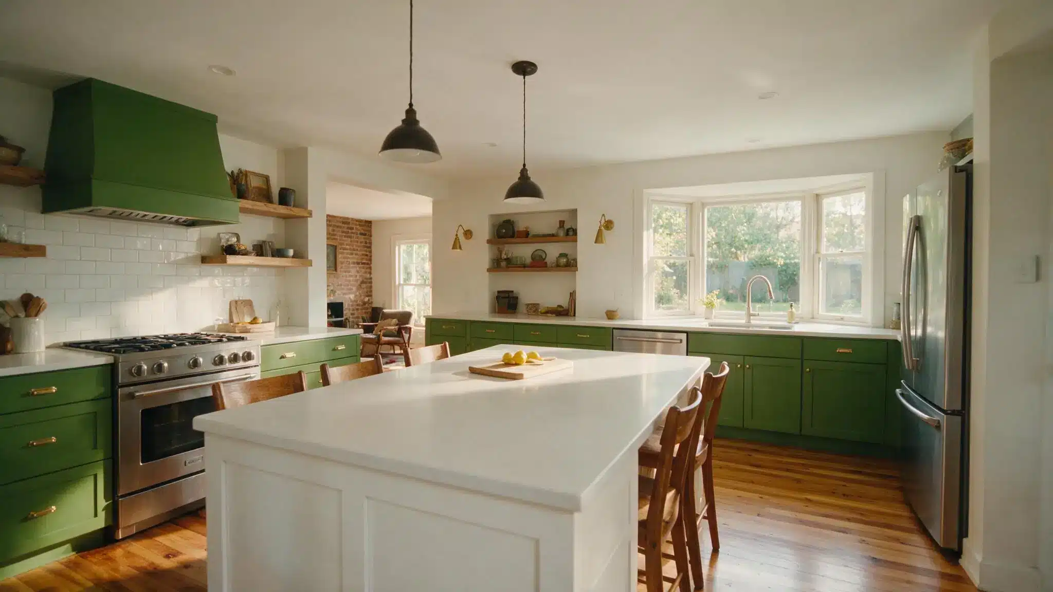
Pick one metal and commit to it across the whole kitchen, whether that’s brushed brass, matte black or something warmer. Then let it turn up in a handful of spots: the cabinet handles, the tap, maybe a shelf bracket or a pendant. That repetition is what makes the room feel intentional rather than scattered.
Flooring is your largest surface, so it sets the temperature of the room whether you plan it or not. Match its undertone to your scheme, not its exact colour. A warm oak floor and a warm-white cabinet are best friends even though one’s timber and one’s paint. A cool concrete-look tile wants cooler cabinetry above it. Get the undertones agreeing and the materials themselves can be completely different.
Test Physical Samples Side by Side Under Real Kitchen Light
Nobody wants to hear this step, and it’s the one that saves you. Screens lie. Showroom lighting lies. The only place your finishes tell the truth is in your actual kitchen.
Get real samples of everything: a benchtop offcut, a cabinet door in your colour, the splashback tile, a handle, and a plank or tile of your flooring. Lay them out the way they’ll actually sit, floor sample low, benchtop and splashback in the middle, cabinet colour beside them.
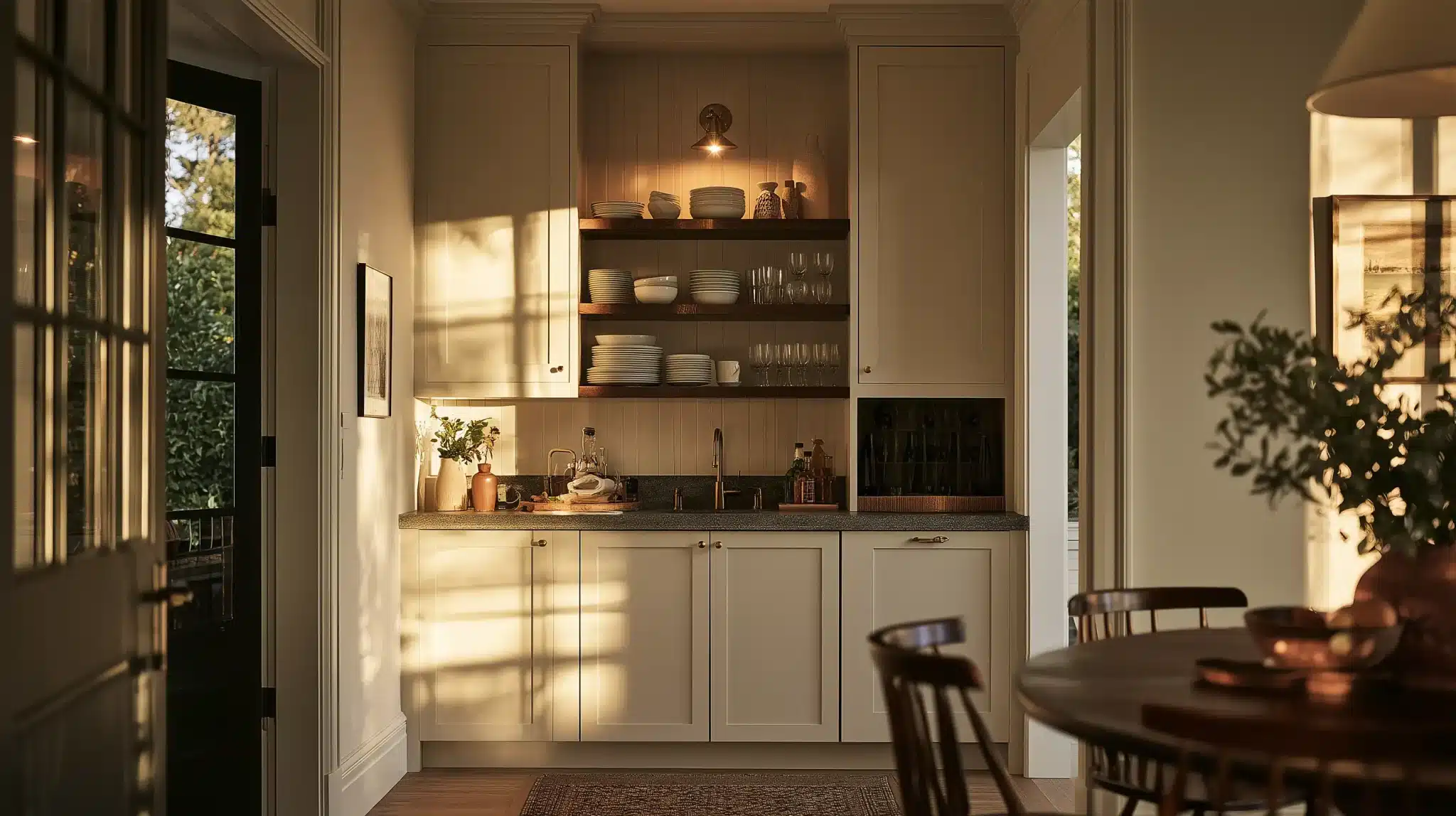
Then look at them across a full day. Morning, midday, and again at night with your lights on. North-facing kitchens go cool. West-facing kitchens go warm and golden late in the day. Downlights throw everything off. Watch for the undertone clashes that only surface in certain light, like a “white” cabinet suddenly reading pink or green next to your stone once the afternoon sun hits.
Give it a couple of days. If two tones are subtly fighting, you’ll feel it before you can name it. Trust that feeling and adjust before you order anything.
When It’s a Full Renovation, Someone Specs the Whole Fit-Out at Once
Everything above assumes you’re choosing things one at a time, at your own pace. That’s exactly right for a refresh or a partial update. A full renovation works differently.
Here the finishes get locked in early, on paper, before anything is built. A benchtop edge, a cabinet door profile, a splashback tile and a handle all have to be committed to at once, not chosen one weekend at a time. Once you’re past a single wall colour and coordinating durable cabinetry, stone and internal finishes as one fit-out, that whole-kitchen specification is the work a full-service design team like Action Kitchens takes on. It’s also where the sample-testing habit earns its keep, because a designer is checking the same tones together under your kitchen’s own light before the order goes in, while a mismatch still costs nothing to fix.
Whether you do it yourself over a few weekends or hand the whole thing over, the method is the same. Choose one hero surface and make everything answer to it. Match undertones before you match colours. Let the splashback bridge, let hardware and flooring repeat a note, and test real samples in real light.
Do that, and your kitchen stops looking like a pile of separate good decisions. It starts looking like one room you meant.