You’ve tried the safe colors. White. Beige. Grey. And your home still feels… flat. Orange can change that.
It brings warmth, energy, and a personality that no neutral ever could.
In this blog, we’ll show you the best orange color palette, from bold accent walls to small pops of color that tie a whole room together.
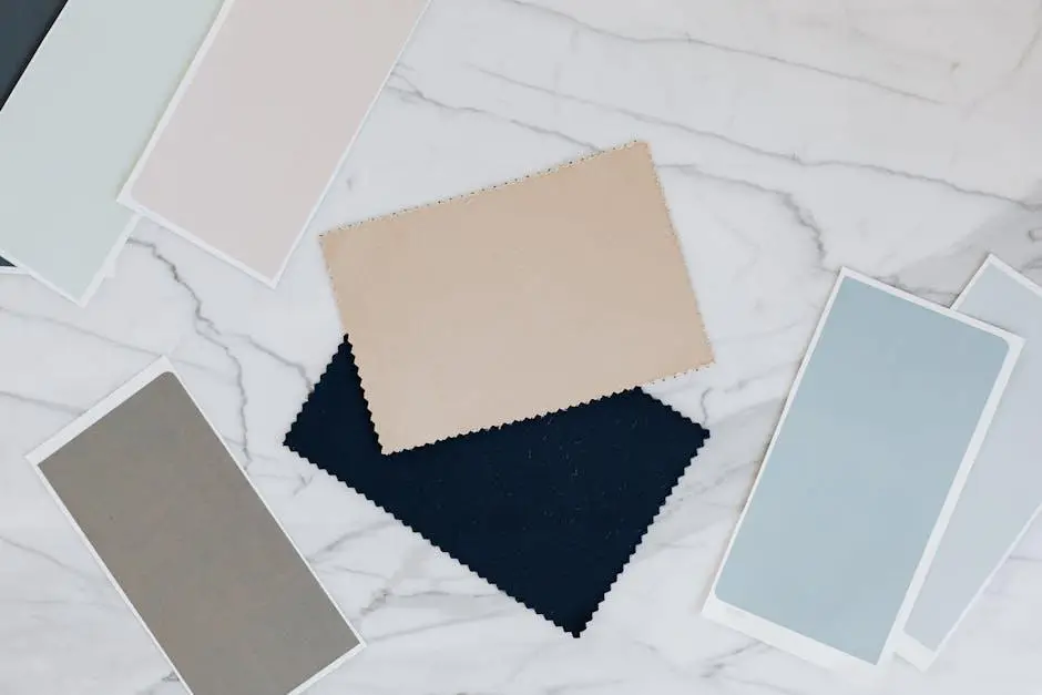
How to Make an Orange Color Palette Look Balanced?
A balanced orange palette does not use orange alone; it needs supporting colors, as these colors either calm orange down or enhance it further.
Three simple ways to balance orange in a palette are:
- Pair it with neutrals like white, beige, or gray to tone it down.
- Use dark shades like brown or navy to add depth.
- Add a light tint of orange alongside the main shade for variety.
Creative Color Rules that Make Orange Shine
Color theory is like a map for designers; it tells you which colors work well together and why.
When you work with orange, these rules help you build palettes that feel intentional and pleasing to the eye.
1. Complementary Colors
Blue brings a cool contrast that makes orange pop. White keeps things clean and fresh.
Brown and beige add a grounded, natural feel. Green pairs with orange in an organic way. Gold adds richness and weight to the palette.
Navy brings a strong, structured look to the mix.
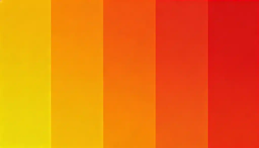
2. Analogous Rule
Use colors next to orange, like red and yellow. These colors blend smoothly without fighting each other.
This works well for autumn themes and food packaging.
2. Triadic Rule
Combine orange with green and purple. These three colors are equally spaced on the color wheel.
This creates a bold, balanced palette and is great for creative, playful projects like festival posters and illustration work.
3. Split-Complementary Rule
Use orange with blue-green and blue-violet. This is softer than a full complementary pair.
It gives contrast without being too bold. Works well for interior design palettes and editorial layouts.
Orange Color Palette Ideas
Blue and orange are opposites on the color wheel, which is why they work so well together.
The coolness of blue perfectly balances the heat of orange.
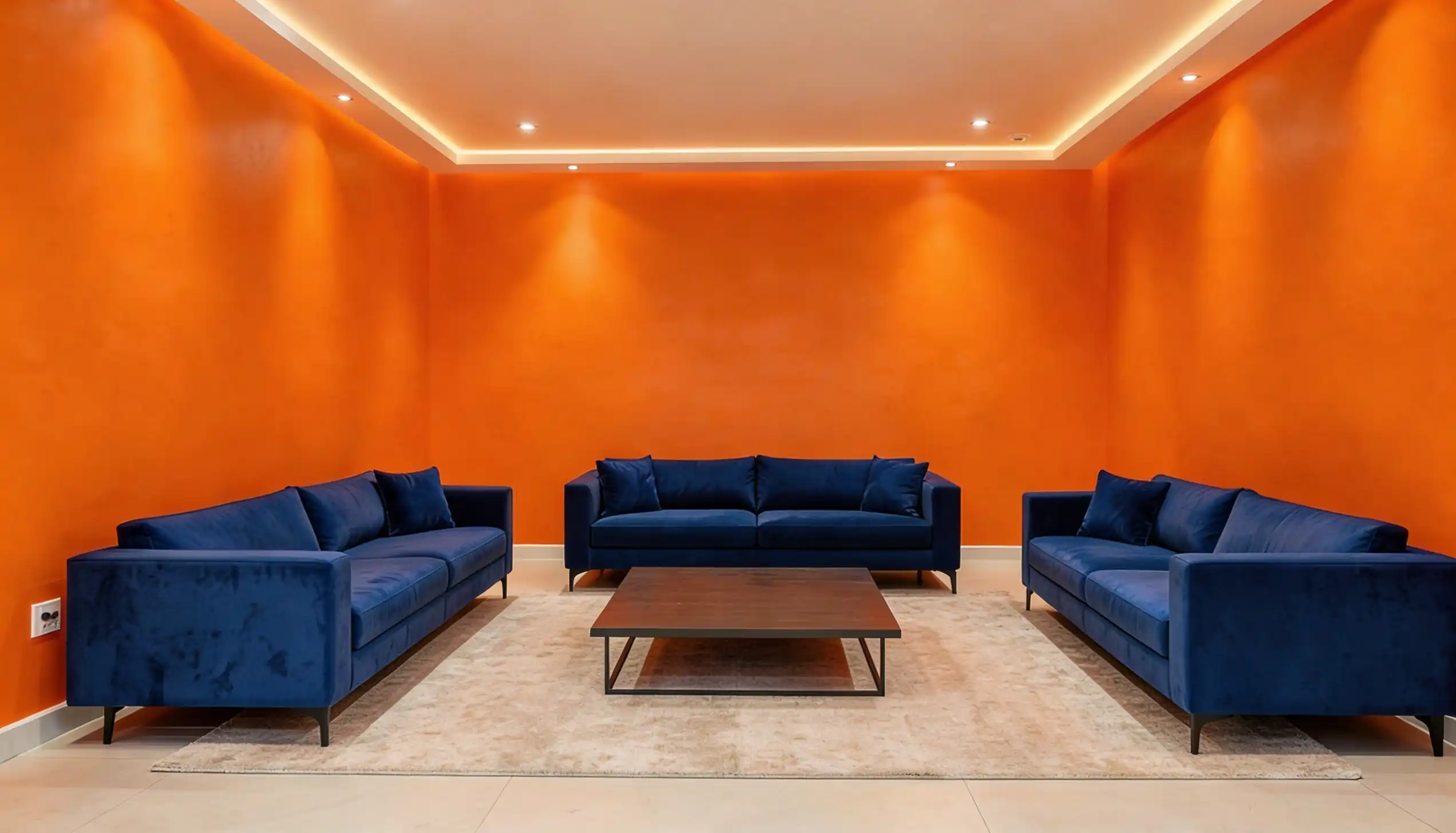
1. Navy Blue + Burnt Orange
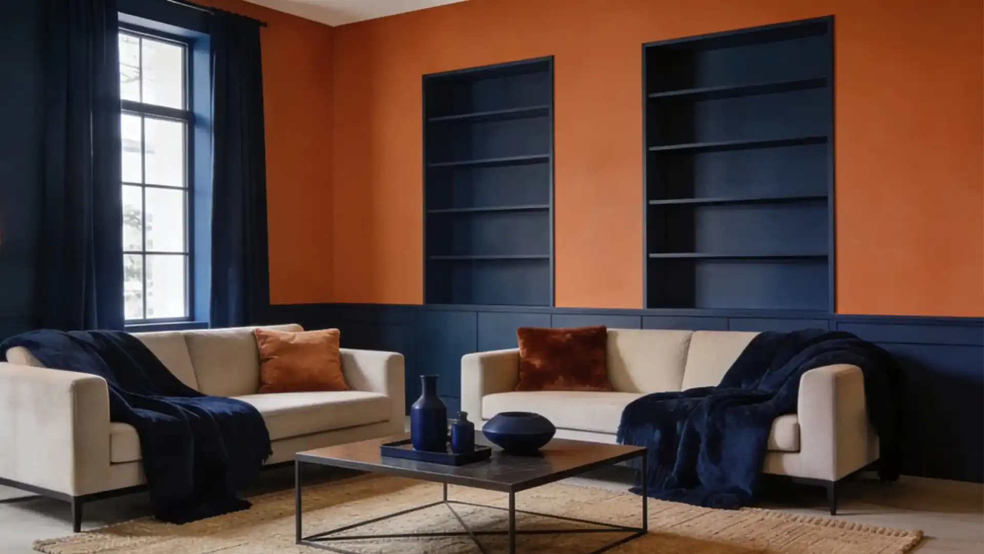
Blue and orange color palette is a classic that never goes out of style.
Navy blue lends a strong, serious tone, while burnt orange adds personality and richness.
Together, they work well for brand identities, packaging, and interior spaces; if you want a palette that feels confident, this is a solid choice.
2. Teal Blue + Tangerine Orange
This pairing brings a lot of energy to any design. Teal is cool and a little unexpected, and Tangerine orange is bright and full of life.
Put them together, and you get something that feels creative and fun; Great for event graphics, app interfaces, and bold poster designs.
3. Royal Blue + Bright Orange
This is one of the most high-contrast pairings you can use. Royal blue is rich and commanding, and bright orange is loud and attention-grabbing.
This combo works best when you want something that stops people in their tracks.
4. Denim Blue + Rust Orange
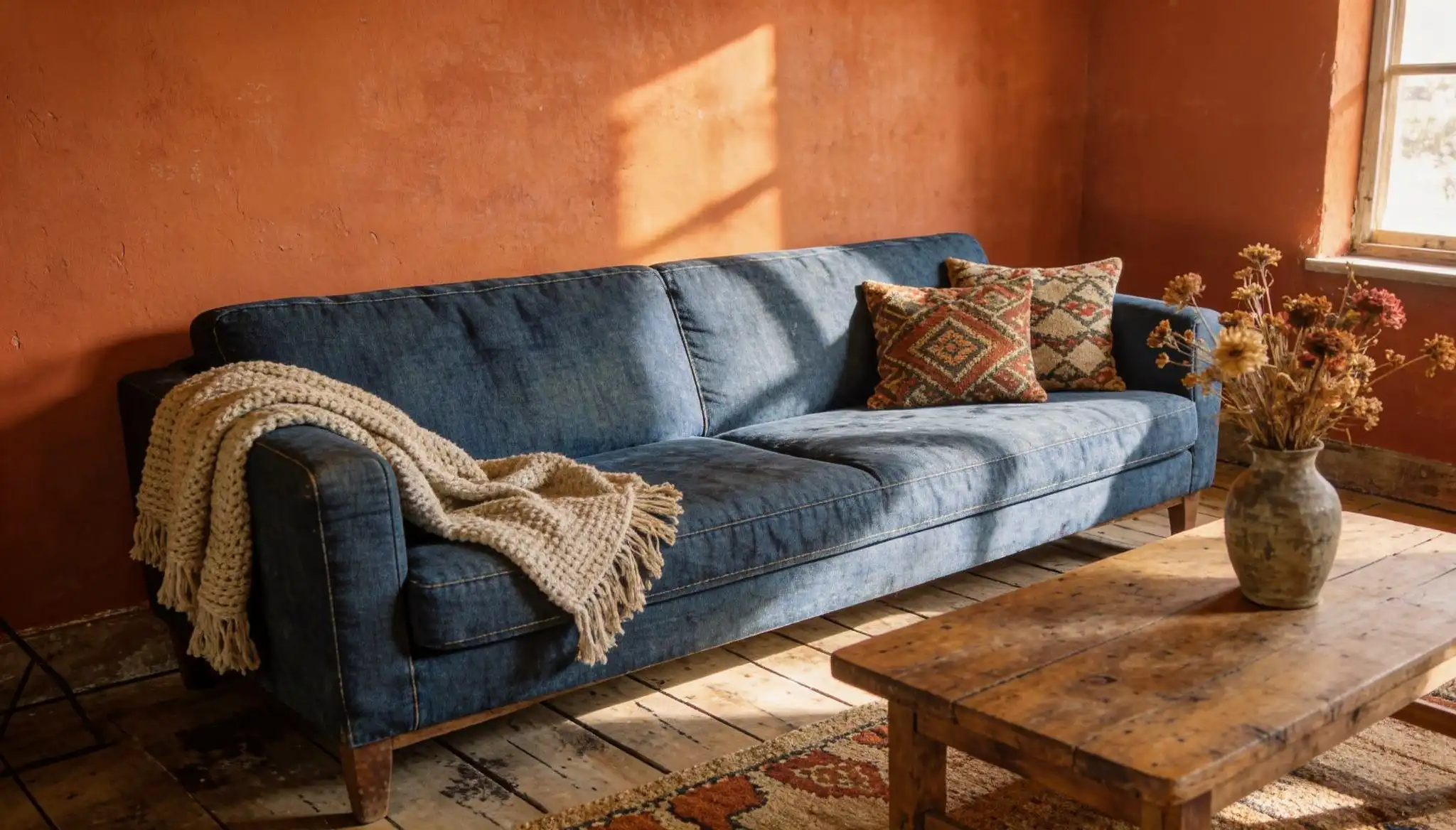
This pairing has a relaxed, casual feel. Denim blue is familiar and easy to look at, and Rust orange feels grounded and natural.
Together, they create a cozy and stylish look. Works really well for fashion brands, lifestyle blogs, and autumn-inspired designs.
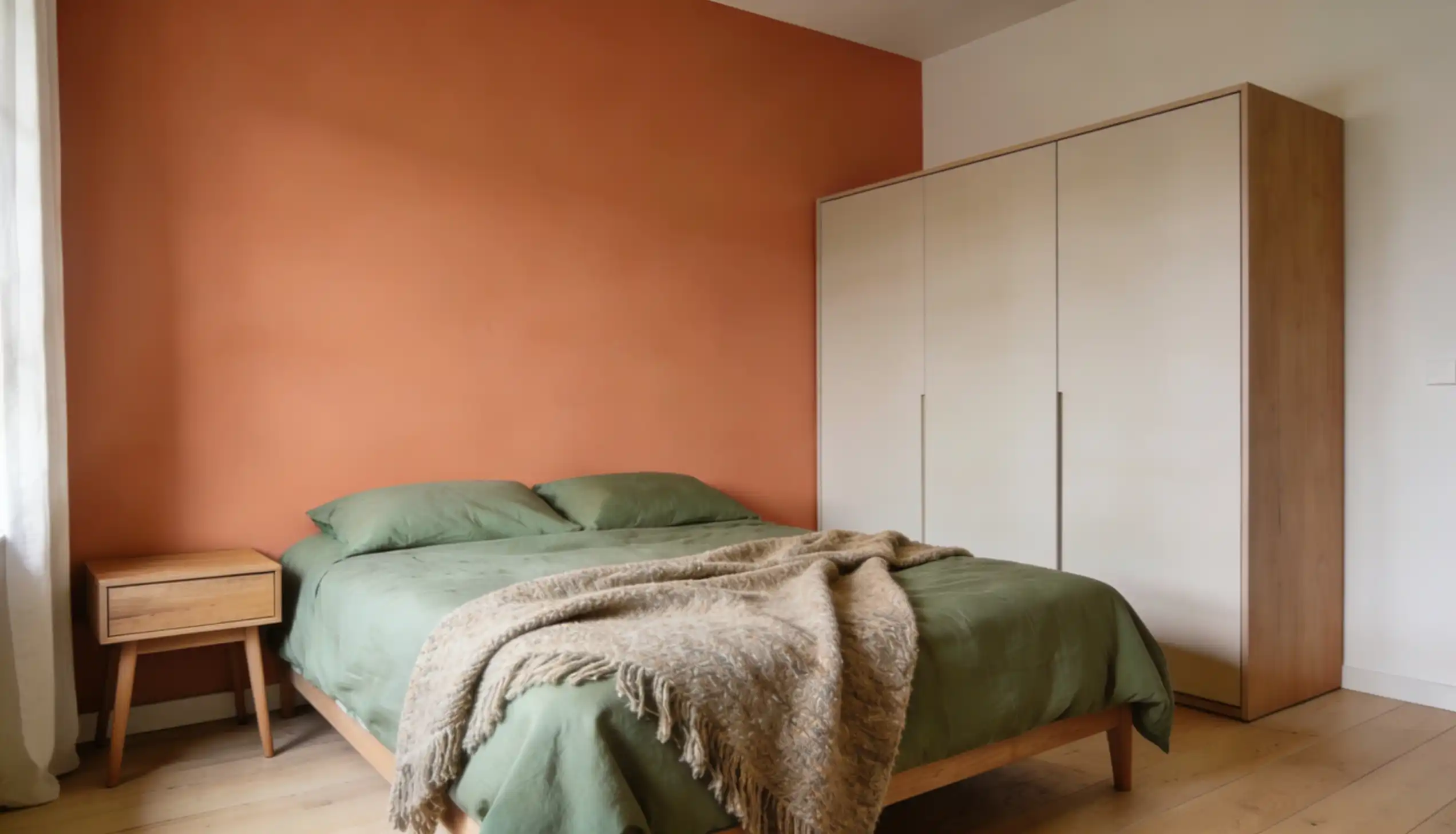
5. Olive Green + Terracotta Orange
This pairing feels grounded and natural. Olive or Sage green has a muted, organic tone, and Terracotta orange feels raw and rustic.
Together, they create a palette that works well for pottery brands, natural skincare packaging, and boho interior design.
If your project has a handmade or nature-inspired feel, this combination fits perfectly.
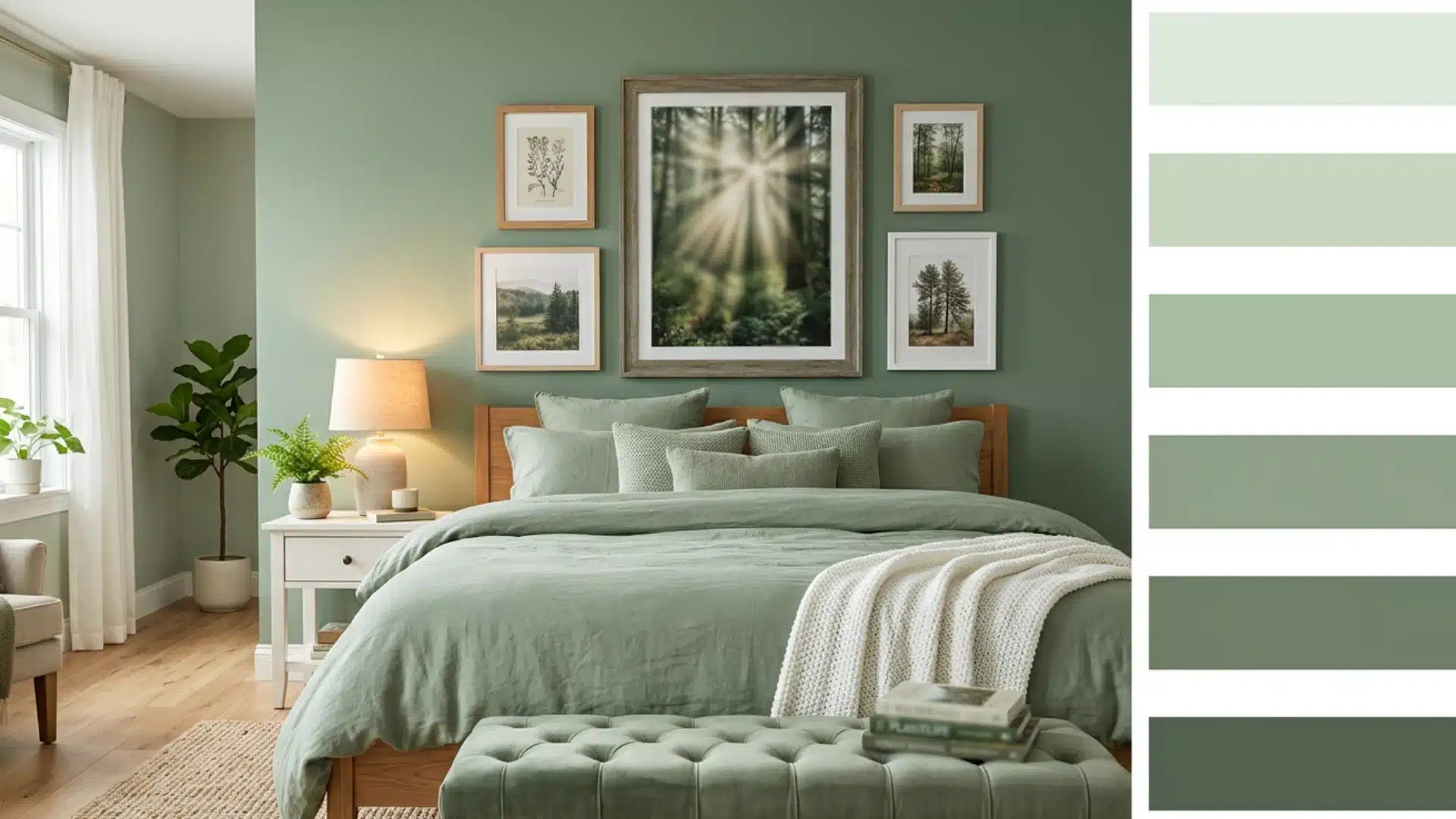
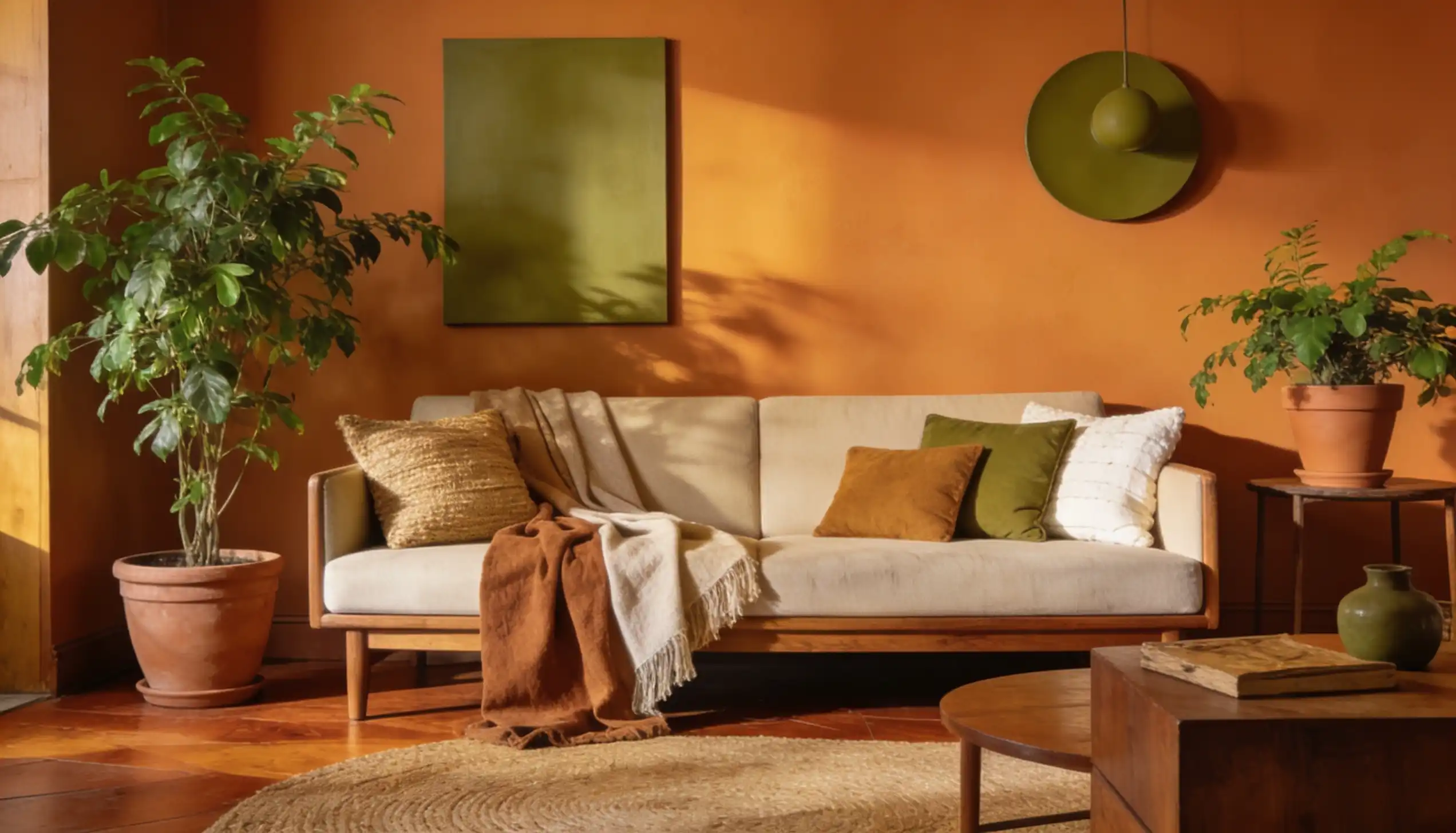
6. Sage Green + Apricot Orange
The green and orange color palette is a soft and understated pairing.
Sage green is calm and easy on the eyes, and Apricot orange adds just enough color without feeling loud.
The result is a gentle and refined look. This works well for wedding stationery, wellness brands, and minimalist lifestyle content.
7. Emerald Green + Burnt Orange
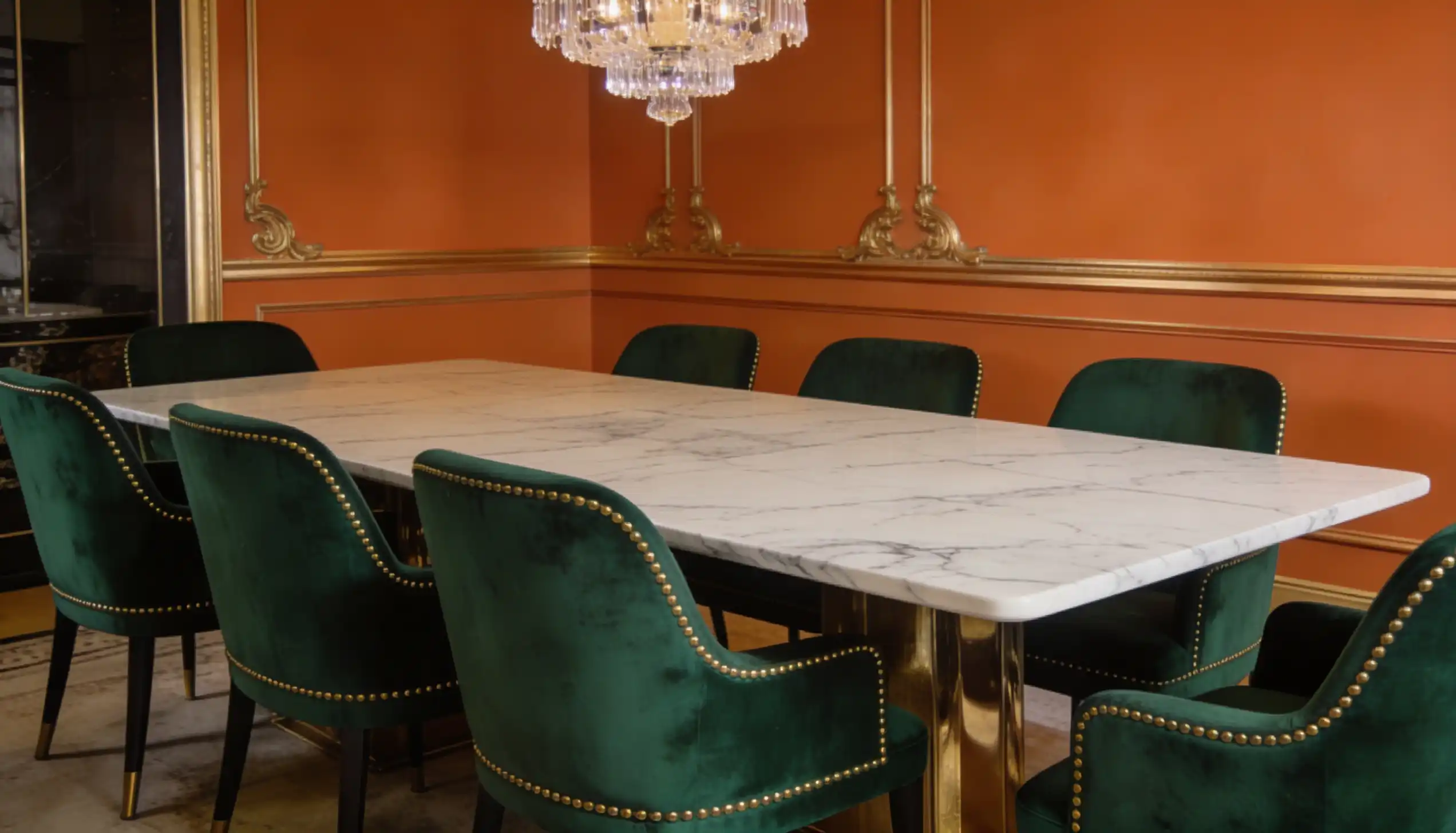
This combination feels bold and premium. Emerald green is rich and commanding, and Burnt orange adds a strong, confident tone next to it.
Together, they create a palette that feels luxurious and well considered. Great for high-end packaging, editorial design, and upscale interior decor projects.
8. Mint Green + Soft Orange
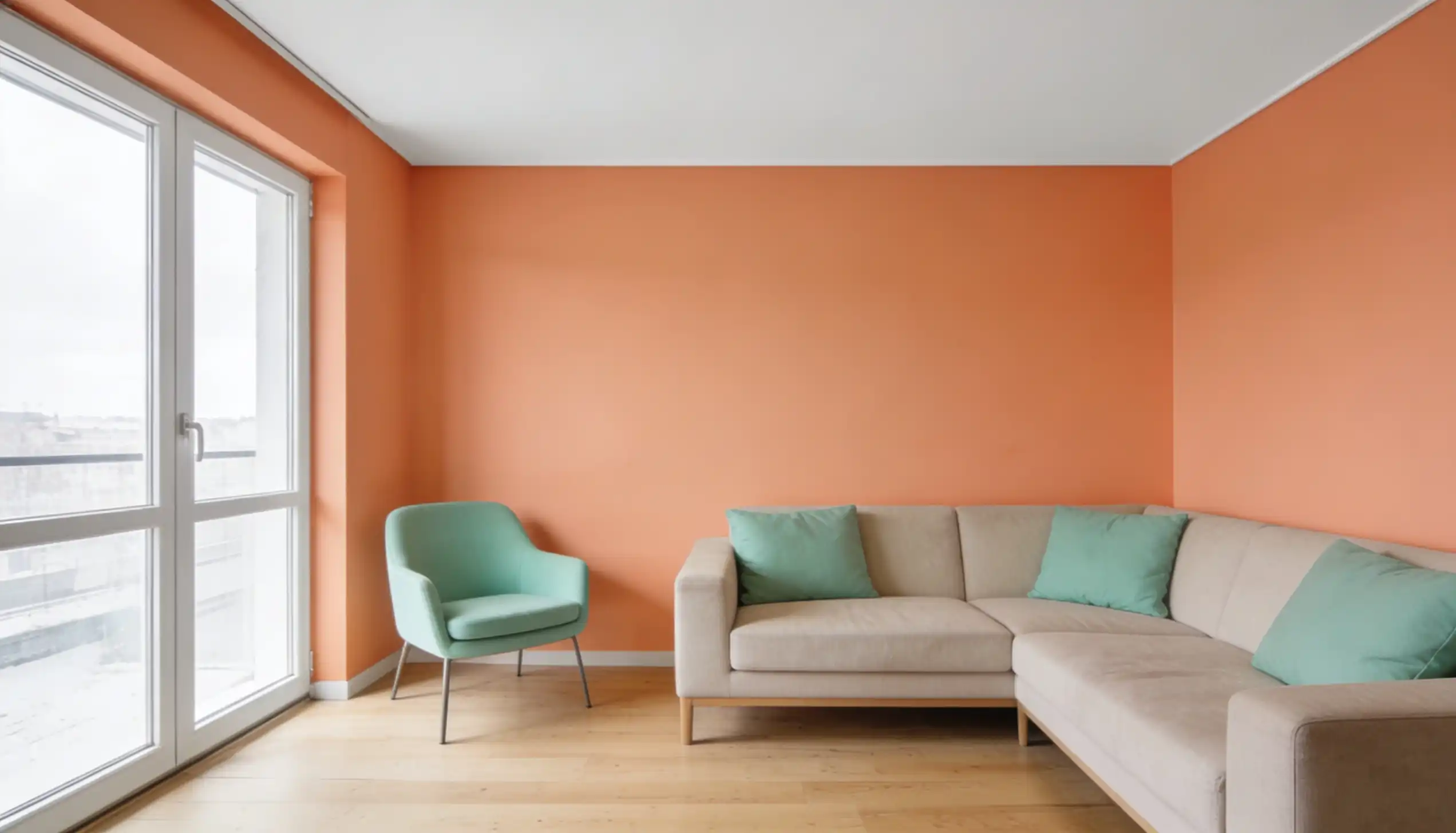
This combination is fresh and easy to look at. Mint green feels cool and clean, and soft orange adds a gentle pop of color next to it.
Together, they create a light and cheerful palette. Works great for nurseries, bathroom decor, and spring-inspired interior spaces.
9. Forest Green + Pumpkin Orange
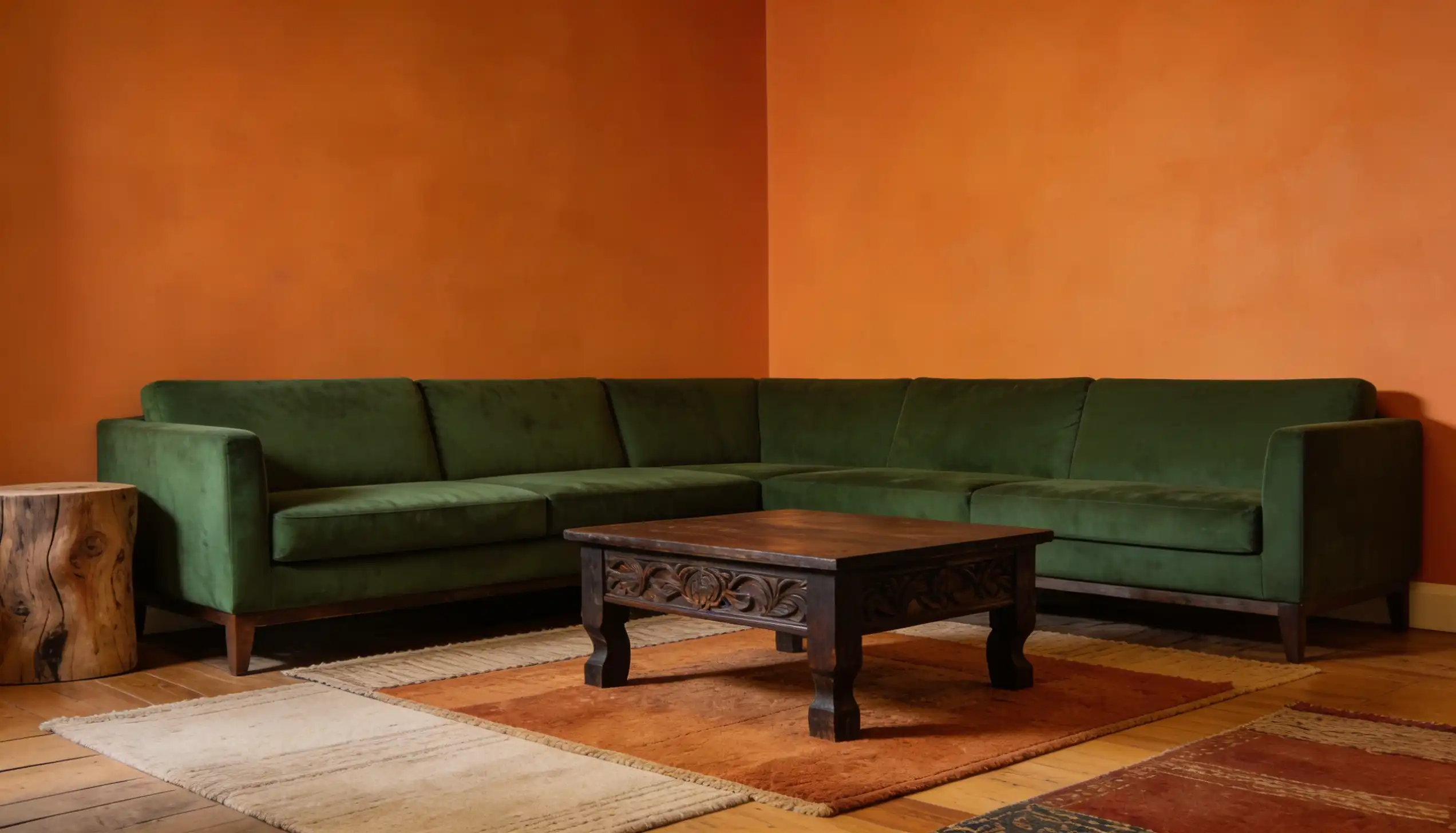
This palette feels like a walk through an autumn forest. Forest green is deep and serious, and Pumpkin orange is bold and seasonal.
Together, they create a strong visual contrast that feels cozy and striking. Perfect for Halloween branding, autumn collections, and seasonal packaging designs.
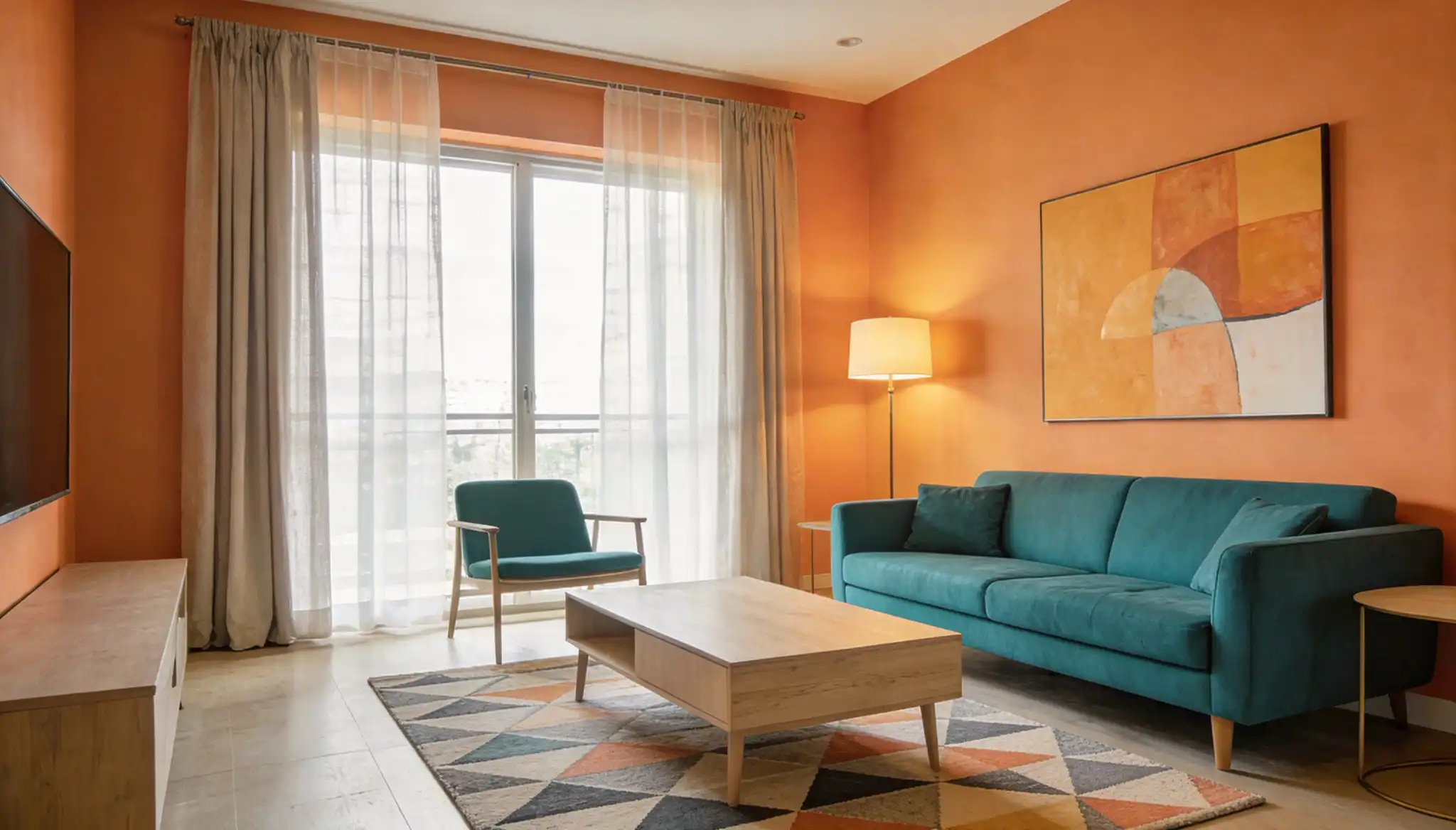
How to Choose an Orange Palette for Your Space?
Picking the right orange palette for your home is not just about what looks good to you. It is about what works for the room. The color you choose sets the tone for the entire space. Make sure it feels right before you commit.
The following are a few things to think about before you settle on a palette:
1. Think About the Mood You Want in the Room
Orange comes in many shades, and each one feels different.
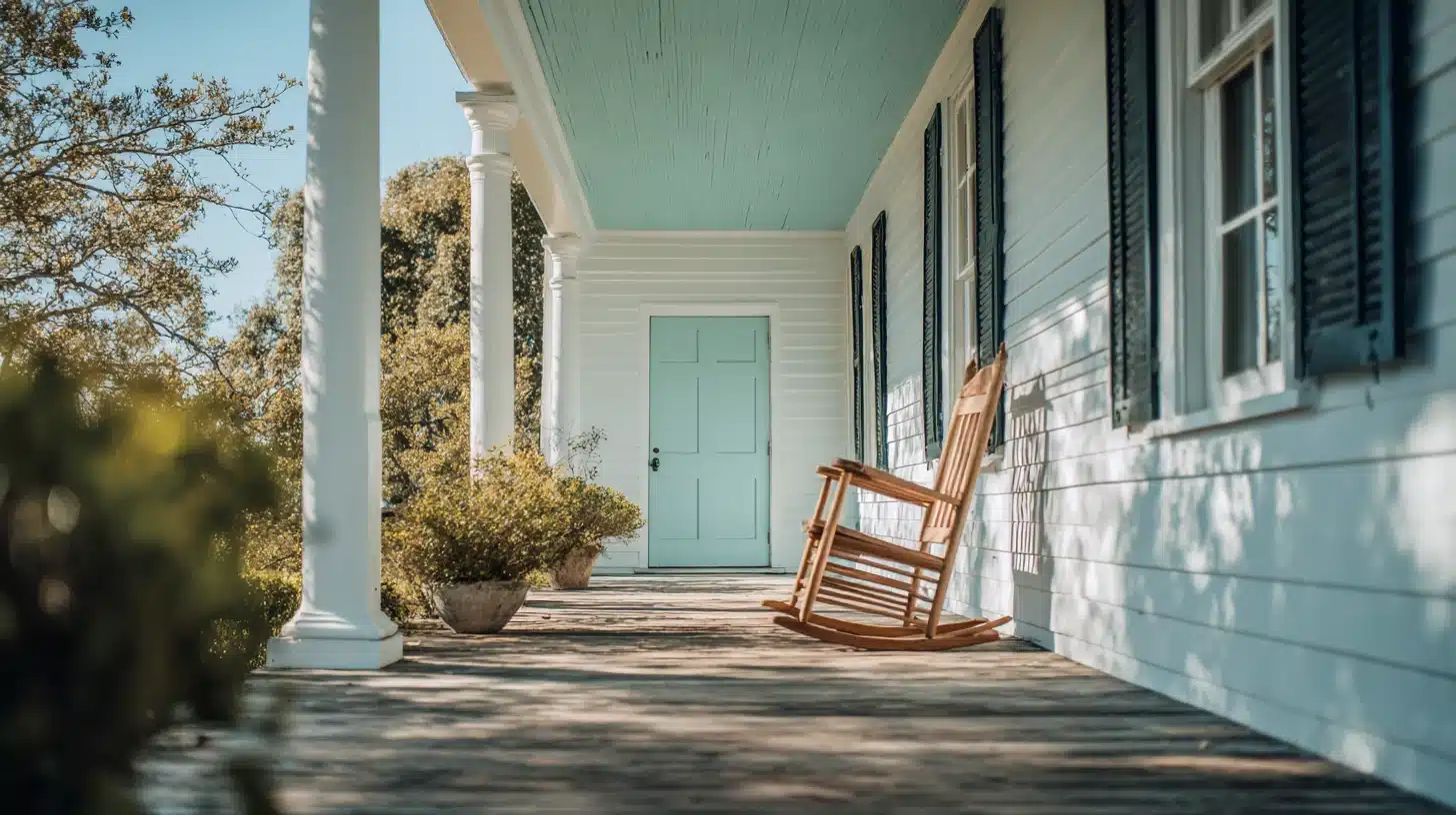
Bright orange suits playrooms and gyms. Burnt orange works well in living rooms. Peach orange is perfect for bedrooms.
Ask yourself: how do I want this room to feel?
2. Consider the Size of the Room
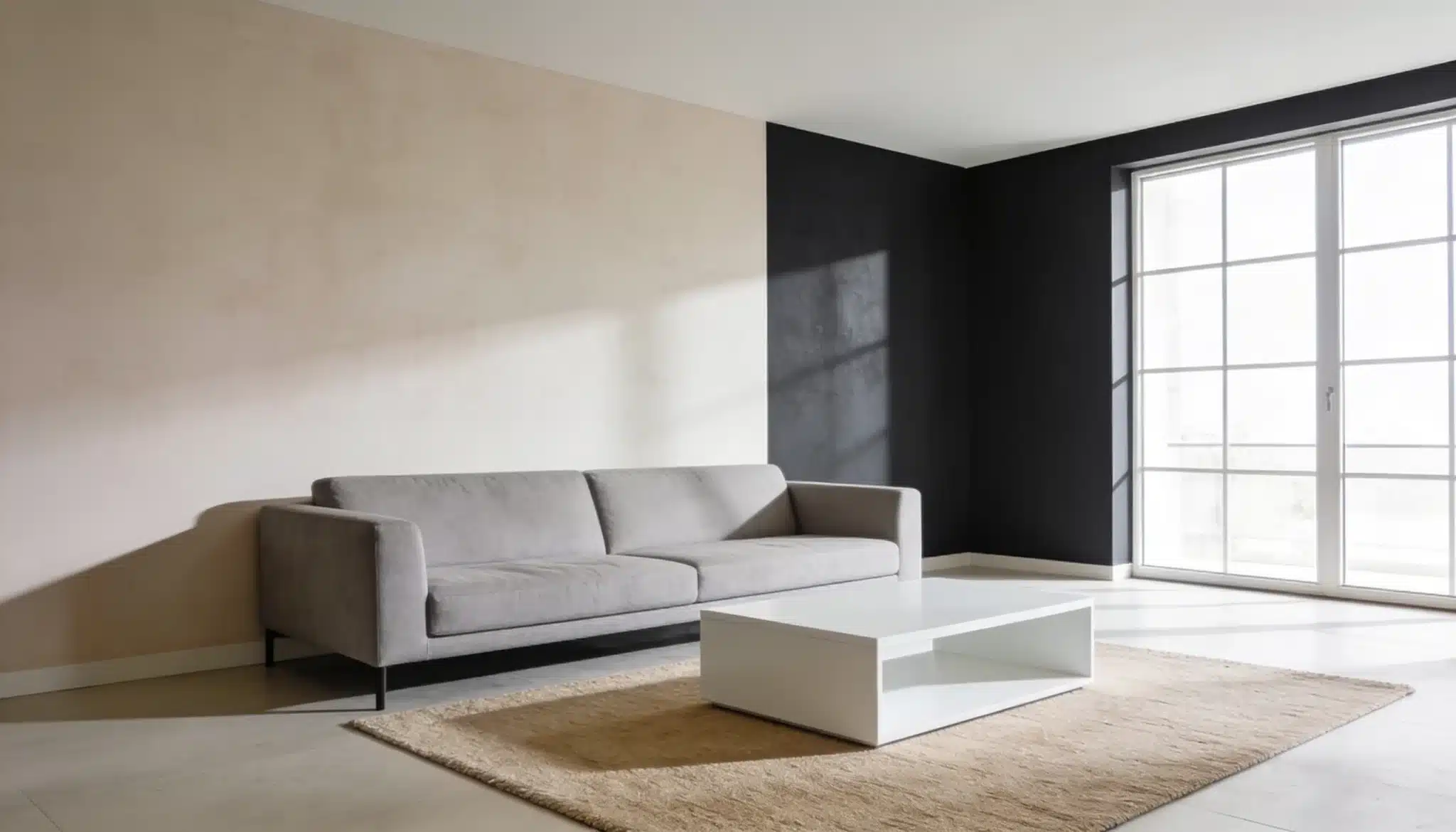
Room size matters; bright oranges can make a small room feel cramped, and muted tones like terracotta and rust suit compact spaces better.
Bigger rooms can handle bolder shades without feeling too heavy.
3. Think About Your Existing Furniture and Fixtures
Do not choose a palette in isolation. Look at what is already in the room. Your floors, furniture, and curtains all play a role.
4. Limit Your Palette
Do not use too many colors at once; stick to three or four colors max.
Pick one shade of orange as your main color and then choose one or two supporting colors. Add a neutral like white or beige to bring balance.
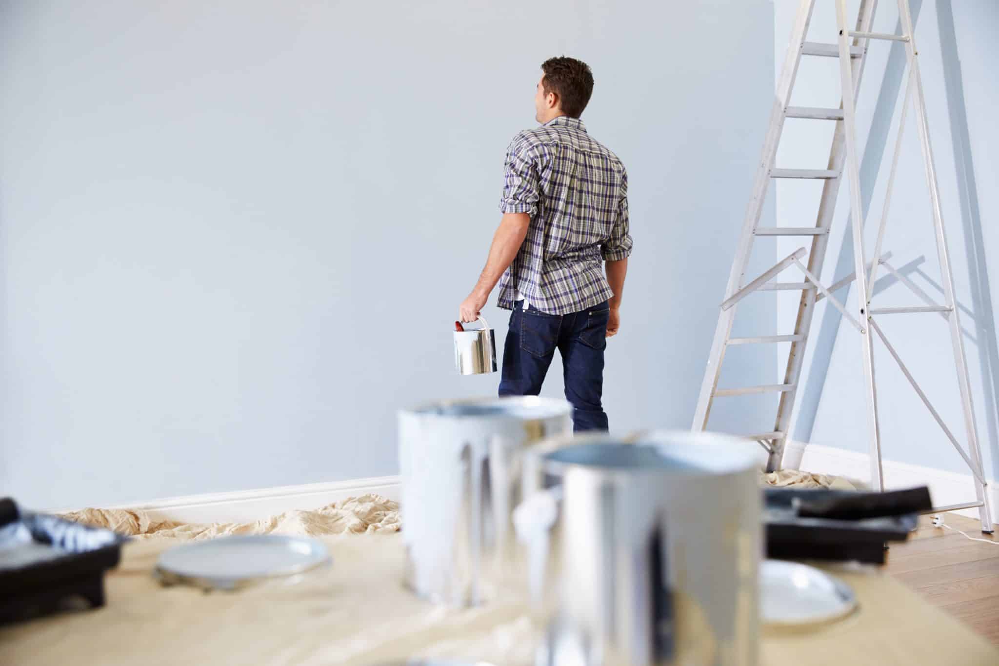
5. Test Before You Commit
Do not just look at paint swatches in the store; take them home and hold them up against your walls in different lighting.
Natural light and artificial light change how orange looks on a wall, so always test first.
Final Thoughts
There are so many ways to bring orange into your space, and now you know how to work with it.
Start small: try an orange accent wall, swap in some rust-orange cushions, and see how it changes the feel of the room.
The right orange color palette can completely change how a space looks and feels, so go ahead and experiment.
Got a favorite orange combination? Drop it in the comments below!
Frequently Asked Questions(FAQs)
1. What Shade of Orange is Most Popular in Interior Design Right Now?
Terracotta and burnt orange are trending right now. They feel natural, work with most styles, and add color without feeling too loud.
2. Is Orange a Good Color for a Kitchen?
Yes. Orange stimulates appetite and adds a lively feel to kitchens. Terracotta tiles or rust orange cabinets are great starting points.
3. What is the 3 Color Rule?
The 3 Color Rule Means Using One Main Color, One Supporting Color, and One Accent. It Keeps Any Design Clean and Balanced.