Painted my whole living room grey last spring. Loved it for about two weeks. Then it just sat there looking like a waiting room.
Turns out grey isn’t the problem. It’s what you pair it with.
One wrong accent color and grey looks unfinished forever. Get it right and the same paint suddenly looks planned.
I’ll show you exactly which accent wall colors work best with grey according to the latest trends.
I’ll share current color trends, room-specific tips, and practical advice to help you choose confidently.
Are Accent Walls Still Relevant?
The most common question – Are accent walls outdated? People keep saying that, but theyaren’t going anywhere.
Bad accent walls from 2010 look dated – because they are random feature walls with no purpose. Today’s accent walls are different.
Color-drenching is trendy now. Some prefer this over single accent walls. Others want all-neutral spaces. But accent walls have evolved.
Modern ones are thoughtful and purposeful. Grey accent walls prove this; they’re subtle yet impactful.
In fact, when you look at how Feng Shui guidesthe use of a feature wall in the living room, you see why placement and intention matter just as much as color choice.
A well-positioned wall can actually shift the mood of the entire room and bring a sense of harmony.
Why Grey is the Perfect Base for Accent Walls?
Grey has become my go-to neutral for good reason. It’s timeless and works with almost any color you throw at it.
Cool vs Warm Greys Matter
Not all greys are the same. Cool greys have blue undertones and feel modern. Warm greys lean toward beige and feel cozy. I always check my grey’s undertones before picking accent colors.
Check your grey’s undertone in daylight before picking an accent color, since the wrong pairing usually traces back to skipping this step.
Grey Creates Perfect Balance
What makes grey special is that it acts like a mediator. Got a bold red in mind, grey tones it down just enough. If you want soft pastels, grey gives them the grounding they need.
Works with Every Style
Grey adapts to your design style. Modern homes get clean sophistication. Cozy spaces feel more inviting. Industrial designs get that urban edge they need.
Interestingly, this flexibility is also why many real estate experts believe a well-chosen accent wall can boosthow buyers see a property.
Best Colors That Complement Grey Accent Walls
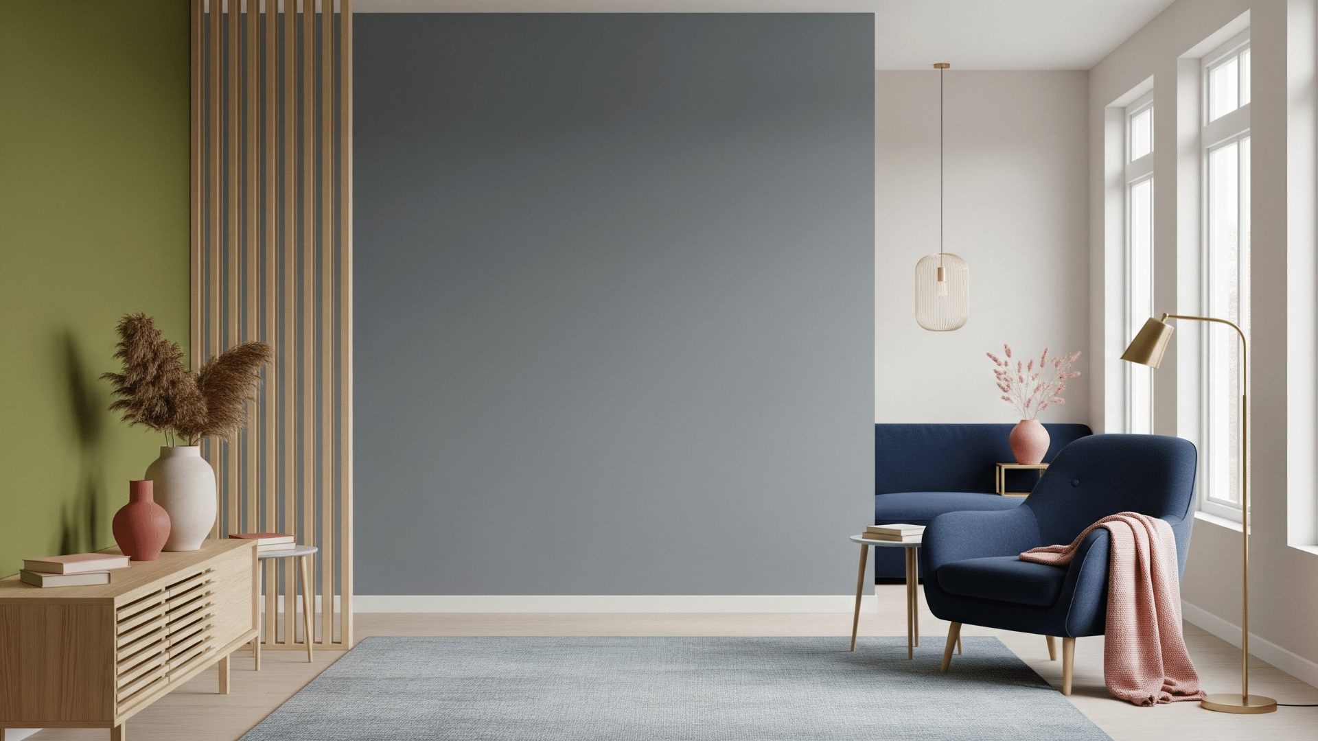
I’ve tested countless color combinations with grey walls. Here are the winners that look amazing this year.
1. Deep Jewel Tones
Emerald green against green is pure magic. Navy blue creates instant sophistication. Plum adds drama without feeling overwhelming.
These rich colors work best in living rooms and bedrooms. They make grey feel luxurious instead of plain. I love how jewel tones catch light and create depth.
If you want a specific navy to ask for, Benjamin Moore Hale Navy (HC-154) is the one most designers reach for first.
2. Earthy & Organic Shades
Olive green brings the outdoors inside. Terracotta warms up cool greys beautifully. Clay colors make any room feel grounded and calm.
These earthy tones are huge this year. They connect with nature and wellness trends.
Plus, they make your space feel more sustainable and mindful.
3. Soft Pastels & Muted Tones
Blush pink softens grey walls perfectly. Dusty lavender adds gentle color without shouting.
Sage green creates a spa-like feeling. And on that note, Soft Sage by Sherwin-Williams might be the perfect and only green you are looking for!
I recommend these colors for smaller spaces. They brighten rooms without overwhelming them.
Light grey walls make pastels pop just enough.
4. High-Contrast Neutrals
Sometimes, simple wins. Black accent walls against light grey create bold drama. Charcoal adds depth while staying sophisticated. Crisp white keeps things fresh and timeless.
These combinations never go out of style. They’re safe bets that look expensive and intentional.
SW Urbane Bronze is a rich brown that looks almost charcoal in less light – and might be a good option for everyone looking for a good contrast look.
Should the Accent Wall be Lighter or Darker Than Grey?
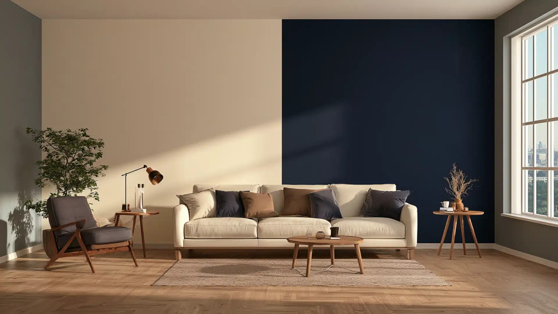
Everyone asks this. It’s not a yes or no thing, but here’s how I think about it.
Darker works when you want the wall to disappear a little – like navy color behind a bookshelf or charcoal behind a headboard. It sits back instead of demanding attention.
Go for lighter if the room already feels a bit much: low ceilings, small windows, not a ton of sun coming in.
A pale sage or a dusty blush next to mid-tone grey opens things up instead of closing them in further.
Here’s where people mess up though. They go three shades darker than they should because it looked incredible on Pinterest, then wonder why their 8 foot ceiling suddenly feels like 7. If your ceilings are already low, stay close to your grey’s own depth and let the color do quieter work.
So no universal rule. Just pay attention to how much light the room actually gets, and be honest about whether you want the wall to hide or show off.
Styling the Wall so the Wall Actually Looks Finished
Paint color is half the job. What surrounds it decides whether the wall looks planned, or like you ran out of a different color halfway through.
Start with decor that echoes the color. Pillows, rugs, curtains, whatever picks up a hint of that shade pulls the whole room together instead of leaving the wall stranded on its own.
Lighting changes everything here. One overhead fixture flattens paint.
Layer in a table lamp, a floor lamp, a sconce, and suddenly the color has depth it didn’t have before.
Avoid too much art, too many shelves because less works better. Always.
Texture does a lot of quiet work too. Set a woven basket or a wood side table against that smooth painted surface and the contrast does something flat paint alone never could.
Design tip: A single large piece of furniture reads as intentional against a bold wall. A handful of small scattered ones just looks cluttered.
Conclusion
Grey accent walls offer the perfect solution for modern homes today. You now have the color combinations that work, from dramatic jewel tones to calming pastels.
The styling tips I shared will help you create a space that feels intentional and polished. It’s not about following every trend. It’s about choosing what feels right for your home.
Don’t let anyone tell you accent walls are finished.
Start with one room. See how it changes your space. You might surprise yourself.
Frequently Asked Questions (FAQs)
1. Do All Four Walls Need to Match, or Just One?
Just the one you see first when you walk in. Keep the rest lighter, and it still feels balanced, not matchy.
2. Will a Dark Wall Make My Small Room Feel Even Tighter?
Sometimes, especially with charcoal. Toss in a mirror or an extra lamp nearby and the room won’t feel boxed in.
3. What Paint Finish Actually Holds Up on an Accent Wall?
Eggshell or satin, honestly. Flat paint shows every scuff mark, and gloss just points out every little wall flaw.
4. Window Wall or Door Wall, Which One Should I Paint?
I’d go with the wall facing the door. It’s the first thing anyone notices the second they walk in.