Most people spend weeks choosing the right blue for their walls.
And still end up unsure. If you have been looking at Upward Sherwin Williams, you are not alone.
This soft, airy blue keeps showing up on mood boards for good reason. But does it actually work in a real home?
I have broken down everything you need to know, from the best rooms to use in to , so you can decide with confidence.
Upward Sherwin Williams Paint Specifications and Product Details
For those who like to look beyond just color, understanding the basic specifications of Upward Sherwin Williams can help you make a more confident decision.
These details give you a clearer picture of how the paint performs and where it fits best.
| Detail | Information |
|---|---|
| Color Name | Upward |
| Brand | Sherwin Williams |
| Color Family | Blue |
| LRV | Approximately 57 |
| Undertone | Blue gray |
| Available Finishes | Flat, Matte, Eggshell, Satin, Semi Gloss, Gloss |
| Best Finish for Walls | Eggshell or Matte |
| Best Finish for Trim | Semi Gloss |
| Best Finish for Cabinets | Satin or Semi Gloss |
| Availability | In store and online at Sherwin Williams |
| Sample Option | Yes, available as a peel and stick sample or small paint pot |
The LRV of 57 means Upward reflects a good amount of light. It is not a dark color and will not make a room feel closed in.
It sits in the medium range, which makes it flexible across different room sizes and light conditions.
Quick insight:
From experience, testing this shade on different walls is worth it, since lighting can shift how soft or cool it appears throughout the day.
What Kind of Color is Upward Sherwin Williams?
Sherwin Williams named Upward their Color of the Year 2024, highlighting its calm, modern appeal.
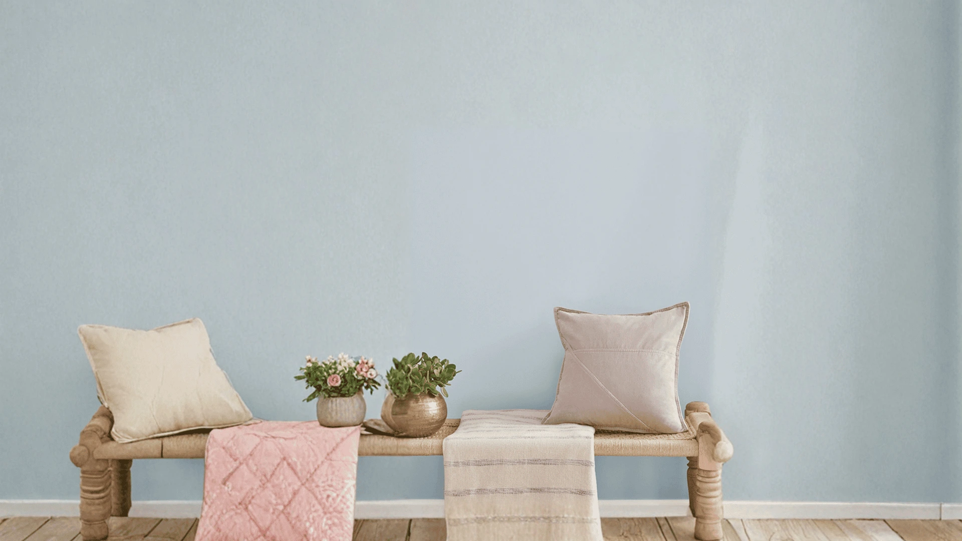
It is a soft, muted blue. It is not a bright sky blue or a deep navy. Think of it as a blue that has been slightly toned down with a touch of gray.
It sits somewhere between calm and cool, and that is exactly what makes it so easy to live with.
That calm, airy quality is why so many homeowners are reaching for this color right now. Modern homes lean toward soft, neutral tones.
Loud colors are out. Quiet, easy colors are in. Upward fits right into that space.
It works well with white trim, natural wood, and light gray furniture. You do not need to overthink the styling.
Upward Sherwin-Williams Undertones Explained
The undertones of Upward Sherwin-Williams help you avoid surprises once it is on your wall.
The base is clearly blue. But there is a soft gray sitting underneath it. That gray influence keeps the color from feeling too bold or too icy. It gives the color a grounded, settled quality.
Here is how the undertones behave in different conditions:
Bright Natural Light: The gray pulls back and the blue comes forward. The color looks fresher and slightly cooler. It can feel almost like a soft sky blue in full sun.
Low Light or Cloudy Days: The gray becomes more noticeable. The color looks quieter and more muted. It can feel a bit flat if the room does not get much natural light at all.
Artificial Lighting: Warm bulbs bring out the gray more. The blue softens and the color can look closer to a blue gray. Cool white bulbs keep the blue tone more visible.
How Upward Sherwin Williams Looks in Different Lighting
Lighting changes everything with paint. The same color can look like two completely different shades depending on which way your room faces.
Here is what to expect with Sherwin Williams Upward paint in each light condition.
North-Facing Rooms
North-facing rooms get indirect, cooler light all day.
In these spaces, Upward can look noticeably grayer and more muted. The blue tone is still there, but it takes a back seat.
If your room faces north and does not get much sunlight, test a sample first. You may want to pair it with warm white trim to balance the cool feel.
South-Facing Rooms
South-facing rooms get the most natural light throughout the day.
This is where Upward really shines. The color looks bright, fresh, and clearly blue. South facing rooms bring out the best version of this color.
East-Facing Light
East-facing rooms get warm morning light and cooler afternoon light. In the morning, Upward looks soft and slightly warm.
By afternoon, it shifts to a cooler, more blue-gray tone. It is a pleasant color to wake up to in an east-facing bedroom.
West-Facing Light
West-facing rooms get golden afternoon and evening light. That warm glow softens the gray undertone and gives Upward a cozy, relaxed feel in the evening.
During the day, the color looks more neutral and balanced.
Artificial Lighting
Warm yellow bulbs push the color toward a blue gray. Cool white or daylight bulbs keep the blue tone truer.
For living rooms and bedrooms, warm bulbs create a cozy feel. For bathrooms and kitchens, cooler bulbs help the color look clean and crisp.
Where to Use Upward Sherwin Williams
Sherwin Williams Upward works in more places than most people expect. It is calm enough for bedrooms, fresh enough for kitchens, and flexible enough to work outside too.
Interior Uses
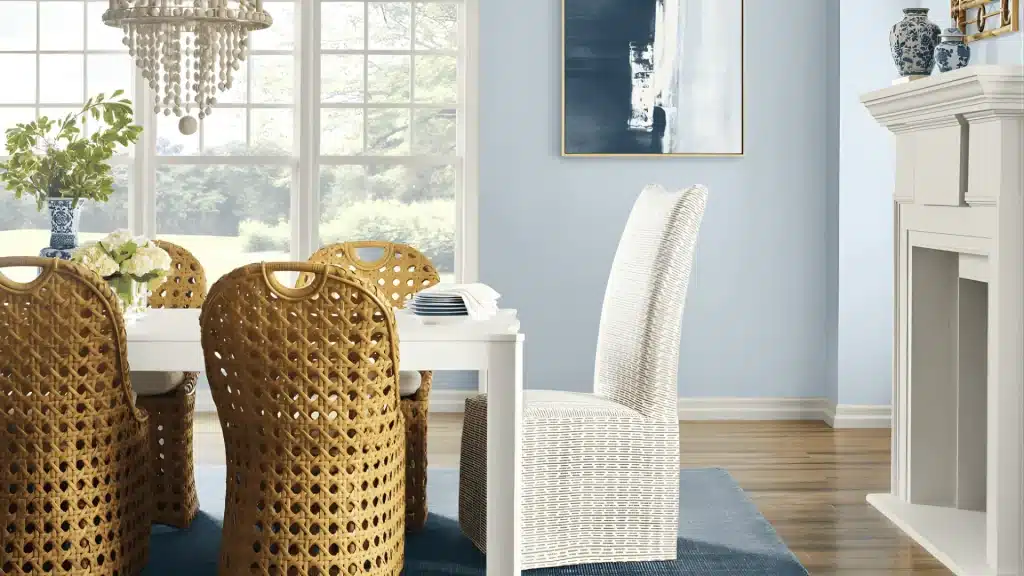
Upward works well in living rooms, bedrooms, kitchens, bathrooms, hallways, and stairs. It keeps spaces feeling calm and open. Rooms with good natural light show it best.
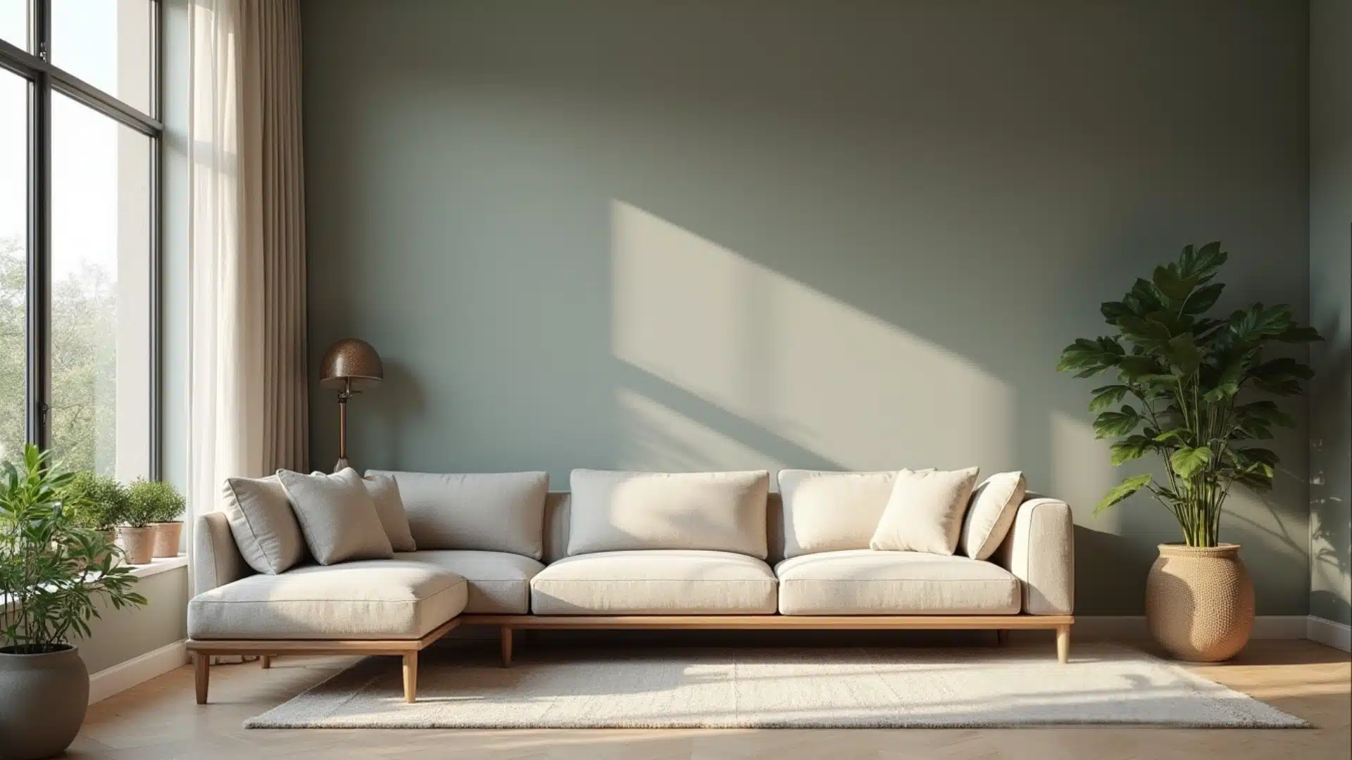
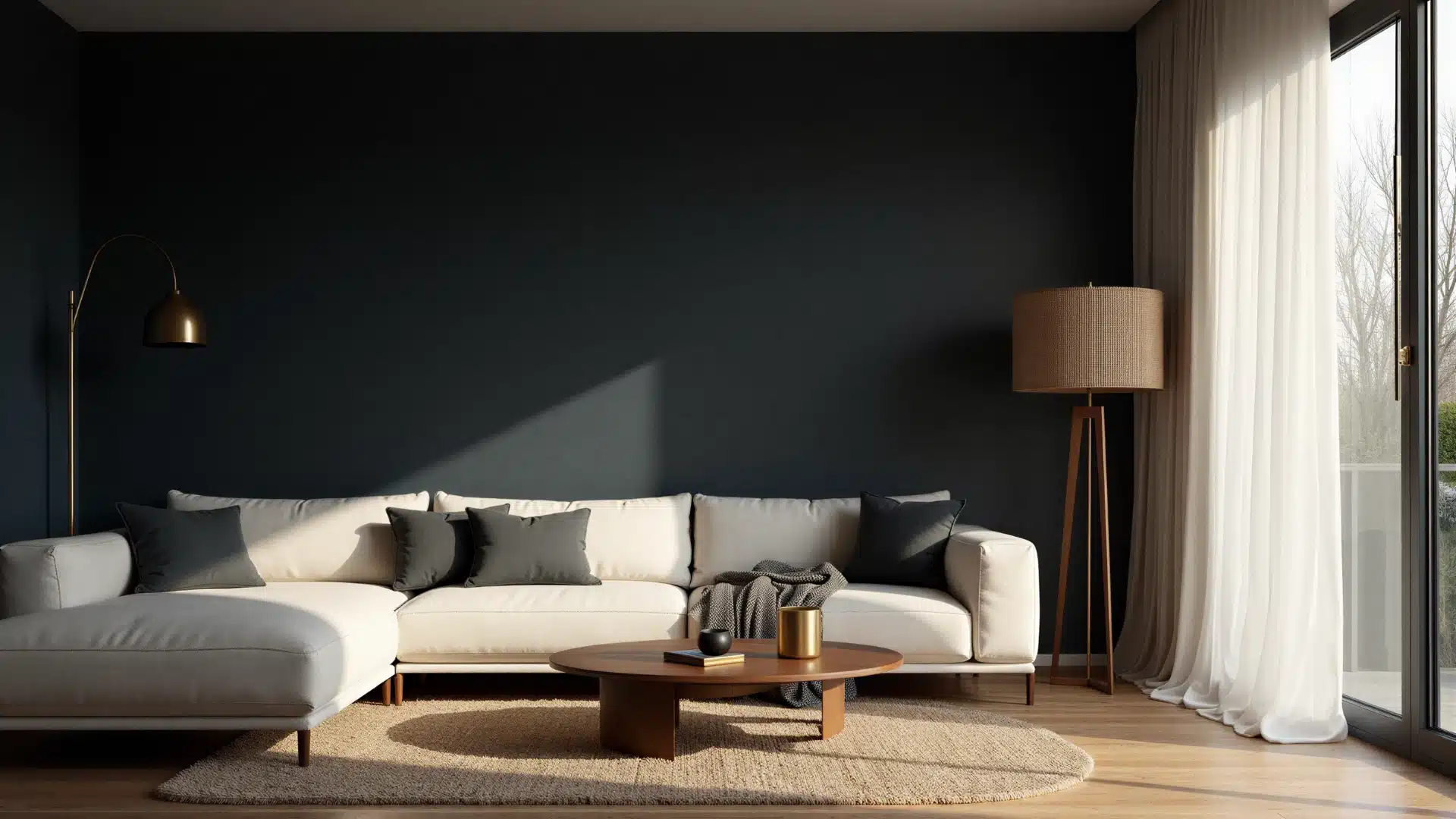
Living Room
Upward gives a living room a relaxed, open feel. It works well with light gray sofas, white shelving, and natural wood floors.
Keep the trim white to let the blue come through clearly. Rooms with large windows will show this color at its best.
Bedroom
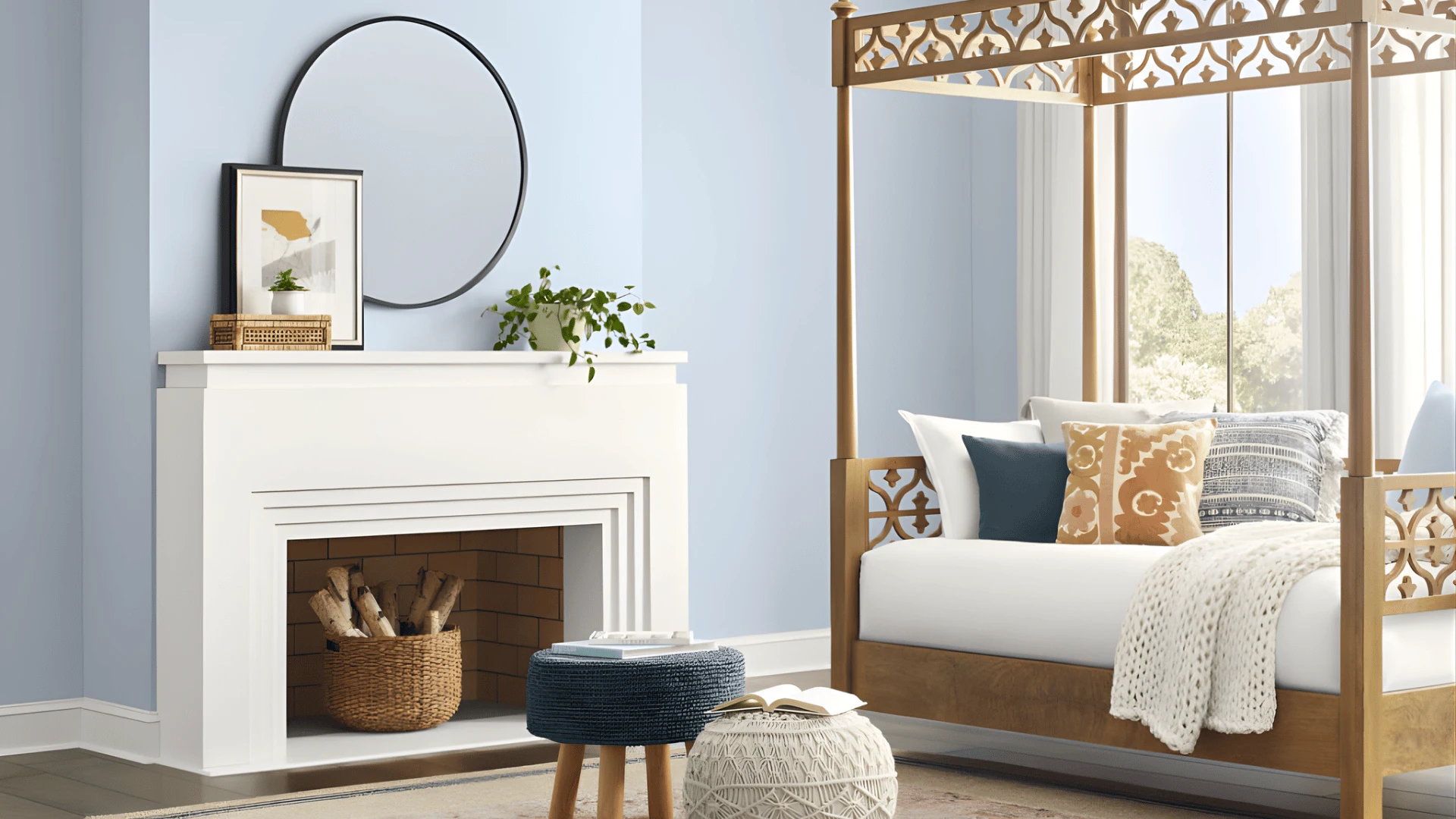
This is one of the most popular spots for Upward.
The soft blue gray tone is calming and easy to rest in. It does not feel cold if you add warm bedding and wooden furniture. It suits both adult bedrooms and kids rooms.
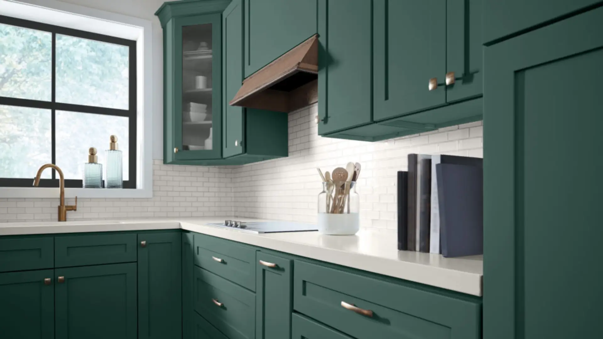
Kitchen
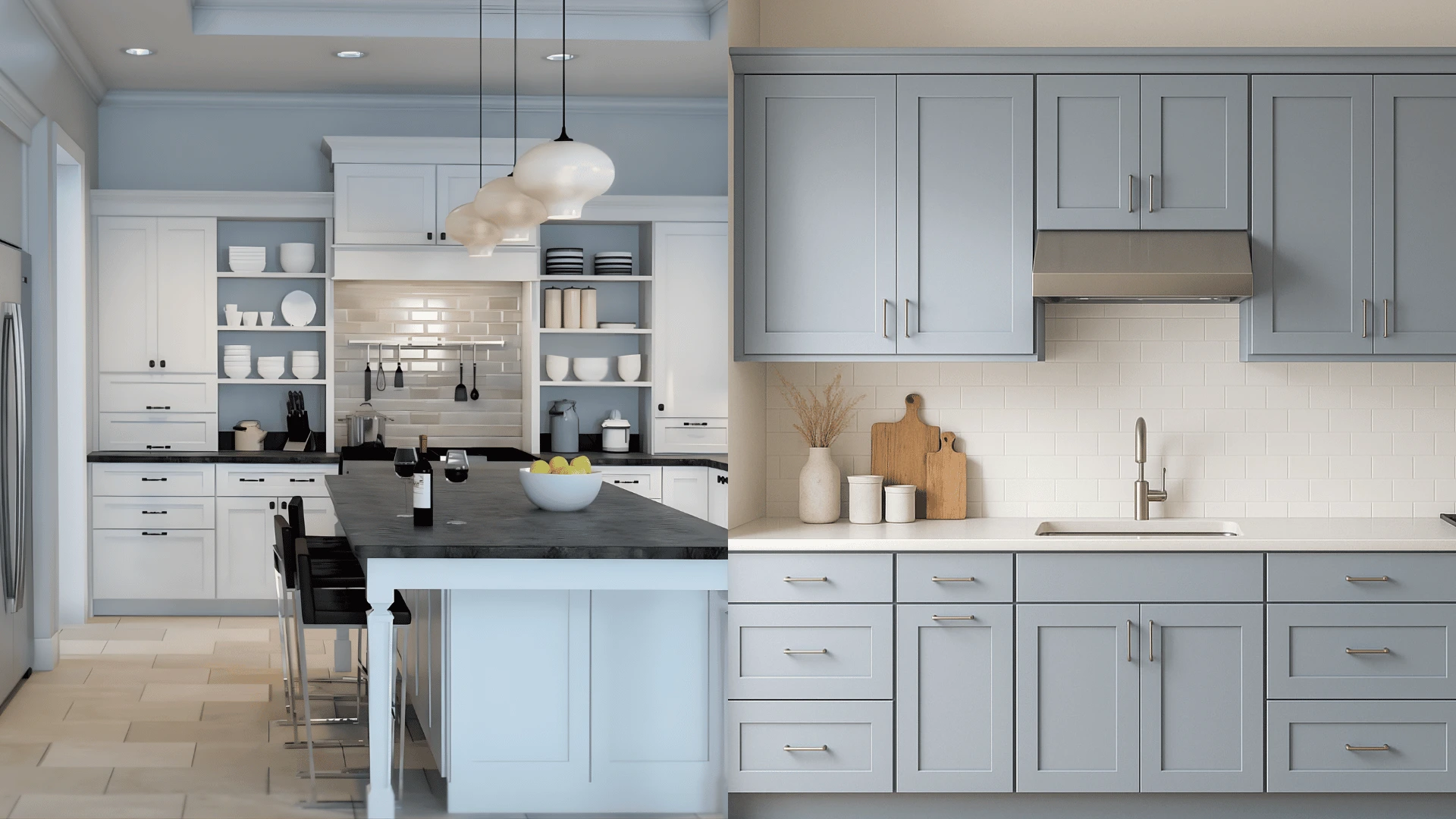
Upward on kitchen cabinets or walls gives the space a clean, airy feel. It pairs well with white countertops and stainless steel appliances.
It is a good alternative to plain white if you want a little more character without going too bold.
Bathroom
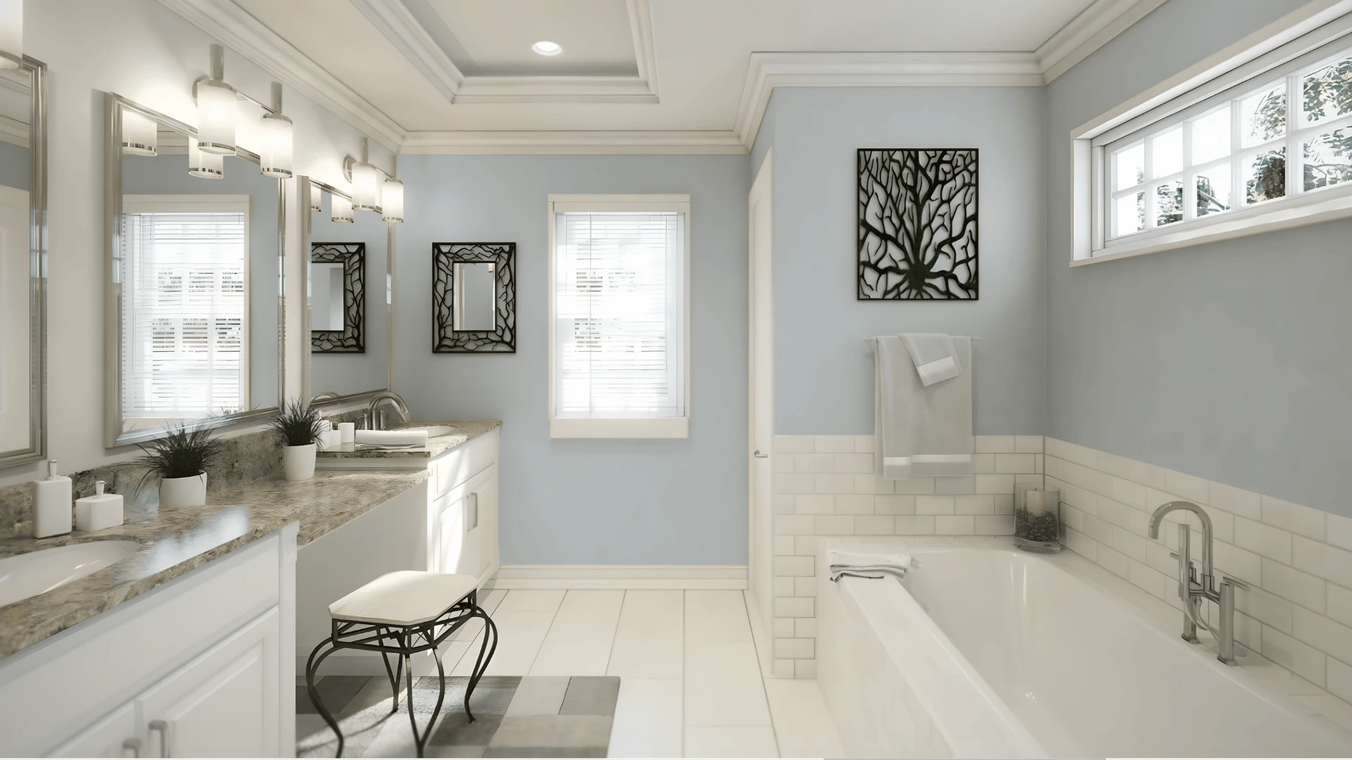
Upward feels right at home in a bathroom. The blue gray tone works with white tiles, chrome fixtures, and light wood accents. It gives the space a calm, clean quality that feels fresh every day.
Exterior Uses
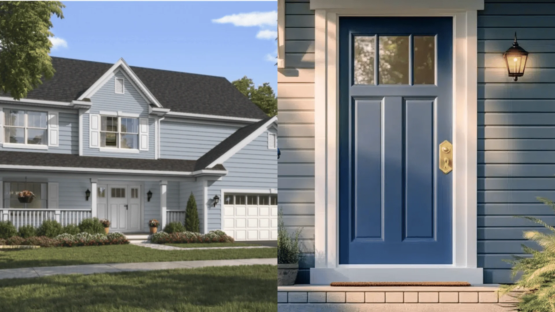
Use it on a full exterior, front door, shutters, or porch. It reads as a soft, clean blue from the street. Always test it in sun and shade first.
Full Exterior: Upward is a solid choice for a full exterior. It reads as a soft, cool blue from the street. It suits craftsman, farmhouse, and coastal style homes well.
Front Door: Not ready for a full exterior? Use Upward on the front door instead. It stands out without being too loud against brick, white siding, or gray stone.
Shutters: Upward on shutters with a white or light gray exterior gives the home a soft, put together look. A simple way to bring in the color without overdoing it.
Porch: Upward on a porch ceiling is a popular move in coastal and southern style homes. It adds a calm, intentional touch of color.
Accent Areas: Use Upward on accent walls, garage doors, or trim details for a subtle color moment that does not overpower the rest of the home.
Pros and Cons of Upward Sherwin Williams
Every color has its strengths and its limits. Here is an honest look at both sides of this Upward Sherwin Williams review.
Pros
- It is soft and works across many spaces, from living rooms and bedrooms to kitchens and exteriors
- It does not overpower a room, making it easy to live with every day
- It pairs well with a wide range of colors, from crisp whites to warm neutrals and deep blues
- The LRV of 57 means it works in both larger and smaller rooms without feeling too heavy
- It suits many home styles, from modern and coastal to farmhouse and transitional
Cons
- In low light or north facing rooms, the gray undertone can make the space feel cooler than expected
- Under warm artificial lighting, the blue can shift more toward gray, which may not suit every preference
- It needs the right color pairing to avoid looking flat
- It may not be the best fit for warm or rustic interiors with earthy, brown heavy palettes
Is Upward Sherwin Williams the Right Choice for You?
Still deciding? Here is a simple checklist to help you figure out if Upward Sherwin Williams is the right color for your space.
You should use Upward if:
- Your room gets good natural light, especially from the south or west
- Your home has a modern, coastal, farmhouse, or transitional style
- You plan to pair it with white trim or light neutral furniture
- You are using it in a bedroom, bathroom, living room, or on an exterior
- You prefer a color that works both inside and outside the home
You may want to reconsider if:
- Your room faces north and gets very little natural light
- Your interior style leans heavily warm, with lots of terracotta, rust, or deep brown tones
- You want a color with a strong, clear blue presence without any gray softness
- You are working with very warm lighting throughout the space
So, is Upward the right color for your home? If your space gets good light and you love the idea of a calm, cool blue that does not try too hard, this color is well worth a try.
Paint Well!
Upward Sherwin Williams is a calm, easy going blue that works in more spaces than most people expect.
It handles light well, pairs with a wide range of colors, and suits both interiors and exteriors.
If your room gets decent natural light and you want a soft blue without the drama, this is a solid choice.
Try a sample first. See how it looks in your light. Then make your call.
Frequently Asked Questions
1. Is Sherwin Williams Upward Gray or Blue?
Upward is a soft blue with a gray undertone that shifts with light.
2. What Colors Help Sell a House Faster?
Soft neutrals, warm whites, and muted blues like Upward tend to attract more buyers.
3. Is Upward Good for a Bedroom?
Yes, its calm and soft blue tone makes it a great bedroom color choice