You see some colors in a magazine, on a Pinterest board, or at a friend’s house, and it stays with you.
Benjamin Moore Manchester Tan is one of those colors.
It’s not flashy, and it makes a room feel finished, warm, and genuinely livable, the kind of color that designers love.
Depending on your lighting, flooring, and furniture, this color can vary from wall to wall, home to home.
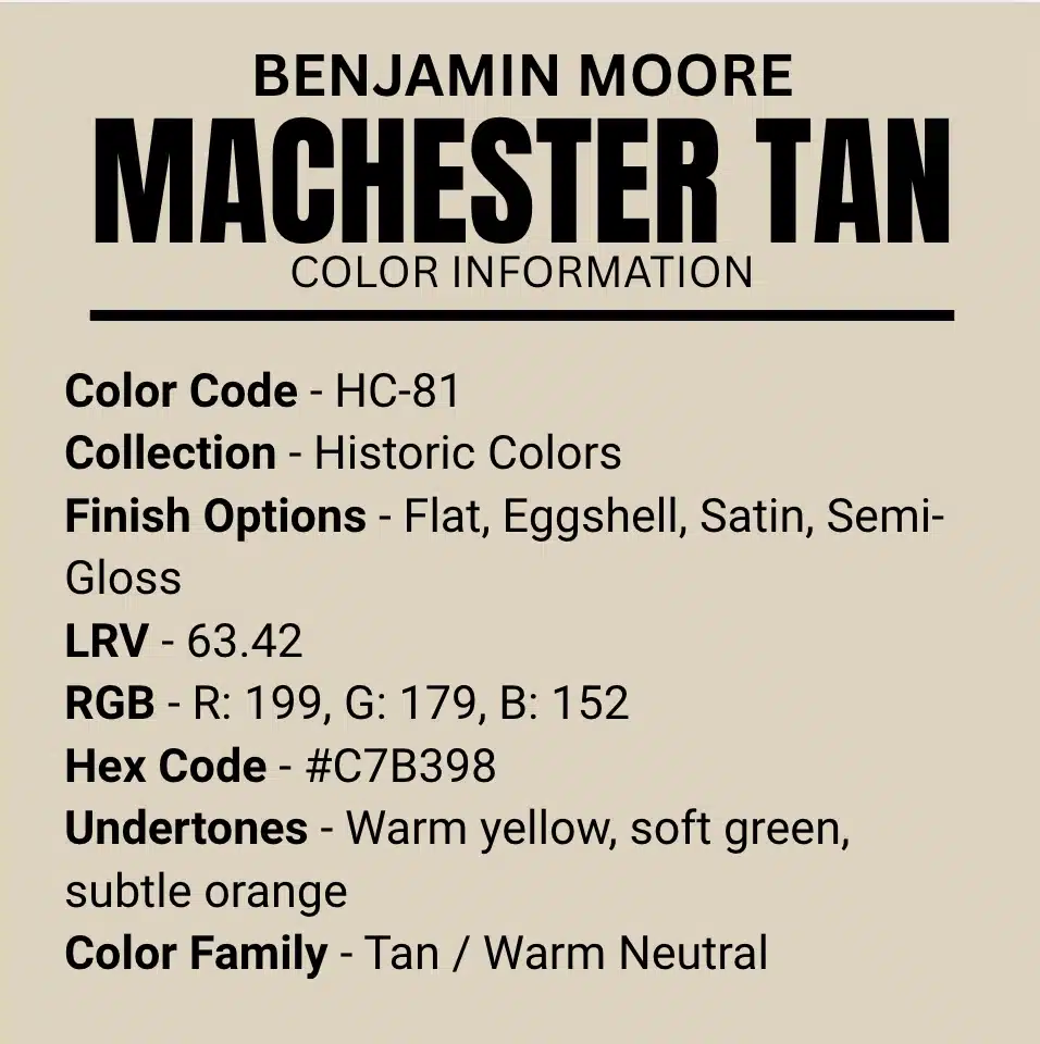
What Color is Benjamin Moore’s Manchester Tan (HC-81)?
Manchester Tan is part of Benjamin Moore’s Classic Colors collection.
It is a warm, muted neutral that comes between beige and tan without fully committing to either. It belongs to the Historic Colors line.
It has an LRV (Light Reflectance Value) of 63.42, which keeps a room bright and prevents it from feeling heavy.
It is not as stark as white, and not as bold as brown.
Manchester Tan Benjamin Moore Color Information
The LRV of 63.42, it is right where a color feels bright without really washing out. But Manchester Tan isn’t for a statement wall.
It makes your whole room feel cohesive.
In a north-facing room, it leans a little cooler and more refined. But when you flip to a south-facing space flooded with natural light, it softens just like a glow.
Same color, totally different mood depending on where you use it.
What are the Undertones of Manchester Tan?
Undertones make a safe tan, paint your walls, and if you see it looks green or weirdly orange under your lights.
When you put it on your walls, and it starts reacting to everything around it, like your lighting, your flooring, your furniture.
That reaction due to its undertones. Let’s know more about it!
Yellow Undertone
This is the most dominant one.
In soft, natural light, especially in south or west-facing rooms, Manchester Tan leans into a soft, honeyed yellow.
It feels very comfy and inviting, like a late-afternoon sun sitting on your walls, which is why it is most commonly called a warm neutral.
Green Undertone
When it comes to green undertones, in cooler light, in north-facing rooms, on overcast days, or in rooms with lots of white trim, the yellow quietly shifts.
And a subtle green undertone starts showing up.
It’s never loud, but it’s there. If your space is cool-toned, then test this one first.
Beige Undertone
The beige undertone keeps everything balanced.
It acts as a buffer, softening the yellow and neutralizing the green, keeping Manchester Tan from going too warm or too cool.
It’s the reason this color feels so livable across different spaces.
Does Light Affect the Undertones?
Manchester Tan reacts to the light in your room, from the natural, artificial, warm bulbs, or cool LEDs.
Under incandescent lighting, it gets yellow-ish and more golden.
Under cool white LEDs, it can get slightly green. This isn’t wrong, it’s just how layered neutrals are.
Test a large swatch in your actual space before deciding on what to do.
So, is Benjamin Moore Manchester Tan a Warm or Cool Color?
Manchester Tan is primarily a warm color, but it’s not one-dimensional.
Its yellow and beige undertones anchor it firmly in warm territory, but that subtle green undertone keeps it from feeling too heavy or too golden.
The result is a warm neutral that still feels fresh and balanced.
Manchester Tan Interior Palette Recommendations
Manchester Tan moves through your home naturally without feeling too much.
It adds character without feeling overwhelming and is adaptable enough to work in any room with varying light throughout the day.
An accent wall or a whole-home palette, this color fits the profile perfectly.
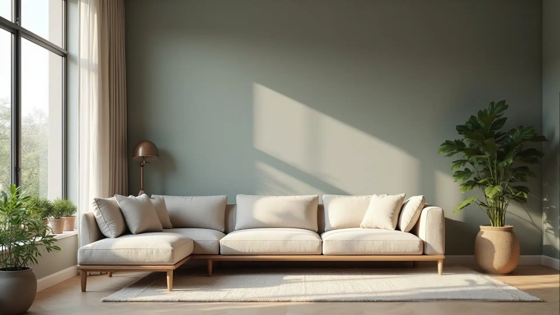
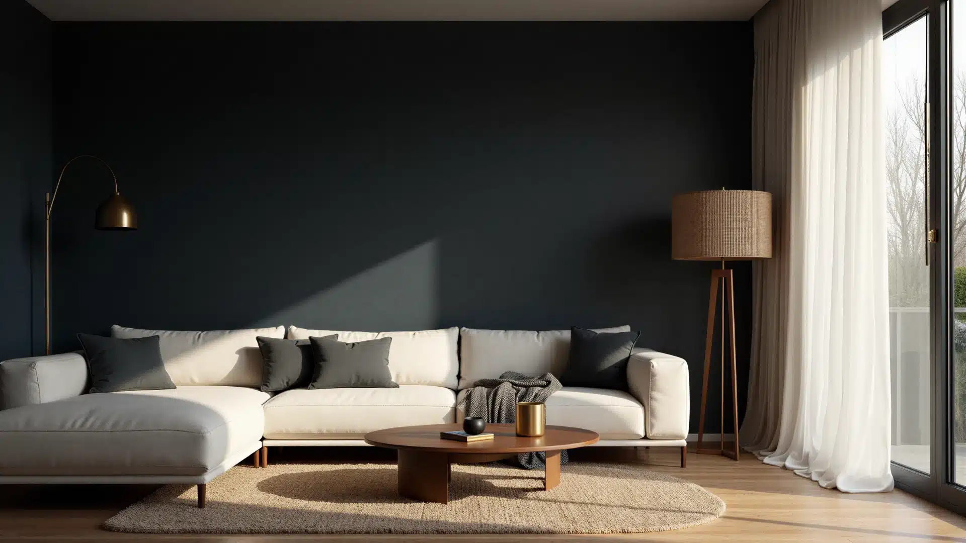
1. Living Room Color Palette
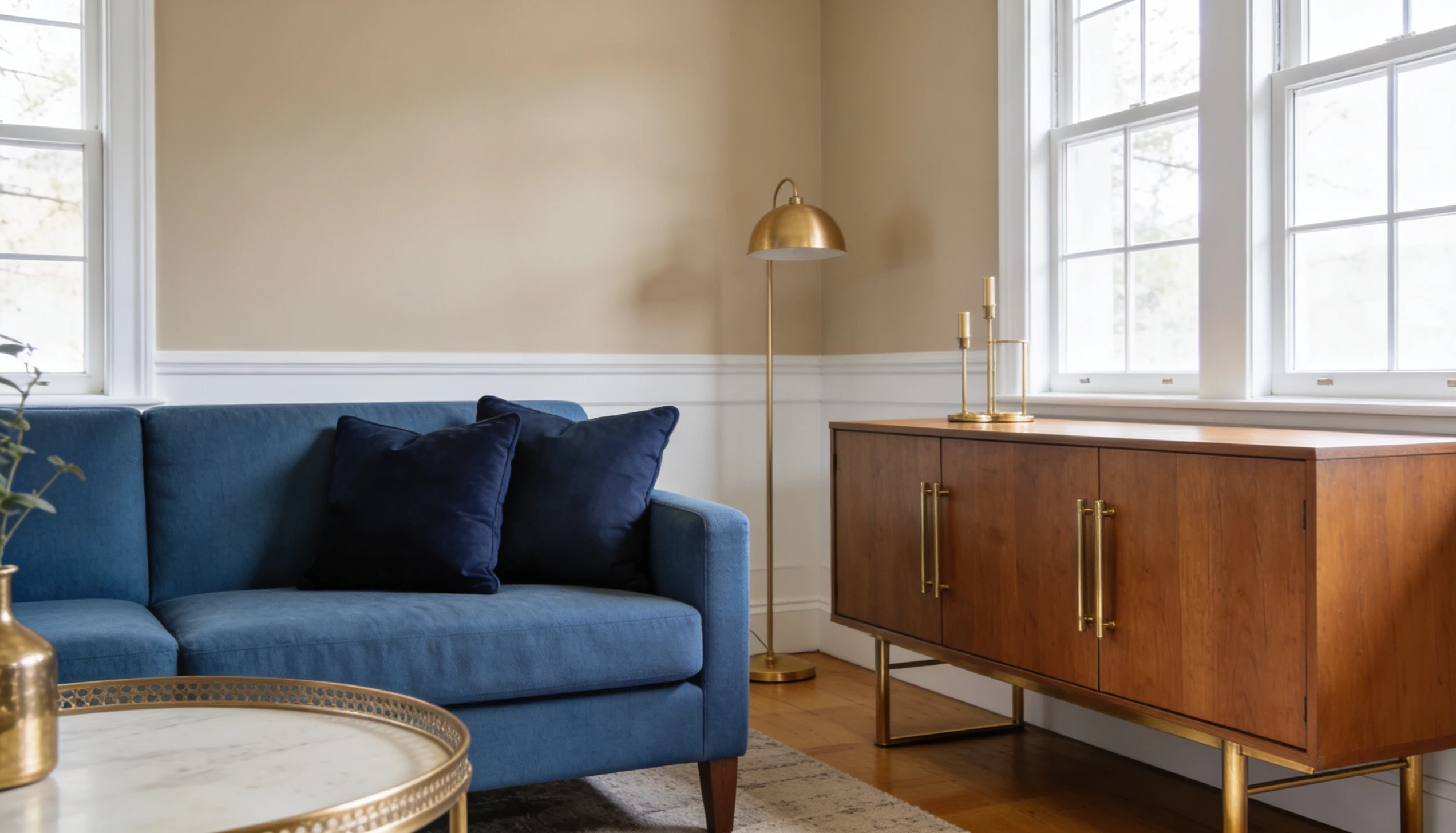
Your living room is the life of your home, and Manchester Tan improves it. The yellow undertones add the comfy feeling without making the space feel closed or constricting.
Build your palette around Manchester Tan using White Dove on the trim and ceilings.
Bring in Navythrough accent pillows or a statement sofa for contrast. Layer with natural wood tones and dark metallics like brushed brass.
2. Bedroom Color Palette
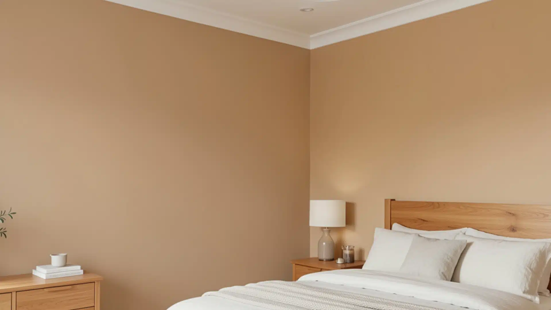
Want a bedroom that actually feels restful? Manchester Tan makes sure it stands up to that.
It’s warm enough to feel inviting but muted enough not to feel distracting.
In a bedroom, pair Manchester Tan with Pale Oak on an accent wall for a soft, tonal look that feels restful and cohesive. And add Chantilly Lace on the ceiling to keep things airy.
Warm linen textures, muted terracotta accents, and soft wood furniture complete the palette beautifully.
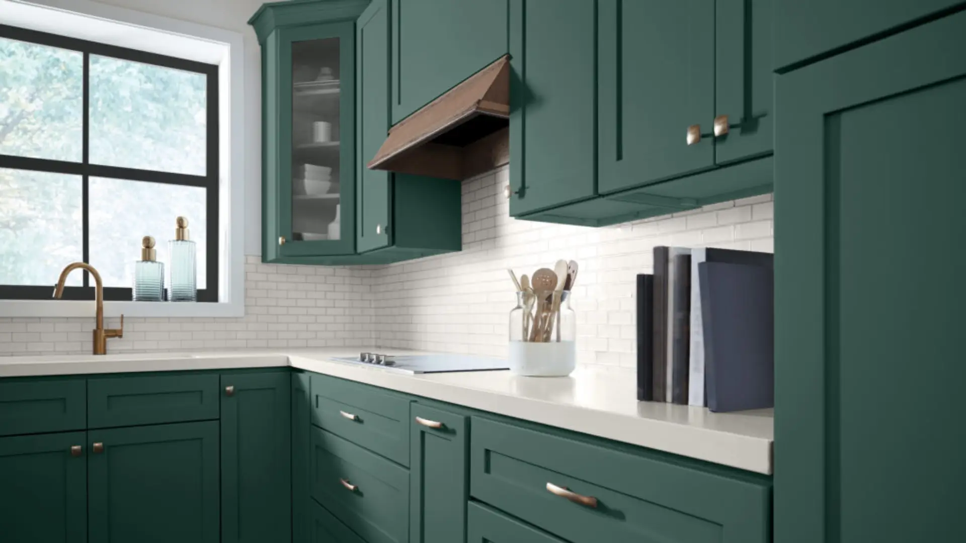
3. Kitchen Color Palette
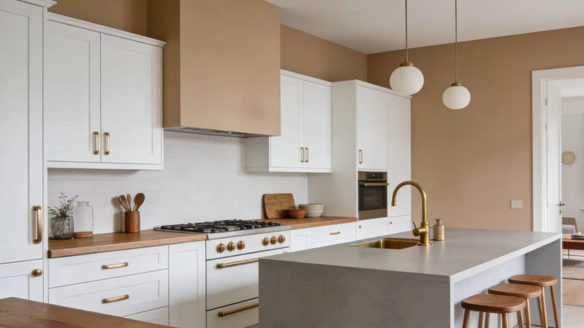
In a kitchen, Manchester Tan adds softness without competing with your cabinets or countertops.
It plays especially well with white or off-white cabinetry, butcher block counters, and brushed brass or bronze hardware.
It works perfectly with simple whitecabinetry. Use Revere Pewteron an island for depth and contrast.
Brushed bronze or warm brass hardware ties the undertones together.
Manchester Tan Benjamin Moore Exterior Use
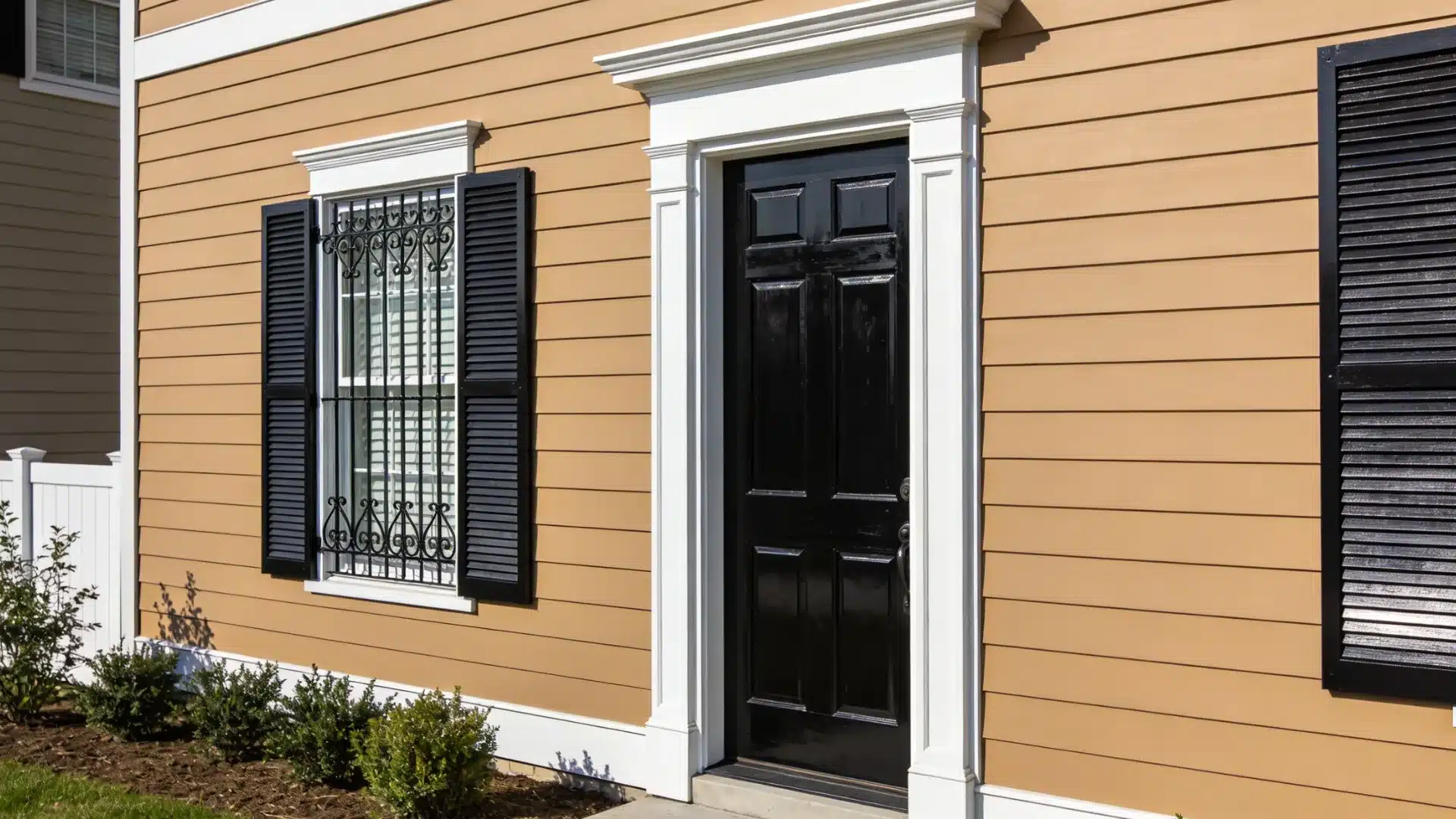
Yes, you can use Manchester Tan outside too.
On a home exterior, it feels like that one classic, neutral color. It’s warm enough to feel welcoming from the street, but not so saturated that it clashes with landscaping, brick, or stone.
Natural light, especially in the morning and late afternoon, gives a soft, golden quality.
For a complete exterior palette, pair Manchester Tan with Wrought Iron shutters, White Dove trim, and a black or deep navy front door.
This combination looks expensive, intentional, and genuinely effortless.
Best Colors That Pair With Benjamin Moore Manchester Tan
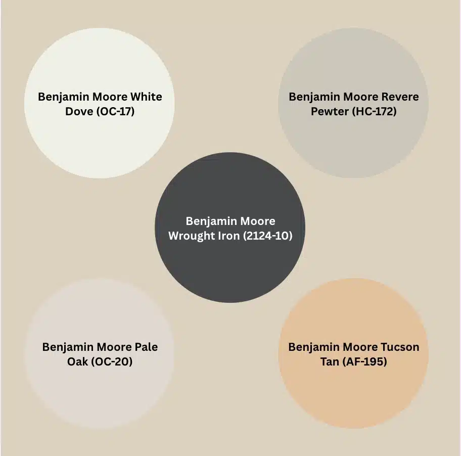
Manchester Tan is a team player. It can be paired with any color.
Its soft, muted base means it doesn’t contrast with other colors – instead, it lifts them. These Benjamin Moore color combinations bring everything together.
Benjamin Moore White Dove (OC-17)
This is the last time I am bringing White Dove here. I promise.
A perfect, clean, creamy white that softens Manchester Tan. Everyone’s favourite combo.
Use the white dove on trim and ceilings to create a polished contrast without making it feel stark or cold.
Benjamin Moore Revere Pewter (HC-172)
A warm greige fits with Manchester Tan.
It can be a great option for open-plan spaces where you need two neutrals that go together naturally without competing.
Benjamin Moore Wrought Iron (2124-10)
A deep, moody charcoal that gives Manchester Tan a bold feel.
Perfect for front doors, accent walls, or cabinetry when you want a contrast.
Benjamin Moore Pale Oak (OC-20)
A lighter, airier neutral that goes with Manchester Tan.
This Pale oak paint is ideal for adjacent rooms where you want a cohesive, tonal flow throughout the home.
Benjamin Moore’s Manchester Tan vs Accessible Beige
Manchester tan and Accessible beige are two popular soft neutrals from different brands, and people often can’t decide which to choose.
Both are in similar territory on the color spectrum.
But they turn out quite differently on walls depending on your lighting and space.
| Detail | Manchester Tan HC-81 | Accessible Beige SW-7036 |
|---|---|---|
| Brand | Benjamin Moore | Sherwin-Williams |
| Color Code | HC-81 | SW-7036 |
| Collection | Historic Colors | Timeless White Collection |
| LRV | 63.42 | 58 |
| Undertones | Yellow – Green – Beige | Beige – Taupe – Green |
| Warmth | Warm Neutral | Warm Neutral |
| Green Undertone Risk | Moderate | Moderate |
| Best Lighting | South – West Facing | South – West Facing |
| Best Used In | Living Room – Bedroom – Exterior | Living Room – Kitchen – Open Plans |
| Trim Pairing | White Dove OC-17 | Alabaster SW-7008 |
| Overall Feel | Warm – Soft – Historic | Warm – Greige – Casual |
Is Manchester Tan Benjamin Moore Outdated?
No. See, trends come and go.
Greige was everywhere, then came white, then gray, and now yellow neutrals are back.
Benjamin Moore’s Manchester Tan never really chased any trend, but it just stayed how it always was. That’s the thing about Historic Colors – they’re built for decades.
If a color this reliable is “outdated,” then outdated looks pretty good on a wall.
People Also Asked
1. What is Benjamin Moore’s Most Popular Beige?
Pale Oak OC-20 and Revere Pewter HC-172 are the most popular beiges.
2. What is Benjamin Moore’s Most Popular Color?
Simply White OC-17 consistently tops Benjamin Moore’s best-sellers. It’s clean, soft, and works in any space.
3. What Color is Replacing Gray?
Warm neutrals are taking over. Beiges, tans, and greiges are replacing cool grays.
4. What Paint Colors are Outdated?
Cool grays, stark whites, and matchy-matchy greiges are feeling flat.