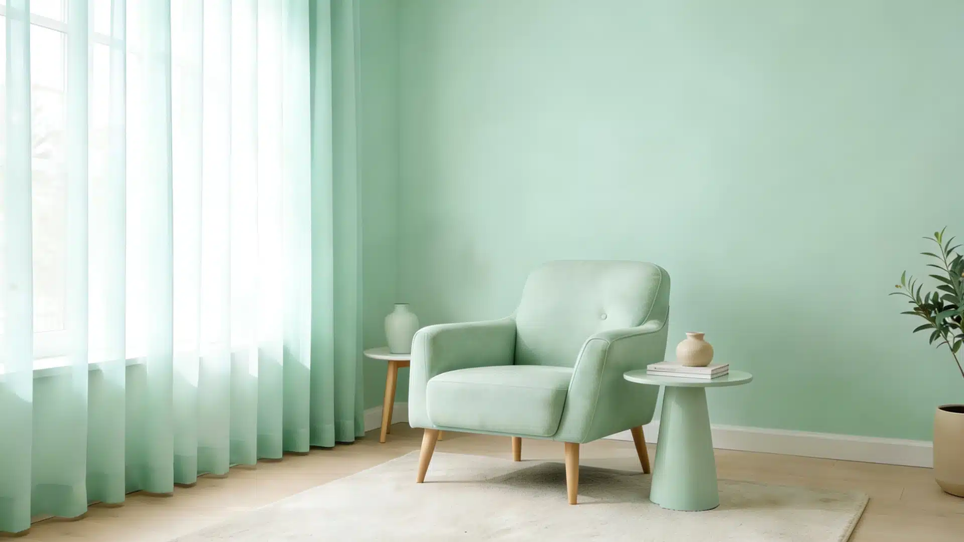
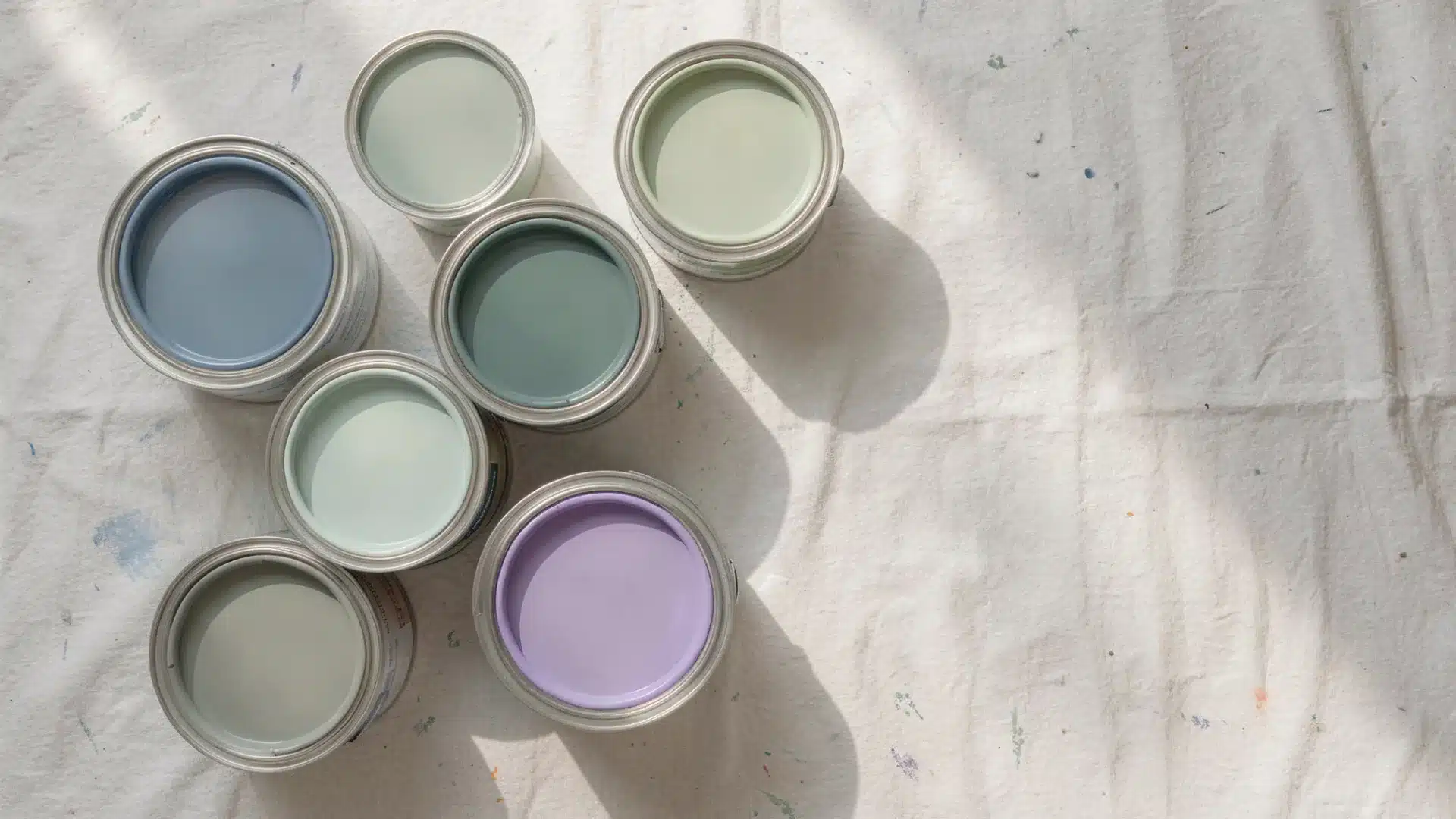
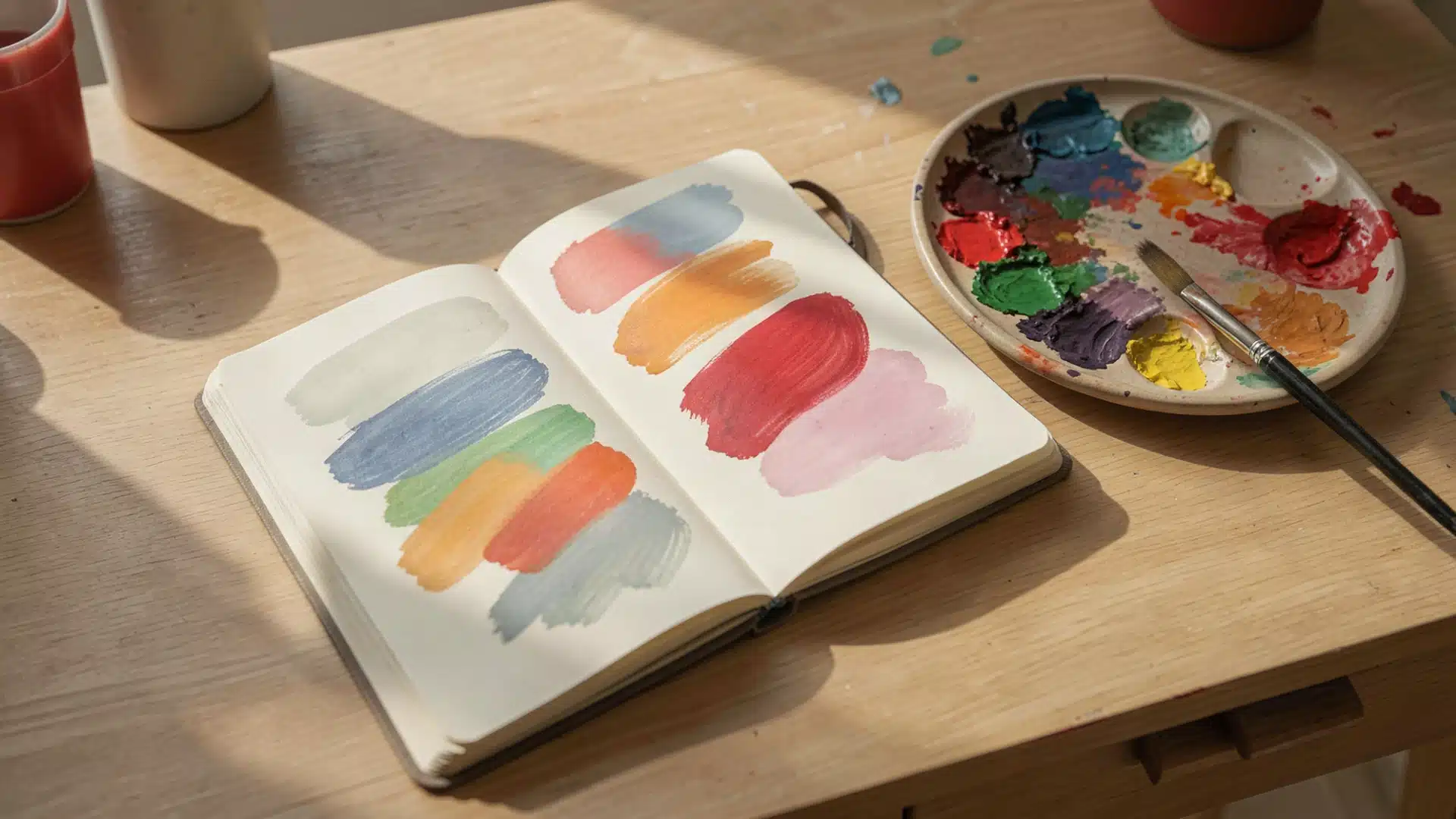
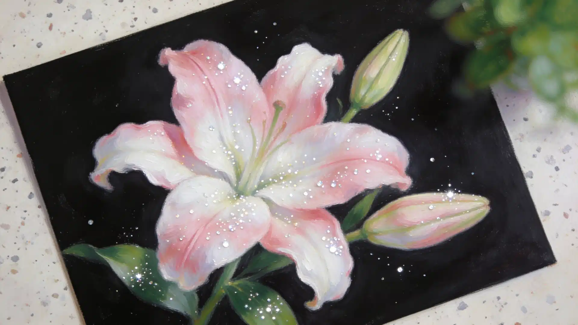
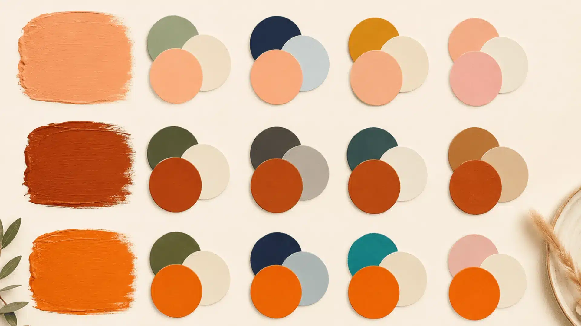
When someone sees a logo, a room, or an outfit and thinks, “Why does this look so good?” the answer is almost always color.
Color theory basics explain why certain combinations feel right and others feel off. It is not just for artists. Anyone can learn it.
This guide explains the color wheel, key relationships, and why some combinations work better. Basics click, colors in everyday life start making a lot more sense.
What is Color Theory?
Color theory is the basic idea of how colors work together and affect the way we see and feel things.
It explains which colors match well, which create contrast, and why some combinations look balanced while others don’t.
It is considered both art and science because it mixes creativity with rules.
Artists and designers use it to make things look beautiful, while science helps explain how our eyes and brains react to different colors.
Some colors look perfect together, while others feel weird, you know why? That’s exactly where color theory basics become interesting.
The Core Psychology of Colors
Our brains connect colors with feelings, memories, and moods almost instantly.
Sometimes, a single color can completely change the mood of a room, a photo, or even a person’s outfit. Colors influence emotions, mood, and behavior more than most people realize.
Yellow often feels cheerful and full of energy, while blue tends to make people feel calm and relaxed.
Red evokes excitement or urgency, and green evokes nature, freshness, and balance.
That is exactly why brands, websites, rooms, and outfits are all built around specific color choices: the right color sends the right message without a word.
Why Beginners Should Give Color Theory a Try?
Learning color theory basics can make a huge difference, even if you are not a designer. It helps make designs, photos, or projects look cleaner and more professional.
- Helps beginners understand how colors work together.
- Makes designs, drawings, and artwork look more balanced.
- Helps choose the right colors for mood, emotion, and message.
- Improves confidence when creating posters, logos, paintings, or digital designs.
- Prevents random color choices and makes work look more professional.
- Makes it easier to create eye-catching and attractive visuals.
All About Color Wheel
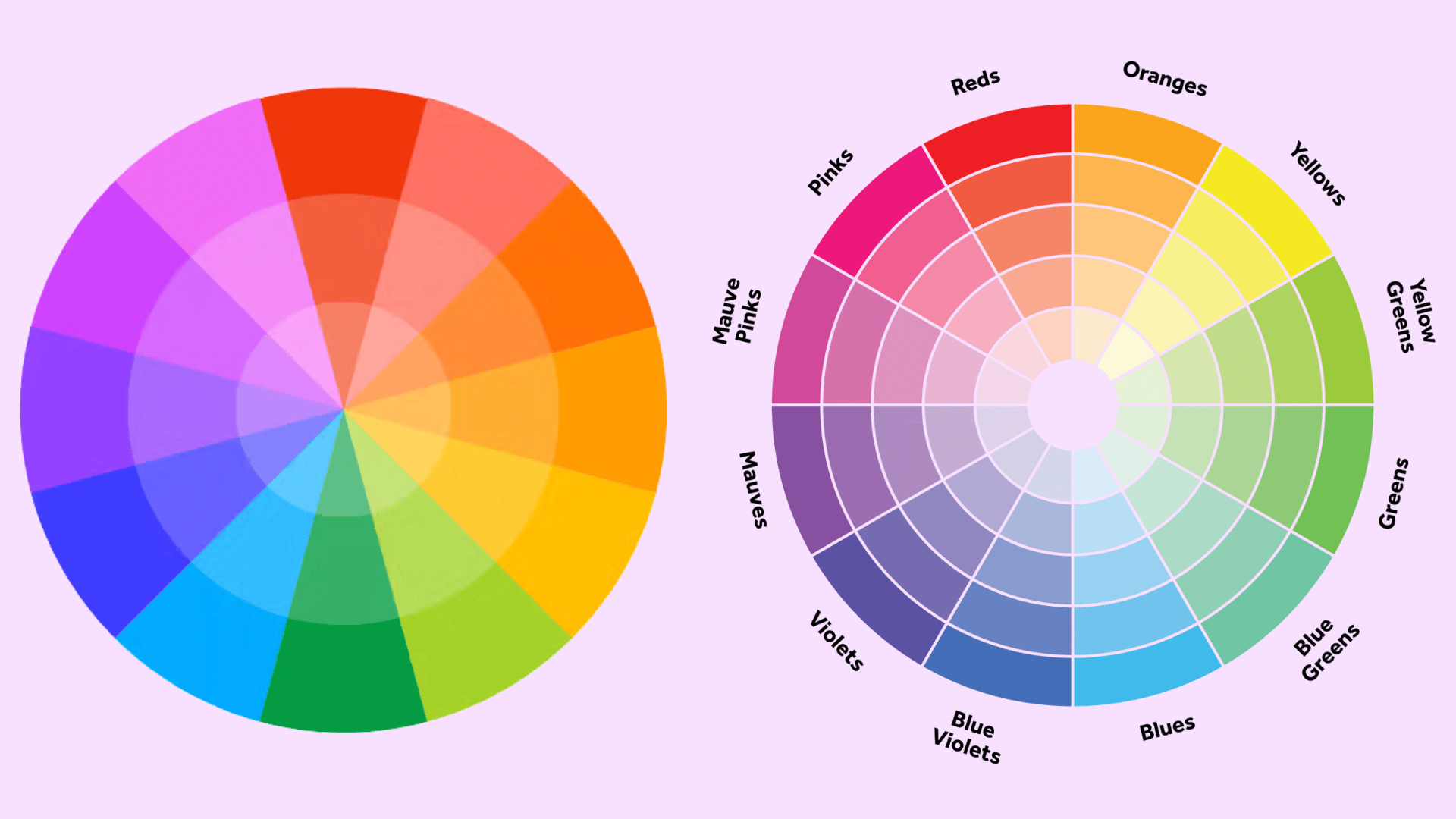
The color wheel is one of the most important parts of learning color theory. It helps us understand how different colors are connected and why some colors look good together.
1. Primary Colors
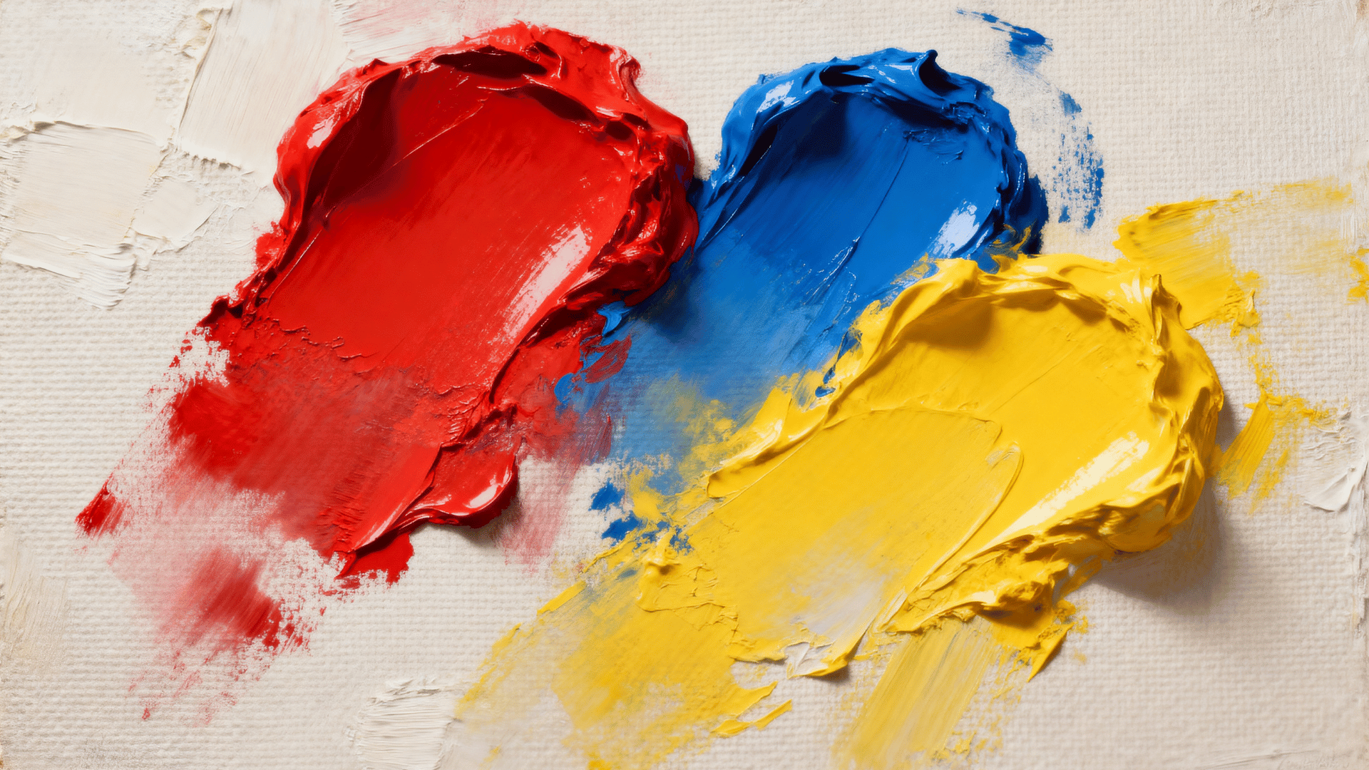
The primary colors are red, blue, and yellow. These colors are special because they cannot be made by mixing other colors. Instead, they are the main colors used to create many other colors on the wheel.
You can think of primary colors as the starting point of the whole color wheel.
2. Secondary Colors
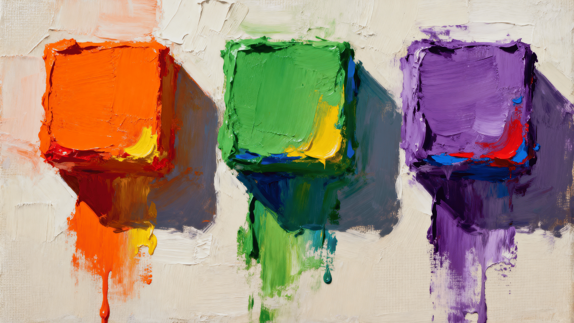
Secondary colors are made by mixing two primary colors together. When red and yellow mix, they make orange. Blue and yellow make green, while red and blue make purple.
These colors sit between the primary colors on the color wheel and help create more variety and balance.
3. Tertiary Colors
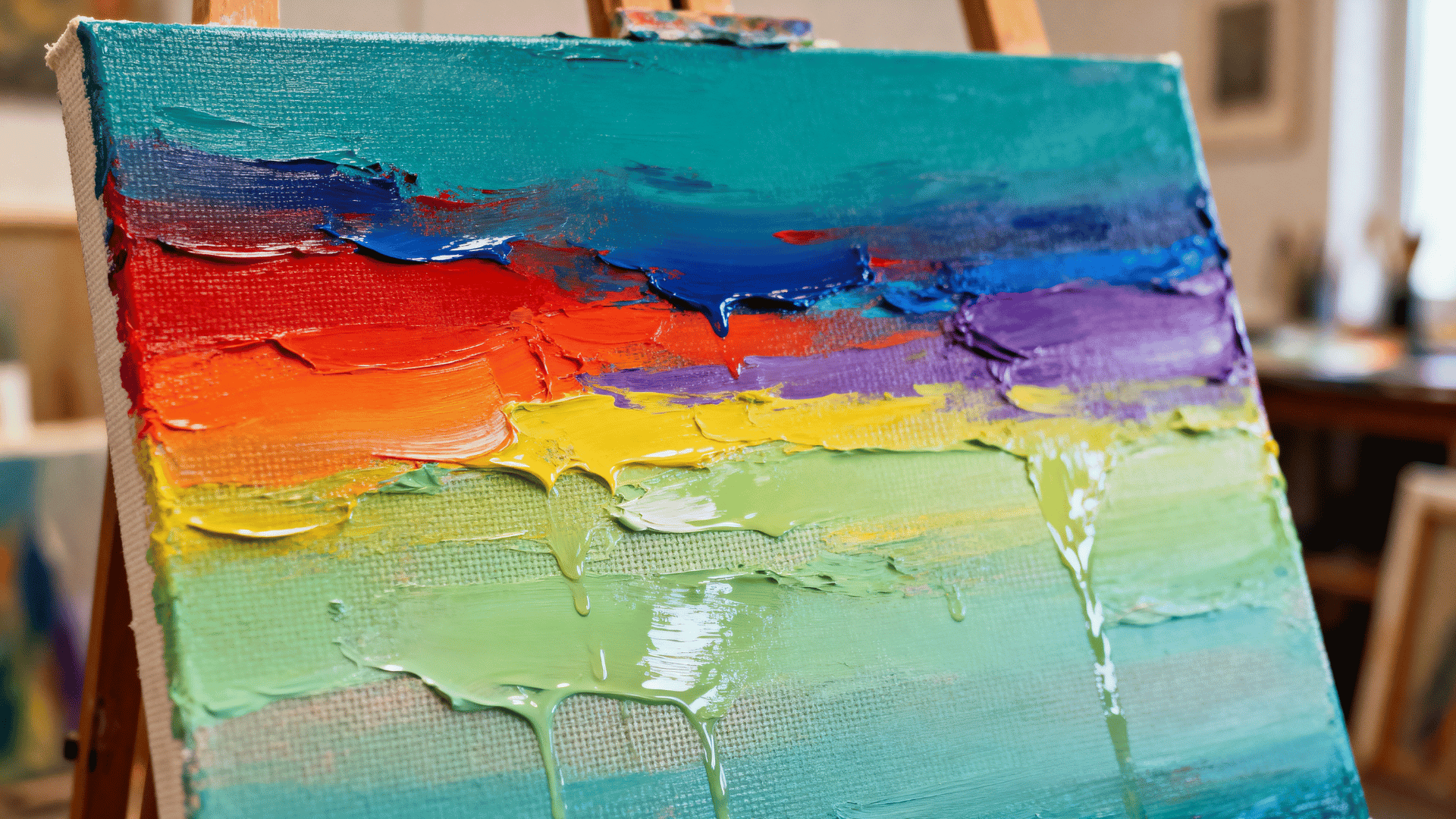
Tertiary colors are created when a primary color mixes with a secondary color. This creates shades like blue-green, red-orange, or yellow-green.
These colors add even more options and help make color combinations look more interesting and detailed.
Warm Colors Vs Cool Colors: Know the Difference
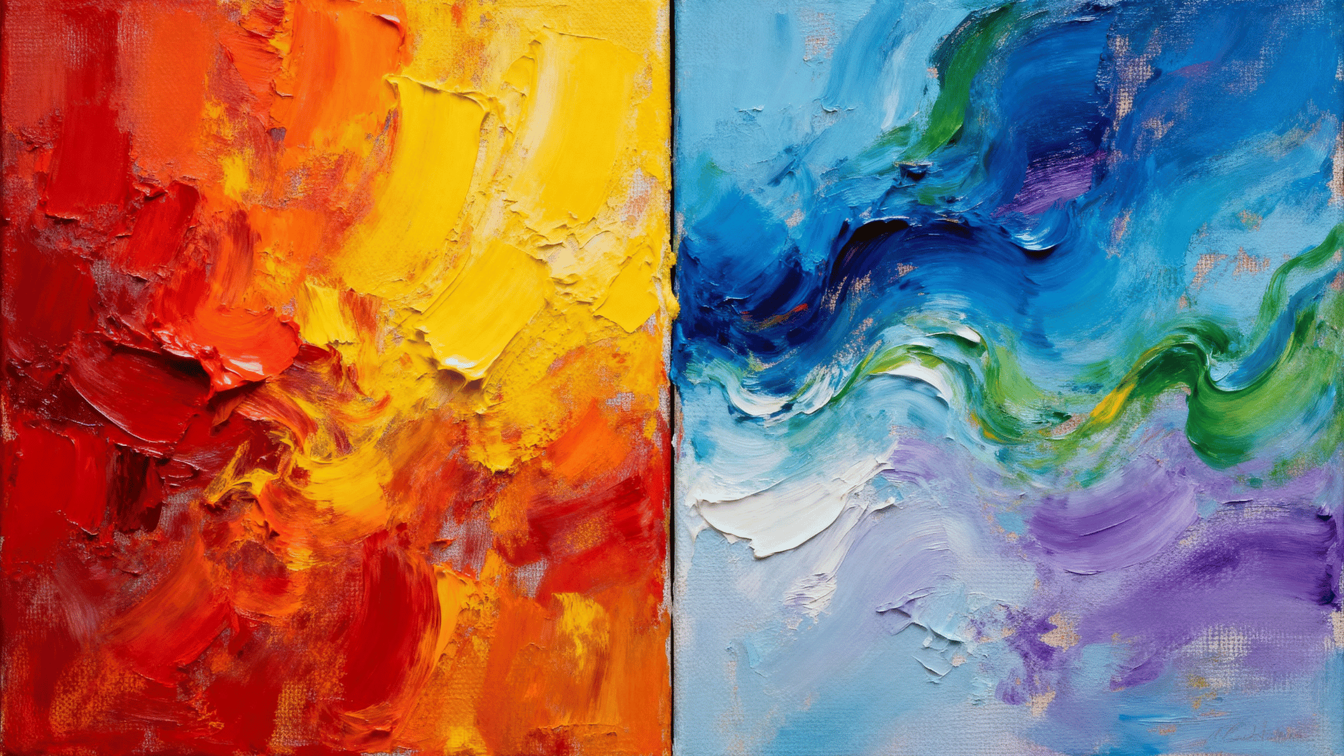
Different colors can change how we feel without a single word, which is why color choices matter so much in design, fashion, and everyday life.
| Feature | Warm Colors | Cool Colors |
|---|---|---|
| Examples | Red, orange, yellow | Blue, green, purple |
| Feeling | Energetic, happy, exciting | Calm, peaceful, relaxing |
| Visual Effect | Feel closer and more attention-grabbing | Feel farther away and softer |
| Best Used For | Highlights, alerts, warmth, excitement | Backgrounds, calm designs, nature themes |
| Common Mood | Passion, energy, comfort | Trust, freshness, balance |
Color Relationships That Make Designs Look Good
Knowing these color relationships can help you choose colors that look more pleasing and professional, even if you are a complete beginner.
1. Complementary Colors
Complementary colors are colors that sit opposite each other on the color wheel, like blue and orange or red and green.
These combinations create a strong contrast, which makes designs stand out quickly and grab attention. That is why many sports teams, ads, and fast-food brands use complementary colors in their logos and marketing.
2. Analogous Colors
Analogous colors are colors placed next to each other on the color wheel, like blue, blue-green, and green. These colors naturally blend well together and create a smooth, calming look.
They are often used in nature-inspired designs because they feel soft, balanced, and comfortable to look at.
3. Triadic Colors
Triadic colors are three colors that are evenly spaced around the color wheel, such as red, yellow, and blue. This type of color scheme creates designs that feel colorful, energetic, and balanced at the same time.
It works well when you want something bright without making it look messy.
4. Monochromatic Color Schemes
A monochromatic color scheme uses different shades, tones, and tints of one single color. For example, light blue, medium blue, and dark blue can all be used together.
This style creates a clean, simple look, which is why many modern, minimalist designs use it.
5. Split-Complementary Colors
Split-complementary colors are similar to complementary colors but softer and easier to manage.
Instead of using a single opposite color, this scheme uses the two colors adjacent to the opposite color.
It still creates contrast, but the overall design feels less harsh and more balanced, making it a great choice for beginners.
Let’s Wrap it
Color theory may seem intimidating at first, but it’s really just about understanding how colors work together and how they influence emotions, attention, and perception.
Learning the color wheel, understanding color psychology, and mastering color relationships, these color theory basics can completely change the way you create and experience visual content.
Once you start noticing color combinations in brands, movies, websites, and everyday life, you’ll naturally begin building a stronger eye for design.