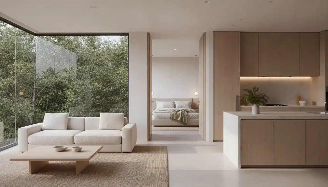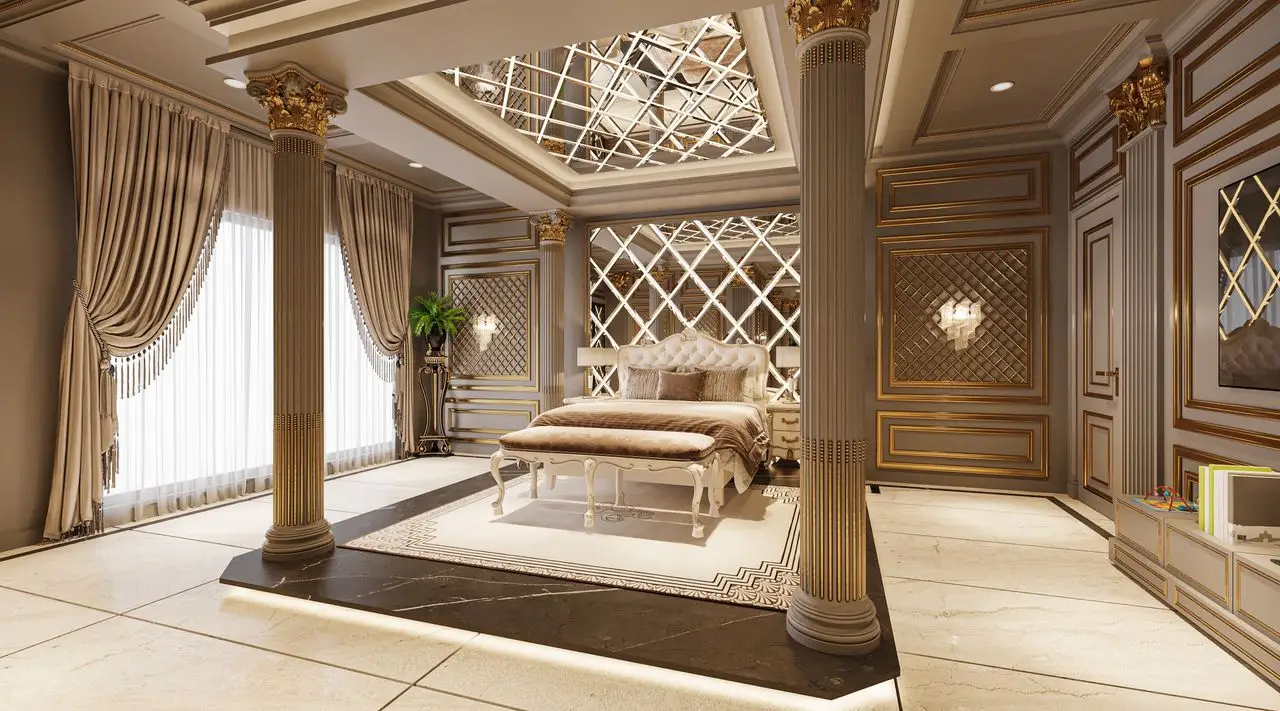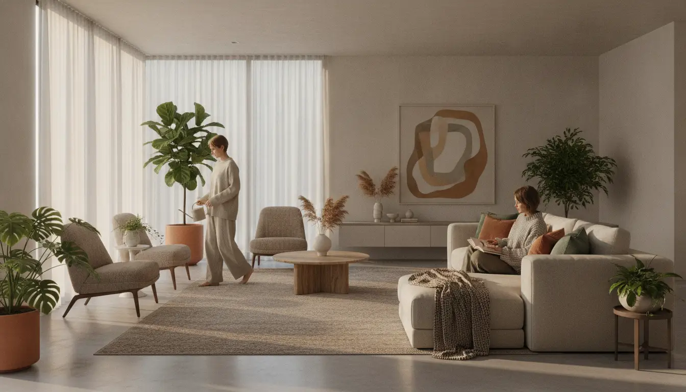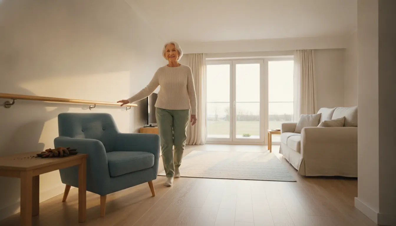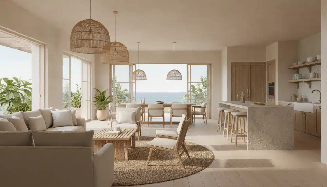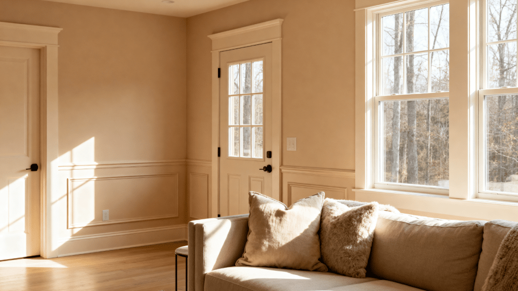
One paint color on walls and trim sounds too simple, yet it’s one of the most repeated tricks in high-end interior design.
Painting walls and trim the same color is a simple shift that can make a space feel larger, calmer, and more put-together.
Designers have used it for years. Now it’s showing up in everyday homes.
But the wrong color choice can make a room feel flat fast. Here’s what works, what doesn’t, and which shades get the best results.
So, What Do Same-Color Walls and Trim Actually Look Like?
Painting walls and trim the same color means using the same paint shade on the walls, baseboards, crown molding, doors, and other trim in a room.
Instead of making the trim stand out with a different color, everything blends together for a smooth look.
This style has become more popular in modern home designs because many people now prefer spaces that feel clean and less busy.
You may also have seen this look on social media, on home makeover shows, or in designer homes online.
Some people love how calm and cozy it makes a room feel, while others are still unsure about it. That’s why more people are becoming curious about trying this design trend in their own spaces.
Advantages of Painting Walls and Trim the Same Color
Painting the walls and trim the same color can completely change how a room looks and feels. While it may sound like a small design change, it can make a big difference in the overall feel of a room.
1. Creates a Bigger and More Effortless Appearance
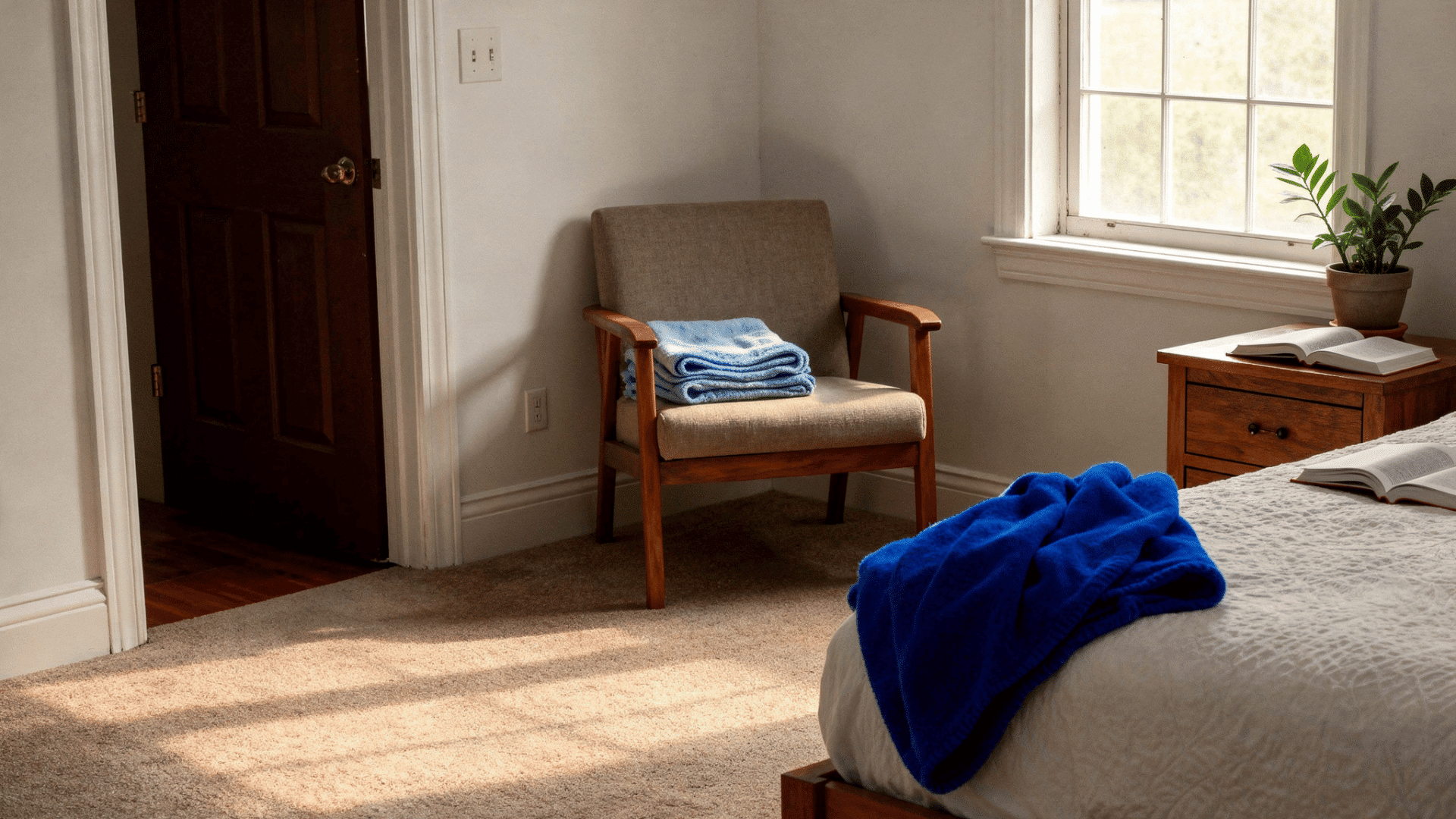
When the walls and trim are painted the same color, there are fewer visual breaks in the room. Everything blends together smoothly, which can make the space feel more open and less crowded.
This is one reason smaller rooms can sometimes look bigger and airier with this style.
2. Gives the Room an Advanced Designer Feel
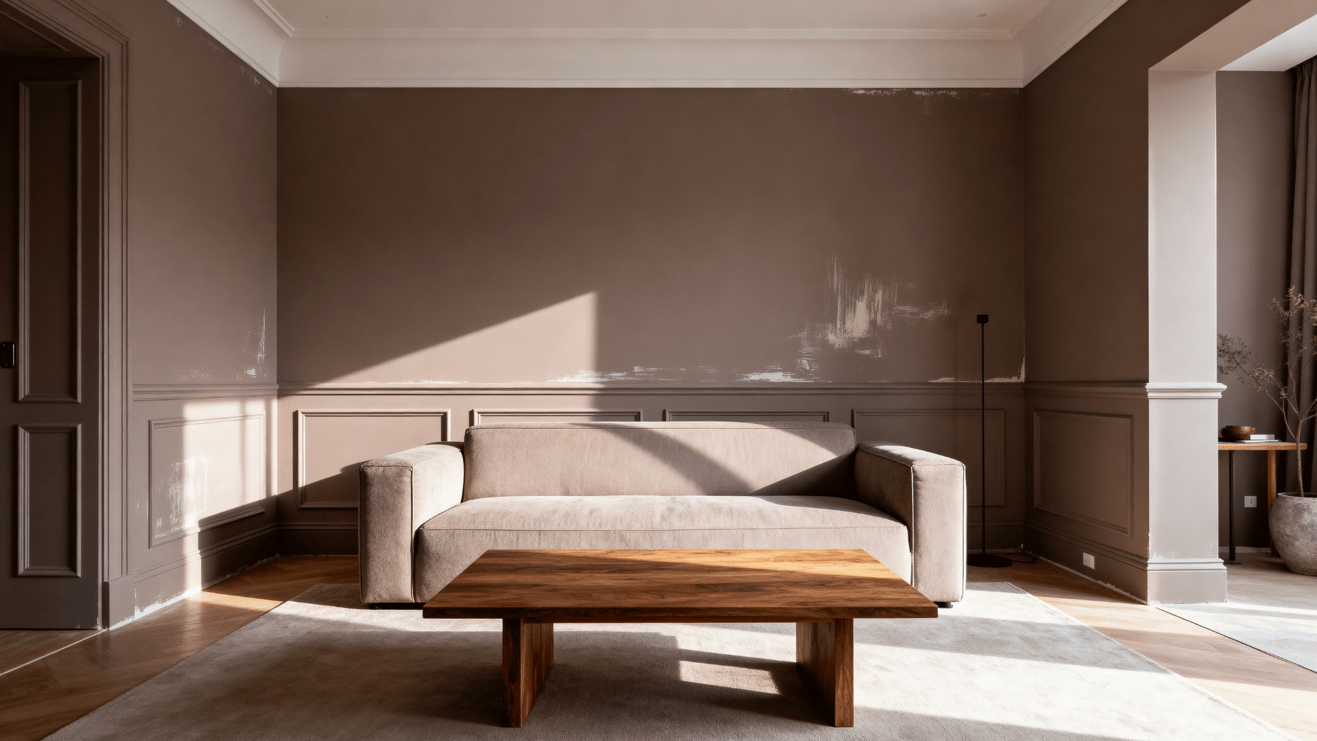
Many modern and luxury homes use a single color across different surfaces to create a polished look. Instead of drawing attention to the trim, the whole room feels more balanced and calm.
It can make the space look planned and well put together without trying too hard.
3. Makes Low Ceilings Feel Taller
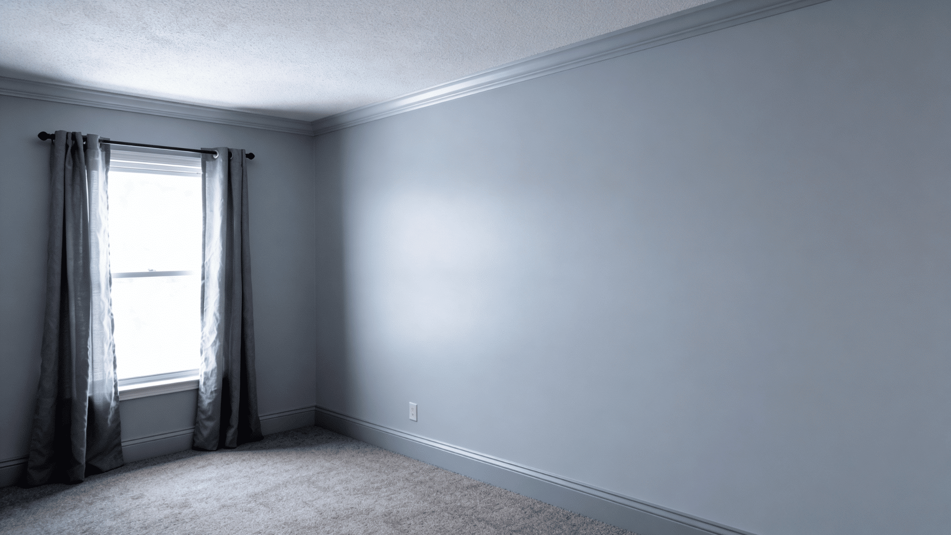
Using the same color from the walls to the trim helps the eyes move around the room more naturally.
Since there are no strong color changes stopping your view, the ceiling can appear taller than it really is. This can help smaller rooms feel less tight and boxed in.
4. Helps Highlight Architectural Features Differently
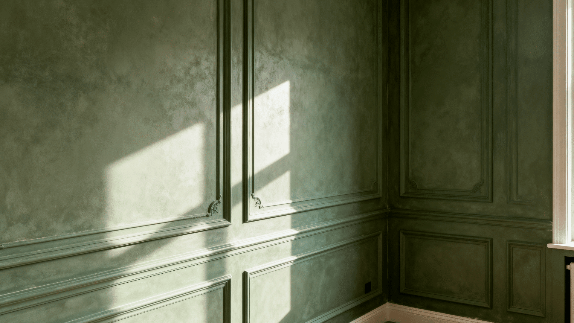
Instead of using contrast to show off trim and molding, this style depends more on light, texture, and paint finish.
Natural shadows and lighting help add depth to the room in a softer way. This can create a smoother look overall.
5. Works Especially Well in Modern and Minimalist Homes
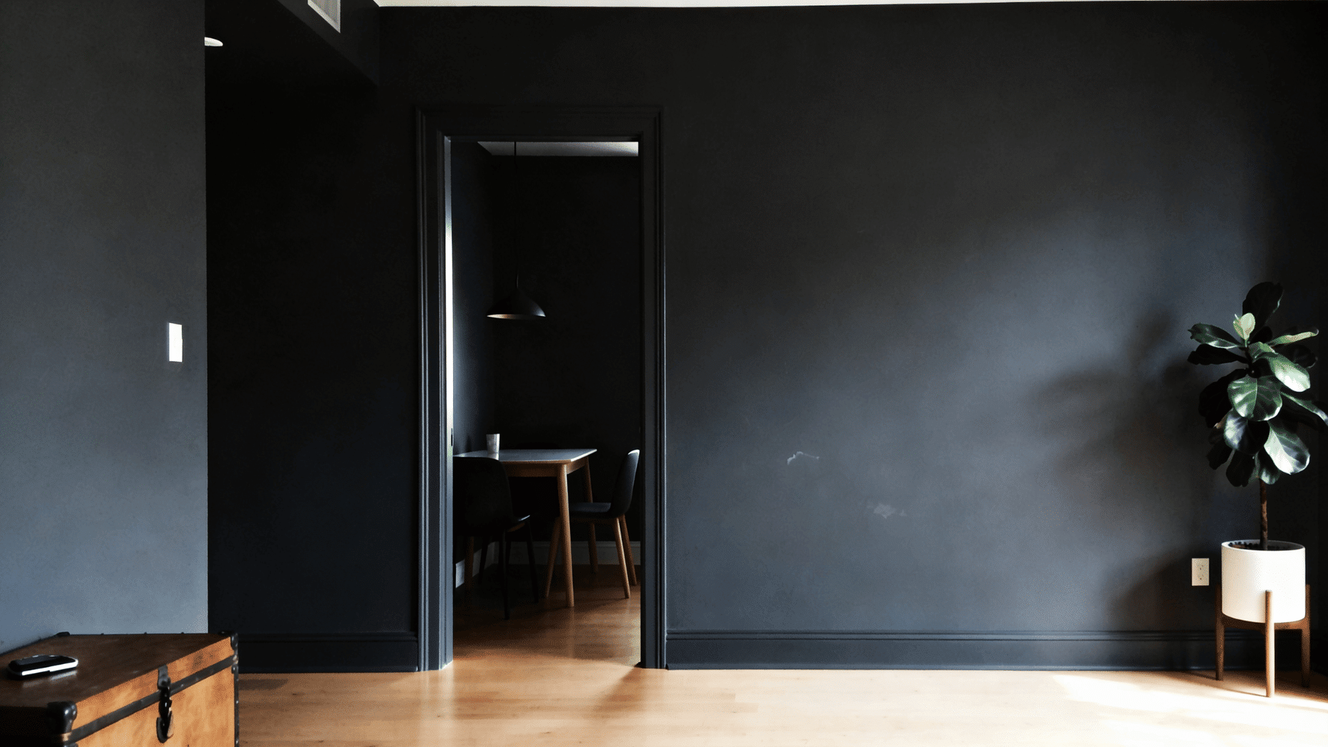
Homes with modern or simple designs often look great with this painting style. It gives rooms a clean and uncluttered appearance without too many sharp lines or color changes.
This is why many people choose it for newer homes and modern interior styles.
Rooms Where This Style Works Best
A few specific rooms tend to get the most out of this painting style.
- Bedrooms: This style works very well in bedrooms because it helps the space feel more relaxing. When the walls and trim are the same color, it creates a calm, comfortable atmosphere after a long day.
- Living Rooms: Living rooms often look neater and more modern with this style because the matching color helps everything flow together smoothly.
- Small Bathrooms: Painting walls and trim the same color can work great in small bathrooms because it helps the space feel a little more open and less crowded, even if the bathroom is small.
- Hallways and Entryways: Hallways and entryways usually connect different parts of the house, so this style helps these areas feel more connected. Using the same color can make narrow spaces look cleaner, especially in homes with smaller hallways.
Popular Paint Colors that Work Well for Walls and Trim
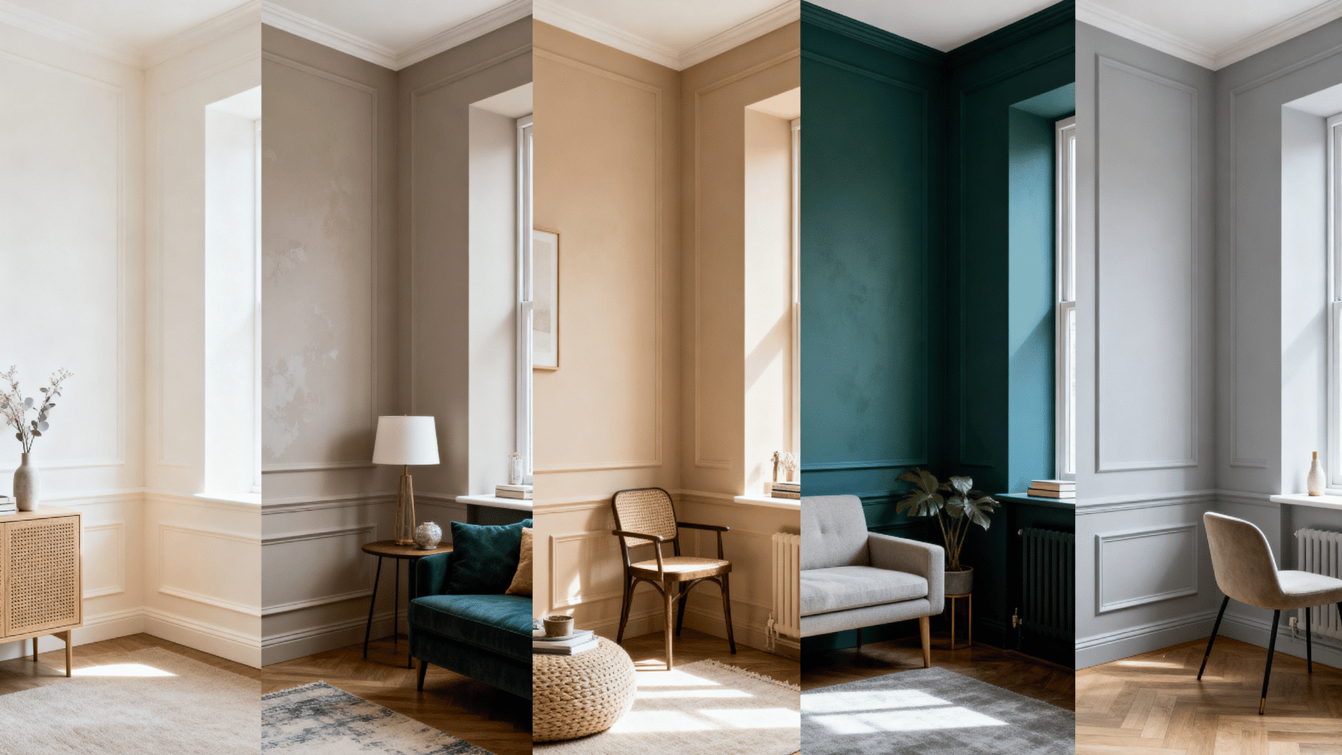
The color you choose can completely change how the room feels when the walls and trim are painted the same shade. Some colors make a space feel brighter, while others help it feel warmer.
Here are some popular choices and why many people like them.
1. Soft Whites and Creams
Soft whites and cream colors work well because they make rooms feel open, clean, and easy on the eyes. They reflect light nicely, which helps spaces feel brighter without looking too sharp or plain.
- Sherwin-Williams Alabaster (SW 7008): A warm, creamy white that works on both walls and trim without feeling yellow.
- Behr Ultra Pure White: Widely considered the whitest white on the market, great for a sharp, crisp finish.
2. Greiges and Taupes
Greige and taupe colors give rooms warmth without leaning into strong color. They also hide small marks or dirt better than plain white walls.
- Sherwin-Williams Agreeable Gray (SW 7029): One of the most popular greiges; reads warm without going too beige.
- Benjamin Moore Revere Pewter (HC-172): An evergreen greige that shifts between warm and cool depending on the light.
- Benjamin Moore Edgecomb Gray (HC-173): A softer, lighter greige that keeps rooms feeling airy and warm.
3. Moody Greens, Blues, and Charcoals
Dark greens, blues, and charcoal shades create a rich, cozy feel. They make a space look more stylish and dramatic without requiring much extra décor.
- Sherwin-Williams Cyberspace (SW 7076): A deep charcoal-blue that reads almost black in low light; bold and modern.
- Benjamin Moore Hale Navy (HC-154): A classic deep navy that brings a rich, layered look to any room.
4. Warm Beige and Sand Colors
Beige and sand colors give rooms a soft, welcoming feel and pair well with wood furniture, natural textures, and warm lighting.
- Benjamin Moore Muslin (OC-12): A warm, welcoming light beige that works beautifully on walls and trim together.
- Sherwin-Williams Accessible Beige (SW 7036): A soft sand-beige with just enough warmth to feel cozy without going orange.
5. Light Gray Shades
Light gray gives rooms a simple, modern look without feeling cold. It pairs well with a wide range of furniture colors, making it easier to change décor later without repainting.
- Benjamin Moore Classic Gray (OC-23): A very light greige-gray, great for smaller or darker rooms.
- Behr Silver Drop (N520-1): A soft, airy gray that keeps spaces feeling open and fresh.
When Should You Avoid Painting Walls and Trim the Same Color?
Before committing, there are some room types where this approach tends to fall short.
- If your home has a very traditional style, using the same color everywhere may take away the classic look and charm of the space.
- Rooms with very little sunlight can sometimes feel darker and more closed-in when everything is painted in one shade.
- If you have beautiful crown molding, woodwork, or detailed trim, painting it the same color as the walls may hide those details.
- Homes with lots of patterned furniture, colorful rugs, or busy wallpaper may start to look too crowded with this style.
- Very small rooms with dark paint colors can sometimes feel heavy instead of cozy.
- If you like bold contrast in your home design, this style may feel too plain for your taste.
- Older homes with vintage features may lose some of their original character when the walls and trim fully blend together.
It’s a Wrap
Sometimes the smallest design decisions create the biggest transformations. Of course, it’s not a one-size-fits-all solution. In some homes, contrast will always win.
But that’s exactly what makes this design choice so interesting: it breaks the rules people assume they have to follow.
Start with one room, test a few shades, and see what happens. You may end up loving the new look of your home far more than you expected.