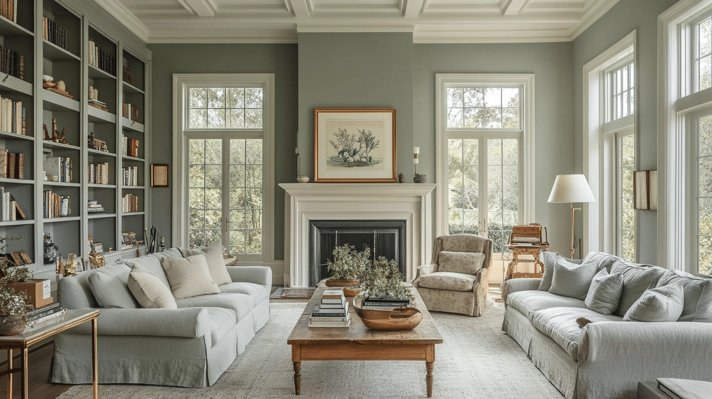
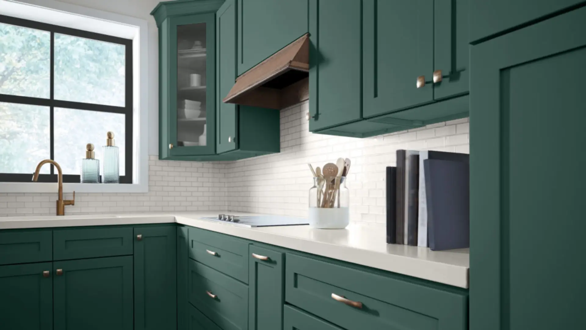
Soft Sage by Sherwin-Williams reads more gray than green in a lot of light, which is exactly why it works for people who want a different color yet are not ready for the “POP” of it.
It works in so many rooms without making the space look weird and badly decorated. The LRV of 49.5 explains a lot here.
But there is a lot more to this color.
So here’s what it pairs with, where it looks best, and the two or three sage cousins people mix it up with.
Soft Sage Sherwin Williams (SW) 9647 – What is this Color?
Soft Sage (under the neutral color family of Sherwin-Williams) has a yellow undertone that gives it a warm feel and look despite its muted appearance.
With an LRV of 49.5, it sits right in the middle of the light scale, not too dark, not too bright. This makes it catch light well without washing out.
LRV stands for Light Reflectance Value, and it's the single most useful number on a paint chip if you're trying to guess how a color will actually behave. It runs from 0 (absolute black, absorbs all light) to 100 (pure white, reflects all light). A color in the high 40s to low 50s, like Soft Sage, reflects roughly half the light that hits it. That's the range where a color still reads as a real color rather than a tinted white, but a room won't feel closed in either.
On the color wheel, Soft Sage sits at 60° HSL, placing it firmly in the warm color family with 9% saturation and 71% lightness.
This color looks its best in natural morning light from east-facing windows, which brings out its warm qualities.
Although in north-facing rooms, it may look slightly cooler.
South-facing rooms will highlight their yellow undertones all day long, making the color feel sweet and cozy.
Learn the difference between Soft Sage and Evergreen Fog.
Creating a Color Palette of Soft Sage Sherwin Williams
This palette works well in living spaces, bedrooms, and even kitchens where you want to create a space that feels both fresh and cozy.
| Category | Details |
|---|---|
| Main Color | Soft Sage SW 9647 – Muted green-gray with a yellow undertone; calming, warm, and welcoming. |
| Neutrals that Pair Well | – Alabaster SW 7008: Soft white that brightens without harshness. – Accessible Beige SW 7036: Warm neutral complementing Soft Sage’s warmth. |
| Accent Colors for Depth | – Urban Bronze SW 7048: Adds richness and grounds lighter tones. – Canyon Clay SW 6054: Adds warmth and an organic feel. |
| Metallic Elements | – Brushed nickel: Subtle and modern touch. – Aged brass: Adds warmth; complements yellow undertones. |
| Textures That Amplify | – Cane: Natural texture and visual interest. – Matte ceramic: Clean lines and elegance. – Bleached wood: Lightens space, natural element. – Boucle: Cozy and tactile comfort. – Terracotta: Earthy tones, rustic charm. |
| Sherwin-Williams’ Own Pairing | Drift of Mist and Extra White are the coordinating colors Sherwin-Williams itself lists alongside Soft Sage, if you want a pairing straight from the source. |
Building a Moodboard Before You Finalize Soft Sage
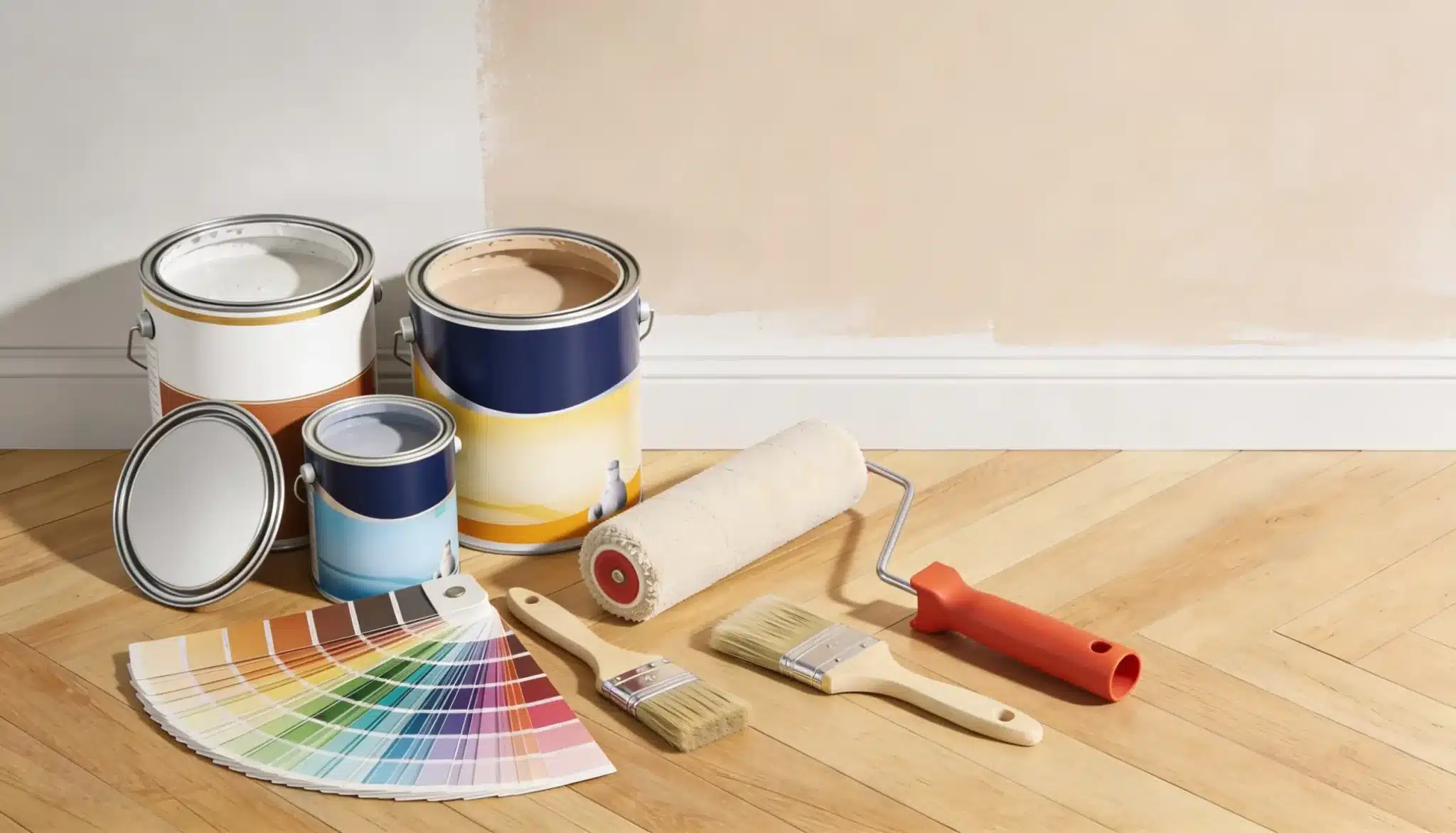
Moodboards help you see how Soft Sage will look in your space before you paint a single wall. I find them useful for testing ideas without wasting time or money.
Why Moodboards Work so Well:
- They show color connections between Soft Sage and other items in your room
- They help you test different light settings with this yellow-toned green
- They save you from buying the wrong furniture or decor items
- They make your ideas clear for sharing with family or friends
When I create moodboards for Soft Sage, I pay close attention to how it pairs with whites and warm neutrals. This way, it is easier to spot any color clashes early.
What to Put on Your Soft Sage Moodboard:
- Paint chip samples of SW 9647 Soft Sage
- Photos of rooms with similar green walls
- Fabric swatches that might go in the room
- Pictures of furniture and decor you plan to use
- Natural elements that match the calm feeling of this color
You can even use online tools like Canva for creating mood boards or even lay items out on a table to see how they look together.
5 Mood Board Aesthetics for Soft Sage (Something for Every Room)
A mood board helps you plan your room’s look before you pick up a paintbrush.
Soft Sage SW 9647 works well with several styles. This gentle green with yellow undertones fits into many home designs.
1. Organic Modern Look (best for living rooms)
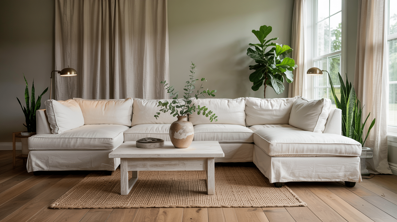
This organic modern style brings together clean lines and natural elements to create a peaceful interior space.
And on top of that, it works perfectly with soft sage, highlighting its gentle green-gray tones.
How to use soft sage here:
- Apply as a full wall color in living rooms or bedrooms for a complete look
- Or maybe create a feature wall behind a bed or sofa for a subtle focal point
- You can also combine soft sage color with light wood trim and alabaster accents for a fresh feel
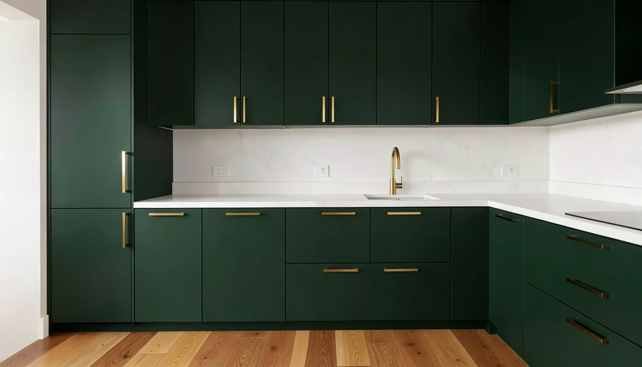
- Using on kitchen cabinets with light countertops for a soft look isn’t a bad idea either
Key decor items to include:
- For living rooms, go for a linen sectional sofa in a neutral tone
- Rattan pendant light to add texture overhead. Any rattan furniture like a hanging chair works too
- Oversized ceramic vases in white or soft gray tones
2. Bohemian Chic (best for bedrooms and home office)
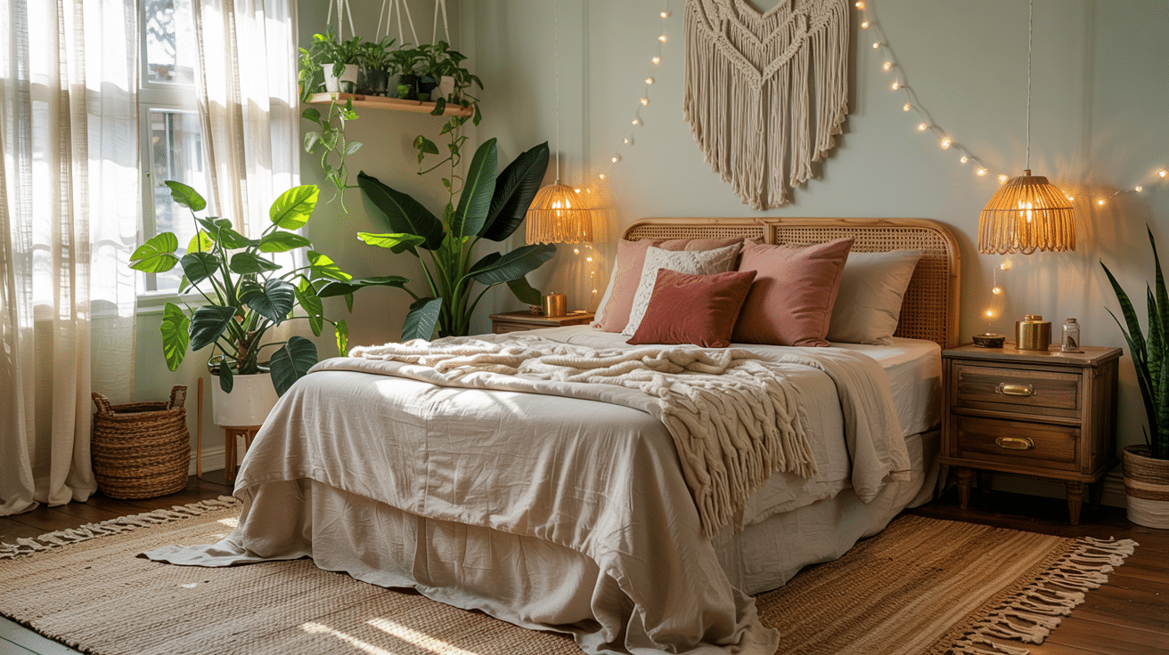
In the bedroom specifically, Soft Sage gives the space a quiet base, making patterned textiles and handmade pieces stand out.
How to Use Soft Sage in this mood board aesthetic:
Use a matte finish on the walls to keep the color soft under daylight and bedside lighting.
In a medium bedroom around 10 by 12 feet, painting all four walls can make the space feel connected.
For a smaller bedroom although, use Soft Sage behind the bed like an accent wall look and keep the remaining walls warm white. This adds color without making the room feel enclosed.
Color Pairings:
Its muted green tone works especially well with warm clay, dusty rose, ivory, and dark wood.
Styling Tips:
- Try mixing vintage finds with artisan pieces for a collected-over-time look
- Layer different textures like cotton, wool, and linen for coziness
- Bring in natural light with sheer curtains to showcase the paint’s subtle shifts
- Add plenty of plants to enhance the organic feel of the space
This style works best in spaces like bedrooms and home offices where you want a clean and calm look.
3. Minimalist Japandi (perfect for home offices)
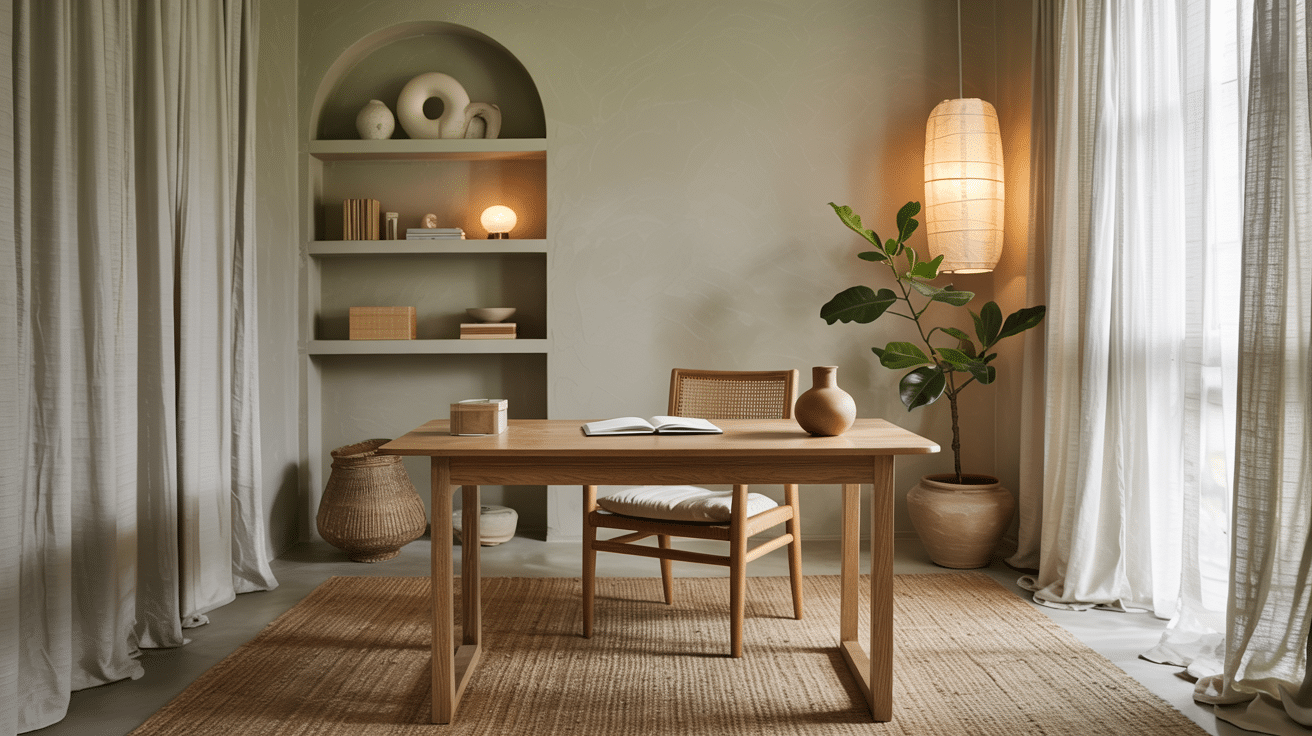
Okay, so this Minimalist Japandi style blends together Japanese simplicity and Scandinavian look.
Japandi rooms hold up best with a matte or eggshell finish on Soft Sage. A glossier sheen can look too polished sitting next to raw oak and linen.
Best Accent Pairings
- Pale oak desk and shelving
- Mushroom or gray beige upholstery
- Charcoal desk lamp
- Cream wool rug
- Matte black handles
4. Modern Farmhouse (looks best on kitchen)
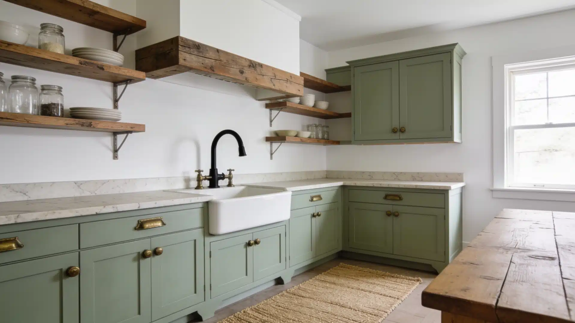
Modern Farmhouse style brings together rural living with clean and modern elements.
Farmhouse kitchens work very well with soft sage sherwin williams. Paint kitchen cabinets with a satin finish. Flat paint shows fingerprints fast near a sink or stove.
As a Wall Color:
- Looks good in bathrooms paired with white fixtures
- Makes a welcoming statement in entryways
As a Cabinetry Color:
- Pair with crisp white walls for a clean look
- Try adding black fixtures for contrast and definition
Fixtures and Hardware:
- White farmhouse sink as a focal point
- Black gooseneck faucet for contrast
- A mix of aged brass and matte black metals for depth
Storage and Display:
- Open wood shelves to showcase dishes or collections
- Shiplap wall paneling for texture
5. Contemporary Classic Look (best for dining rooms)
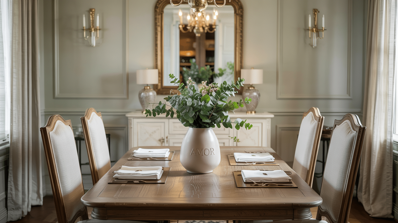
Contemporary Classic style pairs traditional elements with modern touches, creating rooms that feel both fresh and lasting.
How to Use Soft Sage here:
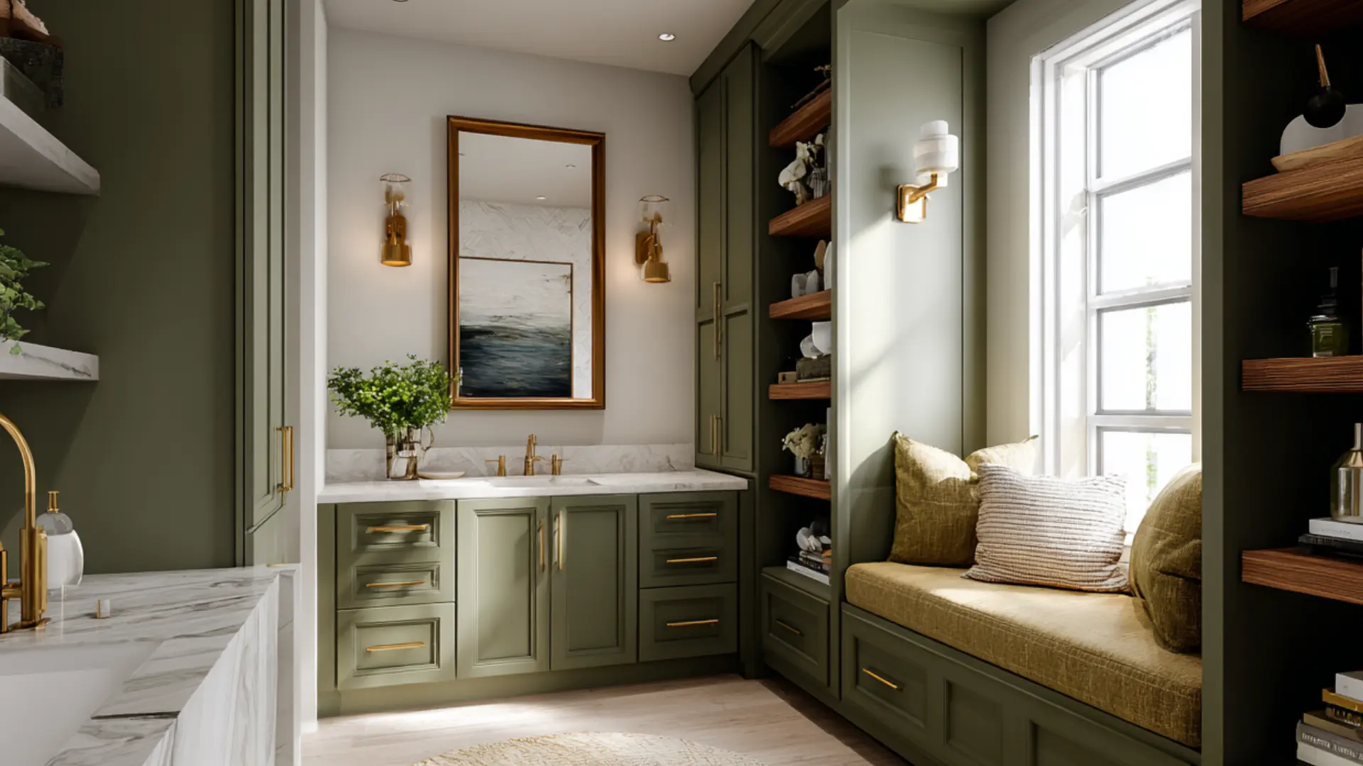
- Apply Soft Sage to built-ins and cabinetry for a subtle color statement
- Use it on accent furniture pieces like console tables or side chairs
- Pair with ivory walls for brightness and charcoal accents for depth
Perfect Decor Items:
- Tufted velvet armchair in taupe adds texture while staying neutral
- Brass-framed gallery wall brings polish and visual interest
- Marble coffee table introduces natural materials with formal appeal
Styling Tips:
- Keep structured lines in your furniture choices
- Add metallic finishes through hardware and small accessories
- Arrange furniture in symmetrical layouts for a formal touch
- Balance the color with plenty of white trim and dark wood accents
Contemporary classic dining rooms look best in this aesthetic at 12 feet wide or more. The symmetrical layout this style calls for needs enough space on both sides of the table.
Soft Sage Compared: Undertones, Mood, and Versatility
Let me show you how Soft Sage Sherwin-Williams compares to similar colors. This will help you decide if it’s the right choice for your home.
| Color Name | Undertone | Mood | Best Used In | LRV |
|---|---|---|---|---|
| Soft Sage SW 9647 | Yellow | Calm, soothing | Living rooms, bedrooms | 50 |
| Aloof Gray SW 6197 | Green-gray | Subtle, quiet | Offices, hallways | 48 |
| Lattice SW 7654 | Warm beige | Welcoming, soft | Dining rooms, kitchens | 62 |
| Clary Sage SW 6178 | Green-brown | Earthy, grounded | Dens, studies | 37 |
| Austere Gray SW 6184 | Cool gray | Clean, crisp | Bathrooms, laundry rooms | 44 |
I’ve found that Soft Sage works well in most lighting conditions.
North-facing rooms show off their green tones, while south-facing rooms bring out their warmth.
It also looks good with both wood tones and metal finishes, making it super easy to use in any style home.
If you're weighing Soft Sage against a warmer neutral for resale purposes rather than personal style, our roundup of paint colors that boost home value covers where sage-family greens rank against the rest of the field.
Final Thoughts
That’s why Soft sage is such a loved color: an LRV in the middle of the scale, a warm undertone that goes well with almost all home decor and styles.
Starting with a simple moodboard can help you plan your perfect space.
Try mixing smooth and rough textures to add depth. Check how the color looks in both morning and evening light.
For visual interest, add some contrast with whites or deeper tones.
Frequently Asked Questions (FAQs)
1. Can Soft Sage SW 9647 Work as an Exterior Paint Color?
Yes, though direct sunlight can fade LRV 50 shades faster outdoors, so a higher quality exterior paint helps it last.
2. What Sheen Should I Use for Soft Sage in a Bathroom or Kitchen?
Satin or semi gloss holds up better against moisture and is easier to wipe clean than a flat finish.
3. Will Soft Sage Make a Small Room Feel Darker?
Not usually. Its LRV of 50 reflects a fair amount of light, so small rooms stay bright, not closed in.
4. Does Soft Sage Pair Well with Wood Flooring?
Yes. It works with light oak and darker walnut floors alike, since its yellow undertone bridges both wood tones easily.