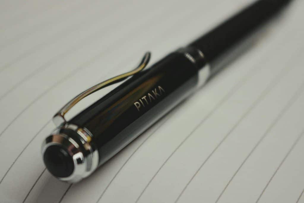
A logo might look perfect online or on business cards, but everything changes when it becomes very small. Such surfaces leave little space for detail. Therefore, when designing pen logos, the designer should consider the physical object from the start, not just shrink the logo to fit.
The upside is that you don’t need to do much to fix it. Whether you are creating artwork for a local print shop or choosing a logo for a new brand, the goal is the same: a point covered in more detail when you visit saveyourink.com/pens.
How Should You Choose Typography for a Logo Printed on a Pen?
Typography matters because the smallest font sizes may become illegible. Fonts that are decorative because of their thin lines, close lettering, or excessive detailing may look nice if the fonts are large in size; however, when these fonts become small and thin, as in the case of pen writing, they tend to become hard to read.
Sans serif fonts print much better than serif fonts, particularly in small printings. You may use simpler lettering forms if you already have a decorative font in your design.
Spacing matters too. Letters packed closely together can merge visually after printing, particularly when the imprint area is small.
How Much Detail Can a Pen Logo Actually Handle?
The solution depends on the printing process, the pen’s surface, and the available imprint space. Increasing complexity is generally more difficult when the logo size reduces.
Very thin lines, very small typefaces, gradients, illustrations, and proximity to other graphic elements may not etch into the skin as easily as they appear on a computer screen. A simplified logo design might yield better results.
When designing logos for pens, focus on recognition rather than reproducing an entire business logo. If people recognize the business instantly, the logo works.
A practical logo should prioritize:
- A recognizable central symbol or wordmark
- Clear separation between individual elements
- Sufficient space around the design
- Lines and lettering that remain visible at the intended size
Which Colors Work Best for a Pen Logo?
Color choices need to account for the pen itself. A logo that looks distinct on a white screen may look unclear once printed on barrels with a dark blue, black, metallic, or colorful finish.
Color schemes using contrasting colors tend to perform better than ones that are composed of the entire range of a brand’s colors. For instance, a logo with one color may be more effective than one made up of many colors.
Moreover, check whether the selected printing technology supports the design. There may be a difference between the final product and what you see on a computer monitor; proofing can be a wise move.
How Should You Adapt a Logo to the Shape of a Pen?
A pen is different from a piece of flat paper. In terms of appearance, the pen’s shape may determine how the imprint looks once printed, since the design needs to fit well on the cylindrical body.
Horizontal designs enhance legibility because they match the pen’s shape, whereas a logo that is too vertical can get squished together, or, if inscribed in too wide an area, it must be reduced in size.
Pay close attention to spacing when designing imprints. The imprint should not fill all available space; always leave some space for the logo.
Notably, use this principle when designing logos for printing on pens, since the shape of a pen requires adjusting the artwork.
What File Format Should You Use for a Pen Logo?
Whenever feasible, you should give the printer a vector version of the logo. Vector files come in various formats, such as AI, EPS, or SVG, depending on the printer type. Vector formats let you resize your file without losing quality, unlike raster formats. You can’t upscale a rasterized logo for printing. In this case, the low-quality image will look pixelated when printed.
How Can You Test Whether a Logo Will Work on a Pen?
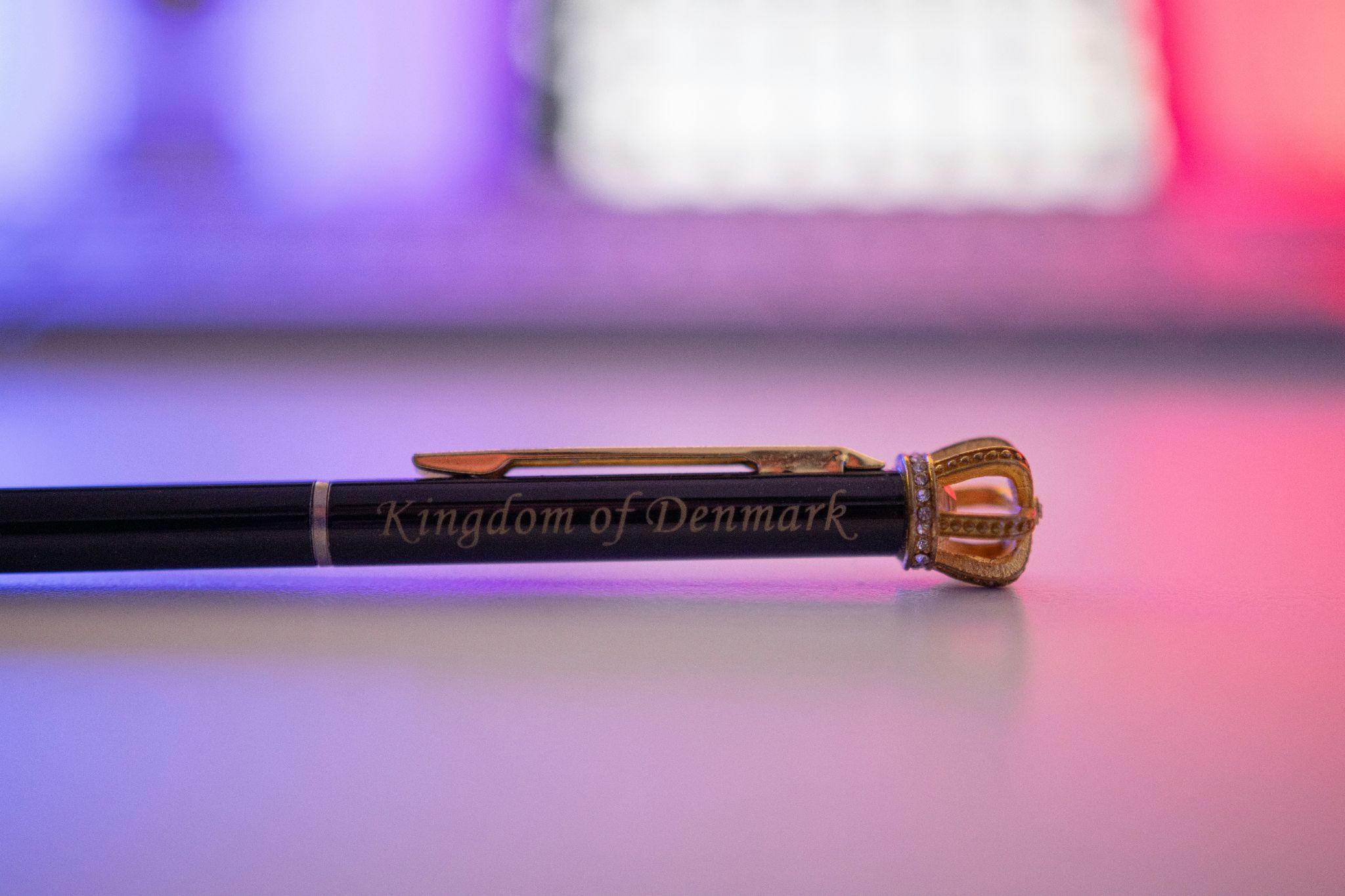
Don’t make the final decision until you test your design. Zooming in on your computer ensures you see details that might not be visible at normal size. Consider printing the design to make sure the information and embossed details are clearly visible.
Pen Selection from Save Your Ink can also help, because you need to consider the dimensions, imprint area, and barrel color of the selected product before finalizing the artwork. The logo shouldn’t be designed independently of the item it will be printed on.
In Conclusion
Successful logo design for pen writing instruments isn’t about cramming an existing logo into a small space, but about choosing what should stay there. Typography, good contrast, proper spacing, simple shapes, and the right file formats can help create the final product.
The best approach to logo design for pens is to test the artwork at its actual size before committing to production. If your logo is distinct and legible once applied to the pen, you have passed the toughest step in the design process. Please share whether you’ve ever found that a logo looks different once printed on a promo item.