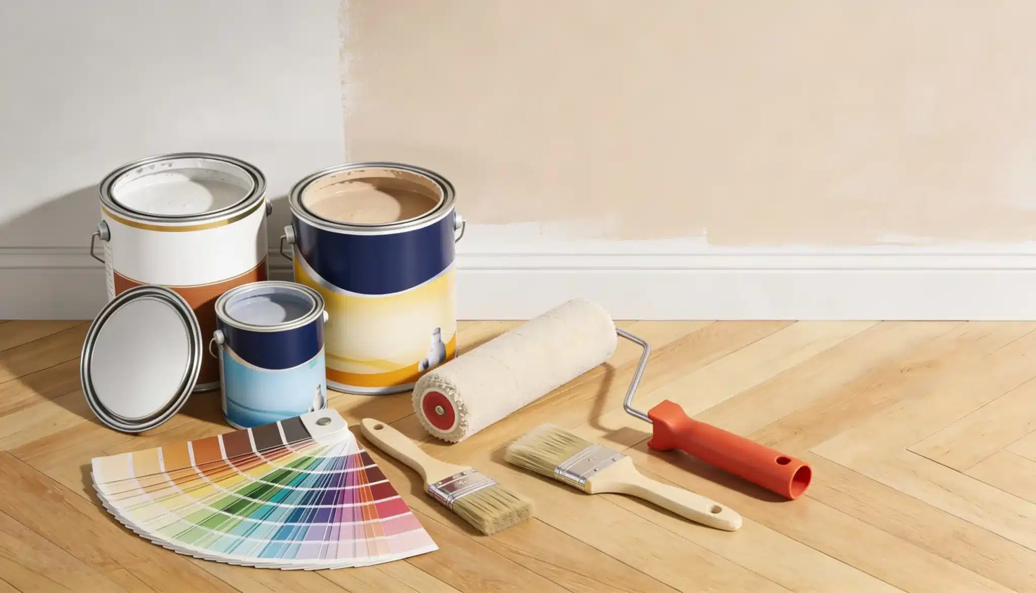
Thirty dollars’ worth of paint samples. That’s what it took before I finally committed to pewter.
Not because the color was wrong, but because it kept looking different every single time I checked it.
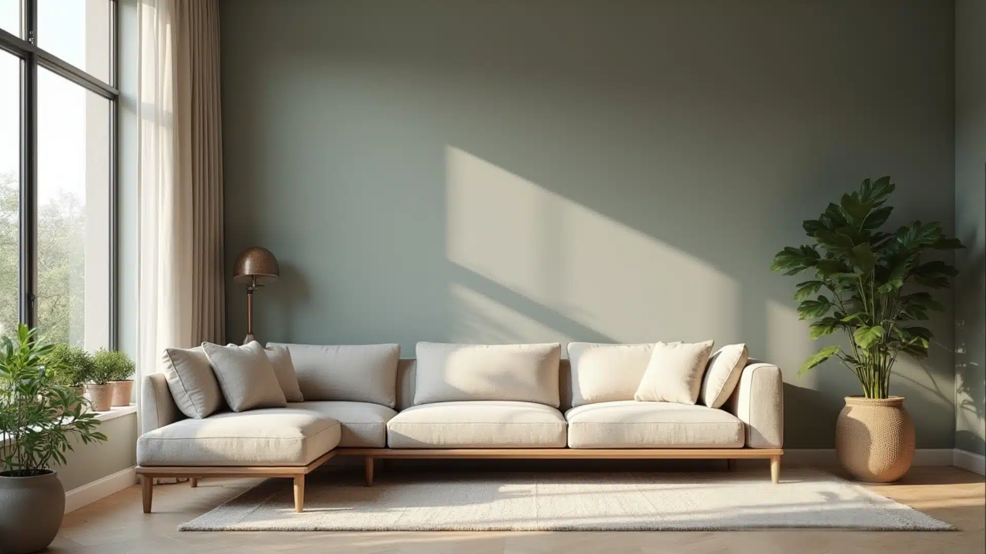
Morning light, evening lamps, cloudy days, pewter shifts with all of it. Most neutrals don’t do that. This one does, and that’s worth knowing before you buy a full gallon.
This blog breaks down pewter color undertones, how light changes it room by room, and what works well with it.
What Color is Pewter?
Pewter is a mid-tone gray with a slight metallic sheen.
It sits between light gray and charcoal, not too dark, not too washed out. Where it gets interesting is in the undertones. Some pewter shades pull warm, leaning toward beige or brown.
Others read cooler, with hints of blue or green coming through depending on the light.
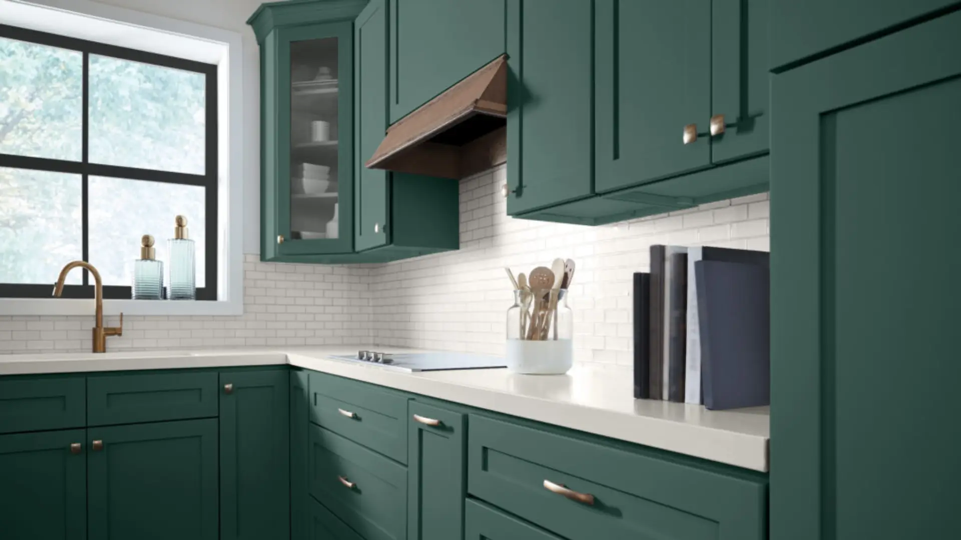
Over the last few years, pewter has shown up everywhere living room walls, kitchen cabinets, and exterior trims.
Designers keep reaching for it because it holds its own without overpowering a space. It works especially well in modern, tiniest, and classic homes.
Always check the LRV of your pewter shade before buying. An LRV of 40–55 provides a true mid-tone pewter look without being too light or dark.
Pewter Colour Undertones and Shades
Pewter reads differently depending on its base. Here’s a quick breakdown of what to expect from each type.
| Shade Type | Undertone | How it Looks on Walls | Best Suited For |
|---|---|---|---|
| Light Pewter | Soft gray | Airy, barely-there coverage | Small rooms, low ceilings |
| Warm Pewter | Beige/brown | Cozy, grounded feel | Wood floors, warm furnishings |
| Cool Pewter | Blue/gray | Crisp, clean finish | Modern spaces, white trim |
| Classic Medium Pewter | Balanced gray | Depth without heaviness | Living rooms, bedrooms |
| Green-Toned Pewter | Subtle green | Shifts under natural daylight | North-facing rooms |
| Blue-Toned Pewter | Cool blue | Calm, understated look | Coastal, Scandinavian interiors |
| Dark Pewter | Deep gray | Bold, moody presence | Accent walls, cabinetry |
Pewter Paint Colours by Brand
Every brand has its take on pewter. Here are the most popular shades worth knowing, broken down by brand.
A Note on Paint Finish
Flat and eggshell finishes read truest for pewter on walls. Satin works well on cabinetry and trim. Avoid gloss it amplifies undertones and can make pewter look unexpectedly green or blue.
1. Benjamin Moore
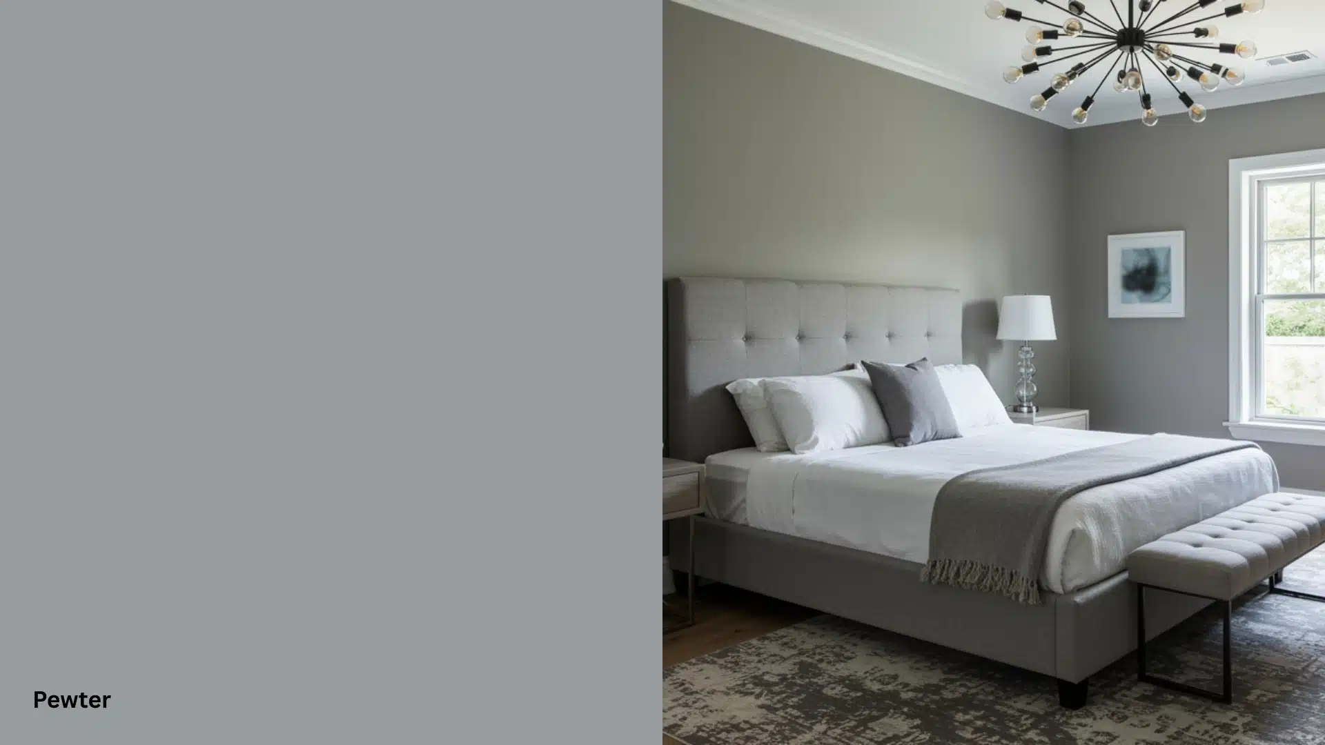
Alt text: Modern bedroom featuring a gray bed, gray walls in Pewter, a chandelier, and a large window
Pewter (2121-30) sits in the cool-gray range with a slight blue undertone. It’s a clean, no-fuss shade that works well in living rooms and hallways.
Consistent across different lighting conditions, which makes it easier to commit to.
Pairs well with crisp white trim and light wood floors.
2. Sherwin-Williams
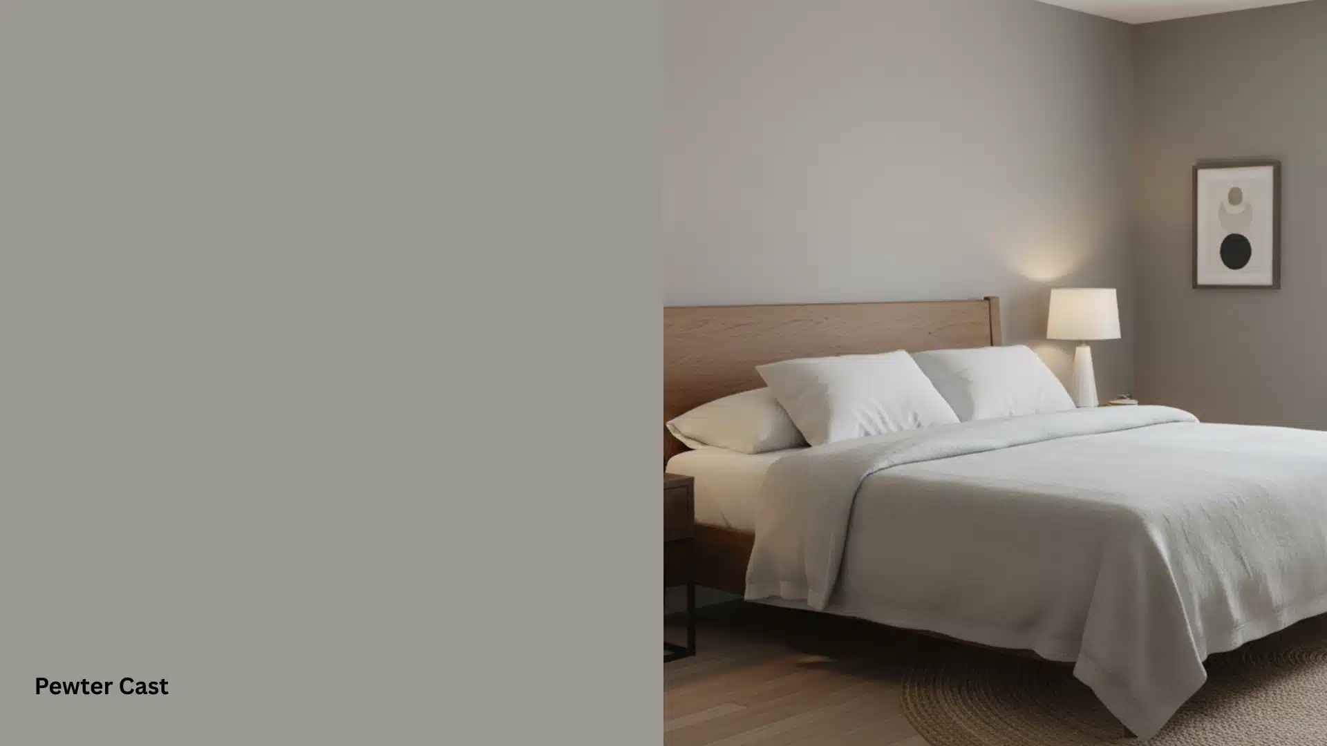
Alt text: A bedroom showcasing a greige wall labeled Pewter Cast on the left half of the image
Pewter Cast (SW 7673) leans warmer than most pewter shades.
It carries a soft brown-gray tone that feels settled and calm on walls. A strong choice for bedrooms and open-plan living spaces with mixed lighting.
The heat in this shade makes it very forgiving with a range of furniture tones.
3. Farrow & Ball
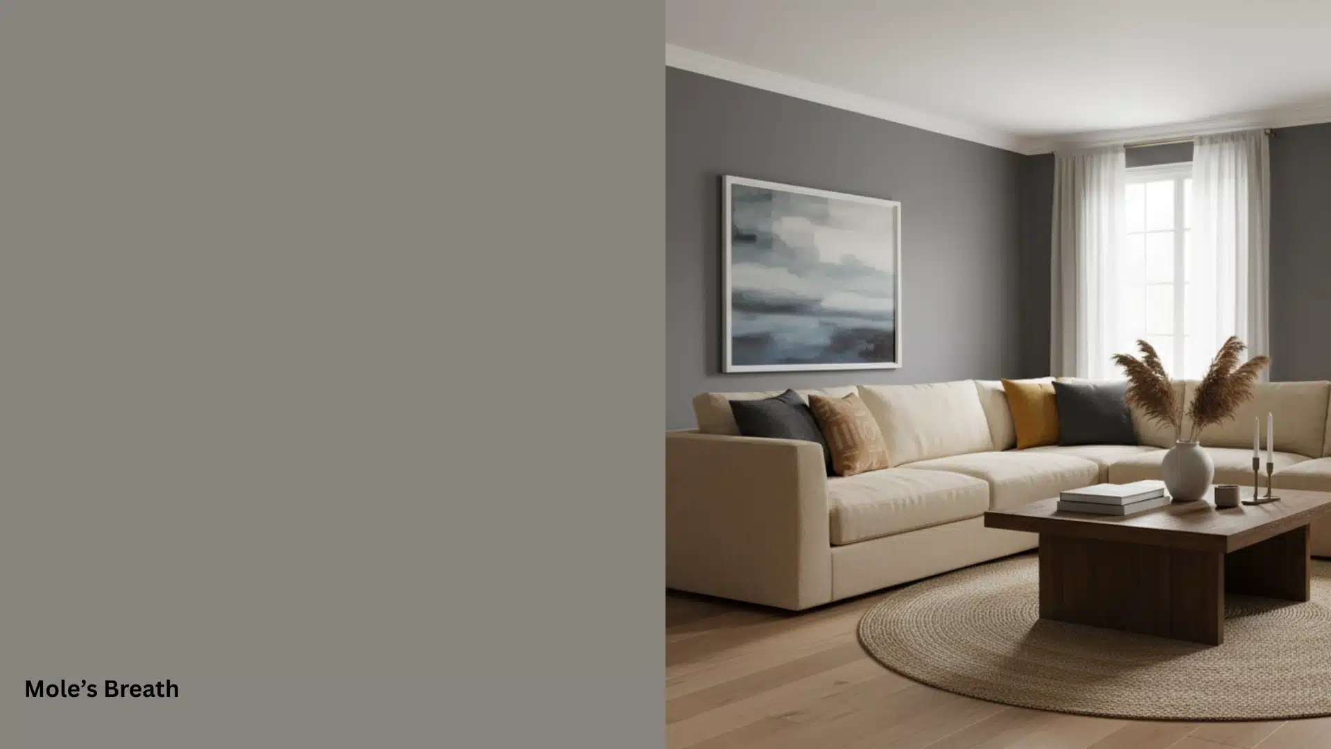
Alt text: Living room featuring a sectional sofa, coffee table, and a square painting on a wall painted the color Mole’s Breath
Mole’s Breath (No. 276) is Farrow & Ball’s closest pewter equivalent. It’s a warm, mid-tone gray with subtle brown depth. The color shifts noticeably between natural and artificial light, giving walls real character.
It works particularly well in older homes with period detailing and natural wood features.
4. Dulux
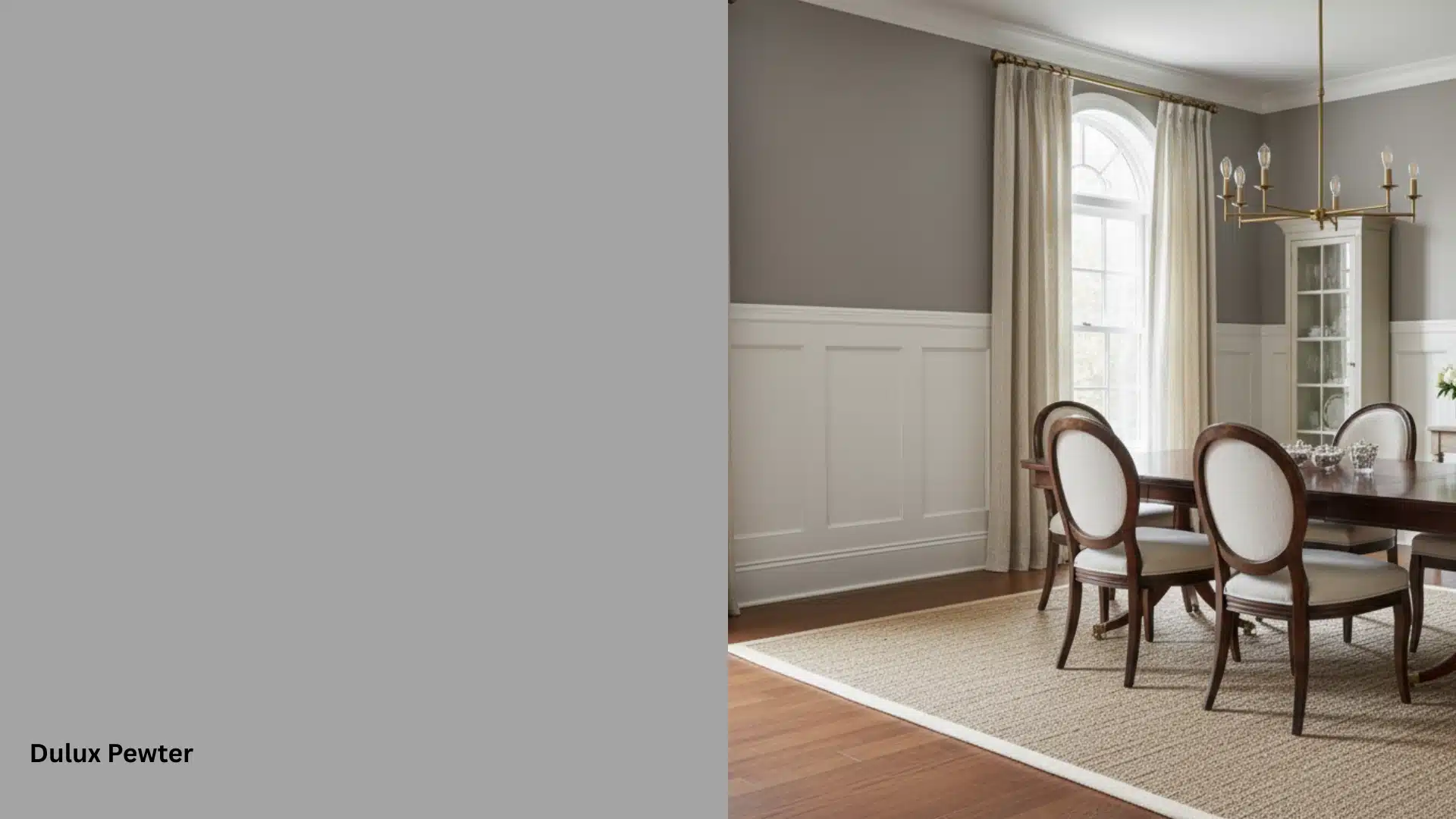
Alt text: A paint color swatch labeled Dulux Pewter next to a formal dining room image featuring gray walls, dark wood chairs, and an arched window
Pewter (Dulux Heritage) offers a balanced gray with a faint green undertone.
It holds up well on both walls and woodwork.
Popular for period homes and spaces where a traditional, understated look is the goal. The green undertone becomes more noticeable in rooms with abundant natural daylight.
5. PPG
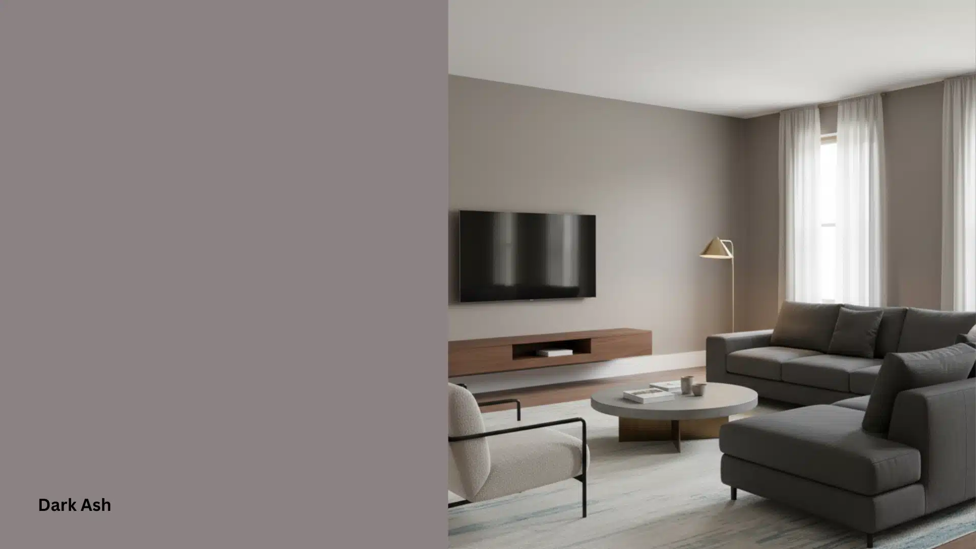
Alt text: Modern living room with a sofa and a large wall-mounted television next to sheer-curtained windows
Dark Ash (PPG1025-5) is a deeper, richer shade, closer to the dark end of the pewter spectrum.
It works especially well on kitchen cabinets and exterior trims where a strong, defined color is needed.
The depth of this shade also makes it a solid option for home office and dining room walls.
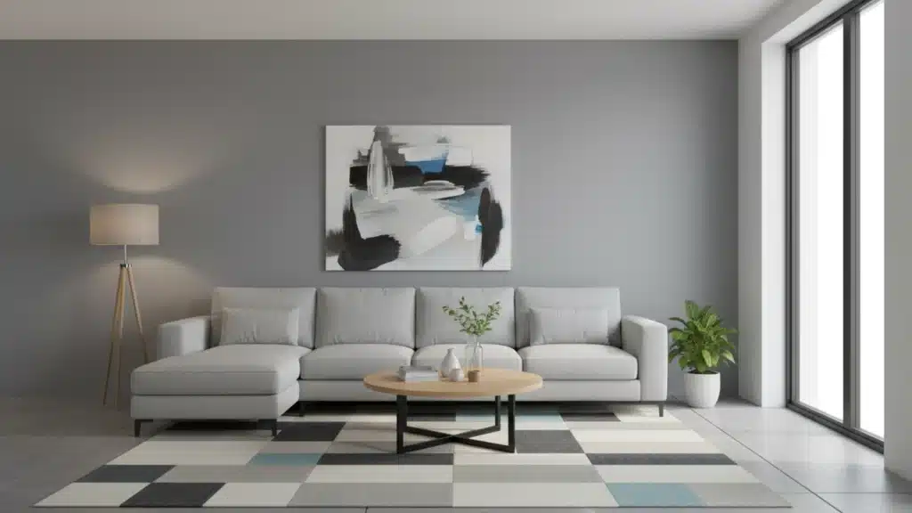
Pewter vs Other Gray Paint Colours
Pure gray sits flat and cool. It doesn’t shift much with light changes, which makes it predictable but sometimes a little lifeless.
Pewter, on the other hand, moves. It picks up heat in the evening and feels cooler in the morning.
Greige sits closer to beige and feels softer overall. Pewter carries more weight and depth than greige does.
Charcoal is darker and more dramatic.
Pewter gives you that same sense of character without committing to such a strong contrast.
If you want a neutral with some life to it, pewter sits in a sweeter spot than most straight grays do.
Why Pewter Holds up Better Long Term?
Straight grays can start feeling cold or clinical after a few years. Pewter avoids that.
Its mixed undertones shift with seasonal light changes rather than working against them.
In summer, it feels cooler and fresher. Come winter, the heat in it comes through more. That natural movement keeps the color feeling current without you having to do anything.
Most people who commit to pewter rarely feel the need to repaint.
What Colours Pair Best with Pewter Colour
Pewter is a strong neutral, but the colors around it make all the difference. Here’s what works well with it.
| Colour | Undertone Match | Best Used As | Why It Works |
|---|---|---|---|
| Crisp White | Cool/neutral | Trim, ceilings | Sharpens pewter’s edges cleanly |
| Navy Blue | Cool | Accents, cushions | Creates strong, confident contrast |
| Sage Green | Warm/cool | Accents, soft furnishings | Complements pewter’s green undertone |
| Burnt Orange | Warm | Cushions, artwork | Adds warmth against cool pewter |
| Blush Pink | Warm | Soft furnishings | Brings softness to darker pewter shades |
| Brass/Gold | Warm metallic | Hardware, light fixtures | Brings warmth to cool pewter tones |
| Terracotta | Warm | Accessories, rugs | Grounds warm pewter shades naturally |
How to Pick the Right Pewter Colour
Picking the right pewter comes down to a few practical checks before you buy.
Start with your room’s lighting. North-facing rooms need a warmer, more saturated pewter to avoid looking cold and flat. South-facing rooms can handle cooler pewter shades without feeling harsh.
Look at what’s already in the room: your flooring, furniture, and fixed fittings.
These will either clash with or complement the undertone you choose.
Then test before you commit:
- Buy sample pots and paint at least an A4-sized patch on the wall.
- Check the sample at different times of day, not just once.
- Look at it under both natural and artificial light.
- Hold your furniture fabrics and flooring samples next to the painted patch.
- If the color reads right across morning, afternoon, and evening, it’s the one.
One thing most people skip is checking your pewter sample against your trim color, too, not just your furniture. A warm trim will pull the pewter warmer than you expect.
Final Thoughts
Pewter colour is one of those colors that rewards you for taking the time to understand it.
Get the undertone right, test it properly, and it works harder than most neutrals on the market. It suits walls, cabinets, exteriors, and accent spaces equally well.
Pair it with the right colors, and it looks intentional every single time.
If you’re still unsure which shade fits your space, start with a sample pot.
Paint it up, live with it for a few days, and let the light in your room make the final call.
In my experience, People who test pewter properly almost never repaint it, indicating how well it settles into a space over time.
Frequently Asked Questions (FAQ’s)
1. Is Pewter the Same as Gray?
Pewter is similar to gray but carries warmer, slightly metallic undertones throughout.
2. What Color is Closest to Pewter?
Silver and charcoal gray come closest to matching the pewter color tone.
3. Does Pewter Turn Dark?
Yes, pewter can darken over time without regular cleaning and proper care.
4. What is a Disadvantage of Pewter?
Pewter scratches easily and requires consistent maintenance to keep its original appearance.
5. Does Pewter Get Shiny?
Yes, pewter can be polished to bring back a smooth, shiny finish.