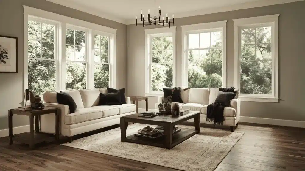
You painted a room in what looked like a perfect grey on the swatch, and now it looks like dishwater on the wall.
This happens more than most people admit, and it is usually because the undertones showed up once the light changed.
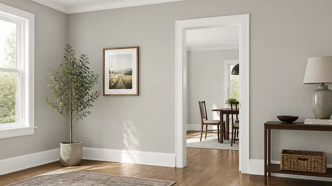
Mindful Grey Sherwin Williams solves a lot of that guesswork.
It holds its balance across different lighting instead of swinging warm or cool, which is exactly what makes it a favorite among people who have already been burned by a bad grey.
Undertones of SW Mindful Grey
Mindful Gray runs on a mix of green, taupe, and a touch of blue. None of them shout. That is the whole point.
In rooms with darker furniture or less natural light, the green tends to step forward a little. Bring in more daylight or lighter finishes, and the taupe takes over instead, giving the wall a softer, warmer read.
This is why two people can look at the same paint chip and describe it completely differently. One will call it a true grey. Another will swear it leans green. Both are right, just in different rooms.
A common mistake is judging this color from a small swatch under store lighting. Undertones only really show up on a full wall, in your actual room, at different times of day.
LRV of Mindful Grey Sherwin Williams
It has an LRV of 48, which sits right in the middle of the scale. That means it will not wash a room out with brightness, but it will not swallow the light either.
This middle ground is part of why it works in so many rooms without needing extra lighting fixes. Just keep in mind, LRV only tells you brightness, not color.
Two paints can share the same LRV and still look completely different once they are on a wall.
How Does Mindful Grey Look in Different Lighting?
Sunlight direction changes everything about this color. The same can of paint can look completely different depending on which way your windows face and what time you check it
In North-Facing Rooms (Bedroom)
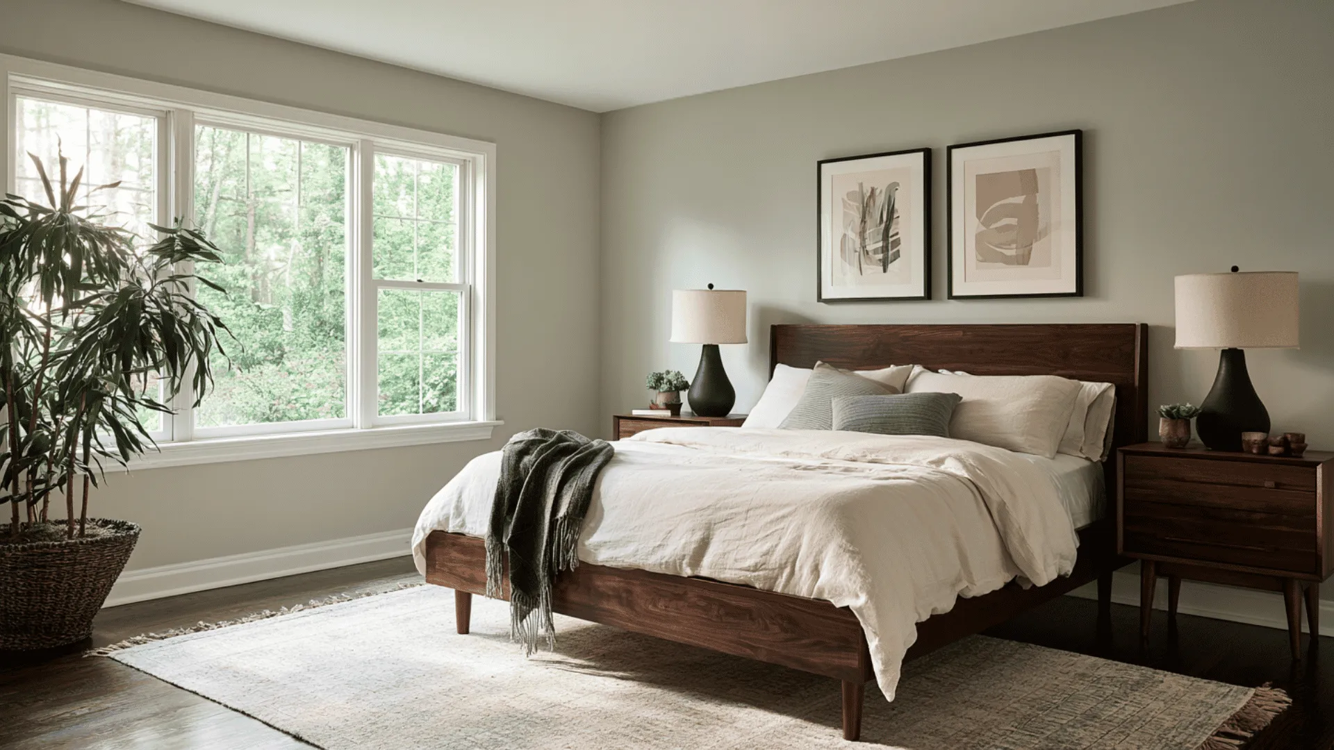
Light here stays soft and cool no matter the hour, so the shade tends to lose some of its warmth and lean grayer than expected.
The green undertone often shows up first, especially on cloudy mornings or against darker furniture. Worth checking a sample wall at both ends of the day before committing.
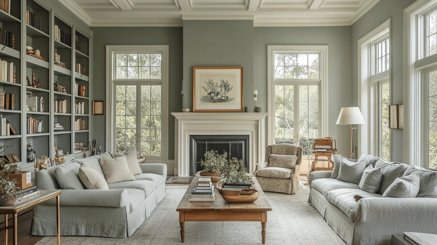
In South-Facing Rooms (Living Room)
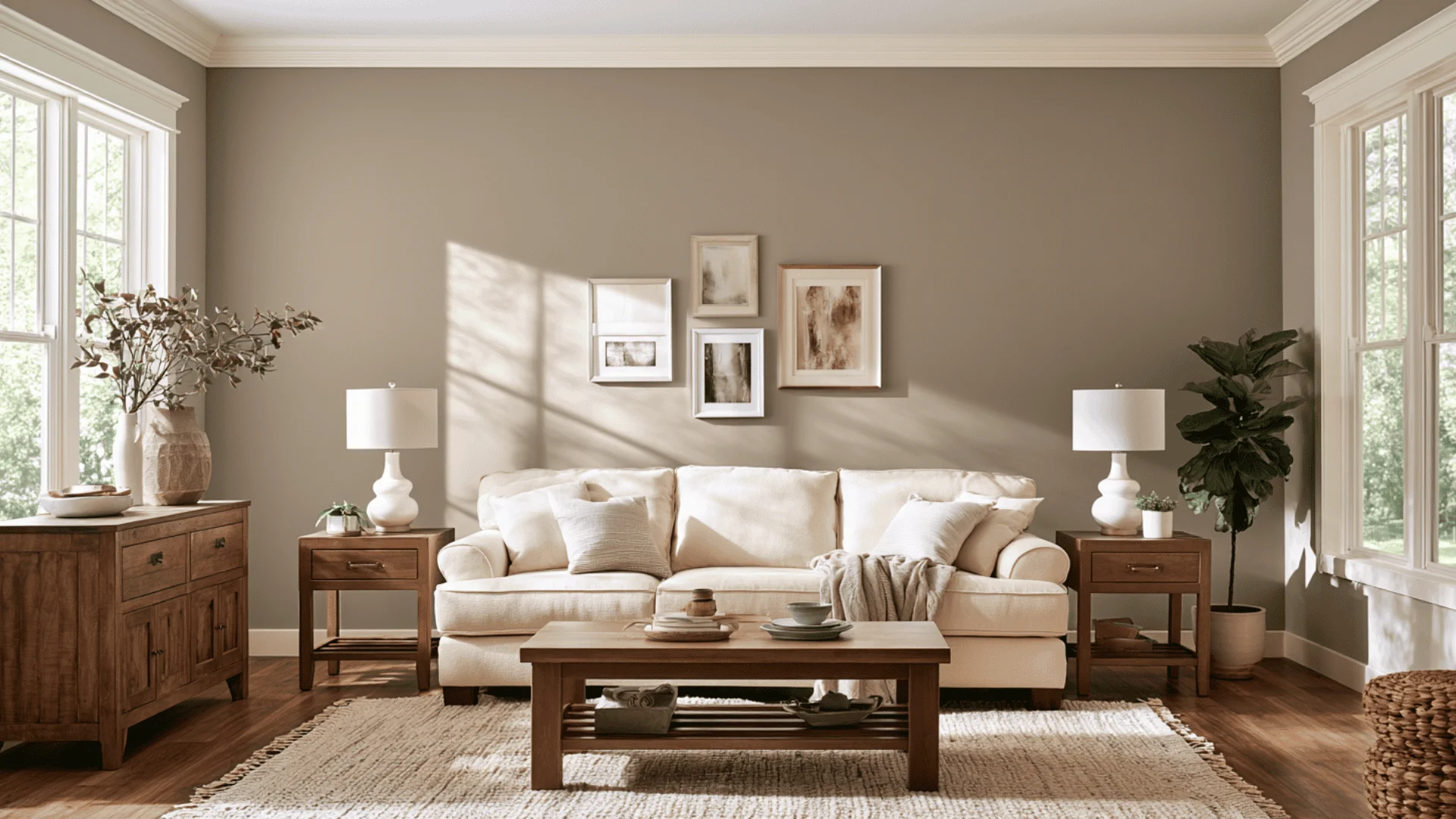
All that direct sun works in Mindful Grey’s favor. The warmth coaxes out its taupe side, giving the color a softer, more welcoming feel while keeping any green tones in check.
Some people worry bright rooms need a paler paint, but here the extra depth actually holds up well.
In East-Facing Rooms (Kitchen)
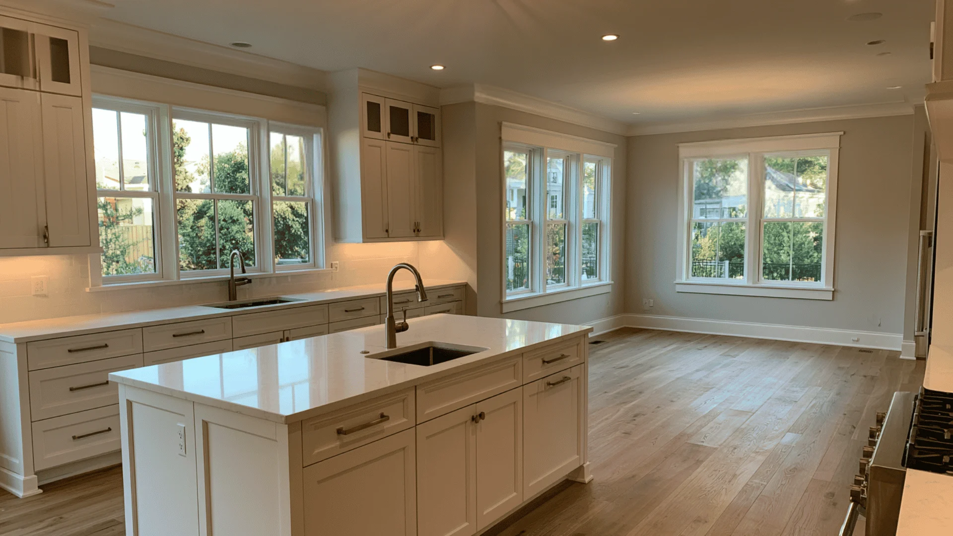
Morning brings a cooler, sharper light that shows off the grey in this color, sometimes making surfaces look a bit crisper than you’d expect.
Once afternoon settles in, the tone lightens, and the taupe becomes more obvious. Worth a look at both times before deciding it’s right. (50 words)
In West-Facing Rooms
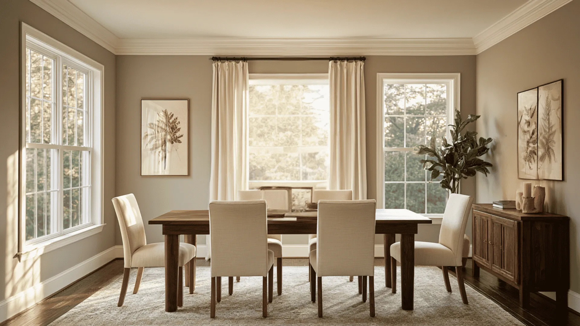
The afternoon sun brings out a richer, warmer version of this color, then evening light softens it into something cozier.
It’s one of the bigger shifts you’ll notice across the day, so a quick check during both stretches saves you from any second-guessing later.
Mindful Grey vs Other Popular Greys
People almost always land on chooisng this paint color after comparing it to a few others first. Here is how it holds up against the ones that come up most.
Acier Gray
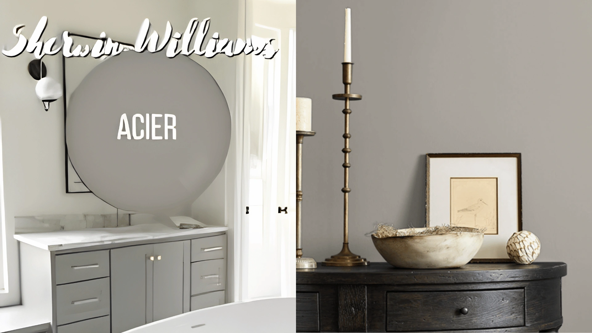
Acier is the darker, moodier cousin here. It sits around an LRV of 32, with an almost purple cast instead of the green and taupe you get with Mindful Grey.
If you want something with more weight, especially in a room with good natural light to balance it, Acier earns its spot. .
Agreeable Gray
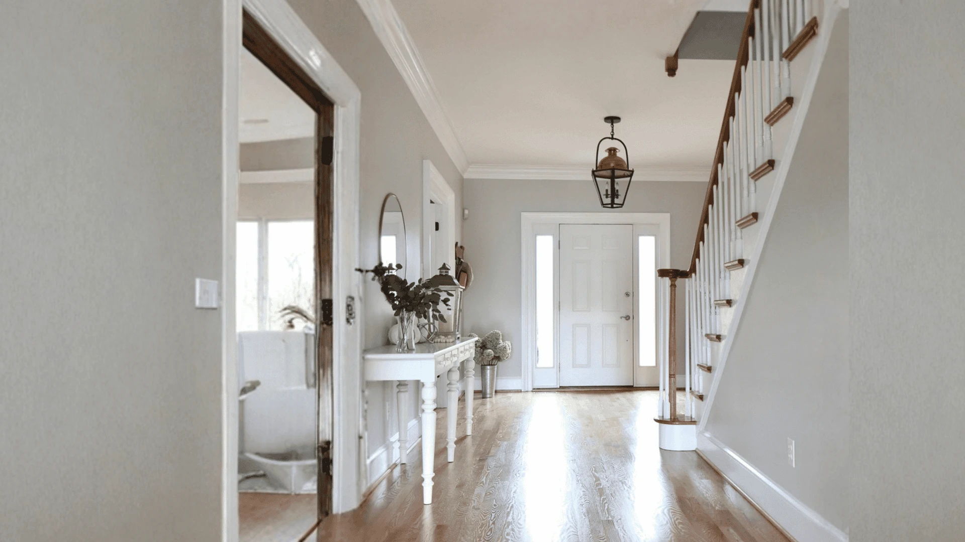
This is the one most people cross-shop against, Mindful Grey, and for good reason.
Agreeable Gray runs warmer and closer to beige, with an LRV around 60 that puts it a good deal lighter. It tends to disappear into wood tones and warm finishes rather than stand apart from them.
Mindful Gray, by comparison, holds onto more of its actual gray, which gives a room a bit more contrast and definition.
Dorian Gray
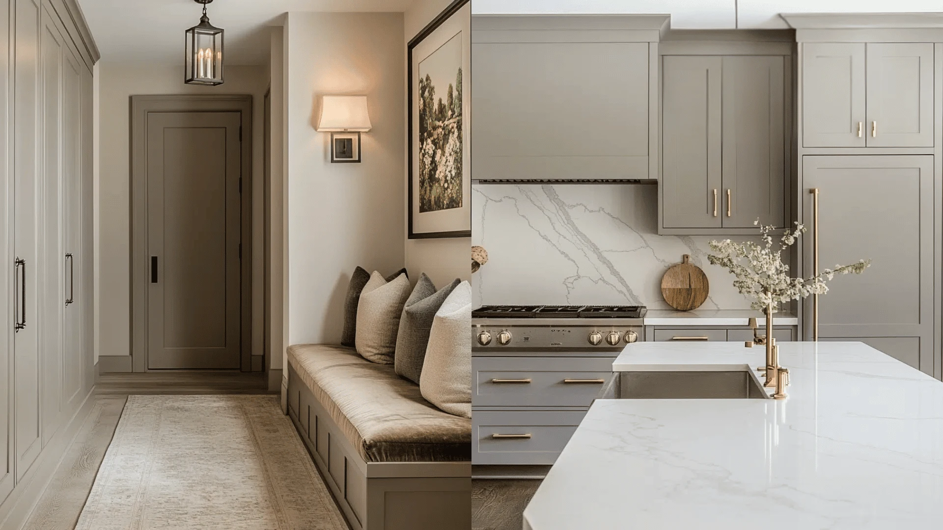
Dorian Gray lives right below Mindful Grey on the same strip, coming in at an LRV of 39.
It reads taupier and sits deeper, which makes it a natural pick for spaces that want a moodier, more layered feel without going full charcoal.
Repose Gray
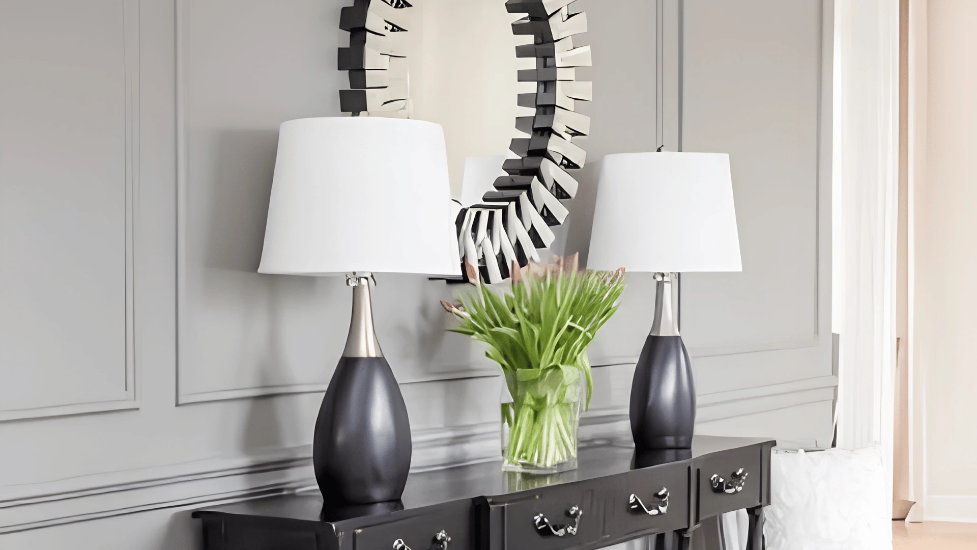
Repose Gray sits just above Mindful Grey in brightness, around an LRV of 58, but don’t let that fool you into thinking it behaves the same way.
Its violet and green undertones can swing more than people expect, sometimes reading almost lavender in the wrong light.
Mindful Gray tends to be the more predictable of the two, which is usually why it wins out for anyone who does not want surprises after the second coat.
Compare Mindful Gray with the best of Benjamin Moore's gray.
Colors That Pair Well With Mindful Grey
Mindful Gray does most of its best work as a backdrop, so it pairs easily with almost anything you put next to it.
Whites and Trims
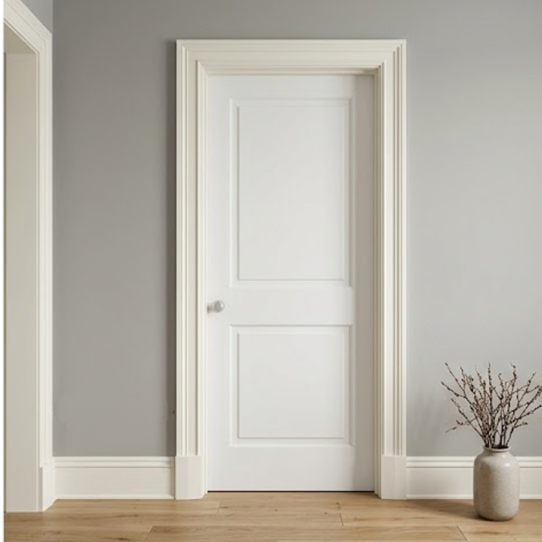
Alabaster shows up constantly with this one, and it is easy to see why. It carries just enough warmth that trim never feels stark or clinical against the wall color.
Some people prefer pure white instead if they want a cleaner, sharper line between wall and trim, which tends to suit more modern spaces.
Either way, the trim stays supporting, not competing.
Accent Colors
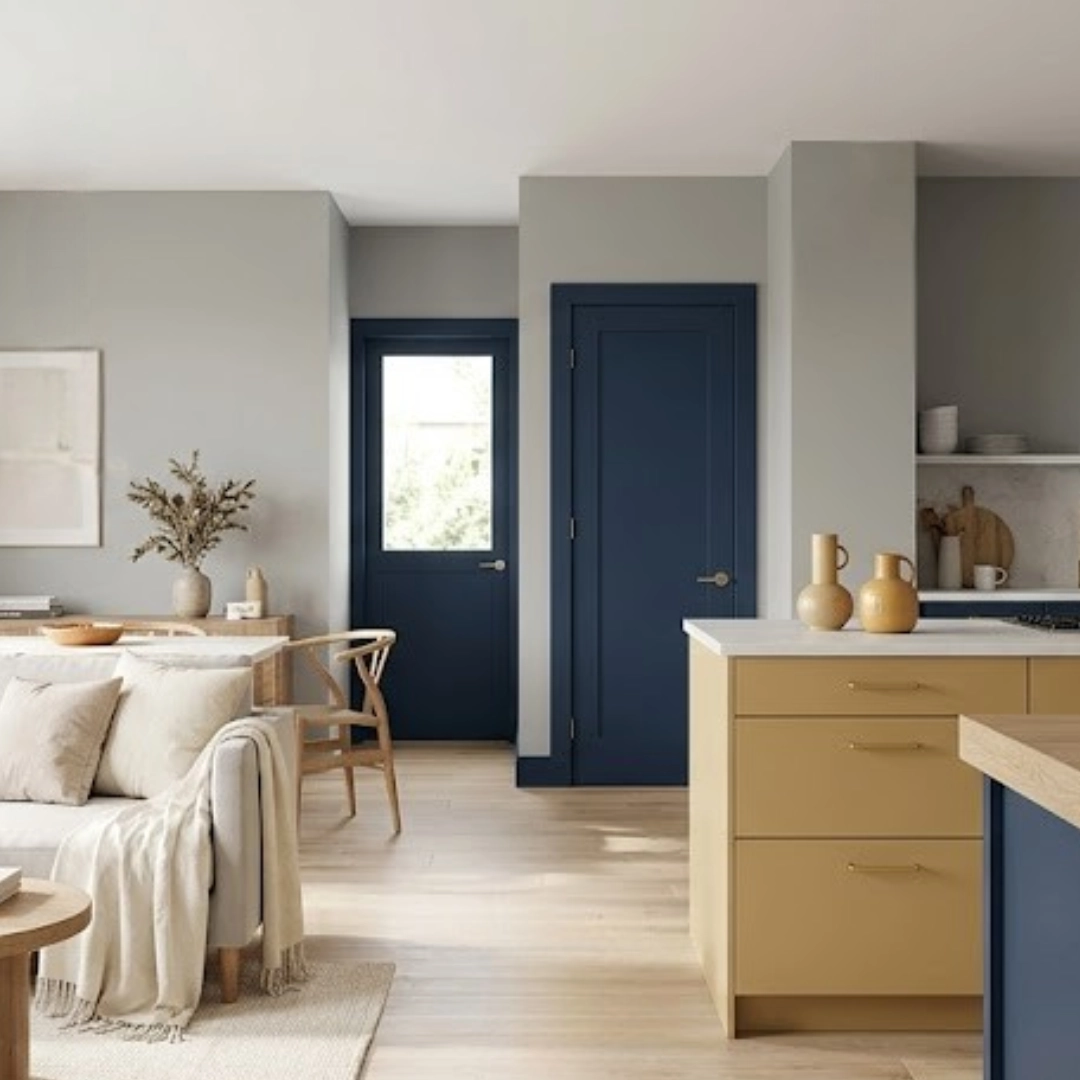
Naval brings deep navy that grounds a room fast, whether on a door, island, or accent wall. Gambol Gold works from the warmer side, picking up Mindful Grey’s taupe hints. Use it sparingly, since a little goes further than expected.
Conclusion
What makes Mindful Gray Sherwin Williams stick around year after year comes down to how little it surprises you.
It shifts with the light, sure, but it never tips into looking cheap or muddy the way some greys do once the sun moves.
If you take one thing from this guide, let it be this. Get a sample on your actual wall and live with it for a day or two before you buy the gallon.
That small bit of patience is usually the difference between loving the color and repainting six months later.
Frequently Asked Questions
1. Is Mindful Gray Beige or Gray?
It’s gray at its core, not beige. The warmth comes from taupe undertones, but it never fully crosses over into beige territory.
2. Does Mindful Gray Look Green?
It can, particularly in dimmer rooms or under cooler bulbs. North-facing spaces tend to bring that green out the most.
3. What Is One Shade Lighter than Mindful Gray?
Repose Gray. It sits just above it in brightness and shares the same color strip.