Orange is one of those bright colors that instantly levels up the energy, whether it is used in interiors, outfits, or even in food. It makes things stand out and get noticed.
Try passing a graffiti wall where the art uses a shade of orange, and do not stop to look. Almost impossible.
Playing with orange while putting together outfits is one thing, but what about interiors? The thing is nothing really goes wrong when pairing orange with other colors.
You just need to know the basics of HOW. And that is exactly what you will find here.
What color goes with orange? Do these combinations actually look appealing in home design and decor?
Let us look at some options and check if they fit the vibe.
What Kind of Color is Orange, Really?
Orange is a secondary color made by mixing red and yellow.
That combination is exactly why it reads as both energetic and approachable at the same time.
It has the intensity of red but without the aggression, and the brightness of yellow but with more depth.
In color psychology, orange is associated with energy, appetite, and social interaction, which is why it shows up so often in restaurants, gyms, and retail spaces. In homes, it works similarly.
It makes a space feel more alive without demanding the same level of commitment that red does.
Orange also has a wide tonal range. From pale peach to deep rust, the same base color can feel soft and subtle in one shade and bold and grounding in another.
What Makes Orange Feel so Strong in Interior Design?
Orange does not sit quietly in a room. It pulls focus the moment it appears, which is why it works so well as an accent rather than an all-over color.
Use it across an entire space, and it starts to feel heavy and hard to relax in.
But give it one spot to own, a wall, a sofa, a rug, and the rest of the room naturally falls into place around it.
It also reacts strongly to lightning. The same orange can look rich and grounded in the afternoon and almost overpowering by artificial light at night.
That is worth keeping in mind before committing to a larger application.
Different Shades of Orange
Not all oranges are the same, and treating them like they are is where a lot of people go wrong.
Before figuring out what color goes with orange, it helps to know which orange you are actually dealing with.
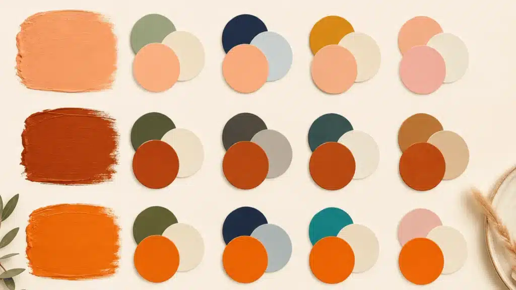
Burnt Orange for Earthy Spaces
Burnt orange leans more brown and red than bright orange. It feels grounded and settled, not loud.
Spaces with wooden furniture, exposed brick, or earthy textures are where this shade fits most naturally.
Peachy Orange for Softer Interiors
Peach orange is the mellow one of the group. It almost reads like a neutral in rooms with good natural light, but in low-lit spaces, it can look flat and washed out.
Bright Citrus Orange for Playful Rooms
Citrus orange is bold and makes no apologies about it. It works well in kids’ rooms or creative spaces where energy is the whole point. In everyday living spaces, though, a little goes a long way.
One accent wall or a couple of statement pieces in citrus orange is usually all a room needs.
Rust Orange for Modern Homes
Rust has a slightly faded, lived-in quality that suits modern and industrial spaces well.
Think concrete floors, metal accents, and matte black fixtures. It adds color without trying to steal the show.
So, What Color Goes with Orange?
Quite a few, actually. Neutrals, bold contrasts, and earthy tones all work well with orange handles.
The question is what mood you want the room to carry. Get that clear, and the right pairing becomes a lot more obvious.
1. White and Orange for a Fresh, Balanced Look
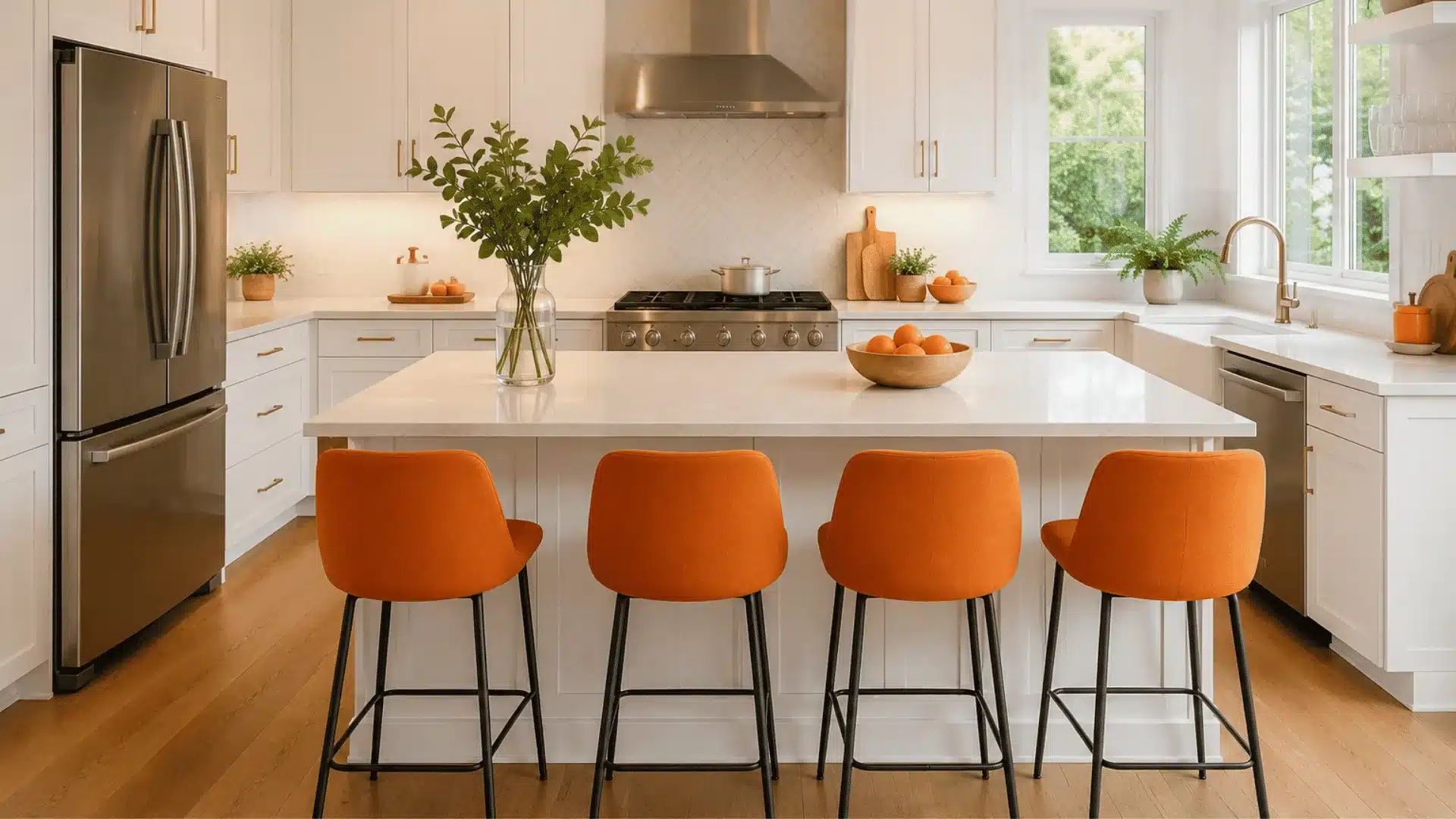
White and orange are probably the simplest pairing you can do, and it works almost every time.
White keeps the room from feeling too heavy and lets the orange do its thing without competing. Kitchens, bathrooms, and living rooms, it fits everywhere.
One thing to watch: if you go bright white with a very saturated orange, smaller rooms can start to feel intense.
2. Pink and Orange for a Trendy Combination
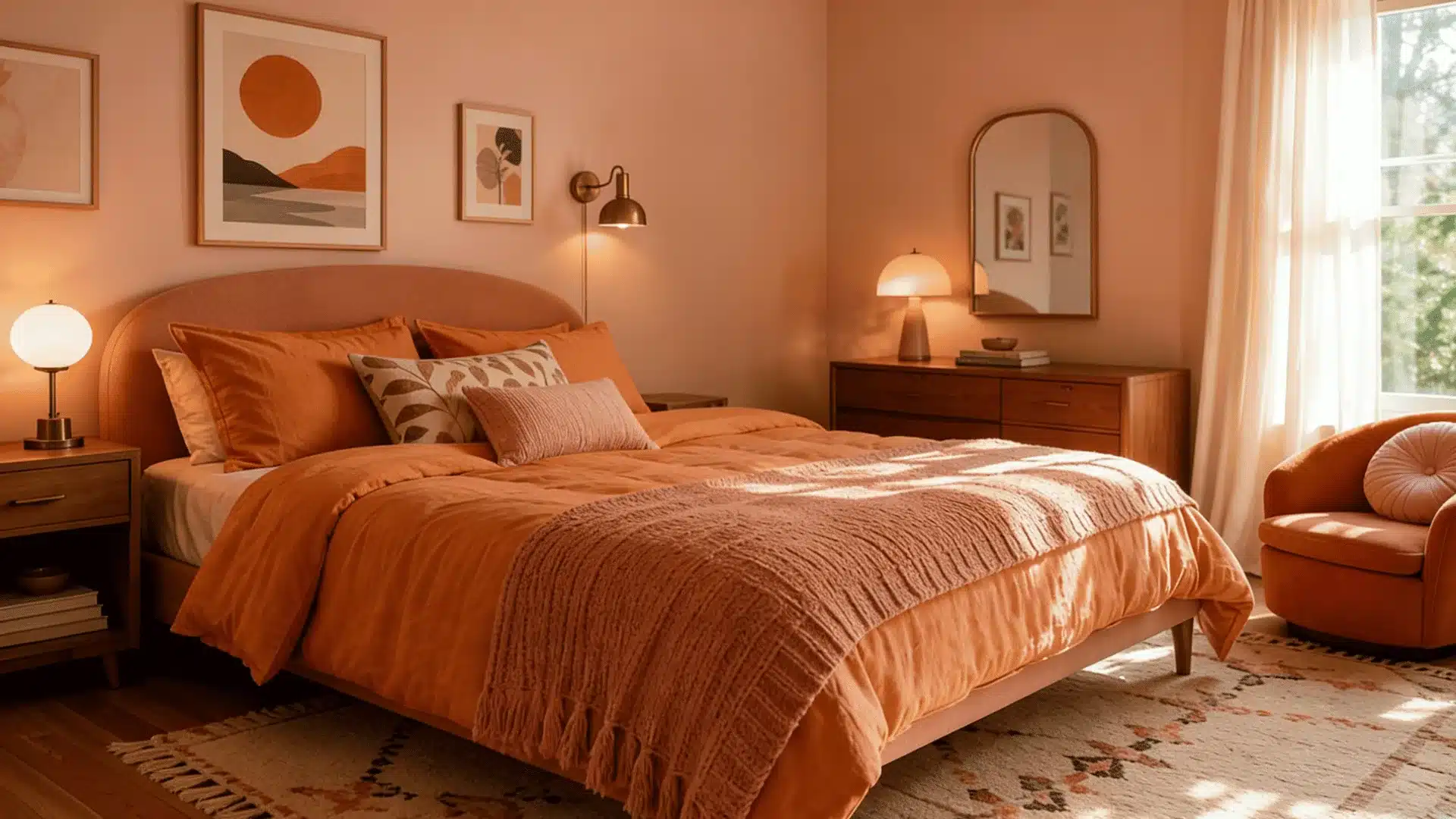
Pink and orange may sound like they shouldn’t work, but they really do.
Blush or dusty pink next to a softer orange, like peach or terracotta, creates this layered, slightly retro feel that is very much having a moment in interior design right now. Bedrooms and sitting rooms especially pull this off well.
3. Purple and Orange for Creative Interiors
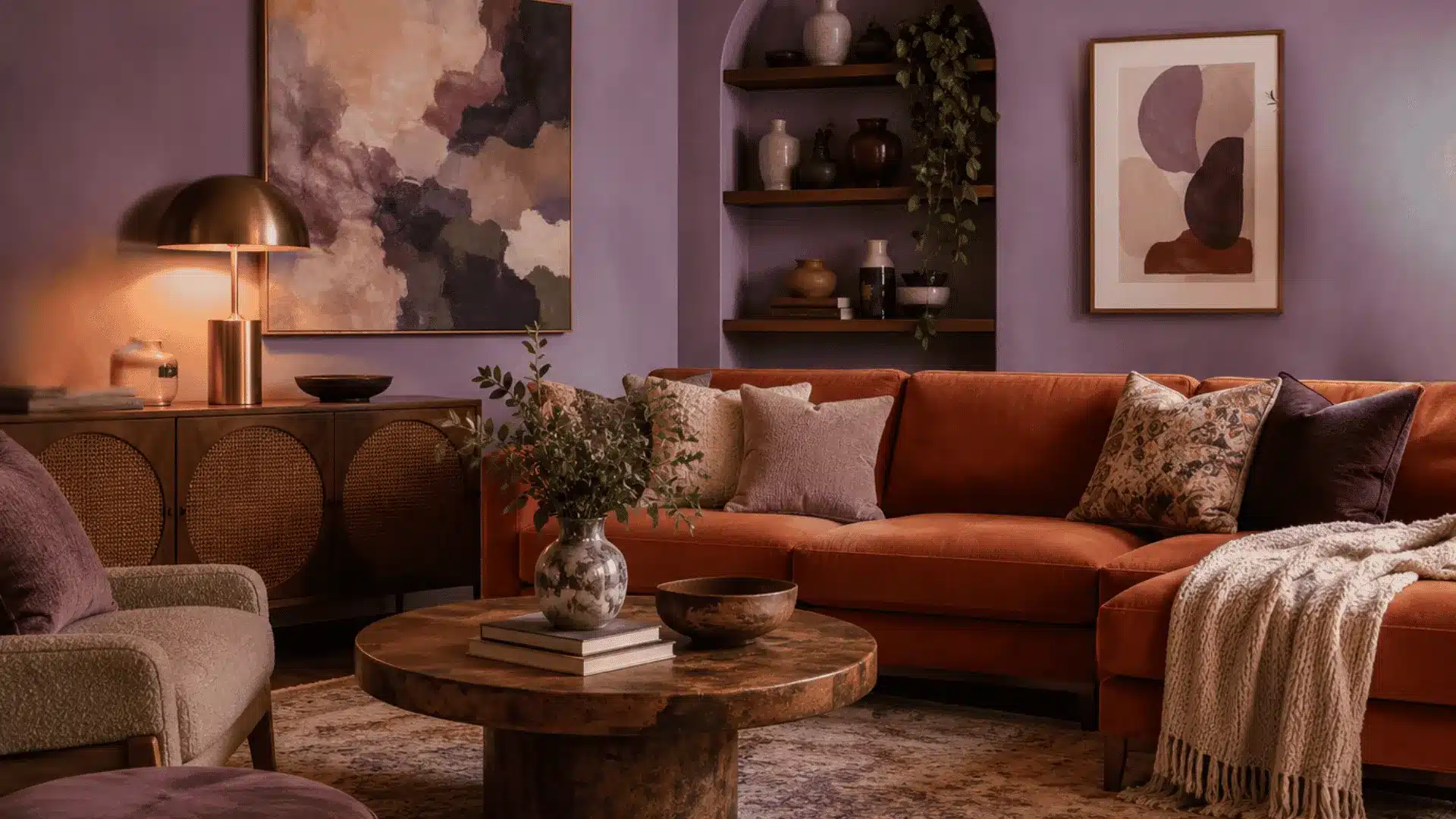
Purple and orange are opposites on the color wheel, so they naturally create contrast. The key here is keeping both shades muted.
Dusty purple walls with terracotta accents or soft lavender with peach, these work. Full-saturation purple with bright orange in a living room is a bit much for most people to actually live with day to day.
4. Beige and Cream for a Softer Feel
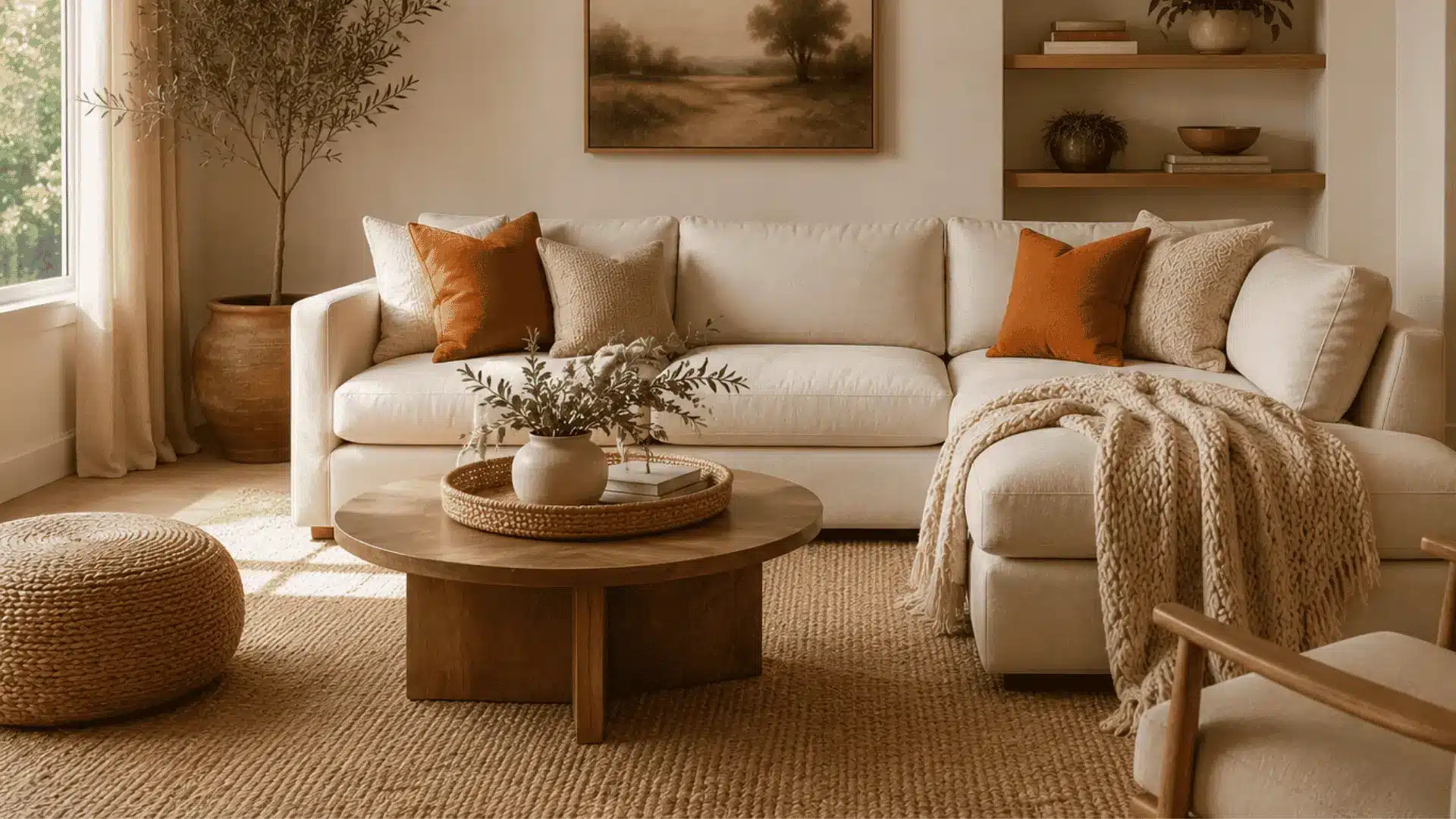
If you want orange in your space but do not want it to feel bold, beige and cream are your best choices for you. Both carry the same golden undertones as burnt orange and terracotta, so they sit together without any awkwardness.
Orange and gray is another clean, modern pairing. Mid-tone grays work best. Popular in home offices and open-plan spaces.
5. Black and Orange for an Aesthetic Style
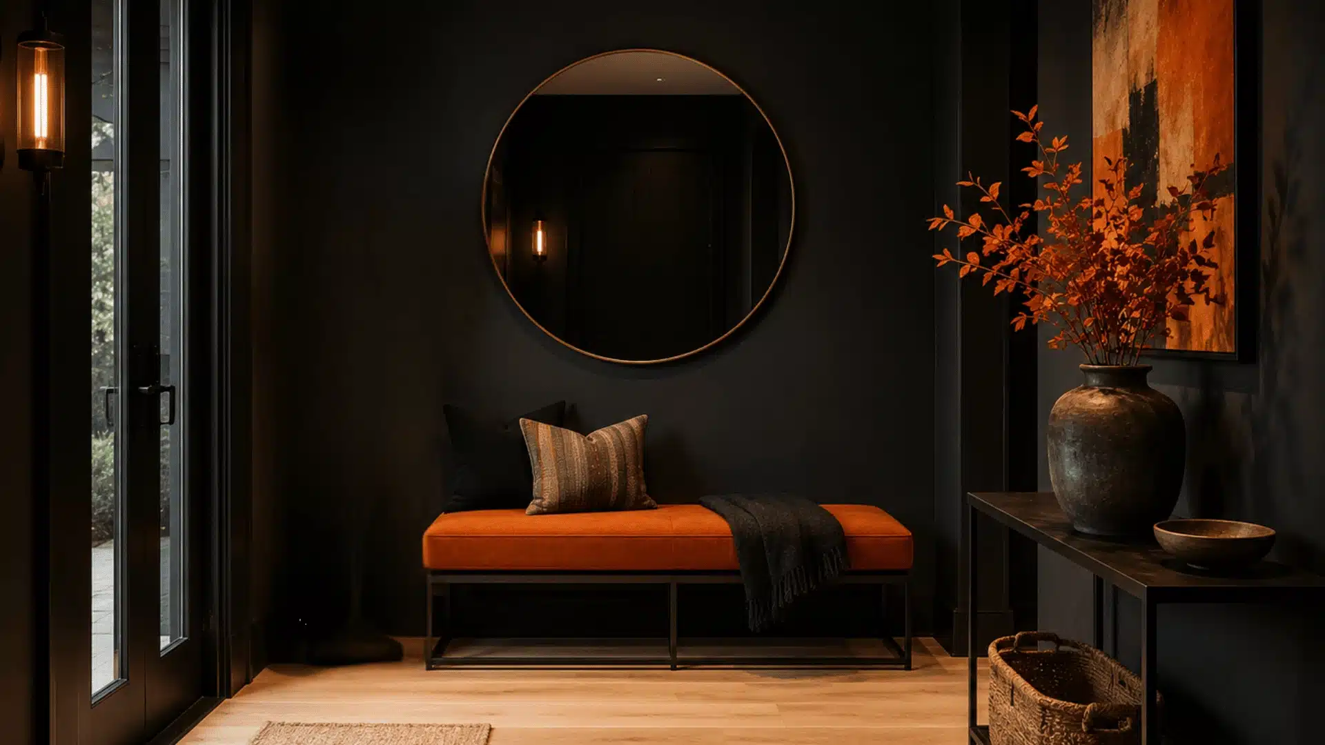
Black and orange is not for the faint-hearted, but when it works, it really works. The contrast is striking, especially in entryways or rooms where you want a strong visual impact right away.
For spaces you actually live in daily, though, mixing in some white or light wood helps break it up so it does not feel heavy by the end of the day.
6. Green and Orange for a Natural Look
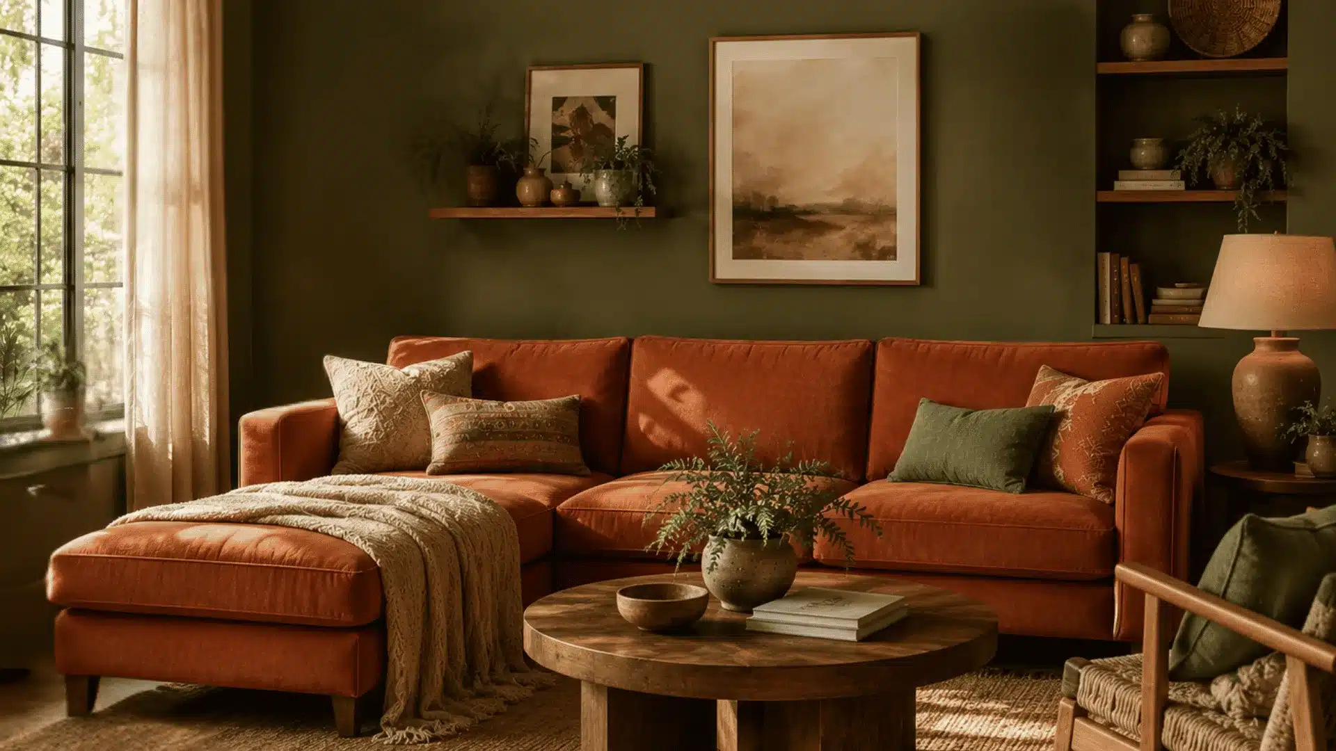
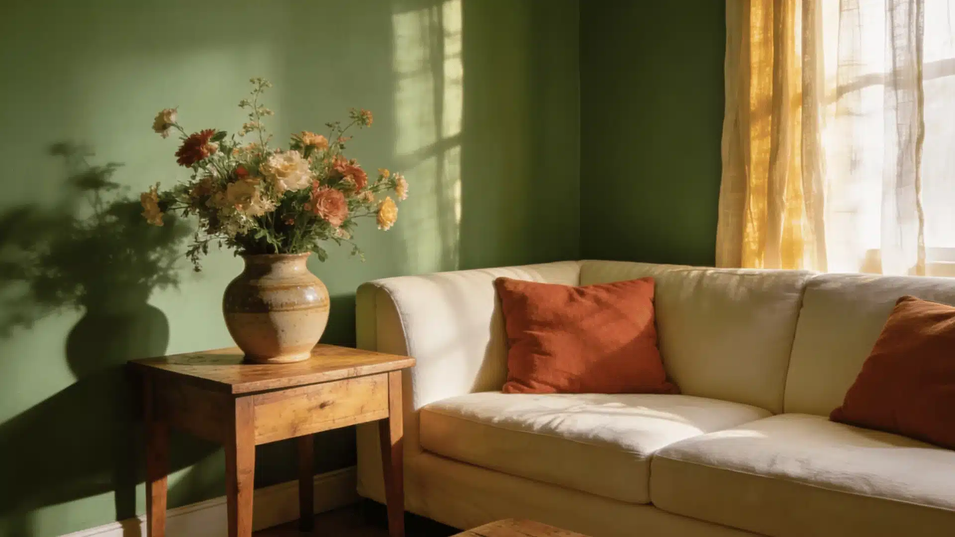
Olive green, forest green, and sage all get along well with orange, especially the earthier shades.
This combination has a natural quality to it that feels really cohesive in spaces with lots of wood, plants, or woven textures.
If your room already leans into natural materials, adding orange to a green palette just ties everything together.
7. Blue and Orange for a Classic Contrast
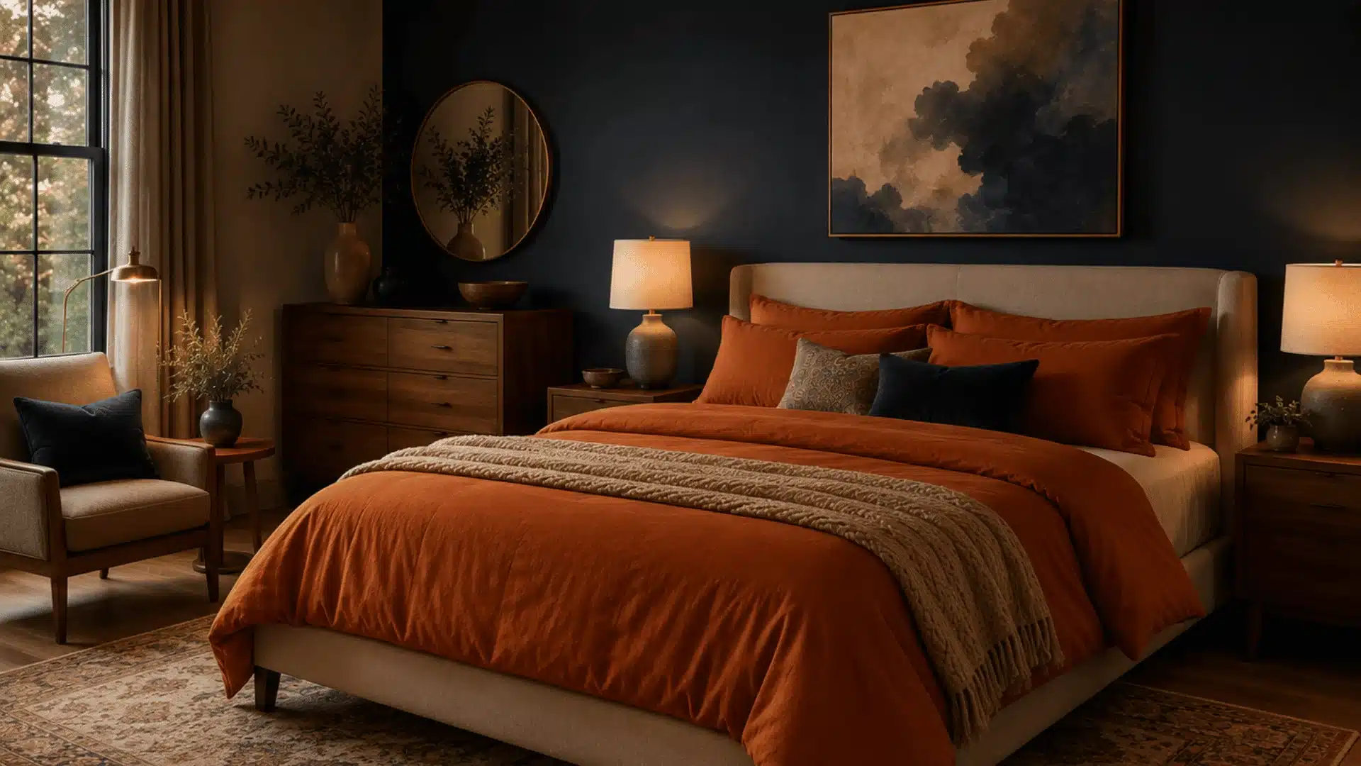
Blue and orange are complementary colors, which means they sit directly across from each other on the color wheel. In practice, that means they create a naturally strong contrast.
Navy or deep blue with burnt orange is one of the most used combinations in living rooms and bedrooms because it gives a classic feel.
For softer orange shades like peach or terracotta, lighter blues like powder blue or sky blue tend to feel more balanced.
8. Teal for a Rich, Colorful Contrast
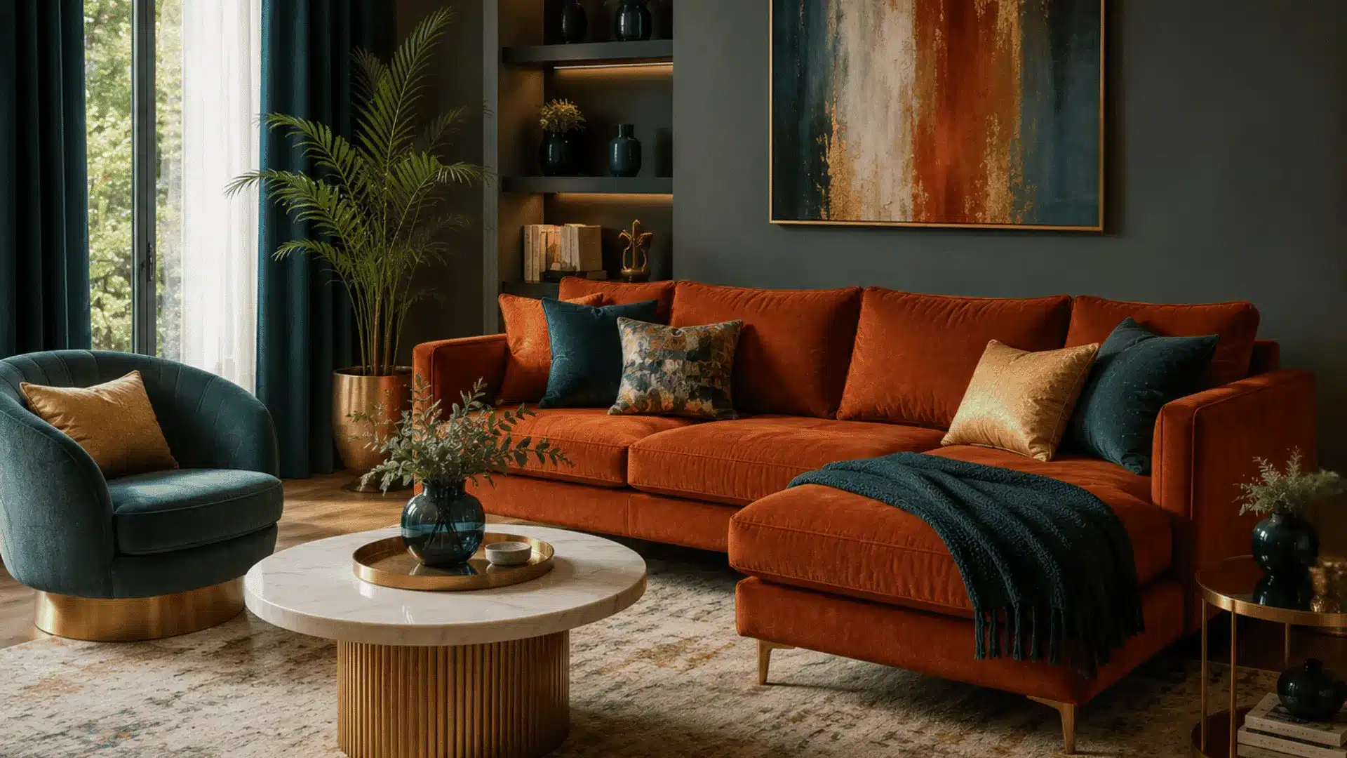
Teal brings contrast to orange without going as stark as black or navy.
It is rich enough to hold its own next to orange but not so bold that it takes over the room. If you want to test this before committing, try teal cushions or curtains against a burnt orange sofa first.
That is usually enough to tell you if it works for your space.
9. Mustard Yellow for a Retro-Inspired Vibe
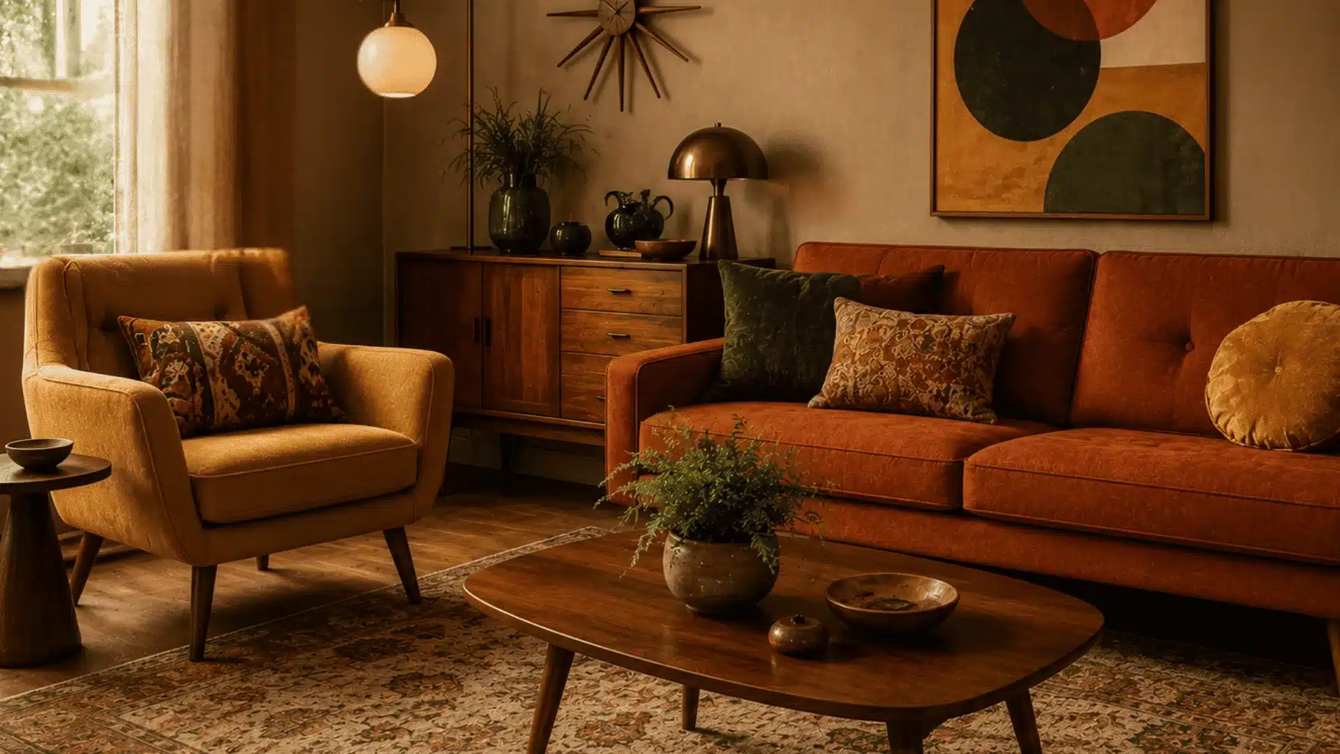
Mustard and burnt orange are both deeply earthy, so they naturally sit well together.
The combination has a bit of a vintage feel to it, which works really nicely in spaces with mid-century or bohemian influences.
Just keep the rest of the room fairly neutral, so all that richness does not pile up in one place.
What Color Goes with Burnt Orange?
Most colors that work with orange also work with burnt orange, but a few behave differently because of its red and earthy undertone.
Here is what changes:
- Bright white feels too sharp against it. Off-white or cream sits much better.
- Cool grays can clash with the red undertone. A greige or mid-tone gray is the safer pick.
- With blue, navy works better than lighter shades.
- Pink needs to stay dusty or muted. Anything too bright overpowers it.
Beige, olive green, mustard, and teal are the strongest pairings for burnt orange.
They share the same earthy depth and do not compete with it.
Ready to Color Your Space?
Orange works with more colors than most people expect.
Beige and gray keep the look grounded. Black and navy add a sharper edge. Olive, mustard, and teal sit naturally alongside it because of the shared earthy depth. Pink and purple can work too, as long as the tones stay muted.
The color itself is more flexible than it gets credit for. What color goes with orange depends on the mood you want the room to convey.
Pick that first, then commit to it. Stop overthinking and start painting.
People Also Ask
1. Does Orange Work with Wood Furniture?
Yes. Orange, especially burnt orange and rust, pairs naturally with natural wood tones in most living and dining spaces.
2. Can Orange Make a Room Look Smaller?
Bright orange on all walls can feel heavy in small rooms. Use it on one wall or through accents instead.
3. What Wall Color Works Best with Burnt Orange Furniture?
Beige, soft white, olive green, and soft gray all work well behind burnt orange furniture without competing with it.
4. Is Orange Still Trendy in Interior Design?
Yes. Terracotta and burnt orange remain strong in current interior trends, particularly in earthy and toned-down palettes.