A color can look perfect on that 2×2-inch card and completely different once it’s rolled onto an actual wall.
BM Stonington Gray has gained popularity among both people and designers, appearing frequently in kitchens, exteriors, and living rooms in numerous renovation photos.
Yet a swatch alone won’t reveal how this shade actually behaves in your space.
Below is the complete color review, from how the color shifts across a day to which finishes and pairings bring out its best side.
What Color is Benjamin Moore Stonington Gray?
Stonington Gray (HC-170) is a soft, universal gray with a whisper of blue in it.
It feels calm, cool, and collected in almost any room. This shade works equally well on walls, trim, and exteriors.
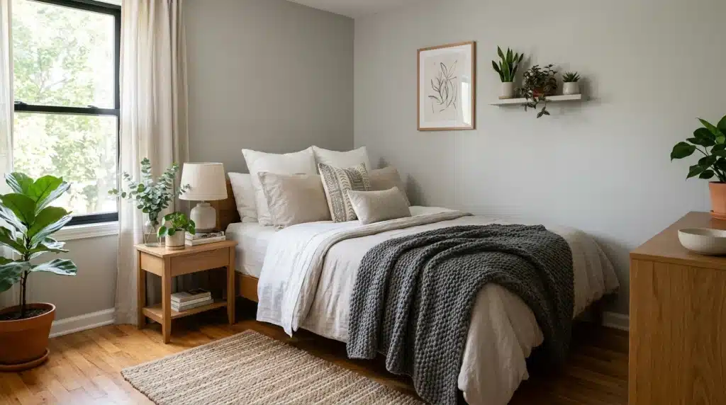
It pairs beautifully with crisp white, natural wood tones, and black accents.
Its LRV is 59.36, placing it in the light-medium range.
It's part of Benjamin Moore's Historical Collection, colors pulled from early American architecture, which is part of why it is known to be a classic color. That heritage is also why it holds up in older homes and new builds alike without looking dated in either.
Undertone of BM Stonington Gray
Stonington Gray is not a completely neutral color; it features a faint blue undertone beneath the gray.
A few things worth knowing about that undertone:
- Next to yellow-toned oak or pine, it can read slightly purple, so test it near your actual wood tones before you buy a gallon.
- Next to true grays, black, or navy, it stays balanced and doesn’t drift blue or violet.
- Crisp white trim like Chantilly Lace (OC-65) keeps it looking clean; a warmer white like White Dove (OC-17) softens it slightly.
This undertone is subtle and hidden, ensuring it does not compete with other colors in a room.
It’s part of what makes this color feel refined without ever tipping into a distinctly blue or purple wall color.
How Lighting Changes BM Stonington Gray Throughout the Day
Light plays a big role in how this color shows up on your walls. Here’s how it shifts through the day.
Morning Light
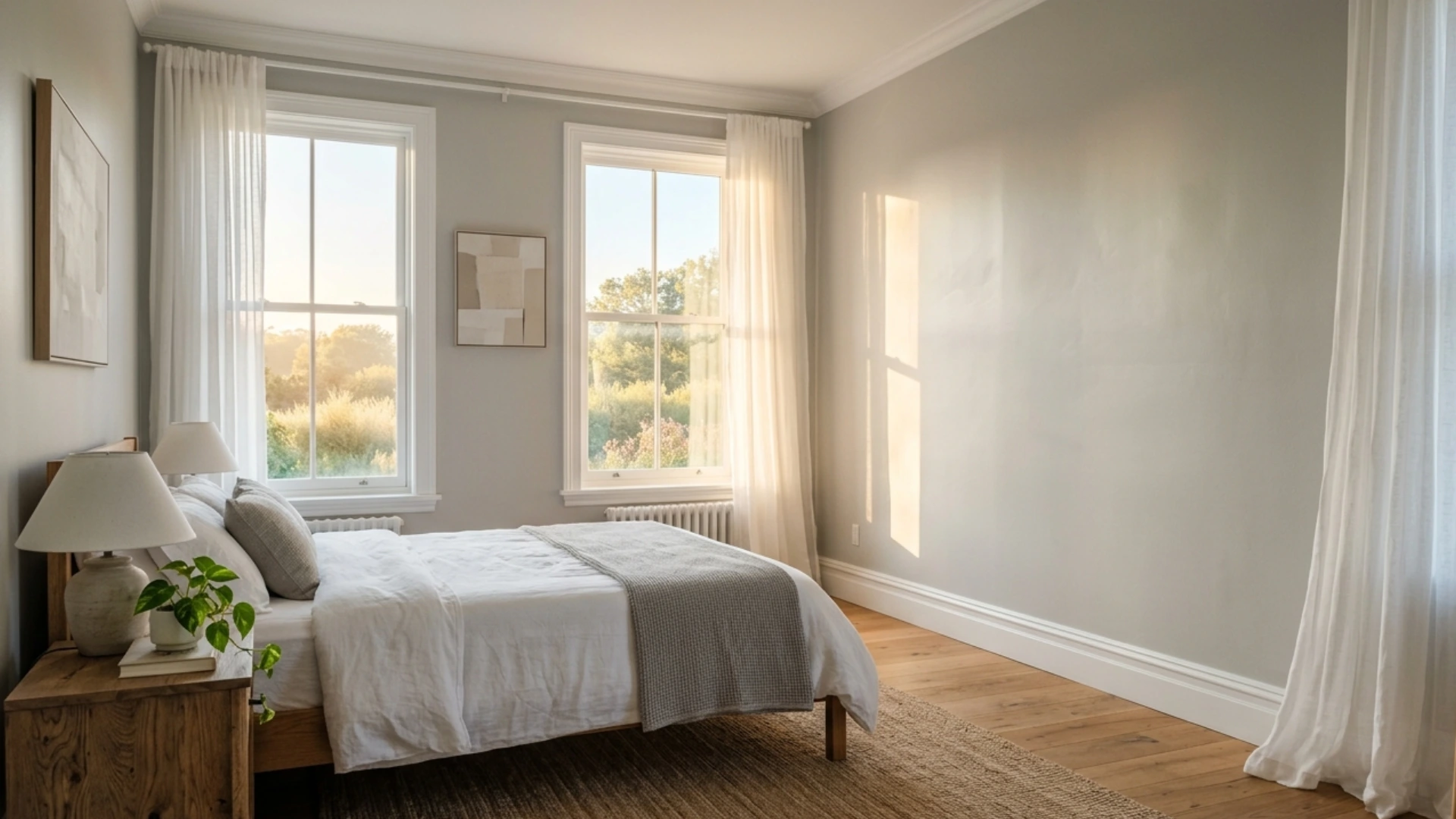
Early sunlight gives this shade a bright, breezy feel.
The gray appears lighter and somewhat hazy, with shadows remaining soft and subtle. This creates a sense of calm and serenity right from the morning, as the walls seem to wake up gradually without strong glare.
Sheer curtains can further enhance this gentle morning glow.
Ideal for kitchens, breakfast nooks, and east-facing bedrooms.
Afternoon Light
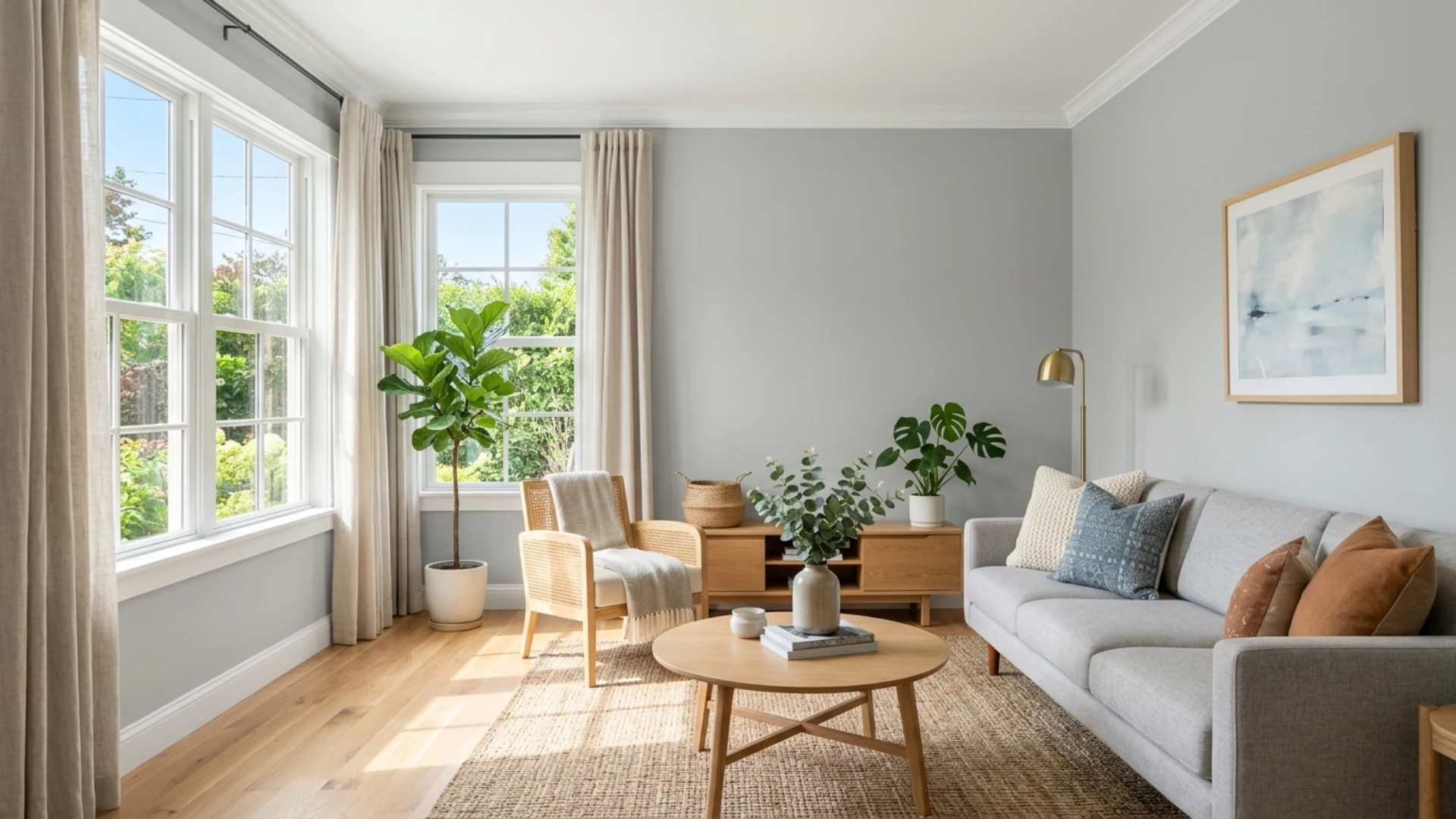
The midday sun provides the brightest light of the day, making the paint color appear most true to the actual swatch. Shadows diminish, and the wall seems even, steady, and genuine.
This is typically the ideal time to assess how the shade will look over time.
Additionally, furniture and decor colors are most accurately reflected in this light.
It’s also a good opportunity to take reference photos.
Best for living rooms, home offices, and south-facing spaces.
Evening Light
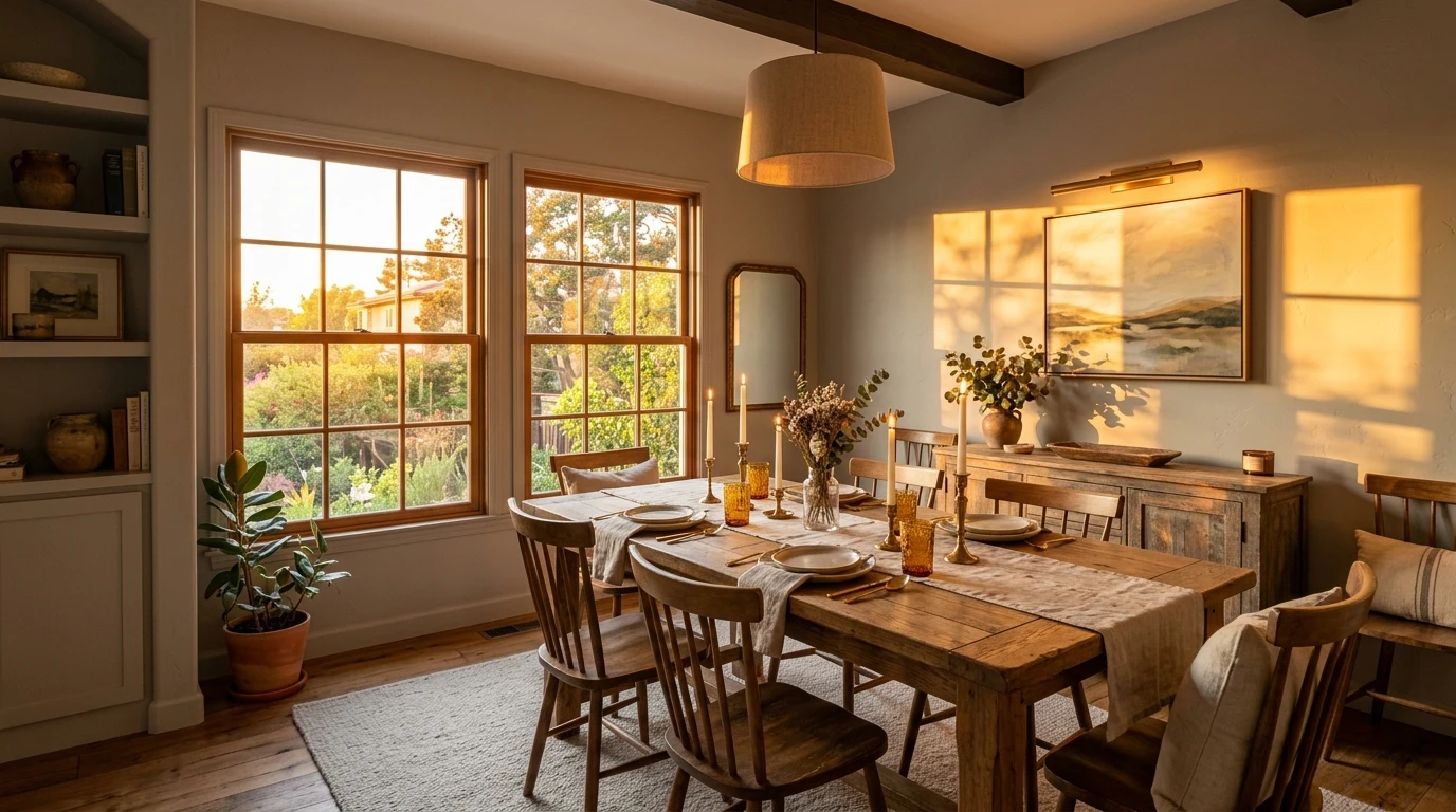
As the sun sets, the light becomes golden and gentler.
Stonington Gray picks up a warm glow along the edges while the core tone stays cool. This creates a gentle contrast that feels relaxed and inviting. The walls seem to soften as the day winds down.
It’s a small change, but it completely alters the room’s atmosphere.
Best for dining rooms and west-facing lounges.
Night Lighting
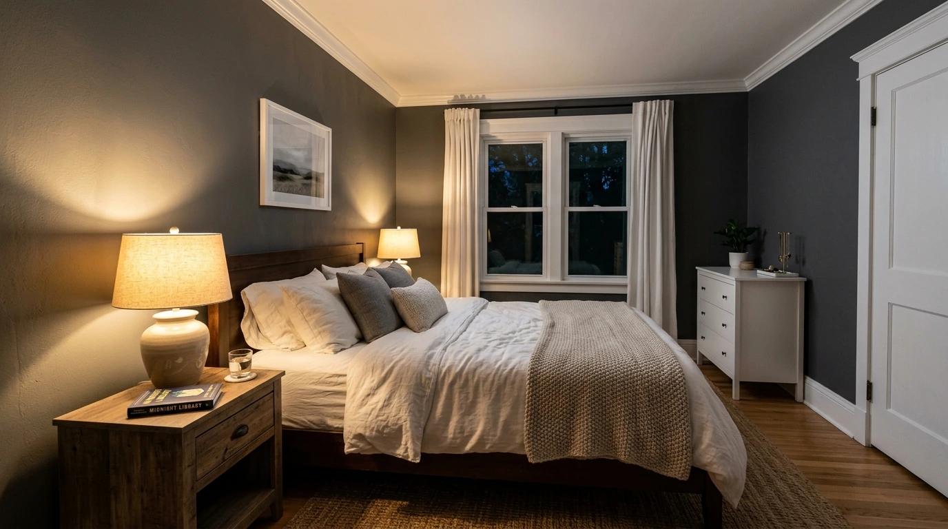
After dark, the shade becomes deeper and more intense, with dim lighting improving its richness.
Contrast with white trim grows sharper, creating a quiet, intimate mood.
The walls appear to recede, creating a cocoon-like, restful atmosphere. A gentle lamp or candlelight highlights its most refined and tranquil aspect, making this shade of gray feel the most composed and serene.
Best for bedrooms and cozy nooks meant for winding down.
Artificial Light
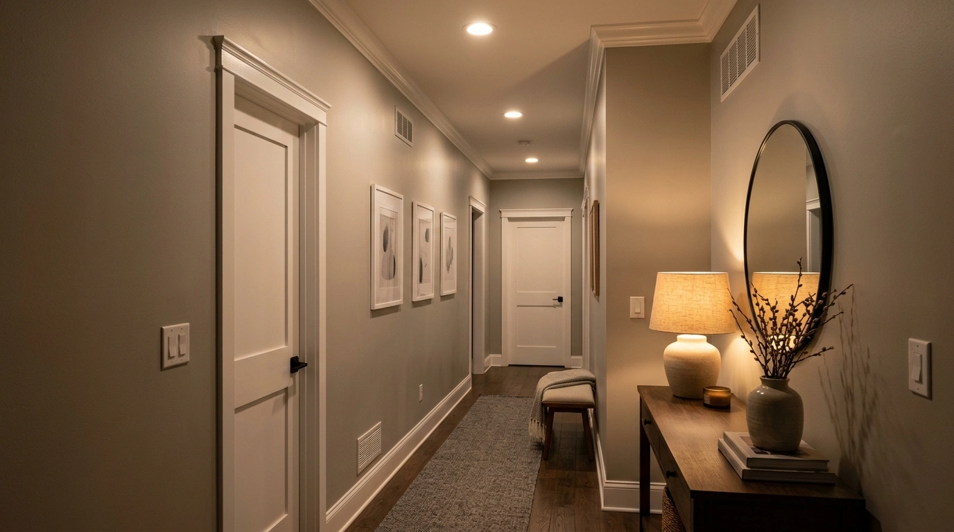
As natural light dims, indoor bulbs enhance the room’s warmth. The shade becomes richer and moodier under lamps, while ceiling lights can soften this effect slightly.
The space maintains its calm, composed character indoors.
Warm bulbs create a cozy atmosphere, whereas cool LED lights maintain a crisp look. If you want it to stay true and cool, look for LED bulbs rated 3000K or higher; anything lower starts pulling in amber tones that fight the blue undertone.
Selecting the appropriate fixture helps define the overall mood of the evening.
Ideal for hallways, bathrooms, and reading nooks.
Is Benjamin Moore Stonington Gray Warm or Cool?
Stonington Gray sits on the cool side of the color spectrum. It’s not warm, but it’s not icy either.
Consider it a balanced, neutral cool gray that pairs well with warm decor without clashing. It naturally fosters a calm and composed atmosphere. Unlike warm grays like Revere Pewter, this color feels sharper and more polished.
It’s ideal if you prefer a gray that appears modern rather than rustic.
Bottom line: this isn't a color for someone looking for something warm. It's cool and composed, and a little more polished than most warm grays. And that is exactly the appeal if you want gray without a little beige.
Benjamin Moore Stonington Gray on Walls vs Cabinets
Stonington Gray works differently depending on where it’s applied.
On walls, it spreads across a larger surface, so the color feels softer and more atmospheric. On cabinets, the same shade looks bolder and more saturated since it’s viewed up close.
For walls, stick to matte or eggshell for that soft, atmospheric look.
Cabinets need something more durable, like satin or semi-gloss, and Benjamin Moore’s Advance line is worth the upgrade there since it levels out brush marks better than a standard wall paint.
Brass or gold hardware is the classic pairing in a kitchen, though satin nickel works just as well if your space leans toward cooler metals — our breakdown of satin nickel versus other finishes covers that pairing in more detail.
Walls in this color tend to work best in bedrooms and living areas; cabinets in kitchens and bathrooms.
Both applications maintain the shade’s character at varying intensities based on scale and lighting.
Does it Work on Exteriors, Too?
Stonington Gray isn’t just an interior color.
On exteriors, it looks well on Colonial and cottage-style homes, where the cool undertone keeps things looking traditional instead of trendy.
Coastal homes lean into it too, since the blue-gray plays off ocean tones naturally.
Modern farmhouses tend to pair it with black windows and dark metal roofing for contrast, while smaller cottages use it to add character without overwhelming the architecture.
Note: test swatches on more than one side of the house. Green landscaping and warm-toned stone can both pull the undertone cooler than you’d expect, so what looks right on the north side might read differently facing east.
How Does Sheen Change the Appearance?
Sheen level changes how this shade reads on the wall.
Flat and matte finishes soften the color, giving it a chalky, muted look. Eggshell adds a slight glow, making it feel a touch richer. Satin brings out more depth and works well on trim or doors.
Semi-gloss and gloss finishes reflect more light, sharpening the tone and highlighting texture.
Higher sheens are ideal for high-traffic areas that require durability.
Stonington Gray vs Similar Benjamin Moore Colors
Stonington Gray belongs to a family of popular Benjamin Moore grays, each with its own subtle twist.
| Color | Undertone | Best Use | Pairing Colors |
|---|---|---|---|
| Stonington Gray | Blue-violet | Walls, exteriors, trim | White, black, navy |
| Coventry Gray | Green-gray | Living rooms, exteriors | Cream, soft blue |
| Gray Owl | Soft green | Bedrooms, low-light rooms | Off-white, taupe |
| Repose Gray | Warm greige | Cozy interiors | Beige, brown |
| Rock Gray | Deeper cool tone | Bold statement walls | Charcoal, white |
Is BM Stonington Gray the Right Paint Color for Your Home?
Choosing the right gray comes down to your space and style.
If you want a shade that feels put-together without trying too hard, this one delivers.
It suits homes with a modern, transitional, or classic look. It’s flexible enough for full rooms or single accent walls.
If your space gets decent natural light, it’ll look even better. It also plays nicely with existing furniture and decor, so a full remodel isn’t necessary. For a dependable, no-fuss gray, this is a solid choice.
Wrapping It Up!
Honestly? Stonington Gray deserves the hype.
No weird blue cast when the light shifts, it just holds steady, day after day. Put it next to Coventry Gray or Repose Gray, and you’ll see the difference in about five seconds flat: this one’s cooler, that one’s greener, this other one’s basically beige wearing a gray costume.
So if you’ve had your eye on this shade for a while now… yeah. Go for it. It’s earned the spot on your wall, not just the fan deck.
Frequently Asked Questions (FAQ’s)
1. What is Benjamin Moore’s Most Popular Grey?
Repose Gray and Gray Owl are among Benjamin Moore’s most popular grays overall.
2. Is Stonington Gray Too Dark?
No, it’s a mid-tone gray, not dark, and works well in most lighting.
3. What Color is Similar to Stonington Gray?
Coventry Gray is close in tone, with a slightly greener undertone.
4. What is One Shade Lighter than Stonington Gray?
Gray Owl is a popular lighter alternative with a softer, airy feel.