Matching White Acoustic Panels to Alabaster, Pure White and Other Popular Trims
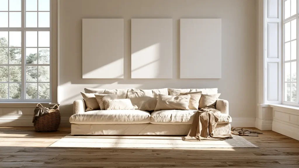
Here’s how it usually goes. You finally get sick of the echo in the living room, you do the research, you order a set of panels listed as white. They arrive, you hang them above the sofa, you step back. And the panels look grey. Cold, slightly blue, like something borrowed from an office. Your Alabaster walls suddenly read creamy in comparison, almost dingy, which they never did before.
Neither colour did anything wrong. The word “white” on a fabric-wrapped panel carries no standard behind it, so one manufacturer’s white sits close to Chantilly Lace and another’s leans toward oatmeal. Fabric also handles light differently from paint film. A woven face scatters light rather than bouncing it back evenly, so a fabric at the same brightness value as your wall still reads a shade deeper and a lot flatter.
Good news is that you already know how to solve this. If you’ve ever held three trim samples against a wall and picked the one that stopped fighting, you have the whole skill set. Choosing white acoustic panels works the same way: identify the undertone of the white you own, then pick a panel that leans the same direction.
Why Two Whites Fight Each Other
Quick refresher, because it applies differently here than it does with paint.
Warm whites carry yellow, cream or beige in the base. Cool whites pull blue, sometimes green or violet. Neutral whites sit near the middle with only a whisper of either. Put a cool white beside a warm one and each exaggerates the other: the warm goes yellower, the cool goes bluer, and both look worse than they did alone.
LRV tells you brightness and nothing about direction. Alabaster at 82 and a panel fabric at 82 can still clash badly if one runs warm and the other runs cool. Matching numbers gets you halfway.
Then there’s the surface itself. Acoustic fabric has texture you can see from six feet away, and that weave breaks up light. The same white in matte fabric reads roughly one step darker than it does in eggshell paint. Sheen widens the gap further. Most trim gets painted in satin or semi-gloss, which throws light back at you, while panel fabric absorbs it. Two whites that measure identically can look like siblings rather than twins, and that’s before anyone turns a lamp on.
The Popular Trim Whites and What They Need From a Panel
Find yours, note the answer, skip the rest.
SW Alabaster (SW 7008)
Warm, creamy, LRV around 82. Everybody’s favourite for a reason. Alabaster wants a panel in soft warm white or a true neutral. Hang a bright cool white next to it and the panel goes blue while your walls go slightly yellow, which is the exact problem I described at the top.
SW Pure White (SW 7005)
Soft warm neutral, LRV about 84. The most forgiving white in this whole list. Neutral panels work. Gently warm panels work. You’d have to reach for something aggressively cool or heavily creamy to make it look wrong.
BM Chantilly Lace
Crisp, clean, LRV up near 90. Very little undertone in any direction. This one needs a bright neutral panel and punishes cream. A warm ivory fabric beside Chantilly Lace looks aged, like it’s been in the room longer than the paint has.
BM White Dove
Warm with a grey thread running through it, LRV around 85. Warm neutral panels sit beautifully here. Avoid anything with blue in it, because the grey in White Dove picks up cool casts and amplifies them.
SW Extra White (SW 7006)
Cool, blue-leaning, LRV about 86. One of the few situations where a bright cool white panel is the correct choice rather than a compromise. Match the temperature and it reads deliberate.
SW Snowbound and Greek Villa
Both live at the softer warm end, low to mid 80s in LRV, Snowbound with a faint pink-grey and Greek Villa creamier. Keep panels warm neutral. Anything stark reads harsh against either.
How to Test Before You Commit
Never judge a panel white from product photography. Screens shift whites more than any other colour, and every phone applies its own warmth correction.
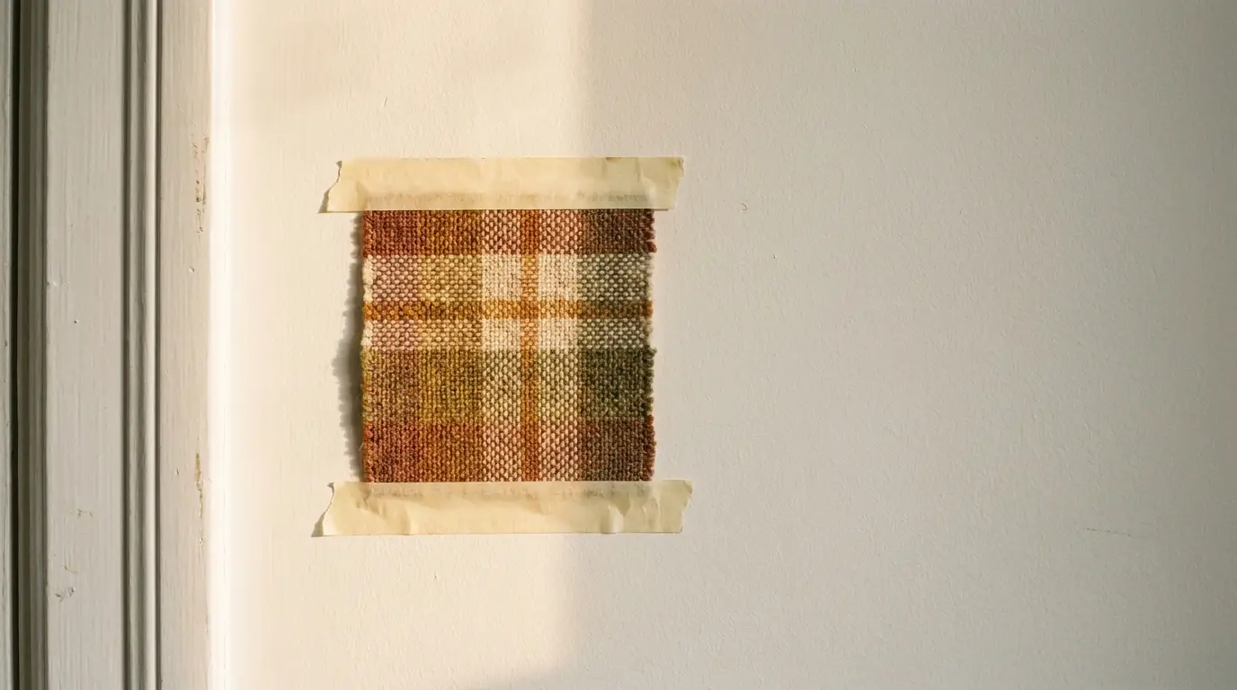
Order a fabric swatch. Most suppliers send them, and the ones that refuse are telling you something. Then tape the swatch flat against the painted wall, touching the trim, no gap between. A quarter inch of shadow between two whites hides exactly the difference you’re trying to see.
Look at it three separate times in one day. Morning, when north-facing rooms go blue and every warm white looks yellower than you remember. Mid-afternoon with sun on it. Evening, under the actual bulbs in that room, which matters more than people expect. A 2700K bulb pushes a neutral panel warm. A 4000K bulb drains warmth out of a creamy panel and leaves it looking grey.
One more trick borrowed from paint chip shopping: hold a sheet of printer paper next to the swatch. Copy paper runs cool and bright, so it gives you a fixed reference and makes any warmth in the fabric obvious immediately.
When Contrast Works Better Than a Match
Aiming for an exact match and landing slightly off looks like a mistake. Aiming for a clear step in value looks like a decision. So if your wall colour sits in an awkward spot, stop chasing the match.
A panel a few points brighter than the wall reads as intentional, especially in a group of three or more where the repetition confirms it was planned. Soft greige panels against a white wall do the same job in reverse, giving you a quiet contrast that ties into any greige you already have elsewhere. Pale wood slat panels over an absorbent backing bring texture instead of colour, which suits farmhouse trim particularly well.
Shape helps too. Circles at mixed diameters, or hexagons in a loose cluster, carry enough visual interest through form that colour precision matters less. Nobody studies the exact white of a piece they read as art.
Practical Notes That Affect How White Stays White
Yellowing is real and it’s the thing people don’t ask about. Cheap panel covers near a sunny window can shift cream within two or three years, which turns your careful match into a slow-motion mismatch. Light-stable acoustic fabrics hold up. Worth asking the supplier directly.
Dust shows on white matte fabric more than on anything else in the room. A vacuum brush attachment on low suction handles it, and a lint roller works on the fine stuff. Keep water away from the core, since mineral wool and moisture make a bad pair.
Kitchens complicate things. Cooking grease travels further than you’d think and settles into fabric permanently. Either choose a wipeable face for a kitchen or put your coverage on the wall furthest from the range.
Edges change the look considerably. Frameless panels wrap fabric around the sides and mount flush, so they read as part of the wall, which suits flat modern casing. Framed panels give you a defined shadow line, and that crisp border sits well against chunky farmhouse trim with substance to it.
Putting It Together in a Real Room
Say you’ve got a living room in Alabaster with Pure White trim, white oak floors, one big window facing west, and a conversation problem every time more than three people sit down.
Both whites in that room run warm, so a warm neutral panel is the target. Not creamy, since Pure White trim would pick a fight with anything too yellow. Three or four panels on the wall behind the sofa, sized to run most of the sofa’s width, hung as one field rather than scattered. Add one on the adjacent wall if the room still rings after you live with it a week. Frameless mounting keeps the field reading as architecture, and because both whites lean the same direction, your eye moves across wall, panel and trim without catching anywhere.
The part that stalls most people is coverage, since it depends on ceiling height, how much hard floor you have and how much glass. Suppliers who deal with this daily are worth using: Sound Pro Solutions stocks matte white panels in framed, frameless and shaped formats along with pale wood options, ships nationwide, and will send swatches plus tell you how much a room your size actually needs. Give them dimensions, your floor finish and your paint colour, and let them do the math.