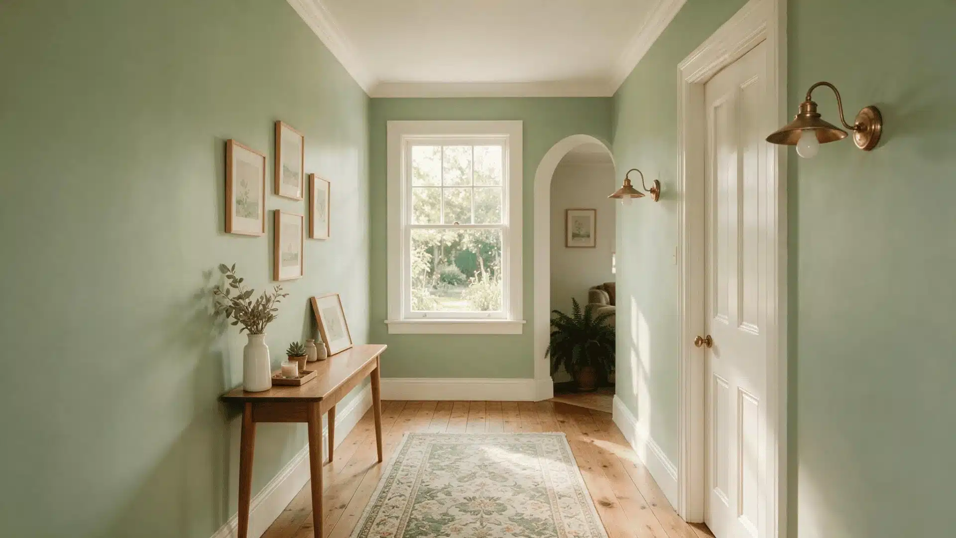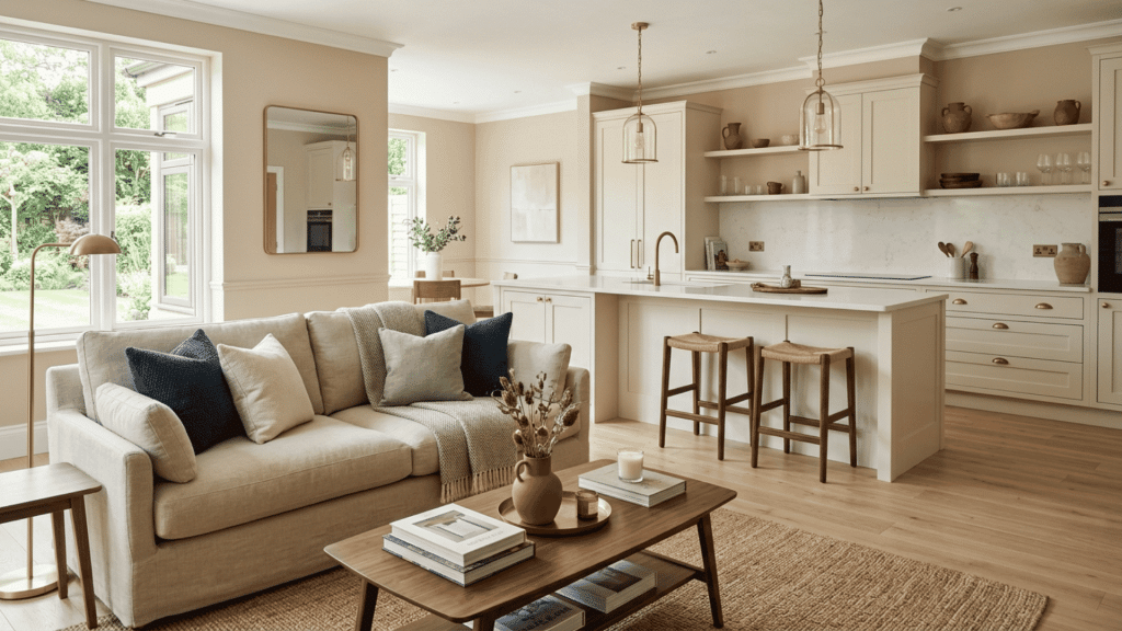
Beige is one of those colors that goes with a lot more than people give it credit for. The trick is picking the right accent for the shade of beige you already have.
A warm, golden beige pairs well with earthy tones like terracotta and olive. A cooler, grayish beige works better with blues and greens.
Once you know the undertone, choosing what colors go with beige gets much easier.
The 15 pairings below cover neutrals, cool tones, warm tones, and bold accents for both home decor and outfits. Pick a section that fits your style and start there.
Why Your Shade of Beige Changes Everything
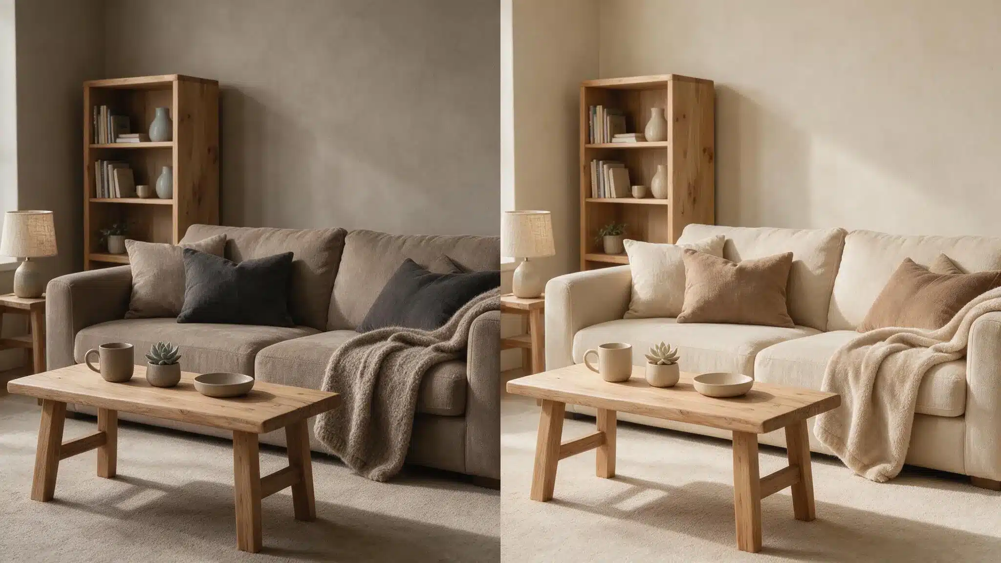
Not all beige looks the same. Some lean yellow, some lean pink, and some sit closer to gray.
Before picking an accent color, figure out which one you are working with. P.S. if you haven’t settled on your actual beige yet, our roundup of 16 beige shades is a good place to start narrowing that down.
Hold a plain white card next to your beige swatch or wall, and the underlying tone will stand out right away.
Warm beige with noticeable gray undertones, like Sherwin-Williams Accessible Beige, pairs best with warm colors like terracotta and mustard.
Pink-beige tones work well with blush and lavender. Gray-beige, often called greige, looks best with cooler shades like navy and sage green.
Matching the undertone to your accents keeps everything balanced.
Best Colors That go With Beige
These colors pair well with beige across rooms and outfits. Each one is grouped by tone so you can find your match fast.
1. White
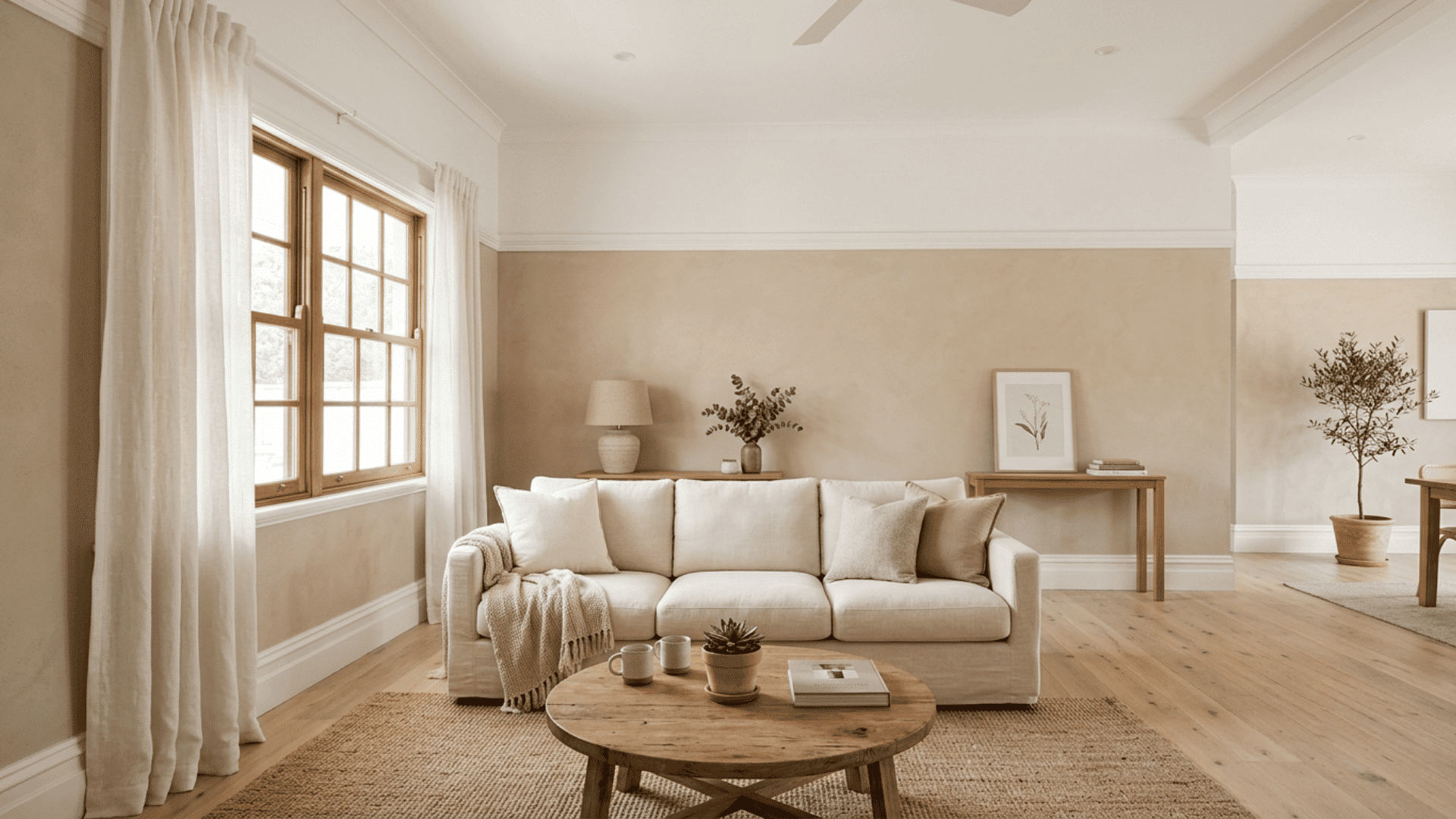
White gives beige a light, clean finish and prevents neutral rooms from feeling dull. Always pick the white shade according to the beige undertone.
- Use warm white beside golden, cream, or tan beige for a softer connection.
- Choose crisp white for gray-beige, then apply it to trim, ceilings, curtains, cabinets, or bedding to brighten the room without adding another strong accent shade.
- Compare white samples beside the beige during morning and evening.
Recommended paint: Sherwin-Williams White Dove – and for that, we’ve already covered its undertones and pairings in depth in our full White Dove guide.
2. Black
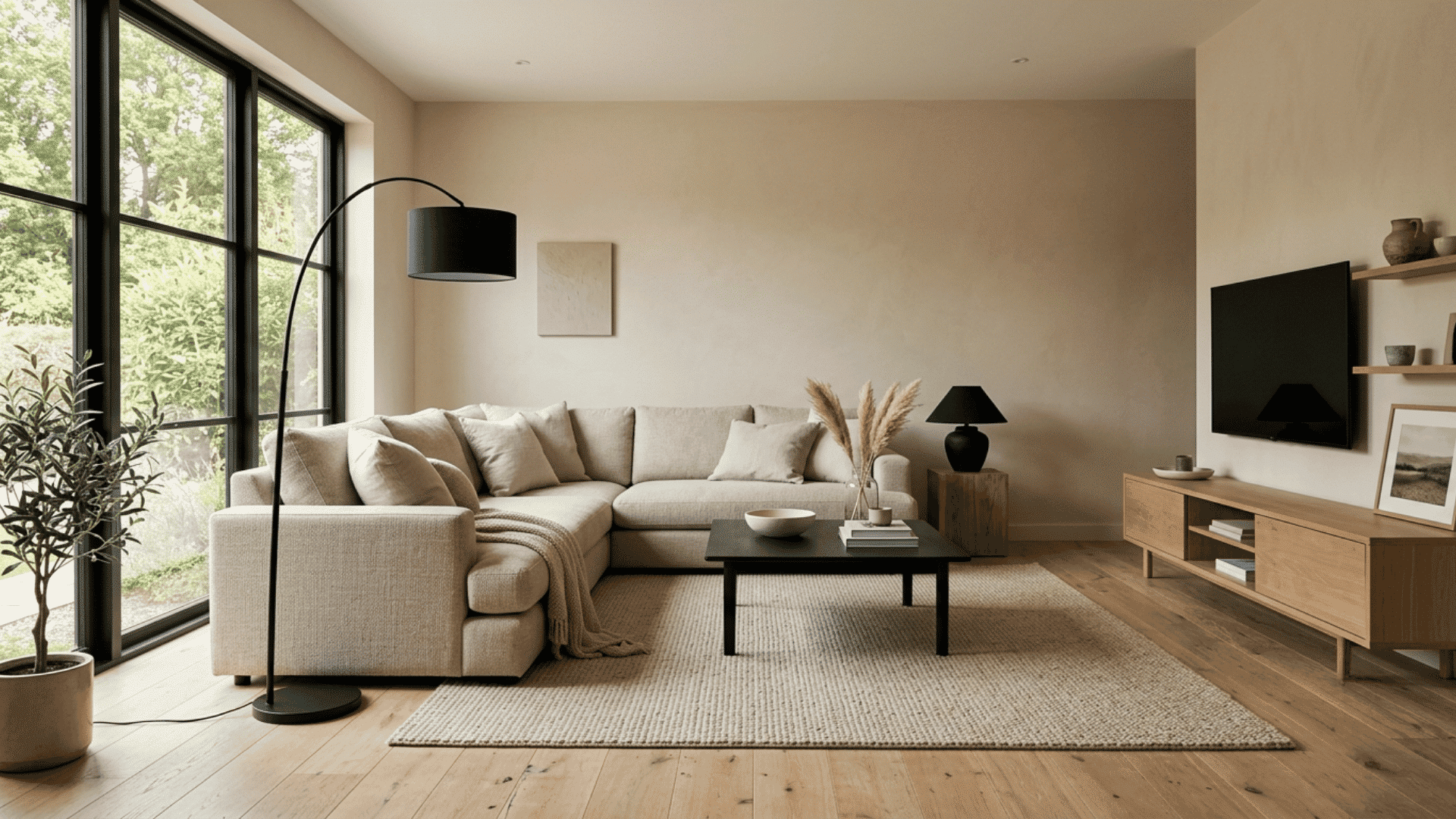
Black gives beige clear definition and adds a modern look without changing the room’s neutral base. Only a small amount usually makes enough impact.
- Use black on frames, lamps, faucets, handles, tables, or narrow furniture legs.
- Spread black details around the room so they feel connected instead of concentrated in one area.
Recommended paints: Sherwin-Williams Tricorn Black (SW 6258) and Benjamin Moore Black (HC-190).
3. Gray
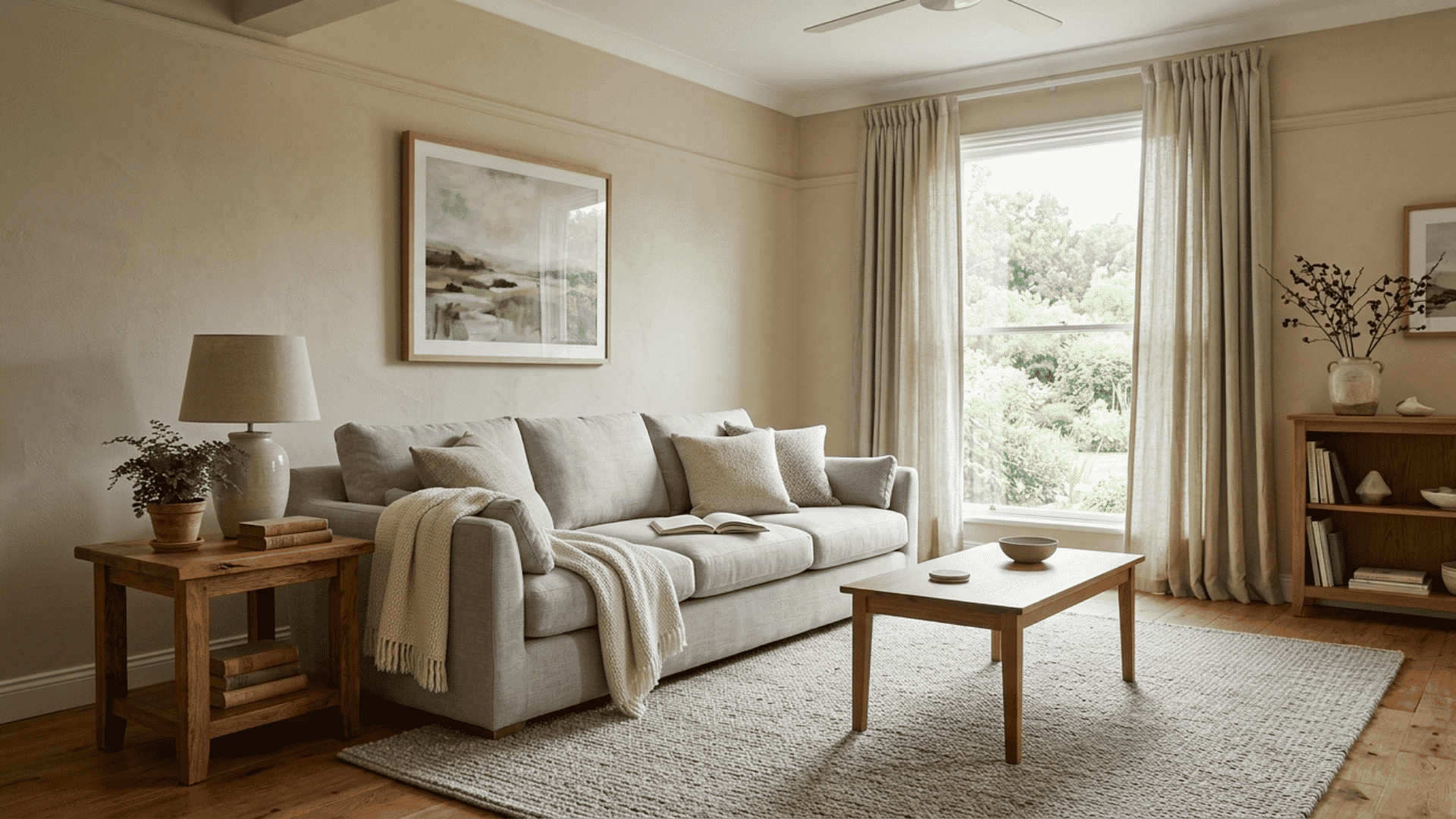
Gray cools the warmth of beige and produces a quiet neutral scheme. The right temperature keeps the two shades from looking disconnected.
- Pair warm gray with tan or golden beige, and use cooler gray beside greige.
- Add separation through a darker sofa, textured rug, pale wood, or white trim when both neutrals have similar depth and begin to merge visually.
- View both shades together before selecting curtains, rugs, or upholstery.
Recommended paints: Sherwin-Williams Repose Gray (SW 7015) and Benjamin Moore Stonington Gray (HC-170).
4. Brown and Tan
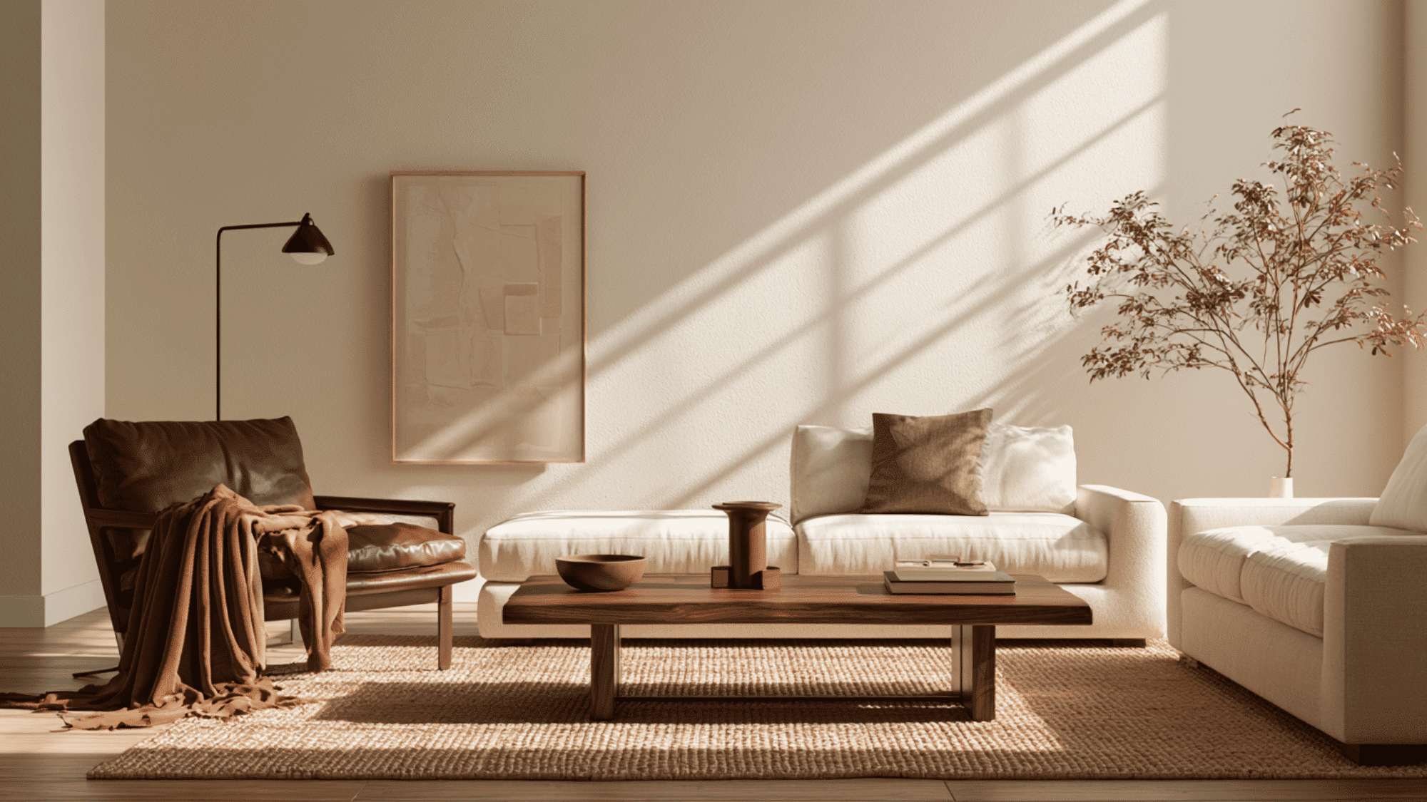
Brown and tan’s shared earthy notes make wood, leather, woven fabric, and natural fibers feel connected.
- Mix chocolate leather, caramel fabric, walnut furniture, and pale beige walls for contrast.
- Keep each brown noticeably lighter or darker than nearby beige, so furniture and flooring remain visible instead of fading into one flat surface.
Recommended paints: Benjamin Moore Fairview Taupe (HC-85). Urbane Bronze is one we’ve already covered in full, including how it holds up on exteriors against beige and warm neutrals — see our complete Urbane Bronze review for the details.
5. Navy Blue
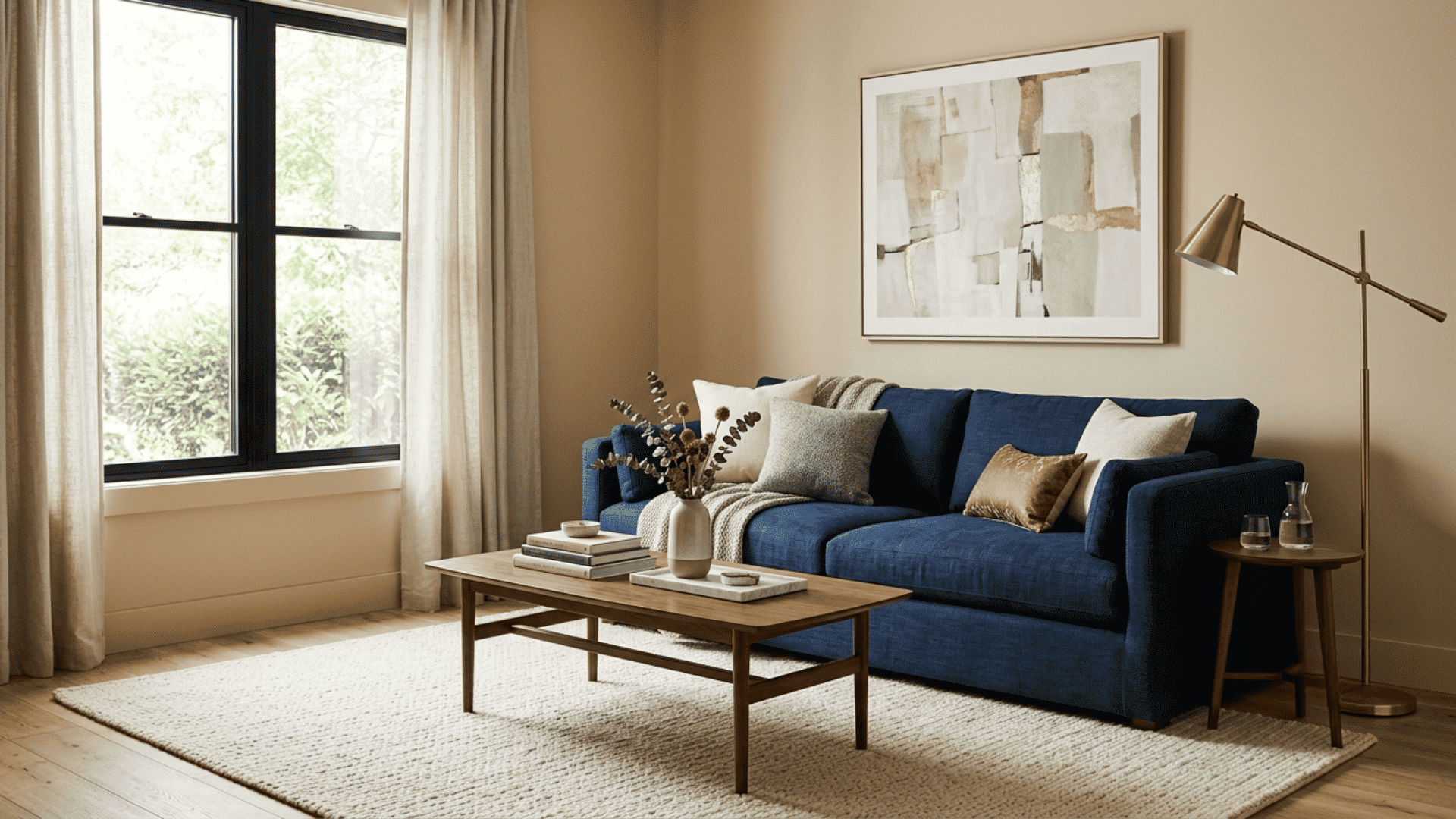
Navy gives beige a deep, steady contrast that suits living rooms, bedrooms, kitchens, and clothing. It feels less sharp than black but still adds structure.
- Place navy on sofas, cabinets, curtains, rugs, blazers, or cushions against a light beige base.
- Add warm white, walnut, or brass nearby, then repeat navy in one smaller item.
Recommended paints: Sherwin-Williams Naval (SW 6244) and Benjamin Moore Hale Navy (HC-154).
6. Sage Green
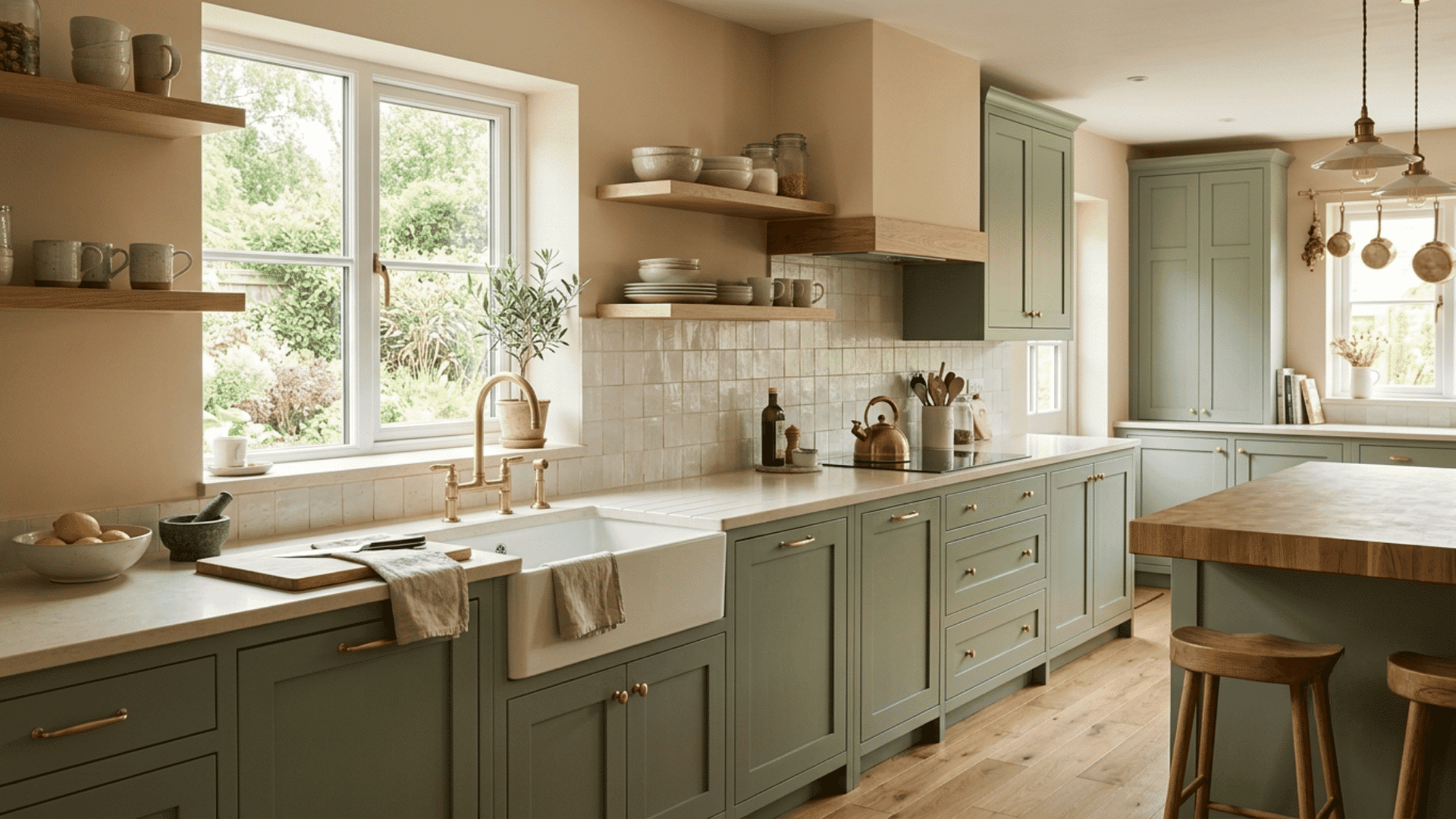
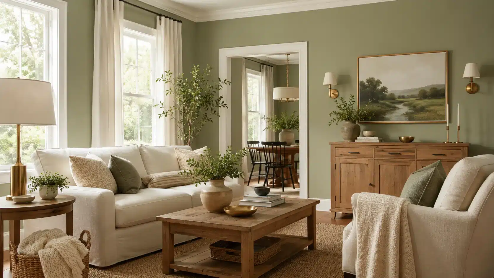
Sage green brings a muted natural note to beige and works well in calm, lived-in rooms. Its gray cast stops the pairing from looking overly bright.
- Use sage on cabinets, chairs, curtains, bedding, or one wall beside cream or tan beige.
- Choose a warmer sage for golden beige and a grayer shade for greige, pink-beige, or rooms with cooler daylight.
Recommended paints: Sherwin-Williams Clary Sage (SW 6178) and Benjamin Moore October Mist (1495).
Both of the go-to sages here already have their own full write-ups on the site. Clary Sage gets a complete breakdown in our color code and best pairings guide, and October Mist is covered alongside eight other shades in our best Benjamin Moore sage greens roundup.
7. Dusty Blue
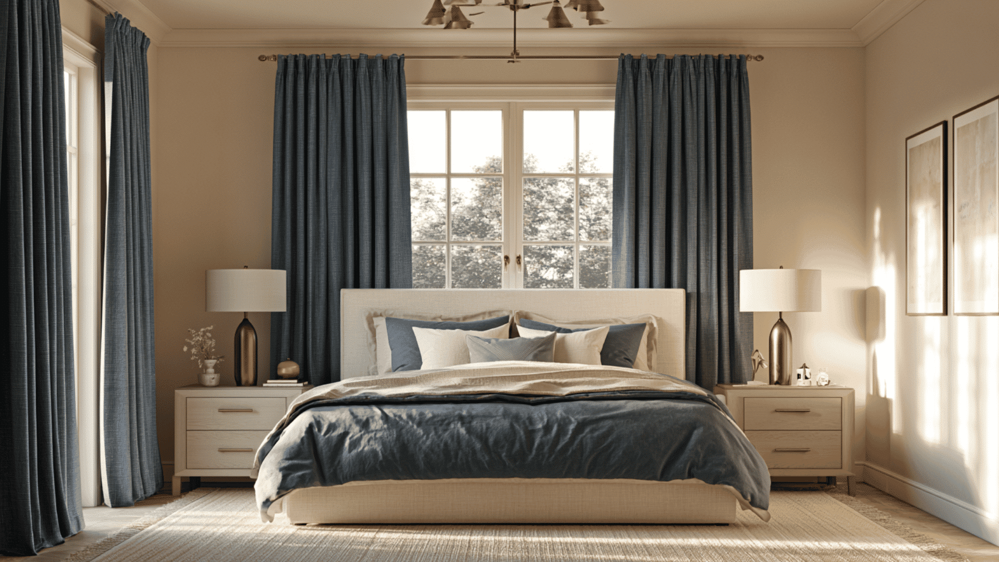
Dusty blue cools warm beige while keeping the room soft and restful. Its muted finish works especially well in bedrooms, bathrooms, and quiet sitting areas.
- Pair dusty blue curtains or bedding with beige walls, cream fabric, and pale wood.
- Add brass for warmth or charcoal for depth, then repeat blue in one smaller item to connect color across the room.
- White trim can sharpen the scheme while preserving its mood.
Recommended paints: Sherwin-Williams Stardew (SW 9138) and Benjamin Moore Smoke (2122-40).
8. Lavender
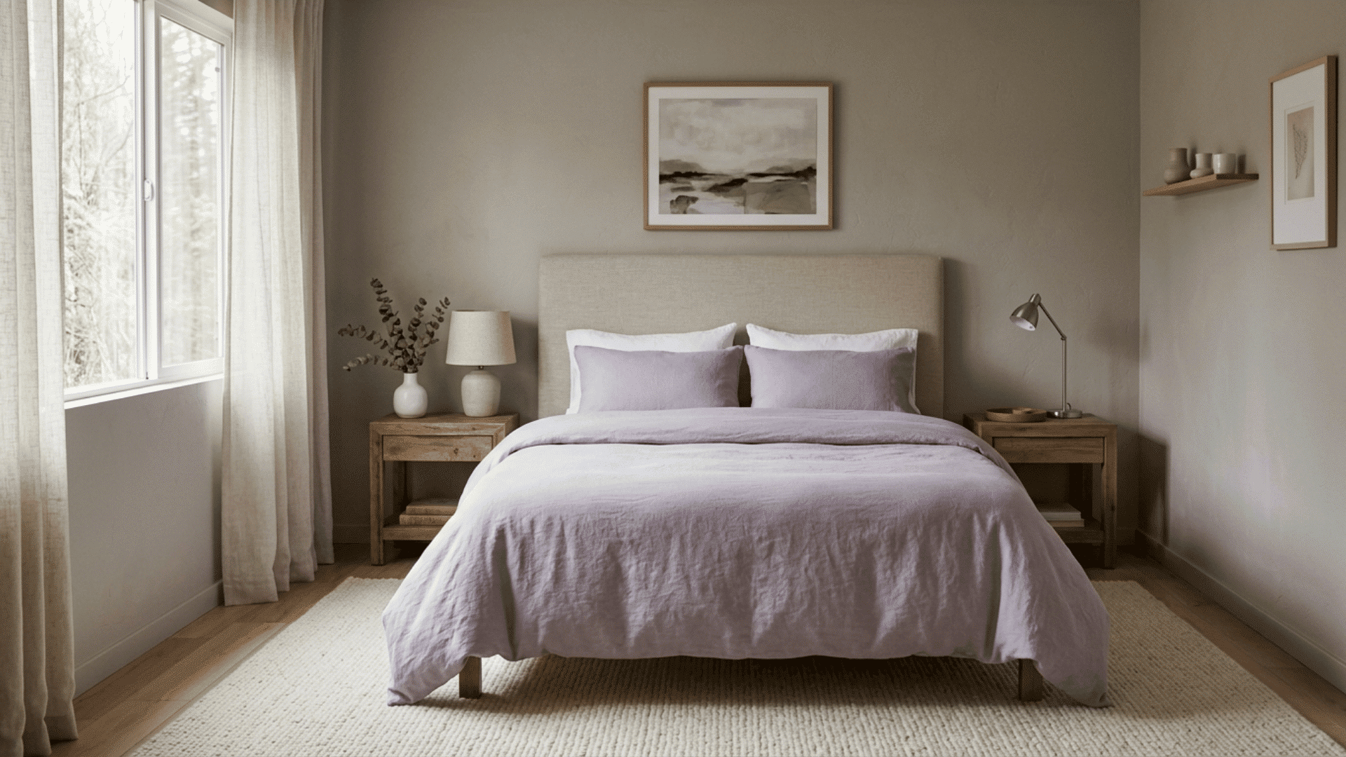
Lavender gives beige a soft, cool accent with a gentle, relaxed mood.
Gray-based lavender works more easily than bright purple beside muted walls and furniture.
- Test lavender through cushions, bedding, pottery, flowers, or artwork before painting a large surface.
- Pair it with pink-beige or greige, supported by cream, walnut, or charcoal details.
Recommended paints: Sherwin-Williams Lite Lavender (SW 6554) and Benjamin Moore Lavender Mist (2070-60).
9. Terracotta and Burnt Orange
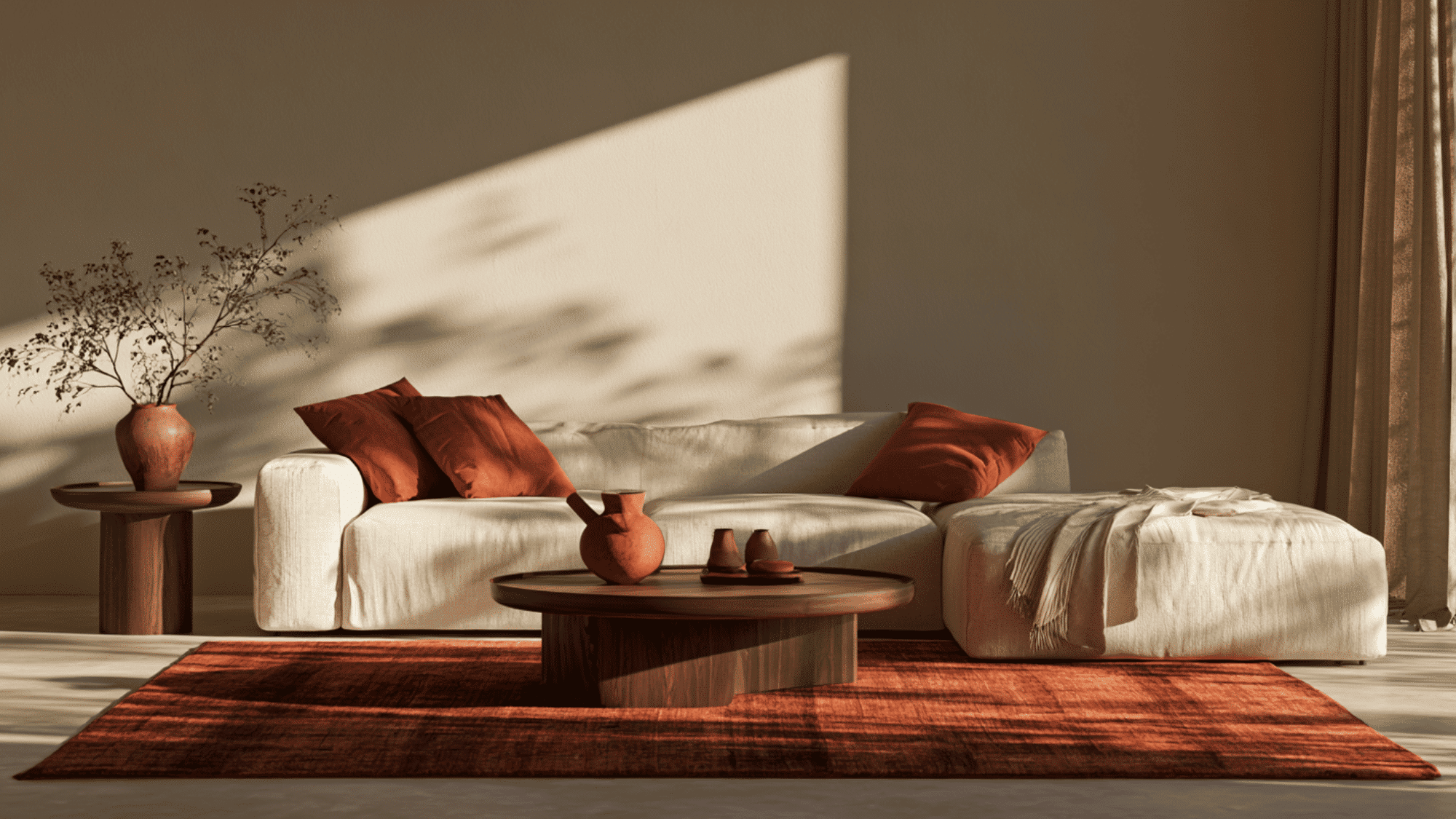
Terracotta and burnt orange strengthen the warm notes in beige.
These earthy shades suit living rooms, kitchens, and dining areas with wood or cream finishes.
- Add terracotta through pottery, rugs, cushions, or throws, using burnt orange for stronger contrast.
- Keep larger surfaces beige, then repeat the warm accent in two areas so the scheme feels connected without becoming overly orange.
Recommended paints: Sherwin-Williams Cavern Clay (SW 7701) and Benjamin Moore Terra Cotta Tile (2090-30).
10. Burgundy and Plum
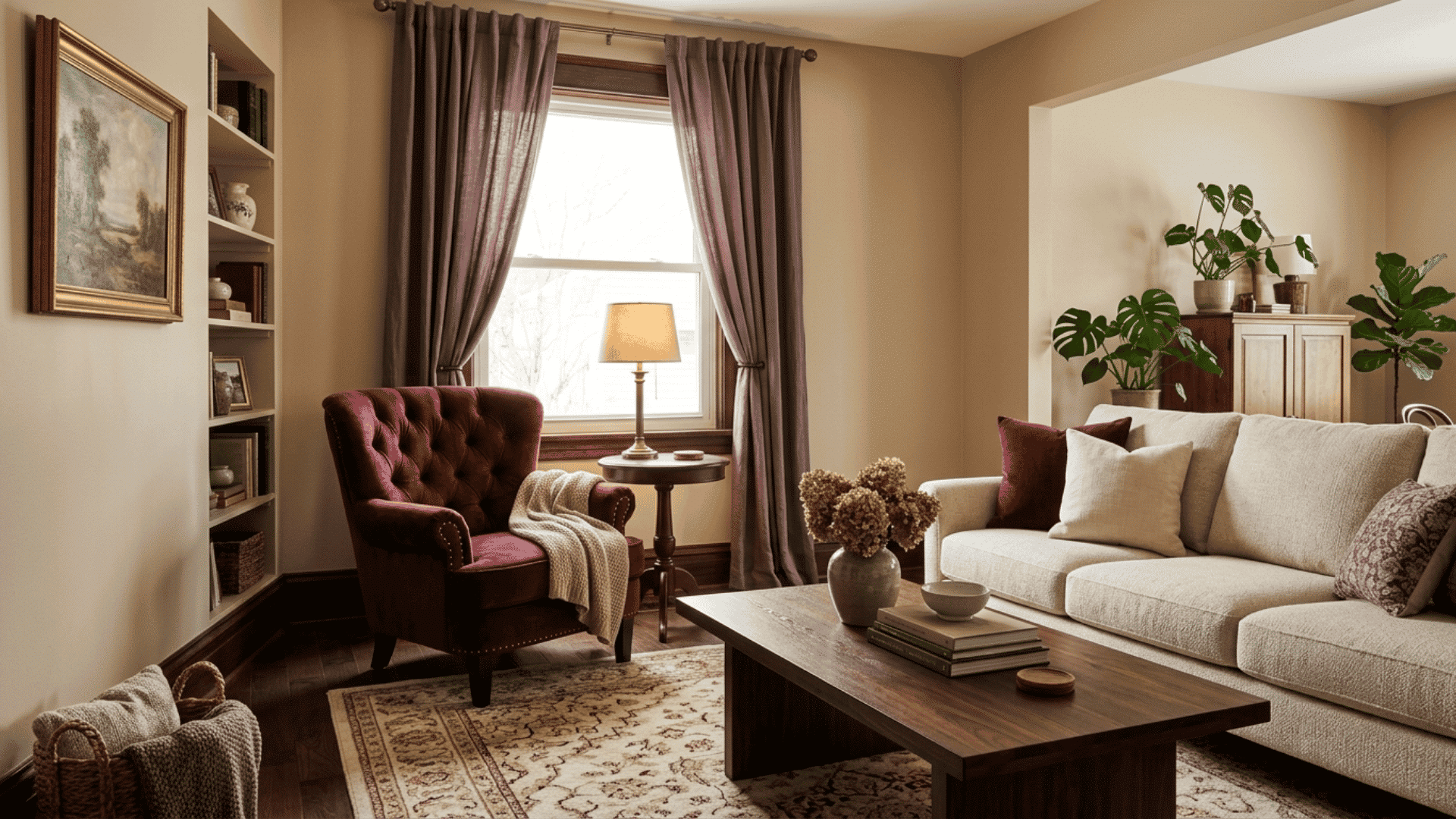
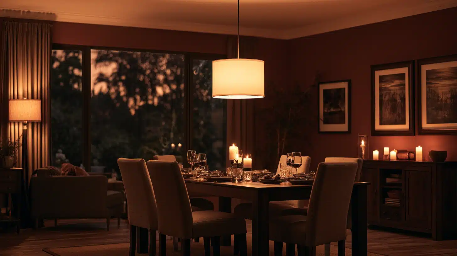
Burgundy and plum add depth to beige, especially during autumn and winter. Their dark red and purple notes create a richer setting without relying on black.
- Try one armchair, curtain set, rug, or cushion group against pale beige walls.
- Choose red-based burgundy for golden beige and cooler plum for greige, then add cream or wood to soften the darker color.
- Clear daylight keeps these deep colors from appearing too heavy.
Recommended paints: Sherwin-Williams Burgundy (SW 6300) and Benjamin Moore New London Burgundy (HC-61).
11. Blush Pink and Dusty Rose
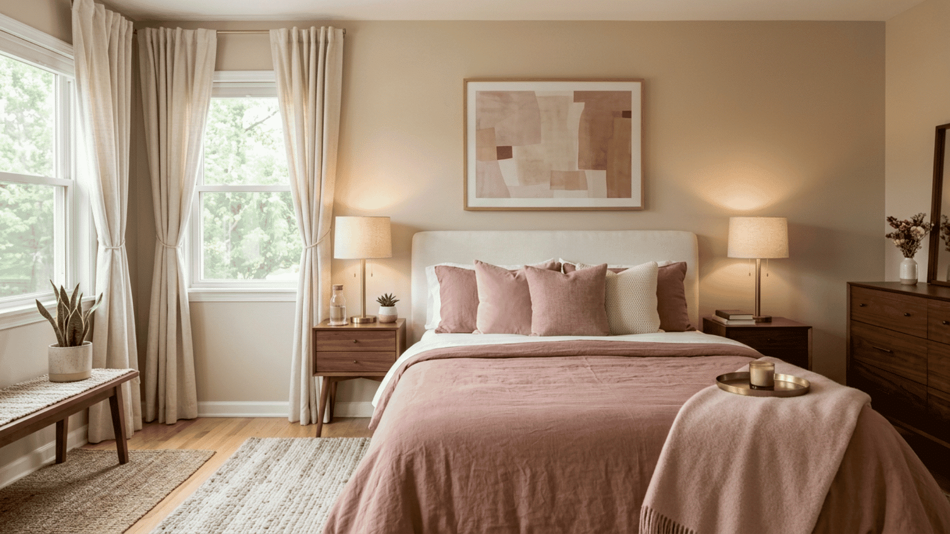
Blush pink and dusty rose bring gentle warmth to beige without making the room feel overly sweet. Dusty rose offers more depth than a very pale blush.
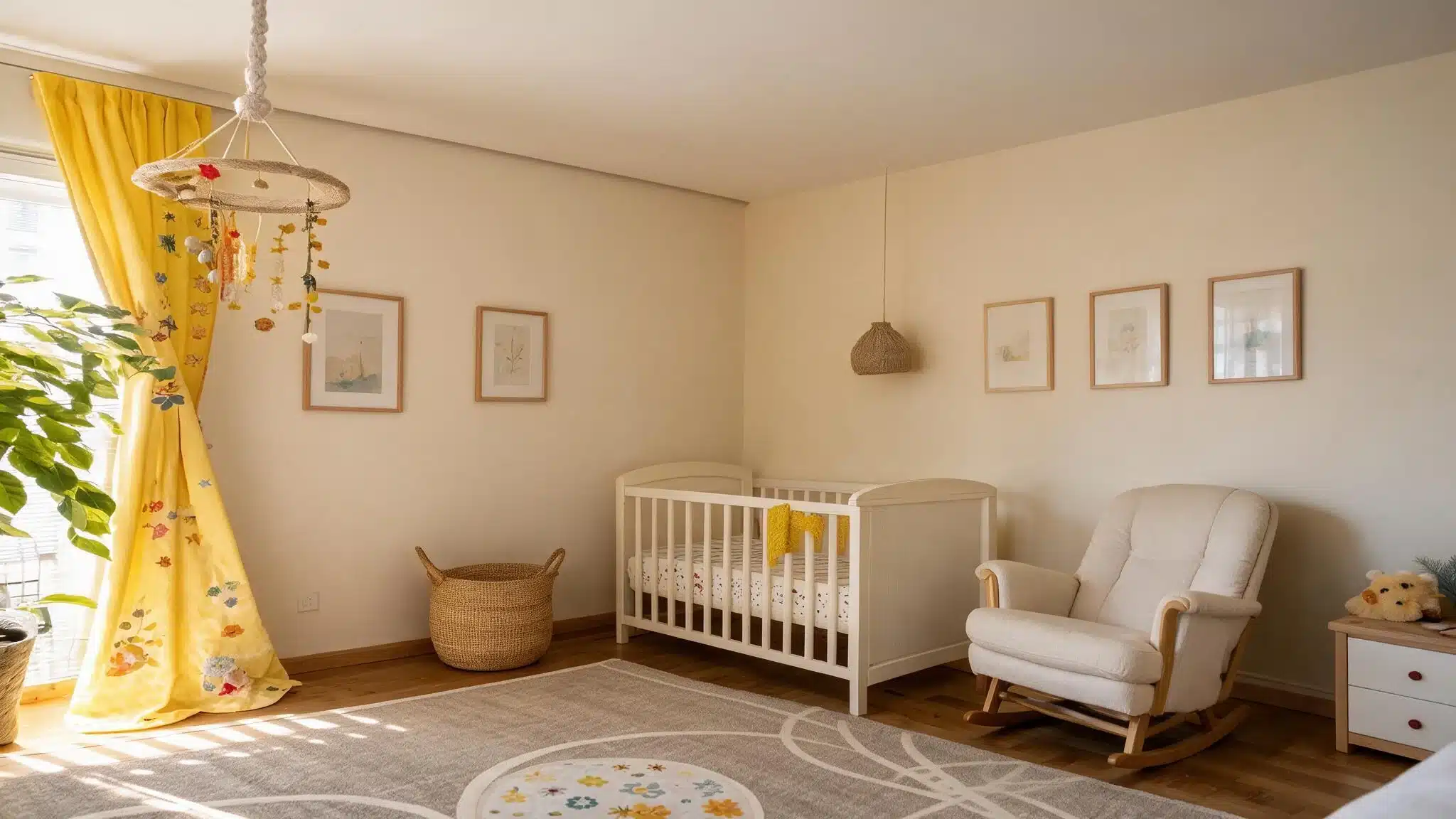
- Use these shades on bedding, curtains, cushions, chairs, or nursery fabrics.
- Add walnut, charcoal, brass, or dark red when the room needs more contrast.
Recommended paints: Sherwin-Williams Intimate White (SW 6322) and Benjamin Moore First Light (2102-70).
12. Mustard Yellow
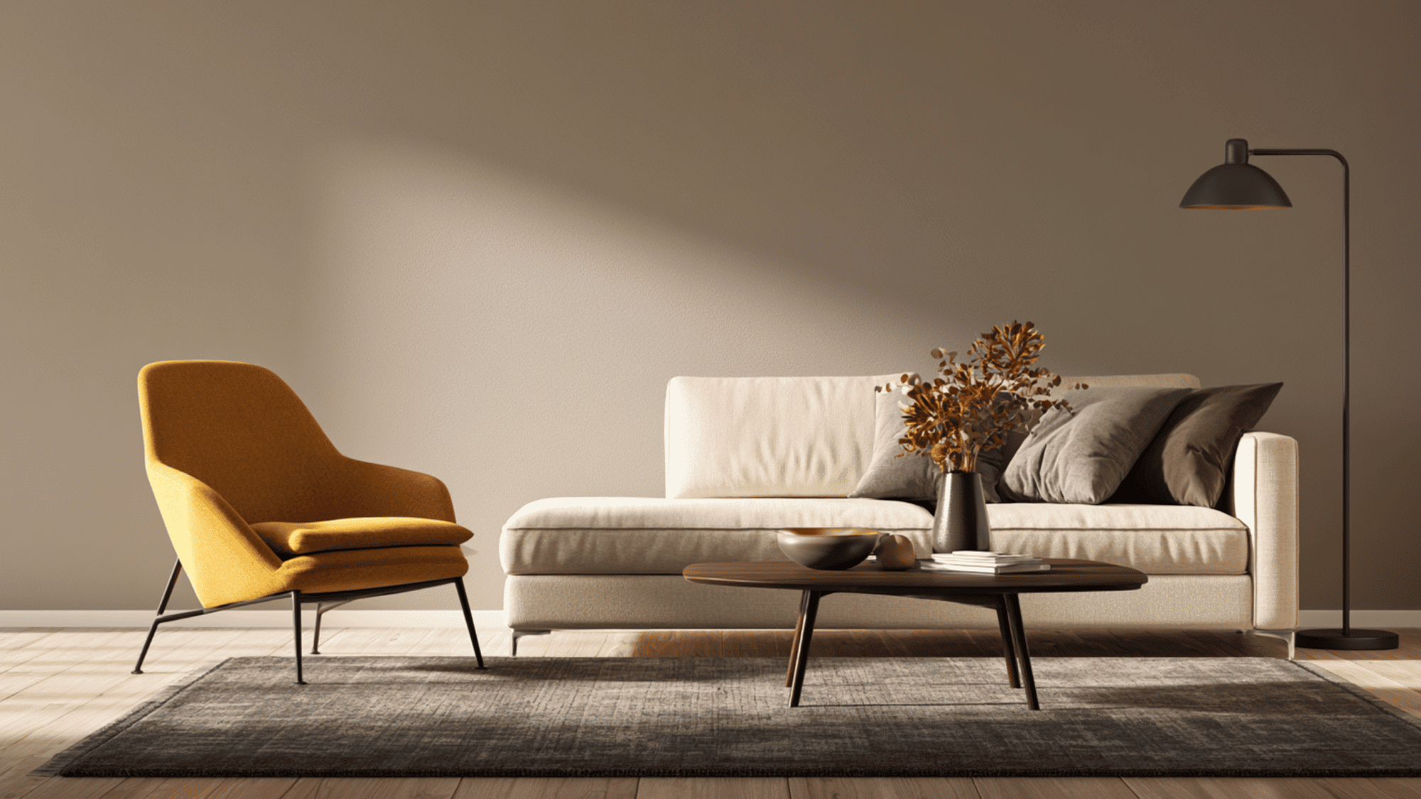
Mustard yellow adds warm energy to beige and works best when the two shades have enough depth difference.
Brown undertones keep mustard from feeling overly bright.
- Use mustard on a chair, lamp, cushion, or artwork beside cool beige or greige.
- Dark wood can ground mustard and separate it from beige.
Recommended paints: Sherwin-Williams Butterscotch (SW 6377) and Benjamin Moore Golden Retriever (2165-30).
13. Coral and Peach
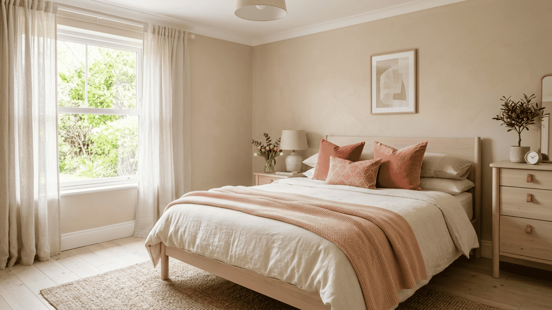
Coral and peach offer lighter warm accents than rust or terracotta. They suit beige rooms that need seasonal color without a dark or heavy furniture change.
- Add peach through blankets, curtains, or ceramics, and use coral for a brighter accent.
- Keep nearby surfaces cream or pale wood so both shades stay clear without making the whole room feel overly warm.
- Limit coral to smaller items if the room receives sunlight.
Recommended paints: Sherwin-Williams Coral Reef (SW 6606) and Benjamin Moore Coral Gables (2010-40).
14. Gold and Brass Metallics
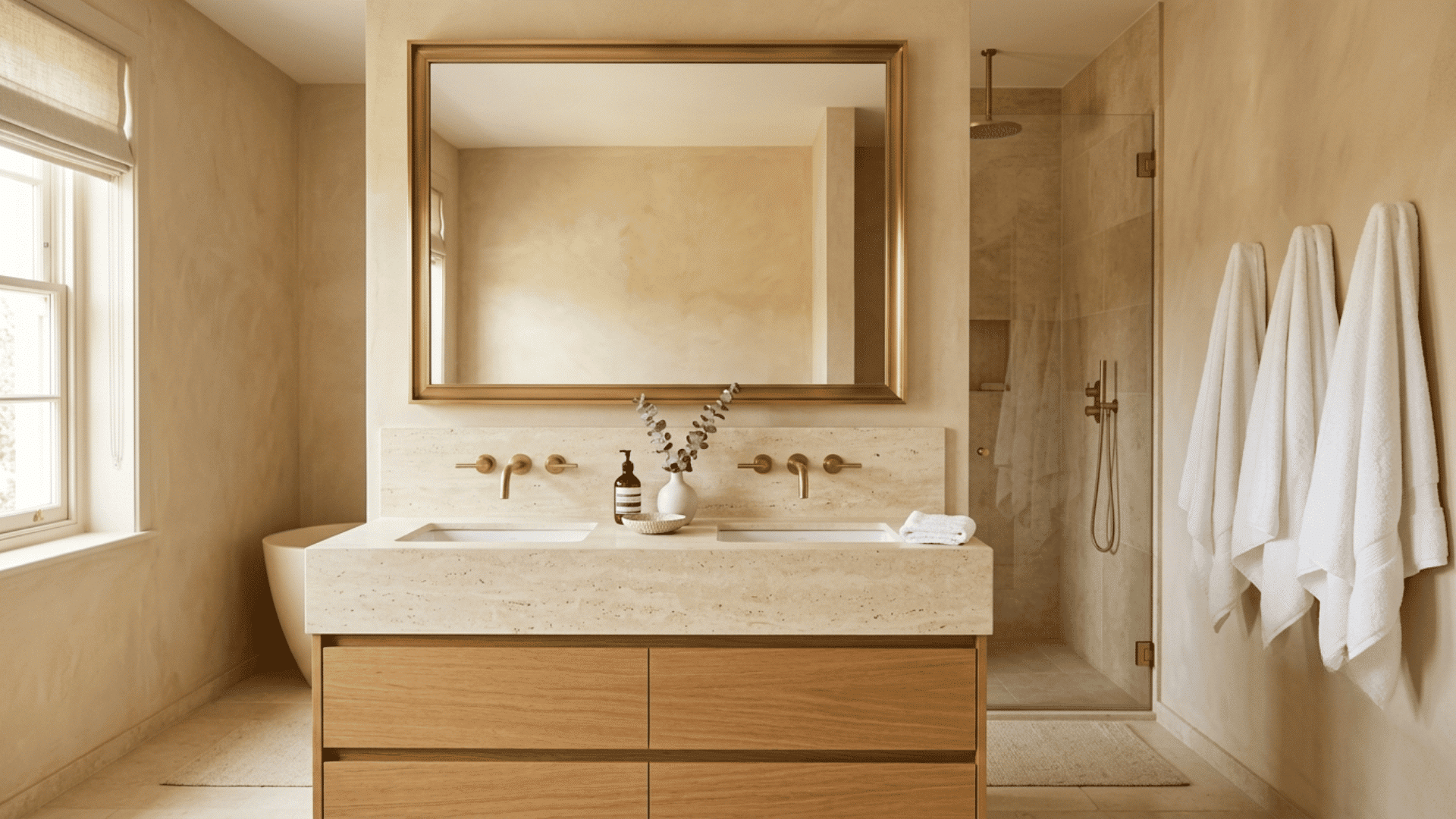
Gold and brass add warmth through reflective details rather than large color areas.
They sit naturally beside cream, camel, tan, and other golden beige shades.
- Use brushed metal on faucets, handles, mirrors, lamps, or curtain rods.
- Repeat one finish across a few nearby fixtures for a consistent appearance.
Recommended paints: Sherwin-Williams Restrained Gold (SW 6129) and Benjamin Moore Golden Straw (2152-50).
15. Olive Green
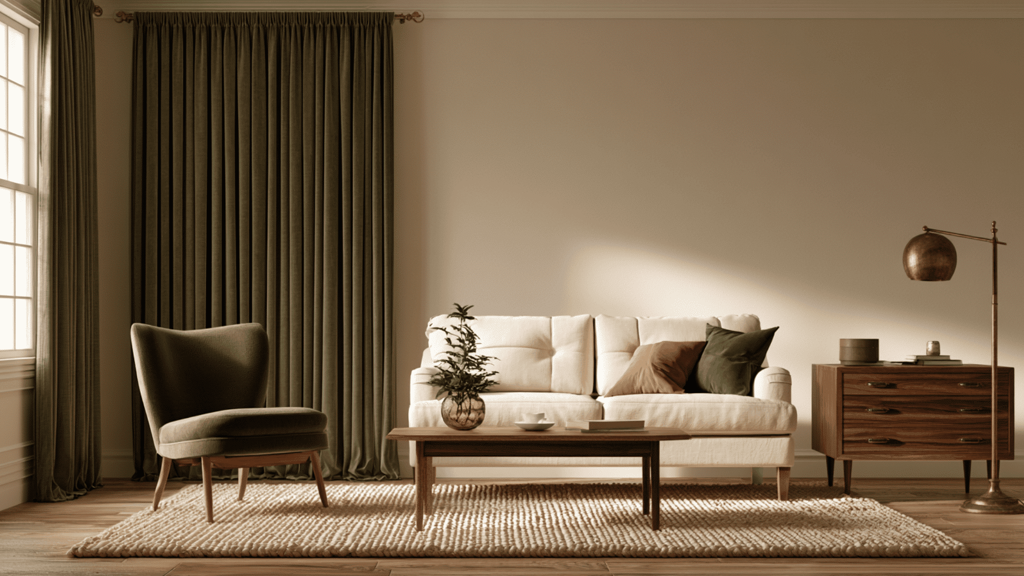
Olive green gives beige a grounded, mature character that suits living rooms, kitchens, bedrooms, and clothing.
Its brown notes sit especially well beside warm neutral shades.
- Try olive curtains, painted cabinets, cushions, or one dark wall with beige furniture.
- Add cream, walnut, black, or aged brass, then vary the depth so the green and beige remain clearly visible and separate.
Recommended paints: Sherwin-Williams Ripe Olive (SW 6209) and Benjamin Moore Dark Olive (2140-30).
Three-Color Palettes Built Around Beige
A three-color scheme keeps decisions manageable.
Beige serves as the main neutral, a second shade supports it, and a stronger color gives the room a focal point.
The examples below can be adjusted through paint, furniture, rugs, or smaller objects.
| Desired Feel | Main Neutral | Supporting Shade | Accent |
|---|---|---|---|
| Light and calm | Beige | Warm white | Sage |
| Warm and earthy | Beige | Brown | Terracotta |
| Cool and restful | Beige | Soft gray | Dusty blue |
| Dark and modern | Beige | Charcoal | Burgundy |
| Rich and classic | Beige | Cream | Navy |
| Soft and warm | Beige | Blush | Walnut brown |
Choose the largest color areas first. Small decorative objects can then repeat the supporting shade or accent without changing the main scheme.
Mixing Beige and Gray Together – 3 Ideas
Beige and gray can create a calm, balanced color scheme when their undertones relate.
Warm gray works best with golden or tan beige, while cooler gray suits greige or pink-beige.
Use Greige Between Them
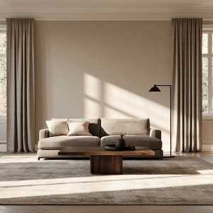
Greige sits between beige and gray, making it useful when the two colors feel disconnected.
Bring it into the room through a rug, sofa, curtains, or upholstered chair. Choose a lighter greige for a soft setting or a deeper shade for contrast.
Repeating it across two surfaces helps the beige and gray appear related without matching every item too closely.
Vary the Shade Depth
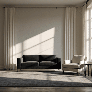
Using beige and gray at the same depth can leave the room looking flat.
Pair pale beige walls with charcoal seating, or place light beige furniture against medium gray walls.
The change in depth gives each surface a clear outline.
Cream textiles, dark wood, or black metal can add another layer while keeping the neutral color scheme orderly and visually clear.
Repeat Shared Undertones
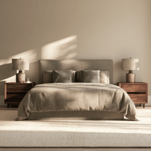
Beige and gray sit better together when they share an undertone.
A warm gray with brown notes suits tan or golden beige, while a pink-gray works beside pink-beige.
Green-gray can pair with some cooler beige shades.
Compare samples near flooring and furniture, then view them during morning, afternoon, and evening light before choosing paint, curtains, or large upholstered pieces.
How to Match Beige With Flooring and Fixed Finishes
Flooring, countertops, tile, and woodwork stay in place longer than cushions or curtains. Use these fixed surfaces to choose accent colors that sit well beside beige.
- Beige With Wood Flooring: Pair warm wood floors with earthy accents, and gray-washed boards with cooler shades after checking the flooring’s undertones in daylight.
- Beige With Tile Flooring: Match cream tile with warm accents and gray tile with cooler shades, keeping surrounding colors quiet beside strong flooring patterns.
- Beige With Countertops: Pair warm beige with cream or gold-flecked stone, while cooler beige suits white quartz, gray marble, charcoal, or black countertops.
- Beige With Wood Trim: Use cream, olive, burgundy, or navy near dark trim, while sage, blush, white, and dusty blue suit pale wood trim.
- Beige With Metal Finishes: Choose brass, bronze, or copper for warm beige, and chrome, nickel, or black metal for cooler beige and greige interiors.
Colors to Avoid With Beige
Not every color sits well next to beige. These are a few to skip:
Neon shades: Neon green, hot pink, or electric blue create a jarring clash against a soft neutral like beige.
Mid-tone yellows: When paired with yellow-beige, a similar-toned yellow can make the whole room look washed out and undefined.
Cool pastels with warm beige: A baby blue or icy mint next to a warm, golden beige can feel disconnected. If you want to go cool, pick a beige with gray or pink undertones instead.
The simplest rule: if two colors next to each other make both look dull or muddled, the pairing is not working. Trust your eyes and swap one out.
Common Beige Pairing Mistakes
Even a strong color pairing can fall short when the room’s fixed surfaces and light are ignored. Most mistakes happen before the paint or furniture reaches the room.
Check these issues before making a large purchase:
- Choosing an accent color before checking beige undertones can create clashing warmth, coolness, or contrast.
- Judging paint only under store lights may hide unwanted undertones visible inside your own room.
- Matching every neutral too closely can leave walls, furniture, and flooring looking flat and indistinct.
- Ignoring flooring, countertops, cabinets, and wood tones may create color clashes after installation is complete.
- Using several bold accents equally can make the room feel crowded, scattered, and visually unbalanced.
Bring fabric, tile, flooring, and paint samples together in the actual room. Move them to more than one wall and view them across the day.
The Bottom Line
Picking colors that go with beige is mostly about knowing your undertone and sticking to two or three accents that sit well together.
Warm beiges lean toward earthy tones. Cooler beiges open the door to blues and greens.
Either way, grab a few paint samples or toss a couple of new throw pillows on your couch before going all in on a full room change.
Small tests save time and money in the long run. If you have a beige pairing that has worked well for you or one you are thinking about trying, drop it in the comments below.
Frequently Asked Questions
Can Silver Hardware Work With Beige?
Silver hardware works well with gray-beige and cooler schemes. Brushed nickel feels softer, while polished chrome creates a cleaner, sharper contrast.
Should the Ceiling Match Beige Walls?
A matching ceiling can feel enclosed. Soft white keeps the room open, while a pale beige creates a warmer, cocooning effect.
How Can Different Patterns Work Together?
Use one large pattern as the main feature, then add smaller, quieter prints. Repeating one shade across them keeps the room connected.