Choosing a paint color for the nursery can feel like a much bigger decision than it seems.
It’s not just about picking a shade; it’s about creating the mood for late-night feedings, lullabies, and all the quiet moments shared in that space for years to come.
Nurseries get repainted often, and experience shows that the best colors aren’t always the ones topping the trending lists.
The best shades are the ones that look good in real light, whether it’s early morning or evening, on a wall you see every day.
Is It Safe to Paint a Nursery? What to Know About VOCs
Since newborns will spend most of their day in a room, paint fumes are a real concern.
The EPA has discovered that everyday levels of volatile organic compounds (VOCs) are consistently higher inside buildings than outside, sometimes to a large extent, particularly right after a fresh coat has been applied to a wall.
It is worth the extra planning to stick to a zero-VOC or low-VOC formula and to ventilate the room for a few days before the baby moves in.
Once the mood is decided and the lighting has been checked, that is the point to start choosing a shade.
Best Neutral Nursery Colors for Any Gender
Neutral nursery colors remain the most requested option, mainly because they don’t commit the room to a particular theme before you know whether the baby will be a boy, a girl, or twins.
1. Benjamin Moore Swiss Coffee
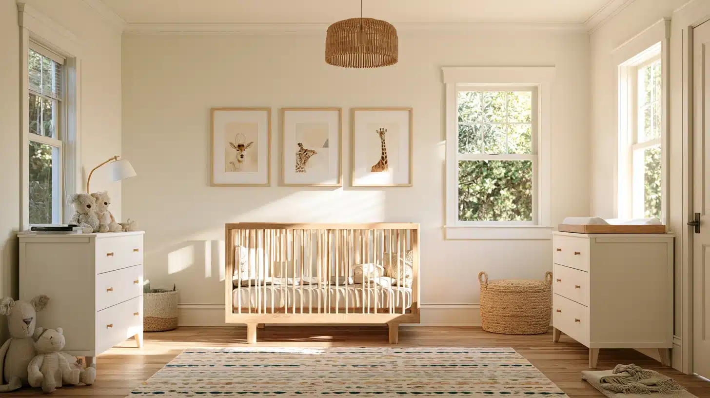
This very light white carries just a little cream to keep a room from looking clinical, and that faint warmth is what separates it from a flat, builder-grade white.
Swiss Coffee pairs naturally with wooden cribs and brass fittings, and because it stays so neutral, it won’t clash with any wallpaper, mural, or bold accent added later as the room evolves from nursery to toddler space.
2. Sherwin-Williams Alabaster
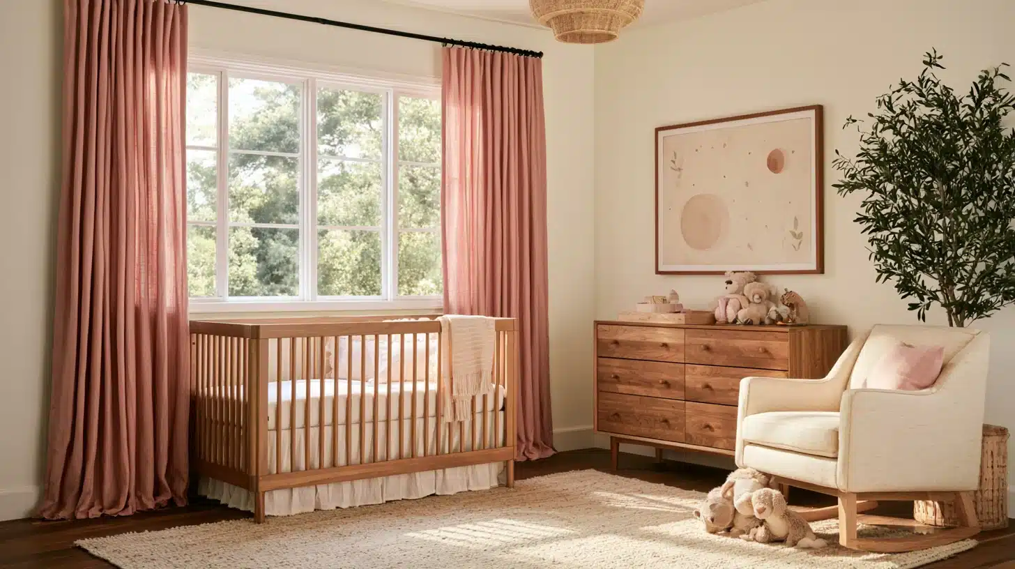
Alabaster appears on more “best neutral” lists than almost any other white, and it is well justified because it has a soft, warm undertone.
It keeps rooms with little natural light from looking stark without turning yellow.
3. Benjamin Moore Revere Pewter
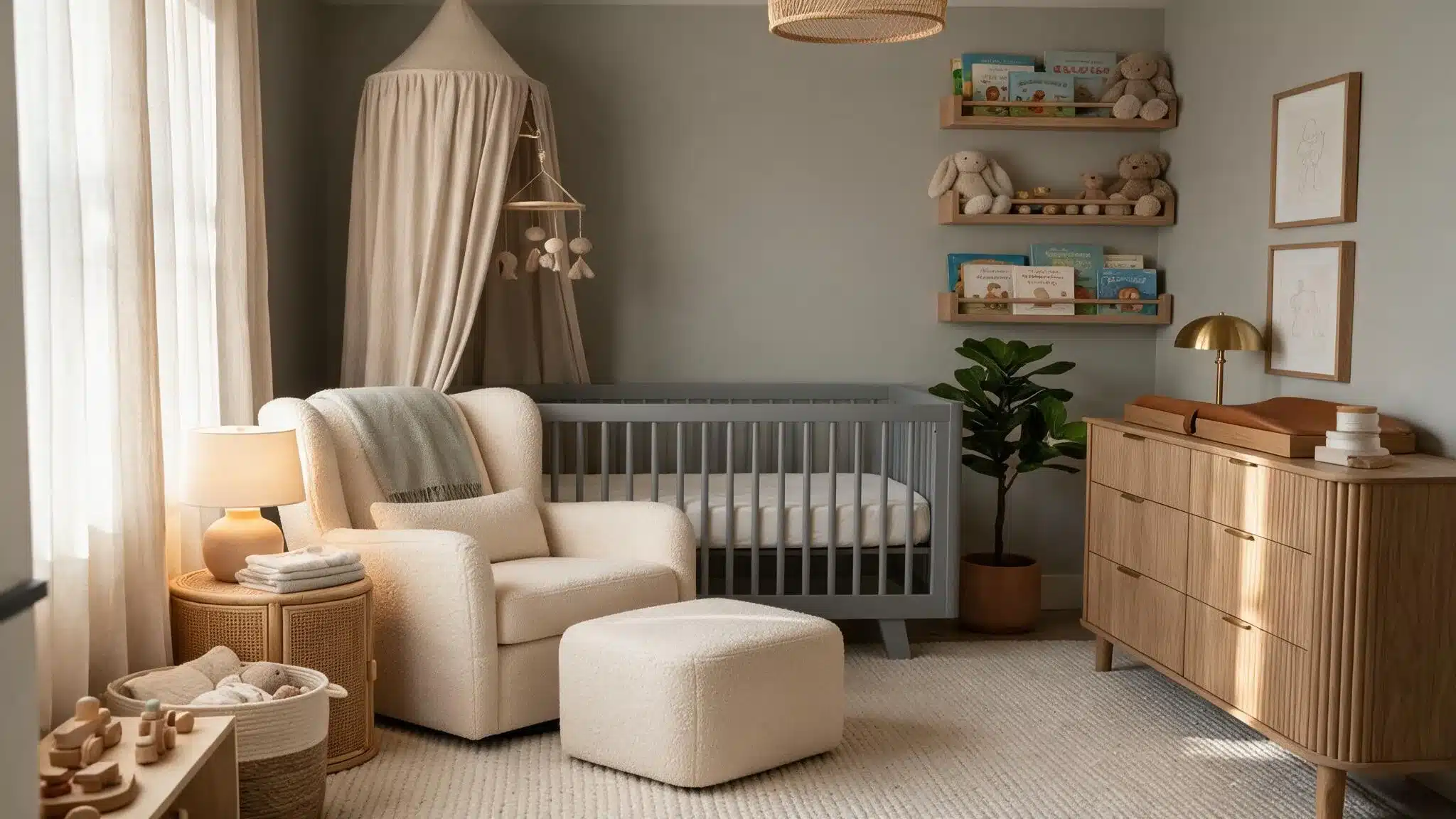
Revere Pewter, a true greige, shifts from warm to cool depending on the light in the room.
It is a good choice if the nursery will later be used as a big-kid room because it goes with almost any accent color you may add in the future.
4. Benjamin Moore White Dove
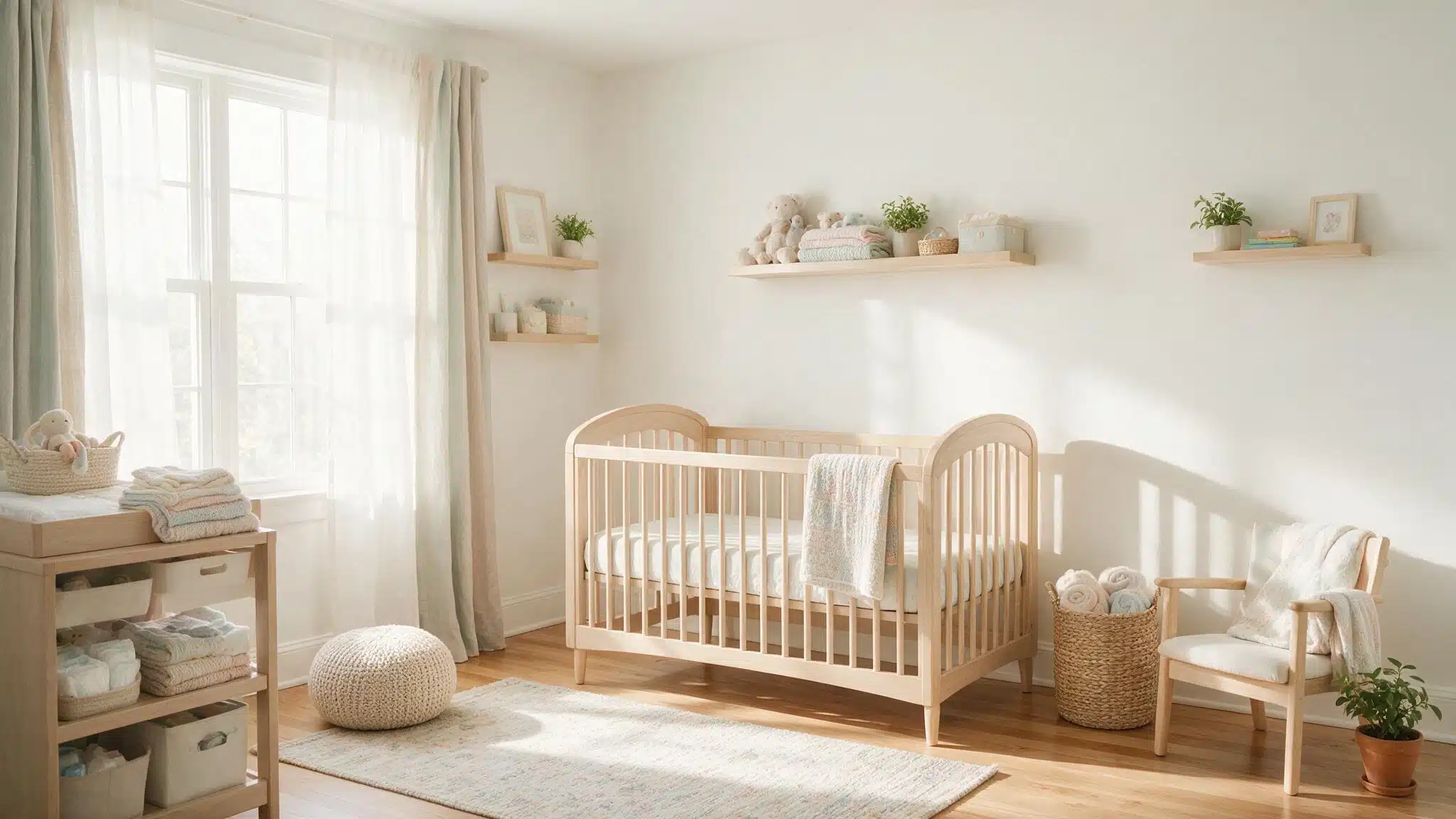
White Dove is the go-to pick when the goal is a white that feels cozy rather than sterile, thanks to warm undertones that soften its overall look.
It keeps a nursery from reading like a hospital room, and its muted warmth makes it soft enough to layer pastel accents, patterned textiles, or wood furniture on top of without visually competing.
Soft Blues and Greens for a Calm Nursery
Blue-greens are the colors often recommended for nurseries because they are restful. They are also some of the most flattering colors in shifting daylight, which matters in a room used around the clock.
5. Sherwin-Williams SW 6212 Quietude
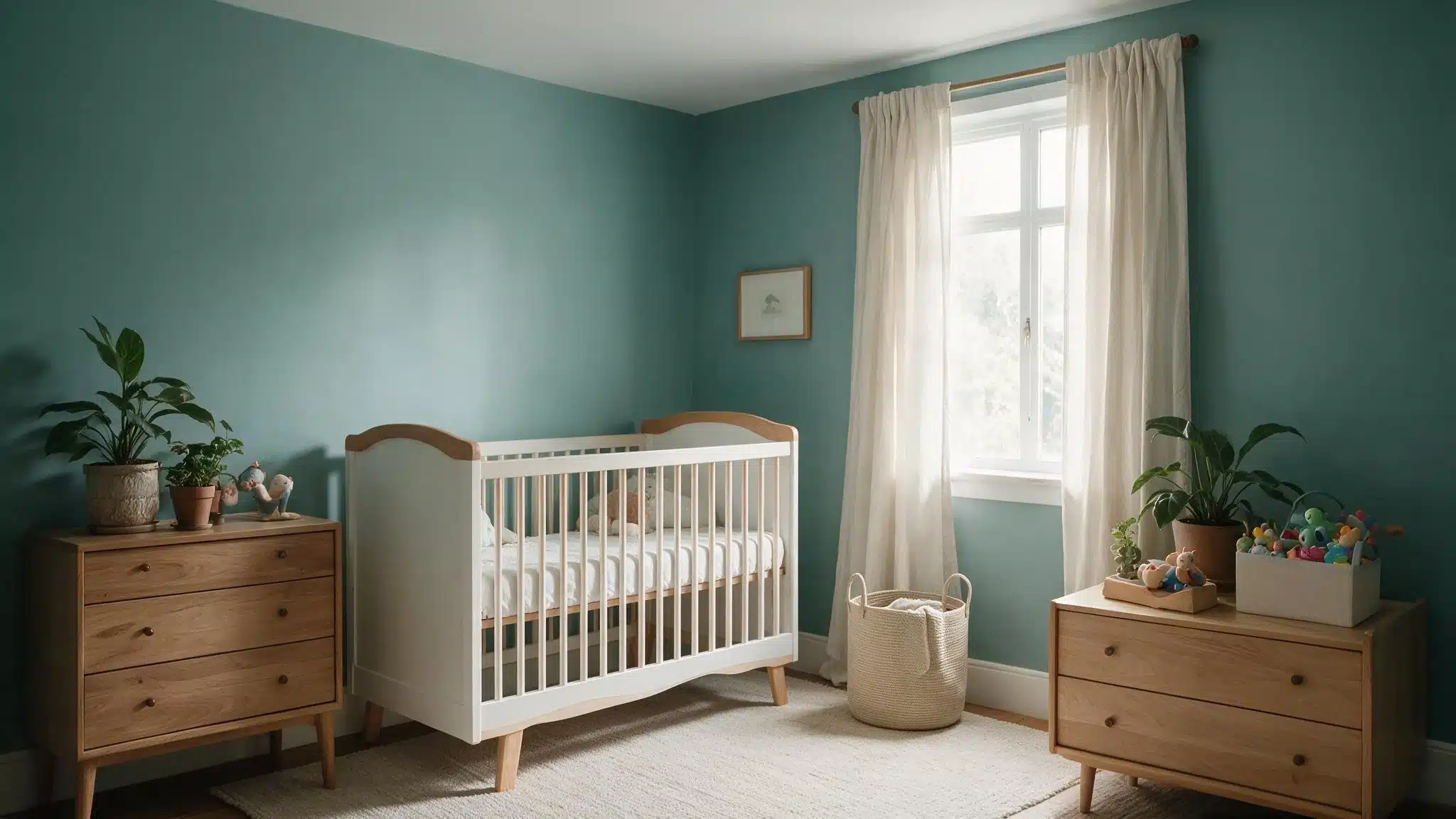
Quietude is one of the most versatile blue-greens on the market, sitting right between pastel and mid-tone so it doesn’t read as “baby blue.”
That balance makes it a smart choice for a room meant to age well into toddlerhood, since it looks just as fitting with playful decor as it does with a calmer, more grown-up palette.
6. Benjamin Moore Beach Glass
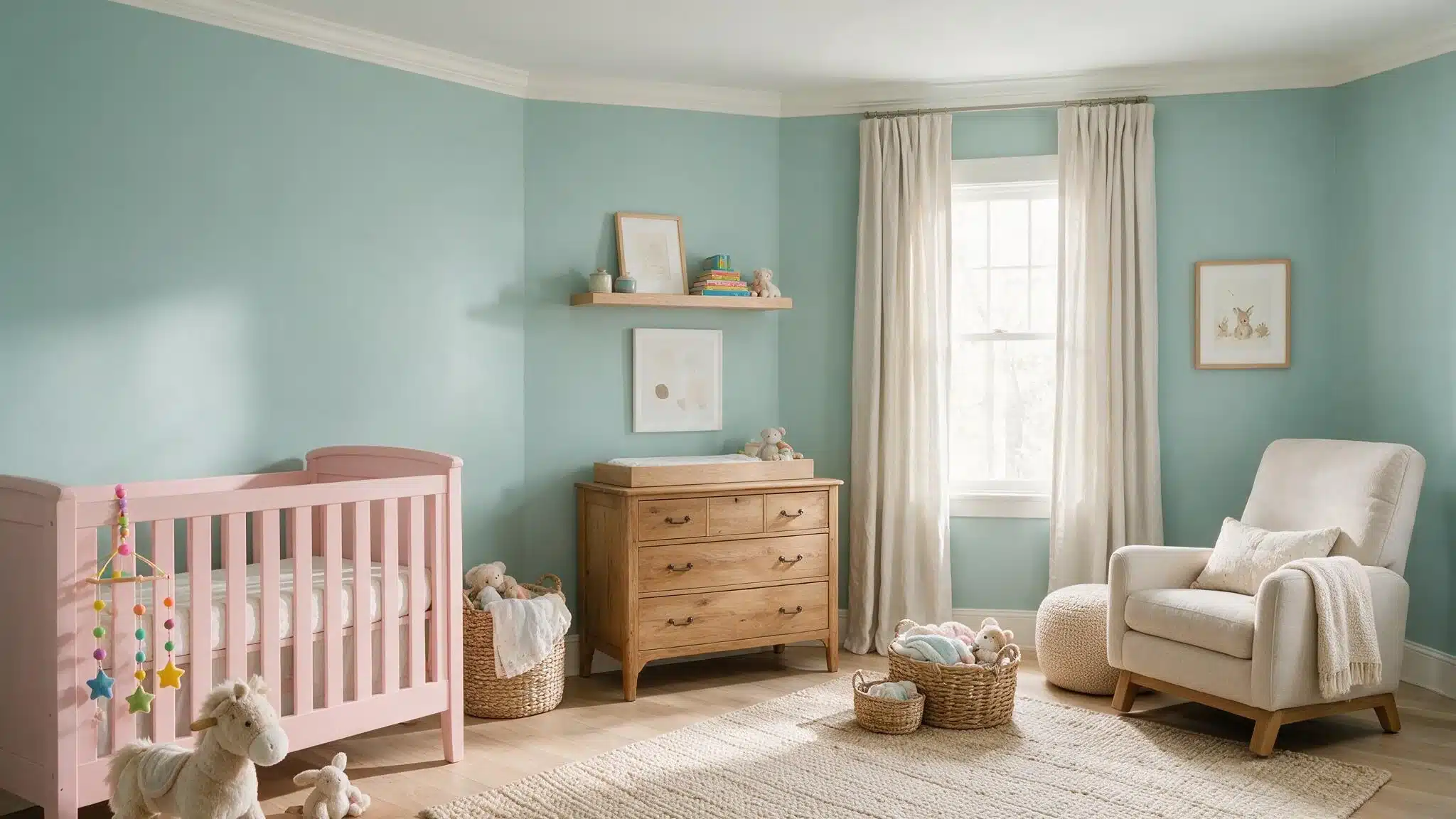
Beach Glass reads bluer in cooler light and greener in warmer light, so it changes personality throughout the day without ever feeling jarring.
It’s an easy match for white furniture and natural wood tones.
7. Sherwin-Williams Sea Salt
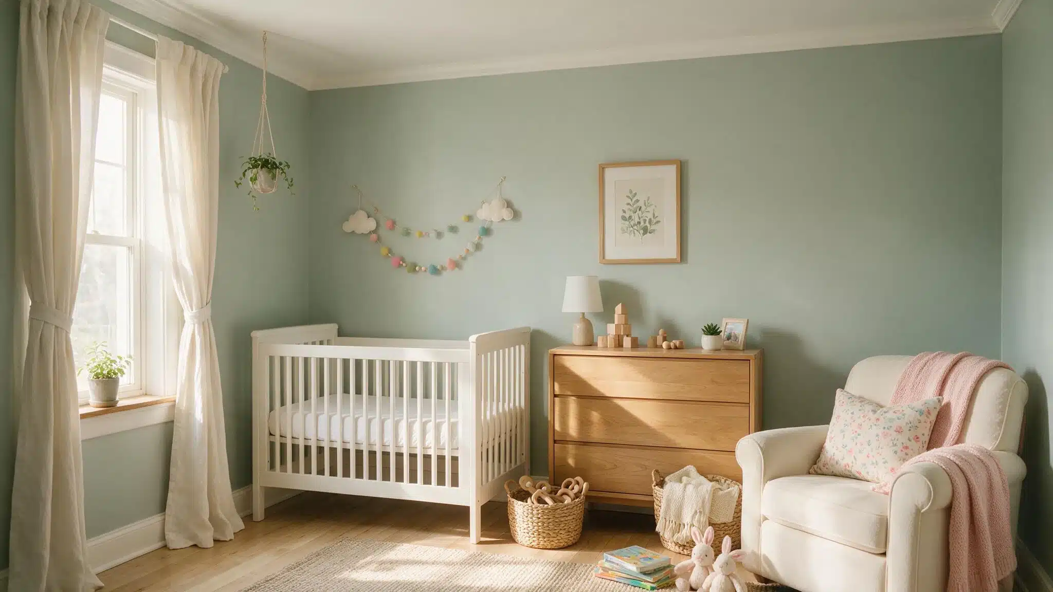
A gentle, grayed-out green with a whisper of blue, Sea Salt shows up constantly in nursery mood boards for good reason.
It reads almost neutral in low light and slightly more green in full sun, which gives it flexibility across rooms with very different amounts of natural light throughout the day.
8. Benjamin Moore Palladian Blue
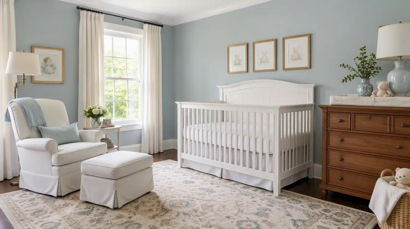
This dusty, soft blue has a bit of gray mixed in, which keeps it from feeling too sweet or overly pastel.
Palladian Blue is a classic pick for a boy’s nursery, but it works just as well in a gender-neutral space when paired with warm wood accents, linen textures, or brass fixtures that balance out its coolness.
9. Sherwin-Williams Retreat
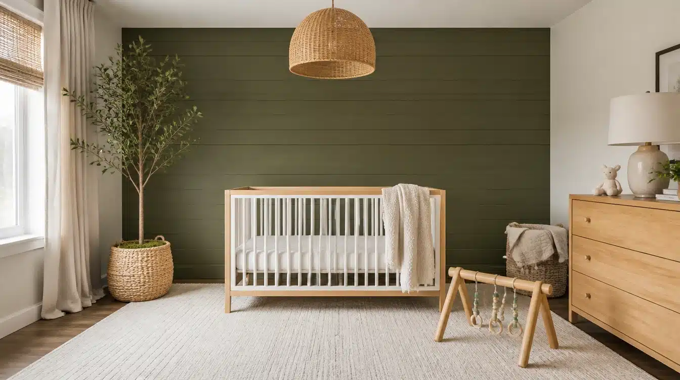
Deeper and more grounded than the pastels on this list, Retreat brings a mossy, mountain-air quality to a room that feels more intentional than trendy.
It’s a good option for an accent wall for anyone wanting more depth and drama than a full-room pastel would give, especially in a space with plenty of natural light to balance the tone.
Warm Pinks and Blushes for a Sweet Nursery
Nowadays, pink nursery colors have moved away from the bubblegum shades that were popular a decade ago.
The ones being requested now tend to be dustier and more complex, since they don’t immediately scream ‘baby girl’ as soon as you walk in.
10. Farrow & Ball Pink Ground
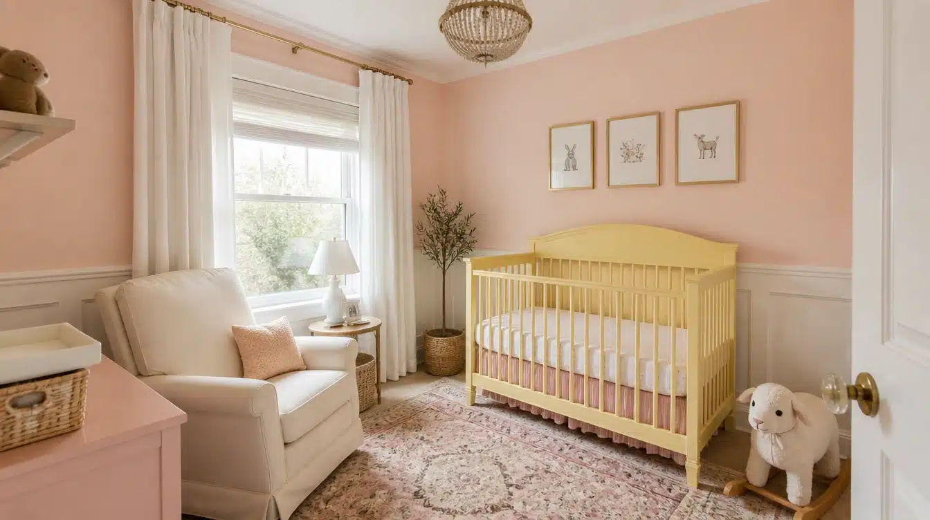
Pink Ground is a genuinely deep peachy pink whose appearance shifts completely according to the time of day, which is part of why it’s so appealing in a nursery setting.
It goes well with white trim and natural linen textiles, and its warmth reads more sophisticated than sugary, especially once the room fills with soft daylight.
11. Benjamin Moore Raspberry Ice
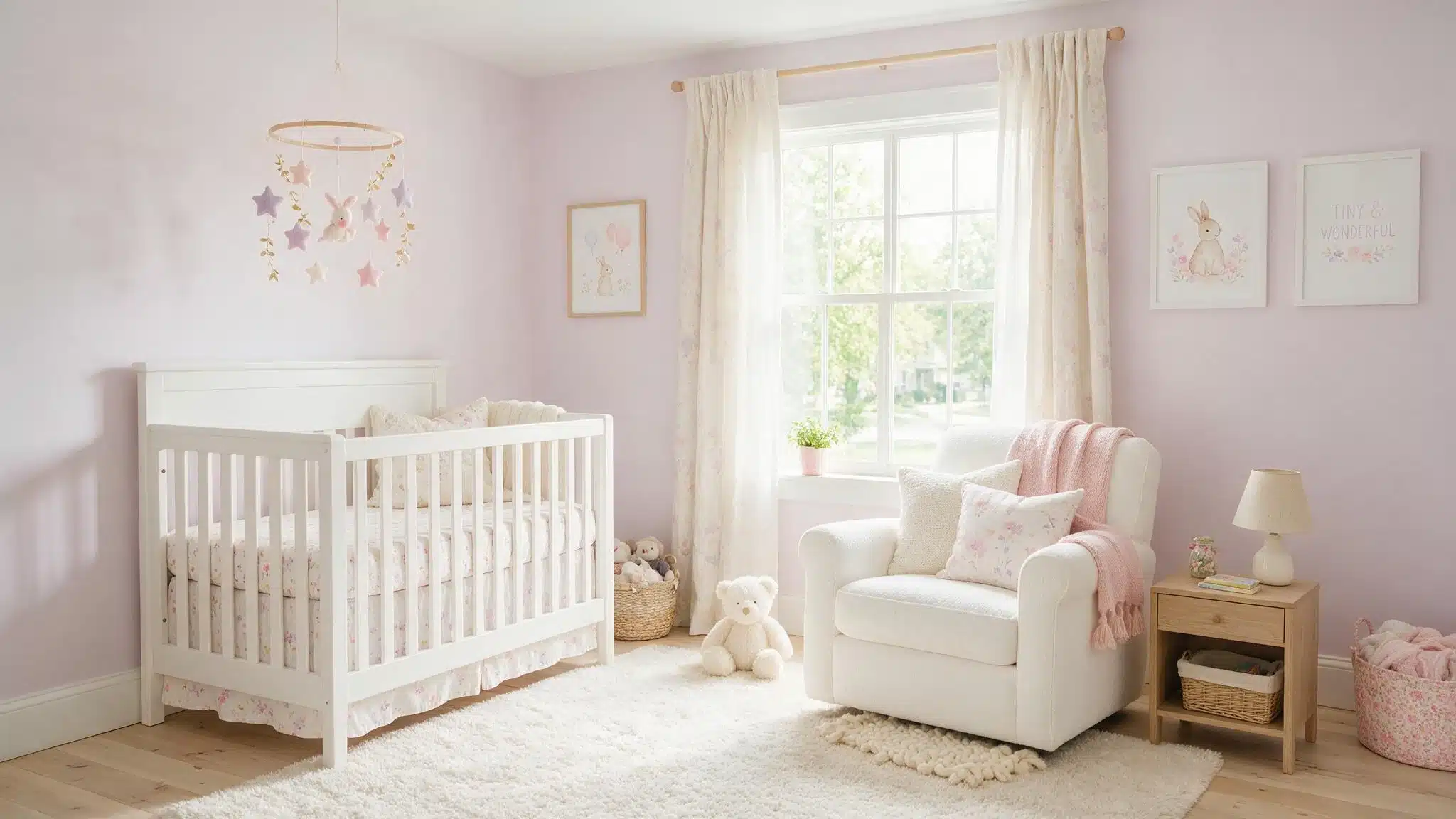
The name might mislead you, but this is a pale, cool-toned purple-pink with gray in it, giving it a sophisticated appearance rather than a sugary one.
Raspberry Ice is a preferred choice for nurseries that will be transformed into big-kid bedrooms.
12. Benjamin Moore Pink Bliss
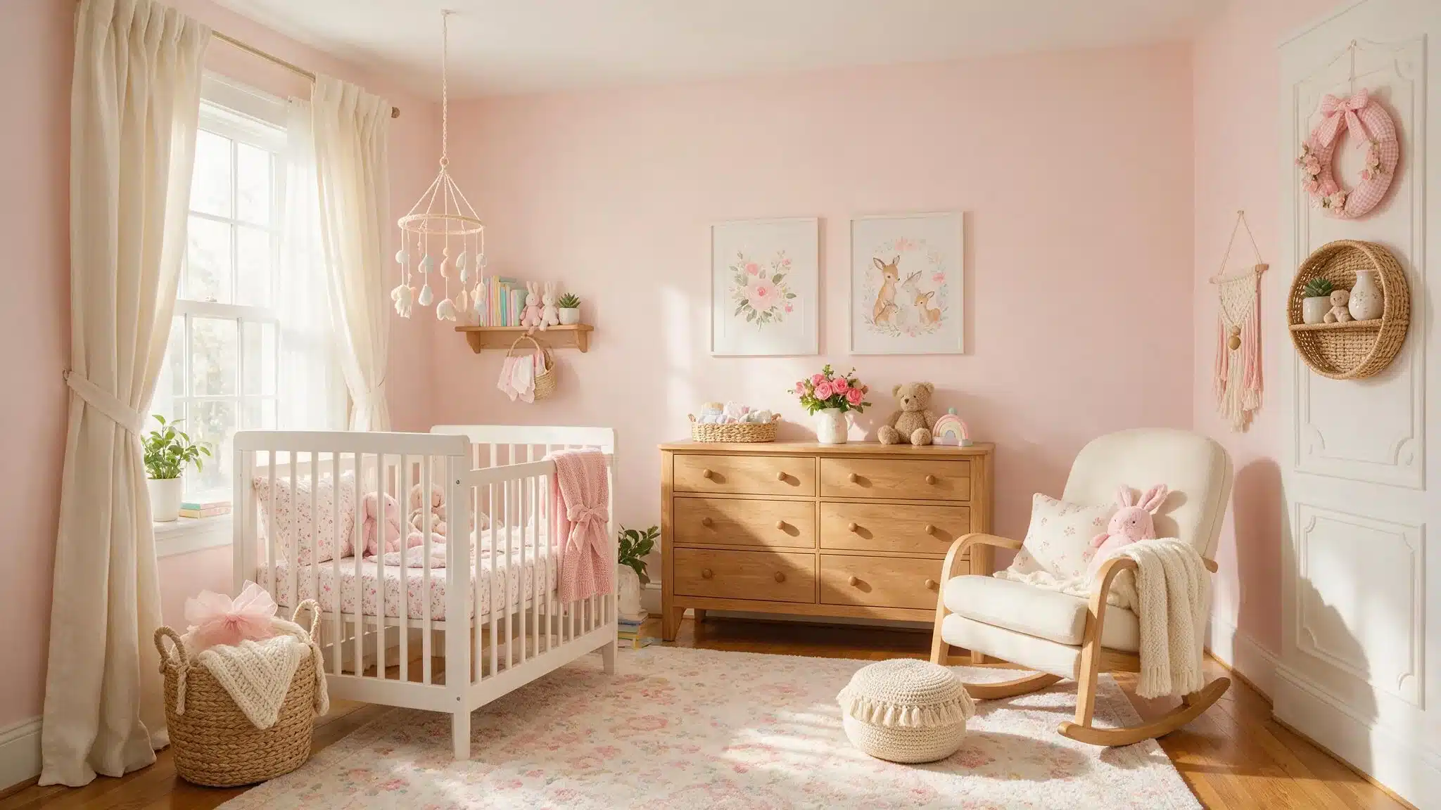
Pink Bliss, one of the softer pinks, has just enough warmth to make a room feel cozy without it becoming overpowering.
It’s best used in rooms with moderate light, since intense sunlight can fade lighter pinks over time.
13. Benjamin Moore Seaside Sand
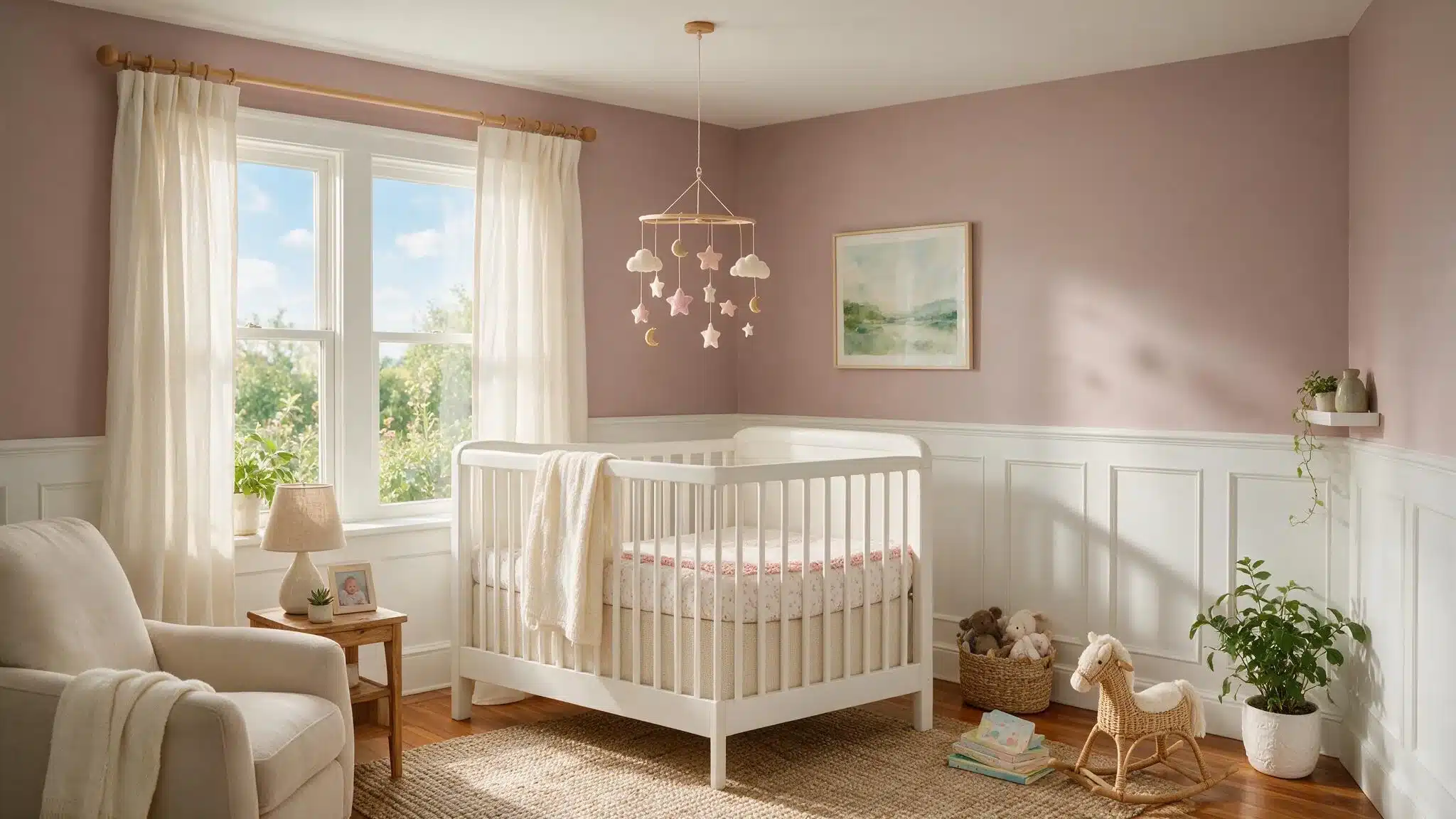
Although it is essentially a neutral mauve, Seaside Sand provides the warmth of pink without actually being pink.
It is an easy shade to use when you want a bit of color without going for a fully pink room.
Buttery Yellows and Warm Neutrals
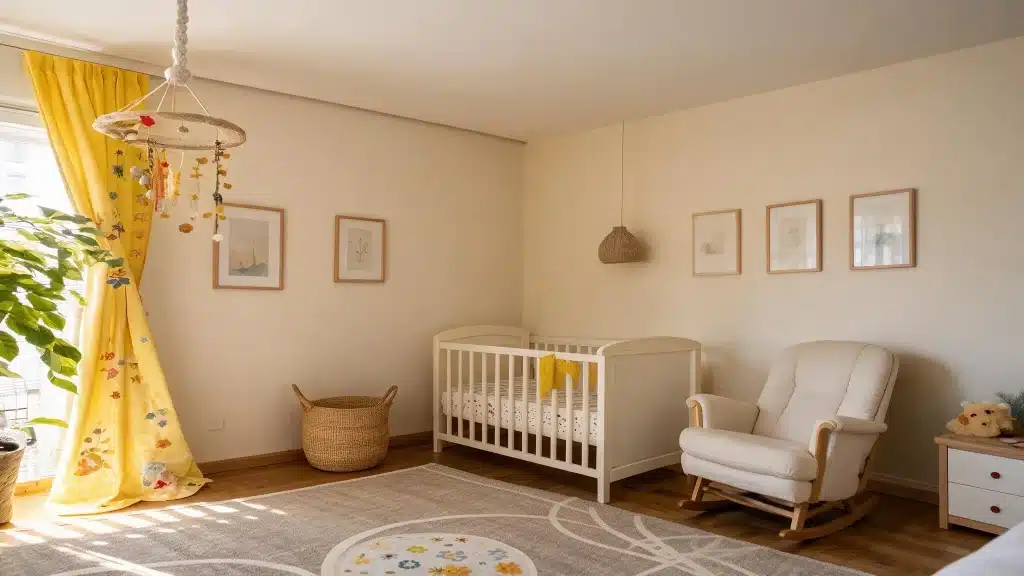
Yellow nursery colors are once again popular, mainly because they suit both genders and look wonderful in natural light.
14. Benjamin Moore Hawthorne Yellow
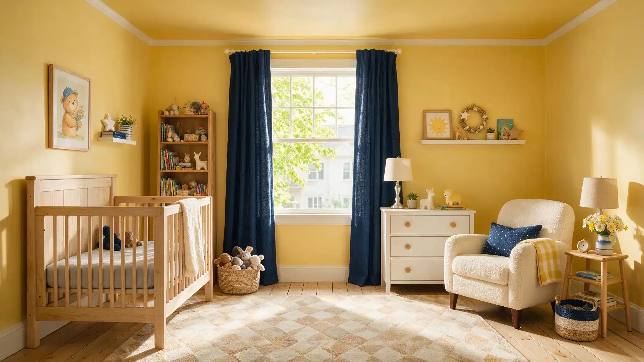
Hawthorne Yellow is a warm, golden yellow that is more akin to mustard than to lemon and, at the same time, brings a pleasant cheer without being as intense as a brighter color.
It combines particularly well with navy accents and natural wood furniture.
15. Benjamin Moore Big Bend Beige
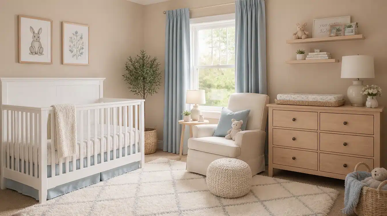
Sometimes compared to desert clay, Big Bend Beige is a warm neutral that takes on a gentle pink tinge in bright light, making it a comfortable choice for anyone wanting warmth on the walls without going fully colored.
Its subtle shift in tone throughout the day adds visual interest that a flatter beige wouldn’t offer.
Bold Accent Wall Colors Worth the Risk
An accent wall is the easiest way to bring in a bolder nursery color without repainting the whole room later.
For anyone weighing whether to carry a bold color onto the trim too, the post on painting walls and trim the same color walks through when that look works and when it doesn’t.
16. Benjamin Moore Hale Navy
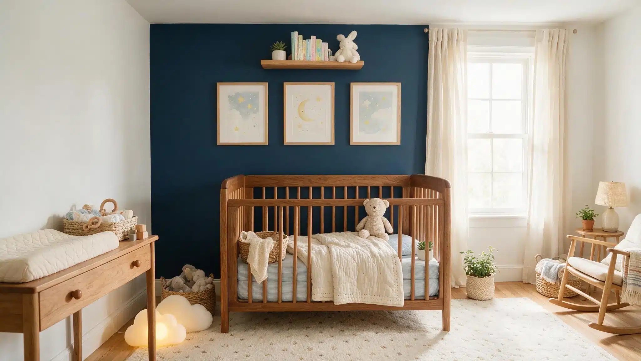
Hale Navy, a deep, genuine navy blue, shows that dark colors can work in a nursery.
When it is used on one of the walls behind the crib, it prevents the room, which contains all white furniture and soft fabrics, from appearing too heavy.
17. Benjamin Moore Lehigh Green
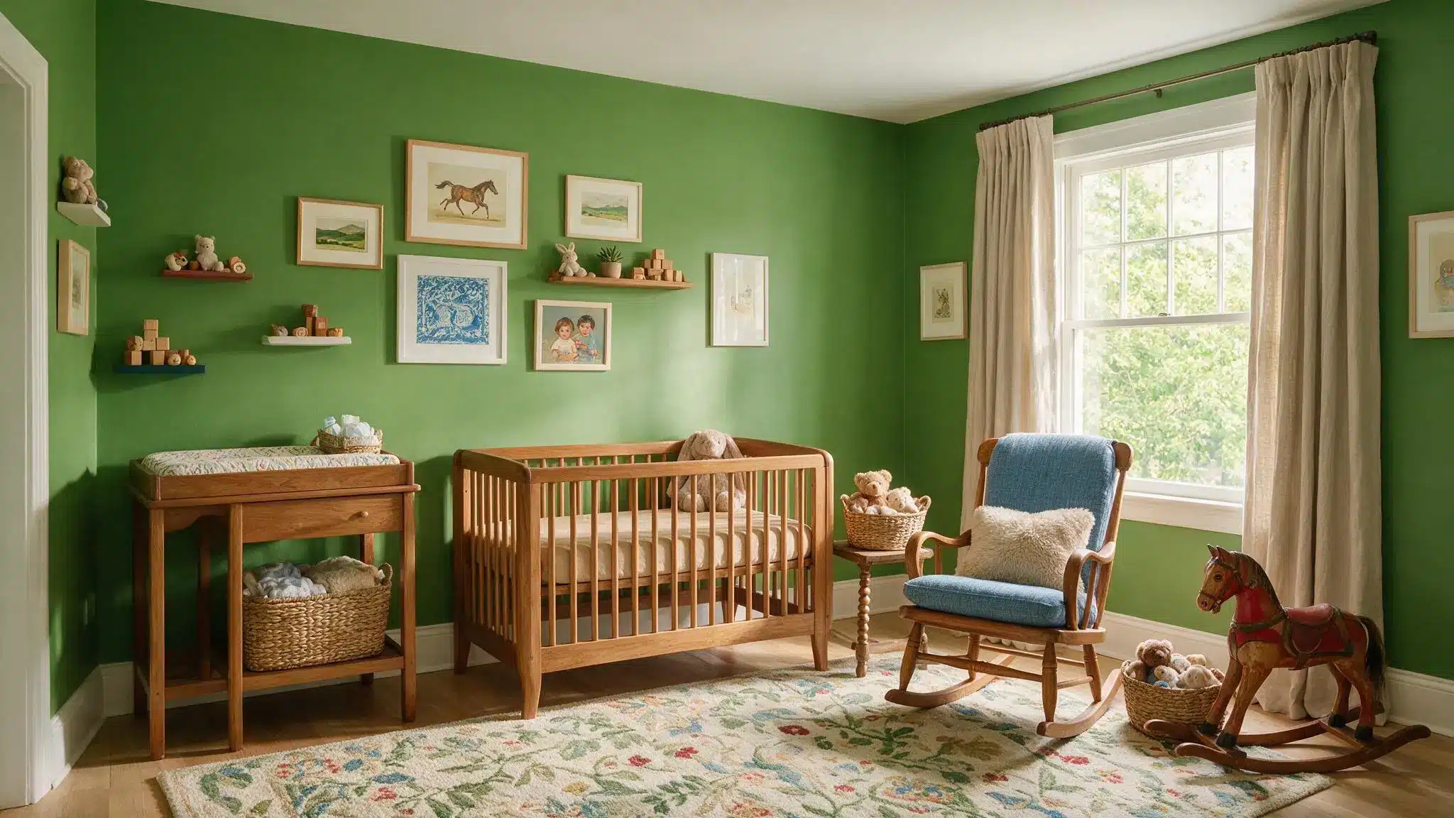
Lehigh Green is a bold, grassy green with a slight tinge of blue that keeps it from appearing too intense.
It creates a very noticeable background for gallery walls or a woodland-themed nursery, and it stands out as one of the more surprising, memorable choices among nursery accent colors.
Nursery Color Palette Combos That Work Together
When pairing a wall color with trim, ceiling, or furniture, undertones matter more than the hue itself.
A cool blue-green like Beach Glass looks best with a true white trim, while a warm neutral like Revere Pewter calls for a warmer white nearby, similar to the comparisons covered in Balboa Mist vs. Pale Oak.
Mixing warm and cool whites in the same room is one of the most common mistakes in nurseries, and it’s easy to avoid once you can spot the difference.
For furniture and decor that play well with any of these wall colors, the paint should be treated as fixed, and everything else shopped outward from there, the same approach covered in choosing wall art that matches paint colors.
Final Thoughts on Choosing Nursery Paint Colors
There is no single correct choice when it comes to nursery paint colors, only one that suits the room’s lighting, long-term plans, and the atmosphere it should carry each morning.
Whether the choice lands on a very soft neutral or a bold navy accent wall, the ideal nursery colors are the ones that still look right long after the crib has been replaced by a toddler bed.
Testing samples in large patches and living with them for a couple of days before deciding is worth the patience.
Frequently Asked Questions (FAQs)
1. What is the Currently Most Popular Color for Nursery Paint?
The soft blue-greens and warm neutrals are most frequently featured in the 2026 nursery trend lists because they are versatile, gender-neutral, and have a calming effect.
2. Should Nursery Walls Be Light or Dark?
In rooms with limited natural light, it is best to use lighter colors with a higher LRV; in bright, sunny nurseries, darker shades are more appropriate.
3. Do Nursery Colors Need to Match the Rest of the House?
Not necessarily, but if you choose undertones that match those of the adjacent rooms, the transition between the rooms will seem purposeful.