When people plan a room, walls get the color, floors get the material, and the ceiling stays white and forgotten.
Yet the right shade can make a low room feel taller, a bright room warmer, or a neutral space full of personality.
As modern ceiling paint color gains ground in interior design and ceiling paint color trends move toward bolder choices, the fifth wall finally deserves attention.
This offers curated, room-based ideas to simplify that selection.
What Defines a Modern Ceiling Paint Color Today?
Today, homeowners and designers treat it as a deliberate design decision.
Current ceiling paint color trends reflect a wider shift toward contrast ceilings, tonal layering, soft neutrals, and bold accent shades that tie a room together.
Lighting plays a major role, as both natural and artificial light alter how a color reads overhead.
Ceiling height and room purpose matter equally, as each factor determines which shade feels balanced rather than forced.
Living Room Ceiling Colors That Make a Statement
Living room ceilings carry more visual weight than most people expect.
The shade chosen overhead affects how furniture reads, how light behaves, and how settled the whole room feels.
1. Soft Warm White
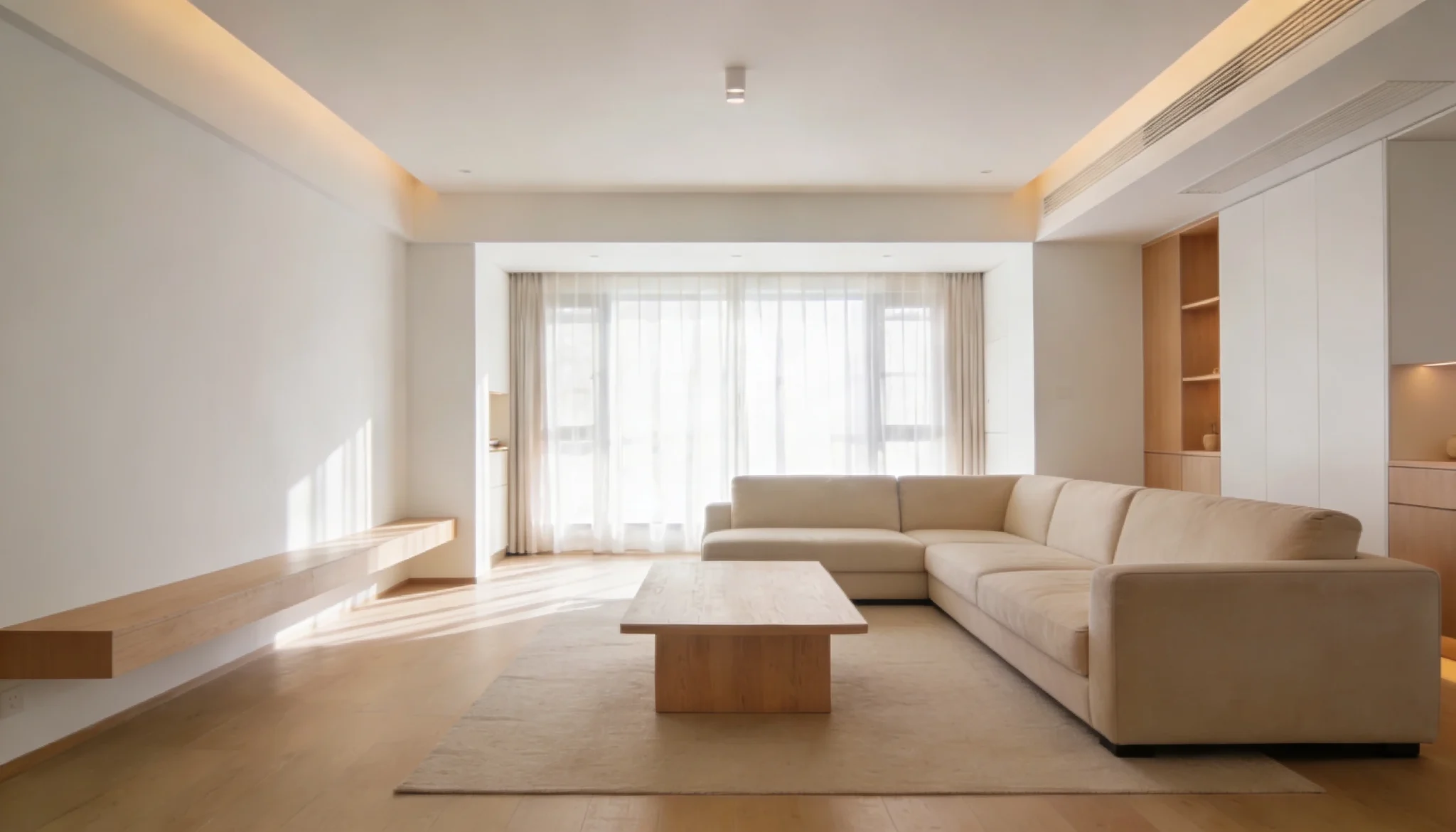
Soft warm white sits in a sweet spot that pure white never quite reaches.
It keeps the ceiling feeling open and airy while adding just enough warmth to prevent that clinical, washed-out look.
This shade works across traditional, coastal, and contemporary interiors without competing with wall colors or furniture.
Sherwin-Williams Alabaster (SW 7008) is a soft, warm white ceiling color that creates a bright and welcoming living room atmosphere.
2. Light Greige
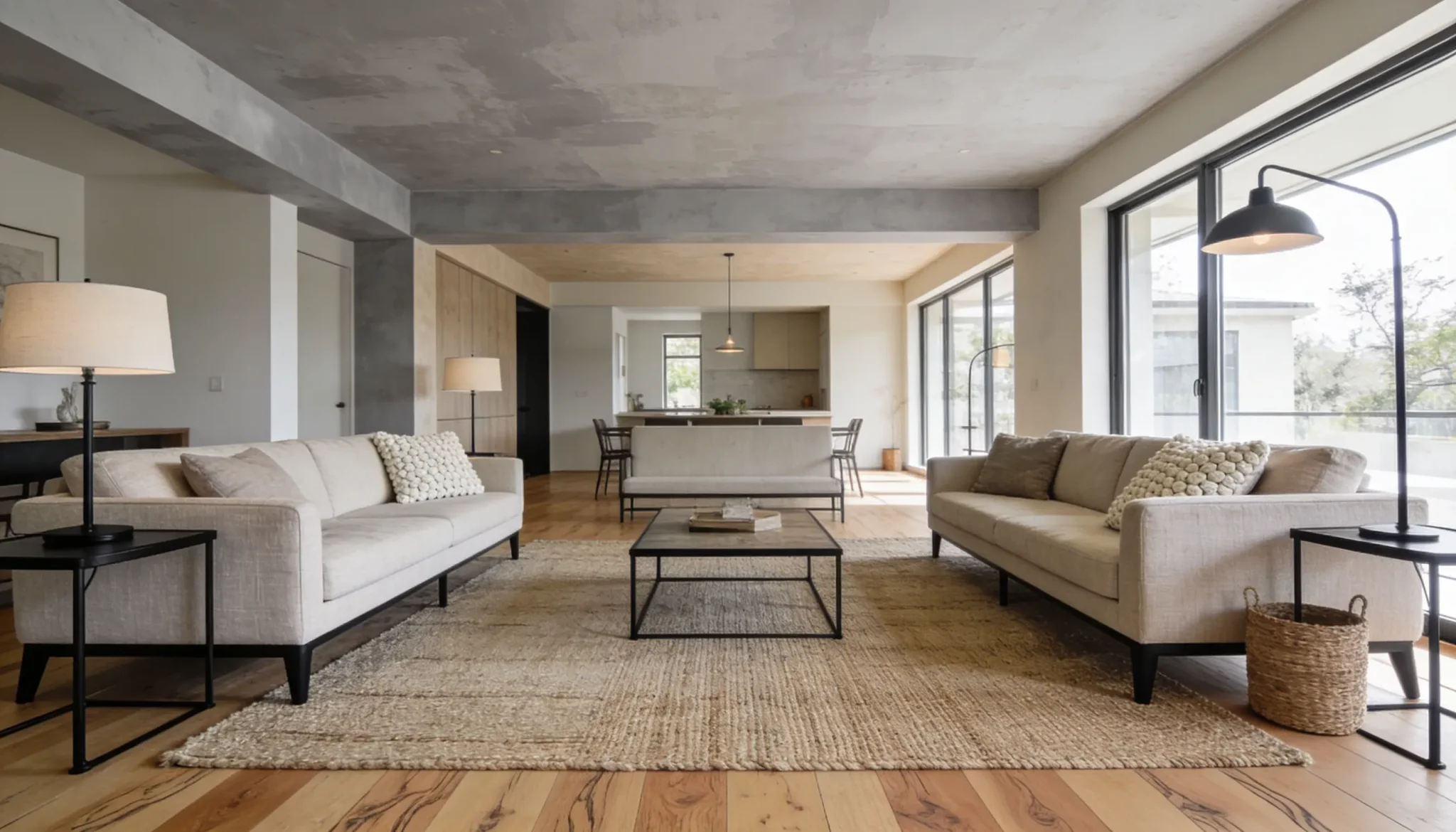
Light greige, the blend of gray and beige, has become one of the most requested ceiling shades in modern interiors.
It layers effortlessly with both warm wood tones and cooler metal finishes.
- Works well in open-plan spaces where the ceiling connects multiple zones
- Pairs naturally with linen, stone, and matte black hardware
- Sits beautifully between warm and cool palettes without committing to either
A greige that leans too dark. On a wall, depth reads as richness. Overhead, that same depth can feel heavy and make the room shrink visually.
3. Muted Sage Green
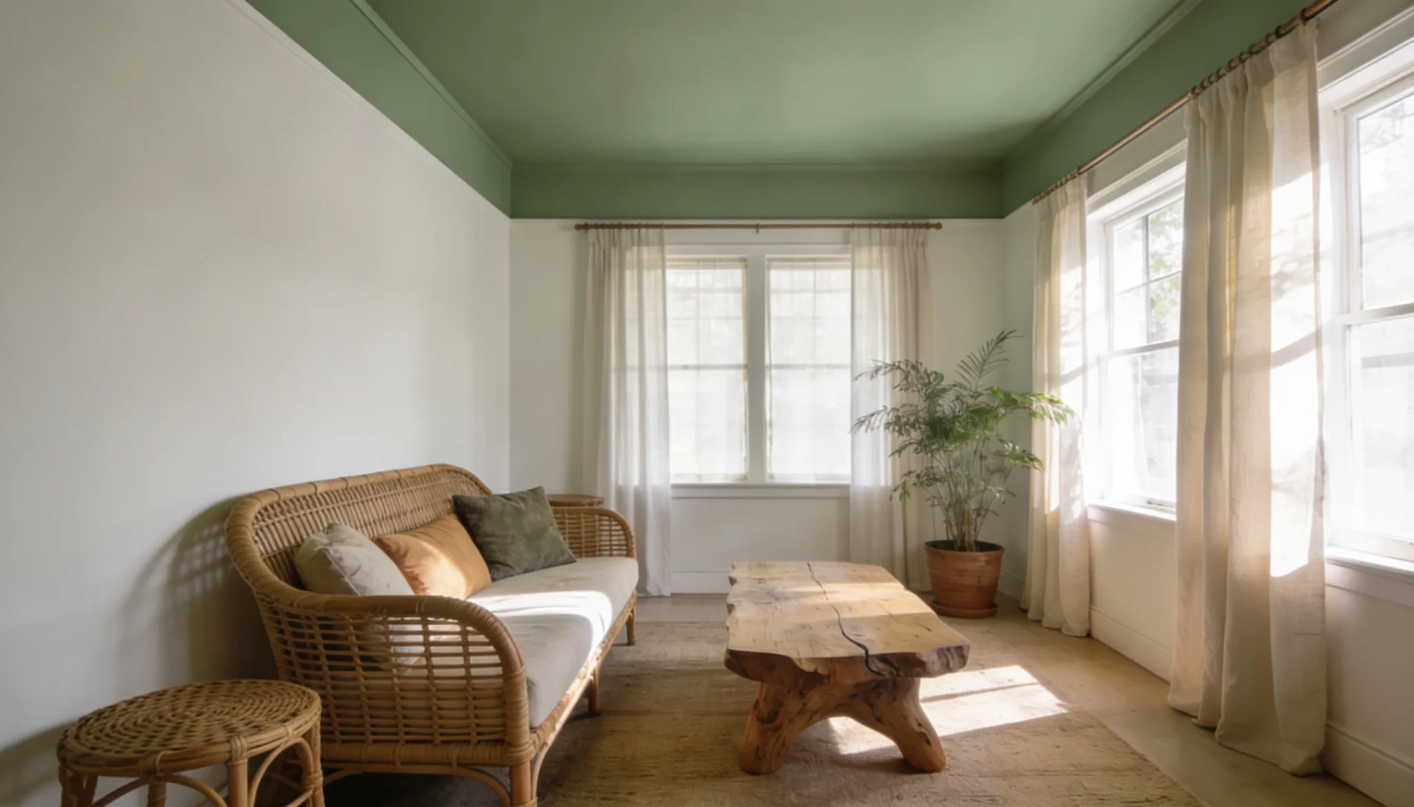
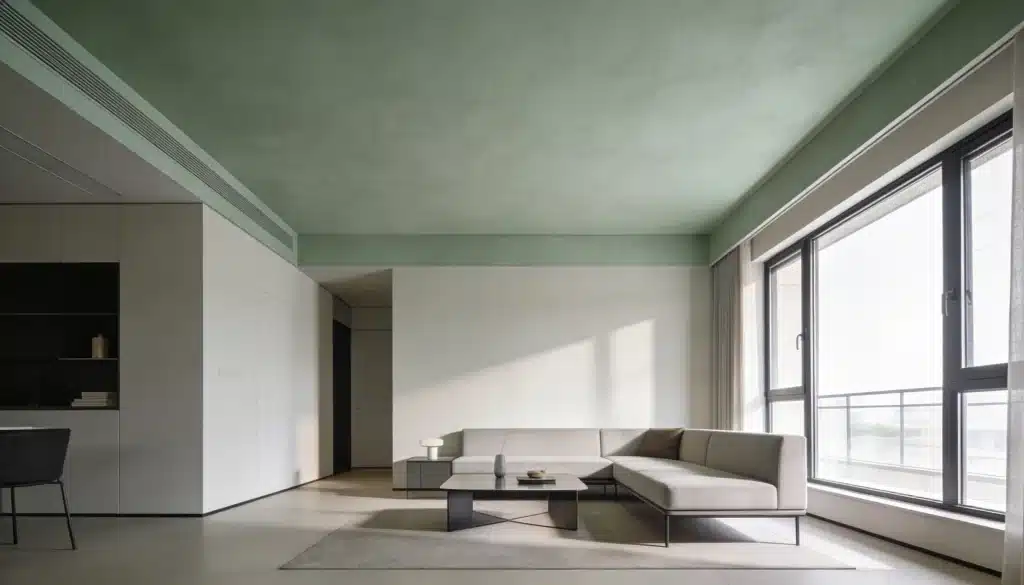
Muted sage green brings the outside in without making a room feel themed or overdone. On the ceiling, it acts as a soft canopy that grounds the space naturally.
Living rooms with natural materials like rattan, linen, or raw wood benefit most.
The earthy undertone connects the ceiling to the room without forcing the palette.
Benjamin Moore Saybrook Sage (HC-114) is a muted sage-green ceiling color that adds a calm, earthy touch to a living room.
4. Dusty Blue
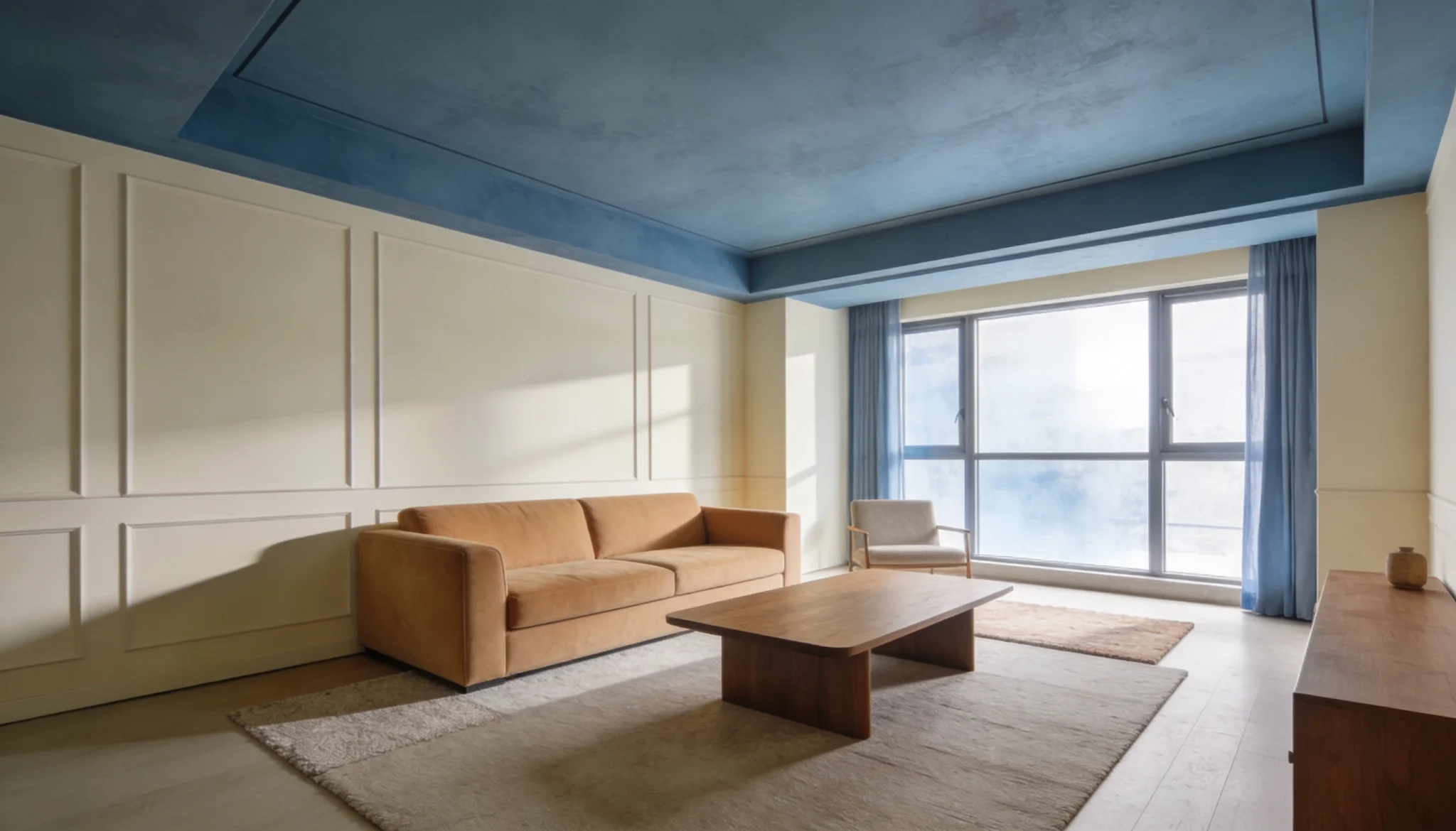
Dusty blue is the kind of ceiling color people notice without being able to name it.
It adds visual interest overhead while keeping the room calm and considered.
Unlike brighter blues, the dusty version carries enough gray to feel cultured rather than playful.
- Best suited for rooms with ample natural light
- Complements warm neutrals, terracotta accents, and aged brass fixtures
- Creates a sky-like effect when walls stay in pale cream or warm white
In rooms with limited natural light, the gray undertones in dusty blue can push the ceiling toward a flat, dull finish. Test a large swatch in your specific lighting before committing, the gray undertones pull this shade toward a dull, lifeless finish.
5. Charcoal Gray
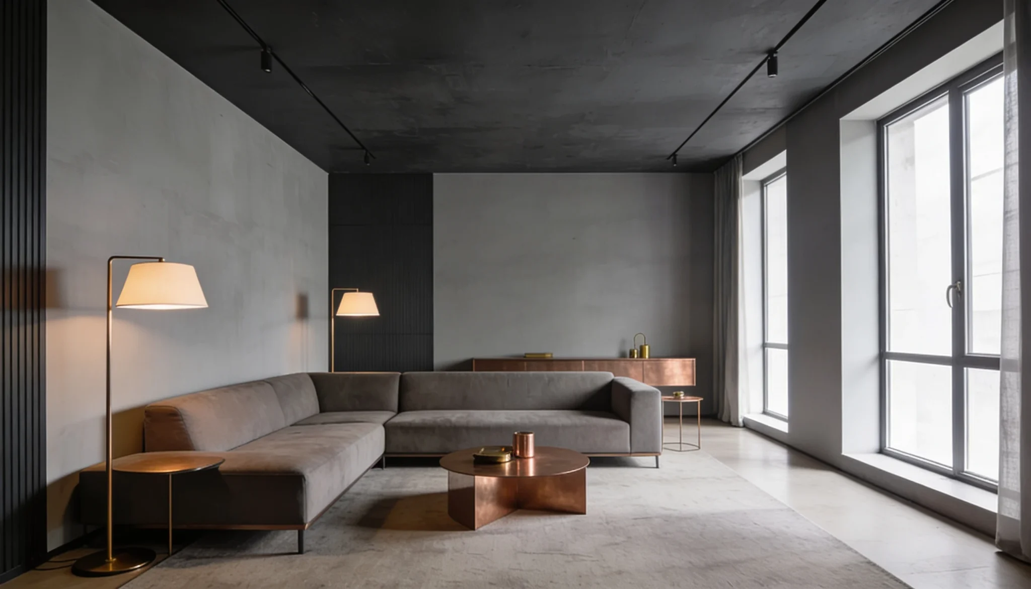
Charcoal gray on a ceiling is not a timid choice, and that is exactly the point. In living rooms with high ceilings, this shade creates an enveloping atmosphere that feels intentionally designed.
It absorbs light rather than reflects it, making layered lighting at mid and low levels essential.
Keep walls in a lighter shade of the same gray family for a tonal, cohesive result.
Introduce warm metals like brushed brass or copper in fixtures and hardware. They break the coolness of charcoal and add richness to the scheme.
6. Pale Blush Pink
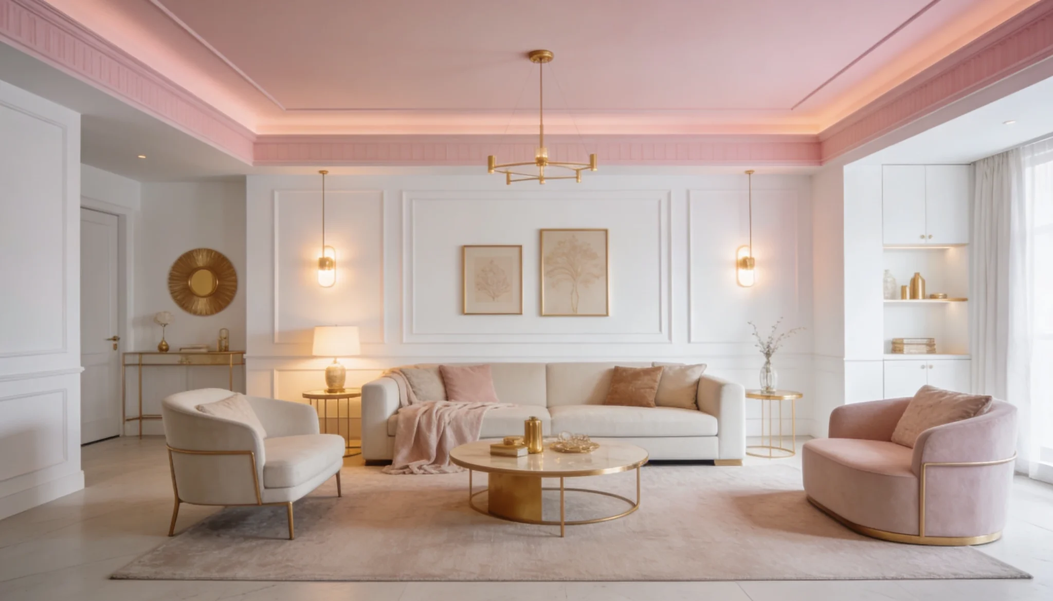
Pale blush pink photographs beautifully and feels even better in person. It casts a gentle warmth across the room, softening harsh lines and adding a natural glow.
Farrow & Ball Pink Ground No. 202 is a pale blush pink ceiling color that brings a soft and airy charm to a living room
- Pairs well with brushed gold and warm brass accents
- Works best alongside white or warm neutral walls
- Suits both contemporary and transitional styles
7. Matte Black
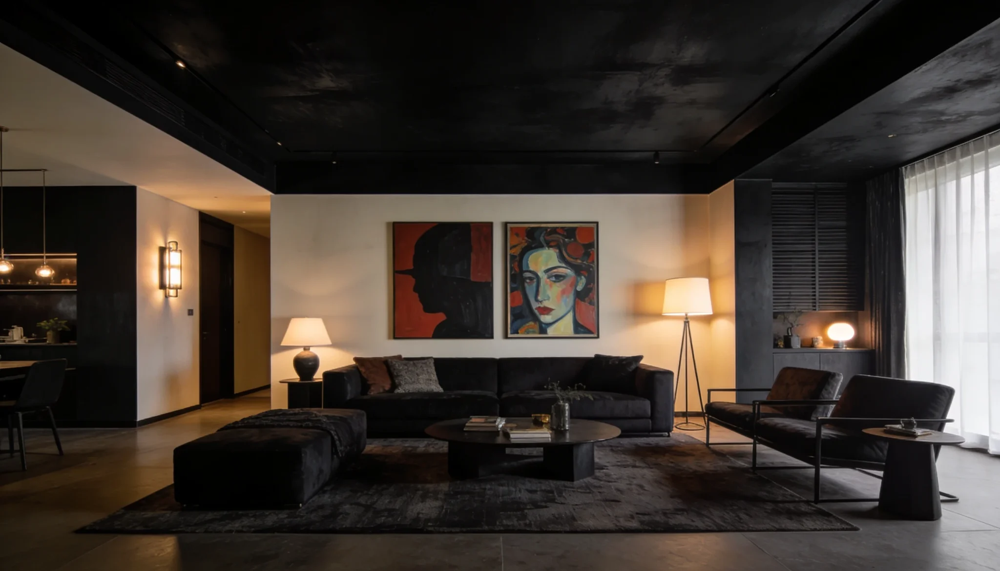
Matte black suits living rooms that carry strong design confidence, bold artwork, and rich layered textures that hold their own against a dark ceiling.
- Who It Is For: Spaces with statement furniture, bold artwork, and rich layered textures
- How to Use It: Apply selectively as an accent ceiling over a seating area or architectural beam
- The Finish Detail: Matte is the only finish that works; satin or semi-gloss undermines the depth
Tip: Relying solely on overhead lighting will flatten everything matte black is meant to deliver.
Related read: 11 Unique Shades of Black and How to Use Them in Your Home
Bedroom Ceiling Colors for a Calm and Relaxing Feel
These tones are ideal for creating a peaceful, sleep-friendly environment.
8. Powder Blue
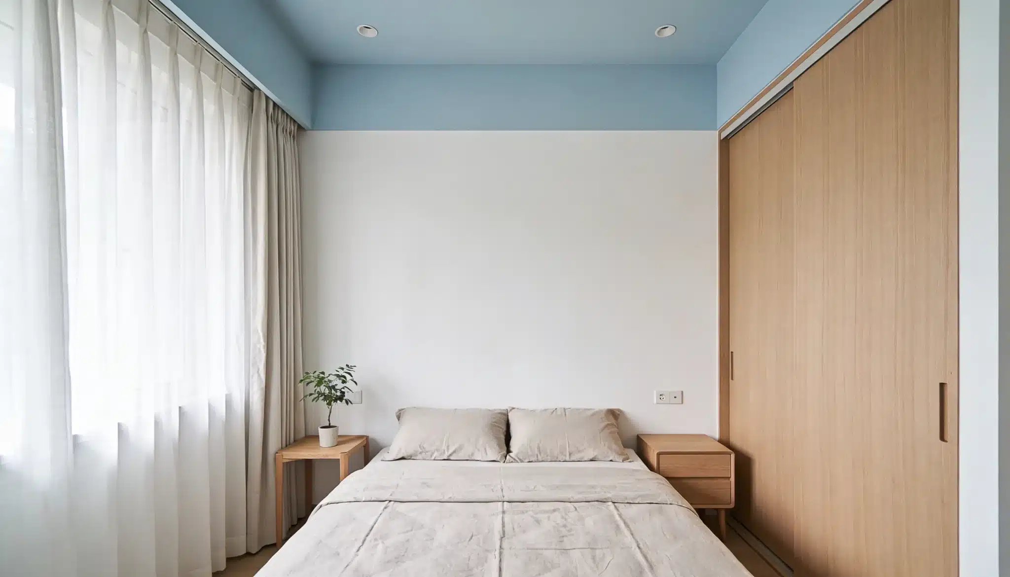
Powder blue on a bedroom ceiling works like a breath of fresh air. It lifts the room without introducing visual noise, making it one of the easiest ceiling colors to live with day to day.
The softness of this shade slows the eye down, which is exactly what a sleep space needs.
Pair with white woodwork and linen bedding to keep the overall palette light, breathable, and cohesive without feeling overdone.
9. Lavender
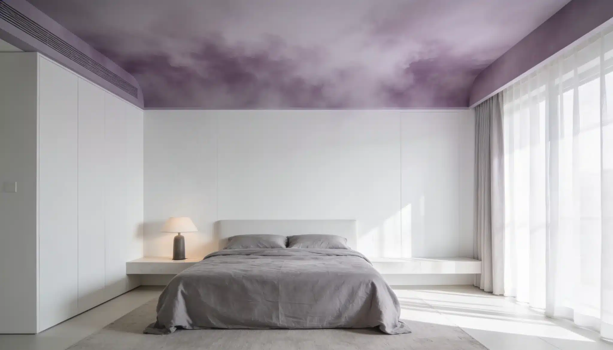
Lavender mist brings a quiet sense of calm that works particularly well in bedrooms designed for rest and unwinding.
Benjamin Moore Lavender Mist (2070-60) is a soft lavender ceiling color that creates a peaceful, dreamy, and relaxing bedroom atmosphere.
- Works beautifully with soft gray, ivory, and dusty rose tones
- Pairs well with brushed silver and matte white fixtures
- Suits both minimalist and softly layered bedroom styles
10. Creamy Off-White
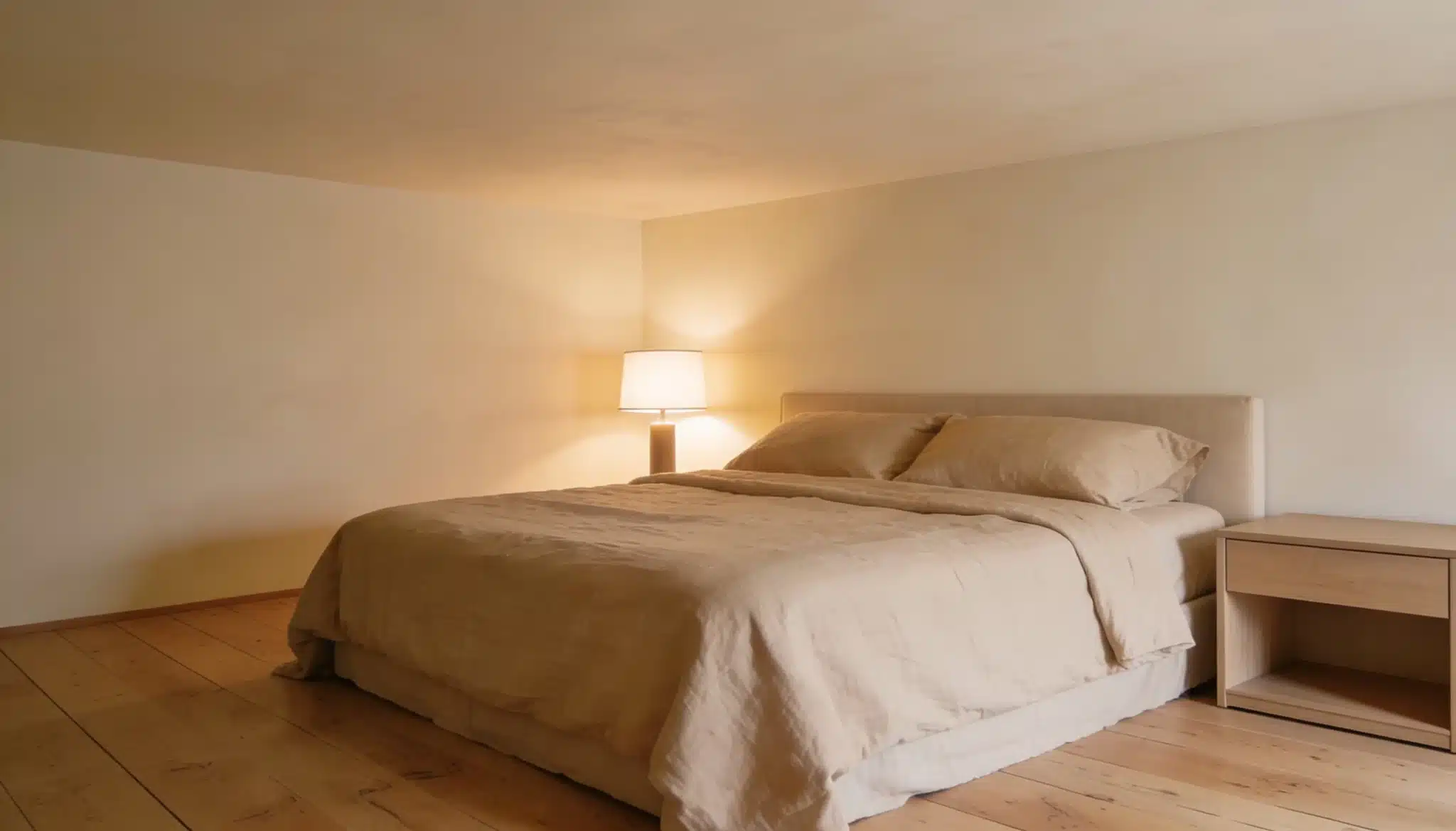
Creamy off-white carries a warmth that plain white simply does not have, wrapping the bedroom in a soft, settled glow that feels comfortable rather than clinical.
- What Makes It Different: Bright white feels stark overhead; creamy off-white never does
- Where It Works Best: Bedrooms with warm timber floors, neutral walls, and natural textures
- Why Designers Prefer It: Works across nearly every bedroom style without requiring adjustment
Test the shade under both natural and artificial light. Some creamy whites shift noticeably yellow under warm bulbs in the evening.
11. Soft Taupe
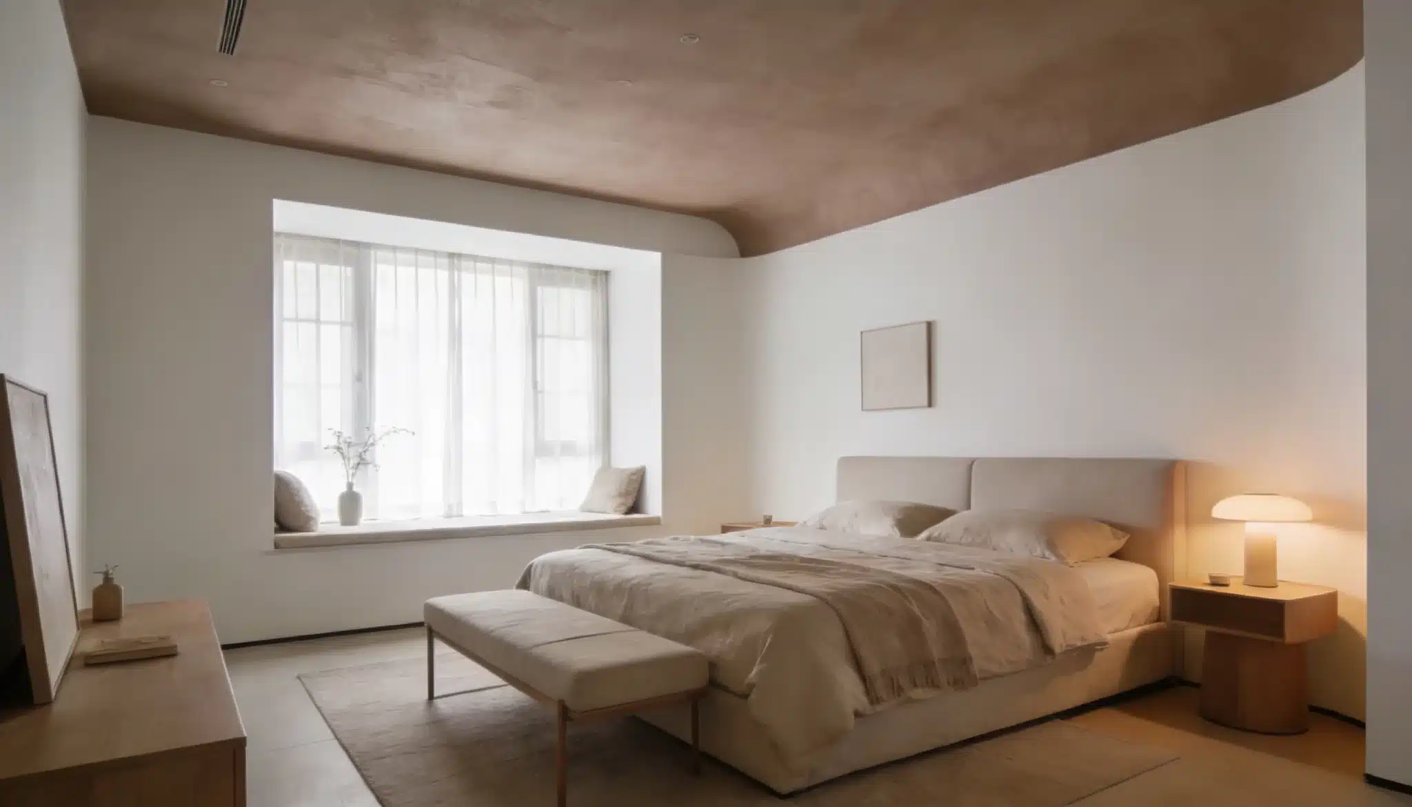
Soft taupe makes a bedroom feel wrapped in warmth from the moment you walk in.
It adds depth overhead without darkening the room, creating a cocoon-like quality that heavier shades often overcomplicate.
The neutral base means it sits comfortably alongside almost any wall color or bedding palette.
- Pairs naturally with warm whites, camel, and deep olive tones
- Works across both modern and transitional bedroom styles
Avoid: Always check the undertone against existing furniture. Some taupe shades pull too pink or too green on the ceiling.
12. Muted Terracotta
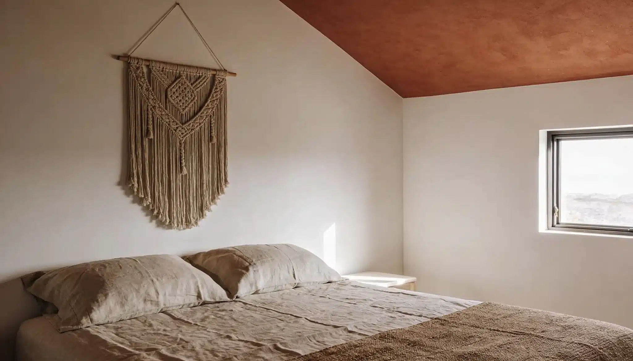
Muted terracotta brings an earthy warmth to bedroom ceilings that feels grounded and enveloping, sitting naturally in bohemian, Mediterranean, and nature-inspired interiors.
Sherwin-Williams Redend Point (SW 9081) is a muted terracotta ceiling color that adds a grounded and soothing feel to a bedroom.
- The Mood It Creates: Warm, settled, and deeply connected to natural textures and earthy tones
- How to Style Around It: Natural linen, woven baskets, clay pottery, and warm timber work best
- The Right Shade: Needs enough gray or brown in it to feel settled rather than vivid.
Style around it with natural linen, woven baskets, clay pottery, and warm timber.
13. Deep Navy
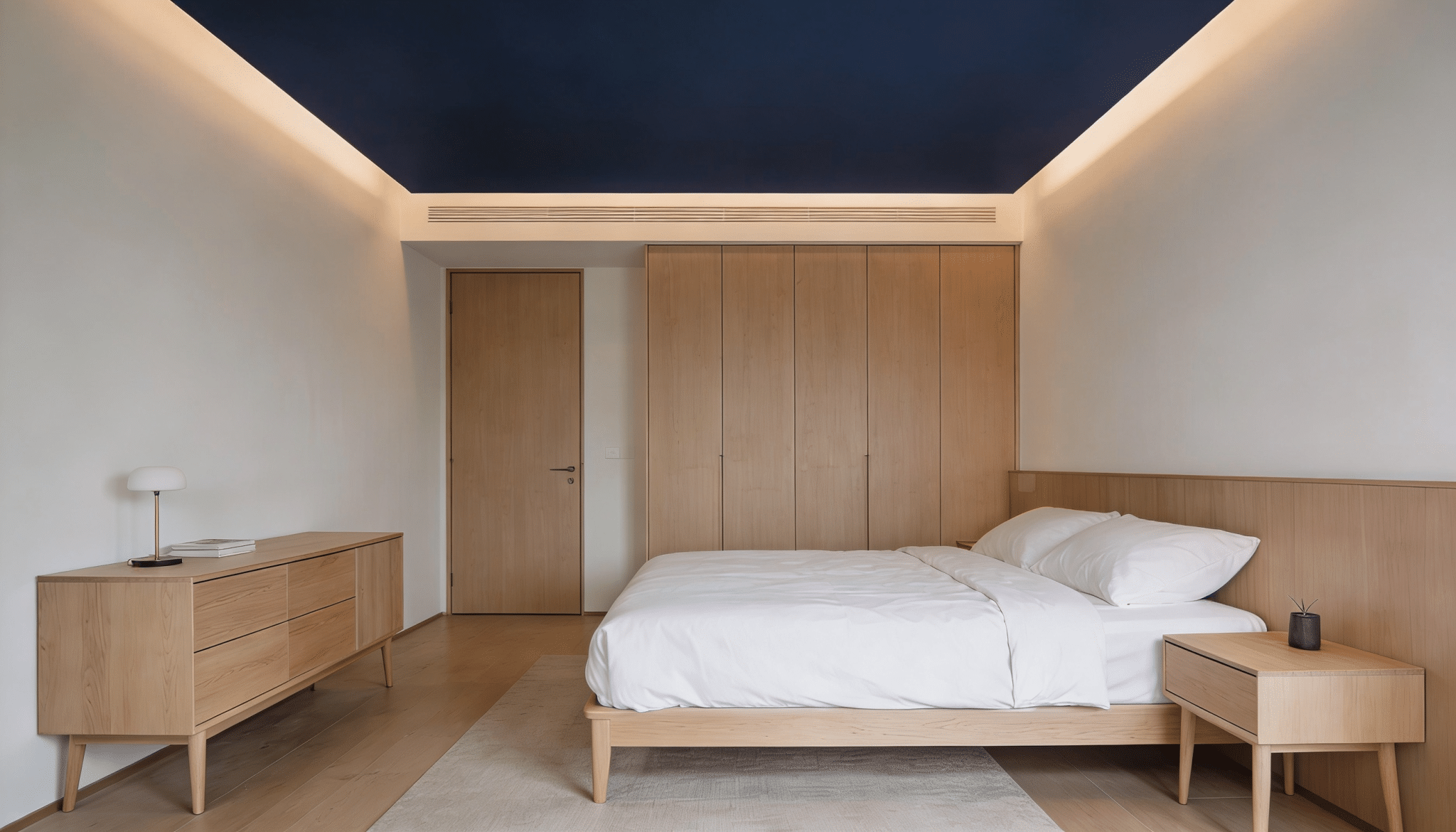
Deep navy creates a sense of depth overhead that feels less like a dark room and more like a clear night sky, still and quietly immersive.
Keep everything below the ceiling lighter so the navy reads as intentional contrast.
- Works best in bedrooms with generous natural light
- Pairs beautifully with warm whites, soft gold accents, and natural wood
- Best applied in matte finish to avoid unwanted light reflection overhead
Cool lighting under a navy ceiling drains warmth from the entire room. Always use warm-toned bulbs in bedside lamps and sconces.
Kitchen, Dining, and Multipurpose Ceiling Colors
These colors keep spaces feeling fresh, clean, and inviting.
Kitchens and dining spaces need ceiling colors that hold up under task lighting, complement cabinetry, and do not compete with everything at the counter.
The wrong shade here reads more obviously than in any other room.
14. Bright White
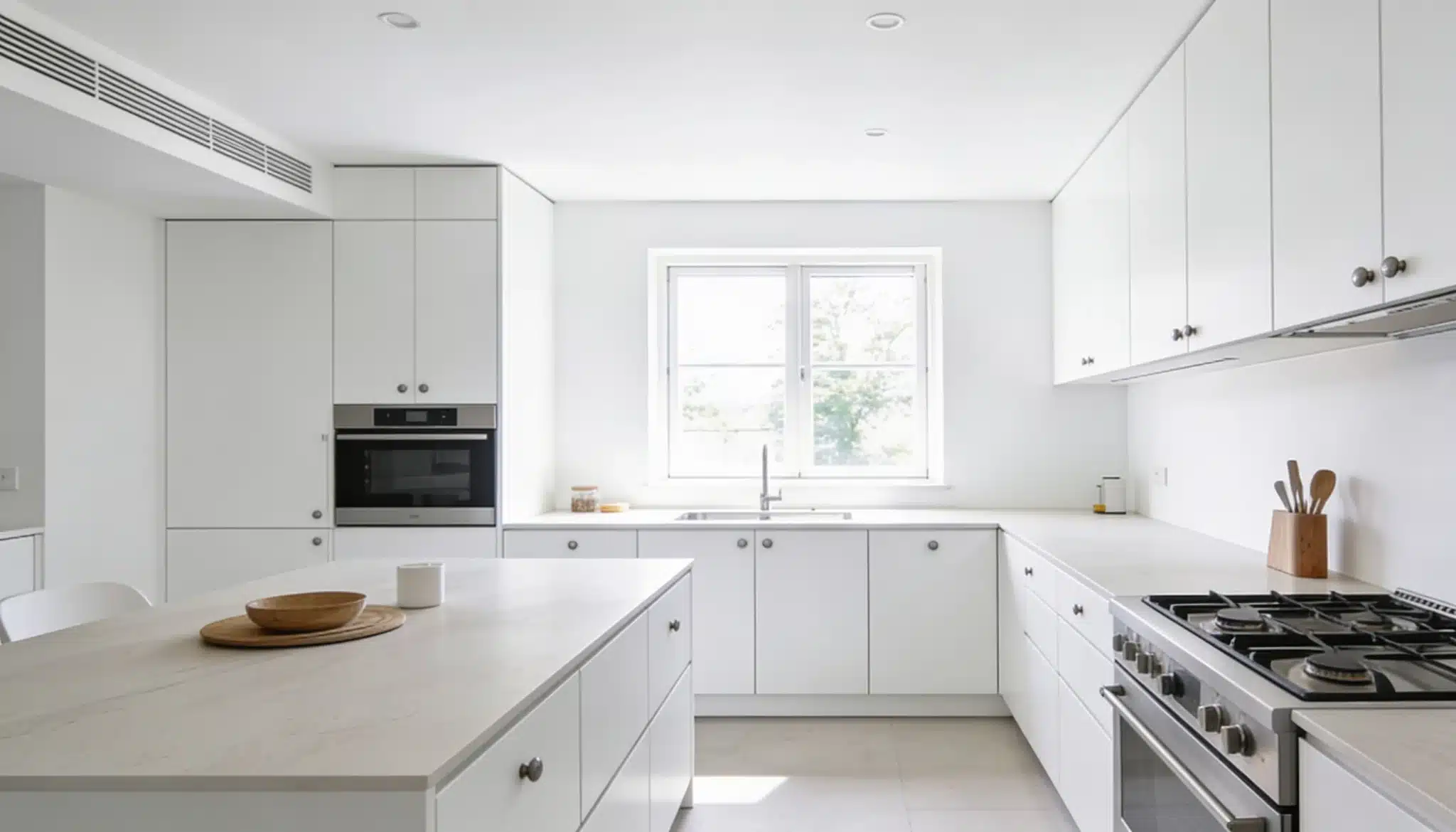
Bright white with high reflectance is the most practical ceiling choice for kitchens and dining spaces.
It bounces light around the room and provides a clean backdrop that never competes with cabinetry, tiles, or furniture below.
Benjamin Moore Chantilly Lace (OC-65) is a bright white ceiling color that gives kitchens and multipurpose spaces a crisp, clean, and open feel
Choose a bright white with a cool undertone in kitchens with warm wood cabinetry. It creates a balanced contrast that keeps the space feeling fresh rather than heavy.
15. Pale Mint Green
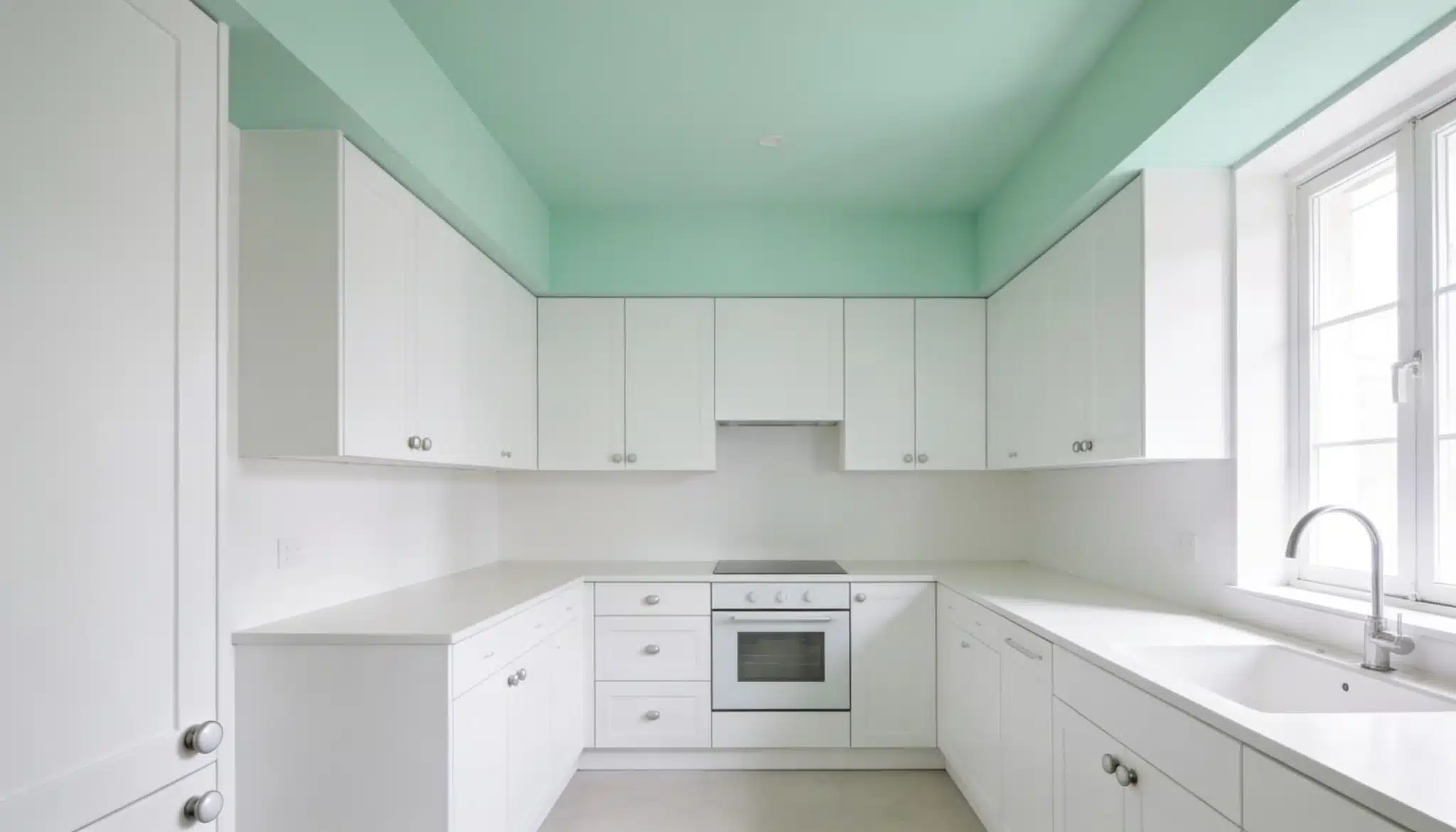
Pale mint green brings a quiet energy to the kitchen and dining ceilings that plain white cannot offer.
It feels clean and fresh overhead without adding visual weight and suits spaces with white or light gray cabinetry particularly well
- Works beautifully alongside white tiles, timber shelving, and brushed nickel fixtures
- Suits both modern and retro-inspired kitchen styles with equal ease
- Reads as almost neutral in strong natural light, adding color only in softer conditions
16. Light Sky Gray
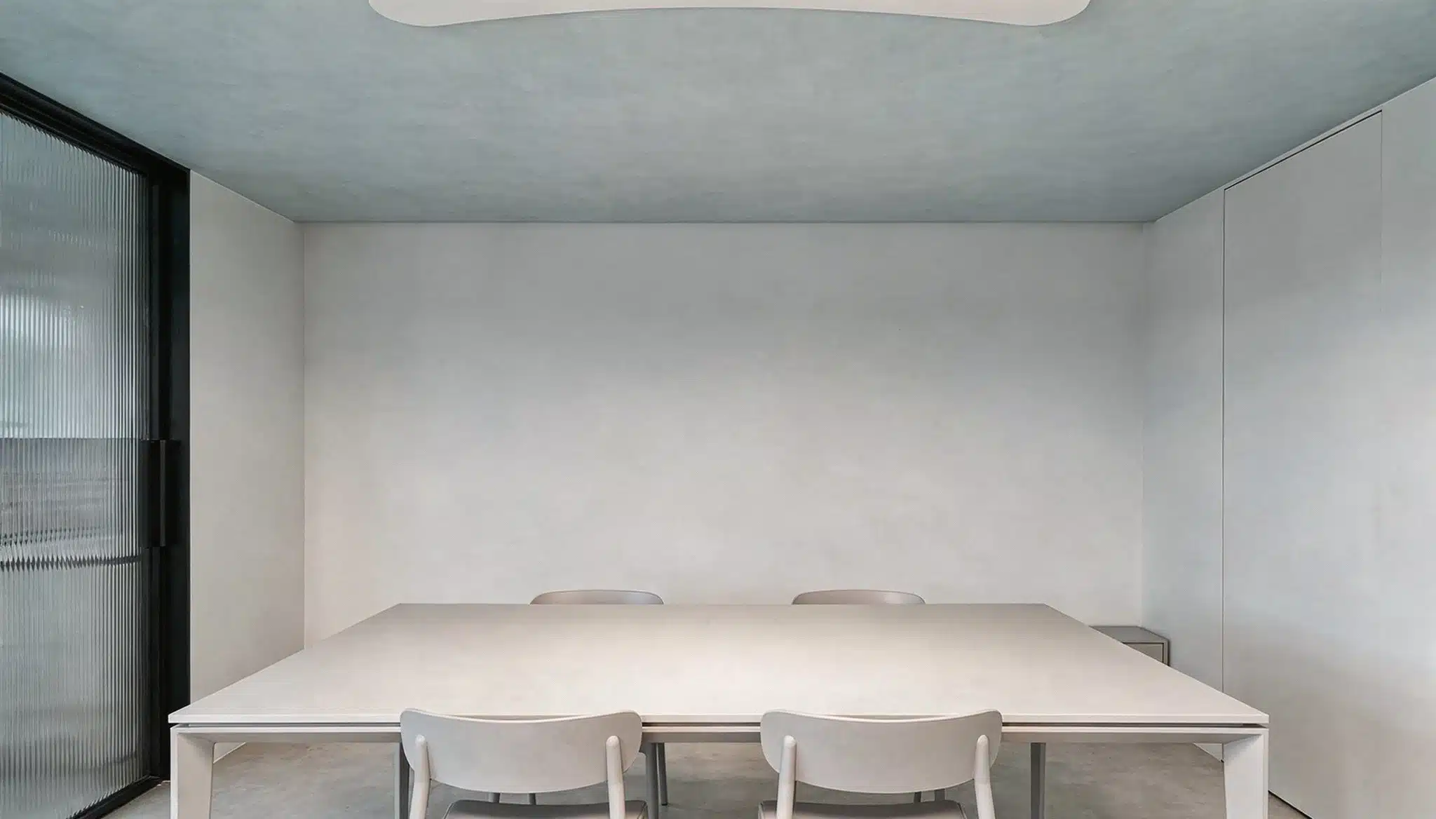
Light sky gray prevents the ceiling from disappearing while keeping the space feeling open and uncluttered.
It unifies kitchen, dining, and living zones in open plan layouts naturally.
Behr Silver Drop (790C-2) is a light sky gray ceiling color that gives kitchens and dining spaces a fresh, airy, and modern feel.
- Why It Works: Prevents the ceiling from disappearing while keeping the space feeling open
- Where It Fits: Unifies kitchen, dining, and living zones in open-plan layouts naturally
- What to Pair It With: White cabinetry, concrete countertops, matte black hardware, and warm timber
17. Buttery Yellow
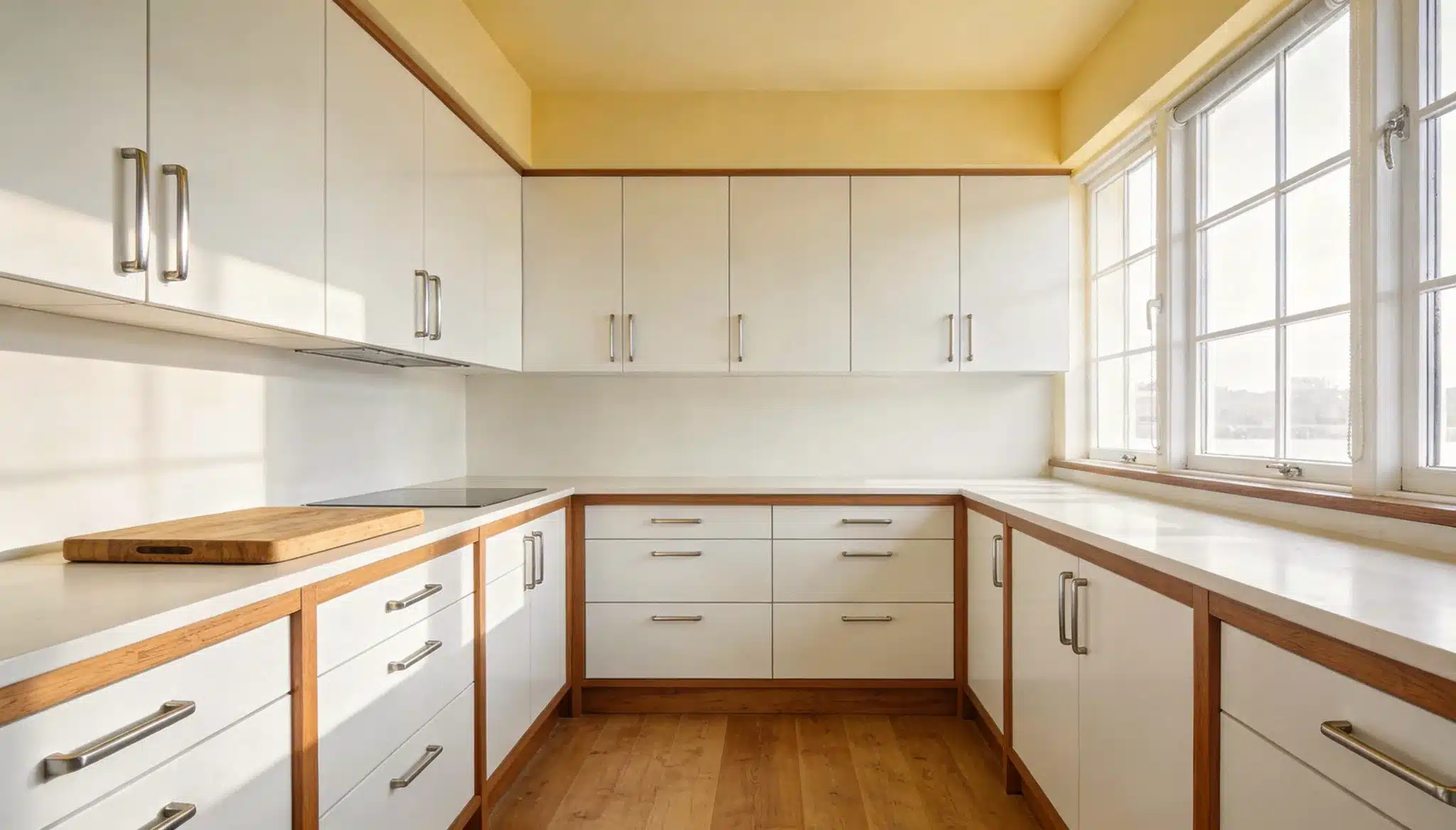
A very soft buttery yellow wraps the kitchen or dining ceiling in a homely way that no neutral shade can replicate.
The shade needs to sit closer to cream than yellow on the spectrum to work overhead without feeling overwhelming.
- Pairs naturally with white, warm wood, and sage green tones
- Works especially well in north-facing kitchens that lack direct sunlight
- Suits farmhouse, country, and transitional kitchen styles most naturally
If the shade looks noticeably yellow on the chip, go one tone lighter. Ceilings reflect color downward across the entire room, which means even a slightly saturated yellow overhead reads much stronger in person than it did on the sample card.
18. Soft Peach
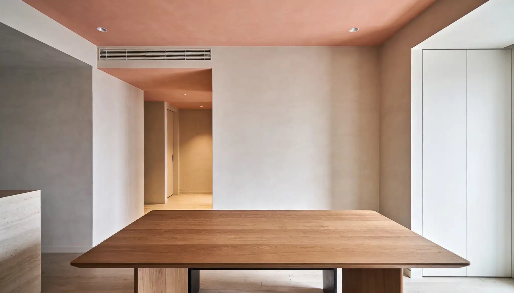
Soft peach adds a warmth that feels almost golden under evening lighting, making dining spaces feel more intimate and inviting.
It works best in north facing or artificially lit dining rooms that need warmth overhead.
Pair it with warm white, soft terracotta, or light caramel walls for the most natural result
19. Cool Beige
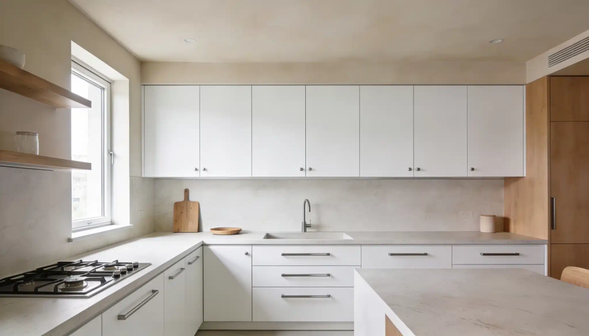
Cool beige is one of the most reliable ceiling colors for open-plan spaces.
Benjamin Moore Edgecomb Gray is a cool beige ceiling color that creates a soft, balanced, and versatile look in kitchens and multipurpose spaces
- Sits comfortably between warm and cool palettes without committing to either
- Works well with stone countertops, linen seating, and mixed metal finishes
- Suits open-plan layouts where multiple design styles need to coexist
Avoid matching the ceiling and walls in the exact same tone. It makes the room feel flat and unfinished.
Trending Ceiling Color Combinations Designers Love
The most talked about ceiling paint color trends right now go beyond choosing a single shade.
Designers are pairing colors with intention, creating combinations that add depth, structure, and personality to every room.
- Monochromatic Look: Walls and ceiling in the same color create a seamless, enveloping effect. This works best in rooms with strong architectural detail or layered lighting that prevents the space from feeling flat.
- Contrasting Ceilings: A ceiling noticeably darker or lighter than the walls adds instant depth and visual drama. The contrast needs to be intentional enough to read as a design choice rather than a mistake
- Two Tone With Trims or Beams: Architectural details in a contrasting tone frame the ceiling and add structural character.
- Accent Ceilings: A bold color applied only above a specific zone defines the space without touching a single wall.
Also read: Monochromatic Color Scheme Ideas for Every Room
Conclusion
A well-chosen ceiling color does not just complete a room; it transforms how the entire space feels to live in.
From soft neutrals that settle a bedroom to bold accents that anchor a living room, every shade carries intention.
Ceiling color is no longer something to default on.
The right shade overhead ties together everything else in the room in a way that wall color alone rarely achieves
Frequently Asked Questions
1. What is the Most Popular Modern Ceiling Paint Color Right Now?
Soft warm white, light greige, and muted sage green are among the most requested ceiling shades in contemporary interiors today.
2. Should a Ceiling Color Always Match the Walls?
Not necessarily, contrasting or tonal ceiling colors often create more depth and visual interest than a perfect wall match.
3. Does Ceiling Color Affect How Large a Room Feels?
Yes, lighter shades reflect more light and make a room feel taller and more open, while darker shades bring the ceiling visually closer.
4. What Finish Works Best for Ceiling Paint?
A matte finish is the most widely recommended for ceilings, as it evenly absorbs light and effectively conceals surface imperfections.
5. Can a Dark Ceiling Color Work in a Small Room?
Yes, when paired with lighter walls and layered lighting, a dark ceiling can add drama and depth without making the room feel cramped.