Paint colors shouldn’t stress you out. But you’ve repainted the same wall three times, and it still doesn’t feel right.
The right wall and trim color combinations can make a room feel pulled together, and the wrong ones will make you hate it.
Thousands of homeowners have transformed their spaces with just two paint colors. You can too. Keep reading to find out which combinations work best.
Let’s Start With Some Basic Color Terms
Before you pick a single paint chip, it helps to know a few basic color terms.
Don’t worry, this isn’t an art class. These are simple ideas that’ll make choosing your wall and trim colors much easier.
A. Primary Colors
Primary colors are red, yellow, and blue. You can’t mix other colors to make them; they stand on their own.
Every other color you see on a paint chart starts with these three. Think of them as the building blocks of your whole color palette.
B. Secondary Colors
Mix two primary colors together, and you get a secondary color. Red and blue make purple. Blue and yellow make green. Yellow and red make orange.
These six colors, three primary, three secondary, form the foundation of the basic color wheel.
C. Tertiary Colors
Tertiary colors sit between a primary and a secondary color on the wheel. Think red-orange, yellow-green, or blue-violet.
They give you more variety when picking wall and trim combos.
Most of the popular paint shades you see in stores are actually tertiary colors.
D. Color Property Terms
These terms describe how a color looks and feels. Once you know them, reading a paint label or talking to a designer gets a lot less confusing.
- Hue: The pure color itself, like red, blue, or yellow. No white, black, or gray mixed in.
- Saturation: How strong or muted a color looks. High saturation means vivid. Low means washed out.
- Value: How light or dark a color is on a scale from white to black.
- Shade: What you get when black is added to a pure color. It makes the color deeper and darker.
- Tint: The opposite of shade. Add white to a color, and you get a tint, softer and lighter.
- Tone: Add gray to a color, and you get a tone. Most real-world paint colors are tones, not pure hues.
- Temperature: Reds, oranges, and yellows feel warm. Blues, greens, and purples feel cool. This affects how a room feels.
- Contrast: The difference in value or color between two surfaces, like your wall and your trim.
Wall and Trim Color Combinations
The right wall and trim color combination can completely change how a room feels. Some pairings feel warm and cozy, while others feel sharp and modern.
The following are popular combinations that work well in most homes.
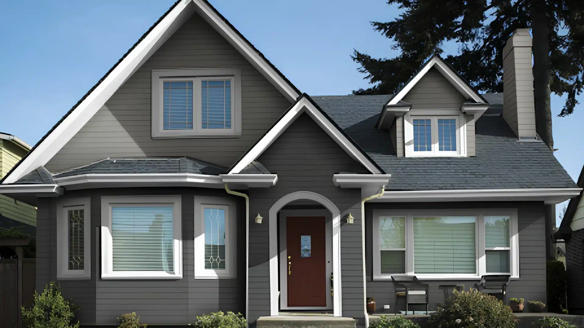
1. Grey Walls and White Trim
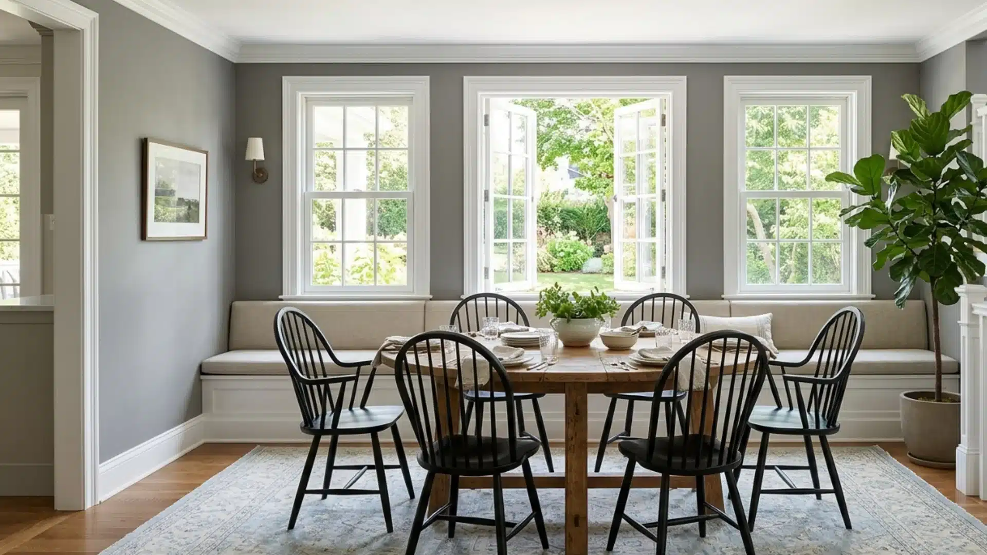
Grey walls with white trim are a classic. The white trim creates a clean border that makes the grey pop without overwhelming the space.
It works in almost any room, from kitchens to bedrooms.
The key is picking the right shade of grey. Cooler greys pair best with bright whites, while warmer greys work better with off-white or cream trim.
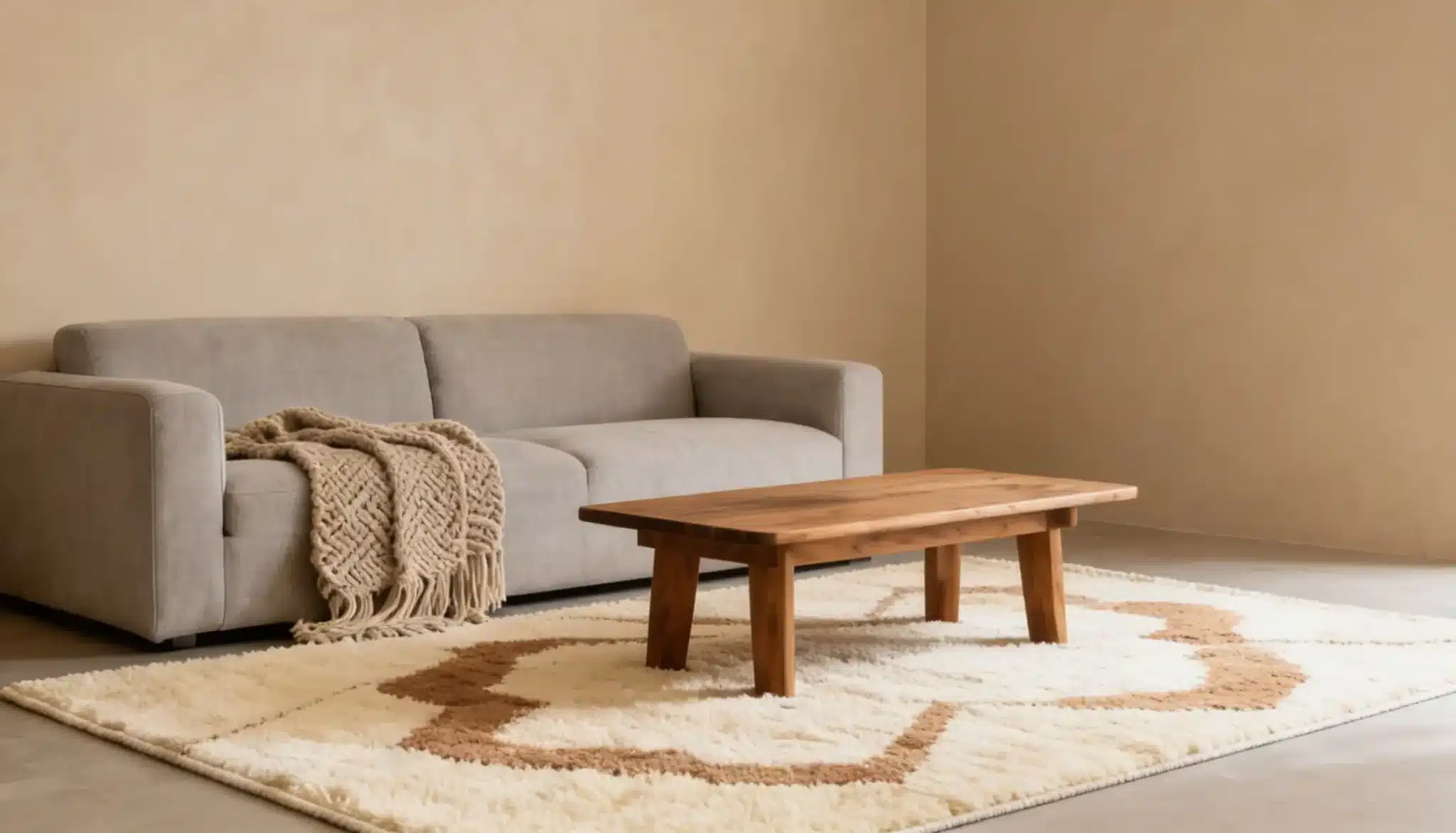
2. White Walls and Beige Trim
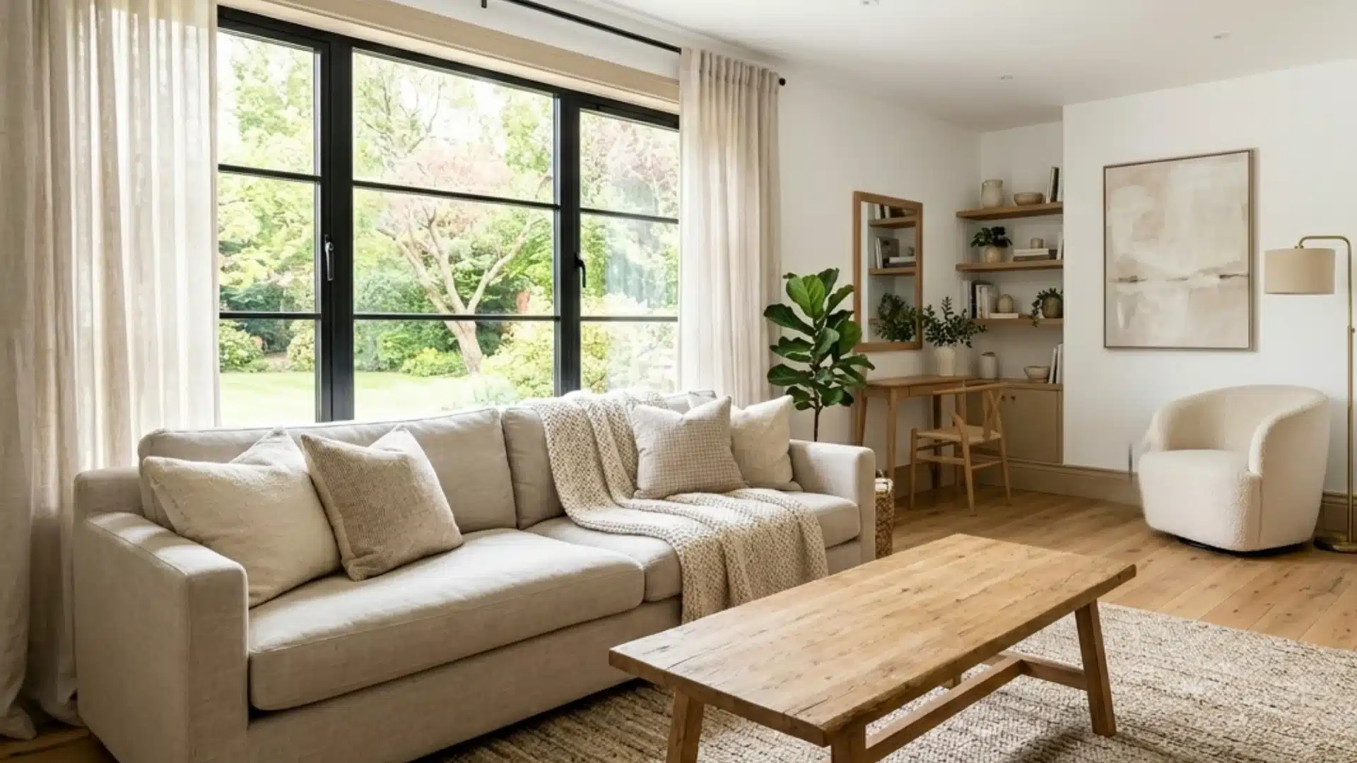
The white walls keep the room feeling open and bright, while the beige trim adds warmth to stop it from feeling cold.
It works especially well in living rooms and bedrooms. If your home gets a lot of natural light, this combo will look absolutely beautiful throughout the day.
A lot of people default to bright white trim with white walls, and end up with a flat, one-dimensional look. Swapping that trim to beige adds contrast without making the room feel busy.
3. Two-Tone Walls and Trim
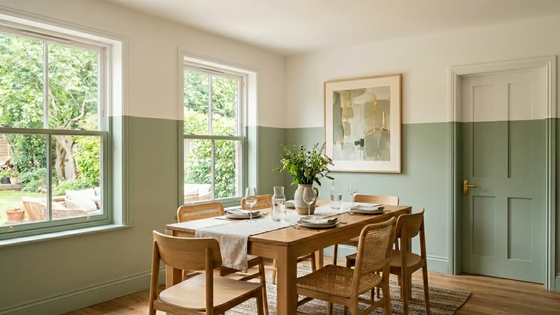
Two-tone walls split the wall into two colors, usually with the darker shade on the bottom and the lighter shade on top.
The trim ties both halves together and gives the room a sense of structure. A chair rail molding between the two colors makes the transition look clean and purposeful.
This works well in dining rooms, hallways, and staircases where you don’t want to add designed furniture or artwork.
4. White Walls and Coloured Trim
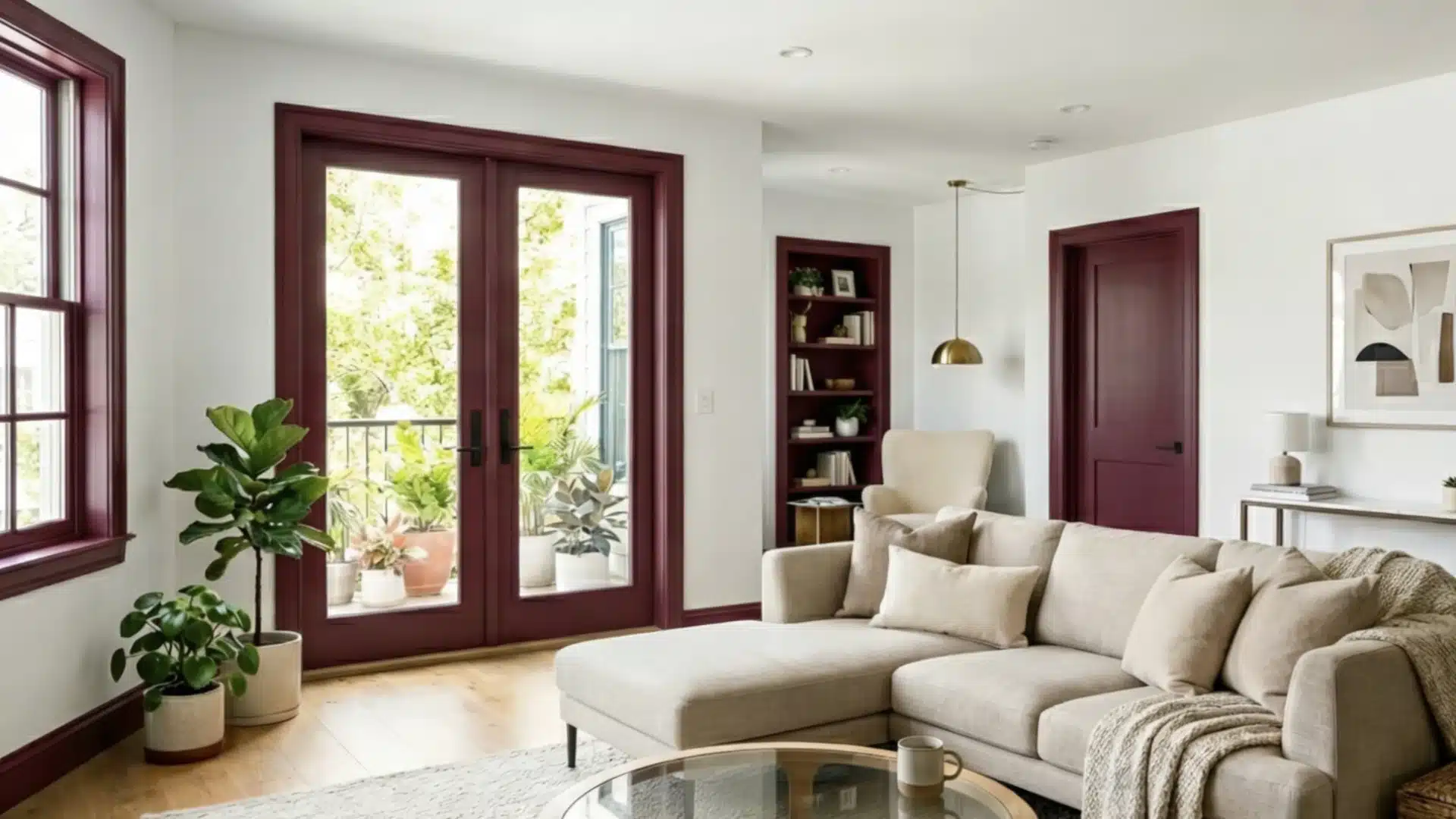
Keeping the walls white gives you a clean backdrop, and the colored trim becomes the statement. Deep blue, forest green, or even a rich burgundy all work well.
The trick is to keep the trim color consistent throughout the room so it feels intentional and not random.
If you’re trying this for the first time, start with a smaller room like a bathroom or a hallway. It’s a lower-risk way to test a bold trim color before committing to a larger space.
5. Colorful Walls and Black Trim
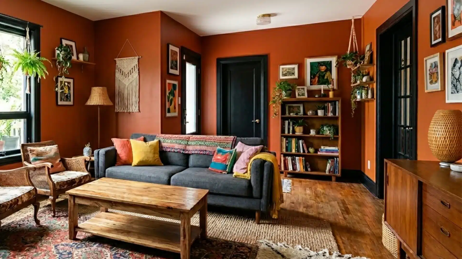
Black colored trim with colorful walls is one of those combinations that just works, no matter what color you choose for the walls.
The black trim acts like a frame, grounding the boldness of the wall color and giving the room a finished look.
Deep teal, mustard yellow, or terracotta all look sharp against black trim.
Just make sure your wall color has enough depth; pale or washed-out shades tend to lose their impact next to black.
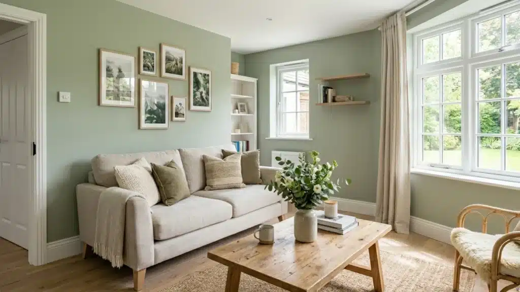
6. Pink Walls and Green Trim
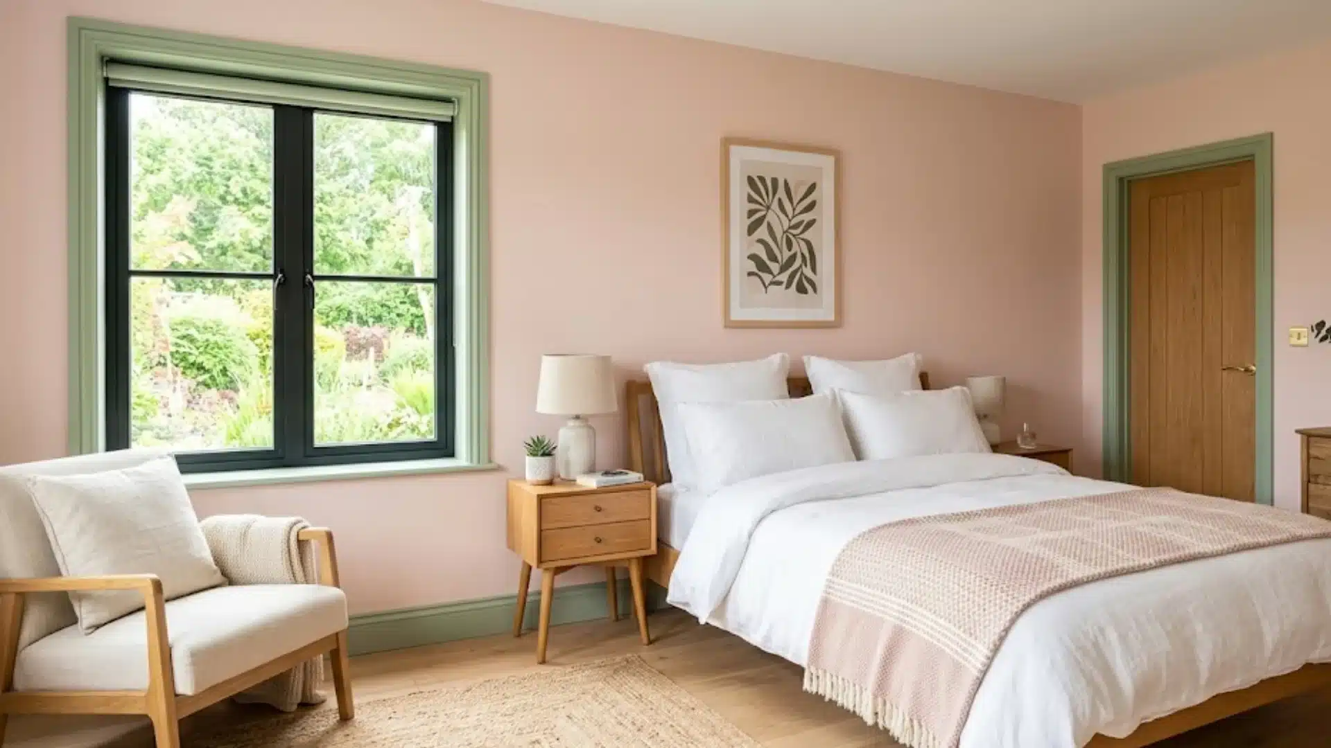
This combination sounds weird, but pink and green are actually opposite each other on the color wheel, which means they naturally complement each other.
A dusty blush-pink wall with a muted sage-green trim feels soft, modern, and very livable. It works particularly well in bedrooms and reading nooks.
Avoid pairing bright bubblegum pink with lime green; it can feel overwhelming fast. Stick to muted and earthy versions.
7. Blue Walls and Yellow Trim
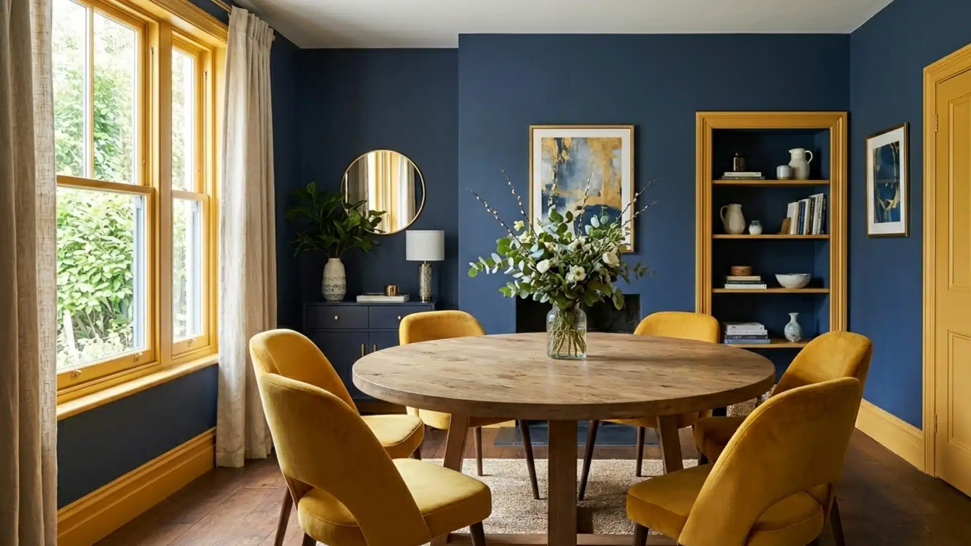
Blue and yellow are another classic color wheel pairing that brings energy and warmth into a space.
Deep navy or slate blue walls with a warm golden yellow trim feel rich and layered. Lighter sky-blue walls with a soft butter-yellow trim give a fresher, more casual feel.
Either way, the contrast between the cool wall and warm trim makes the room beautiful without feeling chaotic.
8. Pink Walls and Blue Trim
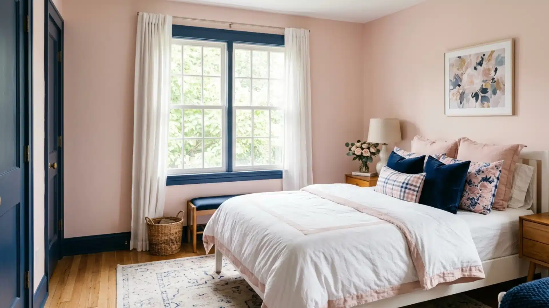
Pink walls with blue trim flip the previous combination, and it hits differently.
The pink takes center stage as the warm, dominant wall color, while the blue trim adds a cool, grounding contrast.
A soft blush-pink wall with a muted steel-blue trim feels calm and modern. It works beautifully in bedrooms, nurseries, and even a stylish powder room.
If your pink is warm and deep, keep the blue trim on the cooler and lighter side. Matching two strong versions of both colors at the same time makes the room feel like it can’t decide what it wants to be.
9. White Walls and Blue Trim
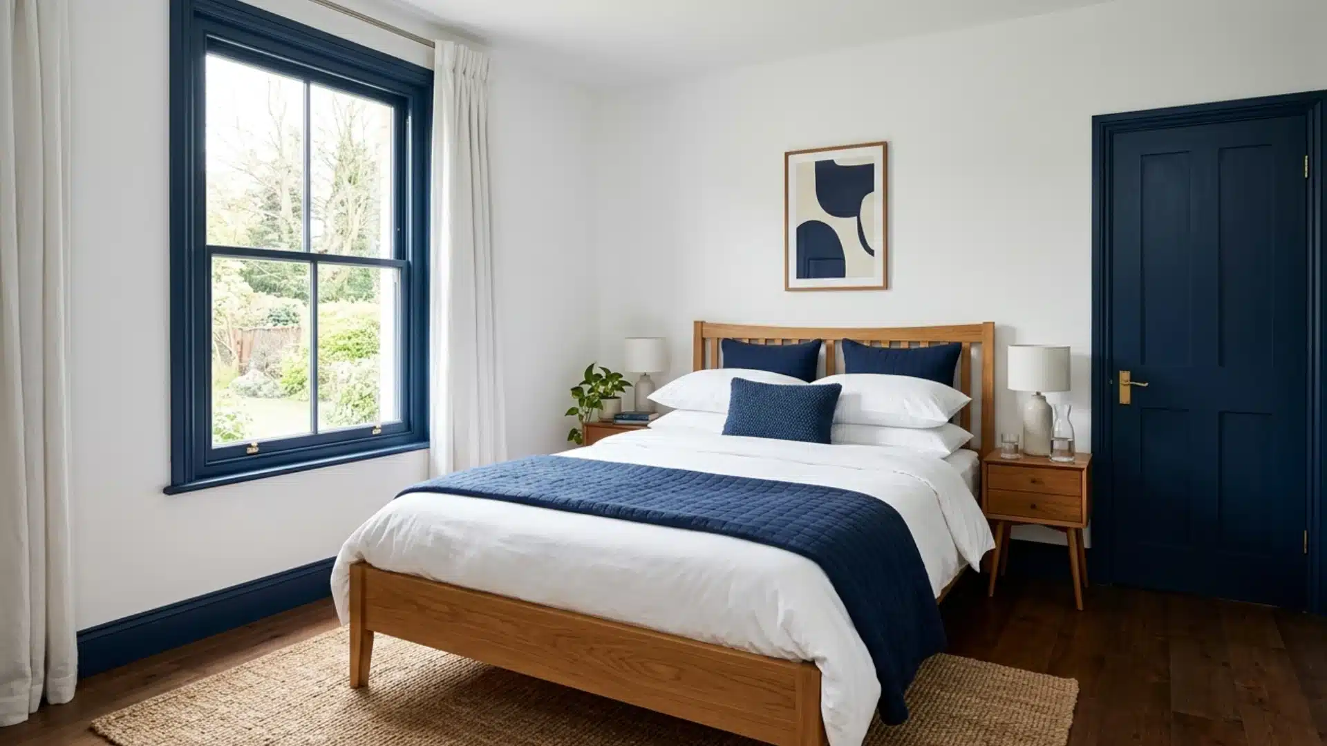
White walls with blue trim are fresh, cheerful, and timeless. It works especially well in coastal-style homes, kids’ rooms, and kitchens.
A bright cobalt or navy trim against white walls feels graphic and confident. A softer powder blue trim gives a more relaxed, airy feel.
Either way, the white walls let the blue trim do all the talking without competing for attention.
This combination works best when you carry the blue trim color into at least one other element in the room, a cushion, a vase, or a rug.
10. Dark Walls and Colorful Trim
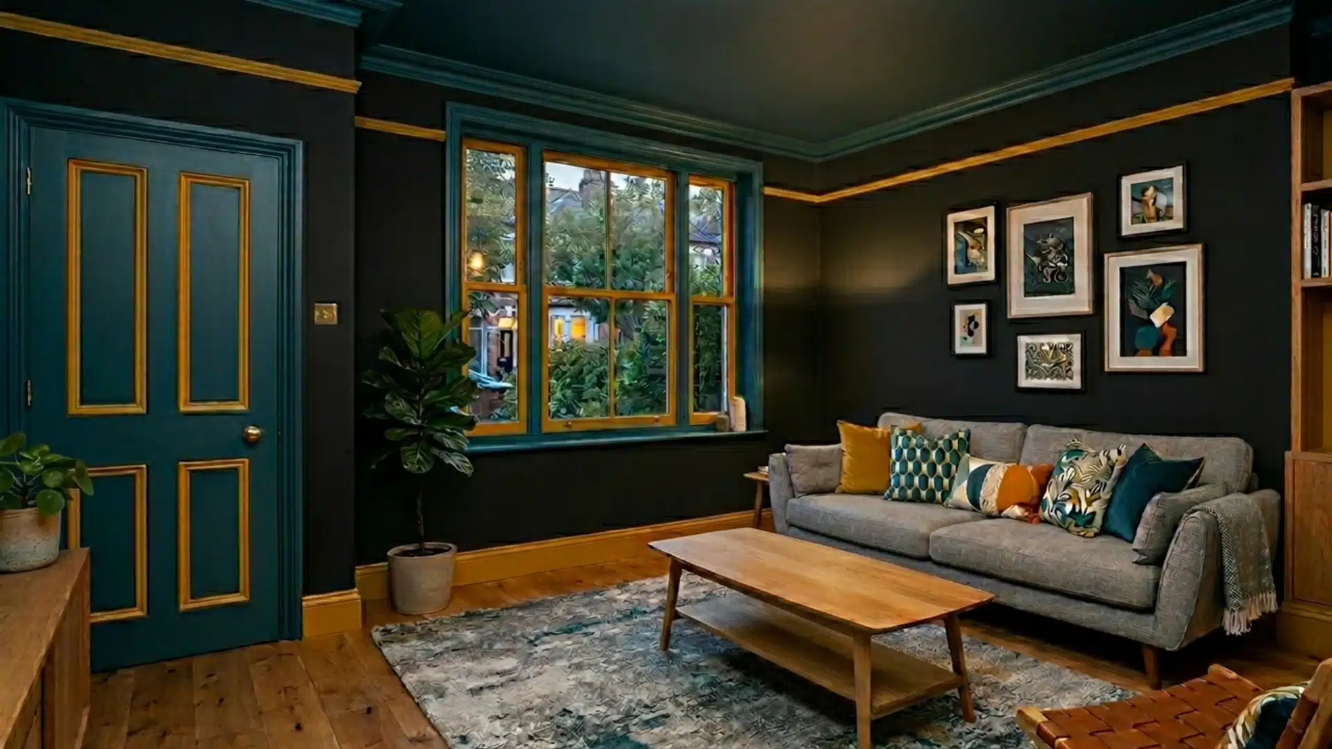
The dark wall creates a moody backdrop, and the colorful trim pops against it with surprising energy.
Burnt orange, mustard yellow, or even a dusty rose all work well here. This combination suits spaces where you want to make a real impression, a home office, a dining room, or an entryway.
When going dark on the walls, don’t play it safe with white trim; a colorful trim adds more depth in the room.
Color Combinations that Will Give You Nightmares
Not every color pairing belongs on your walls.
Some combinations that look interesting on paper can feel jarring, exhausting, or just plain wrong once they’re in a room.
Neon Walls, White Trim
Neon colors on walls, think electric green, hot pink, or bright orange, are too intense for a living space.
White trim does nothing to soften them. Instead, it amplifies the harshness. The combination feels more like a fast-food restaurant than a home.
If you love bold color, go for a deeply saturated version instead of a true neon. It gives you the same energy with far less visual strain.
Yellow Walls, Orange Trim
Yellow and orange sit right next to each other on the color wheel.
That sounds like it should work, but in practice, both colors compete for warmth at the same time. The result feels loud, cluttered, and visually tiring.
There’s no contrast, no balance, and no clear focal point in the room.
Red Walls, Green Trim
Red and green are complementary colors, so in theory they should work together. But at full saturation on walls and trim, they read as a Christmas decoration, not a design choice
It’s hard for anyone who walks into that room to see past the holiday association.
If you love both colors, try a deep burgundy wall with a muted sage green trim instead. The toned-down versions of both colors feel sophisticated rather than festive.
Dark Walls, Dark Trim in the Same Color
Painting your walls and trim the exact same dark color with the same finish removes all definition from the room.
Doors, windows, and moldings disappear into the walls.
The room starts to feel shapeless and heavy, especially in smaller spaces with limited natural light.
Bright Purple Walls, Brown Trim
This combination feels unfinished rather than bold. Bright purple is cool-toned and vivid.
Brown is warm and earthy. The two don’t meet in the middle; they just clash.
The brown trim ends up looking muddy against the purple, and neither color gets a chance to shine.
If you want purple walls, pair them with a crisp white or a soft gray trim. It lets the purple breathe instead of dragging it down.
Beige Walls, Off-White Trim
This one doesn’t clash; it just does nothing.
Beige walls and off-white trim are so close in tone that the trim practically disappears. You lose all the definition that trim is supposed to give a room.
The whole space ends up feeling flat, unfinished, and a little dated.
Multiple Bold Colors on Walls and Trim Together
Mixing several bold, unrelated colors across your walls and trim at the same time creates visual chaos.
Without a clear color story connecting them, the room feels accidental rather than styled. Each color fights for attention, and none of them wins.
One bold color at a time is more than enough.
To Wrap Up
You’ve just walked through wall and trim color combinations, from safe classics to bold, unexpected pairings.
Pick one combination that felt right to you while reading this. Grab a sample pot and test it. Live with it for a few days before committing.
Still unsure? Drop your room details in the comments. We’re happy to help you figure out where to start.
People May Ask
1. What Color is Replacing Gray in 2026?
Warm, earthy browns and soft beiges are taking over from gray. They bring warmth and comfort that cool grays simply couldn’t.
2. Is It a Trend to Paint Walls and Trim the Same Color?
Yes, it is. Painting walls and trim the same color creates a clean, modern look that feels intentional and quietly sophisticated.
3. What Colors Make a House Look Expensive?
Deep navy, warm white, soft sage, and charcoal all read as expensive. Paired with the right trim, they feel polished and considered.