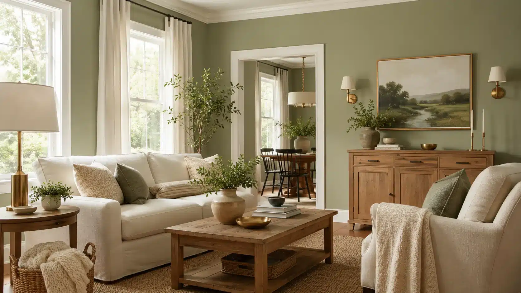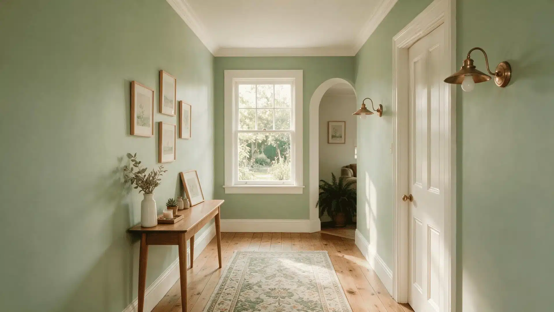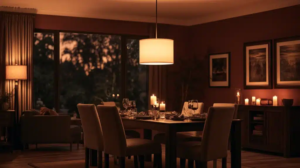
The situation with a dining room is that it’s generally in use for two or three hours each day, almost always with the lights on and almost always in the evening.
This makes a difference to the calculations. The color for a living room has to cope with all-day sunlight, whereas the color for a dining room mainly has to endure candlelight, pendant lighting, and a table full of people looking at one another.
This is the reason why the best dining room colors tend to be warmer and more intimate than those you’d choose for a sunroom.
Deep colors become cozier under warm bulbs, while light, cool colors can end up being flat and a bit institutional after the sun has set.
So, before selecting any color, consider when you actually use the room, not just what looks good on a paint chip viewed under fluorescent shop lighting.
Below are twenty-plus of the best dining room colors we’d actually put on a wall, plus the undertone and lighting traps that ruin a good color before it’s even dry.
Warm Neutrals Dining Room Paint Colors That Never Feel Boring
1. Warm Greige
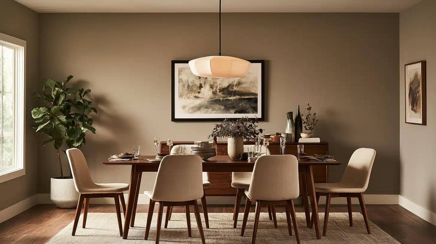
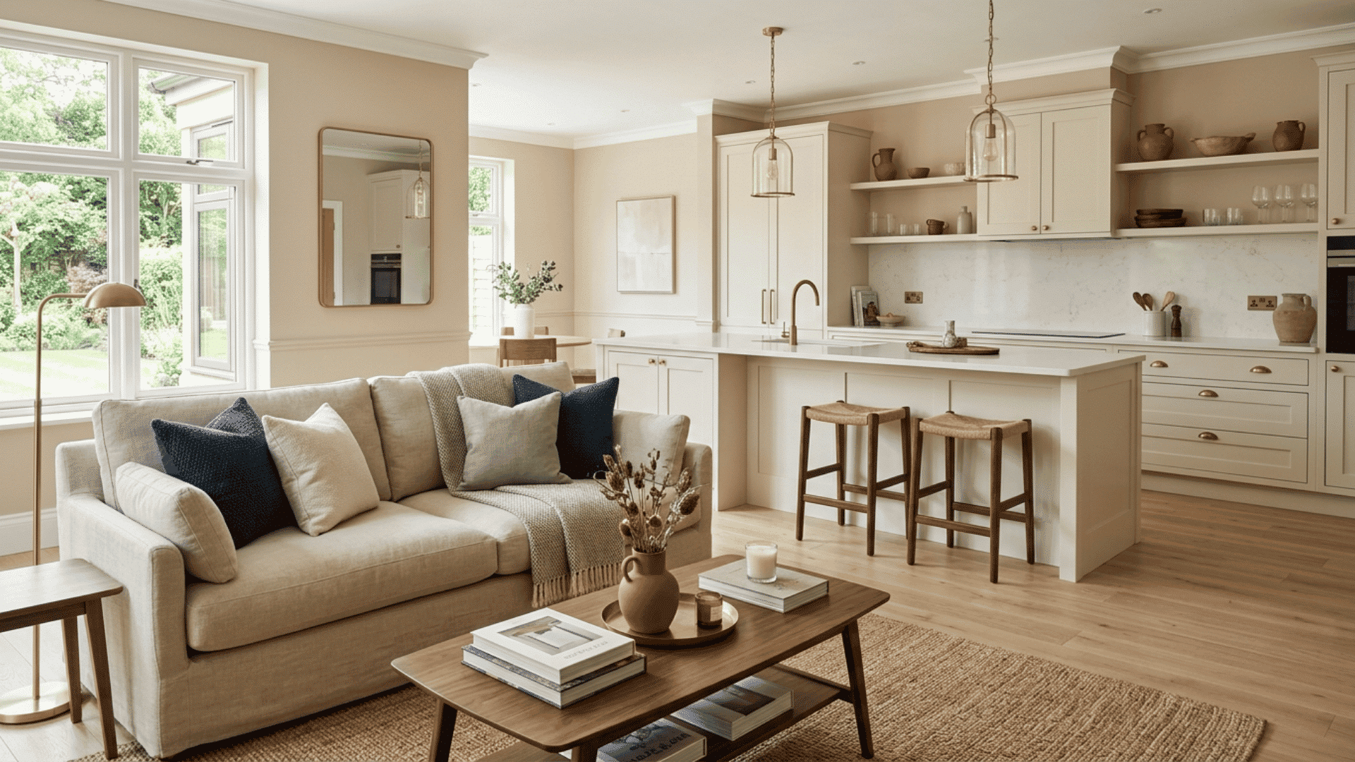
A grey color having a pink or brown tinge (not a blue-grey one) appears warm when viewed under any type of bulb and goes with almost any of the wood tones you have.
It is the most safe of the safe options, and that is entirely acceptable.
2. Soft Limestone
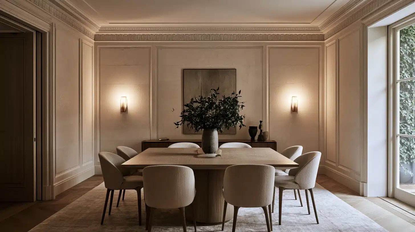
Farrow & Ball leans on stone-based neutrals for exactly this reason; they’ve noted that a warm, limestone-toned wall gives Victorian-style rooms a classic backdrop for wood furniture, and it holds up in both traditional and modern dining spaces.
3. Manchester Tan
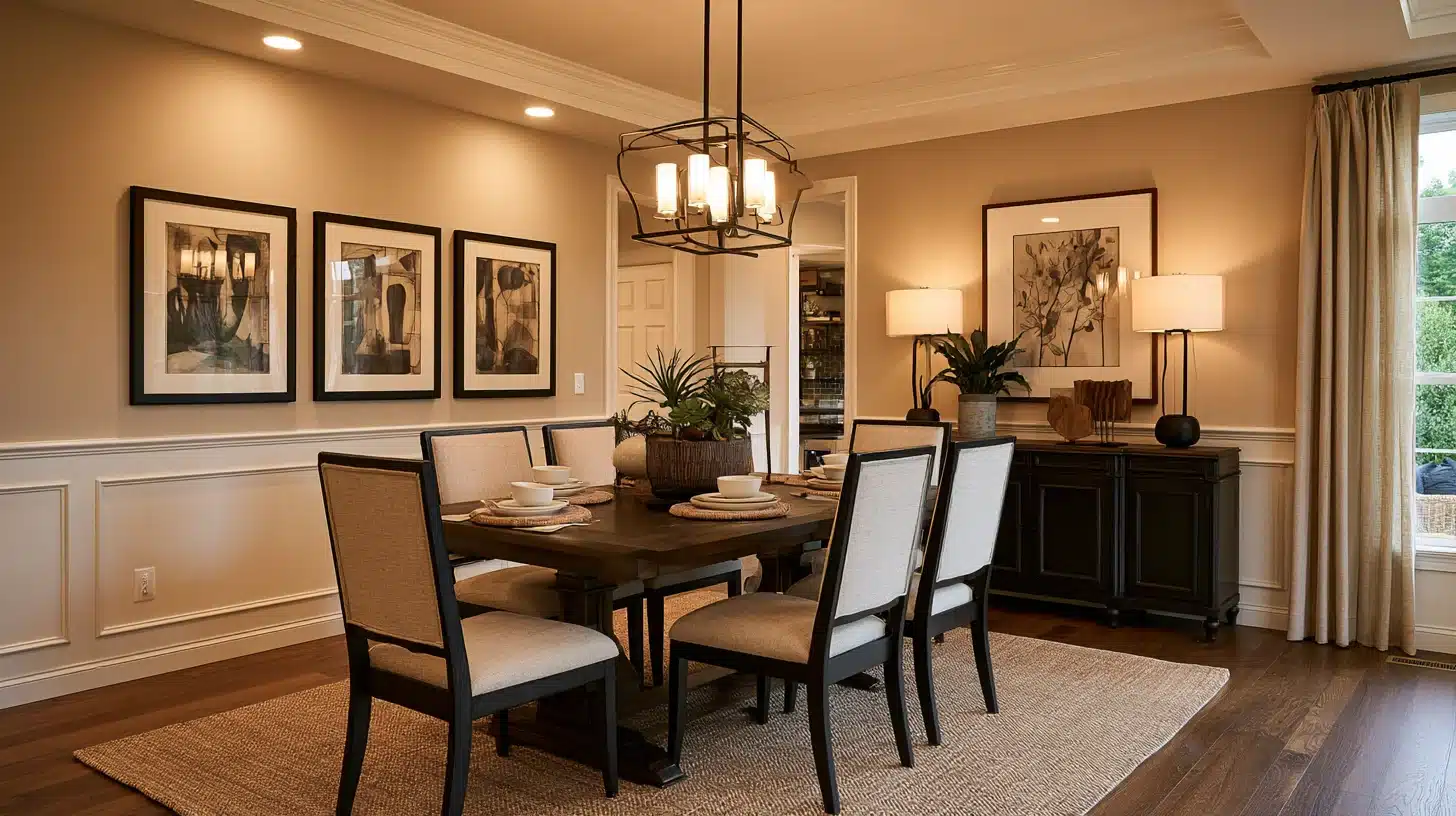
If you are looking for a neutral color that is a bit deeper and more cosy than ordinary builder’s beige, Manchester Tan from Benjamin Moore carries out this role well.
It appears warm without ever moving into the ‘orange’ range.
4. Creamy White
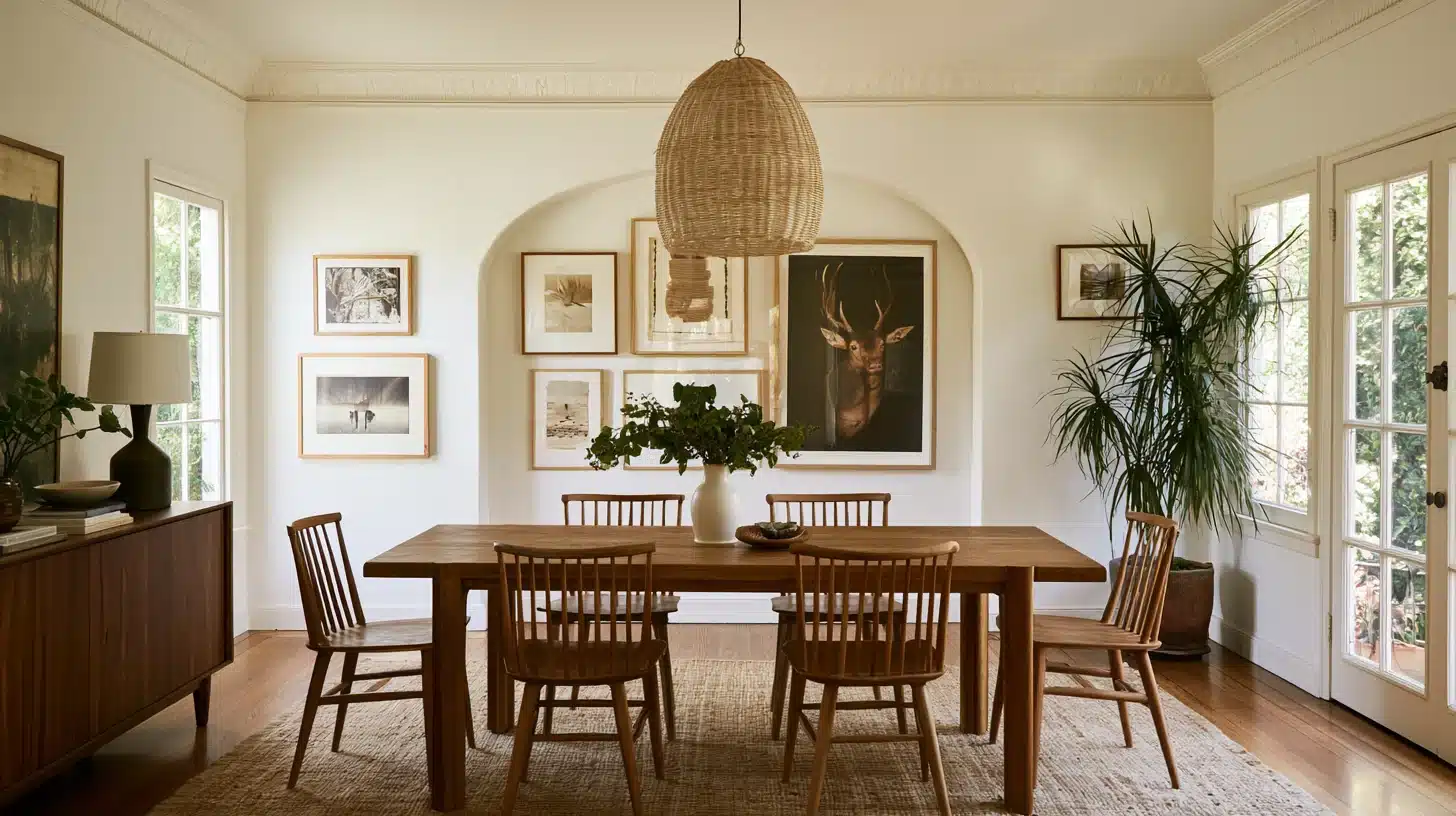
Not stark white, is a type of white that has a slight hint of yellow or gray warmth.
it prevents a small dining room from seeming enclosed while at the same time providing a clean background for paintings and a statement light fixture.
5. Toasted Almond
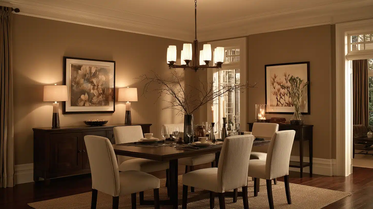
This color is a light brown-beige and is more akin to a cashmere sweater than to builder beige.
It’s a suitable choice when your dining table is already dark wood and you don’t want the walls to compete with it.
Moody, Layered Paint Colors for Drama at Dinner
6. Deep Charcoal
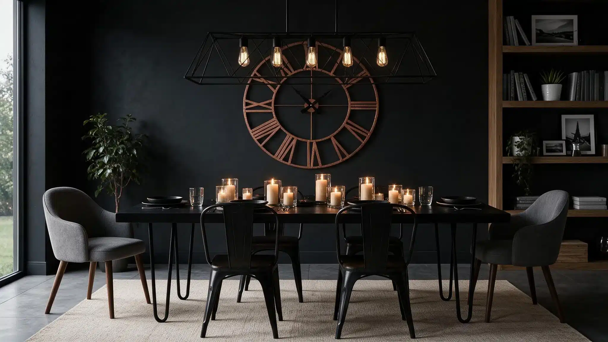
Charcoal gray has consistently ranked as one of the top-performing paint colors for resale in living spaces, according to Zillow’s ongoing paint color research.
The same cocooning effect works even harder in a room lit mostly by candles and pendants.
7. Inkwell Navy
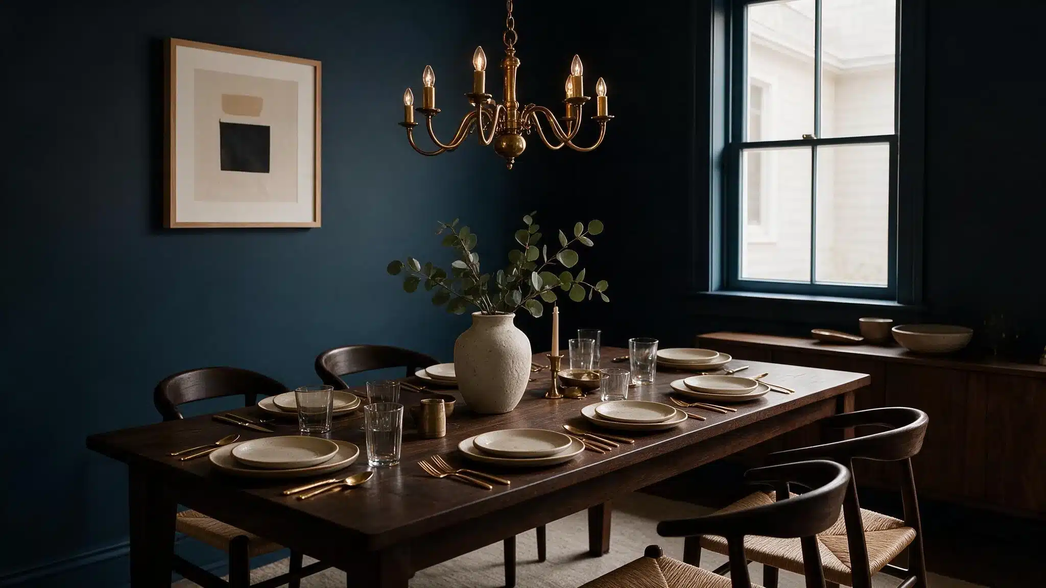
Inkwell by Sherwin-Williams is about as close to black as blue gets, and in a dining room it makes brass fixtures and gold-rimmed dishware look genuinely expensive.
We’ve covered this one in full elsewhere, including how its navy undertones behave under different lighting — see our complete Inkwell color analysis.
8. Bronze Red
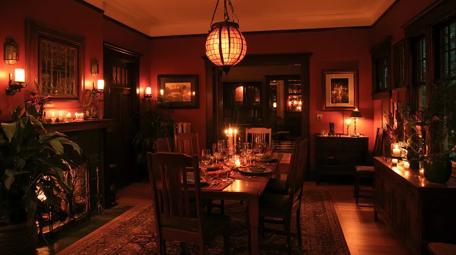
A deep, almost brick-toned red. Little Greene uses this exact approach in their dining room work; full color drench on all four walls.
Sometimes carrying the shade up onto the ceiling for a cocooned, intimate feeling once the sun goes down.
This full-wall-and-ceiling approach is what’s known as color drenching, and it’s one of the biggest dining room trends going into 2026.
9. Aubergine
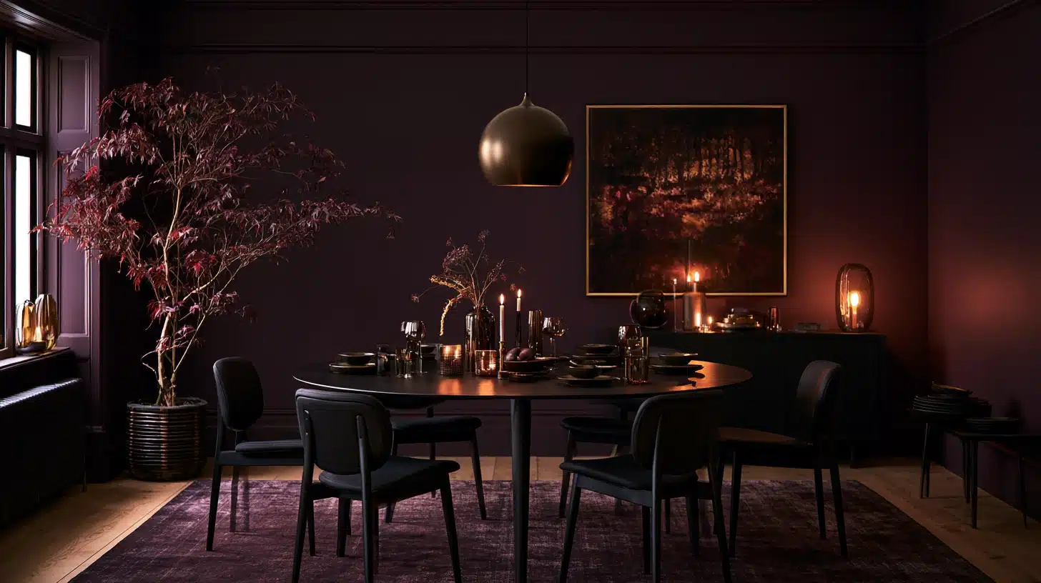
Dark purple sounds risky, looks more like a shadow than a color when seen under lamplight – and that is precisely the reason it photographs so well in pictures taken at evening dinner parties.
10. Chocolate Brown
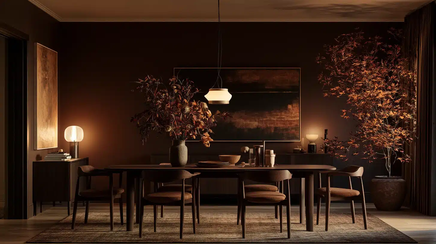
Not an espresso color typical of the 1990s; it’s a warmer one.
It tolerates scuffed chair backs and makes a simple wooden table appear purposeful rather than out of place.
Dining Room Paint Colors – Greens and Blues
11. Sage Green
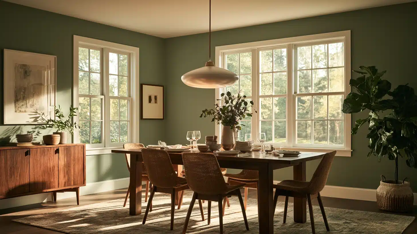
Sage is one of the rare colors which appears calm in a room with north-facing windows and gives a sense of being firmly rooted in a room with south-facing windows.
It’s easy to recommend to someone who is nervous about deciding on a color for the first time.
12. Olive Green
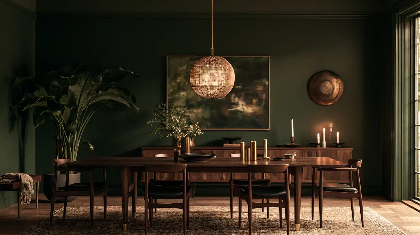
Deeper and earthier than sage, olive has quietly become one of the most in-demand paint colors in the country right now; Sherwin-Williams’ color team has pointed to it repeatedly as a top pick for spaces where people gather.
13. Teal
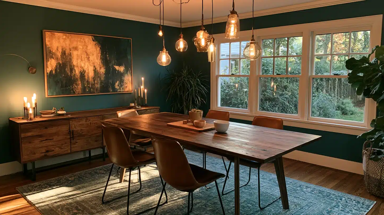
Somewhere between blue and green, is particularly suitable for dining rooms that have afternoon sunlight because the warm light prevents it from appearing cold or clinical.
14. Classic Navy
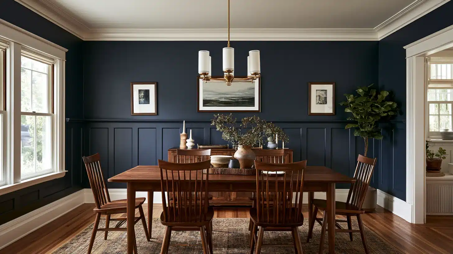
Navy has real staying power because it acts like a neutral once the room is styled; it plays just as well with brass as it does with black iron chairs.
Related Read: Inkwell Sherwin Williams Complete Paint Review
15. Escape Gray
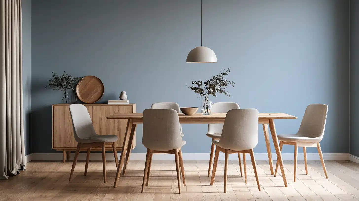
A cooler option for people who want blue-gray calm without full commitment to a saturated color. Escape Gray by Sherwin-Williams is soft enough to still feel neutral in a mixed-use space.
Bold Colors for People Who Are Done Playing It Safe
16. Terracotta
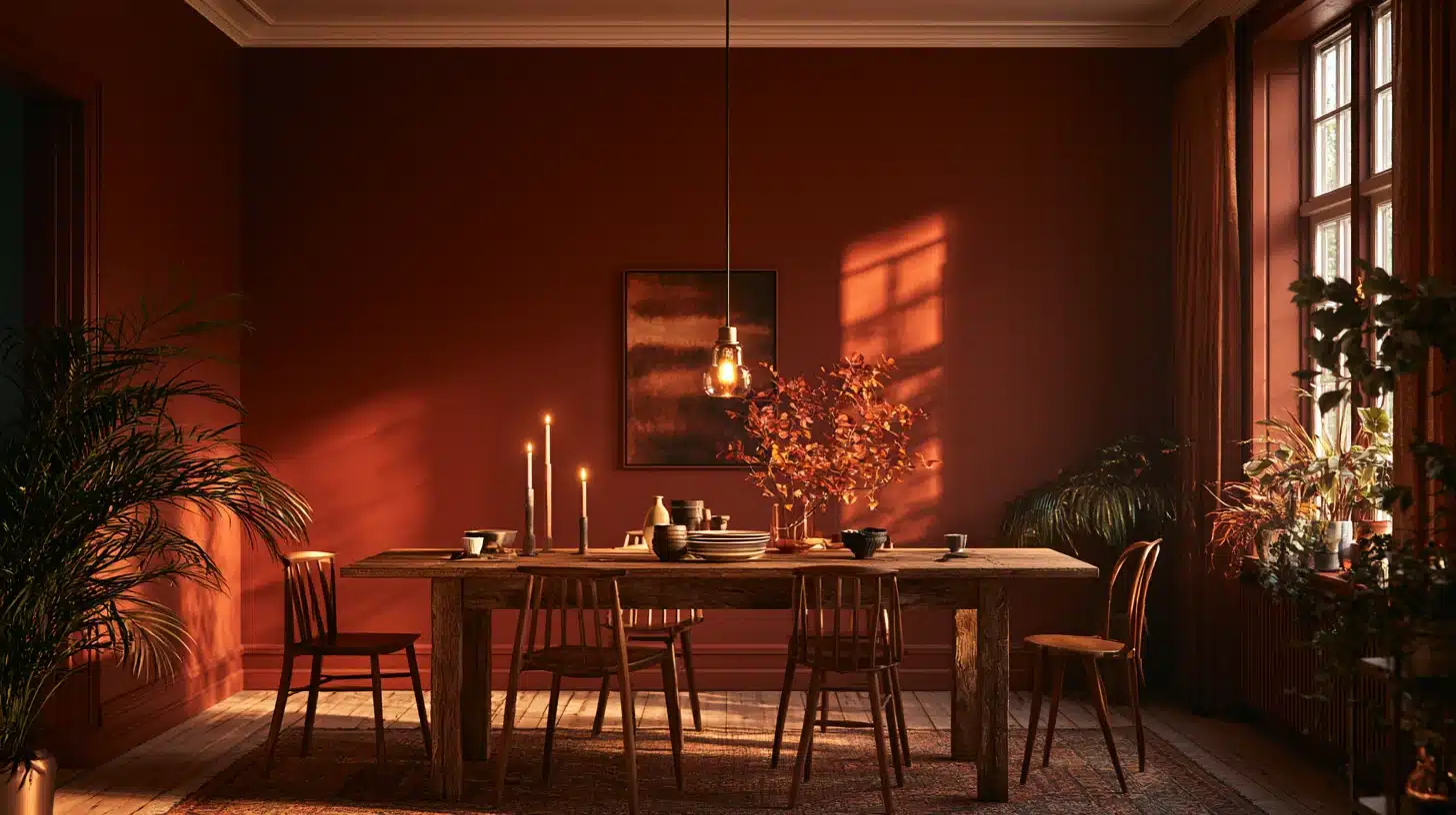
warm, baked by the sun, and right away gives a cozy feeling; it is one of the very few bold colours which still appears neutral when you include wood furniture and plants.
17. Mustard Yellow
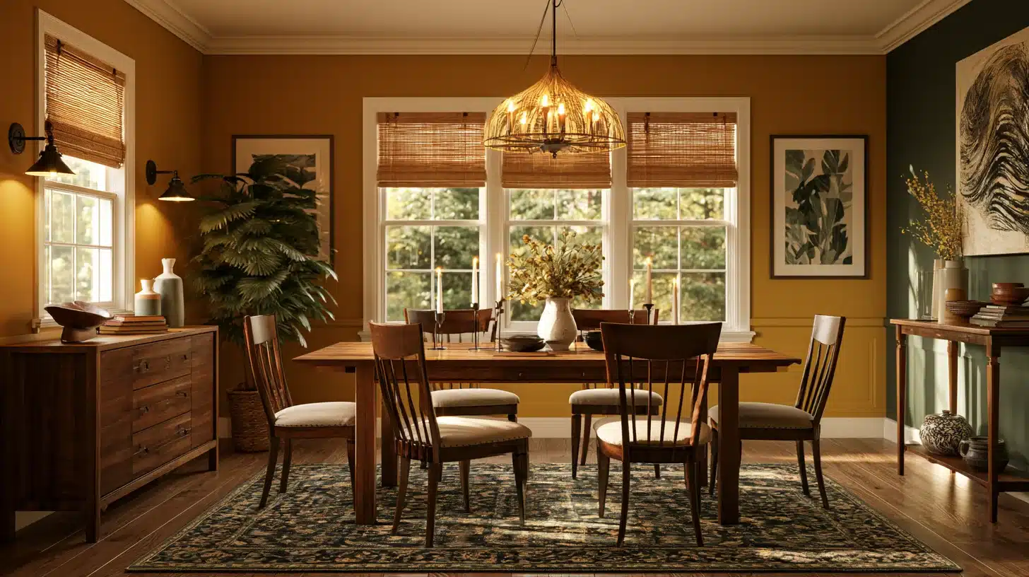
A deep, golden mustard not a bright lemon; it photographs very well in evening light and gives a dining room a real character without seeming like a child’s playroom.
18. Dusty Rose
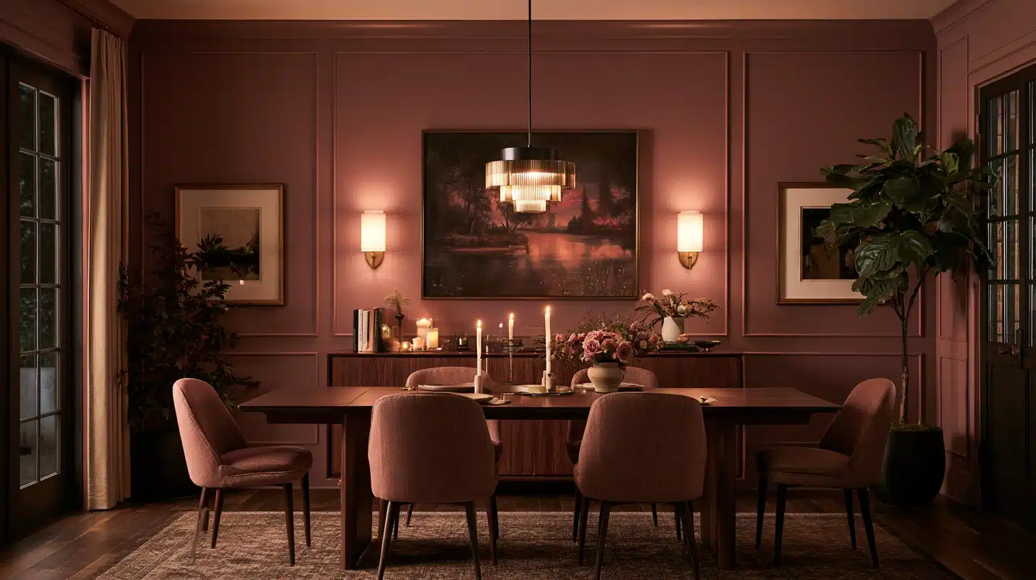
Soft, only a little dusty, and not at all bubblegum pink, it’s an unexpectedly sophisticated choice for a room that’s used as a dining room in the evening and as a sitting area by day.
19. Burnt Orange
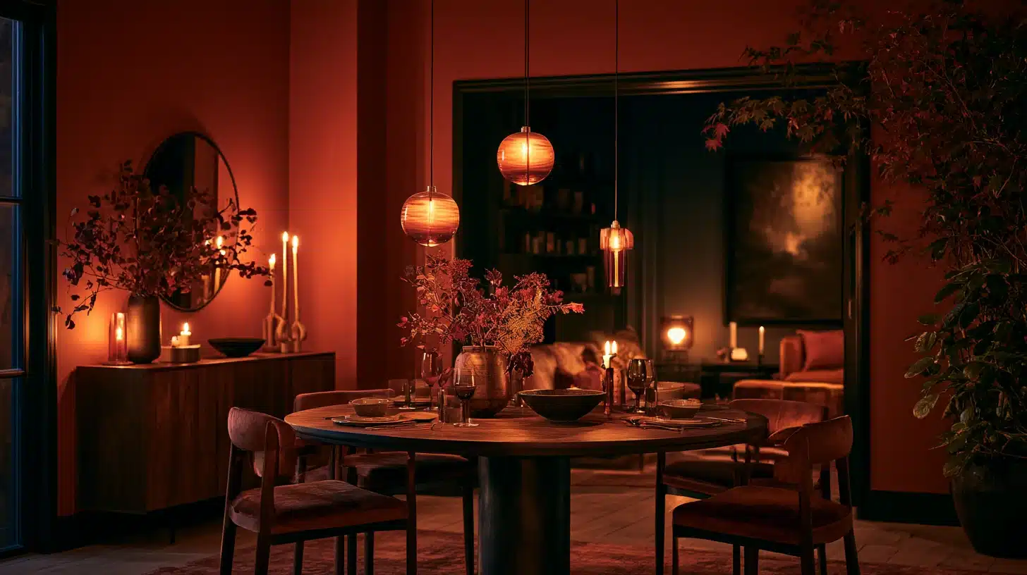
Rich rather than neon.
It’s the color equivalent of a good glass of wine; warm, a little indulgent, and best appreciated after dark.
20. Deep Plum
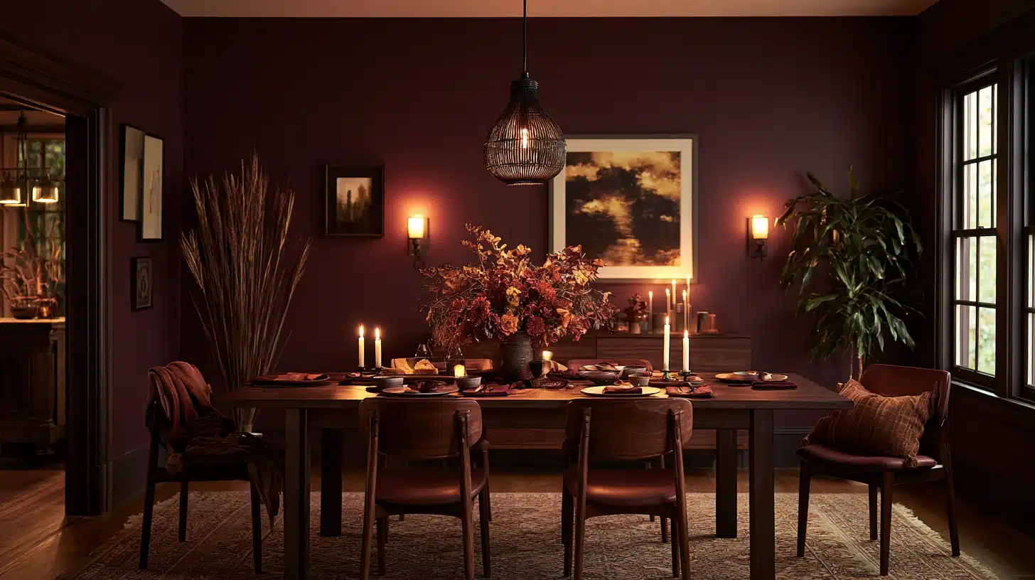
Somewhere between wine and eggplant. This is one to sample first, since plum shifts dramatically between daylight and lamp light.
Two More Rich Dining Room Paint Colors
21. Lavender-Mauve
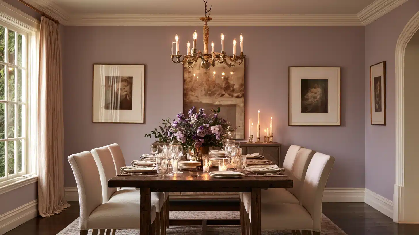
This case is given a real figure: according to Consumer Reports, who cited Zillow’s study on the value of homes and paint, dining rooms painted lavender, mauve, or eggplant sold on average for $1,122 more than dining rooms painted in different colors.
That amount is by no means insignificant for a tin of paint.
22. Warm Off-White
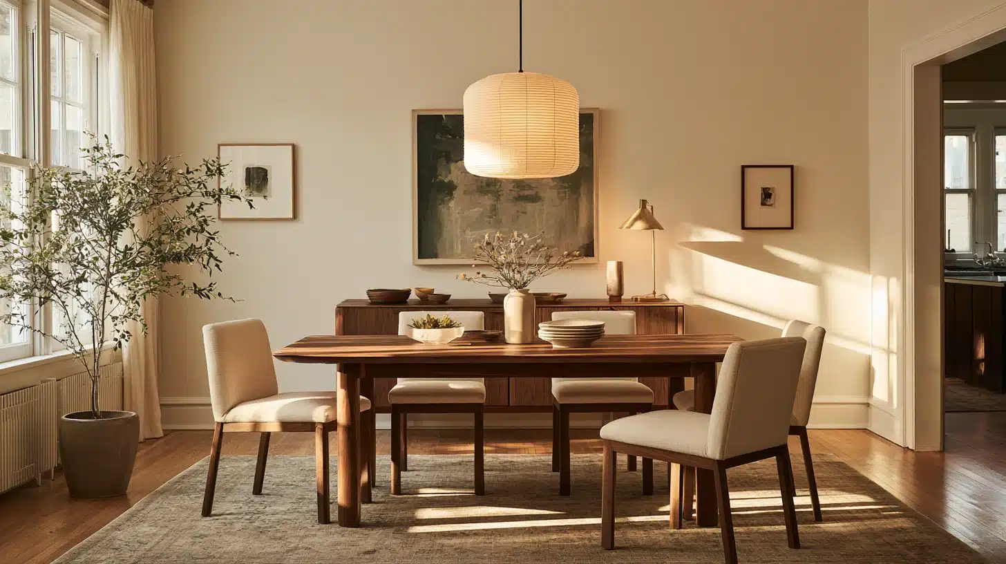
Simple, but worth including because it’s the one color on this list that plays nicely no matter what you end up doing with the trim, chair rail, or wallpaper later.
What Paint Sheen Actually Makes Sense for a Dining Room?
Dining rooms aren’t high-traffic the way a hallway or kid’s bathroom is, so you have more freedom here than you’d think.
Eggshell and satin are the most common choices because they hide small wall imperfections while still wiping clean if a glass of red wine goes sideways.
Flat can work too, since dining room walls don’t get touched constantly; just know it’s harder to spot-clean. If your dining room shares space with a kitchen, lean toward satin for the extra durability.
And if you’re deciding whether to run that same color up onto the trim and ceiling for a fully immersive look, that decision deserves its own conversation before you commit a whole gallon to it.
The One Step That Saves Every Repaint From Becoming a Redo
Get the sample pot every single time.
Paint two coats onto a piece of poster board, not directly on the wall; and then move it around the room during the course of a full day and into the evening.
In order for the walls to appear genuinely finished rather than just painted, the preparation and application are just as important as the colour and finish you end up with.
Wrapping It Up
The dining room is only used for a few hours each day, which is the very reason it can have the bolder of all the rooms.
Regardless of whether you choose a sombre charcoal, a warm terracotta, or one of the more subdued neutrals mentioned here, the objective remains the same: to select a color that encourages people to stay a bit longer after the plates have been removed.
That, in fact, is the entire point of deliberately picking dining room paint colors rather than simply taking one that is already lying around in the garage.
Frequently Asked Questions (FAQs)
1. What Is the Most Popular Dining Room Paint Color Right Now?
Warm neutrals and deep greens are leading, but navy and charcoal remain steady favorites for a moodier, more formal dining space.
2. Should a Dining Room Be Light or Dark?
Either works. Dark colors feel cozy for evening dining; light colors suit rooms doubling as daytime workspaces.
3. Does Dining Room Color Affect Home Value?
Yes. Research from Zillow found certain dining room colors, like mauve and eggplant, added over $1,000 to offer prices.
4. What Sheen Is Best for Dining Room Walls?
Eggshell or satin. Both resist stains and wipe clean without showing every wall imperfection like a glossier finish would.
5. Should the Dining Room Match the Kitchen or Living Room?
Not necessarily. A contrasting but complementary color often makes an open-plan dining area feel more defined.