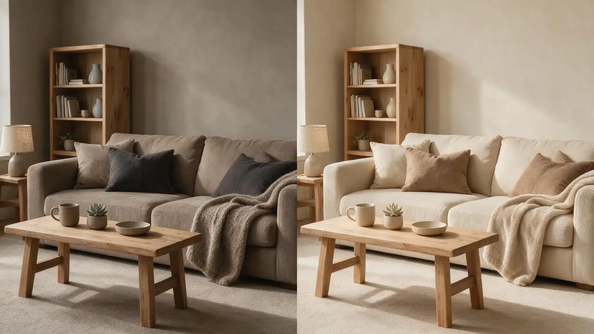
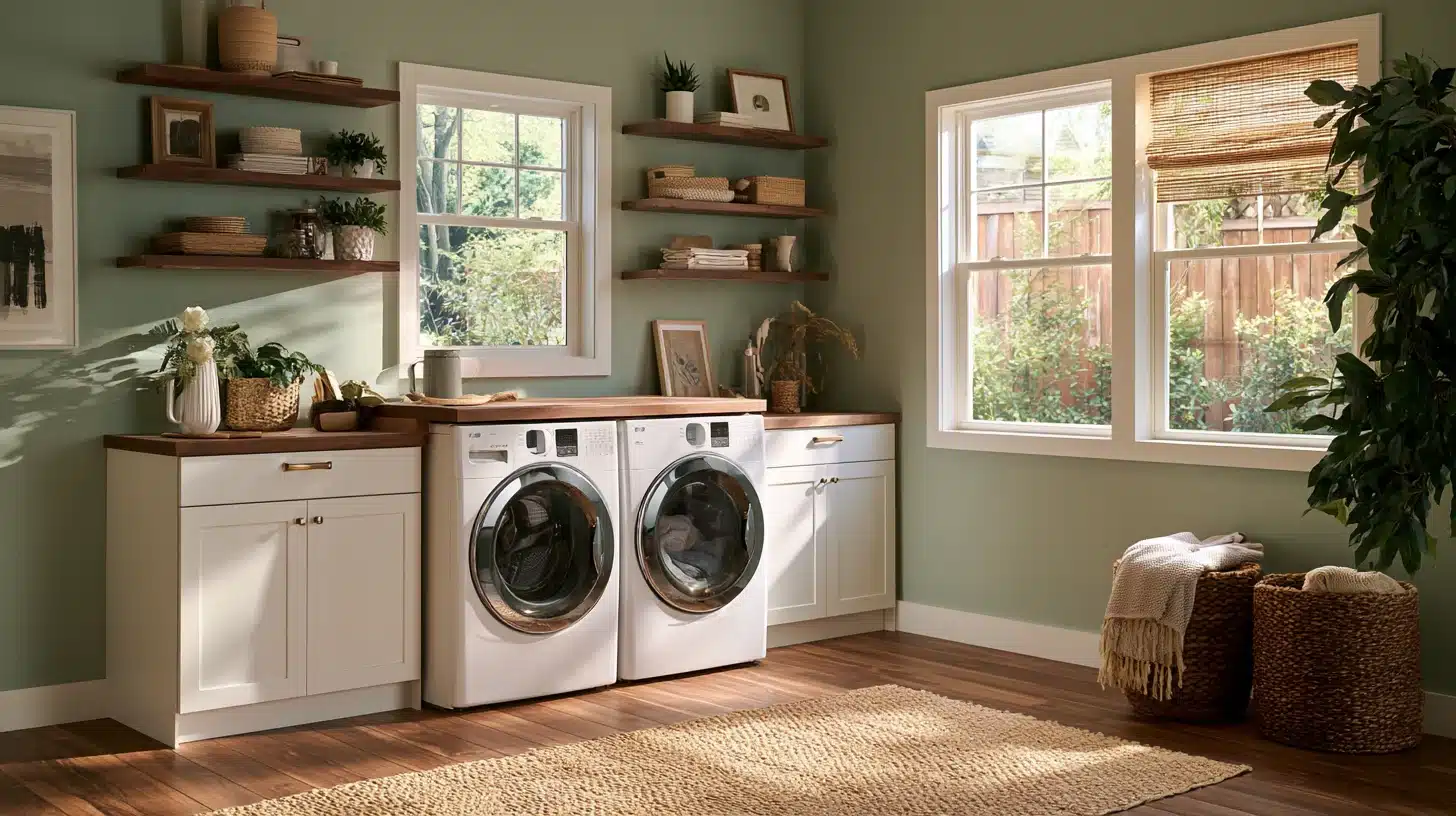
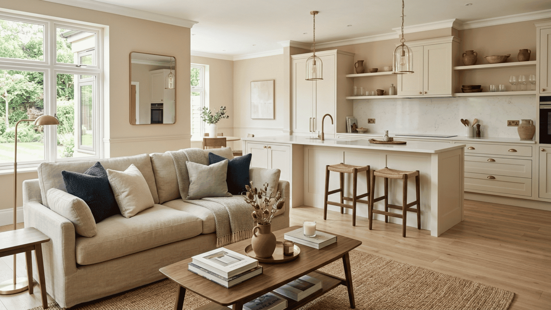
A beautiful home rarely depends on every room wearing the same color. More often, it feels cohesive because the colors relate to one another, the finishes suit the spaces, and small decorative details repeat in thoughtful ways. Paint is one of the simplest tools for creating that connection, but a well-chosen palette starts long before opening a can.
For homeowners who enjoy decorating, the challenge is balancing personal style with the realities of lighting, furniture, wall condition, and daily use. That matters in sunny Arizona homes, where strong daylight can make a subtle neutral look surprisingly bright, but the same principles apply anywhere.
Start With What Is Already in the Room
Before collecting paint samples, look at the features that are unlikely to change: flooring, countertops, tile, cabinetry, large furniture, and the view through the windows. These materials already establish a palette. A warm wood floor may bring orange or golden undertones into a room, while cool stone or gray tile can shift how nearby paint appears.
Instead of choosing a wall color in isolation, place samples beside those permanent finishes. Ask whether the color complements them, contrasts intentionally, or creates an unwanted undertone. A soft off-white, for example, may look creamy beside a cool countertop but crisp beside natural oak.
Take photographs of the room at different times, but use them only as reminders of the overall combination. Camera settings and screens can distort colors. Physical samples viewed in the actual space remain more dependable when deciding between two closely related shades.
Build a Palette, Not a Collection of Favorites
A cohesive home does not need identical rooms. It needs a few recurring color relationships. Start with a base neutral for connecting spaces such as hallways, then select two or three supporting hues that suit the rooms branching off them.
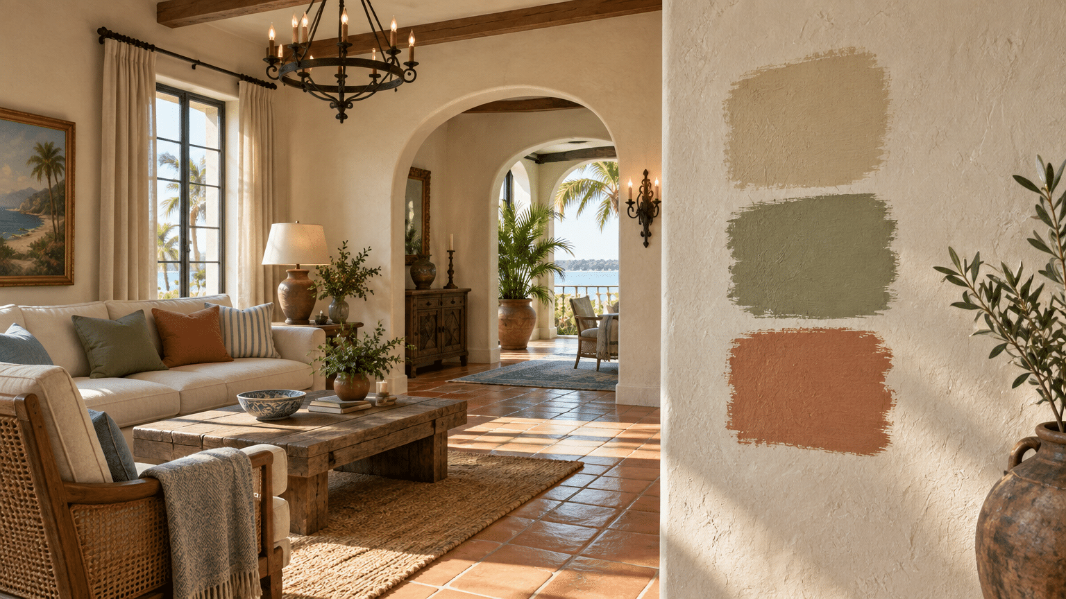
A practical approach is to repeat a color in different roles. A muted sage might appear on a bedroom wall, reappear in living-room cushions, and show up as a small accent on a painted cabinet. Repetition helps spaces feel related without making them look matched.
Consider the sightlines between rooms, too. When standing in the entryway, which walls and doorways can you see at once? Colors that look appealing separately may feel abrupt when viewed side by side. Test combinations from those shared viewpoints before committing.
A simple palette notebook can make the process less overwhelming. Record each paint name, finish, and room, then keep swatches together with fabric or flooring samples. This creates a reference when shopping for curtains, rugs, and accessories months after the walls are finished.
Let Light Have the Final Say
Paint cards and online photos are useful for inspiration, not reliable predictions. Natural light varies by direction and time of day, while bulbs can add warm or cool casts after sunset. Texture and sheen change the result again.
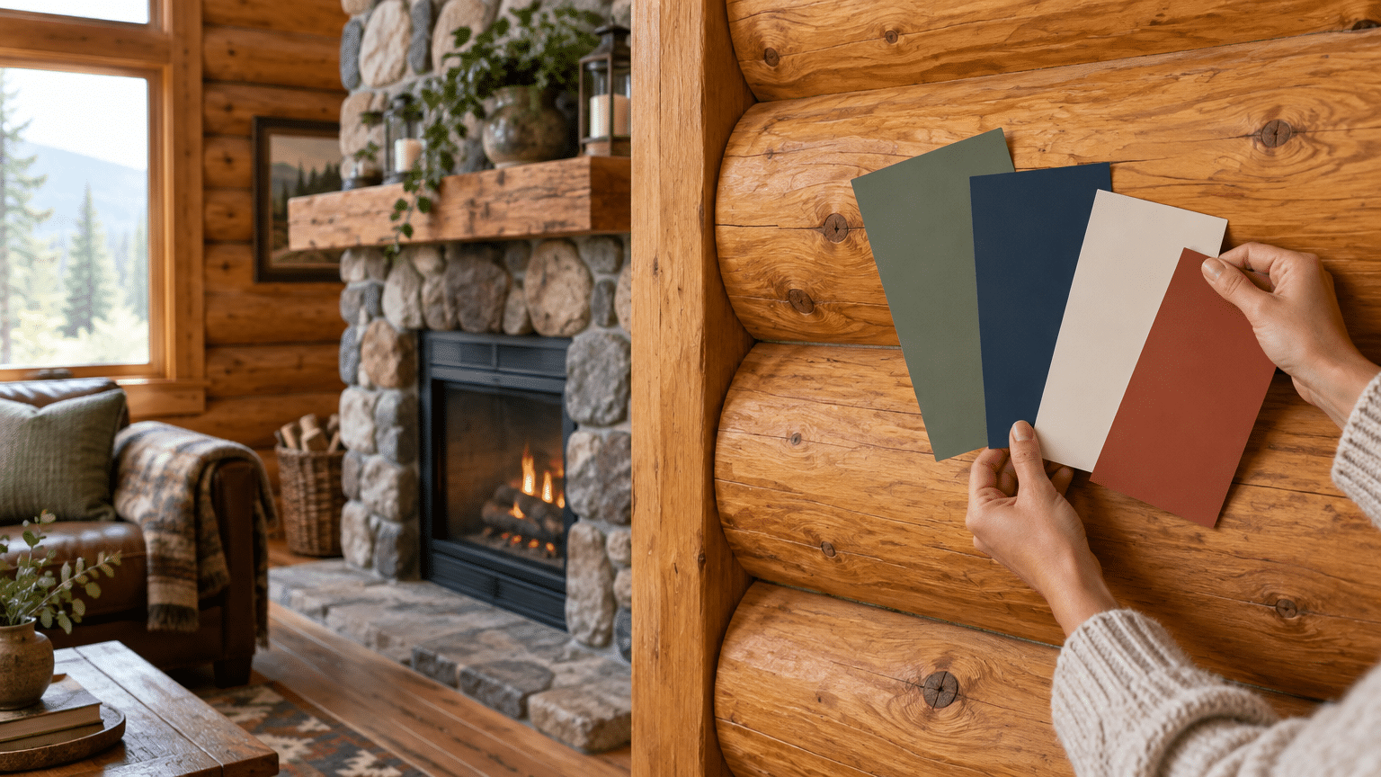
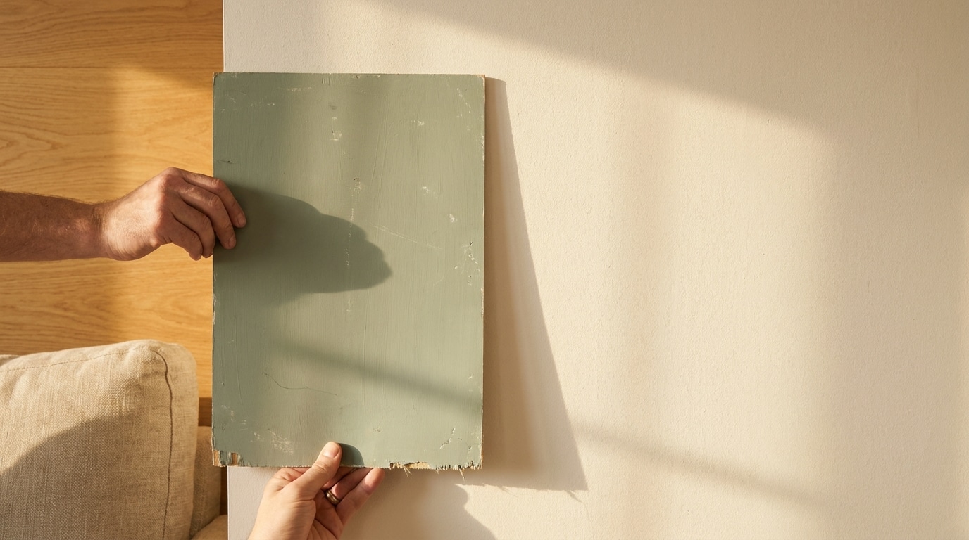
Apply sample colors on movable boards or designated wall areas, following the manufacturer’s directions. Examine them in morning, afternoon, and evening light, alongside the furniture and fabrics that will remain. Larger samples make it easier to notice undertones that disappear on a small chip.
Allow test patches to dry fully before judging them, and note whether the existing wall color is affecting the comparison. Sample boards can be moved near windows, doorways, and shaded corners, allowing a homeowner to evaluate the same color without covering multiple walls.
In Arizona, particularly bright windows can wash out pale colors in the middle of the day. Rather than assuming a darker shade is always the answer, compare several values and look at how they behave under both daylight and artificial lighting.
Give Each Room a Job
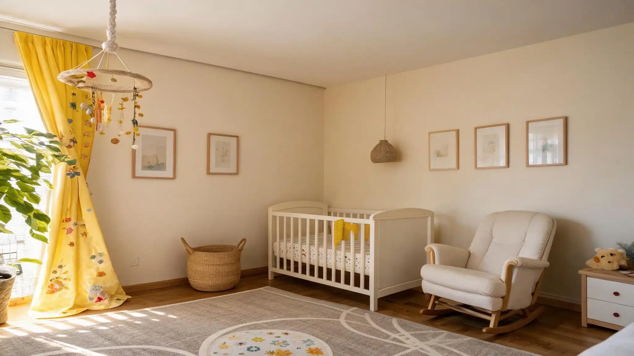
Living areas often benefit from adaptable colors that support furniture, artwork, and changing seasonal decor. Bedrooms may call for softer, quieter combinations. Kitchens and bathrooms introduce practical questions about cleaning, moisture, and the suitability of the finish.
The right sheen depends on the surface and product, not simply a rule that glossy paint is better. A flatter appearance may disguise some wall imperfections, while certain washable finishes are useful in busy spaces. Check the specific coating’s recommendations before deciding.
It is also worth thinking about who uses each room. A busy family entryway faces different scuffs and cleaning demands than a quiet guest bedroom. Choosing for everyday routines, rather than an idealized photograph, helps ensure the final scheme remains enjoyable after the decorating project ends.
Trim deserves attention as well. Bright white trim can create contrast, but a softer white or a tone close to the wall color can produce a calmer look. Painting walls and trim in related shades may be especially effective in smaller rooms where numerous hard color breaks feel distracting.
Know Which Projects Make Good DIY Weekend Work
Small, well-contained painting projects can be satisfying. A sample board, a single accent wall, or a simple piece of furniture offers room to experiment without taking over the house. Good results still depend on cleaning, surface compatibility, careful masking, and adequate drying time.
Other projects can be less forgiving. Tall stairwells, heavily damaged surfaces, extensive cabinetry, and whole-home repaints involve more preparation, access challenges, or disruption. Older homes may also require appropriate precautions when disturbing existing coatings. In the United States, houses built before 1978 can contain lead-based paint, so renovation work should follow applicable lead-safety rules.
Professional help may be worthwhile when the scope exceeds the homeowner’s time, equipment, or experience. For readers in Southern Arizona comparing that option, The Paint Kings’ Tucson painting services provide a starting point for exploring residential painting support.
Connect Interior Choices to the Exterior
The front door, entry hall, and first living space form a visual sequence. A home does not need the same palette inside and out, but it can feel more intentional when those areas share a subtle relationship. A warm exterior neutral might be echoed in interior wood tones; a muted front-door color might reappear in artwork or textiles.
Exterior selection involves additional considerations. Stucco texture, strong sunlight, roof materials, and existing landscaping all change how paint reads on a large surface. Preparation and coating compatibility matter just as much as the visual palette.
For homeowners in the East Valley considering a larger refresh, The Paint Kings’ Chandler, Gilbert, and Mesa painting page offers another locally relevant resource for investigating professional painting services.
Finish With Decorating, Not Another Coat
Once the paint has cured according to its instructions, let textiles, lighting, plants, and artwork complete the room. A new wall color can make familiar objects feel different. Before buying replacements, try rearranging what is already there and observe which accents now stand out.
The strongest palette is not necessarily the trendiest one. It is the one that suits the home’s existing materials, works in real light, and makes everyday spaces feel comfortable. Start with a few well-tested colors, give each room a clear purpose, and allow thoughtful repetition to do the connecting.