

Two of Sherwin-Williams’ most popular neutrals are positioned very close together on the swatch.
The paint chips look almost identical under store lights. On a real wall, in a real room, they behave like two different colors. Most regret begins in that gap, typically after the second coat has dried.
Getting it right is less about which shade is “better” and more about how each one behaves in your space.
This blog breaks down exactly where they part ways, so the choice is clear before you open a can.
Color Breakdown of Accessible Beige vs Agreeable Gray
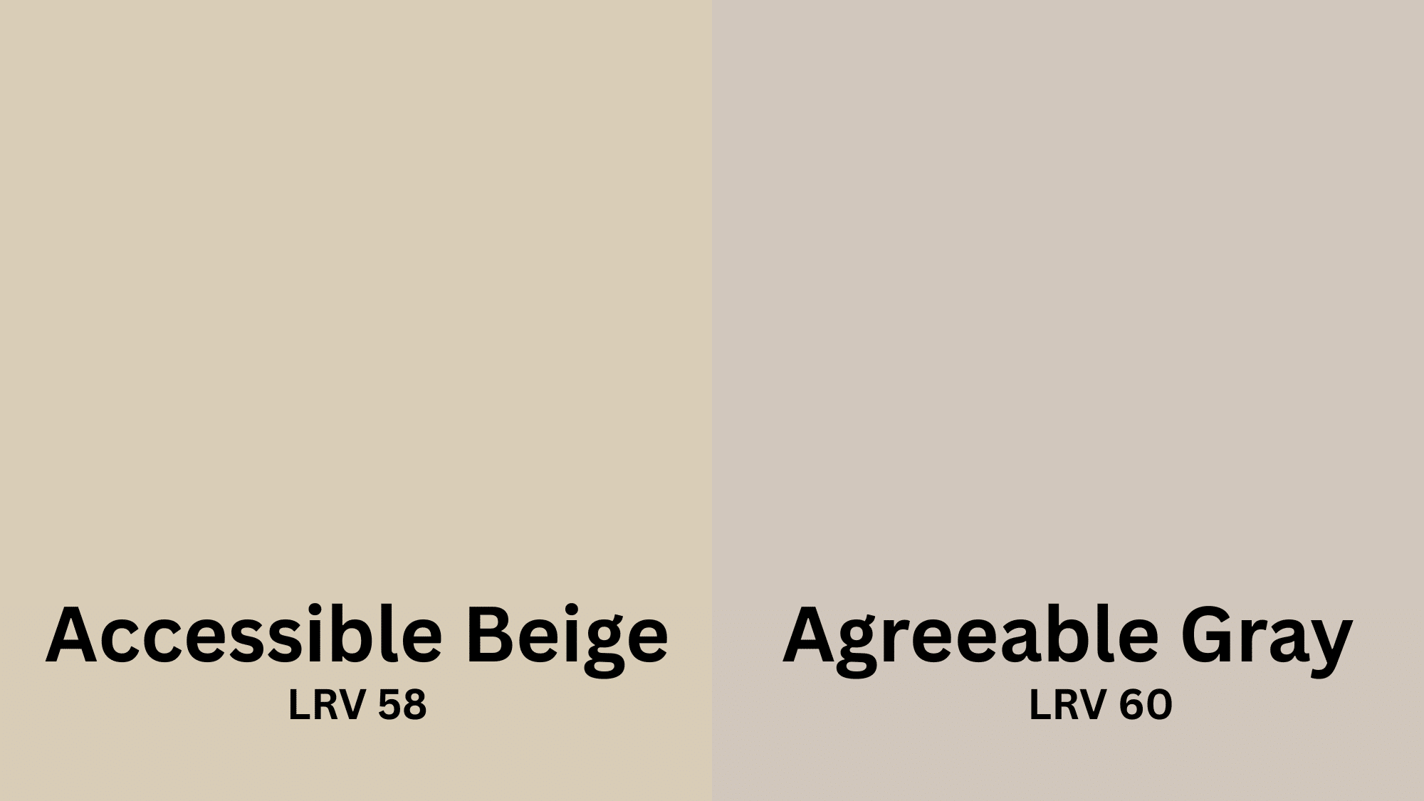
Accessible Beige (SW 7036) is a warm greige that leans beige, grounded by a soft green-taupe undertone.
It reads cozy and settled without ever flashing yellow, and glows in south-facing light. It deepens natural wood and pairs easily with creamy whites and brass, which is why it suits farmhouse and traditional rooms.
Agreeable Gray (SW 7029) is a balanced greige sitting near the beige-gray midpoint, gray-forward but never cold.
Cleaner and more flexible, it holds its character in cool or north light and takes any hardware finish.
That adaptability makes it a reliable whole-home neutral for transitional and modern spaces.
Accessible Beige vs Agreeable Gray Side-by-Side Comparison
Here’s a quick side-by-side comparison to help you decide instantly.
| Feature | Accessible Beige (SW 7036) | Agreeable Gray (SW 7029) |
|---|---|---|
| LRV | 58 | 60 |
| Best for | Cozy, warm rooms | Flexible, all-purpose spaces |
| Mood | Grounded, inviting | Clean, modern |
| Ideal light | South and west-facing | North-facing and low-light |
| Furniture fit | Warm woods, earthy tones | Painted, metal, mixed finishes |
| Hardware | Brass, bronze | Any finish |
| Risk to watch | Can muddy in cool light | Faint violet in low light |
| Style match | Farmhouse, traditional | Transitional, contemporary |
How Lighting Changes Accessible Beige and Agreeable Gray
Light has a greater impact on these two colors than the swatch shows, and small room changes can make them look warmer or cooler than expected.
Accessible Beige changes with room heat, becoming darker or duller depending on the lighting.
- Reads richest and most golden in bright south or west-facing sun.
- A red-toned wood floor throws extra warmth up onto the walls.
- Glossier sheens like satin lift it lighter than a flat finish.
- Overcast light pulls it toward its cooler, taupe side.
Agreeable Gray shifts along the beige-gray line, leaning either way as the light moves through the day.
- Holds its balance best in cool or north-facing light.
- Can wash slightly flat in strong afternoon sun without warmth nearby.
- Nearby cool finishes push it further toward gray.
- Warm evening lamplight nudges it back toward beige.
The key point for both is to test each color in its actual environment, not under store lighting.
How to Pick the Ideal Shade for Your Walls
Choosing the right paint color involves understanding how different colors interact in various settings, based on my experience and research.
Kitchen
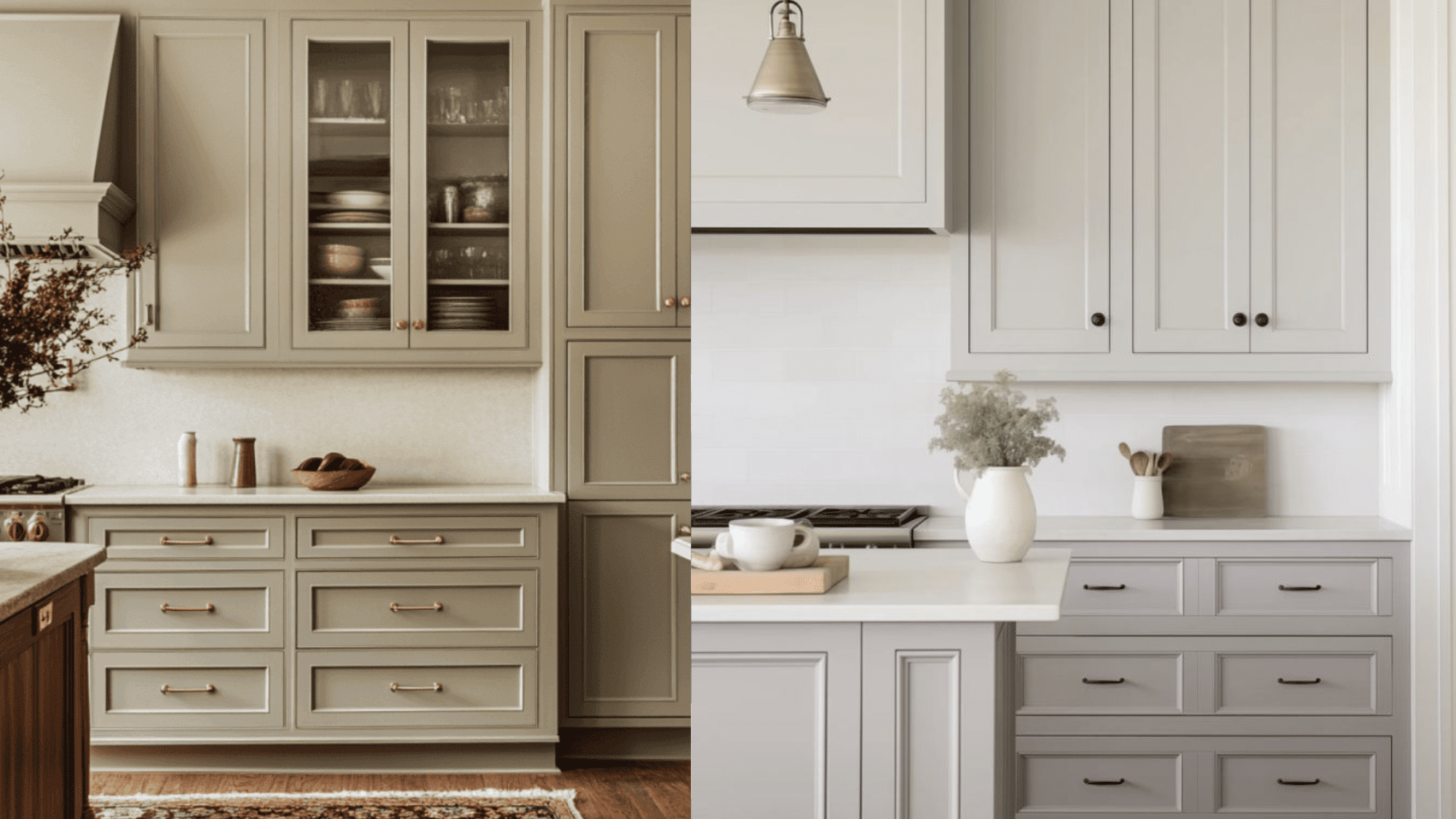
Accessible Beige cabinets create a warm, creamy look that feels timeless and cozy. It can be paired with warm brass hardware and natural wood countertops, and natural wood mixing bowls.
To elevate this look, add crisp white subway tile backsplashes and warm pendant lighting.
However, silver accents can look out of place – the warm walls make cool metals feel cold and unwelcoming.
The beige works beautifully with farmhouse and traditional styles.
Agreeable Gray cabinets offer a fresh, modern appearance that works with any hardware finish.
I’ve seen them look stunning with both marble and butcher block countertops.
Bold backsplash patterns, mixed metals, and contemporary lighting can be great additions. The versatility makes it perfect for transitional and modern kitchens that need to adapt over time.
Stairway
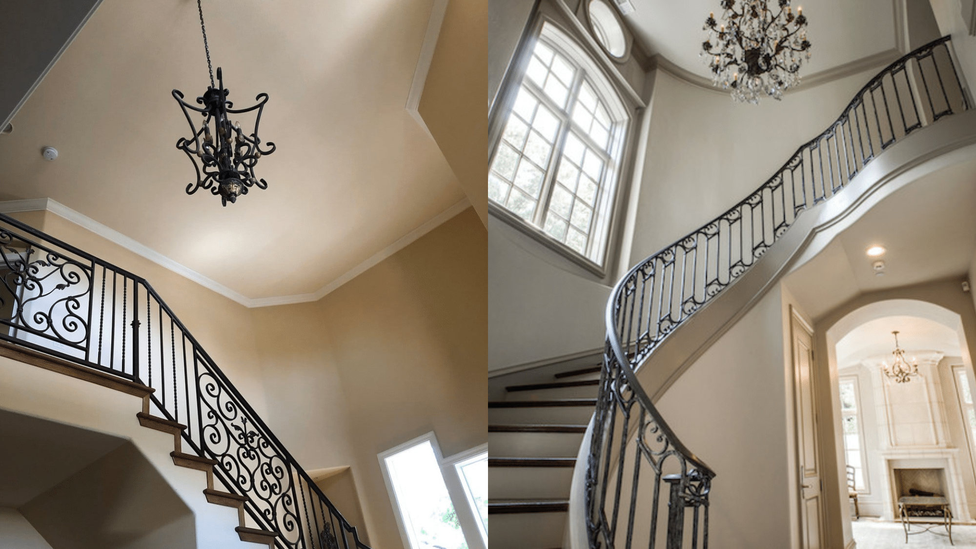
Accessible Beige stairways feel warm and welcoming, but can make narrow stairs feel tighter.
I love how they look with dark wood railings and warm brass fixtures.
A cream sofa blends beautifully but doesn’t disappear. To go a step further, you can add bright white trim, good lighting every few steps, and consider wainscoting halfway up for visual interest.
Agreeable Gray stairways make narrow spaces feel more open and airy.
I’ve found that they work beautifully with both black iron and wood railings. This look can be enhanced with crisp white trim, modern light fixtures, and runner rugs for texture.
The balanced color helps reflect light in typically darker stairway areas, making them feel safer and more spacious.
Bedroom
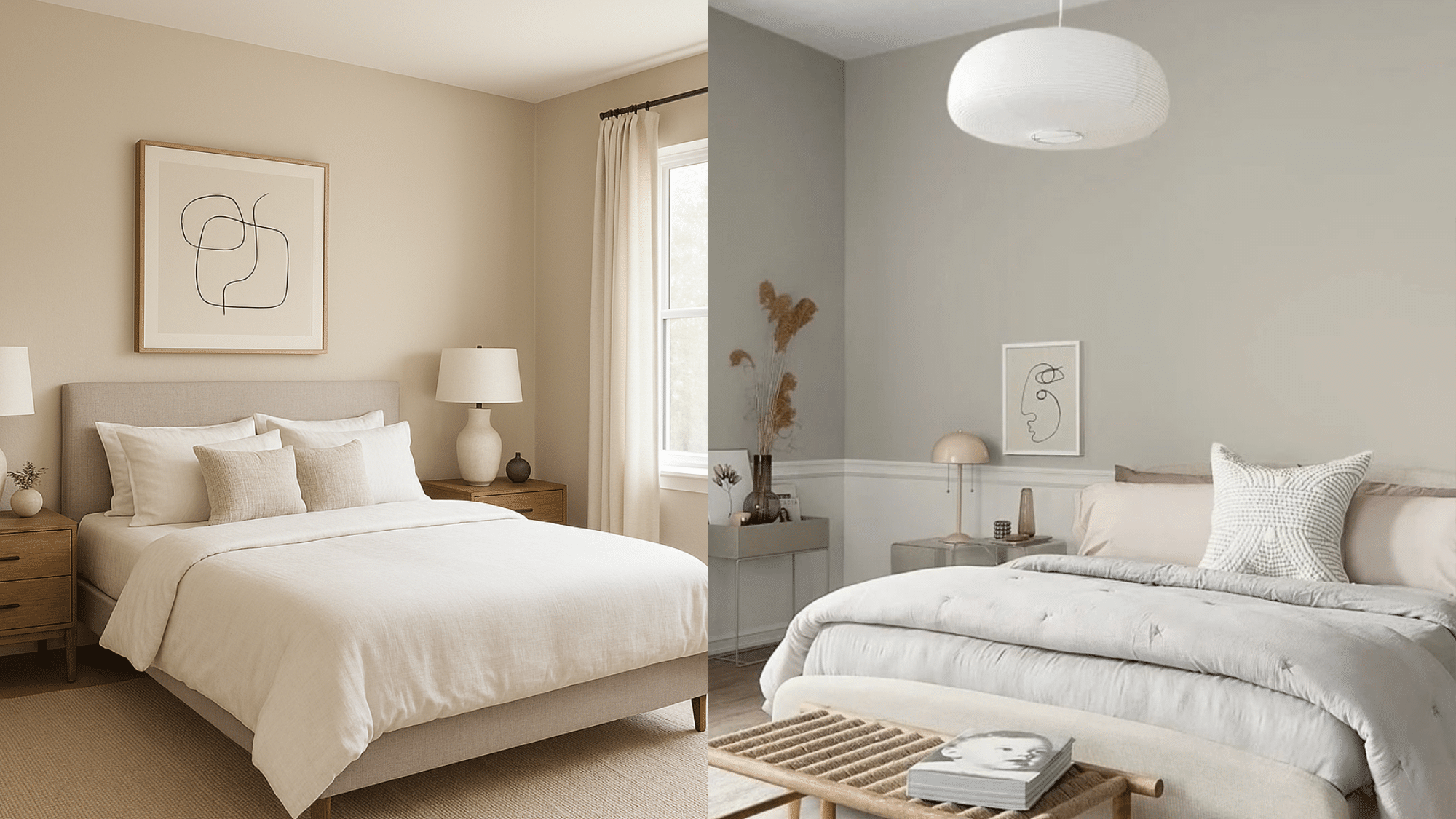
Accessible Beige bedrooms
It creates a cozy sleep cover with warm, restful vibes, making white bedding pop and wood furniture look richer.
A warm, wooden coffee table and an oak bookshelf look incredible against these walls.
Evening lamplight brings out the creaminess beautifully. Warm-toned furniture (cherry, oak, mahogany) pairs beautifully with Accessible Beige. The yellow undertones in the paint complement the warm wood tones.
To elevate this look, one can add layers of cream and ivory textiles, warm brass lighting, and natural wood accents for that spa-like retreat feeling.
Agreeable Gray bedrooms
It feels fresh and clean while staying calming for sleep.
The same wood furniture looks great, but now any silver and chrome accents fit perfectly too. Cool-tonedfurniture (painted pieces, metal accents, glass) works better with Agreeable Gray.
The balanced undertones don’t compete with cooler materials.
Elevate this look with, again – crisp white trim, varied textures in throw pillows, and statement lighting. The versatile backdrop allows you to change your seasonal decor without repainting.
Even on overcast days, the room still feels light and airy.
Coordinating Colors That Work Best
The right partner colors keep either greige from reading flat, so here’s what pairs cleanly with each:
| Element | Accessible Beige (SW 7036) | Agreeable Gray (SW 7029) |
|---|---|---|
| Trim white | Pure White (SW 7005) | Extra White (SW 7006) |
| Accent wall | Sage green | Navy blue |
| Deeper tone | Chocolate brown | Charcoal gray |
| Soft color pop | Muted terracotta | Dusty rose |
| Metal | Aged brass | Polished chrome |
| Flooring | Honey oak | Cool gray wash |
Best Color Palettes
I’ve experimented with numerous color combinations over the years and learned which palettes work best with each of these popular neutrals.
Accessible Beige
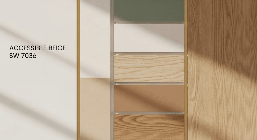
Its warmth blends well with earthy, natural tones.
Embrace wood, cream, and soft hues, as these three elements create a warm and welcoming atmosphere.
The Classic Warm Palette brings together cream whites, soft caramel browns, natural oak or honey maple, muted gold accents, and sage green.
The Modern Neutral Palette balances bright white trim, charcoal gray, jute and linen textures, black metal accents, and soft blush pink.
The Palette combines mushroom gray, terracotta orange, chocolate brown, cream, ivory, and forest green.
Agreeable Gray

Its balanced base takes both warm and cool. That flexibility is the whole appeal. These three show its range.
The Palette features crisp white trim paired with navy blue, silver, chrome hardware, and cool blue-gray tones.
The Warm Transitional Palette offers a softer look with ivory trim, warm taupe, brass or gold accents, dusty rose or coral, and natural wood finishes.
The Refined Monochrome Palette maintains a tonal scheme with layered grays, black accents, white, and silver metallic details, complemented by glass and crystal elements.
Tips for Using Each Color in Your Home
Here are my main suggestions for getting the most out of Accessible Beige and Agreeable Gray.
- Test Agreeable Gray’s warm undertones – Despite being called gray, it has beige undertones that make it warmer than pure grays, so always compare them side by side.
- Mix metals freely with Agreeable Gray – This color works with both brass and chrome finishes, making mismatched hardware look intentional instead of accidental.
- Give Accessible Beige warm lighting – Switch to 2700K LED bulbs to transform this color from muddy to rich and inviting.
- Pair Accessible Beige with crisp white trim – The contrast between warm walls and bright white trim makes both colors pop, rather than blend.
- Follow the 60-30-10 design rule: choose one color as your dominant shade (60%), use another for secondary surfaces like accent walls (30%), and add a third accent color (10%) to tie everything together throughout your home.
Which Color is Right for You?
Accessible Beige wins if you want a room that feels warm the moment you walk in. It’s for farmhouse and traditional furniture, cherry or oak wood you don’t want to fight, brass hardware you’re not planning to change. It doesn’t love cool metals or shifting styles every few years, so know that going in.
Agreeable Gray wins if you switch things up a lot, or you’re mixing metals room to room. It holds up better in north-facing spaces where beige tends to go muddy. And if resale is on your mind at all, this is the much safer bet.
Final Thought
After working with both colors throughout my home, I’ve learned that your choice comes down to the feeling you want to create.
Accessible Beige brings warmth and coziness to spaces where you relax, while Agreeable Gray offers versatility and freshness in active areas.
The key is matching each color’s strengths to your room’s function. You don’t have to pick just one – I use both strategically to create flow while giving each space its own personality.
Start by testing large samples on your walls for at least a week. Your perfect neutral is waiting for you.
Frequently Asked Questions (FAQ’s)
1. Are Accessible Beige and Agreeable Gray Both Greige?
Yes, both blend gray and beige, but Accessible Beige leans warmer and more beige.
2. Which Color is More Popular?
Agreeable Gray is more widely used, thanks to its flexibility across styles and rooms.
3. Can I Use Both Colors in The Same Home?
Yes, use Accessible Beige in cozy rooms and Agreeable Gray in shared spaces.
4. Do These Colors Work with Wood Floors?
Both do, though Accessible Beige suits warm woods and Agreeable Gray fits cooler tones.
5. How Many Samples Should I Test Before Choosing?
Test two or three large swatches per room, checking them morning and night.






2 Responses
Colin, thank you so much for doing all of this work and sharing it so clearly for those of us who struggle with color! I’m still not sure which of the two colors to go with, but you’ve given me much to work with! Blessings.
hi Colin,
thank you for explaining the 2 colors clearly with pictures as comparison. I appreciate it.
so happy to find your website.
Keep the great work! Gbu.