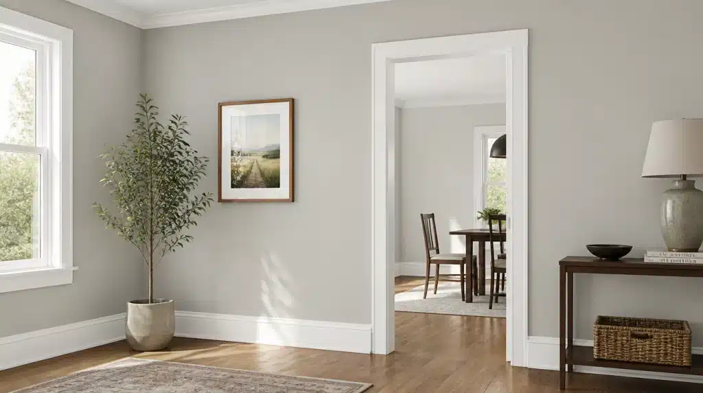
Paint chips can lie.
That little square never tells you what a color does once it’s rolled across four walls and left to argue with your windows all day.
I constantly see Gossamer Veil Sherwin-Williams (SW 9165) misjudged for this exact reason; it looks one way in the store, and something else entirely by mid-afternoon in a west-facing room.
Here’s what I’ve actually noticed: its light reflectance, where the undertones come from, how it shifts across exposures, and how it stacks up against the shade it’s most often compared to, Agreeable Gray.
What Kind of Color is Gossamer Veil Sherwin-Williams, Exactly?
Gossamer Veil is part of Sherwin-Williams’s neutral color family. However, the term ‘neutral’ is doing a great deal of quiet work in that sentence.
It’s not a flat, catalog gray. It’s a warm gray that always tries to cross over into greige territory without fully doing so.
That’s why it looks so different from house to house.
Part of that comes down to numbers, too. Gossamer Veil sits at an LRV of 62 (hex #D3CEC4), which is the kind of middle-of-the-road depth I usually reach for when I’m unsure where to start on a project.
Light enough to keep a room open, but with just enough weight to hold its own once the undertones start shifting.
It’s a chameleon rather than a constant, and that’s one of the reasons why people either love it or find it frustrating.
Gossamer Veil’s Undertones Under Different Light
This is the section that actually addresses the question that most people want to know, since it is because of the undertone aspect that this paint has acquired both its supporters and its negative reviews.
In North-Facing Rooms
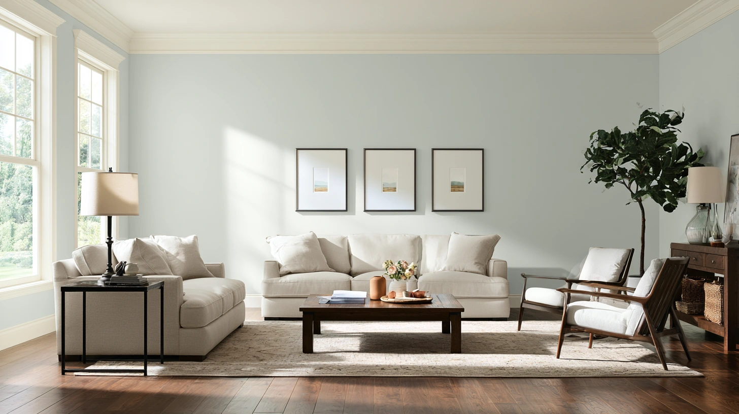
The cooler and more diffused daylight has the effect of bringing the grey tone forward and reducing the warmth.
In these rooms, the green tinge is more noticeable, and the color comes closer to a genuine grey than a greige.
In South and West-Facing Rooms
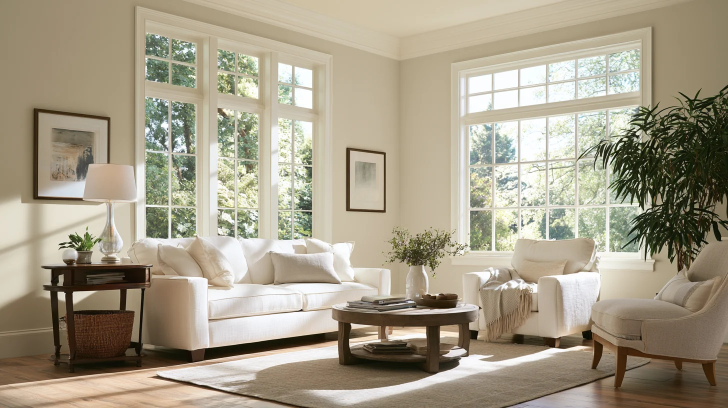
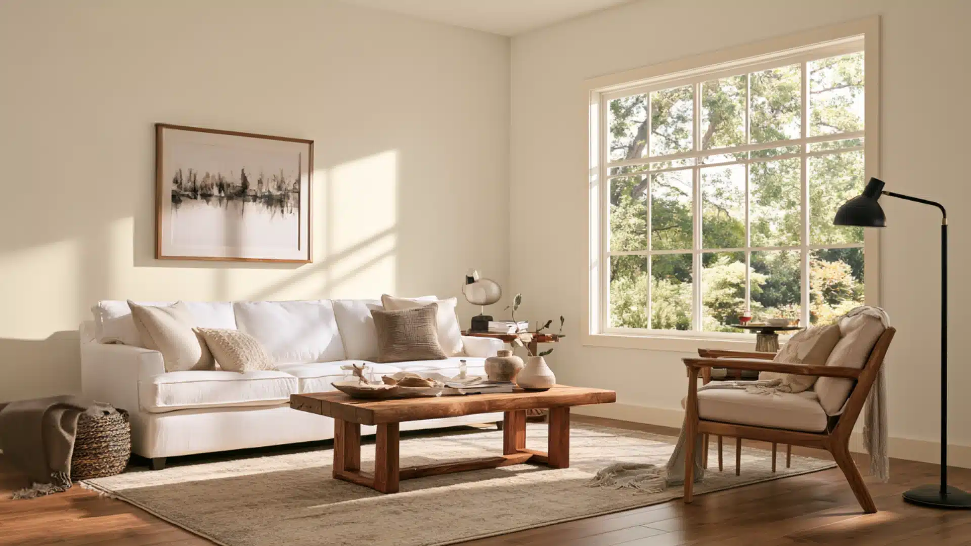
The warmer, golden light brings out the more comfortable aspect of this paint.
The afternoon sun, especially when combined with the warm wood tones already present in the room, can make the atmosphere take on a soft greige hue.
Under Artificial Light
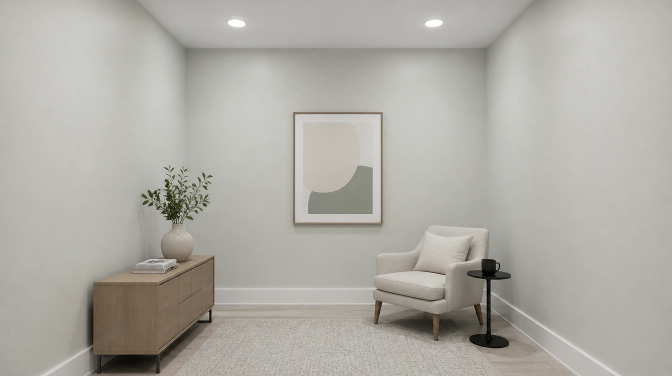
The warm bulbs make the room feel cozier and tame the gray.
Instead, cooler bulbs sharpen the gray undertone and give the wall a more modern edge.
You should take a sample of this color in the room where you spend the greatest amount of time, at the time of day when you are actually there.
Gossamer Veil vs Agreeable Gray: How Close Are They Really?
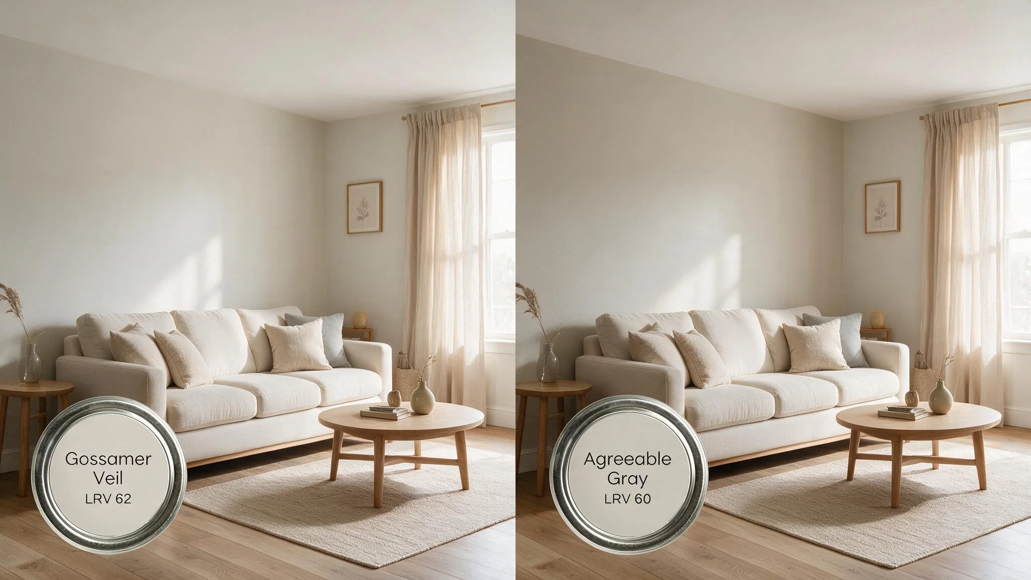
Agreeable Gray is the shade I most often compare other colors to, since both hues sit in that warm, muted neutral range many homes are currently relying on.
- Overall depth: Both land in the light-to-medium range, so neither will read as strikingly darker or lighter than the other.
- Warmth: Both are warm neutrals, not cool grays.
- Undertone: Gossamer Veil leans green, while Agreeable Gray leans brown.
- Mood on the wall: Gossamer Veil feels fresh and slightly gray-forward; Agreeable Gray feels grounded and slightly beige-forward.
The difference between them is so small that it can be barely noticeable, but this tiny gap is still evident when you consider lighting and the surrounding finishes.
If you find that Agreeable Gray is too brown for your liking, then Gossamer Veil is worth trying next; although the change is not dramatic, it is often sufficient to alter the entire atmosphere of a room.
Where Gossamer Veil Works Best Indoors?
From the experience I’ve had with this color in actual rooms, it works most reliably in only a few types of rooms.
What ties them together is the good natural light and some warmth already present in the room, such as that provided by wooden tones, the trim, or the way the room is exposed.
Living and Dining Rooms
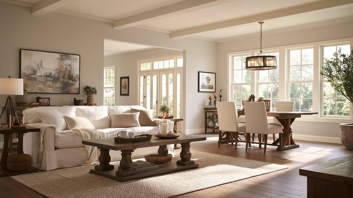
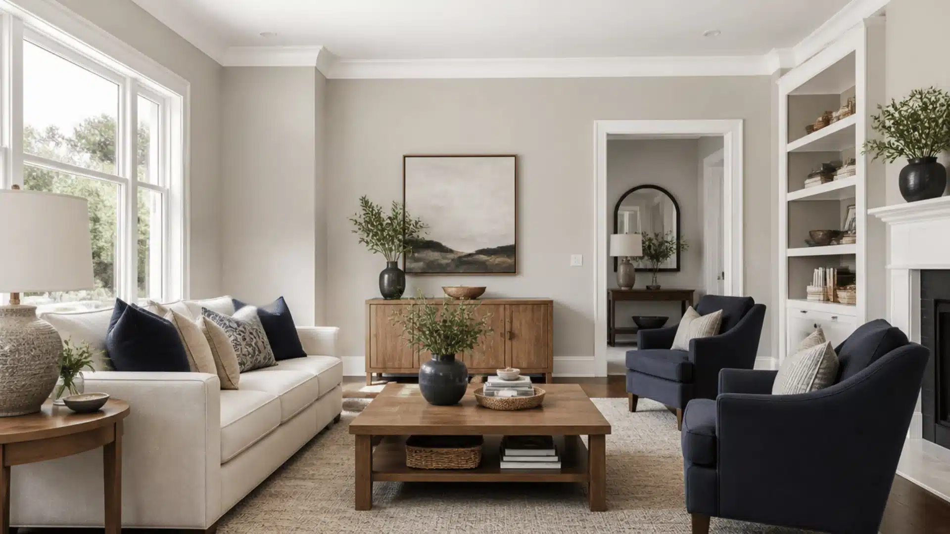
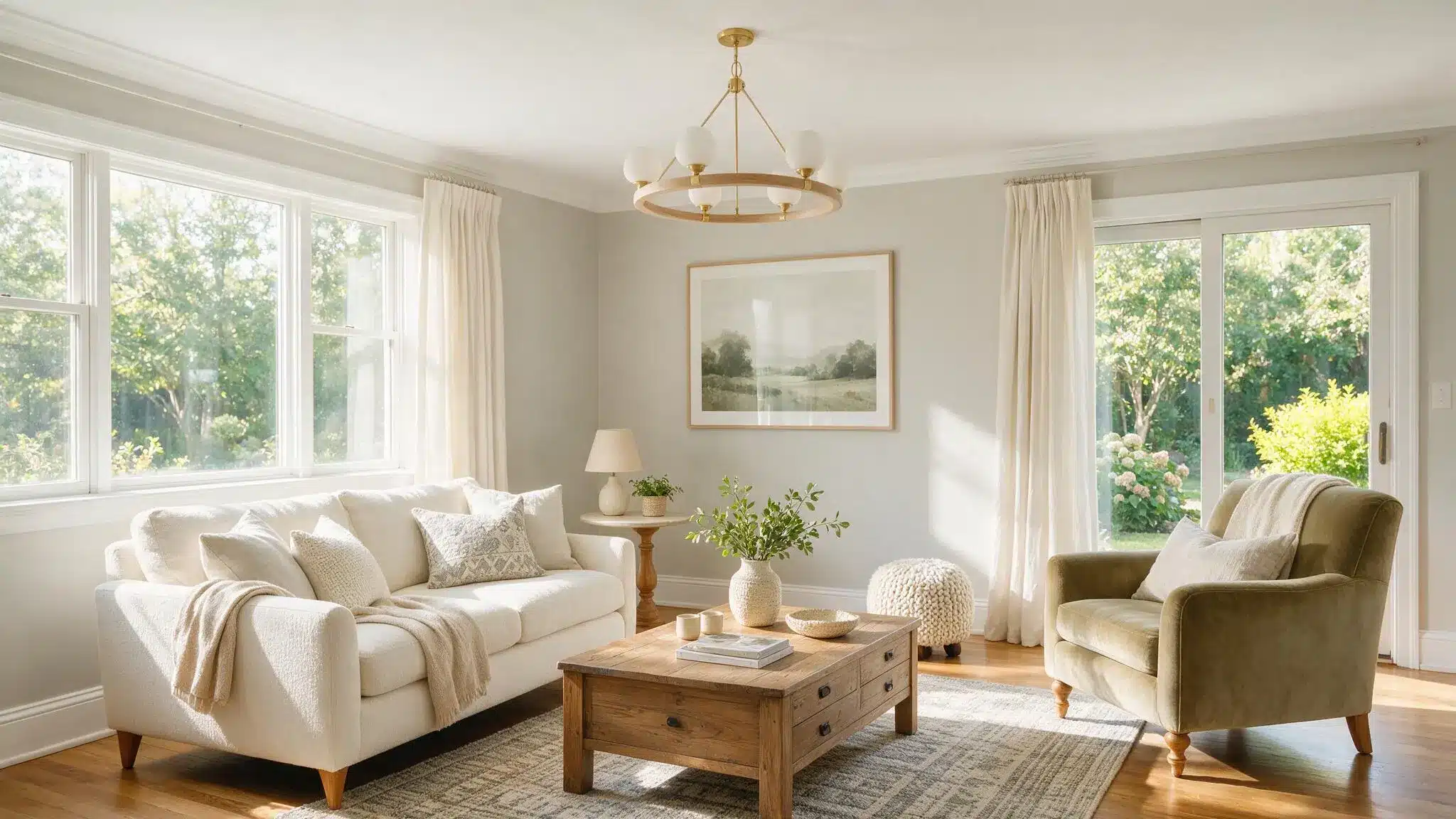
The color suits rooms with moderate to good natural light in both the living and dining areas.
The warmth doesn’t flatten the open-plan layout; instead, it softens it, so the space still has definite character even as it flows into the adjacent room.
Bedrooms
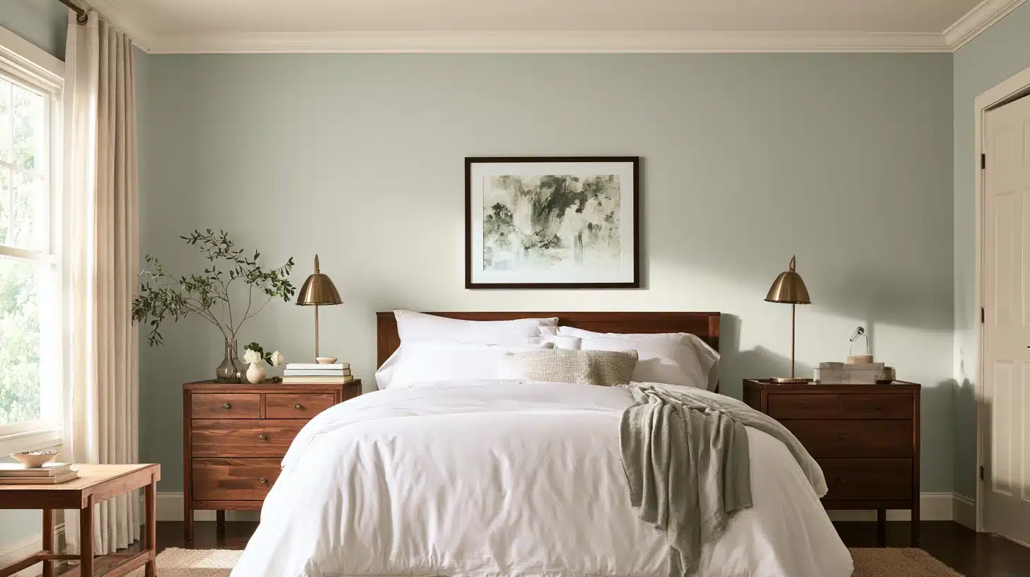
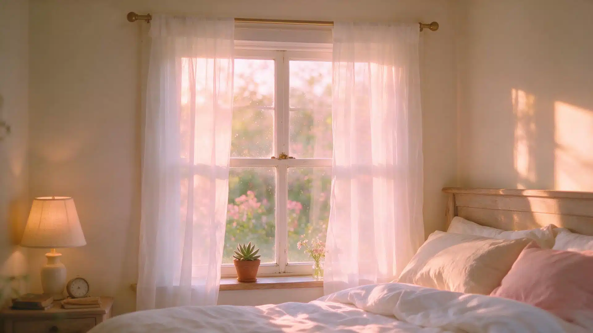
Bedrooms are suitable as well, since the neutral background provides a peaceful setting rather than clashing with the linens and furniture.
It is soft enough to blend into the background at night, yet has enough depth to appear purposeful during the day.
Kitchens with Wood Cabinetry
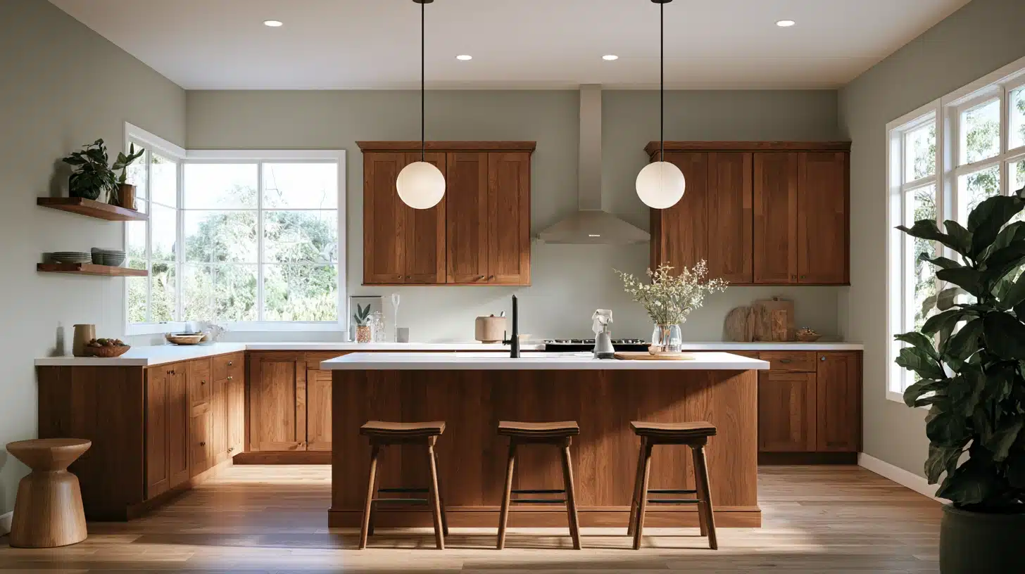
One of my favorite types of kitchens is the one with wooden cabinets, since the green tint gently contrasts with the warm stains rather than conflicting with them.
I consider this combination particularly forgiving in kitchens with both natural and overhead lighting during the day.
Bathrooms
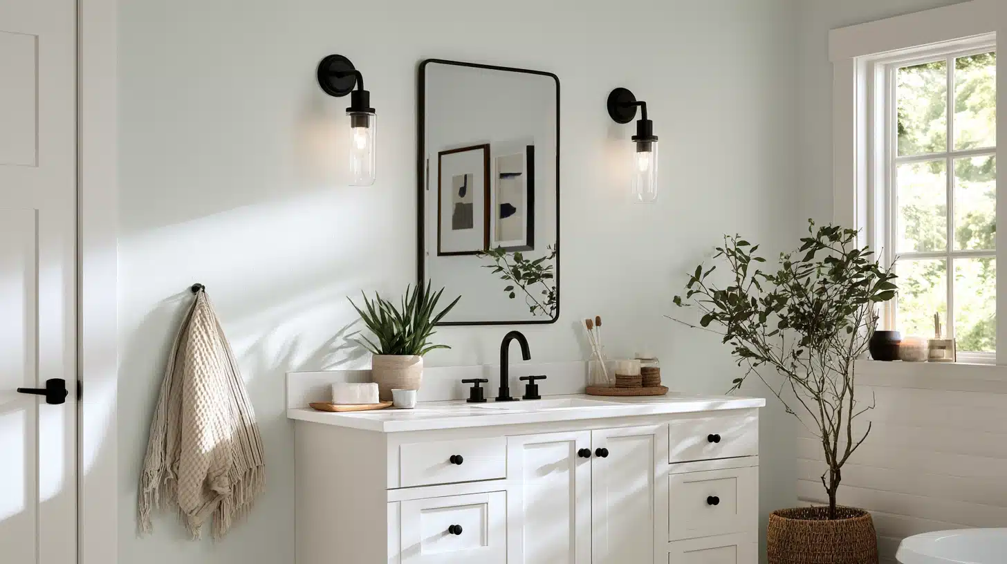
Bathrooms are a bit trickier, mostly because of humidity and the amount of white you’re usually working against: tile, tubs, vanities.
Gossamer Veil holds up well here as long as there’s a window or a strong vanity light, since the green undertone can turn slightly cool and flat under harsh fluorescent bulbs.
Entryways
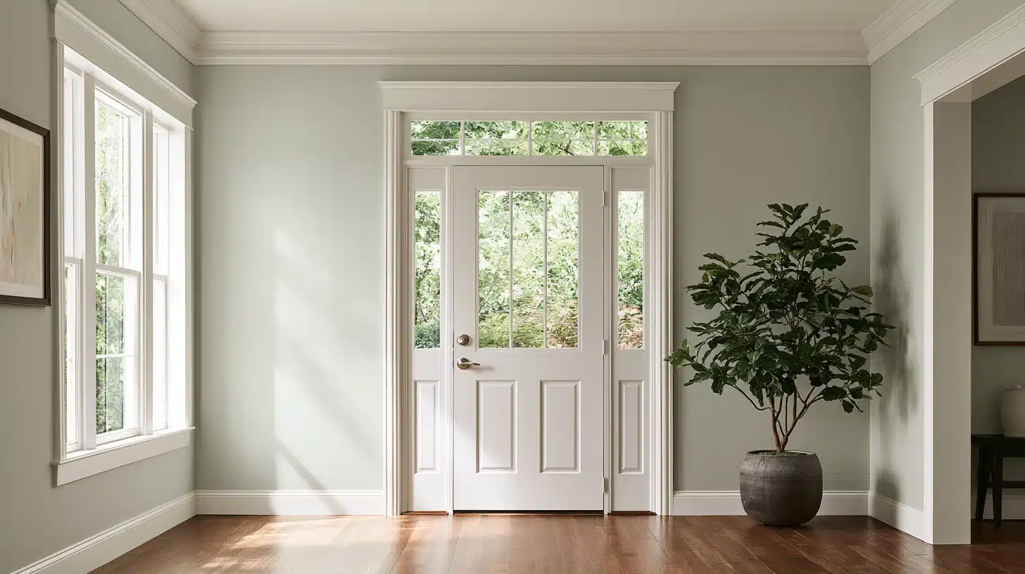
Entryways may work as well, provided the room isn’t relying on this paint alone to make a windowless space more luminous.
When there is a reasonable window or transom above the door, the effect appears soft and clean, but if the entry is a closed-off, windowless space, it can begin to seem a bit flat.
Hallways and Staircases
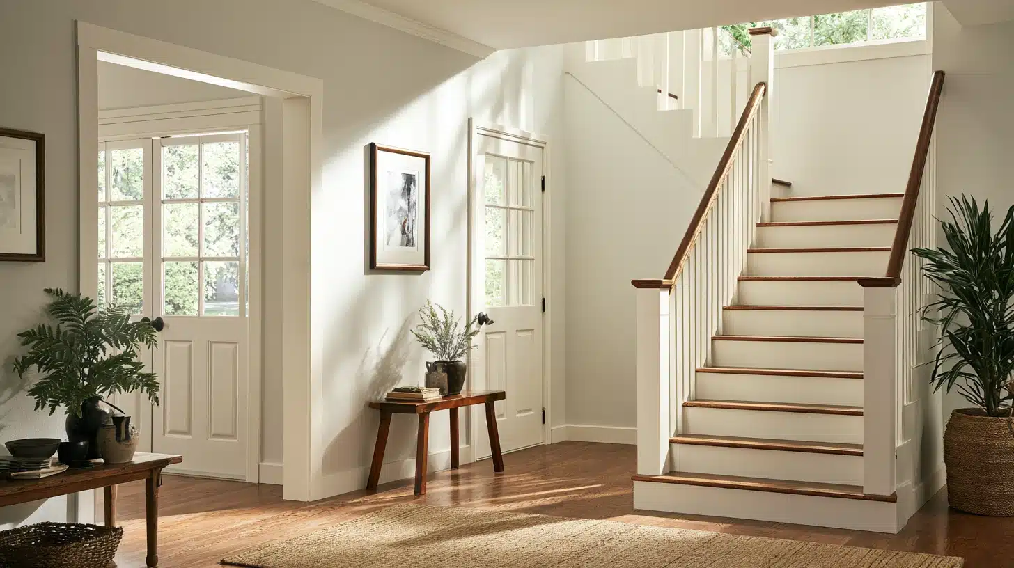
In hallways and stairwells, where light often comes secondhand from adjoining rooms, Gossamer Veil tends to lean more gray than green, so it pairs well with warm-toned runners or artwork to keep the space from feeling cold.
Home Offices and Studies
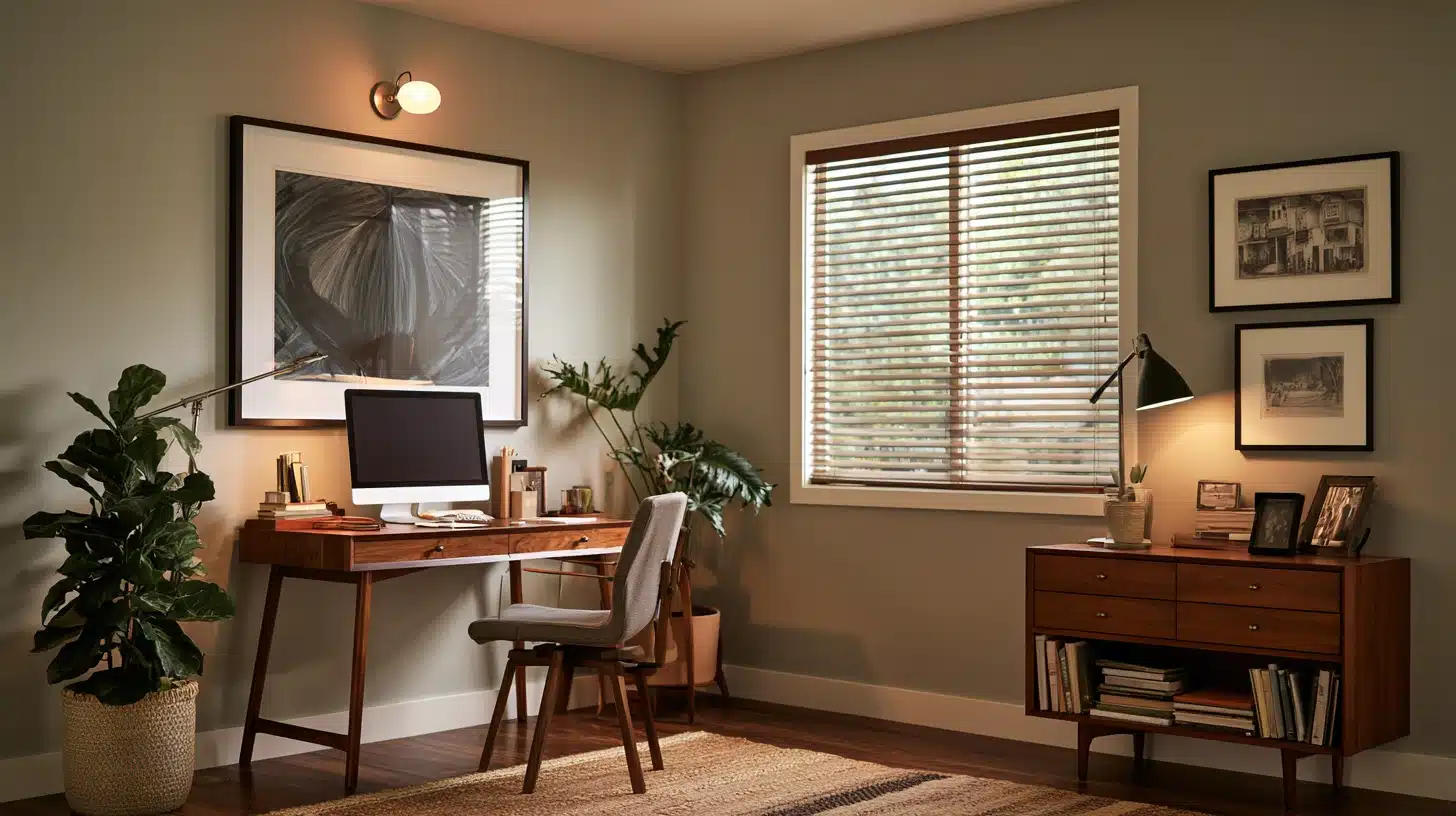
In a home office, this color reads as calm rather than sterile, especially useful for rooms with screens and overhead lighting where a cooler gray might otherwise feel clinical.
Does Gossamer Veil Work on Exteriors?
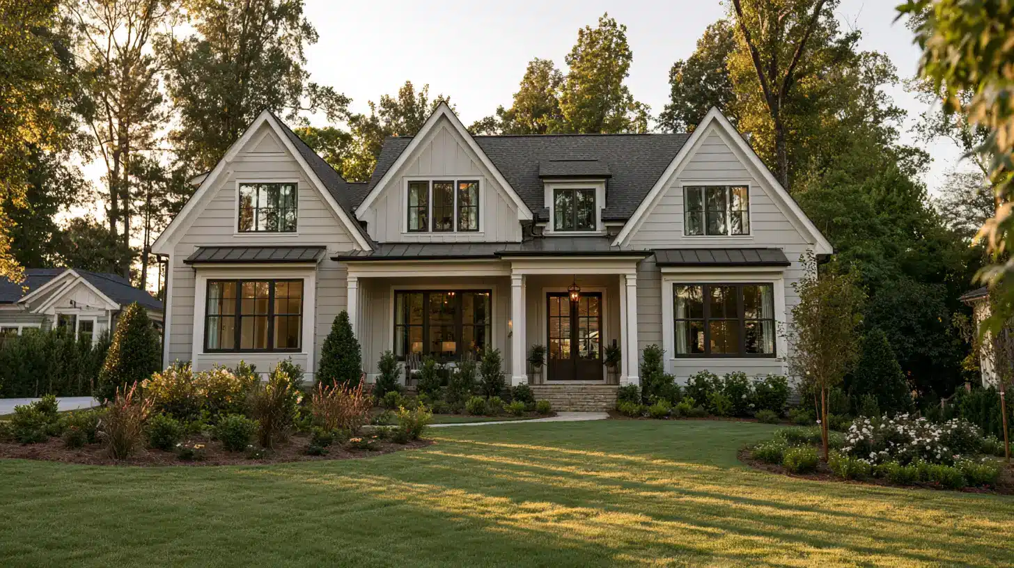
Certainly, although you should be a little more careful than you would be inside.
The amount of outdoor sunlight is less filtered and changes a great deal during the course of the day, enhancing the same kind of variation I referred to earlier.
A house with siding of this color appears quite greige during the middle of the day and becomes a cooler grey by early evening.
It suits the Cape Cod and modern farmhouse types of exterior very well, especially when there is crisp white trim and darker window frames or shutters.
I always advise looking at an exterior sample board at various times during the day before deciding on a complete re-siding or repaint.
Colors That Pair Well with Gossamer Veil
Because its undertone shifts between green and gray, Gossamer Veil is fairly easygoing to build a palette around. A few pairings work especially well:
- Trim: Pure White (SW 7005) or Extra White (SW 7006) for a crisp, clean edge.
- Warm accents: Accessible Beige (SW 7036) or Natural Linen (SW 9109) to lean into its softer side.
- Warm balance: Repose Gray (SW 7015) or Agreeable Gray (SW 7029) for adjoining walls or transitional spaces.
- Contrast: Naval (SW 6244) or Urbane Bronze (SW 7048) for a grounded, moody accent.
- Fixtures: Matte black or aged brass both work well without competing with the paint’s undertone.
Conclusion
In my experience, the Gossamer Veil Sherwin-Williams has earned its reputation for being able to change shape.
It has a warm grey color with a green tinge, a light-to-medium reflectance, and the ability to look different depending on the direction your windows face and the kind of bulb in the lamp next to them.
I don’t regard that unpredictability as a fault, but as a feature, in the right room, with decent daylight, warm wood tones nearby, and your willingness to test it properly before committing to a full repaint
In my view, Gossamer Veil is the better choice of the two for anyone who found Agreeable Gray a bit too brown for their liking.
Frequently Asked Questions (FAQs)
1. Does Gossamer Veil Ever Look Beige Instead of Gray?
Yes, especially against warm wood floors or in golden afternoon light, where its greige lean becomes more noticeable.
2. Will Gossamer Veil Clash with Cool-Toned Quartz or Marble?
It can look slightly off against very blue-gray stone, since its warmth and green undertone don’t always sit comfortably beside cool veining.
3. Is Gossamer Veil a Good Choice for A Whole-House Color?
It works well as a main color, but I’d pair it with a couple of deeper accent shades so the palette doesn’t feel one-note.
4. Can Gossamer Veil Work with Black or Dark Bronze Fixtures?
Very well. The contrast grounds the softness of the paint and keeps the room from feeling washed out.
5. Should I Test This Color on More than One Wall?
I always recommend it, since corners and adjoining walls can catch light differently and change how the undertone reads.