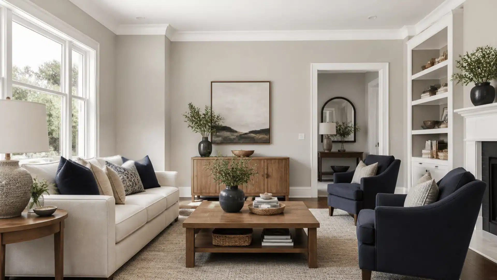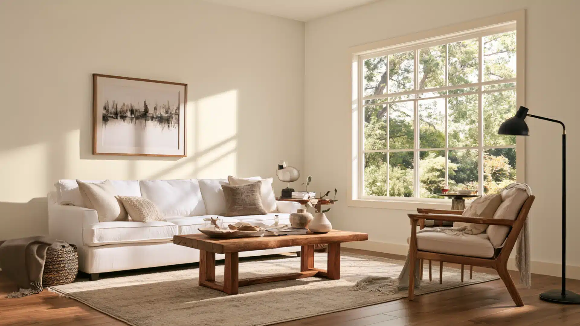
Balboa Mist by Benjamin Moore is one of those neutral shades found almost everywhere.
It has become a favorite in living rooms, hallways, and bathrooms across home designs.
It looks soothing to the eyes and feels really cozy and livable. And that’s the reason for its popularity, as well as the fact that the color is very adaptable.
Let’s get into it.
What Color is Benjamin Moore Balboa Mist?
It is a light, warm gray that you can describe as a color between gray and greige.
Balboa Mist has enough warmth to keep it from feeling cold, but it still looks grayer than a standard beige paint color. Its appearance can shift between warm gray, greige, and soft taupe depending on your room.
- Color Code: Benjamin Moore OC-27
- Color Code Also Used: 1549
- Collection: Off-White Collection
- Light Reflectance Value (LRV): 65.53
- Color family: Light warm gray or greige
- Overall Look: Soft, light, and slightly warm
What are its Undertones?
It has two main undertones that shape how it looks on the wall: a warm beige base and a subtle violet cast.
These undertones make the color feel less boring, plain, or cool gray. Depending on the room, it may appear soft gray, greige, taupe, or slightly violet.
Your room’s setting and lighting can also affect it.
Beige and Taupe Undertone
The beige side of this color is easiest to see in rooms with warm natural light, wood furniture, cream fabrics, or warm-toned flooring.
In these settings, the color can go from gray to a softer taupe or greige appearance.
This warmth helps it feel comfortable and balanced rather than cold, especially in living rooms, bedrooms, and dining spaces.
But are beige and taupe really that different, read here……
Violet Undertone
Yes, it also has a subtle violet undertone that may become more visible in cooler lighting.
The violet usually stays subtle and soft and does not make the wall look clearly purple, but it can create a faint lavender-gray effect in certain conditions.
Testing a sample in the actual room helps reveal how strong this undertone will appear.
Where Does Balboa Mist Look Best in Interiors?
Living Rooms
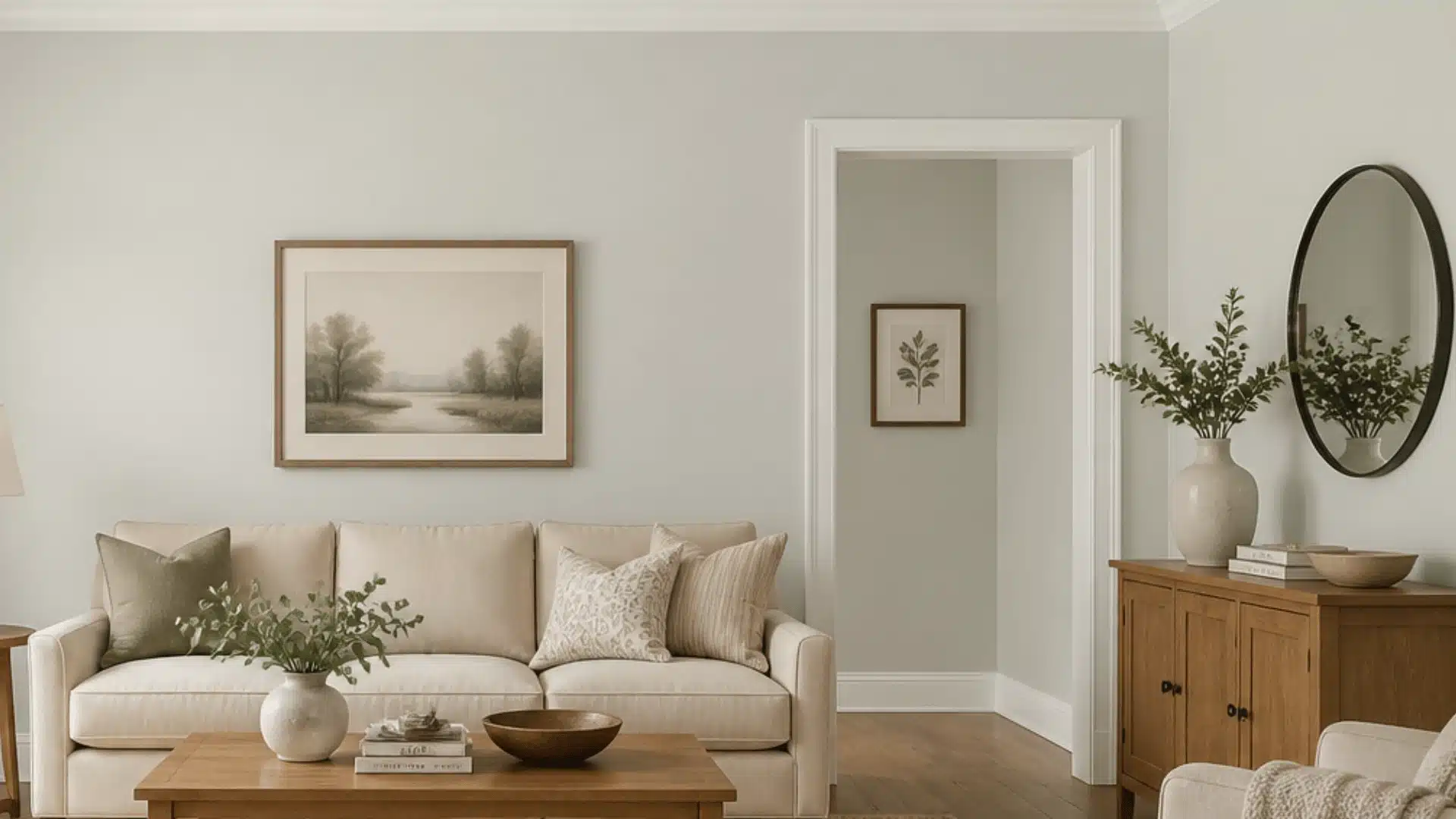
When used on a full wall, It looks like a soft, balanced neutral instead of a stark gray.
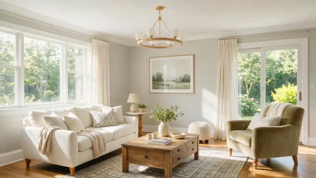
It pairs well with warm wood furniture, linen or boucle fabrics, and white trim, which is why it’s common in transitional and modern farmhouse living rooms.
Because it isn’t a heavy color, it also keeps open-concept layouts feeling connected rather than cluttered.
Bedrooms
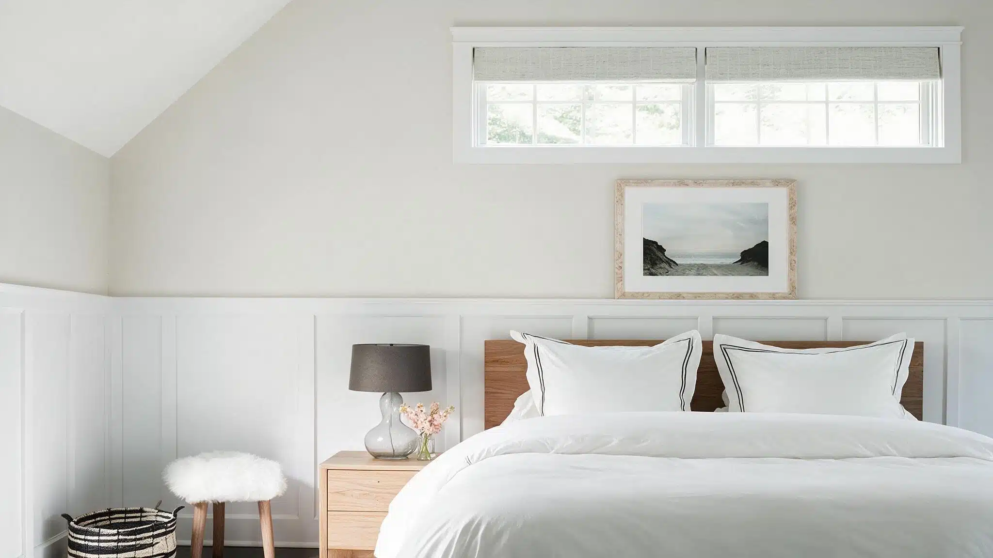
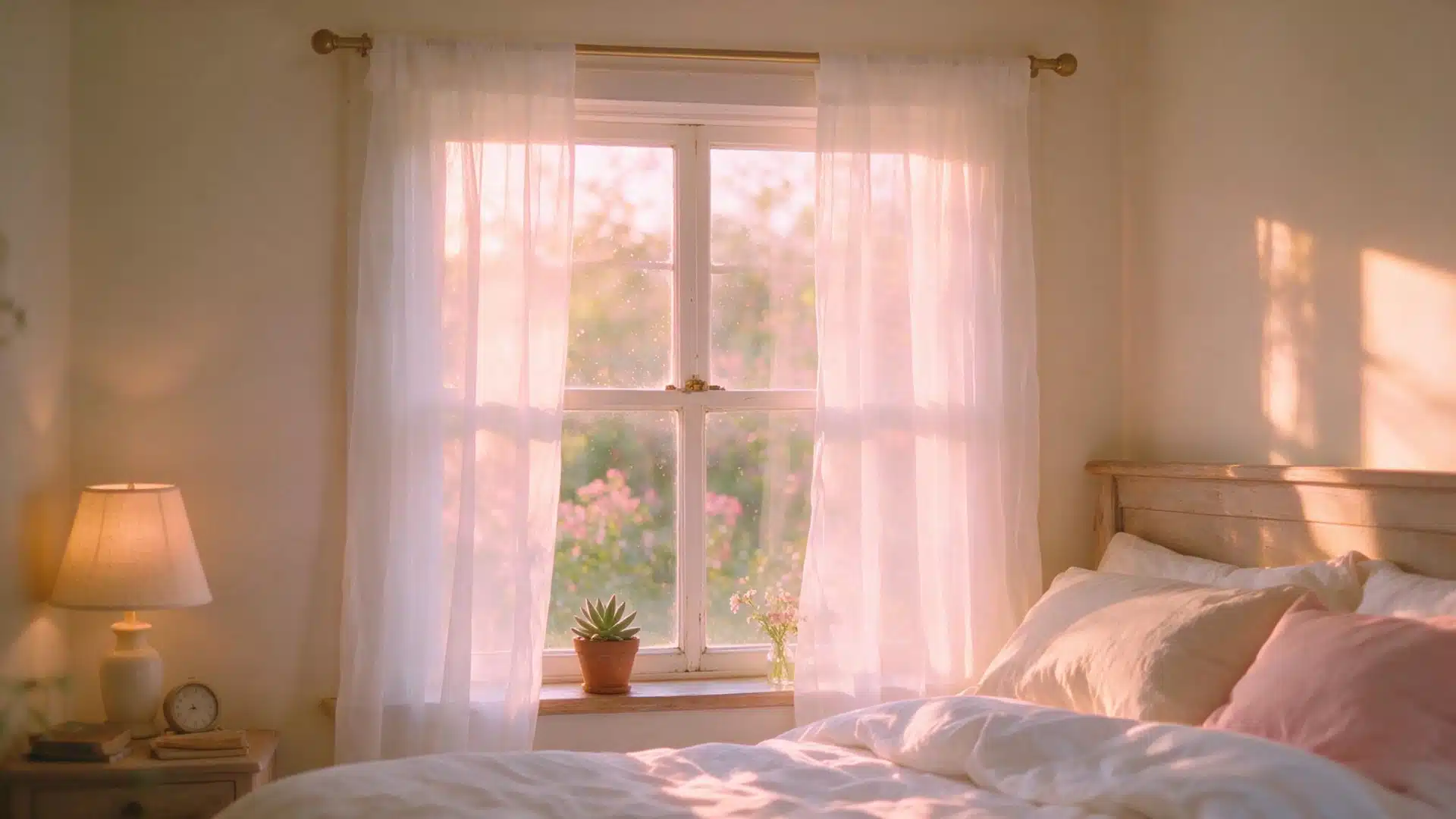
Bedrooms are arguably where this color does its best work.
Its lightness keeps the space from feeling small, and the warm undertone makes it feel calmer and cozier than a cool gray would.
Paired with white bedding, natural wood nightstands, and soft fabrics, it creates a peaceful background.
Kitchens
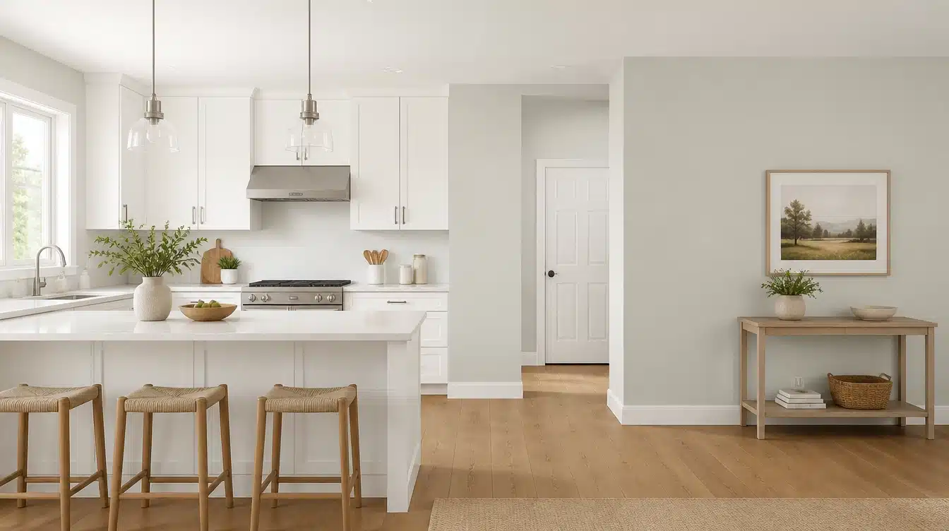
Most homeowners reach for it as a wall color in kitchens with wood or white cabinetry, letting the cabinets do the visual work while the walls stay quiet.
It can be used on cabinetry too, though that’s less common.
On vertical surfaces at eye level, its violet undertone is more likely to show up under warm LED lighting.
Bathrooms
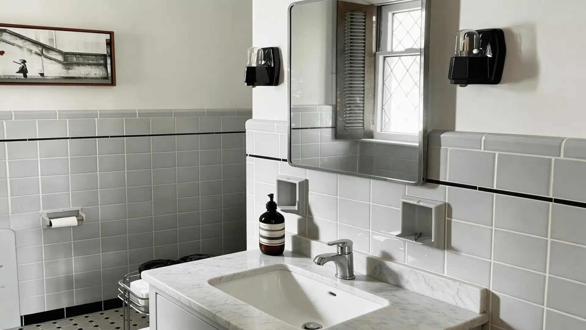
Against white fixtures, marble, and light stone, It tends to look its most gray.
Bathroom lighting, often a mix of vanity bulbs and whatever daylight comes through a small window, is also where its undertone is easiest to catch.
Dining Rooms
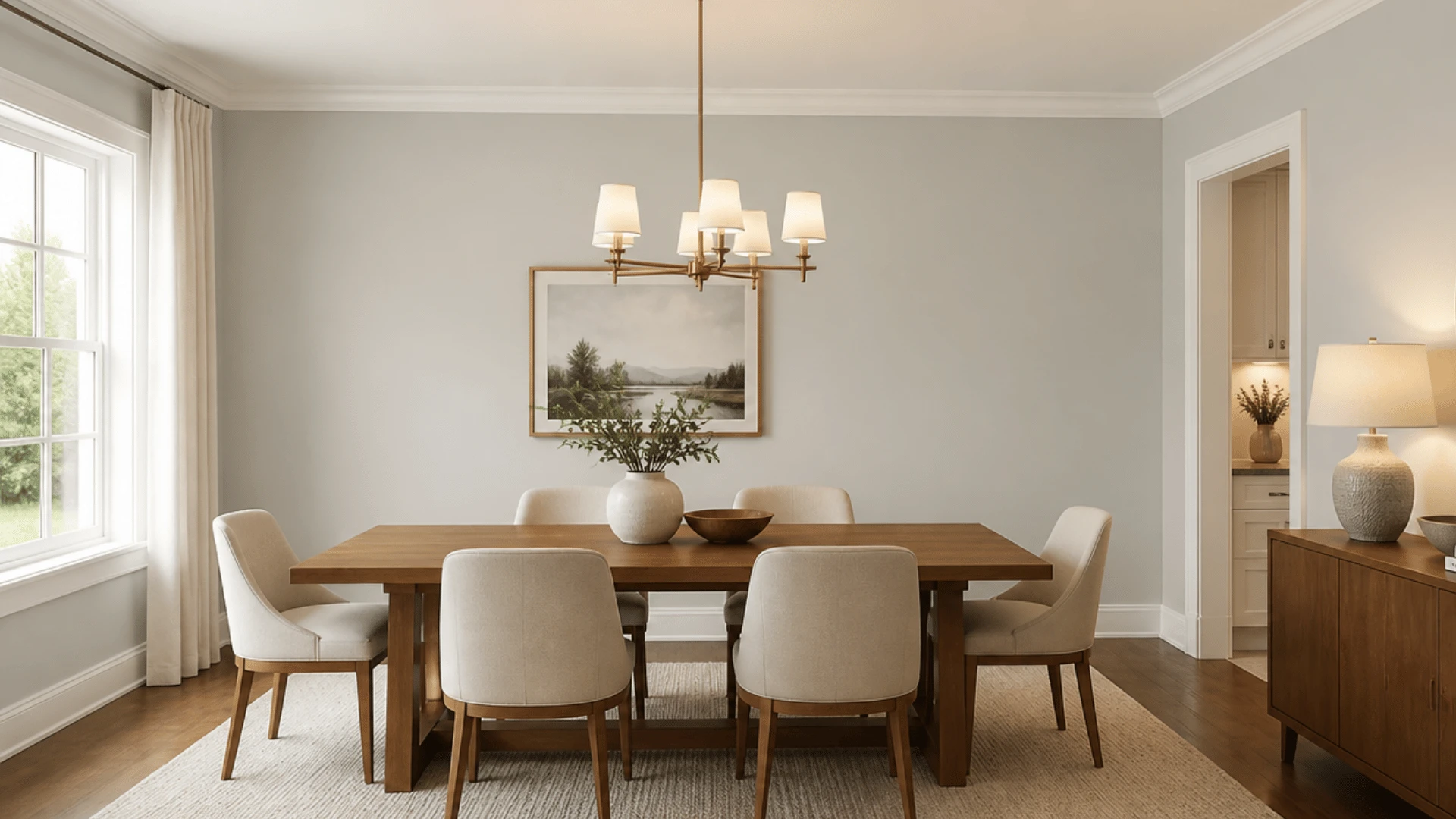
Dining rooms with wood tables and white trim let it lean into its warmer side, especially under the ambient lighting most people use over a dinner table.
In rooms with warmer bulbs, expect it to shift a bit more toward greige than gray.
Entryways
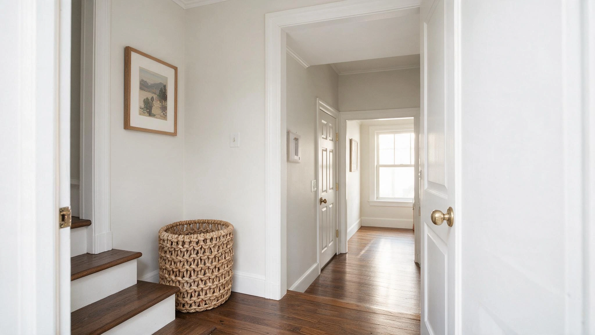
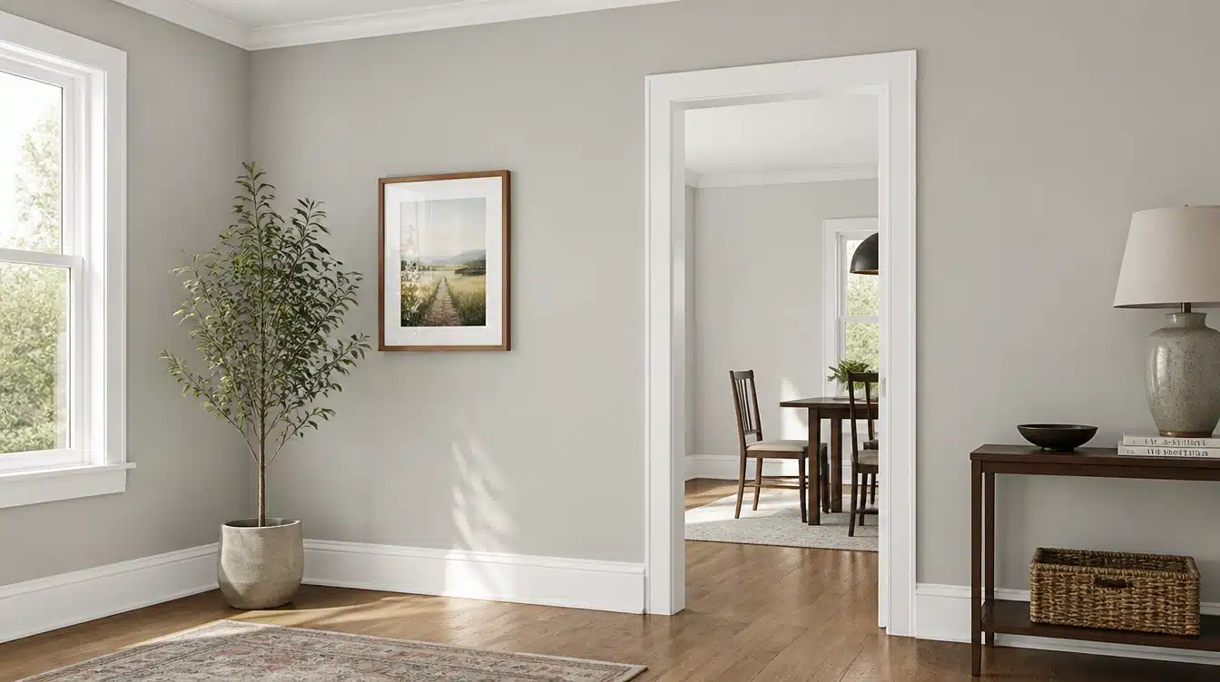
Since this color isn’t too dark, it works well as a connecting color between rooms with different finishes.
It’s light enough to link a white kitchen and a slightly deeper living room without creating a jarring transition as you move through the house.
Benjamin Moore Balboa Mist on Home Exteriors
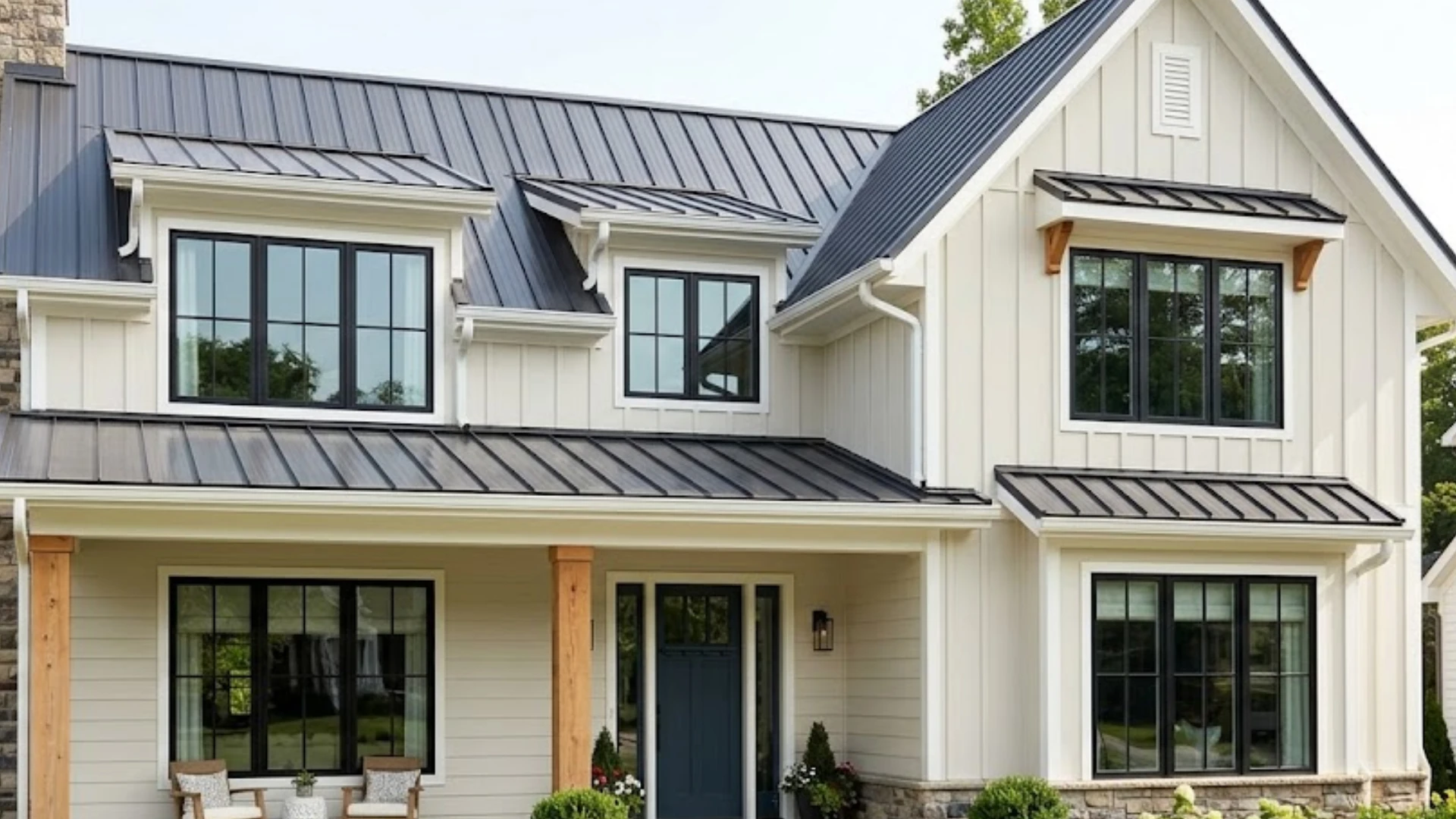
This color has become a frequent pick for exterior siding and brick, especially on homes aiming for a soft, off-white curb appeal rather than a stark white or heavy gray.
Its LRV keeps it bright against all rooflines, while its warm undertone prevents it from feeling cold under the sky.
Direct sunlight tends to wash the color out slightly, while shades and covered porches show more of its underlying gray and violet cast.
Testing a large peel-and-stick sample on more than one side of the house gives a truer sense of how the color will settle in.
It pairs well with charcoal, deep green, or black trim with brass or black exterior hardware.
What Colors Go With Balboa Mist?
Since this shade is in the middle of the neutral spectrum, it pairs well with whites, deeper neutrals, and the occasional pop of color.
Best White Trim Colors
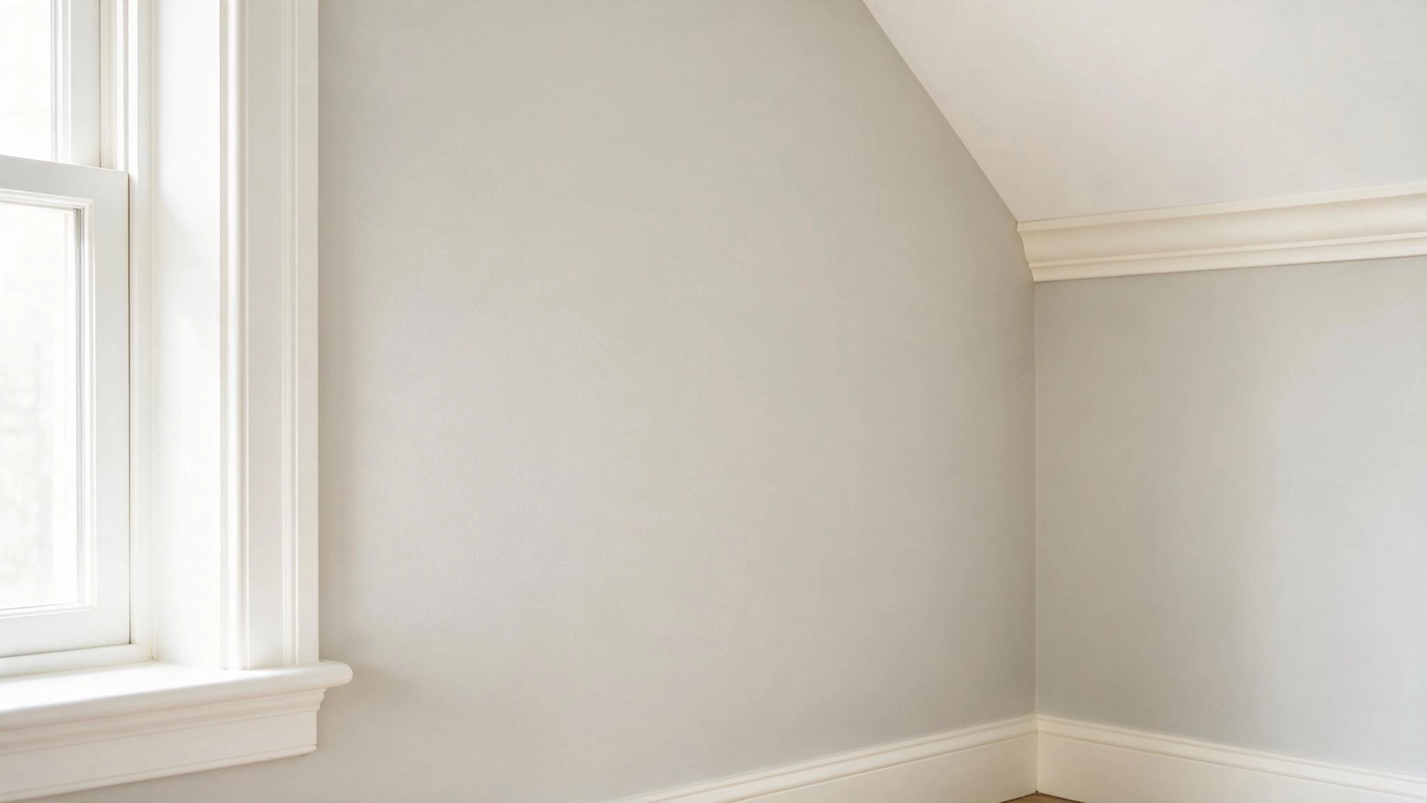
Three white paint colors are often paired with it: Chantilly Lace, Simply White, and White Dove.
Chantilly Lace is the contrast-heavy pairing, best suited to trim meant to read distinctly white.
White Dove is warmer and softer, blending nicely with its warmth. Simply White is right in the middle, and it is not too bright.
Coordinating Neutral Colors
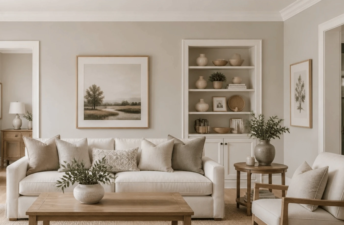
For a whole-house neutral palette, this color works well with other warm grays and greiges that are a bit lighter or darker, as well as soft off-whites.
Keeping undertones similar in each room, instead of mixing cool and warm grays, feels well planned.
Blue and Green Accent Colors
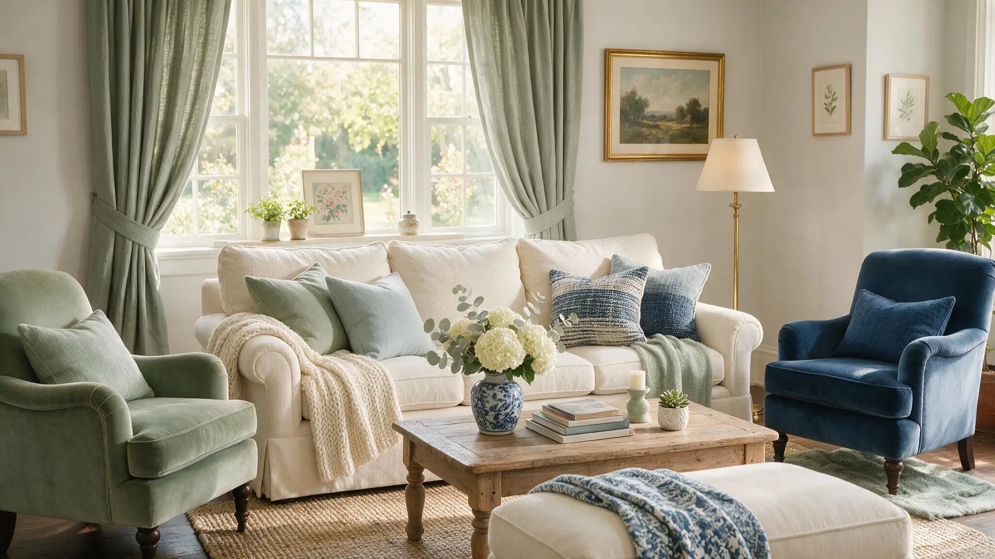
Muted sage and soft gray-blue shades go well with its warmth and are often used for accent walls or soft furnishings in rooms with this color.
Deep navy also works well as a contrast note on doors, pillows, or an accent piece.
Dark Accent Colors
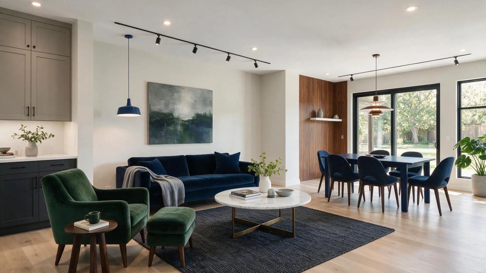
Charcoal, deep warm gray, navy, and dark green all look good on cabinets, doors, kitchen islands, or accent walls when this is the main color.
These darker shades add definition without competing with the wall color.
How Does Lighting Change the Look?
It does not look the same throughout the day because natural and artificial light affect its undertones.
Cooler light generally makes the color appear grayer and can bring its violet side forward. Strong warm daylight often softens the gray.
North-Facing Rooms
North-facing rooms receive cooler, indirect natural light for much of the day.
In this exposure, it usually loses some of its beige warmth and appears more like a soft warm gray.
Its subtle violet undertone may also become easier to notice, especially when the room contains cool white finishes, blue-gray flooring, or limited artificial lighting.
South-Facing Rooms
South-facing rooms receive stronger and generally warmer daylight, which brings out its softer side.
Instead of appearing primarily gray, the color can lean warmer, allowing more of its beige, greige, or taupe qualities to come through.
Strong daylight can also make it look lighter because its relatively high LRV reflects plenty of incoming light.
East and West-Facing Rooms
These rooms catch cooler morning light that keeps the color closer to its gray base.
And then warm up as the sun moves west.
West-facing rooms see the opposite pattern, staying neutral before afternoon sun makes the color warmer and more golden by evening.
Under Artificial Lighting
Warm-toned bulbs, generally in the 2700K to 3000K range, bring out its beige and taupe undertones.
Cooler bulbs at 4000K and above push it back toward gray and can make the violet cast more noticeable, can be seen in windowless rooms that rely entirely on artificial light.
Balboa Mist vs Pale Oak vs Edgecomb Gray vs Classic Gray
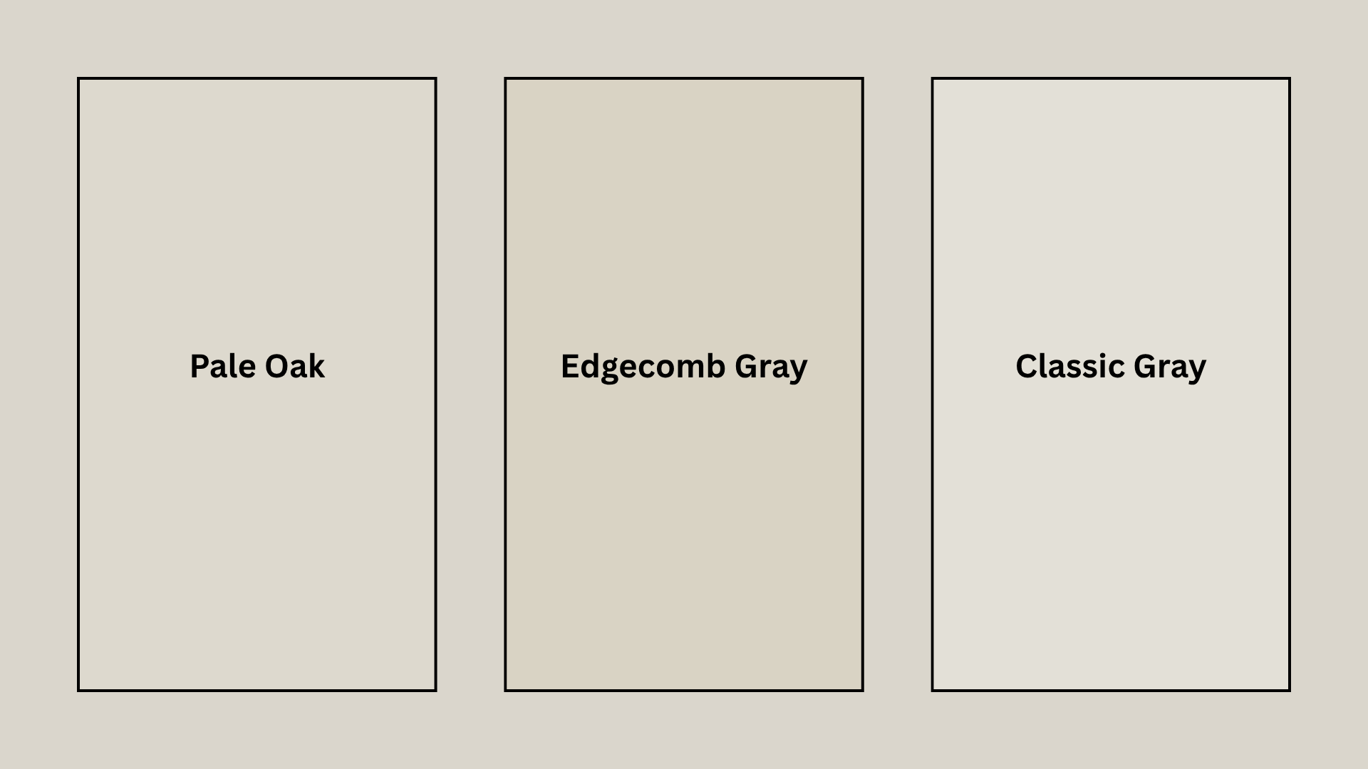
When you compare cans side by side, Light Reflectance Value (LRV) is usually the fastest way to tell them apart.
Pale Oak
Pale Oak (OC-20) is a touch lighter and leans more brown-pink, with less of the violet cast that shows up in this shade.
In rooms with plenty of natural light, Pale Oak is almost like a warm white, while this color holds onto more visible gray even in strong sun.
Edgecomb Gray
Edgecomb Gray has a lower LRV in the low 60s, which makes it read noticeably darker and more taupe-brown than this shade.
That extra depth makes it a common choice for rooms that already get plenty of daylight.
Classic Gray
Classic Gray sits higher on the LRV scale, closer to the low 70s, which pushes it toward off-white territory.
It’s a softer, gentler option than this one but can wash out more in bright, direct light.
It works well in smaller rooms or hallways, keeping things feeling more open and bright rather than adding contrast.
Where to Buy Benjamin Moore Balboa Mist?
This color is sold through official channels, regional dealers, third-party swatch services, and at major chain hardware stores.
- Official Retailers: Samples, color chips, and full cans are available online or for in-store pickup directly from the brand.
- Local Paint & Hardware Stores: Regional dealers such as Ace Hardware and Aboff’s Paints
- Peel-and-Stick Samples: Large 12 “x12” genuine paint swatches can be shipped directly through the Samplize.
Know that Benjamin Moore paint isn’t sold at major chain stores like Home Depot or Lowe’s.
Final Thoughts
It is light enough to open up a room, warm enough to feel welcoming, and neutral enough to sit behind almost any furniture or finish.
Its violet-beige undertone means it will not behave identically in every room.
So sampling it on the actual walls, under the actual lighting, is a necessity, and you need to do that before actually buying it and painting your home.
Handled that way, Balboa Mist by Benjamin Moore looks intentional in every room it touches.
Frequently Asked Questions (FAQs)
1.Is OC-27 the Same as Balboa Mist 1549?
Yes, 1549 is its number in the brand’s Classic Color Collection, while OC-27 refers to the identical shade.
2. What Paint Lines is it Available in?
It comes in Regal Select, Aura, and Advance formulas, covering wall, trim, and cabinetry applications.
3. What RGB Value is Closest to this Color?
Its approximate digital match is RGB 219, 215, 205, a soft warm-gray tone used in color previews.