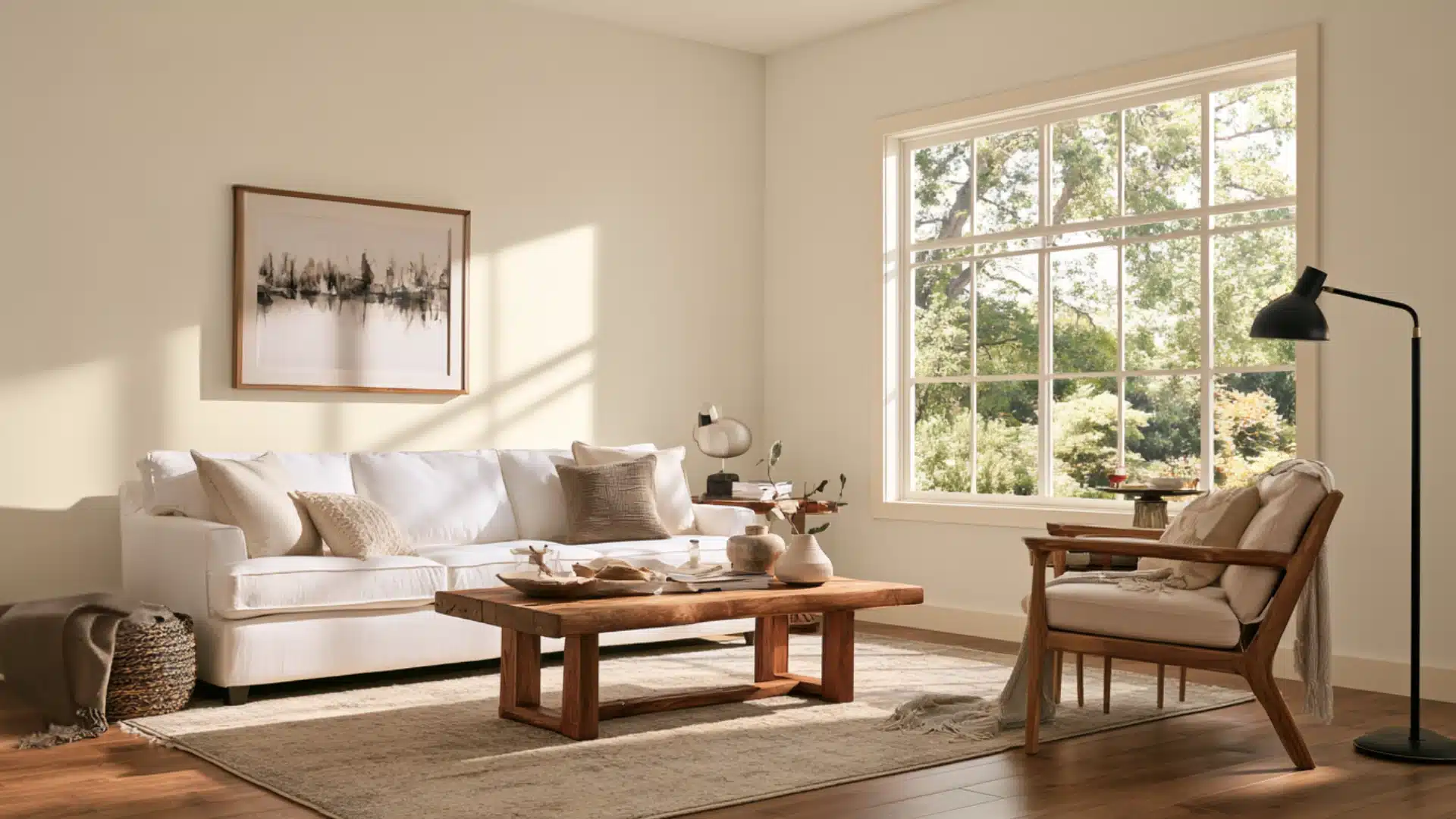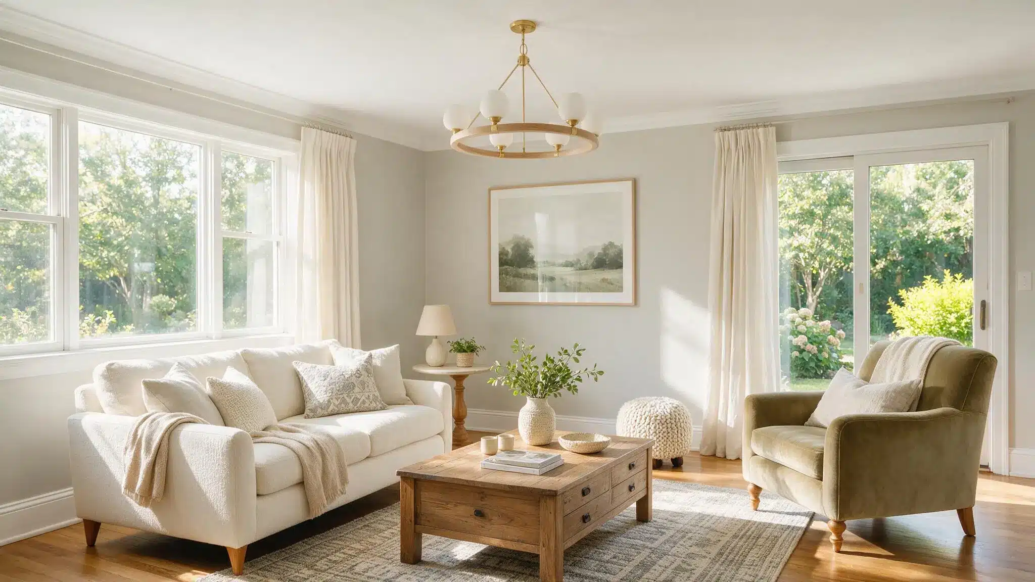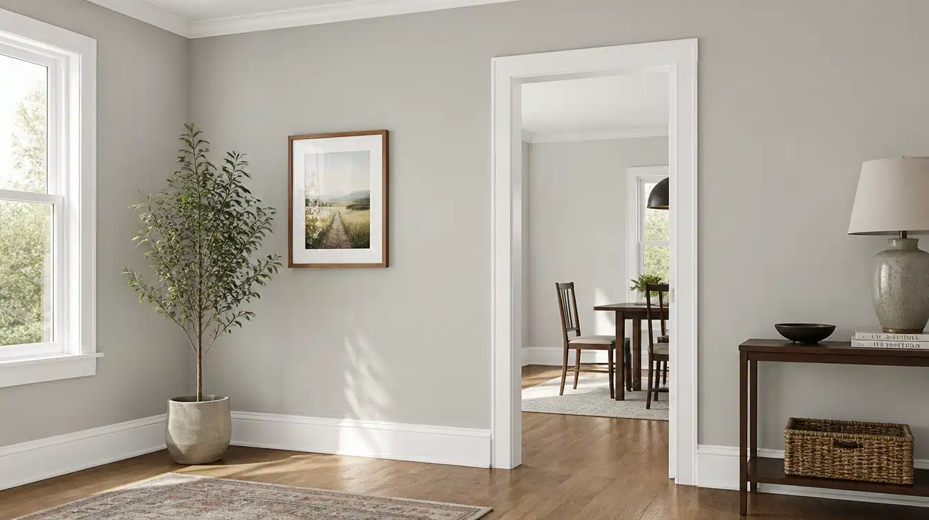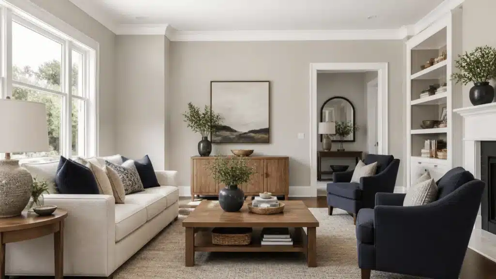
The Sherwin-Williams color Agreeable Gray has held the top spot among neutral colors on the color wheel for over a decade.
It earns its place by never fully committing to either side of the temperature scale.
But choosing agreeable gray coordinating colors takes extra effort, since this shade of greige shifts in different lighting conditions.
Get the pairing right, and the room looks calm and expensive. Get it wrong, usually by placing it next to an almost-identical gray, and the whole room looks like a mistake nobody can quite name
This breakdown covers the trim and accent shades that pair well with it, the coordinating colors Sherwin-Williams recommends on its own color page, and where each fits best from room to room and outside the house.
Agreeable Gray Undertones and LRV
Agreeable Gray (SW 7029) has a Light Reflectance Value of 60; multiple professional color reviews confirm this reading, putting it in the middle of the depth range.
The point is that it doesn’t work like a color, but more like a mood ring the shifts with the room’s lighting.
Test coordinating colors on a large sample board, viewed at different times of day, before applying them to cabinets, an accent wall, or trim you can’t easily repaint.
Agreeable Gray Coordinating Colors for Trim and Accent
These two paint finishes have contrasting value levels. Since greige is in between, you will need both to complete your color palette.
The lighter trim color keeps the greige from looking too dark; the dark accent will provide definition to the doorways, island, or even one accent wall.
The following colors give you both finishes, so you no longer need to guess what goes well together.
1. Pure White (SW 7005)
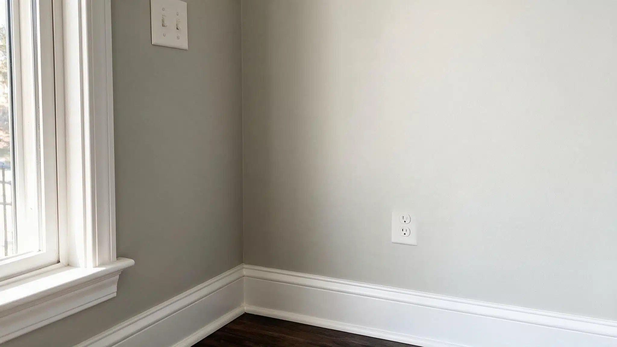
Pure White is a common trim recommendation in professional color reviews. It works with almost any lighting condition, so it’s a safe first choice if you’re not ready to test several samples.
Its slight warmth also keeps the trim from feeling too stark against Agreeable Gray’s beige undertones.
2. White Snow (SW 9541)
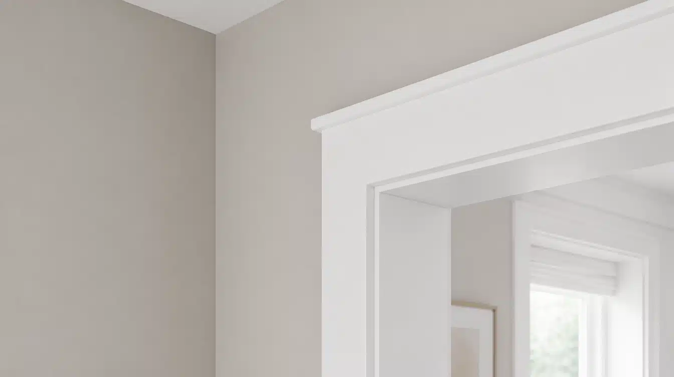
White Snow sits at an LRV near 90; it’s the whitest, brightest option on this list.
It suits modern kitchens or rooms that already lean cool, where you want maximum contrast rather than a soft transition. The brighter finish can also make smaller spaces feel cleaner and more open beside Agreeable Gray.
3. Urbane Bronze (SW 7048)
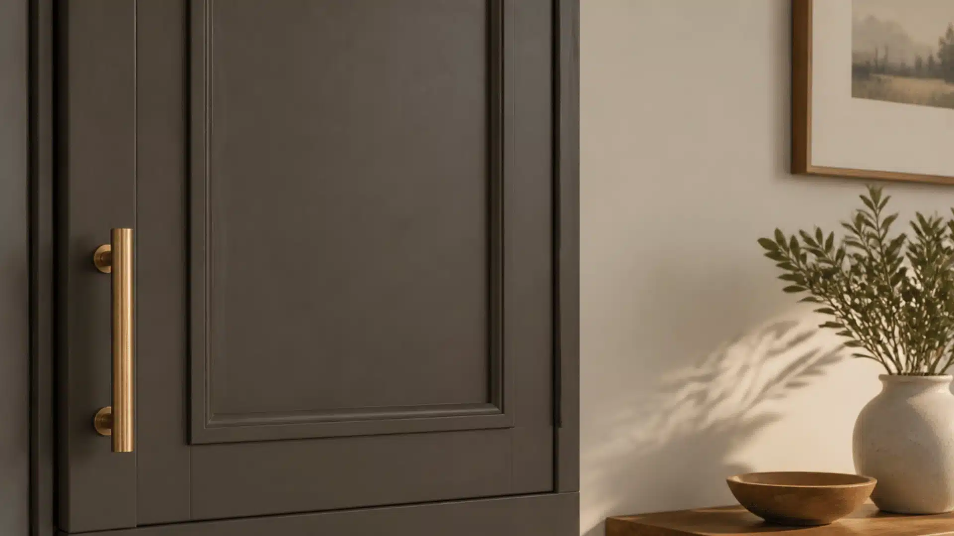
Urbane Bronze is a warm, brownish-green that echoes the wall color’s own warmth while adding serious depth.
It’s a favorite for kitchen islands, front doors, and stair railings because it adds real contrast without clashing on undertone.
Because it leans dark, it works best on a single feature rather than an entire room.
4. Iron Ore (SW 7069)
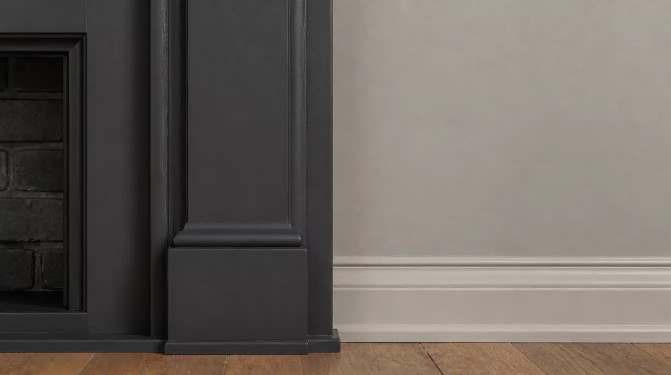
Iron Ore offers a softer alternative to true black, with a subtle green cast that keeps it from looking harsh next to a warm greige.
It suits cabinetry, a fireplace surround, or an interior door where you want strong definition without the starkness of a pure black. It photographs and lights well in both daylight and warm bulbs.
5. Naval (SW 6244)
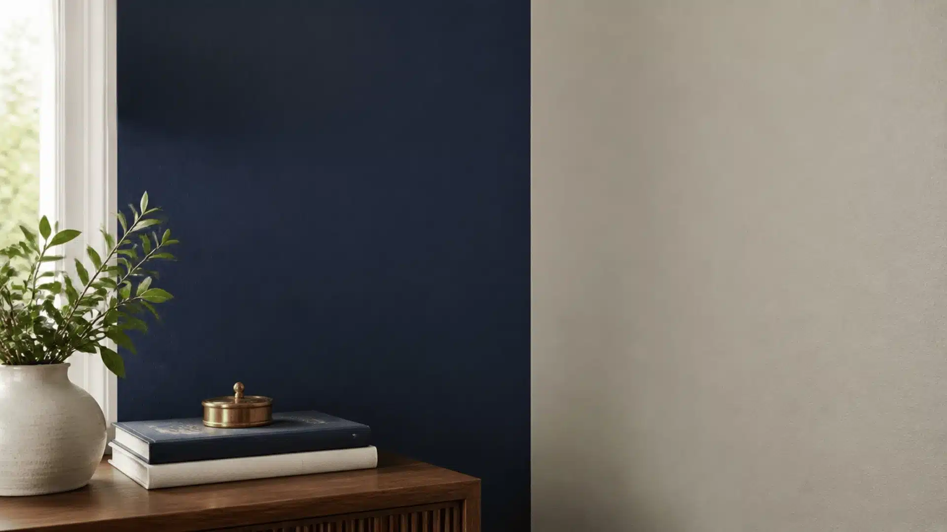
Naval is the classic deep navy that gives a room real drama without leaning on another gray or beige.
It works well as an accent wall behind a bed, on lower kitchen cabinets, or on a front door. Because navy carries more saturation than the other colors on this list, one wall or one surface is usually enough.
Warm wood, brass, and creamy white accents help soften the contrast between Naval and Agreeable Gray.
6. Tricorn Black (SW 6258)
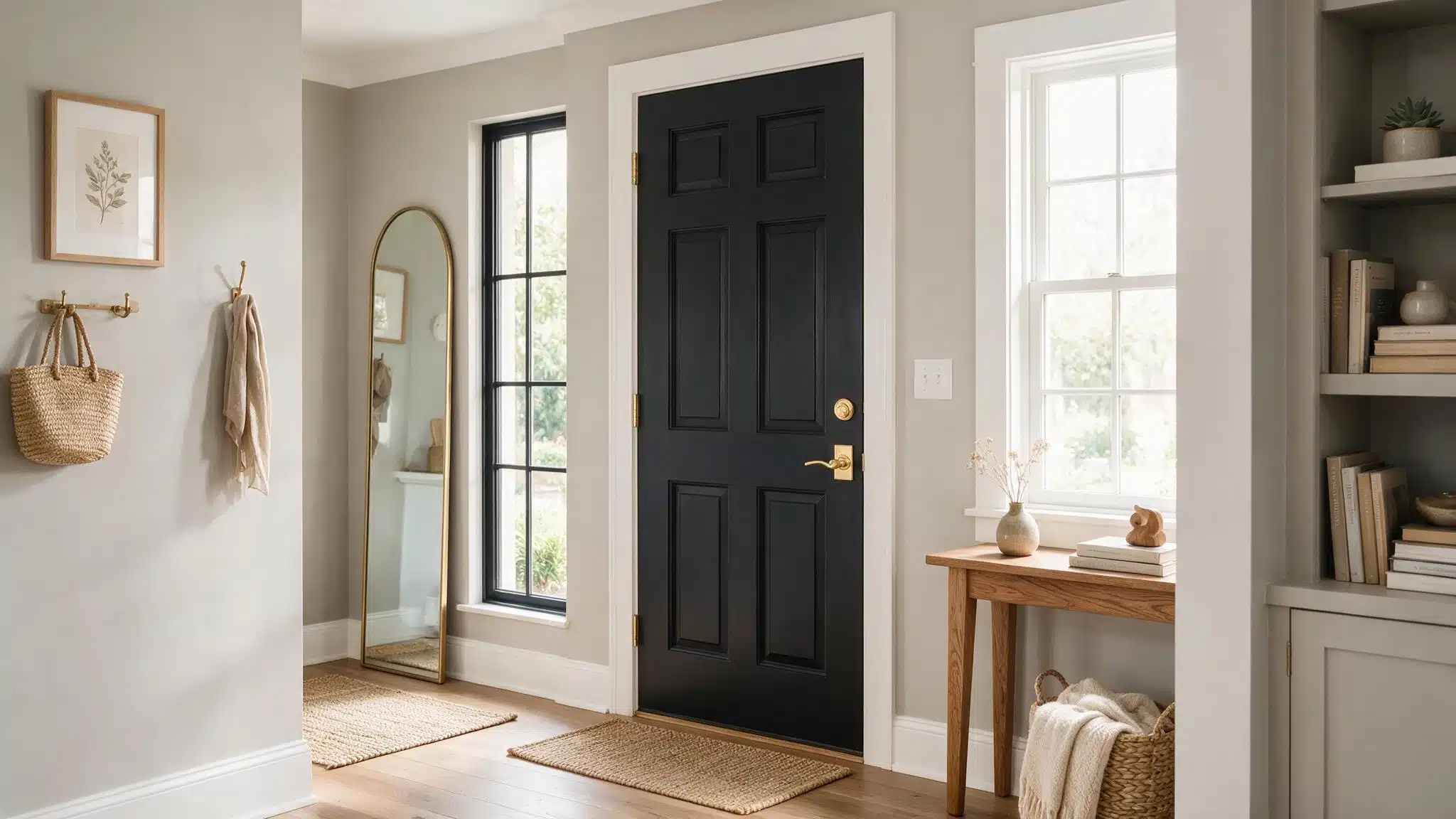
Tricorn Black is the highest-contrast option on this list, best kept to a door, a vanity, or a single architectural feature rather than a full wall.
Against a warm greige, it reads crisp and modern rather than harsh, especially when paired with plenty of light trim and natural wood elsewhere in the room.
It is especially effective when you want architectural details to stand out clearly against the softer greige background.
7. Dorian Gray (SW 7017)
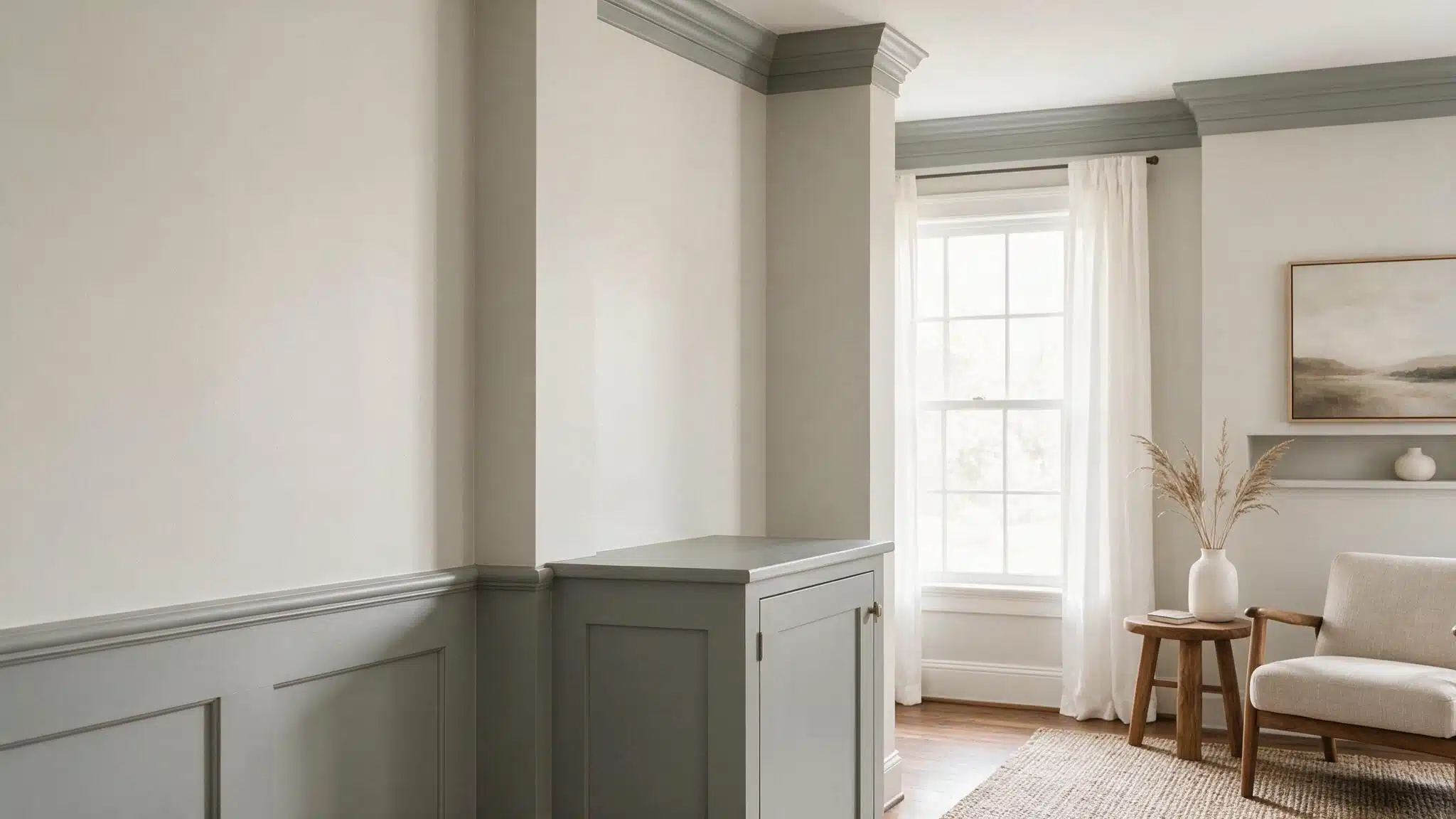
Dorian Gray, with an LRV of 39, has undertones that can drift between purple and green depending on the light, amuch like this greige’s own inconsistency.
Which is exactly why the two often read as intentional partners rather than mismatched grays on a shared wall or ceiling.
Use it when you want visible depth while keeping the overall palette neutral and closely connected.
8. Gauntlet Gray (SW 7019)
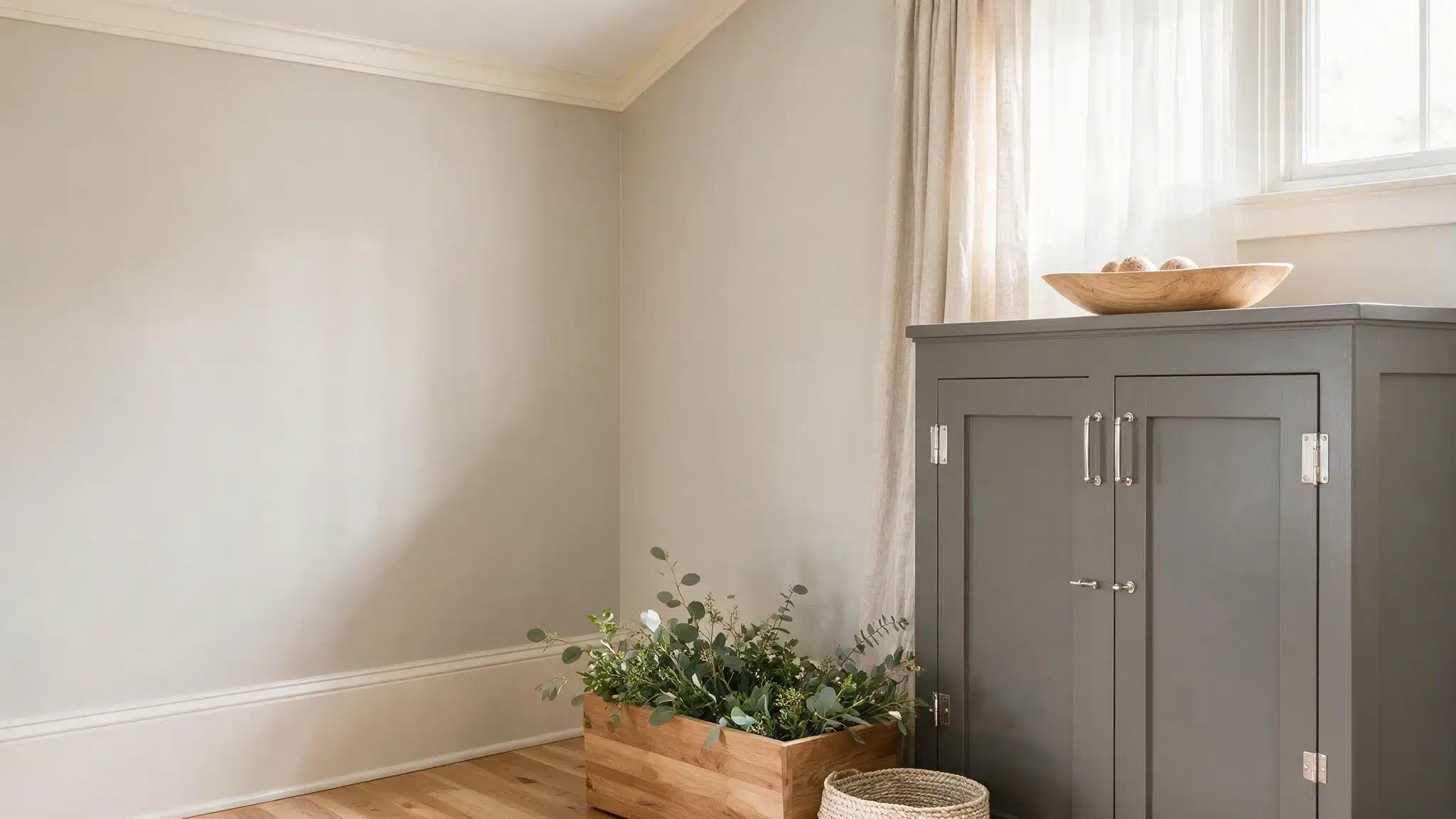
Gauntlet Gray shares this greige’s underlying warmth even though it sits much further down the value scale.
That shared warmth keeps the two from clashing on undertone, so it works well for cabinetry, doors, or a single bold wall in a room that already leans warm and neutral.
Its deeper value gives larger features more presence without introducing a noticeably cooler or more colorful accent.
9. Dovetail (SW 7018)
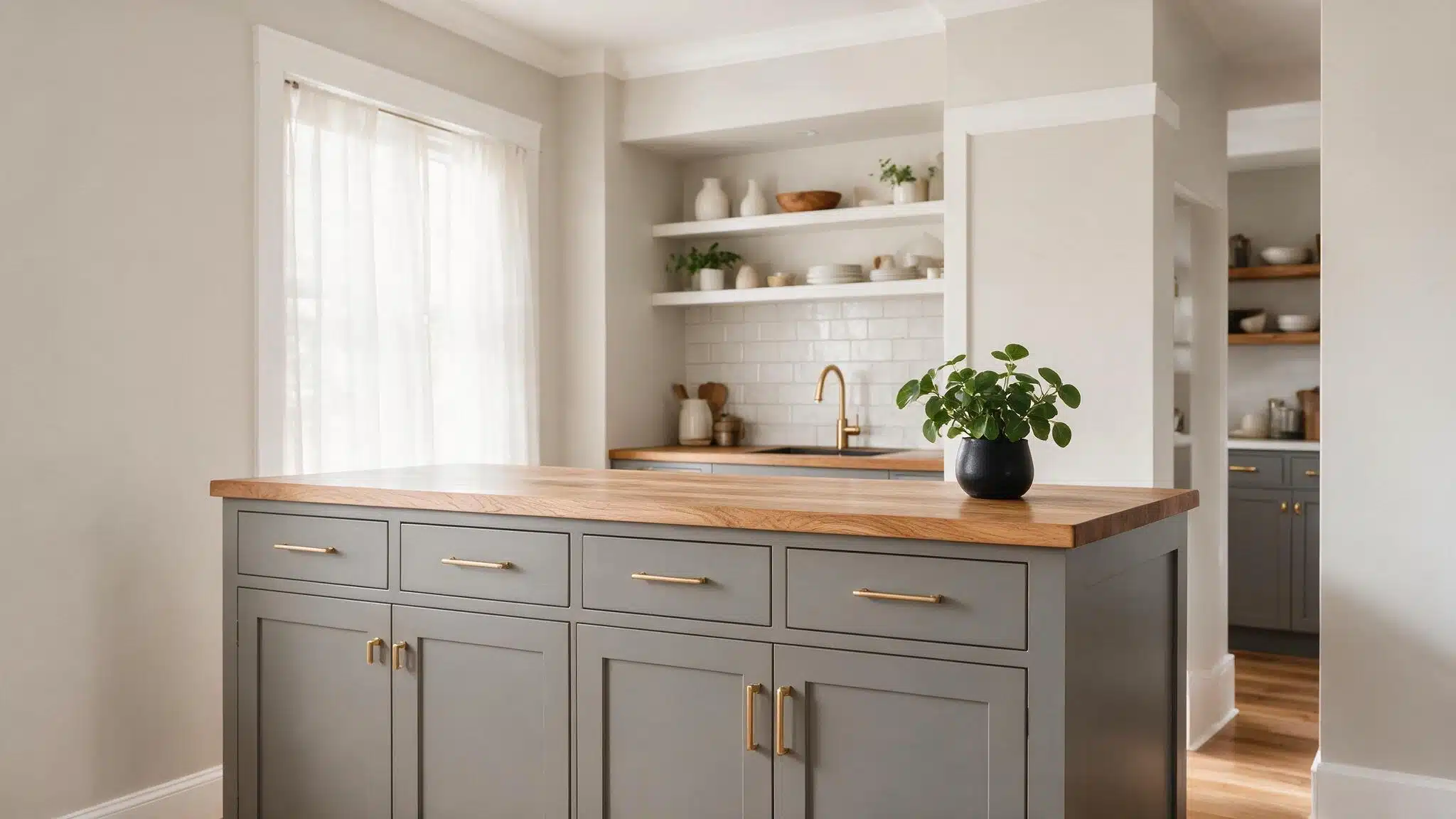
Dovetail adds noticeable depth while staying in the same warm, charcoal-brown family as this greige.
It suits kitchen islands, front doors, and accent walls where you want a bigger step down in value without introducing a completely different color group, and it looks just as good under warm bulbs as in daylight.
The result feels richer than a light gray pairing while still maintaining a cohesive warm-neutral palette.
10. Incredible White (SW 7028)
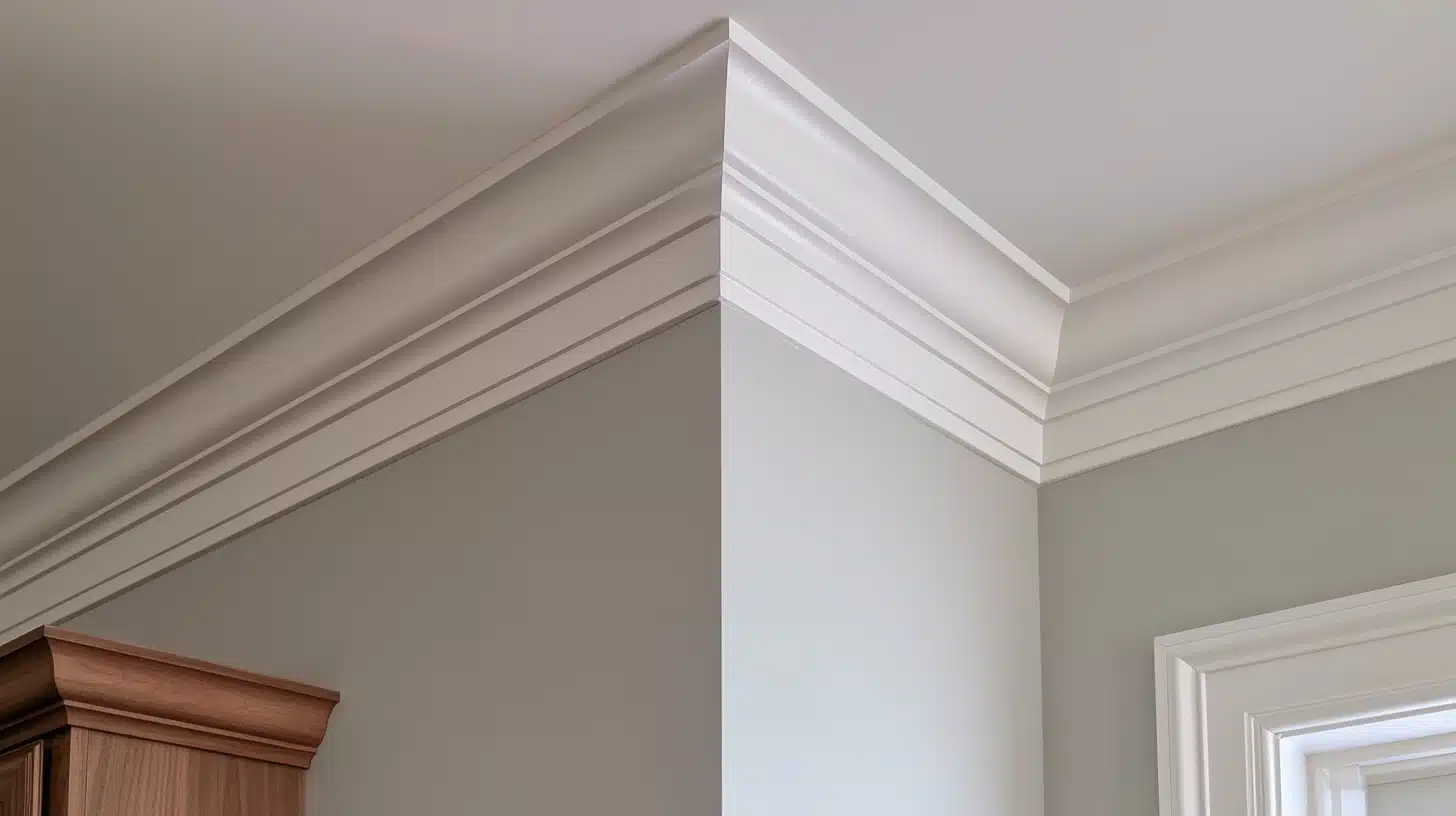
The Incredible White is a soft warm white; it falls comfortably within the family of this greige without competing with it.
This will work great for trims, ceilings, or an adjacent room when you want a bright space without the harsh contrast. Since it has warmth to it already, it will complement the warm woods and metals.
11. Extra White (SW 7006)
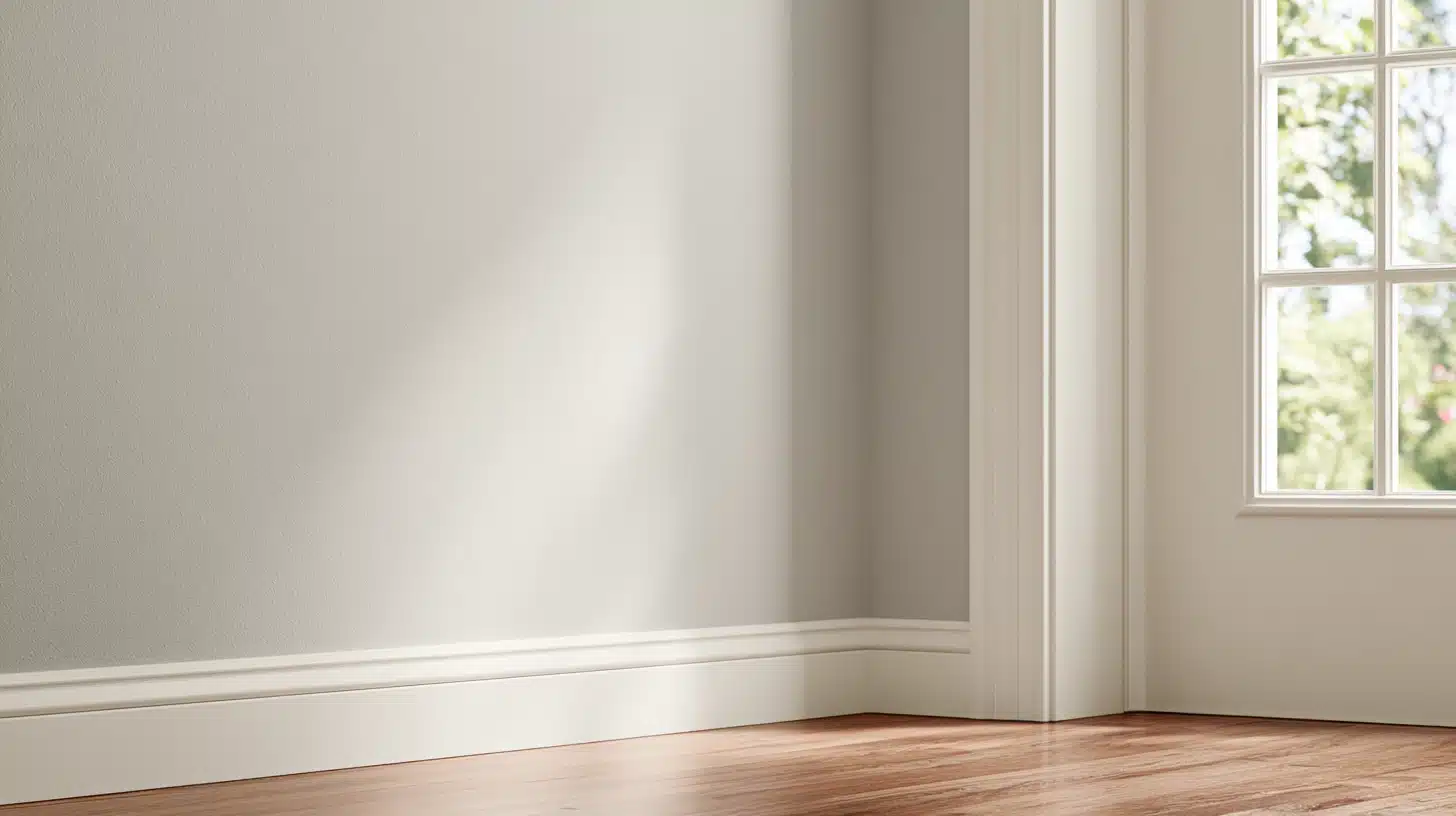
Extra White has a Light Reflectance Value that is higher than the majority of trim whites. As a result, it creates a crisper edge than other trim whites against a warm wall color.
Extra White works well in kitchens and bathrooms that want a clean, fresh look.
Stay away from creamy or yellow-based whites, since they compete with the wall’s beige undertone instead of complementing it.
12. Coral Rose (SW 9004)
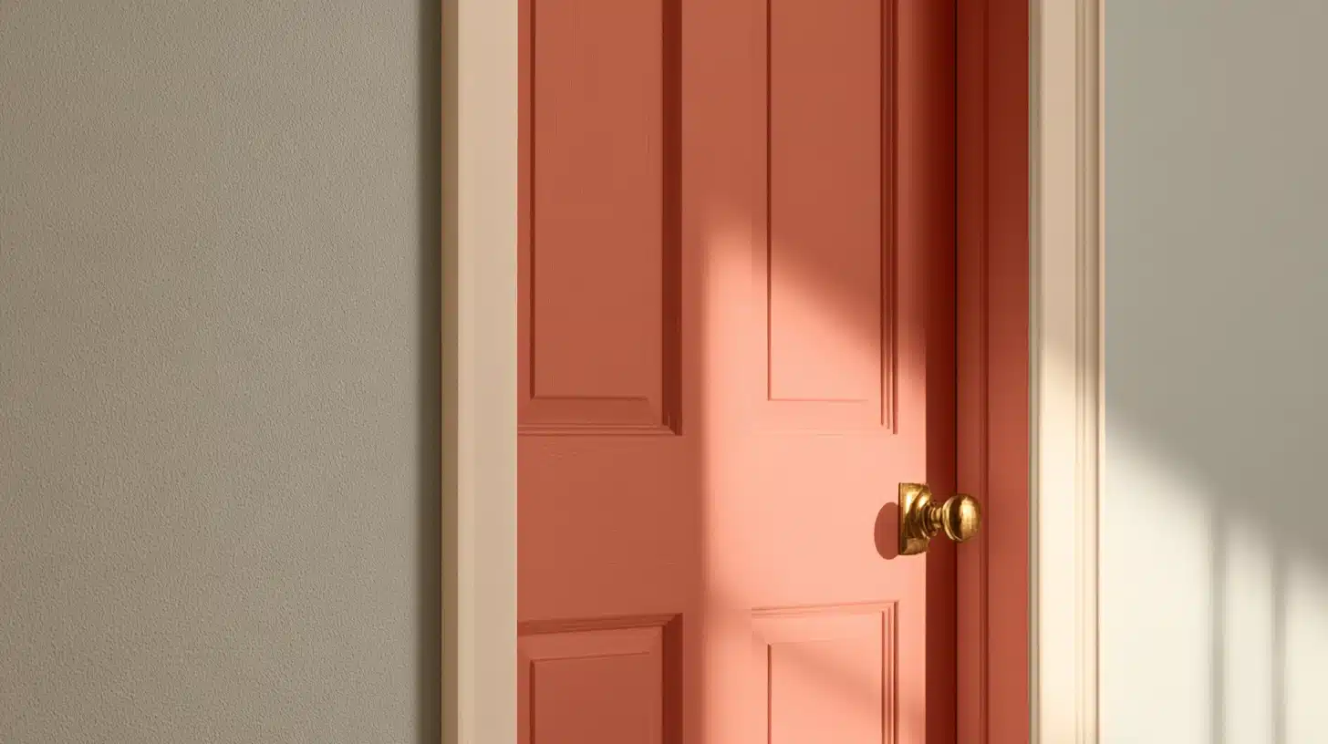
Coral Rose is the shock on Sherwin-Williams’ own chart; a soft, muted pink and orange color that adds personality to the space without being dominating in a neutral color palette.
It works best as an accent wall color or even for the front door, where the warmth complements rather than competes with the wall’s existing beige undertones.
It is a good choice for those who wish to add a touch of color without dedicating an entire room to it.
Agreeable Gray Coordinating Colors Room-by-Room
Choosing agreeable gray coordinating colors often comes down to how you use the color in the room and how much natural or artificial light it receives, rather than personal taste alone.
Here’s how the colors above tend to work best across different spaces in a home, from busy, high-traffic living areas to quieter, softer rooms like a bedroom or home office.
13. Sea Salt (SW 6204) for Living Rooms
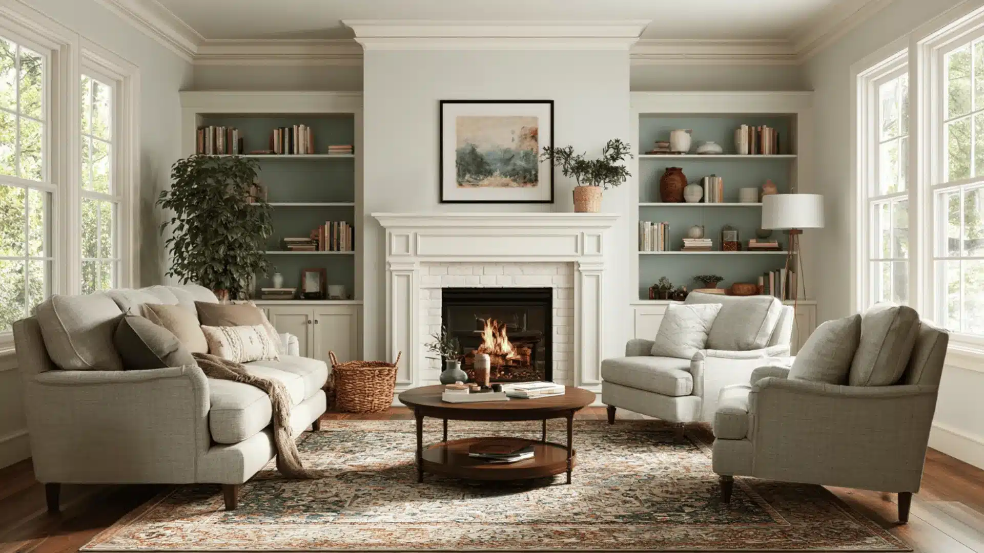
Sea Salt adds a soft blue-green contrast without making the living room feel overly colorful.
Its muted appearance works especially well when Agreeable Gray covers the main walls and Sea Salt is used on built-ins, a reading nook, or one smaller feature wall.
Natural wood, cream upholstery, and warm metals help connect the cooler green tone back to the warmer greige.
14. Evergreen Fog (SW 9130) for Kitchens
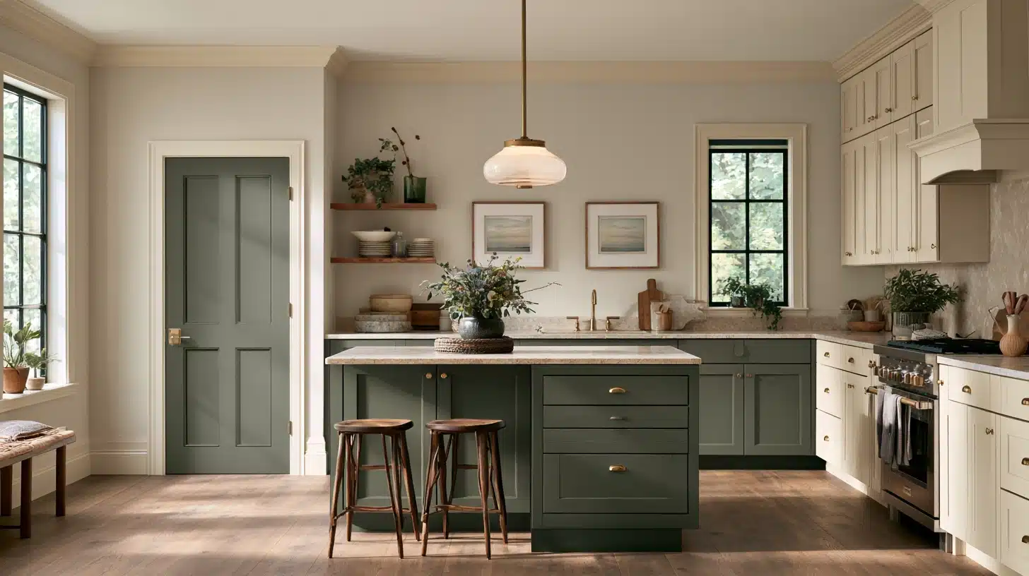
Evergreen Fog adds depth to a kitchen while keeping the palette muted and earthy.
Use it on lower cabinets, a kitchen island, or a pantry door with Agreeable Gray surrounding it on the walls.
The subdued green works particularly well with wood flooring, brass hardware, stone countertops, and other warm finishes commonly paired with this color.
15. Comfort Gray (SW 6205) for Bedrooms
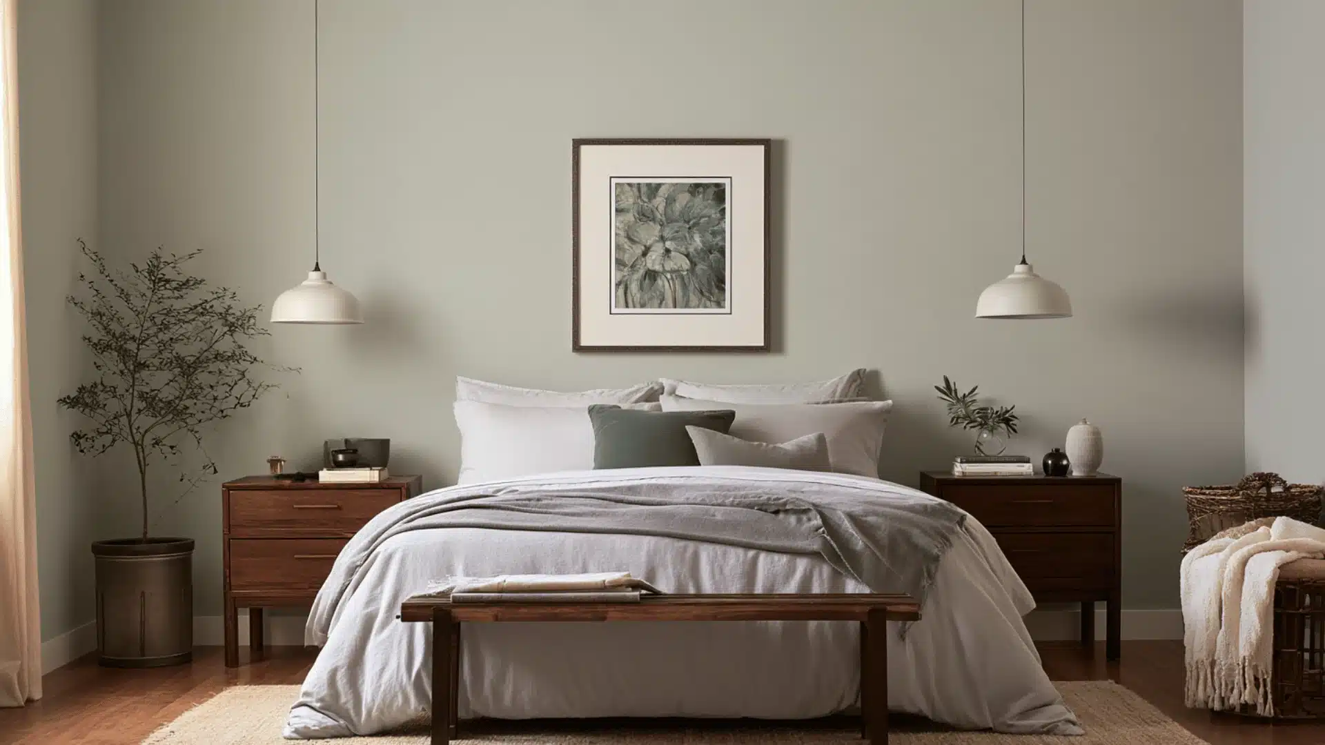
Comfort Gray is a soft blue-green-gray that adds just enough color to make a bedroom feel calmer and more layered.
It can work behind the bed, on painted furniture, or in an adjoining dressing area while Agreeable Gray remains the dominant neutral.
Because neither shade is highly saturated, the transition between them feels relaxed rather than dramatic.
16. Silver Strand (SW 7057) for Bathrooms
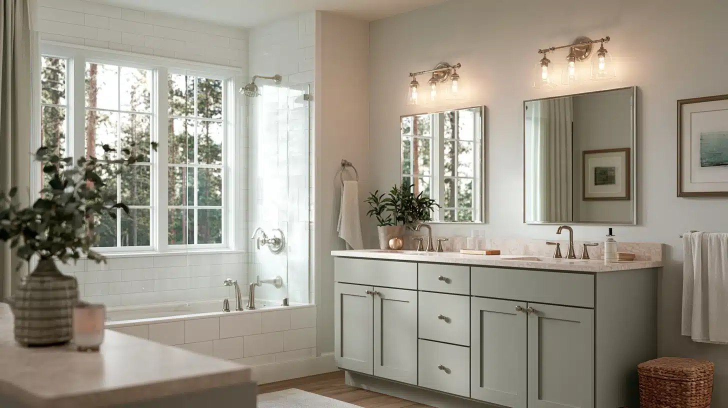
Silver Strand is one of the more useful coordinating colors for bathrooms because its cool blue-green character balances the warmer greige.
Use Silver Strand on a vanity, one wall, or another painted feature where you want subtle contrast.
It works particularly well with white tile, pale stone, chrome, brushed nickel, and bathrooms that receive plenty of natural light.
17. Smoky Blue (SW 7604) for Dining Rooms
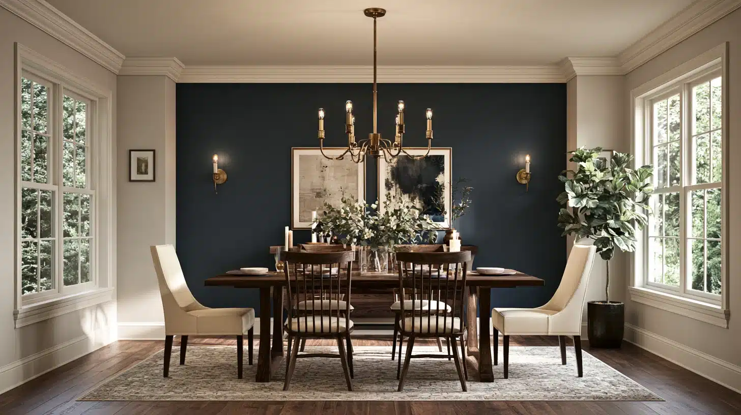
Smoky Blue adds richer color without competing with the space’s warmth.
A dining room can usually carry more depth than an everyday living space, so this muted blue suits an accent wall, built-in cabinet, or painted hutch.
Warm wood dining furniture helps bridge the deeper blue and greige walls.
18. Pewter Green (SW 6208) for Home Offices
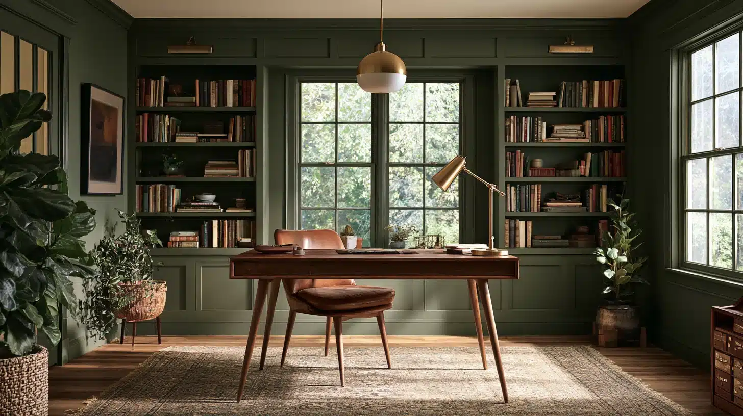
Pewter Green gives a home office a darker, more grounded look while still sitting comfortably beside this color.
It works well on built-in bookshelves, cabinetry, or the wall behind a desk.
Its earthy green undertone also pairs naturally with leather, walnut, oak, brass, and other materials that make a workspace feel warmer.
This is the only room where a truly dark, intense color would work well as a contrast to the gentle nature of Agreeable Gray.
Iron Ore is a good near-black neutral, while Gauntlet Gray provides a dark yet warm shade.
Exterior Color Pairings
The same agreeable gray coordinating colors can move outdoors when it is used as the main siding color on a traditional home or modern farmhouse.
The same undertone rules apply outdoors, so keep trim bright and let one strong accent color carry the contrast on the door or shutters rather than spreading several accents across the whole exterior.
Trim, Soffits, and Fascia
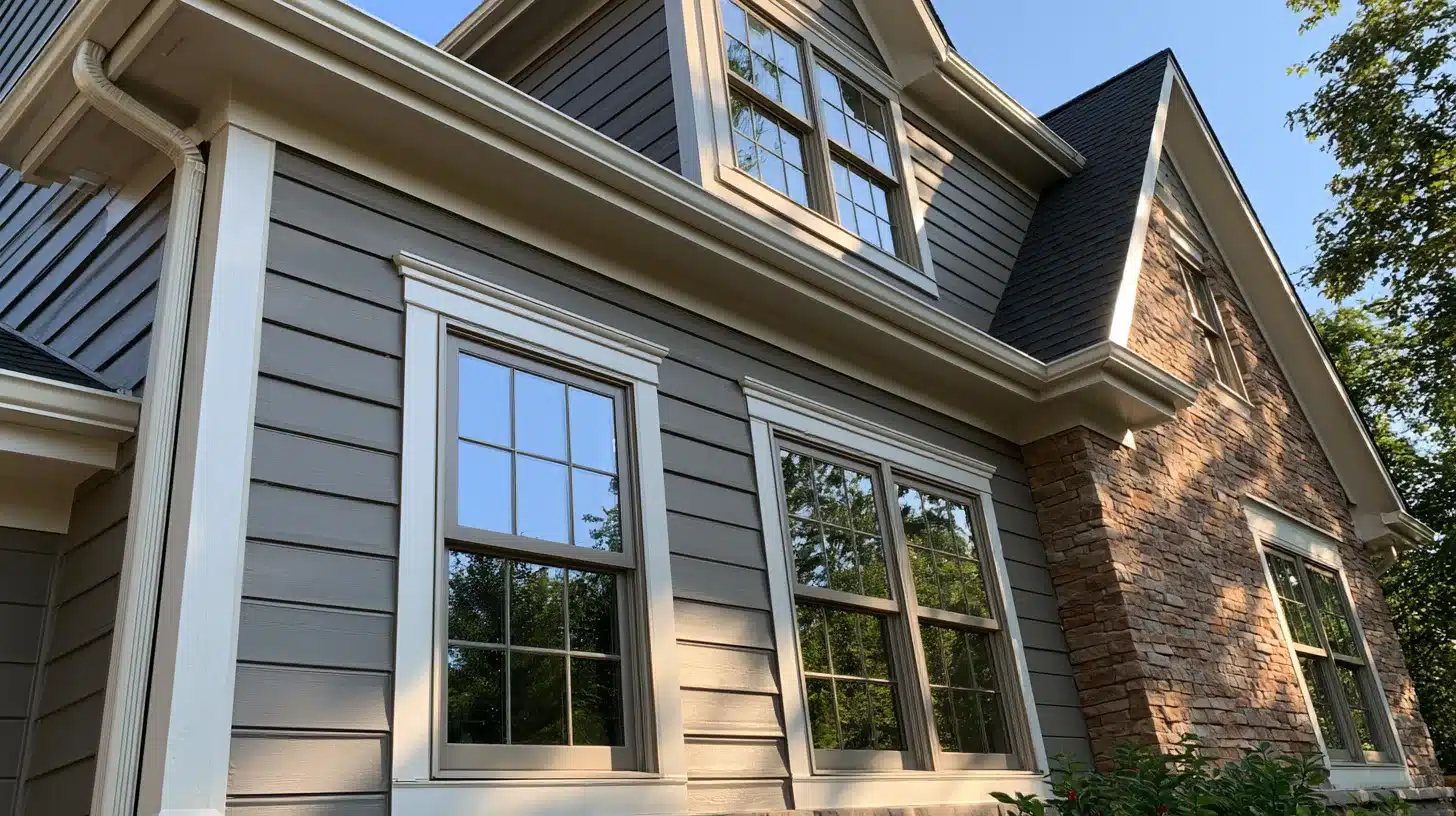
Extra White or Incredible White both hold up well outdoors, staying bright without looking blue or cold in direct sunlight.
Extra White gives a crisper, more modern edge for contemporary exteriors, while Incredible White’s slight warmth suits traditional homes with brick, stone, or wood accents.
Either one keeps the trim from disappearing into the siding color.
Front Door and Shutter Accents
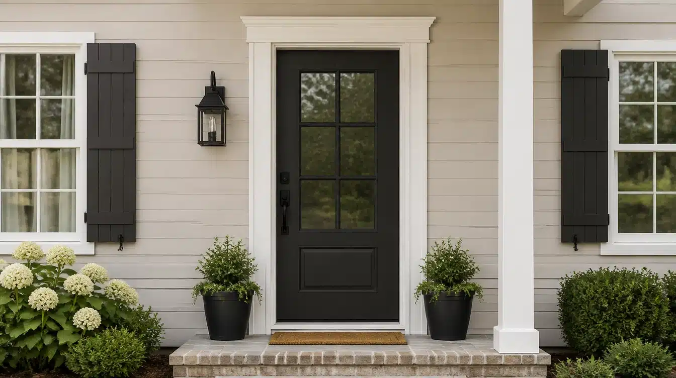
A dark front door in Iron Ore or Naval gives this exterior real curb-appeal contrast, especially paired with black hardware and light fixtures.
For a softer, more distinctive look, Coral Rose on the front door adds warmth and personality while still coordinating with the siding’s undertone.
Shutters usually look best when they match whichever accent color is used on the door.
Conclusion
The best agreeable gray coordinating colors either follow Sherwin-Williams’ own suggestion of Incredible White, Extra White, and Coral Rose, or lean into a stronger contrast with Urbane Bronze, Iron Ore, or Naval.
The worst choices are those that fall too close to the natural hue of this color because that makes them appear to be more coincidental than deliberate.
Test your favorite color choices against this color at different times of day in indoor and outdoor light, and let your flooring, countertops, and siding make the decision.
Frequently Asked Questions (FAQs)
1. Is Agreeable Gray Warm or Cool?
It’s a warm greige overall, though it can read cooler under artificial light or in north-facing rooms.
2. What’s the Difference Between Agreeable Gray and Repose Gray?
Repose Gray is slightly darker and truer gray; Agreeable Gray leans warmer and more beige.
3. Is Agreeable Gray Still a Popular Paint Color?
Yes, it remains one of Sherwin-Williams’ best-selling neutrals, especially in warm, modern-farmhouse interiors.
4. Does Agreeable Gray Ever Look Green or Pink?
Occasionally. Strong green or pink tones nearby can pull out a faint matching undertone in the paint.