I have watched a lot of taupe go wrong. Someone falls for a chip at the paint counter, rolls it on, and by afternoon the wall has gone pink or muddy or three shades greyer than the sample ever showed.
Taupe does this because it sits right between brown and gray, and depending on your light and your floors, it can pick up a hint of green, red, yellow, or even violet.
Once you know what to look for, though, taupe is worth the extra care it brings more warmth than a flat gray and more weight than a plain beige, without tipping into either one.
Below is a list of taupe paint colors I would actually recommend, with the undertone, LRV, and the type of room each one handles best.
What Color is Taupe, Exactly?
Ask five paint brands what taupe means, and you will get five different answers.
The base is always grey and brown, but the pigment they sneak in underneath- a little violet here, a little pink there- is what actually separates one from another, even when two chips look identical in a photo.
LRV matters just as much as undertone. I have seen two taupes with nearly the same lean feel completely different on a wall, one airy, one closer to a cave.
My go-to trick for spotting the real undertone is holding the sample against plain white paper, never your wall or furniture, since nearby colors will lie to you every time.
Taupe vs Beige
Beige and taupe often get mixed up at the paint counter, but the undertone gives it away every time.
| Aspect | Beige | Taupe |
|---|---|---|
| Base undertone | Yellow or golden | Gray or muted brown |
| How it reads on a wall | Warm, sunny, closer to tan | Grounded, calmer, less golden |
| Best trim pairing | Cooler white, to balance the warmth | Works with warm or cool white |
| Common mistake | Picking it for a north-facing room, where it can look dull | Assuming all taupes look the same across brands |
Taupe vs Greige
These two get confused constantly, and honestly, the overlap is real. Both sit somewhere between grey and beige, which is exactly why paint names cross over so often.
| Aspect | Greige | Taupe |
|---|---|---|
| Where it sits | Closer to true gray with a beige assist | Leans further into brown, violet, or earthy tones |
| Undertone strength | Usually subtle, easy to miss | More noticeable, especially at bigger sample sizes |
| Feels like | A neutral backdrop that barely shows a lean | A neutral with an actual personality once it is on the wall |
| Why the confusion happens | Some brands label the same formula either way depending on collection | The line between the two comes down to how much brown or violet is added, not a fixed rule |
Best Taupe Paint Colors Worth Sampling
Here’s the first batch, Benjamin Moore. I’ll do the other brands as separate messages so this stays easy to review
Taupe Paint Colors by Benjamin Moore
1. Pashmina AF-100
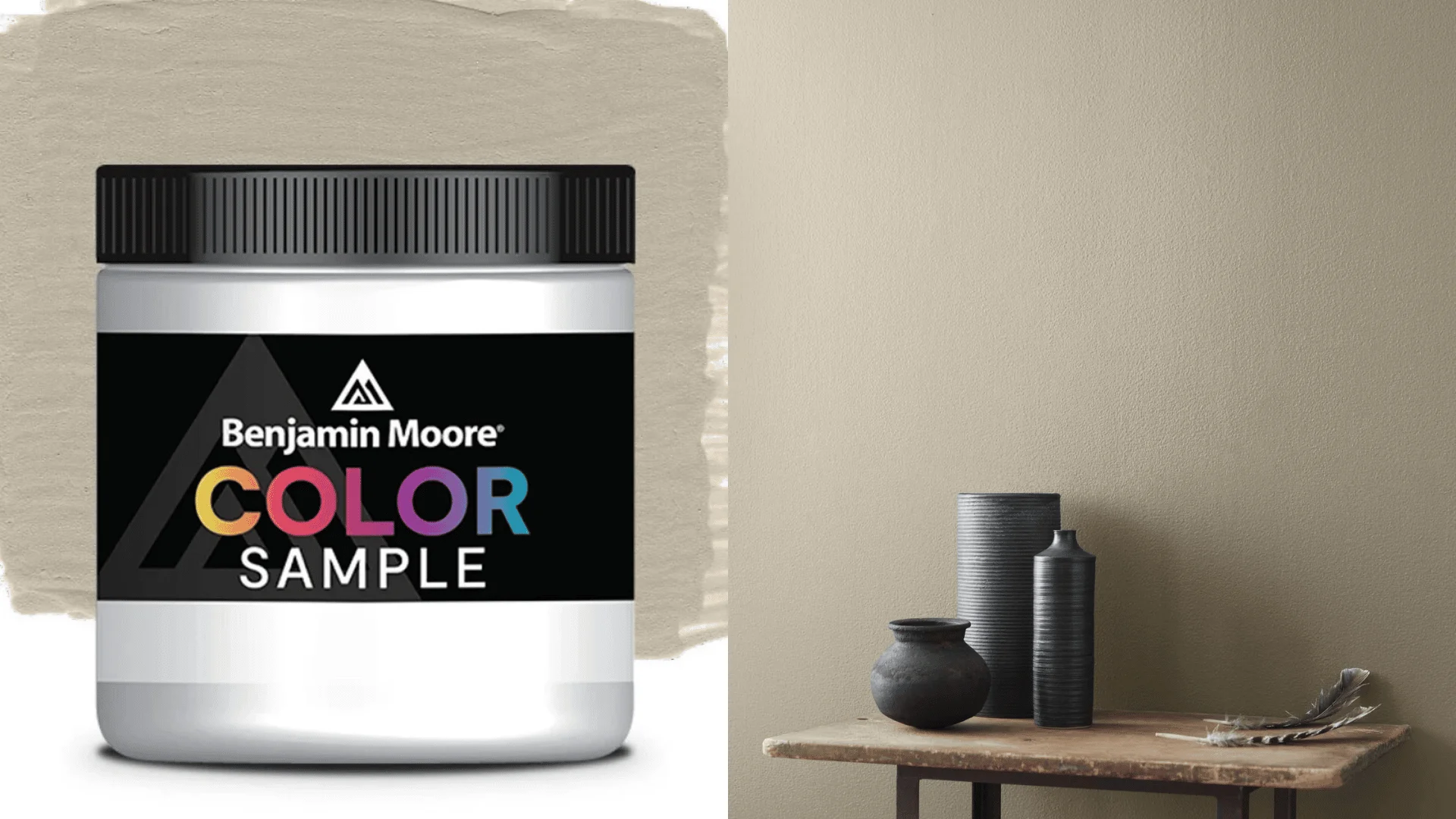
Clients ask for this one by name more than any other Benjamin Moore taupe, and it’s usually because they saw it on a home tour and liked how calm it looked.
What they don’t realize is why it reads calm: the undertone leans soft gray green instead of brown, so it never drifts toward mud the way some warmer taupes can.
LRV sits at 44, right in the middle. Put it in a south-facing room and that green hint.
2. Weimaraner AF-155
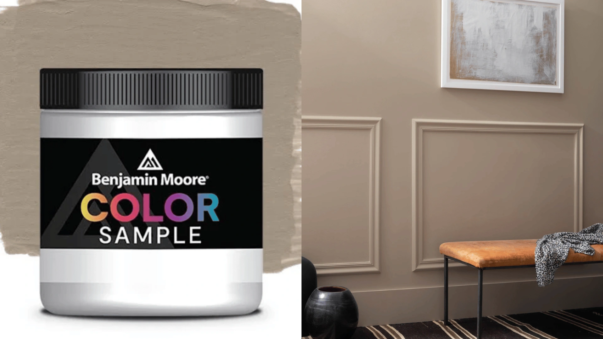
At an LRV of 31, Weimaraner is darker than Pashmina, and it carries a violet undertone that hides most of the time and then shows up out of nowhere on an overcast afternoon or under a cool white bulb.
So do not pick this one off a phone screen.
In a dim room it can turn into something closer to grey mud than the sophisticated taupe it’s supposed to be.
3. Smokey Taupe 983
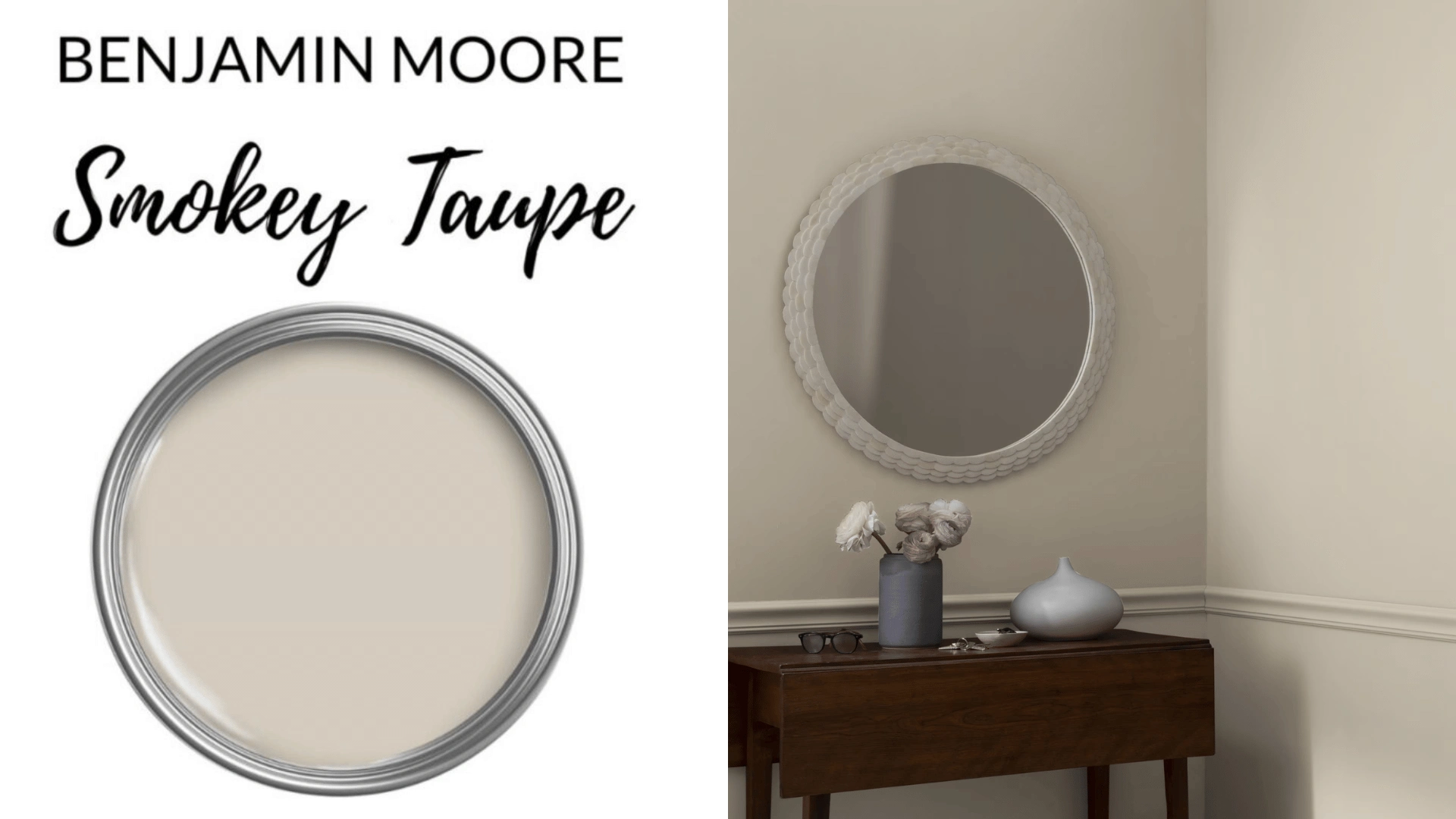
When someone says they want taupe but are afraid to commit, I give them this one.
The slight pink whisper in its undertone is so delicate that most homeowners never notice it unless someone points it out, and LRV 54 keeps it light.
If you want the taupe effect without the wall feeling heavy, this is a good choice.
Taupe Paint Colors by Sherwin-Williams
4. Tony Taupe SW 7038
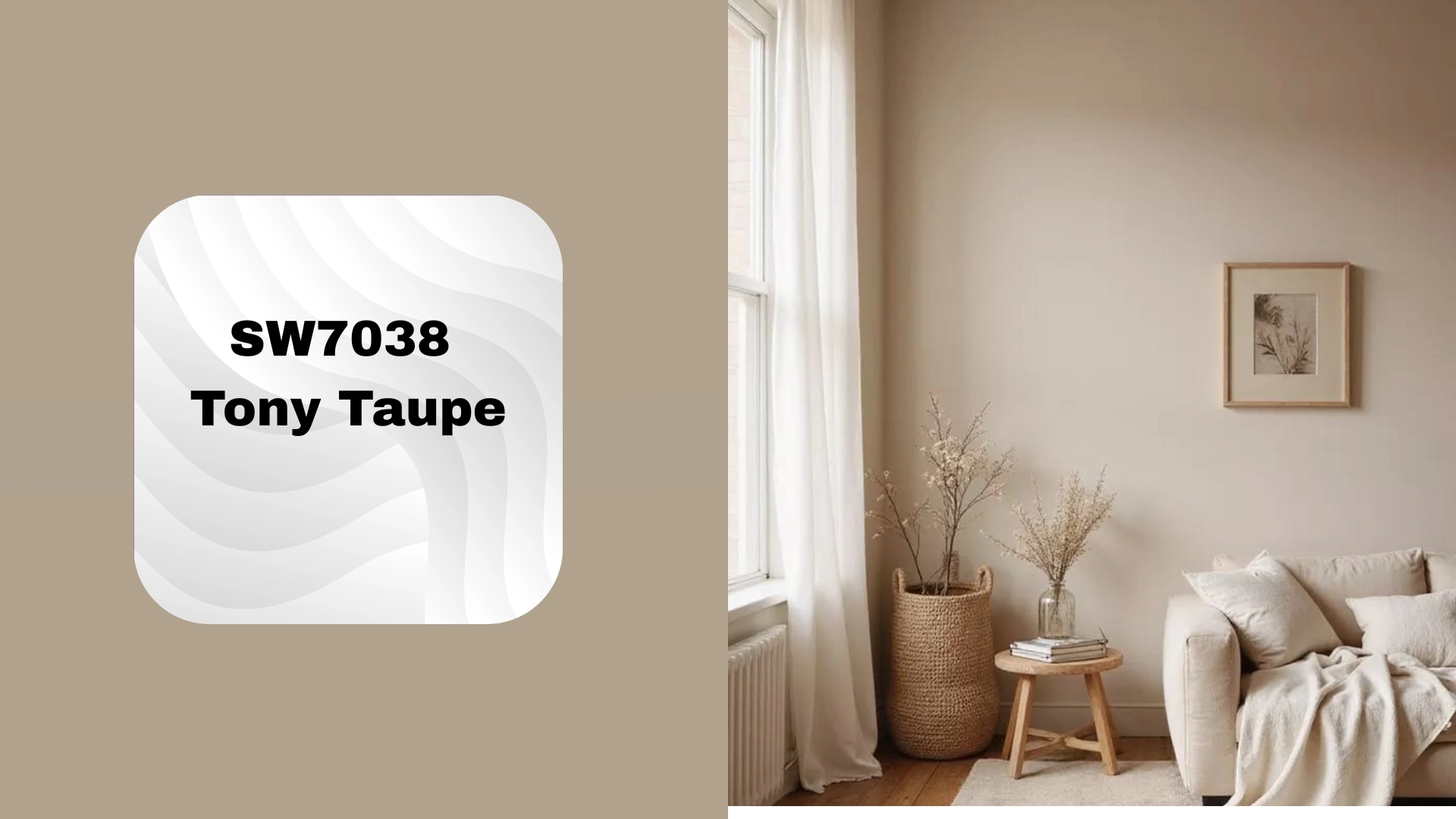
LRV lands at 37.
Homes with a lot of wood already going on, floors, cabinets, and trim tend to do well with this one. The undertone is mushroom, a soft brownish-grey that sits quietly next to wood instead of clashing with it the way a pinker taupe can.
If you already love your wood floors and want the walls to complement them instead of compete, start here.
5. Taupe Tone SW 7633
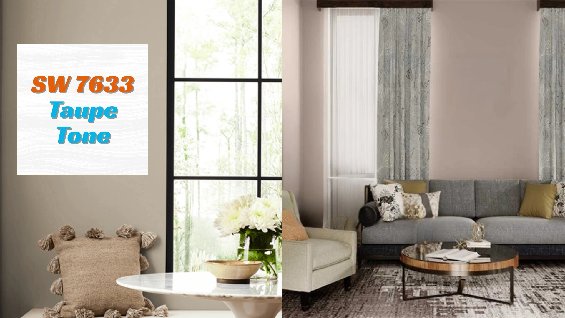
LRV comes in just below at 36, and the warm grey-brown base carries more weight, which is exactly why it shows up so often on cabinets and built-ins instead of full rooms.
It has enough presence to hold its own without needing another color to prop it up.
6. Shiitake SW 9173
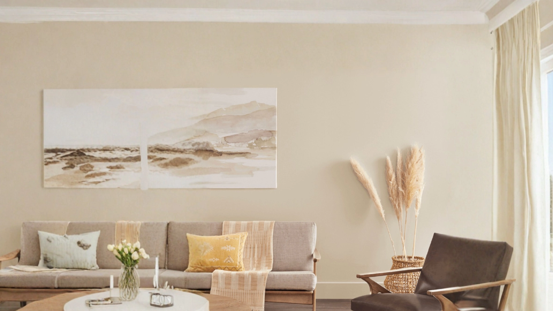
People are usually surprised this one belongs in the same family as the other two.
LRV climbs to around 51, a big jump lighter, and the undertone mixes green with a touch of red, landing somewhere between beige and taupe rather than committing to either.
For anyone hesitant about a taupe reading too dark or too intense, this is the one that tends to win them over.
Taupe Paint Colors by Behr
7. Perfect Taupe PPU18-13
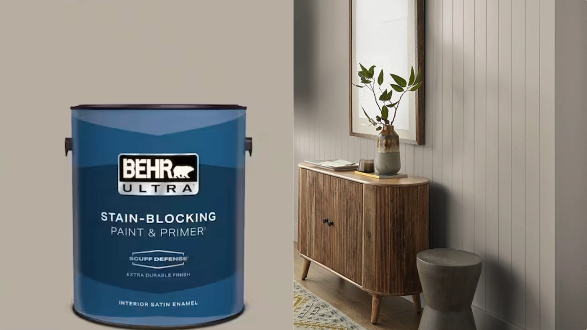
This is the one to reach for when you cannot decide between grey and beige and do not want to decide.
The undertone is about as neutral as taupe gets, no green, no pink, no obvious lean either way – which is why Behr itself lists it as a greige.
LRV sits at 42, so it holds enough color to feel intentional without swallowing the light in a room.
8. Smokestack N220-3
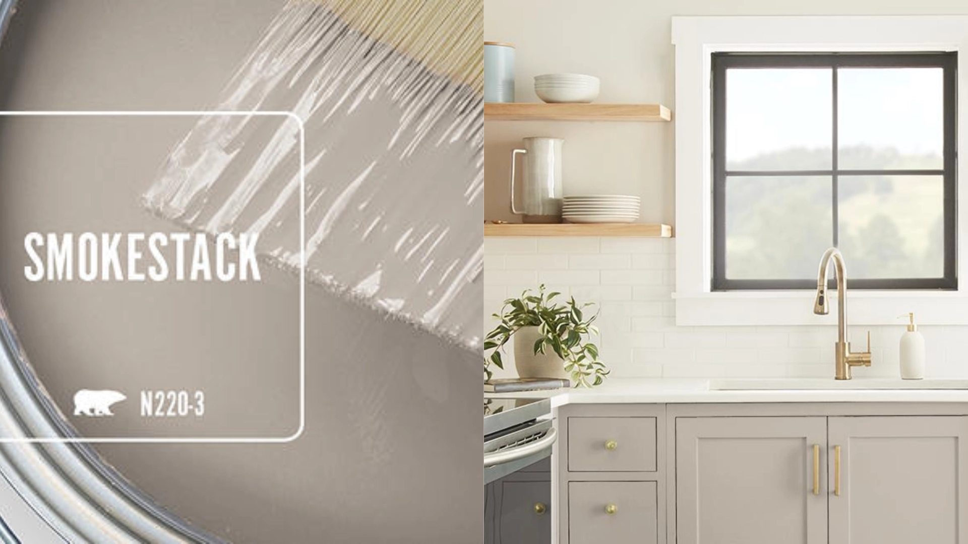
Smokestack earns its spot for range. Behr built it to work as a full wall color or as an accent, and the warm taupe grey base backs that up.
It reads calm next to natural wood, but it also holds its own as a single feature wall if the rest of the room stays lighter.
LRV lands on 46, comfortably mid-tone either way it gets used.
9. Mesa Taupe PPU5-14
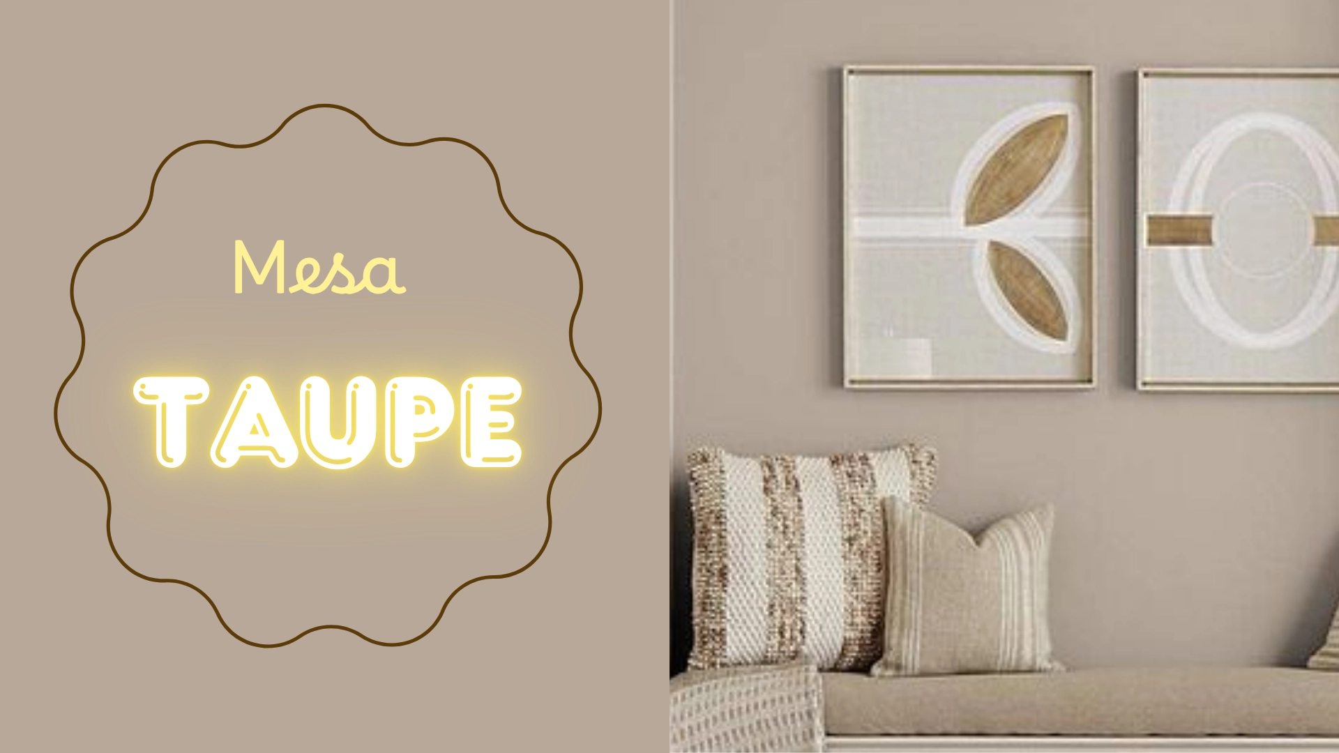
The lightest of the three Behr picks. It carries a genuine rosy undertone, confirmed straight from Behr’s own color description, which makes it a useful pick for showing how differently two taupes can behave even within the same brand.
A good choice for a space that needs warmth but doesn’t want to get too moody.
Taupe Paint Colors by Farrow & Ball
10. Stony Ground No. 211
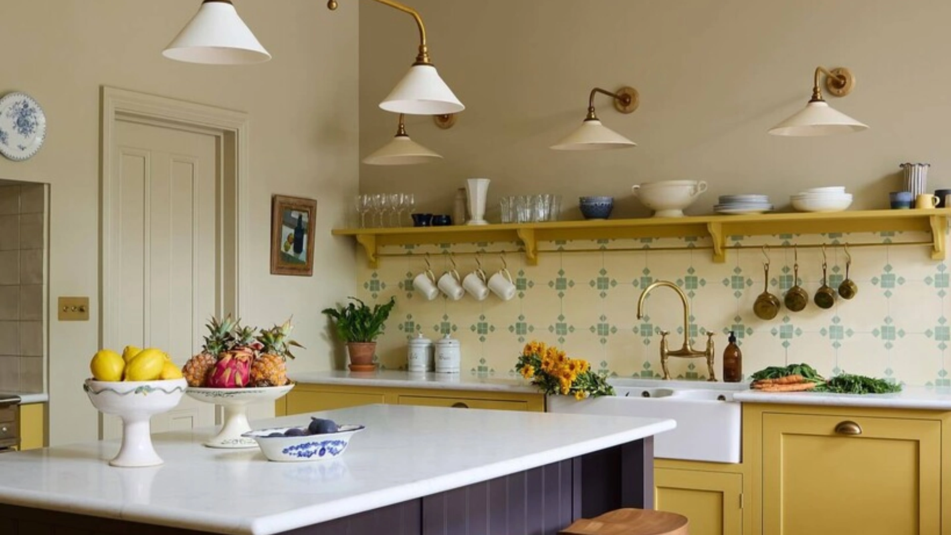
This is the taupe to consider for a home that wants classic and quiet over trendy.
Farrow & Ball describes it as a stone color with a slight red undertone, and that small warmth is what keeps it from reading flat or grey.
LRV sits around 53, light enough to work across most rooms without needing a north-facing exception.
11. Mouse’s Back No. 40
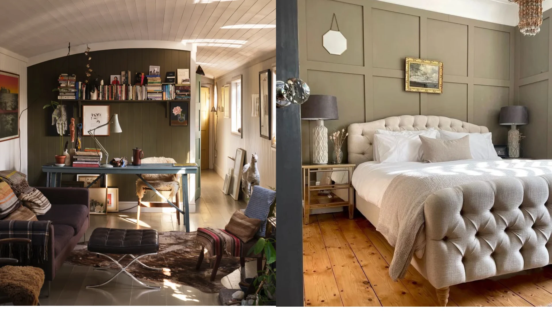
The name comes straight from Farrow & Ball, a nod to the gray brown coat of a British field mouse, and it fits.
This is the deeper, moodier half of the pair, built to work as an accent or a smaller space rather than an entire open plan.
It pairs naturally with Stony Ground if a home wants a lighter and darker taupe working together instead of picking just one.
Finish it with the Right Swatch!
The right taupe comes down to two things: light direction and how much depth a room can handle.
North-facing rooms do better with lighter, warmer-leaning picks like Mesa Taupe or Stony Ground, since cooler light already pulls warmth out of a color.
South- and west-facing rooms have more room to play, which is where deeper choices like Weimaraner or Mouse’s Back can show their character instead of turning muddy.
If there is only one rule I would want someone to walk away with, it is this: never trust a small chip.
Get an actual sample on the wall, live with it for a full day, and let the room decide before the whole space commits to it.
Frequently Asked Questions
1. What Taupe Paint Does Not Look Pink?
Perfect Taupe by Behr and Taupe Tone by Sherwin-Williams stay closest to true gray brown, with almost no pink lean showing up.
2. What Color Trim Looks Best with Taupe Walls?
Bright white works with cooler taupes, while a warm white suits taupes with a stronger brown or pink undertone.
3. Is Taupe a Good Whole House Color?
Lighter taupes like Shiitake or Stony Ground work well throughout a home. Darker ones like Weimaraner are better saved for rooms with strong natural light.