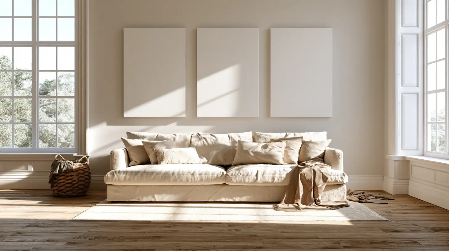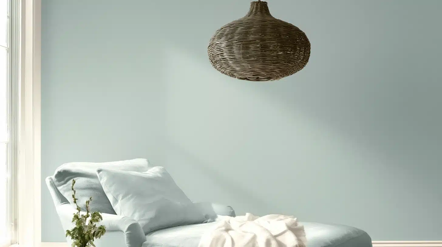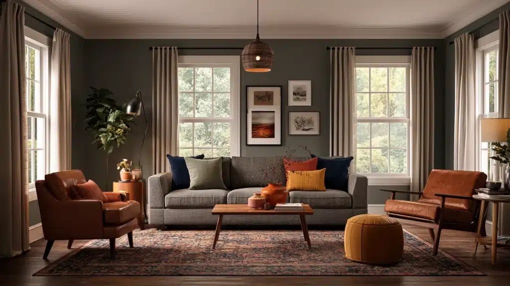
Grey has slowly become the first choice among homeowners for a neutral color, but having just a grey wall alone rarely gives a room a complete finish.
In almost all cases the best color combination with grey relies on a second shade taking the main role, this being either to warm the cool underlying tone, to brighten a dark corner, or to give a otherwise tranquil area something noteworthy.
Pairings such as grey and white have been standard in interior decoration for many decades.
Others, like grey with terracotta or grey with mustard, are more recent and more vibrant, designed for those who want their neutral background to have a personal touch rather than a safe one.
Keep reading and find combinations organized by mood, so you can match one to the room, the light, and the undertone you’re actually working with.
Why the Best Color Combination with Grey Depends on Undertone First
Grey is rarely just grey. Paint chips that look identical in the store can pull blue, green, purple, or brown once on a wall, and that hidden undertone decides whether a pairing looks intentional or off.
Global demand for neutral palettes hasn’t slowed – Axalta’s 2025 automotive color report found white, black, and grey together accounted for roughly three-quarters of vehicles sold worldwide.
Grey alone holding 22 %, mirroring how dominant the same neutral has become inside homes.
Before picking an accent, hold your grey sample next to natural daylight and artificial light at night, since both change how a grey-based color combination reads.
Classic Neutral Pairings
Neutral-on-neutral combinations are the safest place to start, especially when the room is being used as a rental or one that you don’t intend to repaint frequently.
These schemes rely on contrast and texture instead of color intensity.
1. Grey and White
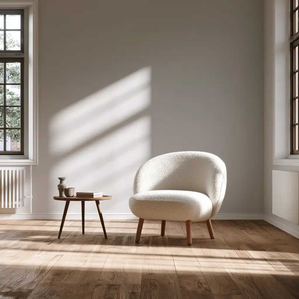
This pairing has a clean appearance without feeling clinical, mostly because white sharpens grey’s edges instead of softening them.
In small rooms, it visually pushes walls outward, and in larger ones it keeps a busy floor plan from appearing crowded.
It is suitable for almost any style, from a minimalist loft to a traditional entryway with crown molding.
2. Grey and Charcoal or Black
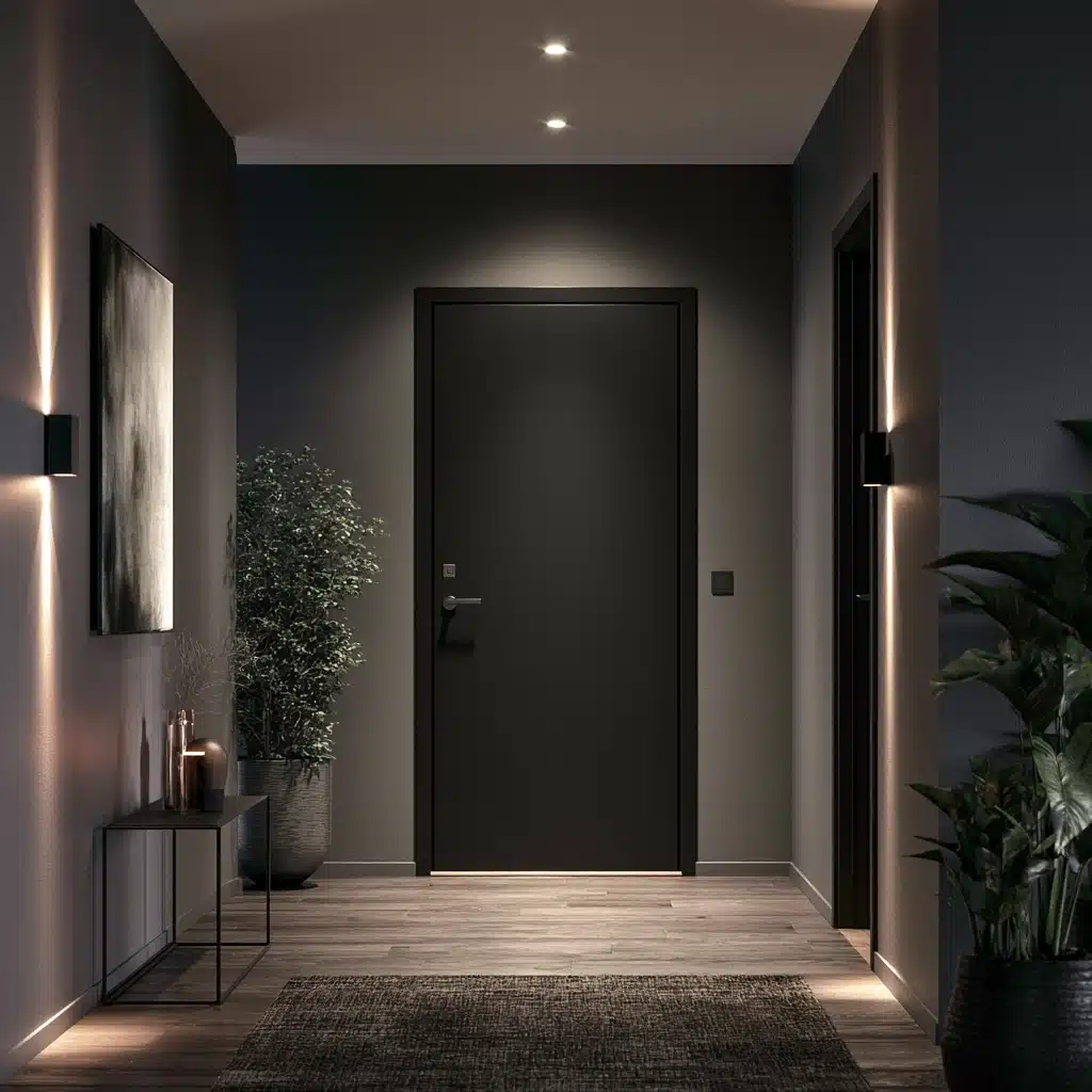
Layering grey with a deeper charcoal or true black creates depth without creating a new color.
Designers apply the 70/30 method here; grey as the dominant wall color, black reserved for trim, a door, or cabinet hardware, so the room feels grounded rather than heavy or cave-like.
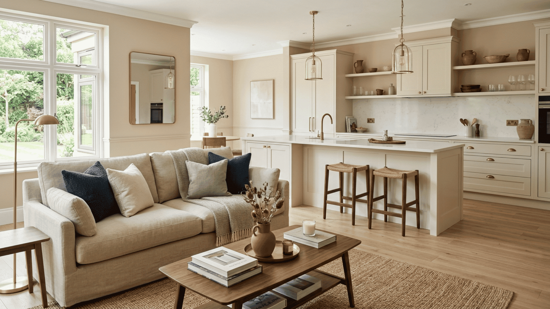
3. Grey and Beige or Taupe
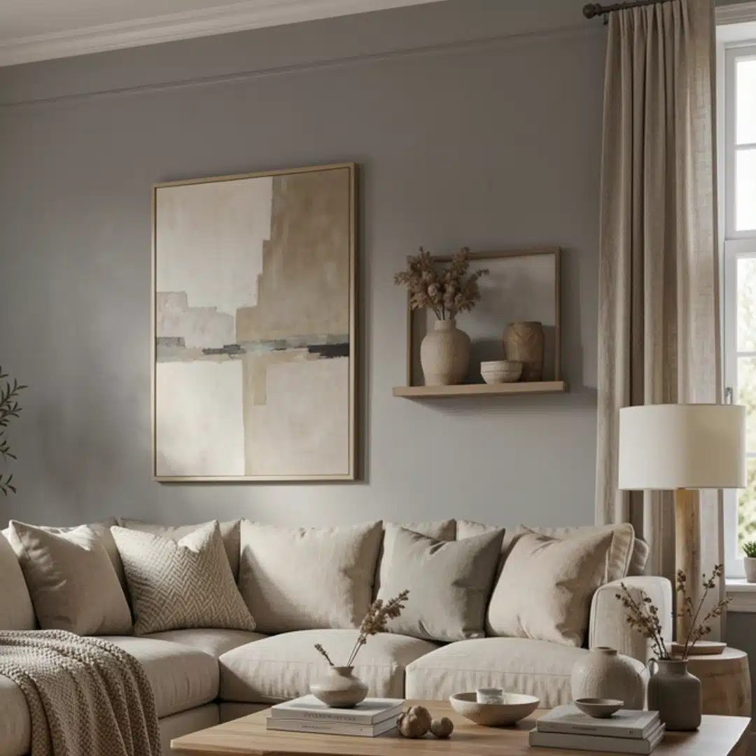
It is commonly known as “greige” and this combination softens grey’s coolness with the warmth of beige.
It is well suited to the houses with lot of natural wood because the beige acts as a bridge between the cool walls and the warm floors.
It’s especially forgiving in north-facing rooms that get flat, bluish daylight.
4. Grey and Cream
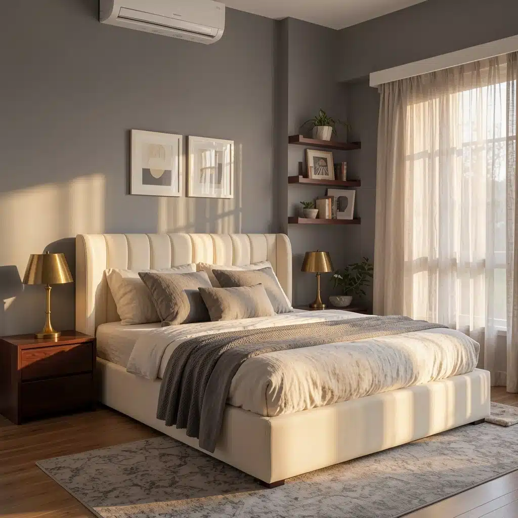
Cream is warmer and less harsh than pure white, so this duo feels lived-in rather than showroom-perfect.
It goes especially well with brass fittings and linen textures, and it is a good choice for bedrooms if you want a calm atmosphere without the coldness that some greys can have.
Soft and Muted Pairings
Muted colors sit close to grey on the color wheel in terms of saturation, so they blend rather than compete. These combinations work well in bedrooms, nurseries, and reading spaces.
5. Grey and Blush Pink
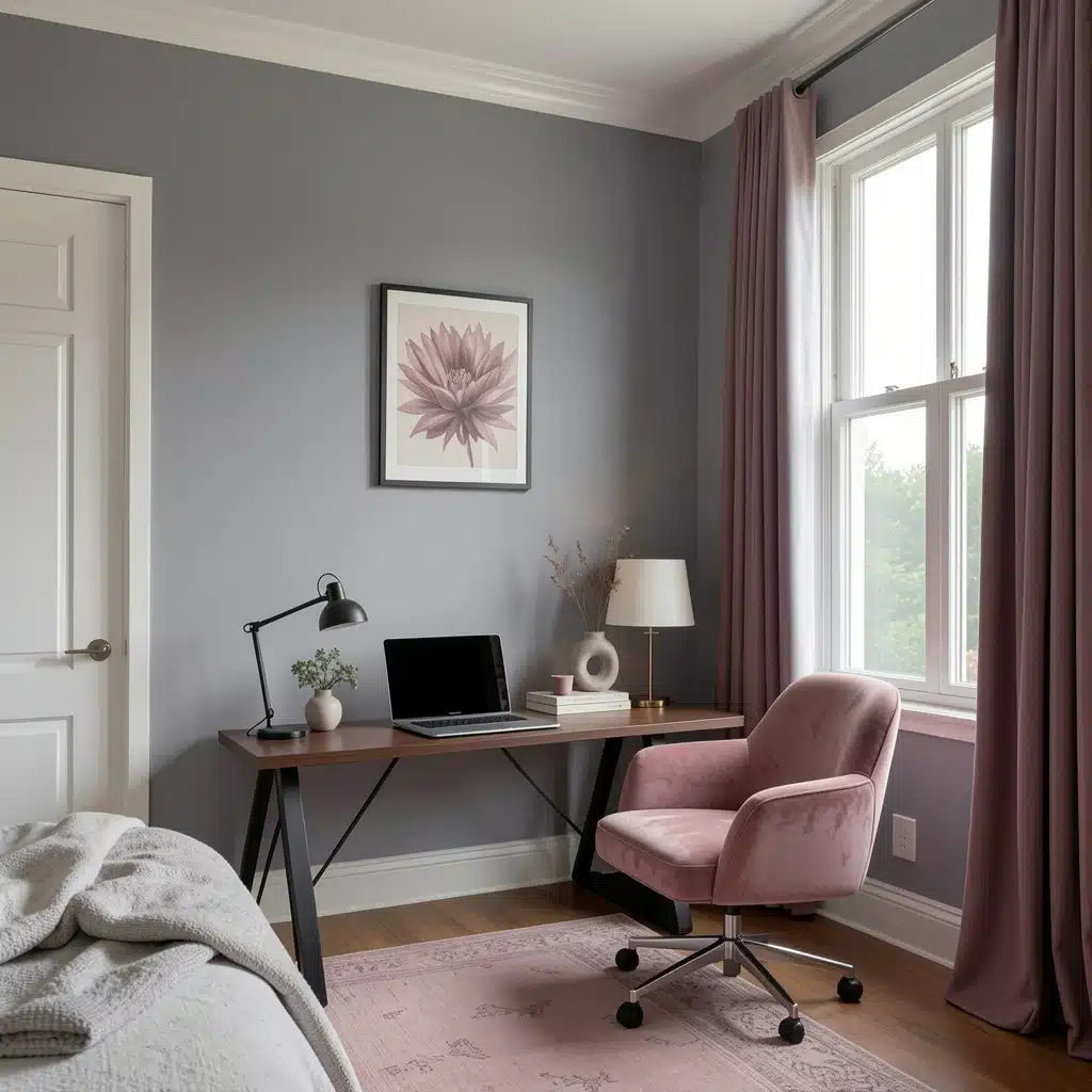
Seeing blush alongside a cool grey has a modern and somewhat surprising effect rather than being obviously feminine.
This is because designers describe it as gender-neutral, and that is one of the reasons it has been used so frequently in nurseries and in shared bedrooms in the last few years.
To maintain the calm atmosphere, keep the blush muted rather than bright.
6. Grey and Dusty Blue
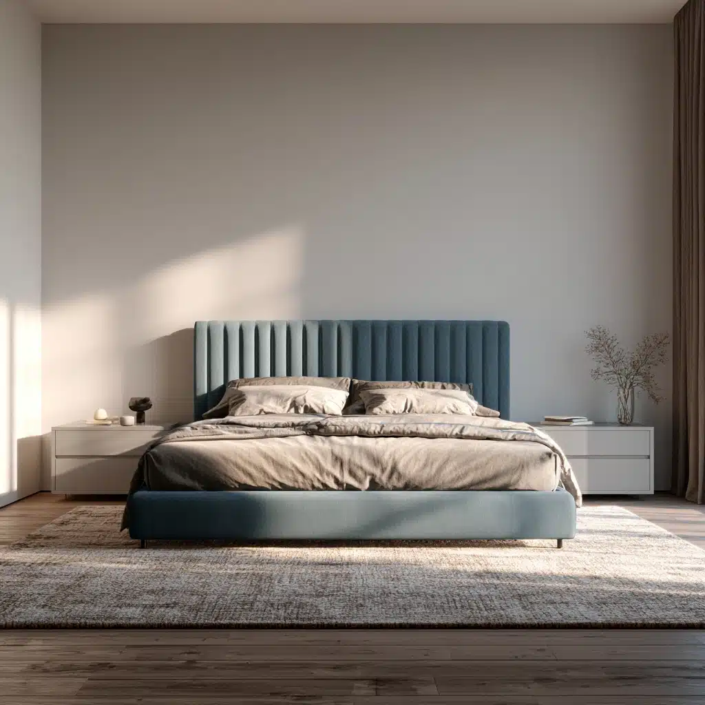
Both colors are quiet in nature, they form one of the most relaxing combinations for a bedroom.
Dusty blue has a slight grey tinge, which prevents the two colours from appearing as if they are competing for attention on the same wall.
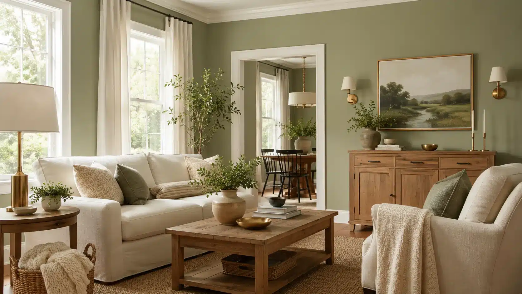
7. Grey and Sage Green
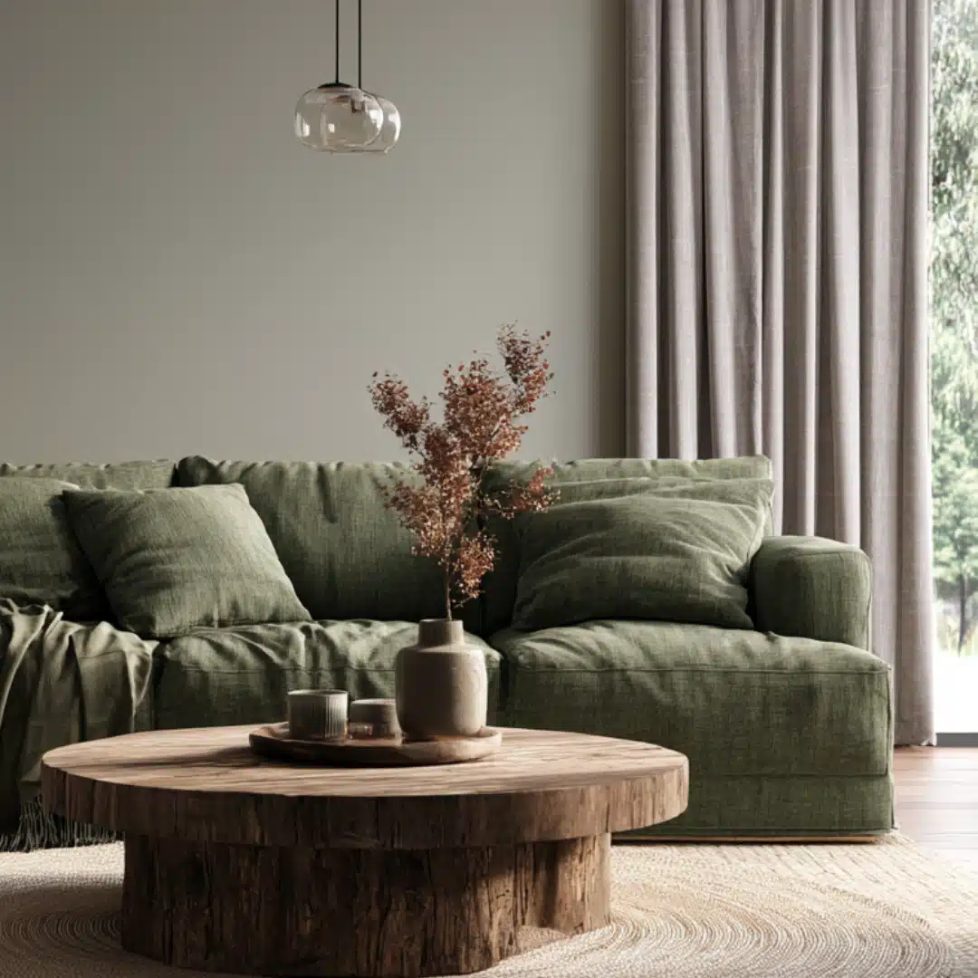
The combination of sage and grey has a calm and discreet character that makes the combination easy to live with for years rather than one season.
It has become one of the most frequently searched pairings in the field of home design since it goes well with wood tones, black metal, and brass without clashing.
8. Grey and Lavender
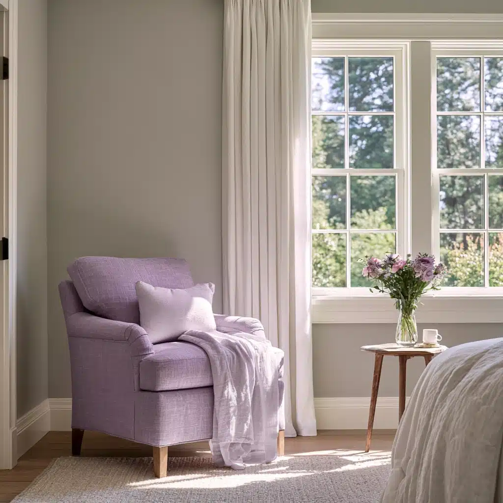
Lavender provides a very slight touch of colour and at the same time maintains a soft tone.
This combination is appropriate for cottage-style bedrooms and bathrooms, especially when paired with white trim, since the lavender never has to compete with a boldly coloured wall for attention.
Warm Earthy Pairings
Earthy tones offset the coolness of a grey background, which make these combinations popular in living rooms, kitchens, and entryways where a welcoming atmosphere is desired rather than an austere one.
9. Grey and Terracotta
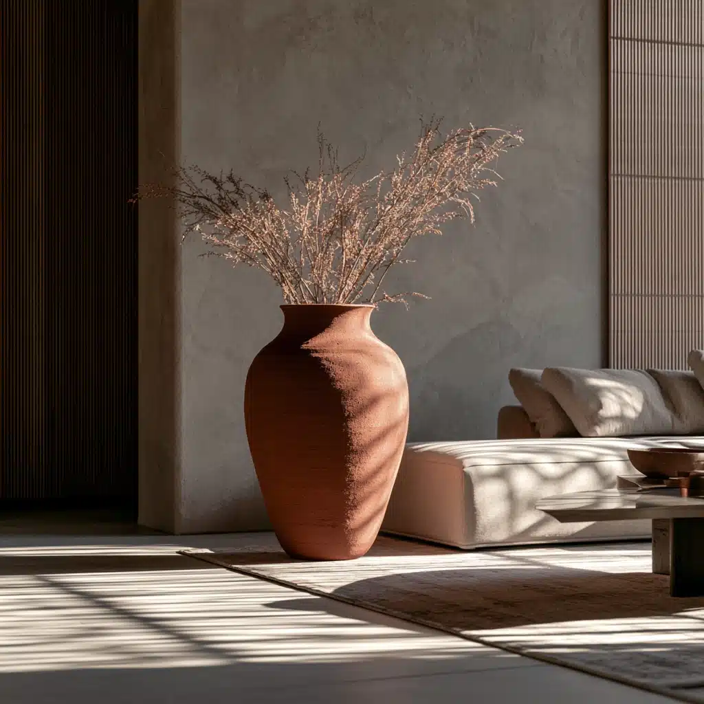
Terracotta gives a clay-like warmth that prevents grey from appearing sterile.
Through cushions, ceramics, and woven textiles, it adds personality without the need for a complete repaint, which is the reason it has recently become one of the more frequently mentioned combinations for boho and transitional homes.
10. Grey and Mustard
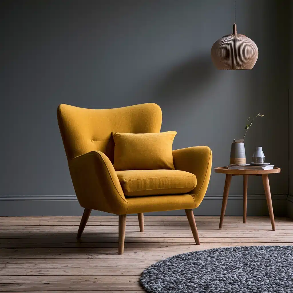
Mustard is bold enough to stand alone in a room, only a small amount is needed to counteract grey.
It should be used in a single armchair, a set of curtains, or artwork rather than on the entire wall, or the contrast would begin to appear busy.
11. Grey and Camel
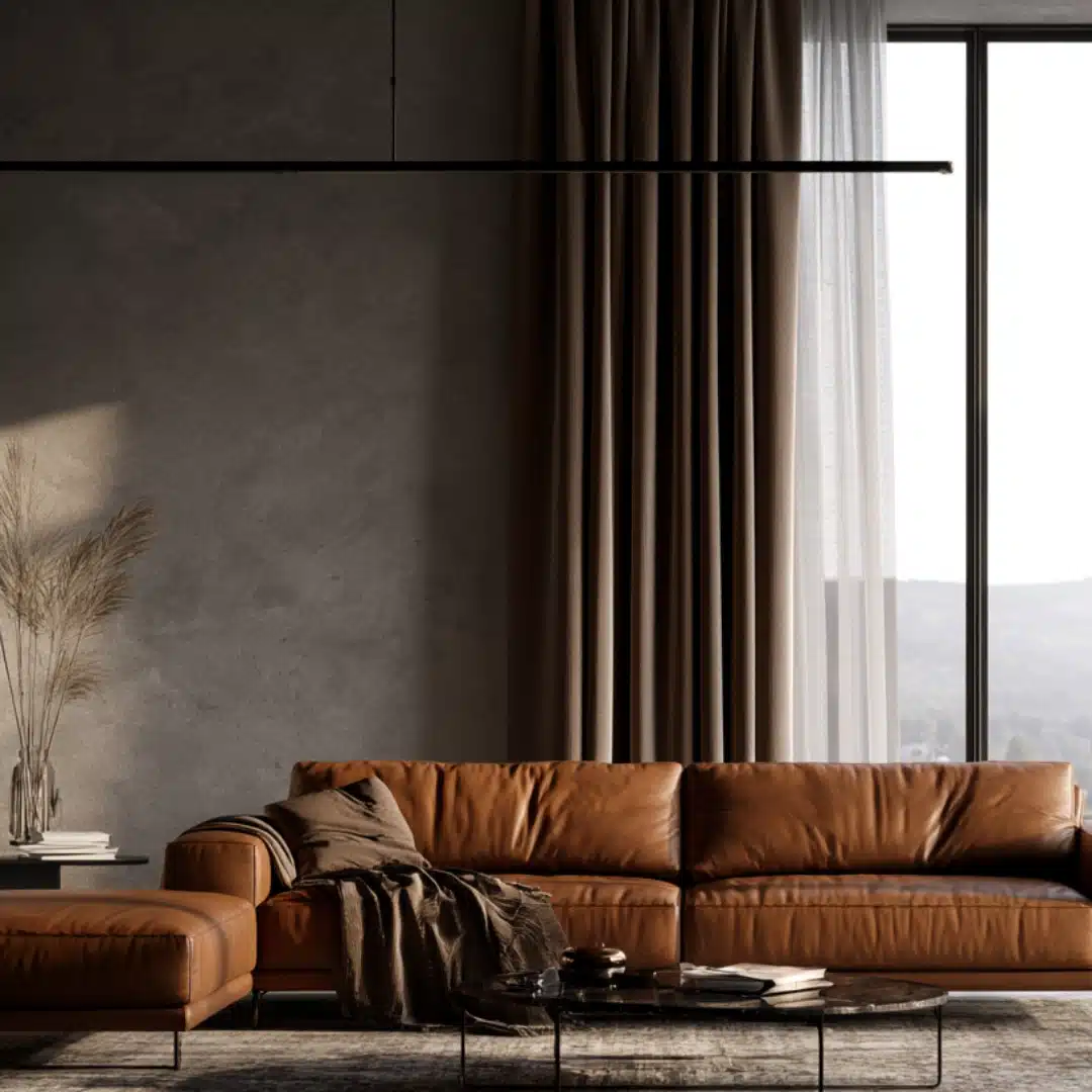
Camel has a sophisticated and slightly retro look, especially when used with leather furniture or wool throw blankets.
It has an immediate warming effect against a cooler grey background and and it photographs particularly well in living rooms with large windows and plenty of daylight.
12. Grey and Rust
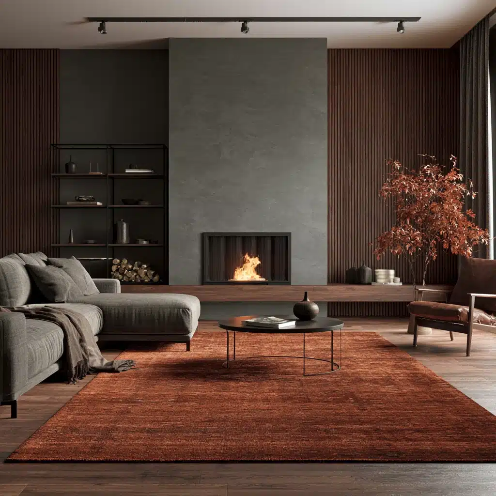
Rust is terracotta’s deeper, moodier cousin, and it works best in smaller doses- a rug, a vase, a piece of art.
It pairs naturally with black metal fixtures and unfinished wood, giving a room an autumnal feel that holds up through every season.
Bold Jewel-Tone Pairings
Jewel tones turn grey into a backdrop rather than the main event.
These pairings suit dining rooms, home offices, and anywhere you want a little drama.
13. Grey and Emerald Green
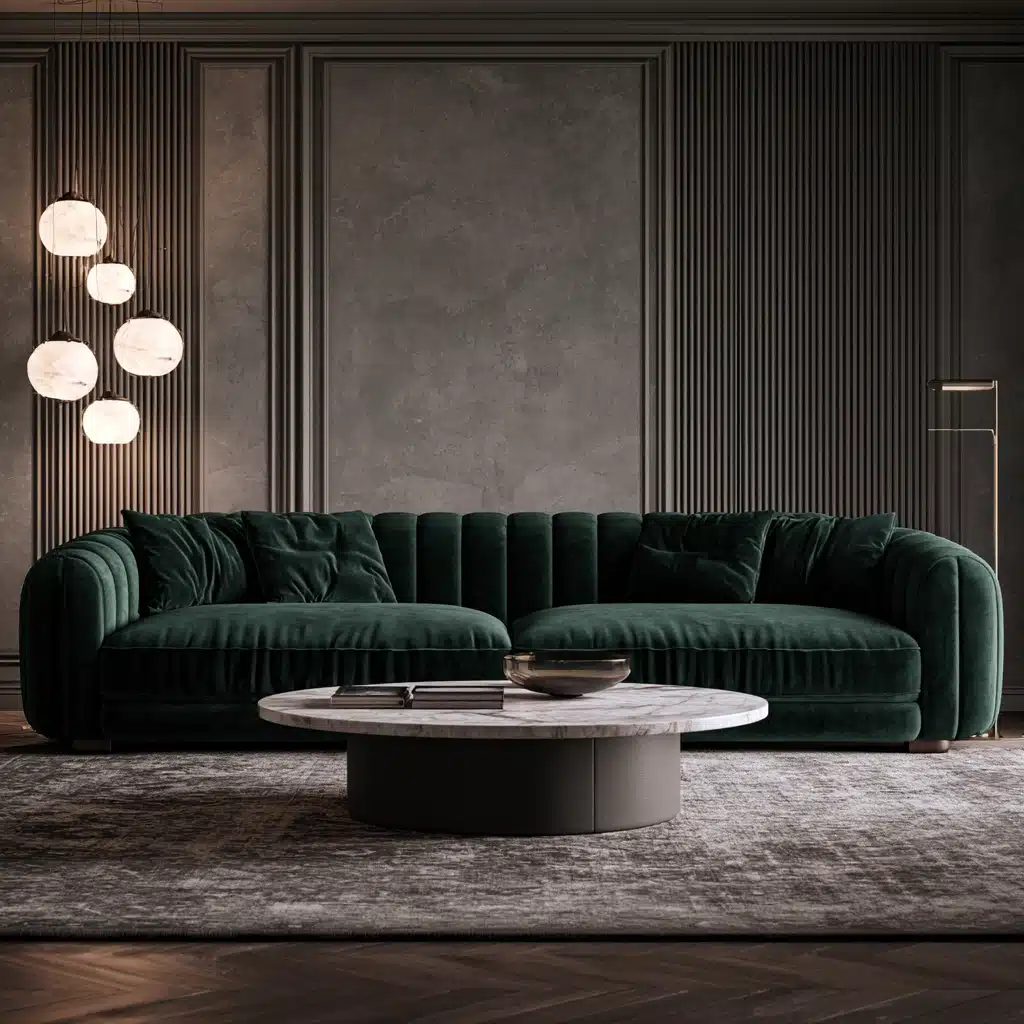
The combination of emerald with grey appears luxurious because the grey remains calm while the green takes the lead in expressing itself.
This pairing shows up often in boutique hotels and high-end living rooms, usually through a velvet sofa or a single accent wall rather than head-to-toe green.
14. Grey and Navy
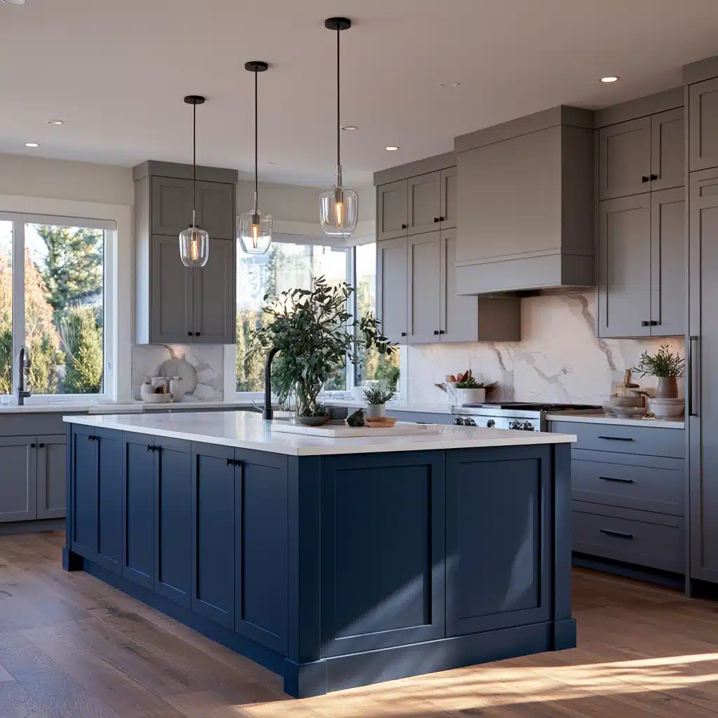
Navy is one of the most classic choices when pairing with a lighter grey, especially on kitchen islands, front doors, and accent walls.
The contrast is strong enough to appear purposeful yet familiar enough that it rarely dates, even after years of shifting trends.
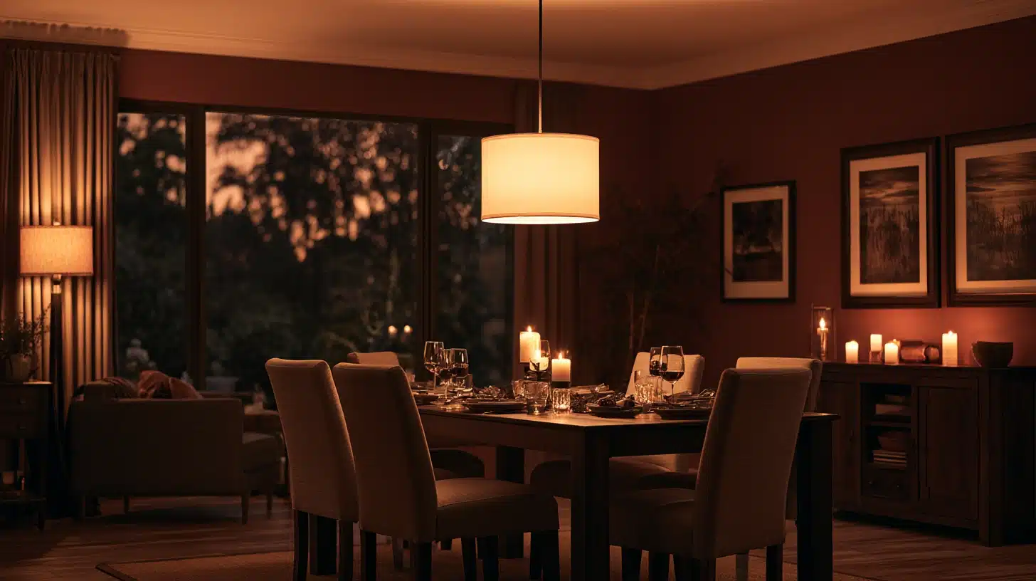
15. Grey and Burgundy
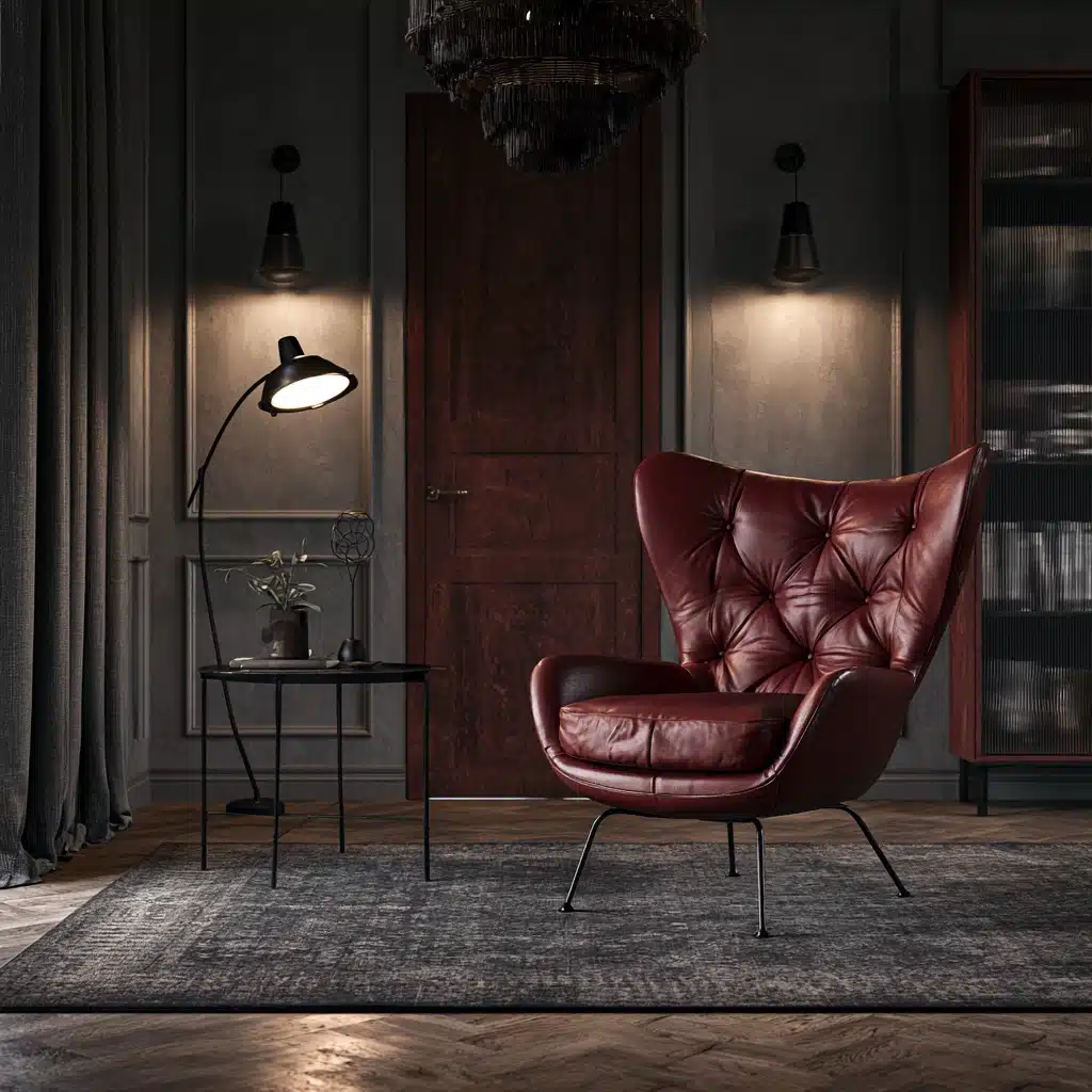
Burgundy brings a rich, almost formal warmth that is well suited to dining rooms and studies.
When paired with charcoal grey, it appears almost monochromatic in low light but shows off its depth under warmer lights, which gives the room two distinct personalities depending on the hour.
16. Grey and Teal
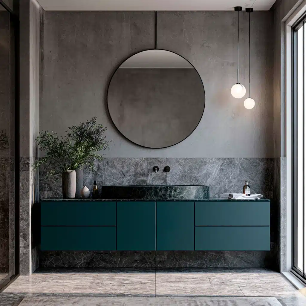
Teal sits between blue and green, it can act both as a cool and a warm accent color depending on the grey with which it is paired.
It is a good choice for bathrooms and kitchens when the tiles or the cabinetry can carry the colour in a durable and easy-to-clean finish.
Nature-Inspired Pairings
These combinations take inspiration directly from landscapes such as moss, stone, sky, and sand.
This has the effect of making a room seem calmer almost at once.
17. Grey and Olive
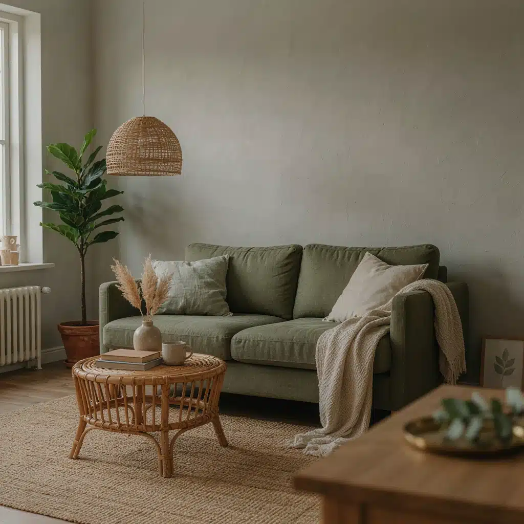
Olive is quieter than emerald yet clearly a green and this makes it a milder choice for people who are nervous about using color.
It is particularly suitable when combined with rattan, jute and other natural textures that reinforce the outdoorsy feel.
18. Grey and Forest Green
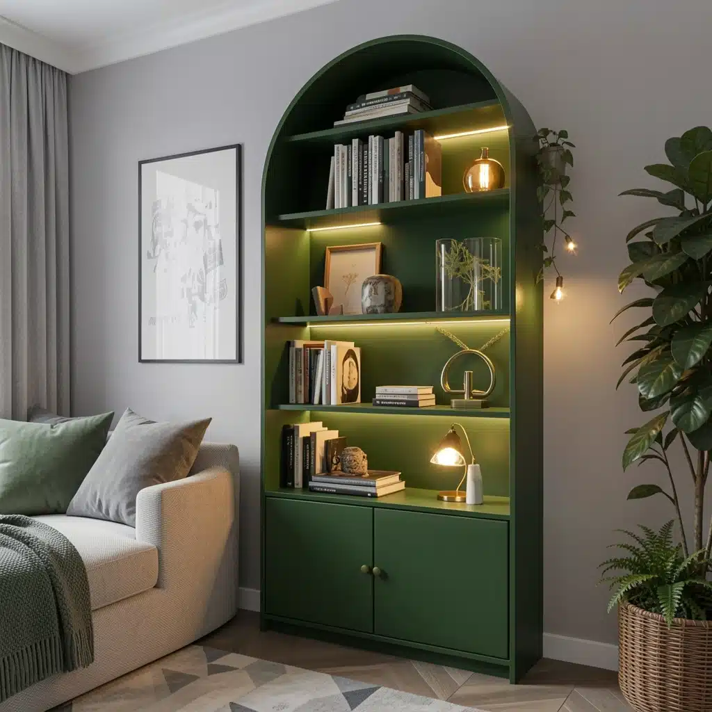
The deep forest green combined with the lighter grey creates a contrast without any of the coldness two neutrals sometimes produce together.
It is a preferred choice for home libraries and study rooms since the combination gives a sense of being enclosed and cozy rather than sparse.
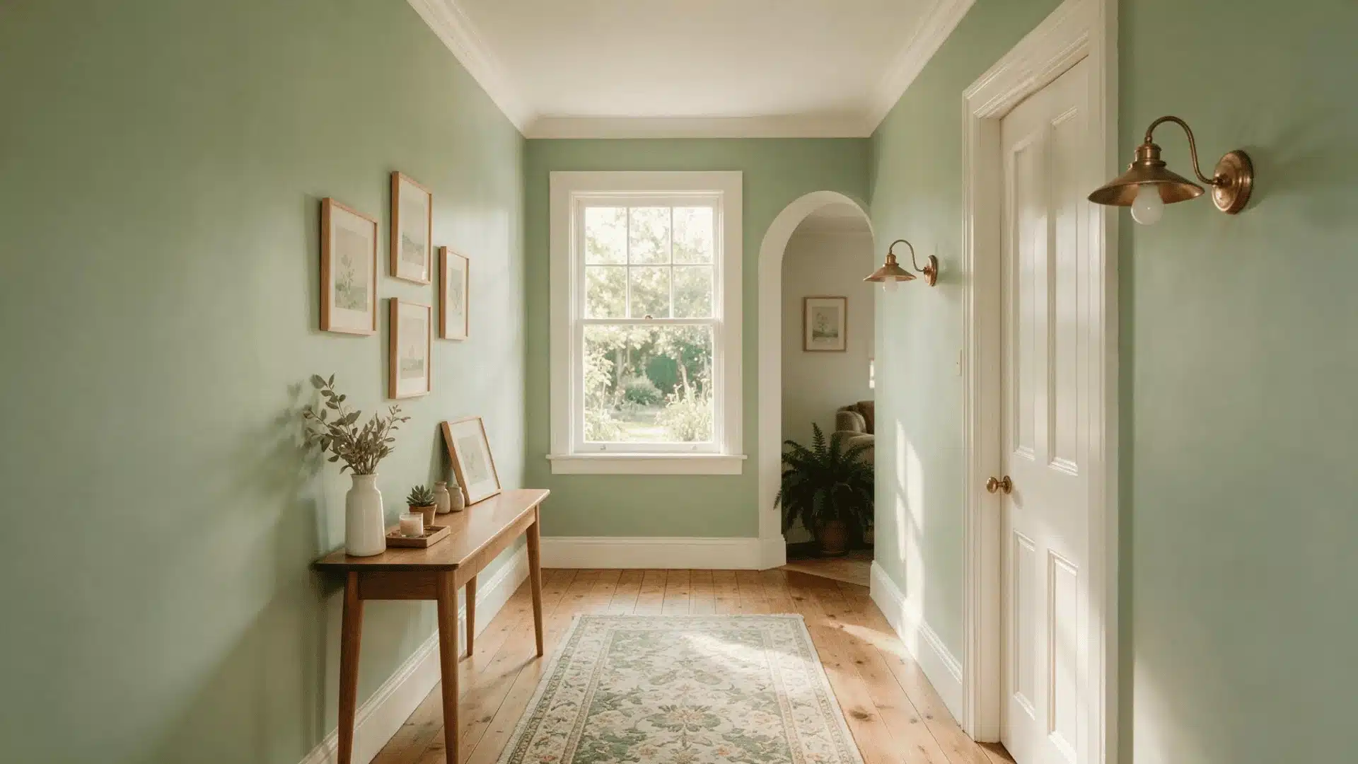
19. Grey and Sky Blue
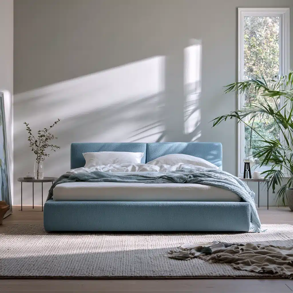
The sky blue is airy enough to prevent a grey room from seeming cramped, making this combination particularly useful in small bathrooms or bedrooms that have limited natural light.
It has a fresh appearance rather than a cold one, unlike some of the other blues that go with grey.
20. Grey and Water Blue
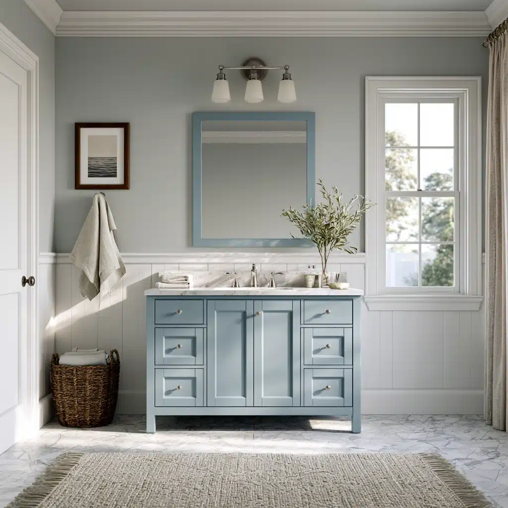
Water Blue is murkier and greener than a straightforward sky blue, closer to shallow ocean water than open air, which gives it a slightly more grounded, less breezy feel.
It suits bathrooms and sunrooms especially well, paired with white trim and natural fiber textures like rattan or linen.
Metallic and Accent Pairings
The finish in metal is not the same as a paint colour, but they change how any color combination with grey actually reads in a room, since light bounces off them differently than off fabric or wood.
21. Grey and Brass
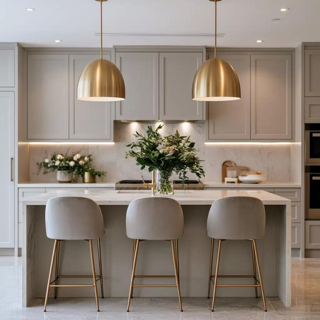
Brass quickly warms up the coolest of grey shades, which is the reason it has become the go-to metal finish for giving a modern look to outdated grey kitchens and bathrooms.
A few brass pulls or a single pendant light can shift the entire mood of the room.
22. Grey and Chrome or Silver
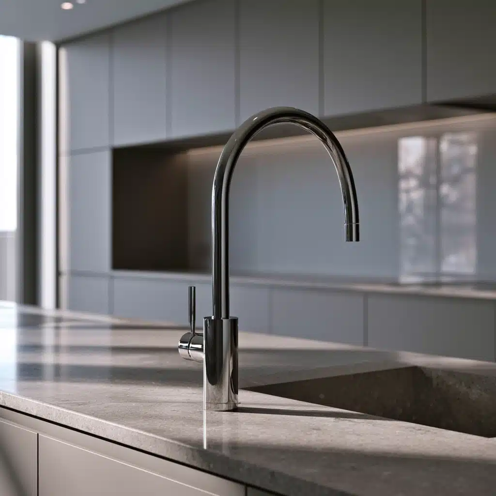
Chrome intensifies the cool effect of grey rather than balancing it, making it suitable for modern, minimalist rooms that wish to fully embrace a monochrome, industrial style.
It is an excellent option for kitchens and bathrooms that have a lot of glass and stone.
23. Grey and Copper
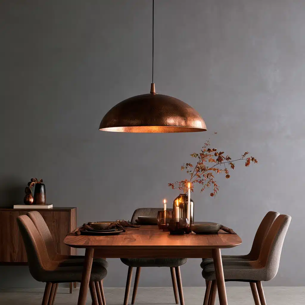
Copper is warmer than brass and yet cooler than rust, and it goes especially well with charcoal or graphite grey.
In most cases, it is sufficient to use light fittings, hardware and small decorative items, copper is intense enough that covering a large surface can overwhelm the room.
24. Grey and Matte Black Metal
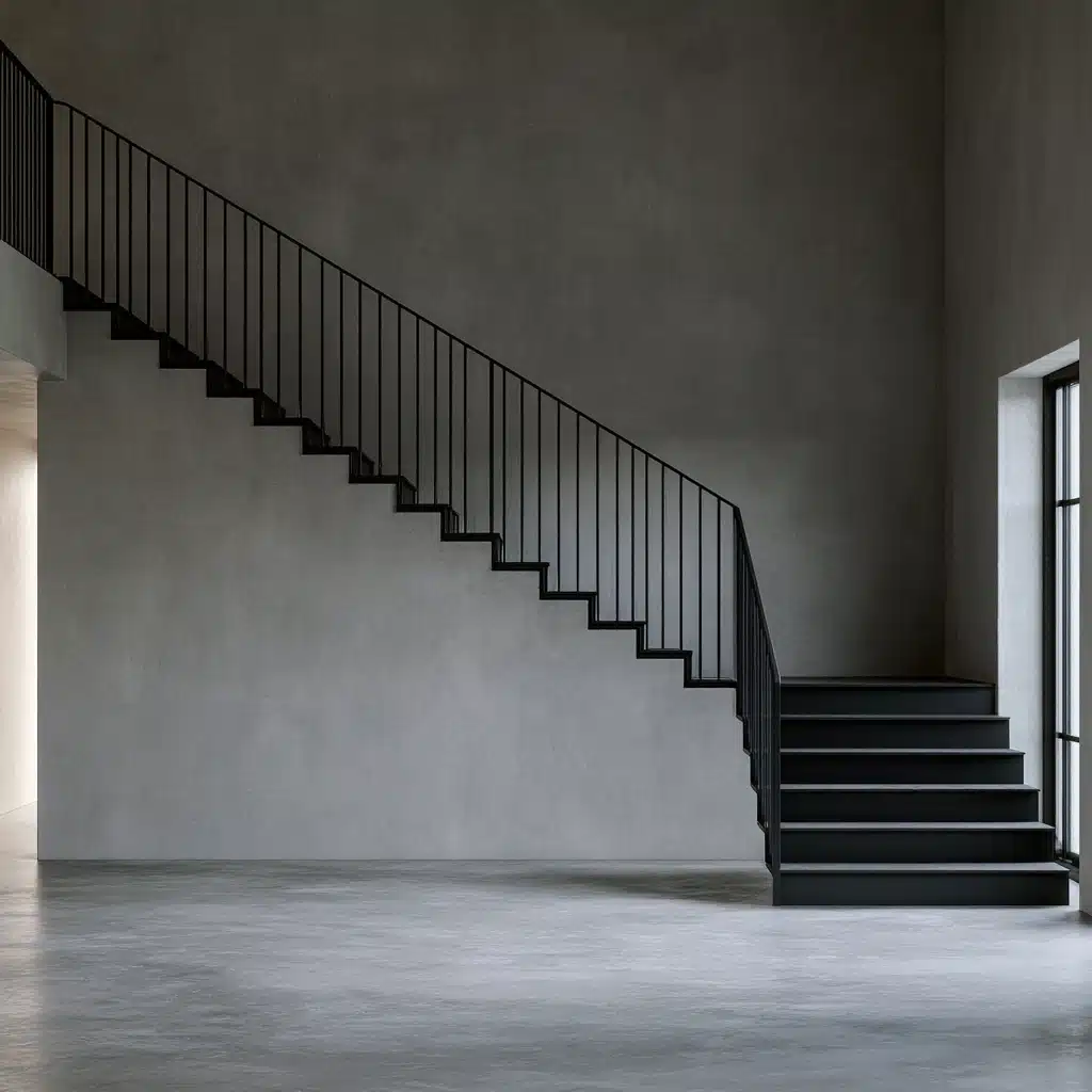
Matte black hardware and fixtures add structure to a grey room without adding any new color.
It has become one of the most popular finishes in newly built kitchens because it appears to be eternal rather than being driven by fashion, even when facing warmer greige tones.
Unexpected Statement Pairings
For those people who wish their space to seem less predictable, these combinations drive grey in a bolder direction without giving up its calming character.
25. Grey and Coral
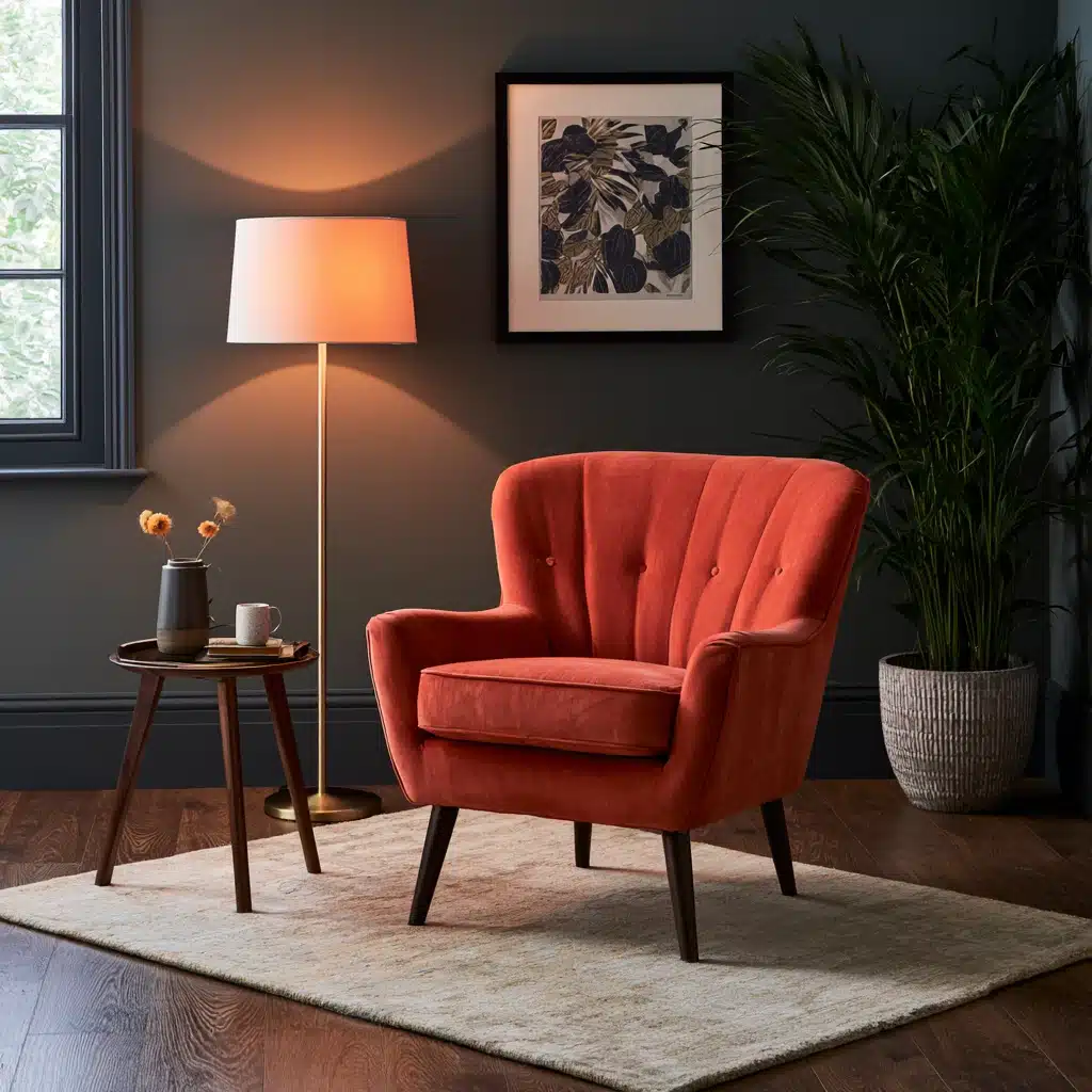
Coral is warm, energetic and a slightly unexpected against a cool grey, which is the reason it is so popular in children’s rooms and in lively living areas.
Since coral is a bright color, it usually works best as an accent rather than the dominant color in the room.
26. Grey and Cobalt Blue
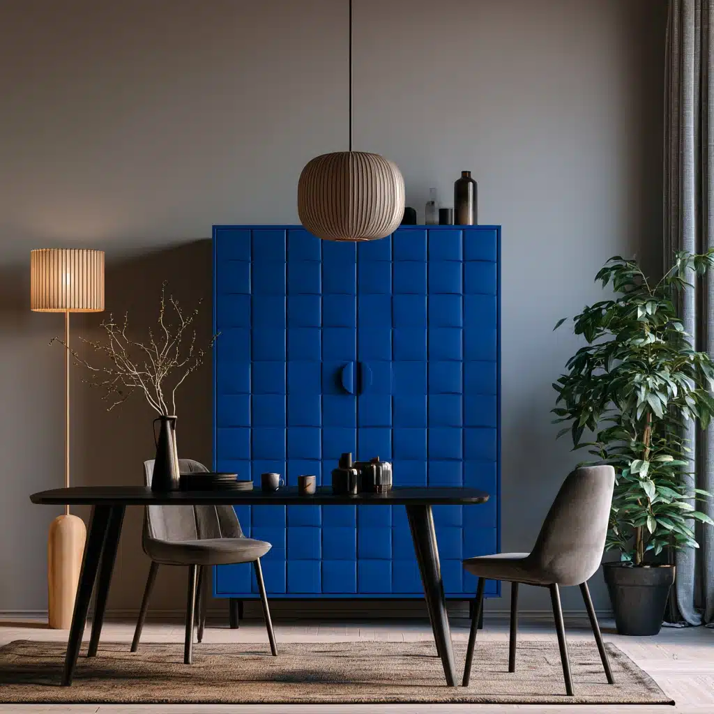
Cobalt is much more intense than dusty or sky blue, so this pairing feels confident rather than restful.
It is a bold option for a single statement wall or as a piece of furniture in a room that is generally neutral and unobtrusive.
27. Grey and Hot Pink
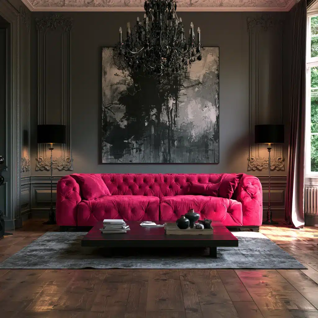
This combination trades subtlety for personality, and it works surprisingly well in creative spaces like home offices or studios.
Grey prevents the pink from appearing overwhelming by serving as a visual break between the intense color bursts.
28. Grey and Deep Purple
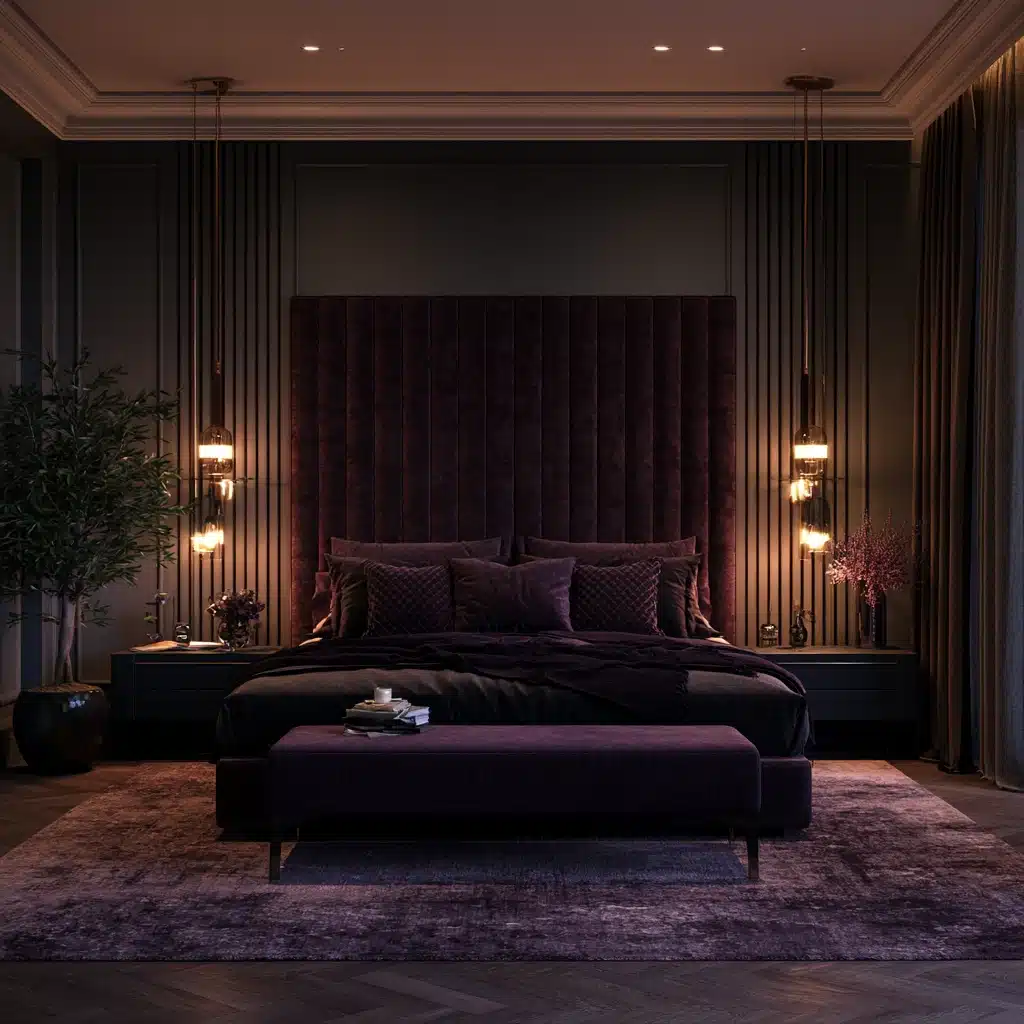
Deep purple against grey has a gloomy effect and is rather surprising, especially in a bedroom or a powder room.
It looks wonderful when photographed under low, warm lighting, which is one of the reasons it is featured so frequently in recent hospitality and boutique interior design.
Conclusion
There’s no single right answer. The best color combination with grey depends on your room’s light, your grey’s undertone, and how much contrast you’re comfortable living with.
The pairings above are a shortcut past months of trial and error, built from combinations already proven in real rooms.
If you take one thing from this list, take this: grey is patient.
It stays calm under almost any accent, so the risk in experimenting is lower than it feels in the paint aisle.
Test your undertone honestly, start bold colors small, and use metal finishes as an underused lever for temperature. Do that, and the right pairing reveals itself fast.
Frequently Asked Questions (FAQs)
1. Does the Sheen of Grey Paint Change how an Accent Color Looks?
Yes. Matte finishes make grey look softer and darker, while satin or semi-gloss bounce light back and make it look cooler and more saturated against accents.
2. Will an Unusual Color Combination with Grey Hurt Resale Value?
Generally not, as long as bold pairings stay confined to accents or a single wall. Buyers respond more to condition and layout than to color choices.
3. How Do I Know if My Grey Is Warm or Cool without a Paint Expert?
Hold your sample against pure white paper in daylight. Blue, green, or purple leaning means cool; beige, pink, or yellow leaning means warm.
4. How Many Accent Colors Can I Use with Grey Before a Room Feels Busy?
Stick to one dominant accent and one supporting color, plus a neutral like white or cream. Beyond that, a grey room starts feeling like a mood board.