Picking the right navy paint color feels more difficult than it should be.
Every shade looks nearly identical under bright store lighting. But None of them show how they will perform in your own home.
Hale Navy by Benjamin Moore addresses that problem more effectively than most other navy shades.
It maintains its color consistently in bright rooms and dim corners alike and also looks great on walls, cabinets, and doors without feeling out of place.
This blog breaks down everything you need to know about the shade, including real examples from living rooms, kitchens, and home exteriors.
By the end, you will know whether Hale Navy Benjamin Moore genuinely fits your space.
What Makes Hale Navy Benjamin Moore Stand Out?
Hale Navy Benjamin Moore is a deep navy with a soft gray blended right into it. This subtle gray is exactly what keeps the color from looking too flashy or overly dark on your wall.
That’s probably why you keep seeing it used everywhere, inside homes and outside too.
Here’s the quick spec sheet:
- Color code: HC-154
- LRV: 8.36, on the darker end of the scale
- Collection: Historical Colors Collection
What are the Undertones of Hale Navy Benjamin Moore?
Let’s talk about undertones for a second, because they matter more than you’d expect.
Hale Navy Benjamin Moore isn’t just one flat, single-note blue. It actually carries blue, gray, and even a subtle hint of green underneath, depending on the lighting hitting your wall.
Blue Undertones
Blue is unmistakably the backbone here, and that honestly shouldn’t surprise anyone. It reads as a true, classic navy, never overly bright and never particularly washed out.
Gray Undertones
Gray genuinely plays the quiet hero role in this particular color. It softens the blue enough that the wall never feels too loud or overly dark.
That’s the reason Hale Navy looks surprisingly calm in person, even though it’s technically classified as a dark shade.
Green Undertones
Here’s the genuinely surprising part about this shade.
Under certain lighting, especially warm bulbs or heavy shade, Hale Navy can subtly hint at green or teal undertones.
It’s fairly subtle rather than dominant, but definitely worth knowing before committing to a large wall.
How Hale Navy Benjamin Moore Changes With Lighting?
We have seen how Benjamin Moore Hale Navy hides blue, gray, and a touch of green underneath.
Here’s where things get genuinely interesting because lighting decides which of those undertones shows up the most. The same paint can look completely different depending on the room, the windows, and the time of day.
Hale Navy in Natural Light
Hale Navy shines in all its glory in daylight. It truly shows the navy blue under the light of the sun.
South-facing rooms will make the color appear more vibrant than anything else. In north-facing rooms, it becomes cool and grayish but is clearly navy.
Hale Navy in Low Light
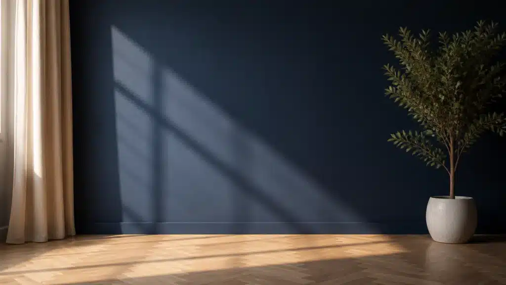
In low light, Hale Navy leans into its darker personality. Walls can look almost black by evening, particularly without a nearby lamp.
That’s not necessarily a flaw, though. It simply means Hale Navy gives rooms a grounded, noticeably cozy feel once the sun disappears.
Hale Navy in Warm Artificial Light
Turn on a warm bulb, and Hale Navy noticeably softens. The gray steps forward, and occasionally that subtle hint of green sneaks through as well.
It never technically turns purple or teal, but it definitely feels cozier and considerably less crisp than in daylight.
Hale Navy in Cool Artificial Light
Cool LED bulbs do the opposite of warm ones, essentially. They sharpen Hale Navy considerably, pulling out more blue and noticeably less gray. The color reads crisper and much closer to the actual paint chip.
If you specifically want a true, unmistakable navy appearance at night, cool bulbs work best.
Hale Navy Benjamin Moore in Real Home Interiors
Now that you understand how lighting changes Hale Navy, let’s actually see it in real rooms to see how it performs in the interiors.
Hale Navy Living Rooms
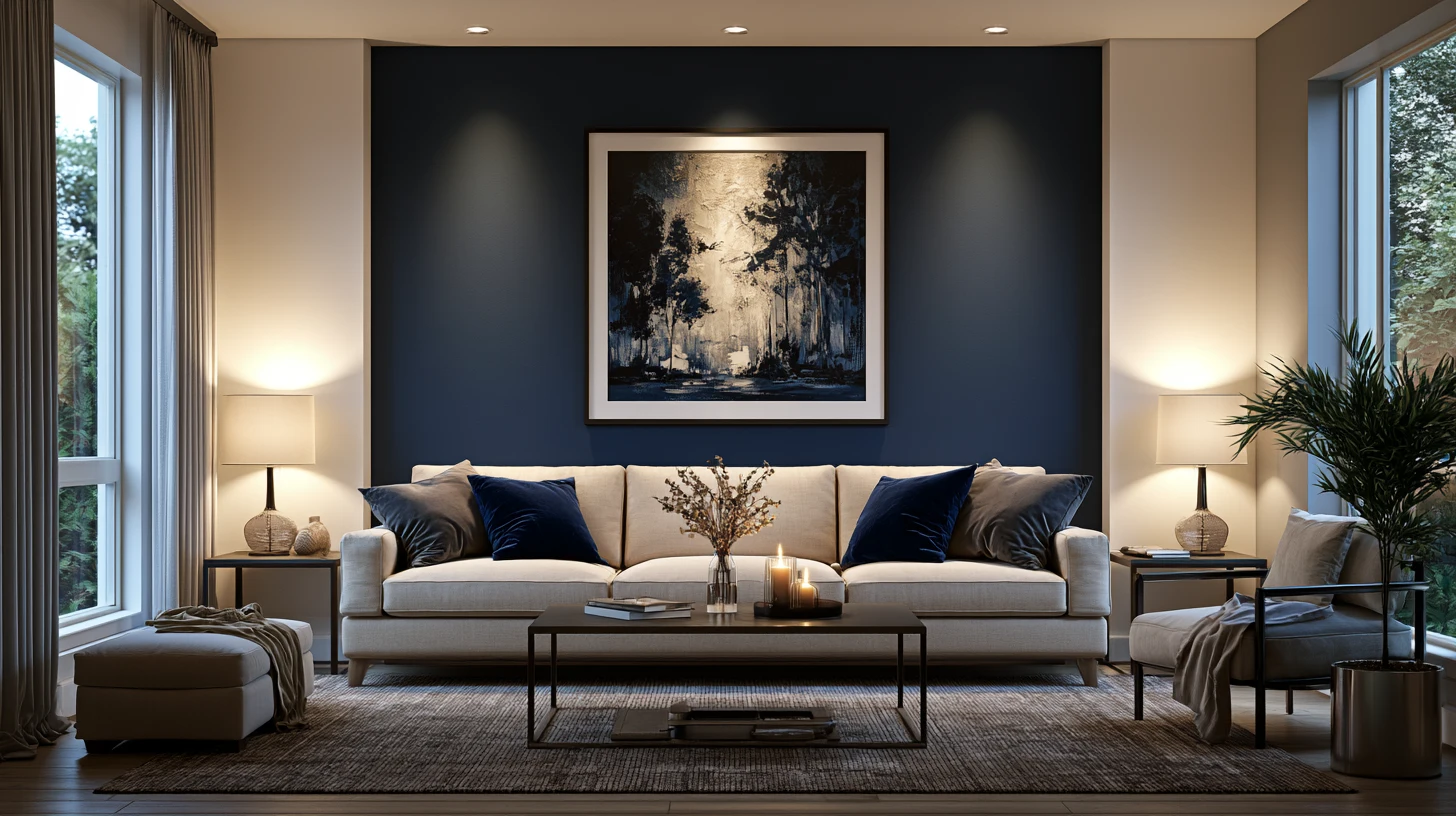
Hale Navy typically appears as a single accent wall behind the sofa or television. The other walls remain lighter and usually come in white or gray hues.
Some individuals choose to paint even the built-in shelves or the fireplaces using the same hue. It complements velvet fabric and warm lamps beautifully at night.
Hale Navy Kitchens
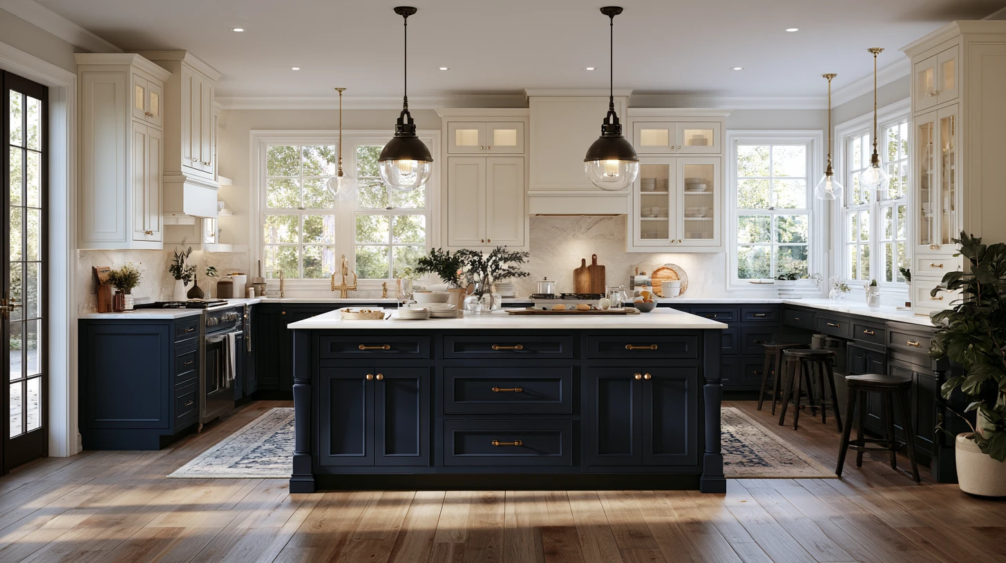
Hale Navy is a favorite for kitchen islands, especially paired with white or cream upper cabinets. The dark island grounds the space while the lighter cabinets keep things bright.
Some kitchens go further and paint lower cabinets navy too, with white countertops and brass hardware pulling everything together.
It also works well on a single wall near open shelving.
Hale Navy Bedrooms
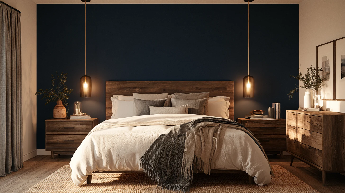
The walls that are usually painted with Hale Navy in bedrooms serve to create a cozy and cocoon-like atmosphere.
Some people paint all their walls in the bedroom in this color and use white bedding along with light wooden furniture in order to balance the color.
Hale Navy Bathrooms
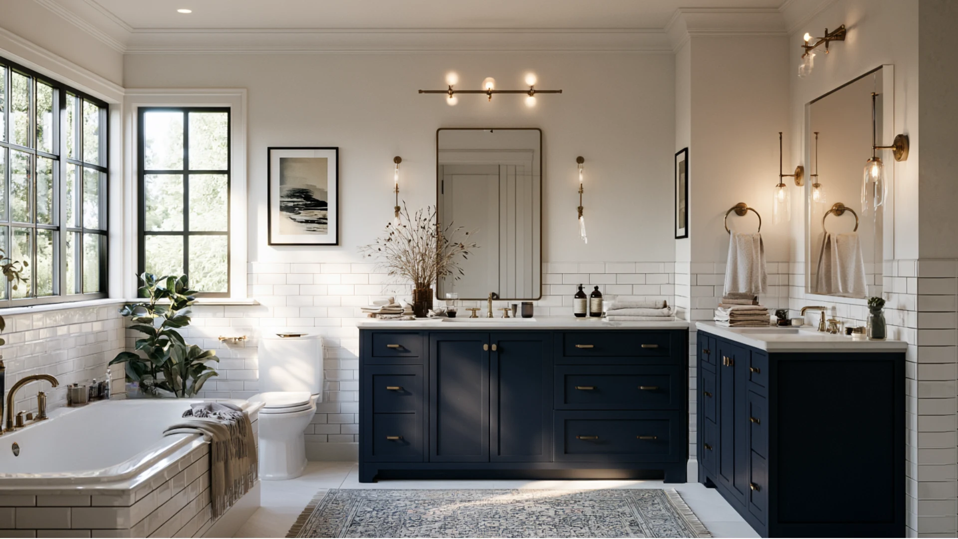
In bathroom vanities, Hale Navy is a brave move, particularly when the background includes white subway tiles and brass taps.
It works best in a small bathroom with limited light, where the vanity is the focal point. In a large bathroom where there is plenty of light, the navy can paint all the walls.
Hale Navy Offices and Built-Ins
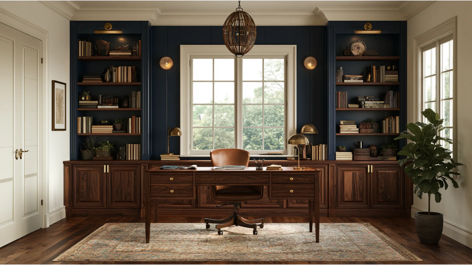
Hale Navy lends home offices and built-in bookshelves a rich, library-like atmosphere. Painting the built-ins alone while keeping surrounding walls white creates strong contrast without darkening the entire room.
Full office walls in Hale Navy work equally well, particularly alongside a large window.
Wood shelving and brass hardware add warmth against the deep navy backdrop.
Hale Navy Interior Doors
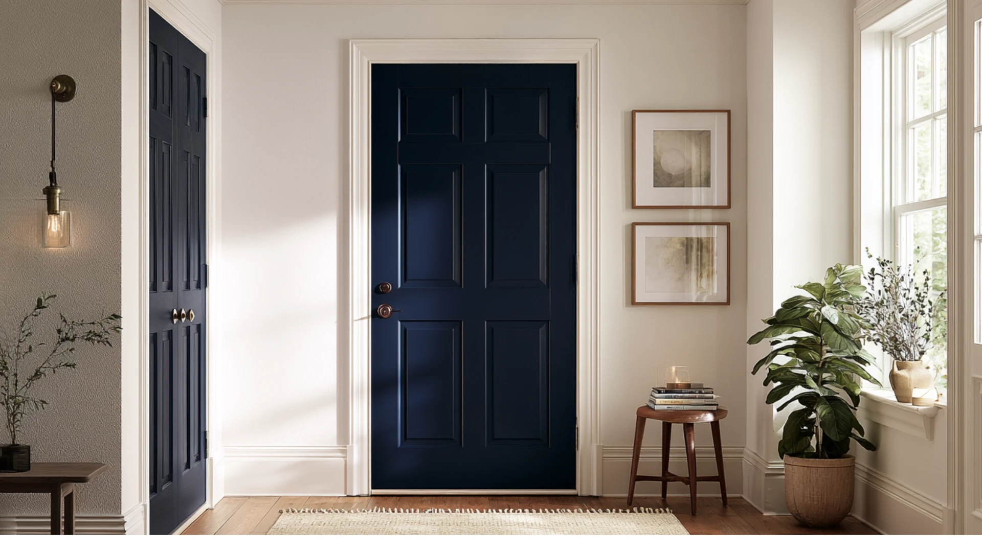
Painting interior doors Hale Navy against white walls adds instant contrast without committing to a full room. It works especially well on paneled doors, where the deep color highlights the trim details.
This trend has become popular in hallways and entryways, giving an otherwise plain space a custom, finished look.
Hale Navy Exterior Ideas for Homes
Alright, let’s step outside for a minute and talk exteriors. Hale Navy exterior applications have become a genuine favorite among homeowners, and it’s easy to see why.
From siding to front doors to shutters, this deep navy holds up well against sun, rain, and changing seasons.
Hale Navy Exterior Siding

On siding, Hale Navy exterior color gives American homes a classic, coastal feel without looking dated.
Pair it with crisp white trim around the windows and doors, and the whole house instantly looks sharper.
Add a natural wood front door or black shutters to make the combination feels timeless rather than trendy.
Hale Navy Front Doors
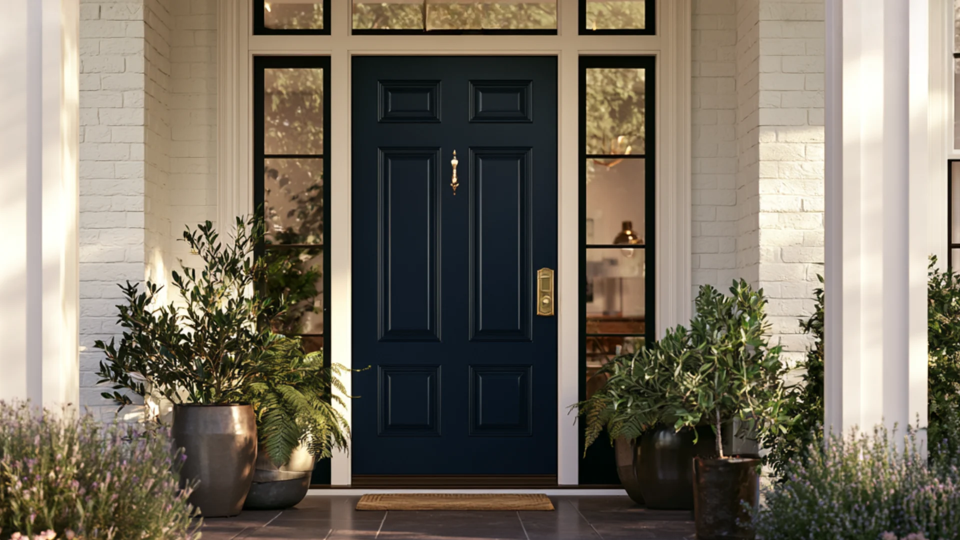
A Hale Navy front door might be the easiest way to boost curb appeal without repainting the entire house.
It pops against white, gray, or brick exteriors and pairs beautifully with brass or matte black hardware. Even on a small entryway, one navy door makes the whole front of the house feel noticeably more put together.
Hale Navy Shutters
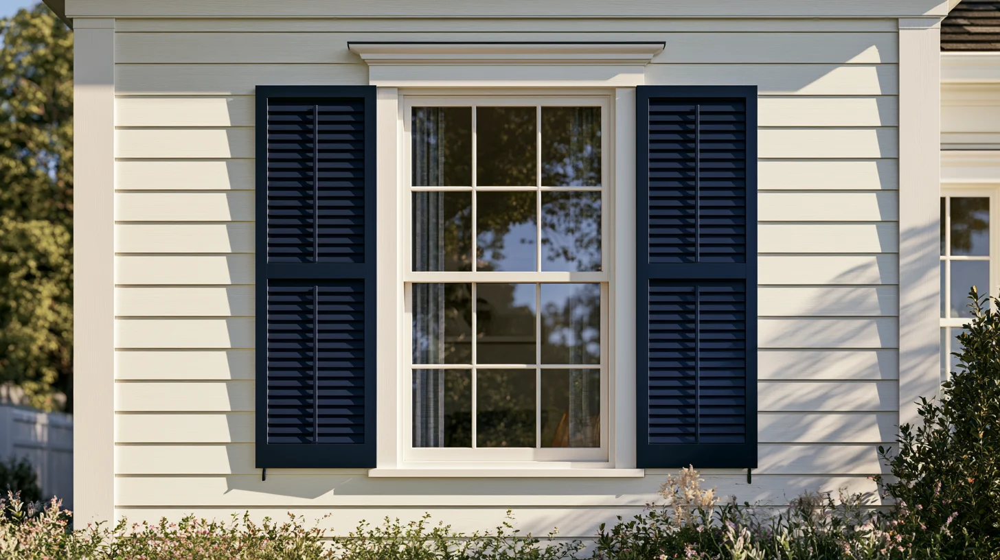
Hale Navy shutters work best against lighter siding, like white, cream, or light gray. The contrast frames the windows and gives the house a crisp, classic look without much effort.
Many homeowners pair navy shutters with a matching front door for a cohesive, put-together exterior.
Hale Navy Garage Doors
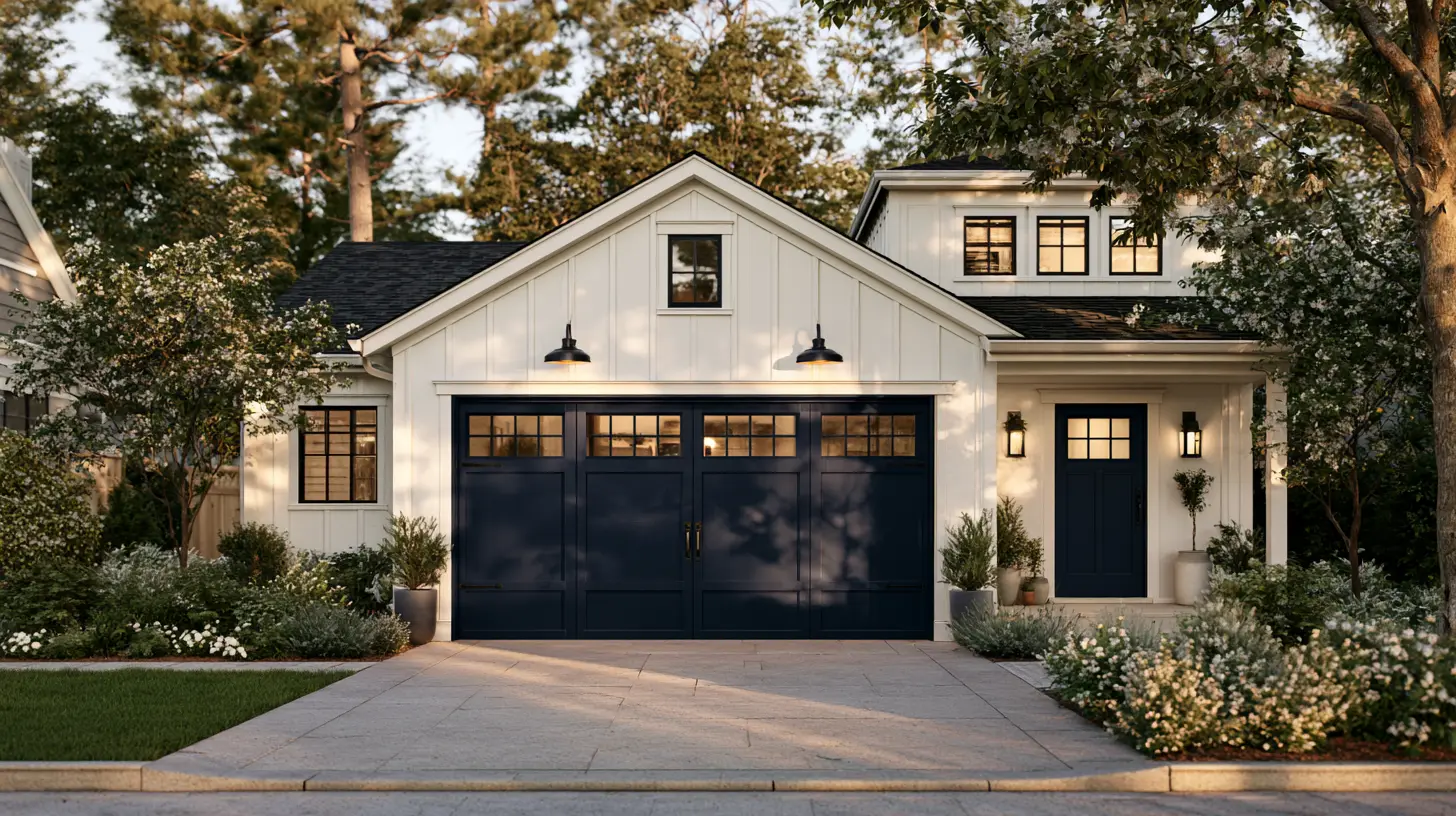
Painting the garage door Hale Navy ties the whole exterior together, especially when it matches the front door. This works particularly well on homes with a lot of garage frontage facing the street.
White trim around the garage keeps the look sharp instead of heavy or overwhelming.
Pros and Cons of Using Hale Navy Benjamin Moore
Every paint color comes with trade-offs, and Hale Navy Benjamin Moore is no exception. Here’s a quick side-by-side look at what works in its favor and what might give you pause before committing.
| Pros | Cons |
| Works in nearly any room, indoors or outside | Can look almost black in low light or small windows |
| Pairs easily with white, wood, brass, and black metal | Needs two coats and often a tinted primer for even coverage |
| One of Benjamin Moore’s best-selling, timeless colors | Clashes with neon, purple, and yellow-toned shades |
| Suits both cozy interiors and classic exteriors | May feel too moody for those wanting a bright, airy space |
Best Colors to Pair With Hale Navy Benjamin Moore
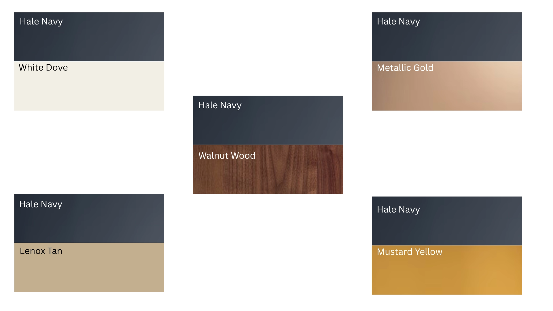
Here’s the genuinely fun part: finding colors that pair beautifully with Hale Navy Benjamin Moore. Choosing the right companion colors can truly make or break an entire room.
Let’s start with whites, since they complement navy in almost any space.
White Paint Colors
White Dove is Benjamin Moore’s recommended pairing for Hale Navy, and it’s easy to understand why. It carries just enough warmth to soften the navy without competing against it.
Glacier White works well too, particularly in brighter rooms, offering a crisper, cooler contrast than White Dove’s softer glow.
Warm Neutrals
Warm neutrals like Lenox Tan or soft beige genuinely keep Hale Navy from feeling overly cold or heavy.
They add a gentle glow next to all that dark blue, balancing the room rather than competing against it.
Try warm neutrals on the ceiling too. Navy walls can genuinely make a room feel shorter without a lighter ceiling to help balance things out.
Wood Tones
Natural wood floors, furniture, or exposed beams add genuine warmth against Hale Navy’s coolness.
Oak and walnut both work particularly well, especially in rooms featuring navy walls or cabinets. The wood keeps the space feeling grounded rather than sterile.
Lighter wood tones like white oak create more contrast, while darker walnut blends more subtly with the navy.
Metallic Finishes
Brass and metallic gold hardware genuinely bring a warm shine that instantly lifts Hale Navy. Matte black offers a moodier, considerably more modern contrast instead.
Either metal works particularly well on cabinet pulls, light fixtures, or door hardware.
Accent Colors
Small pops of mustard yellow, blush pink, or emerald green bring Hale Navy to life without overwhelming the room.
These colors work best in pillows, art, or a single statement chair rather than covering entire walls.
Stick to just one accent color per room, so it doesn’t compete with the navy for attention.
Hale Navy Benjamin Moore Compared With Similar Navy Paint Colors
Benjamin Moore Hale Navy has several close matches within the navy color family. The differences become much clearer when you compare these colors side by side.
Hale Navy vs Newburyport Blue
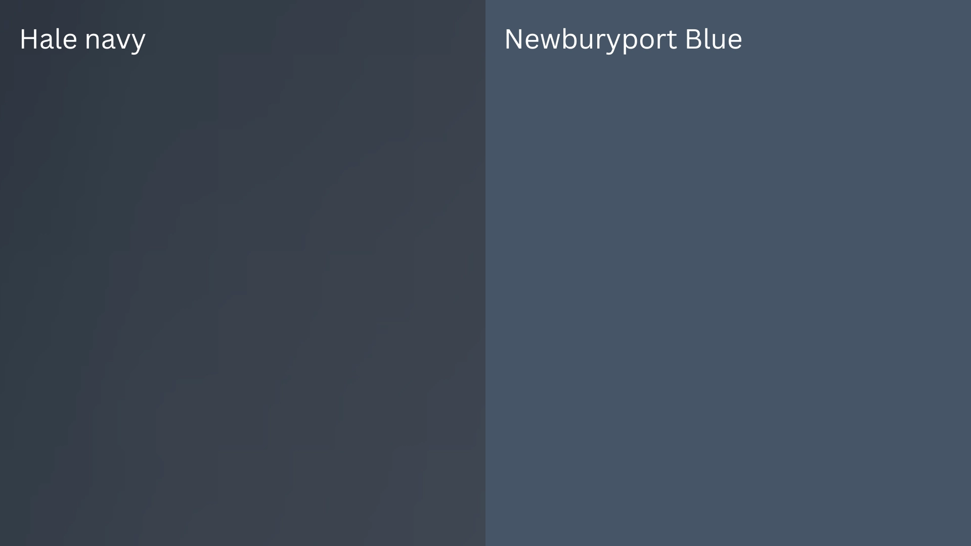
Newburyport Blue sits just one shade lighter than Benjamin Moore Hale Navy.
Its LRV measures around 10, compared to Hale Navy’s considerably darker 8.36. It retains its blue more clearly, particularly in lower lighting conditions.
Hale Navy leans noticeably grayer instead, reading closer to black in dimmer rooms. Choose Newburyport for a brighter navy, or Hale Navy for something moodier.
Hale Navy vs Van Deusen Blue
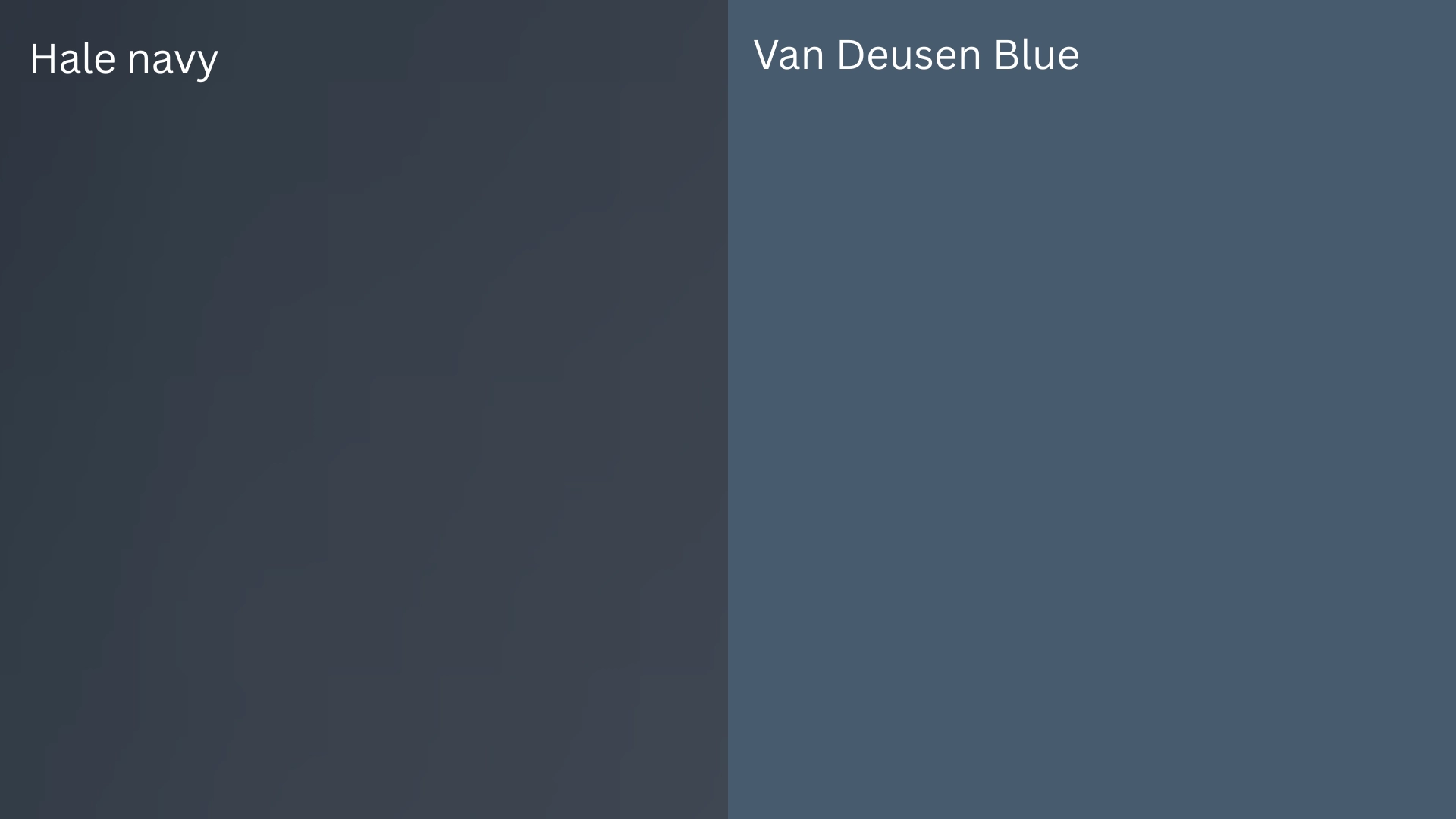
Van Deusen Blue sits noticeably lighter than Benjamin Moore’s Hale Navy. Its LRV measures close to 12, compared to Hale Navy’s considerably darker 8.36.
It carries a similar gray-blue base, but reads noticeably softer and less charcoal overall.
Van Deusen Blue works particularly well when a room needs genuine color rather than near-black depth. Hale Navy suits homeowners chasing that darker, considerably moodier look instead.
Hale Navy vs Sherwin-Williams Naval
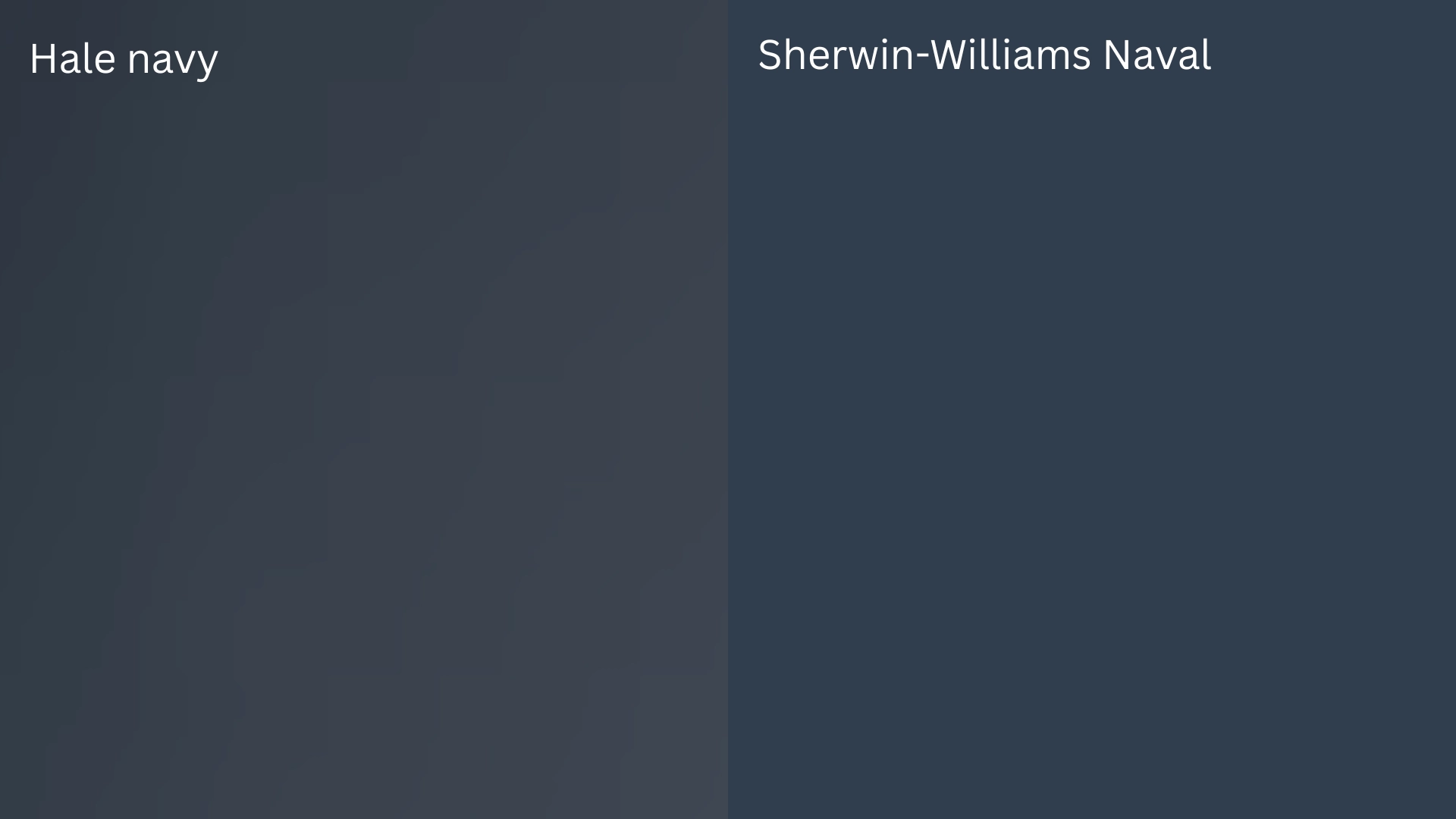
Sherwin-Williams Naval is a true, saturated navy with an LRV around 4, notably darker than Hale Navy’s 8.36. It carries almost no gray, staying bold and blue in nearly any light.
Hale Navy leans softer and grayer instead, making it easier to live with in smaller or dimmer rooms.
Colors that are a BIG NO to Pair with Hale Navy
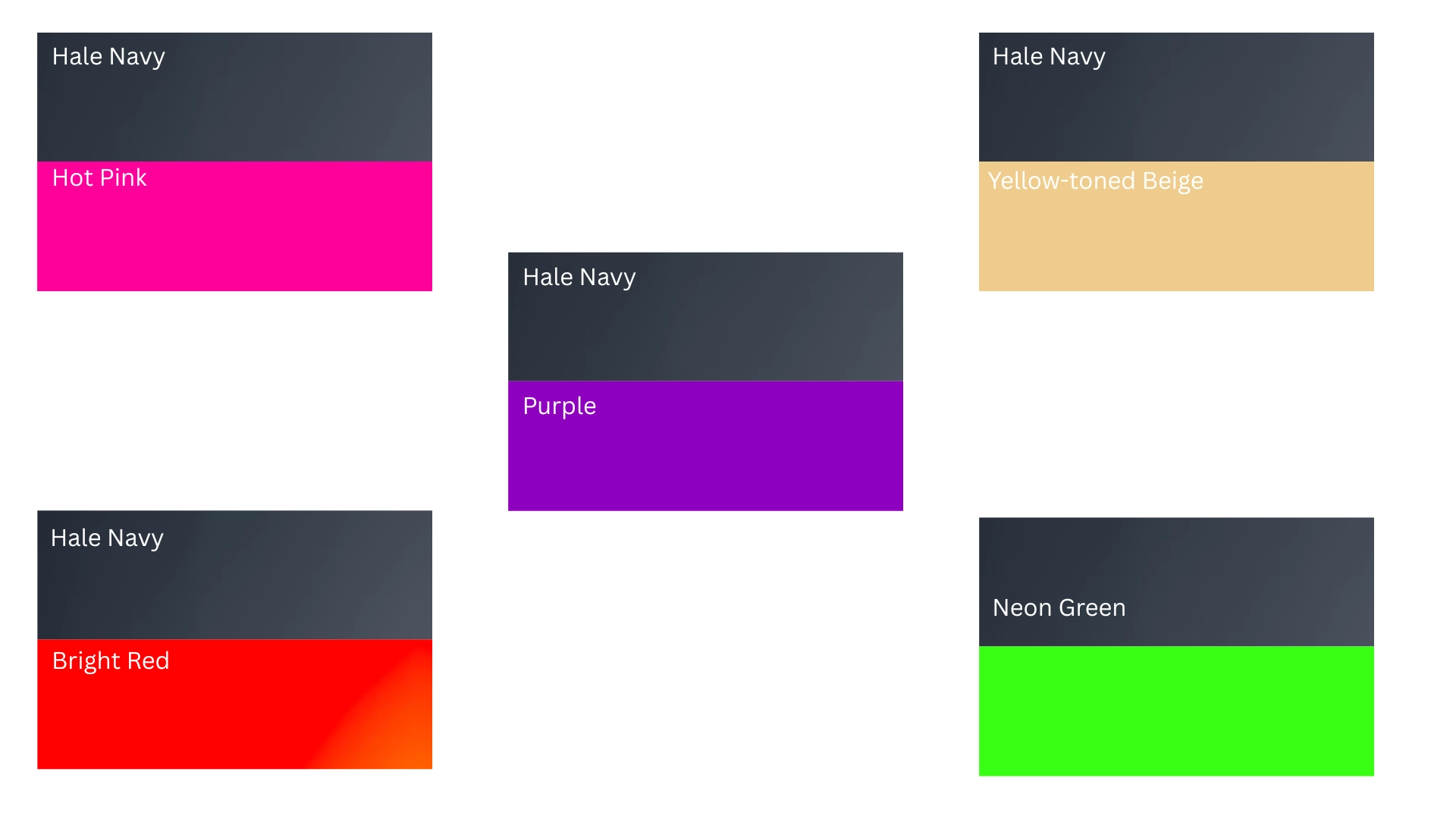
Not every color pairs nicely with Hale Navy. Some combinations look genuinely muddy, mismatched, or simply too busy for a calm, navy-based room.
Here are five colors worth avoiding, along with the reason each one falls flat.
Neon or Hot Pink
Neon or hot pink might look genuinely fun on its own, but next to Hale Navy it feels too loud. The navy is calm and moody, while hot pink practically shouts for attention.
Instead of feeling put together, the room starts to feel like two different design ideas fighting for the same wall.
Bright, Fire-Engine Red
Bright, fire-engine red might work reasonably well in a playroom, but it rarely works next to Hale Navy.
The two colors don’t blend so much as compete, each one trying to become the loudest element in the room. Instead of a bold look, the result often feels considerably more like a sports team than an actual home.
Purple or Lavender
Purple and lavender feel like they should work with navy, since both are cool colors.
In reality, they sit too close together on the color wheel.
Instead of contrast, the room ends up looking muddy and somewhat confused, like the choice was never truly finished.
Yellow-Toned Beige
A yellow-toned beige sounds like a genuinely safe, neutral choice, but next to Hale Navy it can easily backfire. The warm yellow undertone fights with the navy’s cool gray-blue base instead of softening it.
Rather than feeling grounded and balanced, the pairing often looks dull, dated, and slightly off.
Neon or Lime Green
Neon or lime green might feel playful on its own, but paired with Hale Navy it turns harsh rather quickly.
The navy stays soft and muted, while neon green feels loud and artificial. Rather than balancing each other out, the two colors clash in a jarring, unintentional way.
Is Hale Navy Benjamin Moore Right for Your Home?
Hale Navy Benjamin Moore earns its popularity for good reason.
It shifts with light, works in nearly any room, and pairs easily with warm neutrals, wood, and metal accents. That versatility explains why homeowners keep returning to it.
Choosing a paint color rarely comes down to merely liking a swatch. It comes down to how that particular color behaves in your particular space and lighting. Hale Navy handles that test considerably better than most navy shades.
Grab a sample. Watch it throughout an entire day of changing light, then decide if Hale Navy Benjamin Moore belongs in your home.
Frequently Asked Questions (FAQs)
1. Does Hale Navy Benjamin Moore Fade Outdoors?
With quality exterior paint, Hale Navy holds its color well for years. Direct, intense sun exposure over time can cause slight fading, so a quality topcoat helps.
2. How Many Coats of Hale Navy Do I Need?
Most painters recommend two coats for full, even coverage. Dark colors like Hale Navy sometimes need a tinted primer first to avoid patchy results.
3. Does Hale Navy Look Almost Black in Photos?
In photos with limited lighting, Hale Navy can look nearly black. Good natural light or a flash usually reveals its true, softer navy tone.