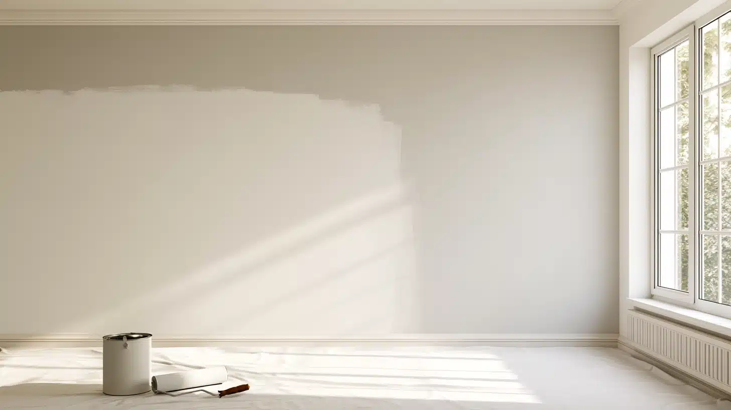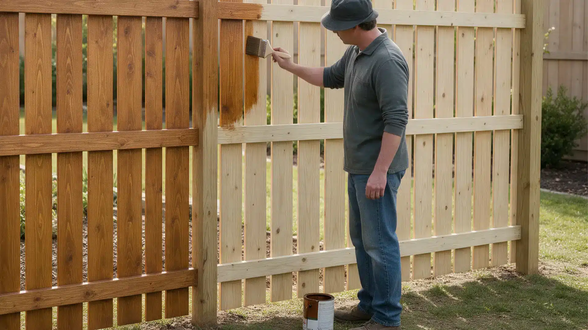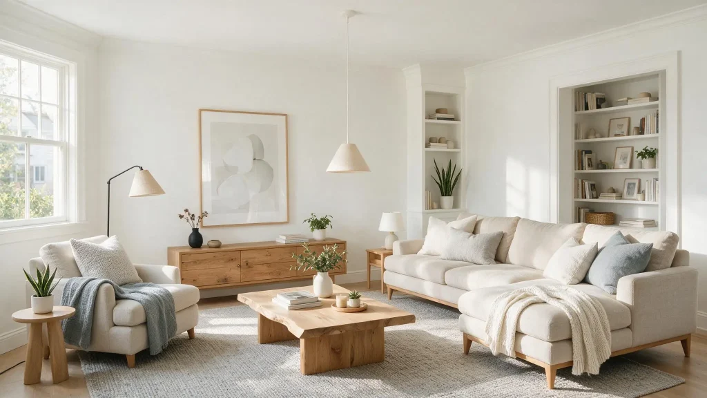
Whenever you scroll through any home remodeling post, you will see one particular color pop up again and again: Simply White by Benjamin Moore.
It is one of those colors that people love for their walls, trim, and even cabinets. People love using it and share its warmth and style on different review platforms. But some find it too creamy for a true white.
That mix of love and doubt makes this shade tricky to judge from a photo alone. Real rooms, real lighting, and real opinions provide a different view than any paint chip ever could.
Below, we’ve broken down how the color looks in real homes with proper lighting, so you can decide whether it fits your walls.
Quick Overview of Simply White OC-117
Simply White packs a lot of character into one shade. Below is everything you need to know about this paint color:
- Paint color: Simply White OC-117
- Brand: Benjamin Moore
- Color family: White
- LRV: 89.52
- Main Undertones: Soft yellow, mild warmth
- Overall Appearance: Bright and clean, with a gentle warm glow
- Best uses: Walls, trim, cabinets, and built-ins in rooms with good natural light
What Makes Benjamin Moore Simply White Popular?

Simply White Benjamin Moore gained recognition for one thing: it is versatile.
Paint manufacturers refer to it as a warm white due to the subtle yellow tone, which prevents the space from becoming too cold.
The light reflectance value is 89.52, allowing it to reflect enough light without being too bright.
That is why Simply White became Benjamin Moore’s Color of the Year in 2016 and remains popular among homeowners at the present time. The paint looks great on kitchen cabinets, trim, and full walls.
South-facing rooms highlight its clean brightness, while north-facing rooms bring out its buttery warmth. Designers love that flexibility, and homeowners feel the same way.
Undertones of Benjamin Moore Simply White
Undertones decide how a white paint really behaves. Below is what shows up beneath the surface of Simply White.
- Simply White carries a soft yellow undertone beneath its bright finish.
- This warmth stays subtle in most lighting but grows stronger in low light.
- North-facing rooms bring out more of the yellow tone.
- South-facing rooms with strong sunlight keep the white looking clean and crisp.
- Warm light bulbs increase the creamy feel, while cool LED lights reduce it.
- Compared to Chantilly Lace, Simply White always reads warmer and softer.
Is Simply White a Warm or Cool White?
Simply White by Benjamin Moore falls on the warm side of the color wheel. That soft yellow undertone gives it away every time. It never turns fully neutral or cool, even under bright light.
Some people expect a stark white and get surprised by its gentle warmth instead. This warmth makes it a comfortable choice for comfy spaces like bedrooms and living rooms.
Cooler whites, like Chantilly Lace, sit on the opposite end of the spectrum. If you want a crisp, icy white, look elsewhere.
But for a soft, inviting glow, Simply White delivers warmth without feeling heavy or dull.
How Does Lighting Change Benjamin Moore Simply White?
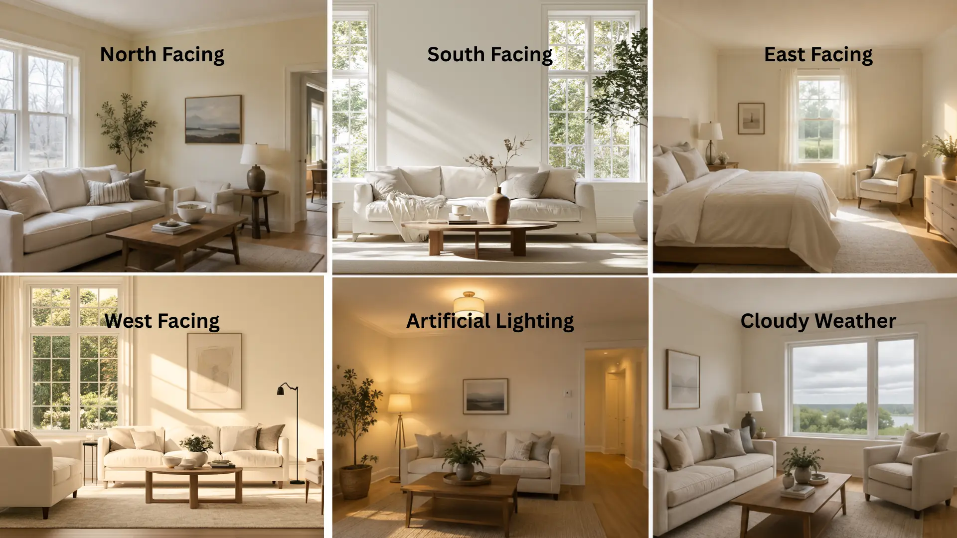
Benjamin Moore Simply White reacts strongly to the light around it. This shade never looks the same in every room.
- Rooms Facing North: It becomes more yellow, creating a warm, creamy look on the walls.
- Rooms Facing South: Appears brighter and cooler, without the warm undertones.
- Rooms Facing East: It shows a warm and comfortable shade of white, especially in the early morning.
- Rooms Facing West: It turns slightly golden as the day approaches and evening fades.
- Artificial Lights: Warm bulbs create warmer tones, whereas cool LEDs make it look fresher.
- Cloudy Weather: It becomes more muted and warm.
How Does Simply White Benjamin Moore Look in Real Homes?
This color changes personality from room to room. Below is how it performs in the spaces people care about most.
1. Simply White in Living Rooms
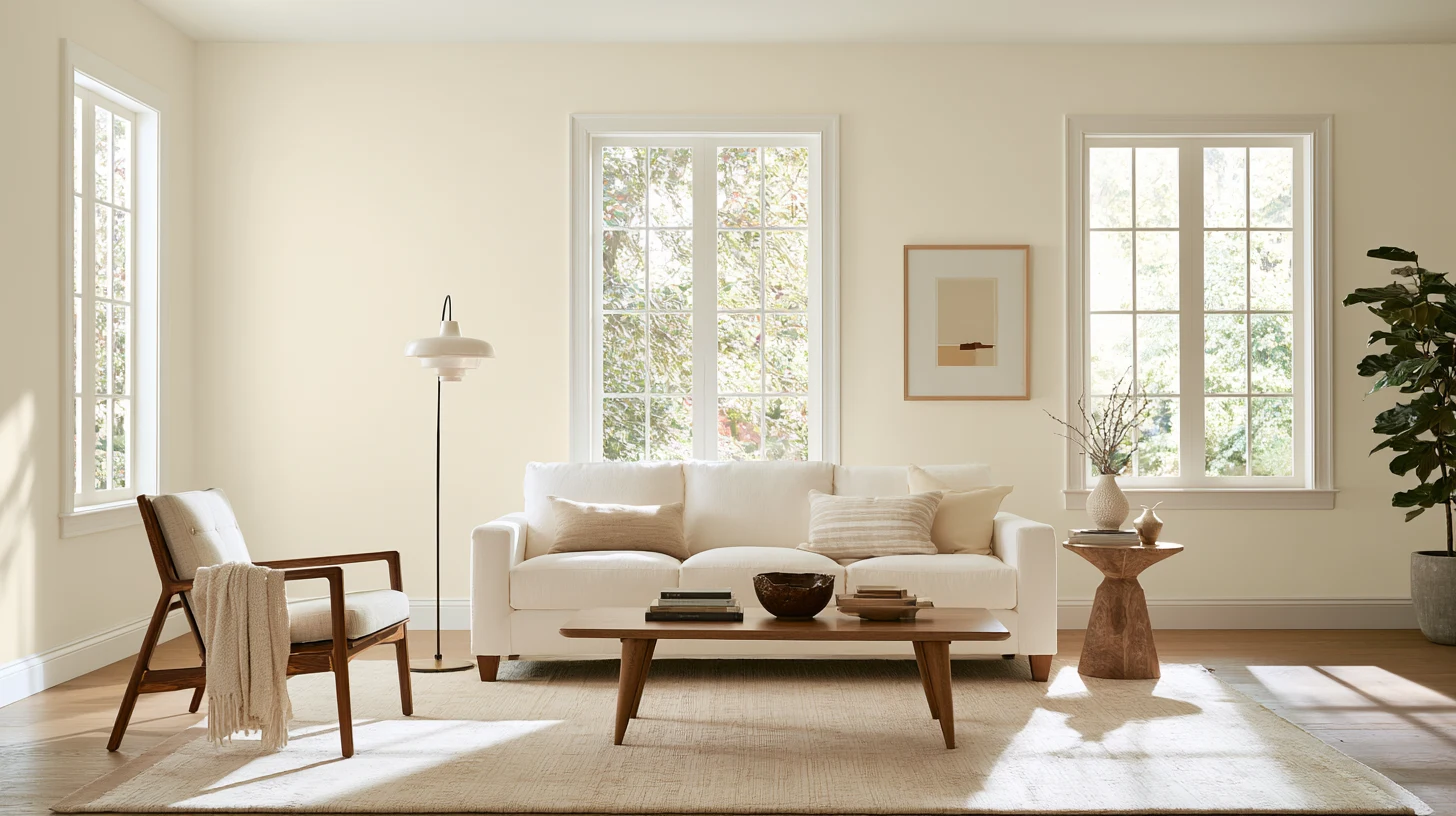
Simply White creates a soothing and welcoming environment in the living space. Living spaces with large windows allow the color to appear white with minimal warmth.
Interior spaces without adequate sunlight feel warm. Homeowners complement the color with wooden furniture and neutral interior furnishings.
The color complements artworks and dark-colored furniture very well. It creates a bright environment without being cold or bare.
2. Simply White in Bedrooms
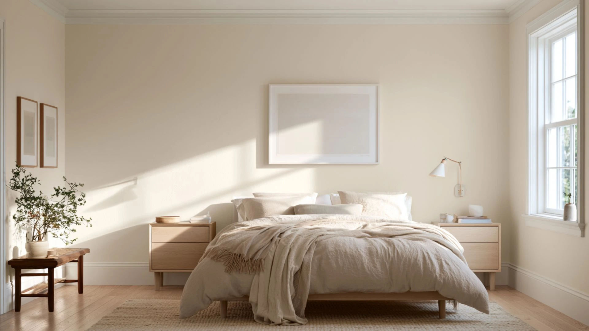
Simply White rooms make bedrooms relaxing and comfortable. The warm base of color makes them feel comfy without making them darker.
Morning light brings out a clean, bright finish. Evening light shows a gentle, creamy warmth instead.
The color usually works well with soft fabrics and light wood furniture. It works well in bedrooms of all sizes.
3. Simply White in Kitchens
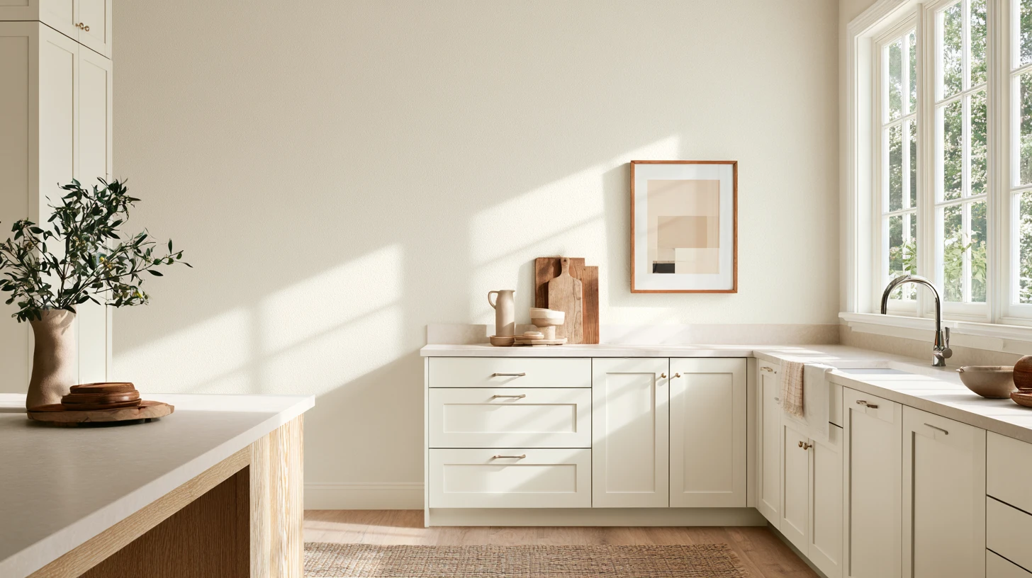
Kitchens are where Simply White gets used the most. It works well on cabinets, giving a bright, clean base.
The color pairs nicely with brass and wood accents. Its warm undertone keeps white cabinets from feeling cold or plain.
Many homeowners also use it on kitchen trim and walls, creating a matching look that still feels fresh and simple.
4. Simply White in Bathrooms
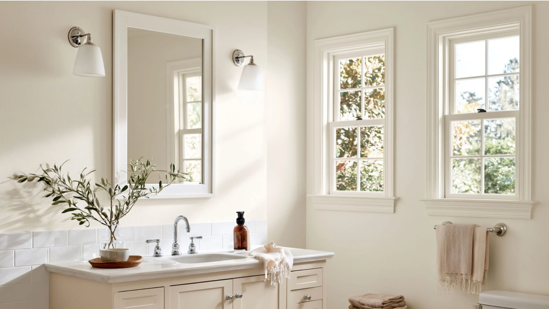
Bathrooms benefit from Simply White’s high LRV. The color reflects plenty of light, making small bathrooms feel bigger.
Windowless bathrooms show more of the warm undertone under artificial light. Rooms with natural light stay bright and clean all day. It pairs well with white tile and chrome fixtures.
Many homeowners choose it to brighten dark, closed-off bathroom spaces.
5. Simply White on Home Exteriors
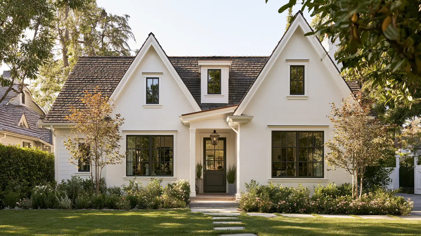
Simply White works less often on home exteriors. Its high LRV can look too bright under strong outdoor light.
Many painters suggest lower LRV whites, like White Dove, instead. Those shades handle outdoor light and shadows more evenly.
Simply White still works well on trim or smaller exterior details. For full exteriors, homeowners often pick a slightly deeper white.
Is Simply White too Yellow or Dingy?
In most homes, Simply White doesn’t read as yellow or dingy; its subtle undertones only show up in certain lighting conditions.
In north-facing spaces that do not get much light, Simply White will show its warmest tones. Spaces that experience plenty of natural light will keep it pure and crisp.
Some homeowners with truly cool-toned homes may see it as somewhat creamy in color, but it does not show itself that much when there is natural light, which reveals colors the best.
When used alongside bright white colors, Simply White appears creamier than it normally is, and it looks bright and soft on its own.
Simply White for Trim, Ceiling, and Cabinet Ideas
Simply White works well beyond just walls. Below is how it performs on trim, ceilings, and cabinets.
For Trim
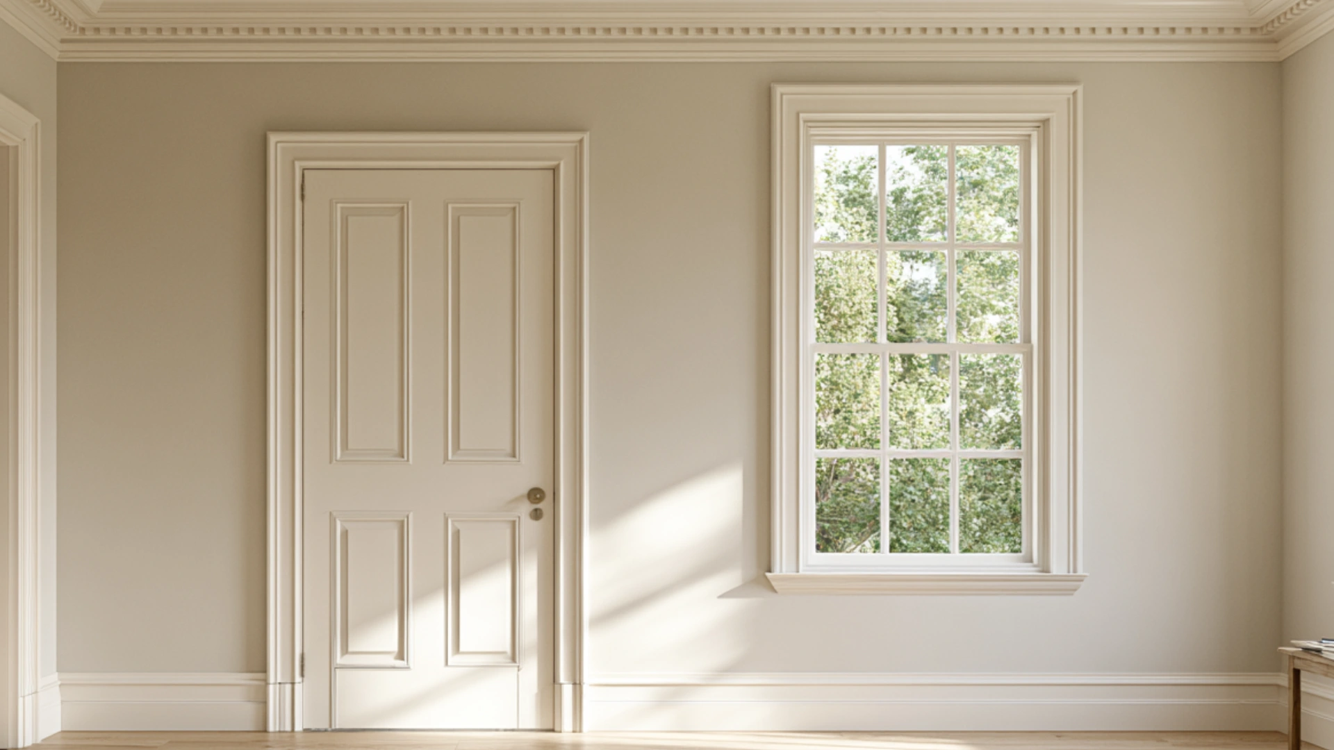
Simply White on trim creates a bright, clean edge against wall colors. It highlights molding, doors, and window frames without looking harsh.
Pairing it with deeper wall shades adds contrast. Semi-gloss finishes work best, helping trim catch light and stand out in any room.
Test trim paint next to your wall color before committing to the whole room.
For Ceiling
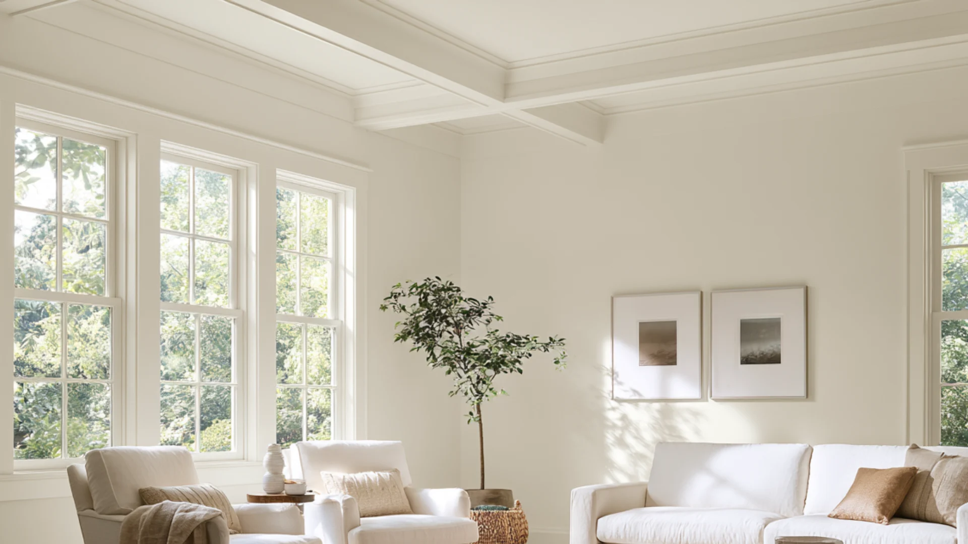
Ceilings in Simply White feel soft and open, especially in bright rooms. It avoids the stark, cold look of pure white ceilings.
This shade works well with warm-toned walls below. Many homeowners choose it over standard white for a cozier, more inviting feel.
For Cabinet
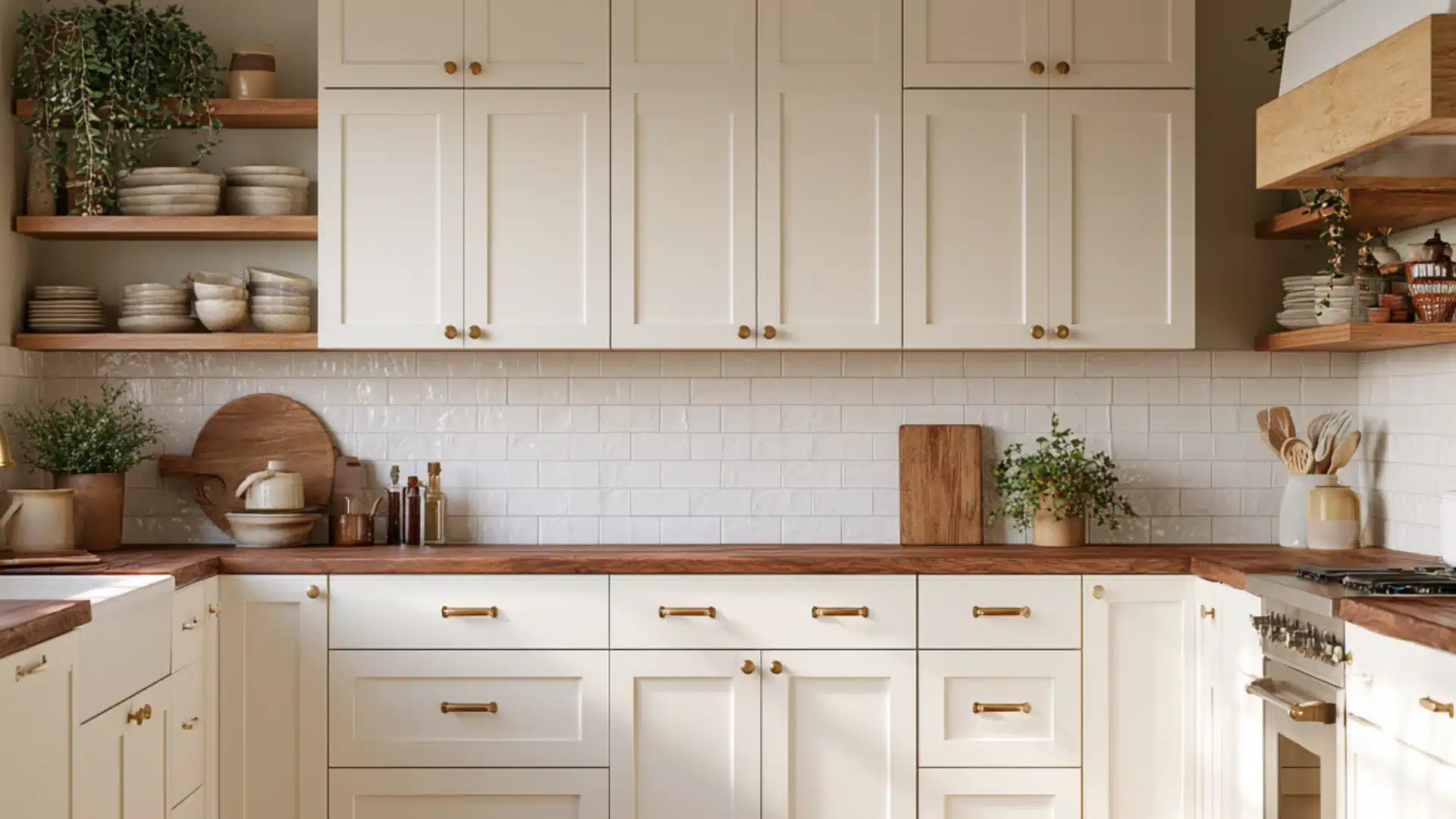
Cabinets painted in Simply White create a fresh, classic kitchen foundation. They pair beautifully with wood countertops, brass hardware, and open shelving.
The warm undertones prevent the space from feeling cold or clinical. This versatile shade complements both modern farmhouse and traditional kitchen styles, offering timeless appeal and warmth.
Pros and Cons of Benjamin Moore Simply White
Every paint color has its strong points and its limits. Below is an honest look at both sides of Simply White.
| Pros | Cons |
|---|---|
| High LRV keeps rooms bright and open | Can look creamy in north-facing rooms |
| Warm undertone feels cozy, not cold | Not a true, stark white |
| Works well on walls, trim, and cabinets | Less suited for cool, gray-toned spaces |
| Pairs easily with many other colors | May look too bright for exteriors |
| Suits most home styles and eras | Warm bulbs can increase the yellow tint |
Best Colors to Pair With Simply White Benjamin Moore
This color pairs well with many shades. Below are five colors that bring out its best side.
1. Dove Wing OC-18

Dove Wing is similar to Simply White, so they look beautiful together without clashing. These shades are warm, so they complete each other.
This combination is perfect for monochromatic color schemes. Many homeowners choose Dove Wing for trims and Simply White for walls.
2. Silver Satin OC-26
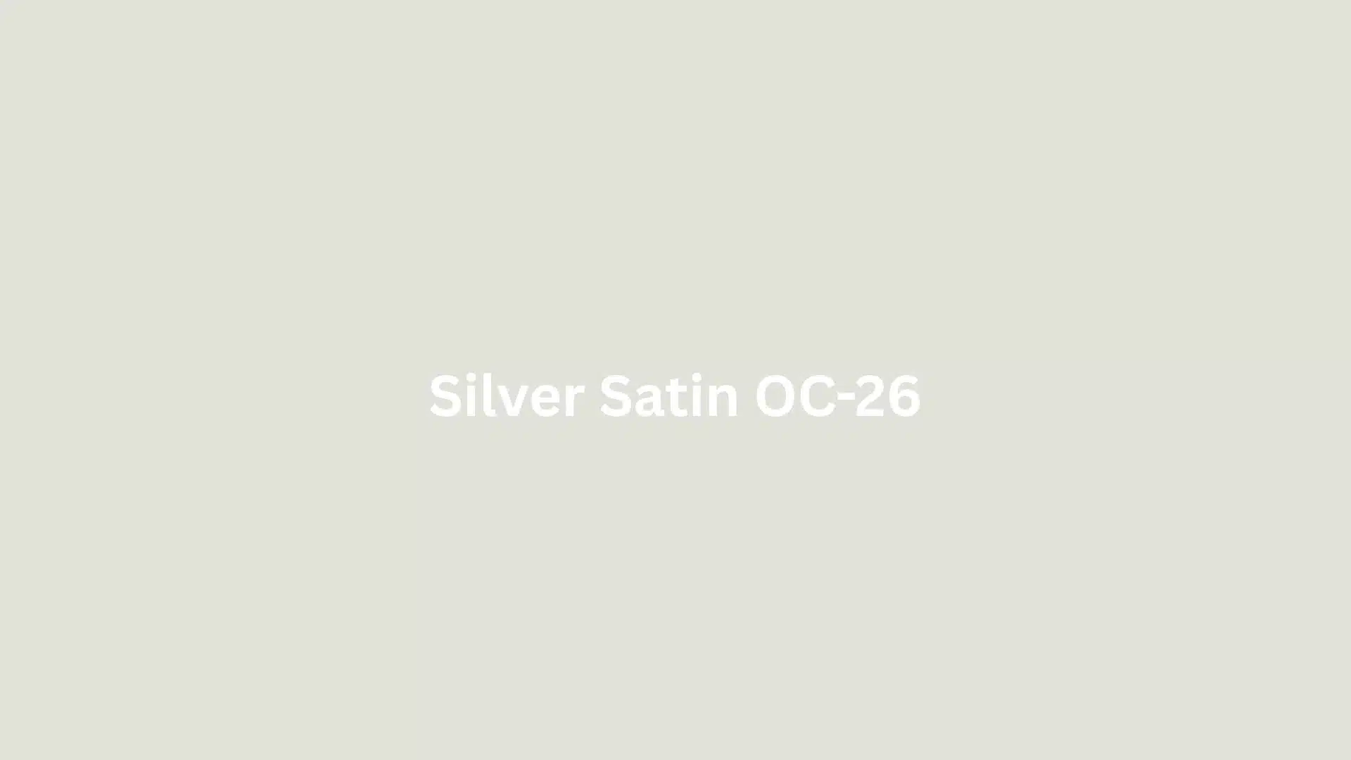
Silver Satin adds a touch of coolness to the warmth of Simply White. They work together harmoniously to create a nice contrast between wall and trim.
This combination is perfect for those who want bright and clean interiors. It works particularly well in areas with lots of natural light.
3. Casco Bay 2051-30

Casco Bay brings bold depth against Simply White’s brightness. This combination suits accent walls or cabinetry needing a strong contrast.
The deep tone makes Simply White trim stand out even more. Many designers use this pairing in kitchens and dining rooms for a striking look.
4. Somerville Red HC-62

Somerville Red adds warmth and richness alongside Simply White’s soft glow. This pairing works well for comfy, traditional-style rooms.
The muted tone keeps the combination feeling classic rather than bold. It suits living rooms, dens, and spaces with wood furniture.
5. Revere Pewter HC-172

Revere Pewter pairs beautifully with Simply White, complementing its subtle yellow undertone with a soft warmth.
Together, these colors create a calm, balanced, and versatile neutral palette. The combination works well throughout nearly any room in the home.
Many homeowners choose Revere Pewter for the walls and Simply White for the trim, creating contrast.
Colors to NOT Pair With Simply White Benjamin Moore
Not every color complements Simply White’s warmth. These shades can clash or bring out unwanted undertones.
1. Chantilly Lace OC-65

Chantilly Lace is cleaner and brighter than Simply White. Placed side by side, this contrast can make Simply White look creamier or more yellow than expected.
Homeowners wanting a matched white pairing should test both shades together first, since the difference becomes clear when painted side by side.
2. Iceberg 2122-50

Iceberg 122-50 carries cool blue undertones that contrast sharply with Simply White. This pairing makes Simply White’s yellow undertone easier to spot, especially in rooms with limited natural light.
Homeowners considering this combination should test both shades together first, since the temperature difference tends to stand out more on larger surfaces.
3. Stonington Gray HC-170

Stonington Gray’s cool, gray base can pull out more yellow in Simply White. This effect becomes stronger in rooms with limited natural light.
Sampling both colors together is especially important here, since low light tends to exaggerate undertone differences between cooler grays and warmer whites like this one.
4. Gray Owl OC-52

Gray Owl can shift cool or slightly blue-green depending on the room. That cooler character often draws more attention to Simply White’s creamy side.
Homeowners pairing these two colors should test them under their own lighting first, since the contrast can look different from room to room.
5. Paper White OC-55

Paper White is a cooler off-white with gray undertones. Placed beside Simply White, it can make the latter look noticeably more yellow.
This pairing works best when tested in natural light first, since the undertone gap tends to stand out more in darker or artificially lit spaces.
Comparison Between Simply White vs Other Whites
No two whites behave the same way in a room. Below is how Simply White compares to other popular shades.
| Paint Color | Brand | LRV | Undertone | Best For |
|---|---|---|---|---|
| Simply White OC-117 | Benjamin Moore | 89.52 | Warm, slight yellow | Walls, trim, cabinets in bright rooms |
| White Dove OC-17 | Benjamin Moore | 83.16 | Warm, soft greige | Trim, exteriors, low-light rooms |
| Chantilly Lace OC-65 | Benjamin Moore | 90.04 | Cool, crisp, minimal warmth | Modern spaces wanting a bright white |
| Pure White SW 7005 | Sherwin-Williams | 84 | Cool, slight gray | Homeowners wanting a neutral, cooler white |
When comparing Simply White vs Pure White, the difference especially comes down to undertones. Simply White leans warm with a soft yellow hint, while Pure White stays cooler with a slight gray base.
Conclusion
Simply White by Benjamin Moore has earned its reputation for its versatility.
It changes with the light, matches both warm and cool hues, and works well on walls, trim, and cabinets. That is why it is popular among interior decorators for a variety of uses.
Color choice can be hard sometimes, but this shade makes it easier.
But before purchasing the whole gallon, you should try the color out on your walls. Such a simple solution will save you both time and money in the future.
Frequently Asked Questions (FAQs)
1. When Not to Use Simply White?
Avoid Simply White in cool, gray-toned rooms wanting a stark, neutral look. Also skip it for exteriors, where a lower LRV white often performs better.
2. Is Simply White Brighter Than Pure White?
Yes, Simply White has a higher LRV than Pure White, making it reflect more light. This gives it a brighter, cleaner look in most rooms.
3. What is a Good Dupe for Benjamin Moore Simply White?
Snowfall White by Benjamin Moore comes very close, with similar warmth and brightness. Sherwin-Williams High Reflectance White is another close match worth testing.