Your living room looked great back in June.
Now the same pillows and rug feel off, and you can’t quite say why. Nothing broke, nothing got old. The room just doesn’t match the season anymore.
That’s usually a color problem, not a decorating problem, and a good fall color palette fixes it faster than buying new furniture ever will.
Classic Autumn Color Palette
This is the classic autumn color scheme. Not all of these seven colors have to be used in one room at once; it’s enough to use one or two for a basis.
Burnt Orange: The classic fall color; however, it tends to fade bright walls fast under direct sunlight, so it’s best suited for accessories.
Mustard Yellow: This is the deeper version of yellow that looks great even in poorly lit rooms where the pastel yellow will appear dull.
Rust Red: A deeper and more brownish variety of red; doesn’t contrast wood surfaces as much as pure red.
Chocolate Brown: The basic element of almost any fall color scheme. It goes well with everything and covers up dirt and dust better than most other colors.
Olive Green: A green shade with brown undertones that can be used in rooms with northern exposure.
Burgundy: A deep red color with purple undertones that adds depth to the color scheme without using black color in the room.
Beige: The neutral shade for any fall color scheme.
Beautiful Fall Color Palette Ideas
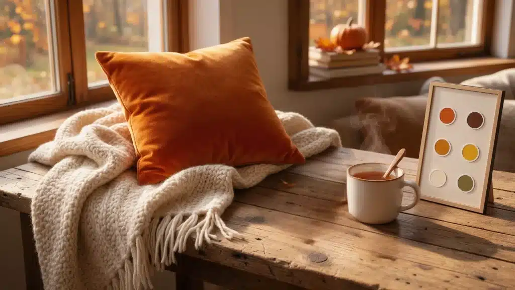
1. Burnt Orange, Cream and Brown

These are some of the most classic color schemes when it comes to fall.
Cream helps to balance out the burnt orange, which might seem overwhelming without it, while brown acts as a bridge between burnt orange and cream.
This combination works well for decorating living spaces and in season-specific decor, but it would be too overwhelming on painted walls after fall has passed.
2. Burgundy, Blush and Beige
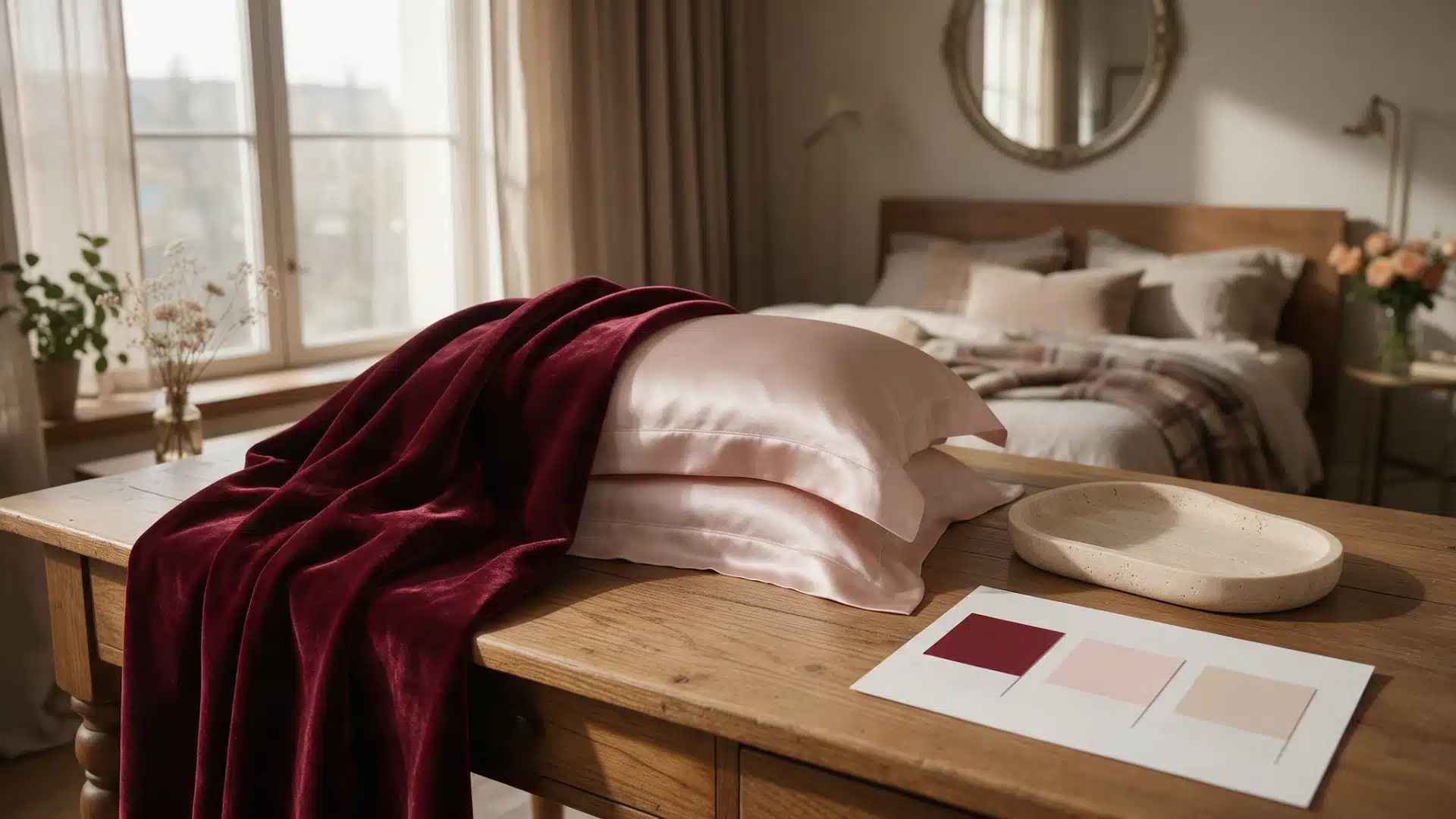
A burgundy-dominated combination might seem too formal, but blush will add some softness to it. This color scheme is often used to decorate bedrooms and tables, as it gives off the fall vibe without involving any orange.
Blush should make up only a small part of the overall color scheme; otherwise, the interior will start looking like a nursery.
3. Mustard, Olive Green and Cream
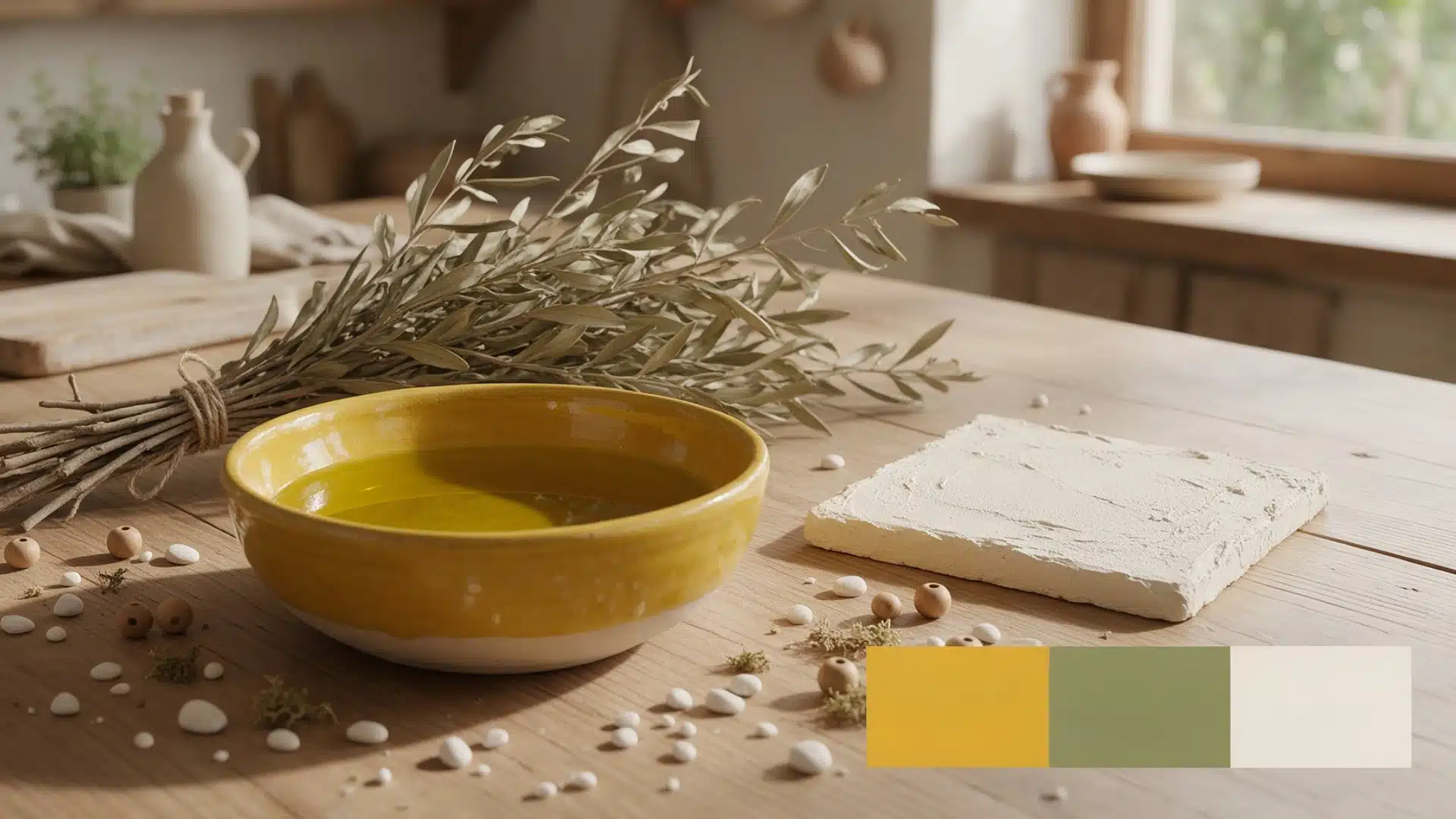
Compared to orange dominant schemes, this one resembles more of a real fall palette. In this combination, cream is crucial because, without it, mustard and olive will look rather muddy in a room.
4. Terracotta, Sage Green and Tan
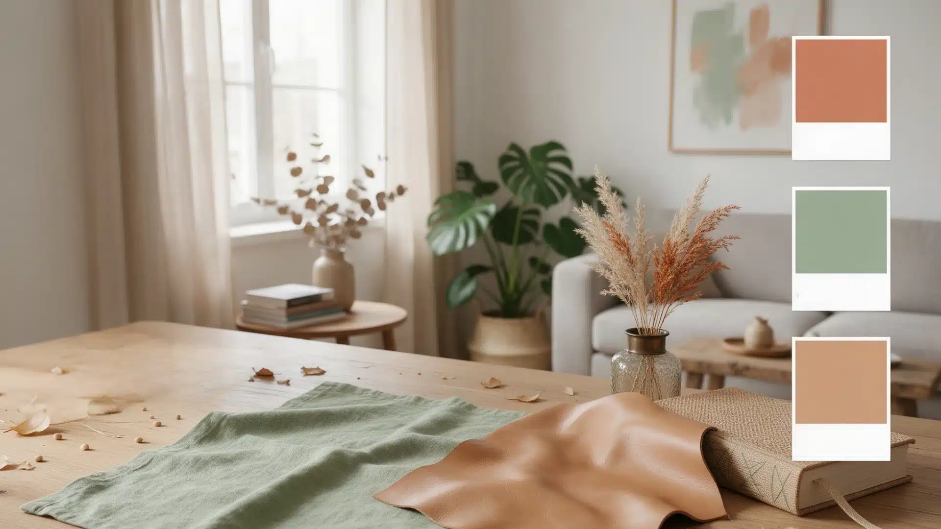
It is a toned down version of the traditional autumn palette.
What sets this one apart from the other options is the fact that while many autumn colors become out-of-date fast, this palette would remain relevant well into the fall season.
5. Chocolate Brown, Camel and Ivory

The neutral color combination from our list. No bright autumnal shades, just textures: wool throws, woven baskets, leather.
This is a perfect combination if your furniture is neutral, because you’ll only need to swap a couple of accents and change textures to create a fall transformation.
6. Rust, Navy and Warm White

The majority of fall color combinations are usually limited to shades of orange and brown, but adding navy makes a break in this pattern. If your furniture is mostly brown, then this combination will come in handy.
7. Forest Green, Brown and Gold

It is more of a nature-inspired than a porch color scheme.
Forest green and brown colors should be dominant in the room, while gold color should serve as an accent, as it will not be appropriate to use too much gold in your fall design.
Use no more than one or two golden accents, and your color scheme will work throughout the season.
8. Plum, Taupe and Cream

It could be a solution to those who got bored of orange and red dominant color schemes. The plum looks rich and not loud, particularly, when combined with taupe.
The addition of cream will lighten the palette and make your room more spacious. It works well in dining rooms because it pairs nicely with dark wood furniture.
9. Pumpkin Orange, Charcoal and Beige

The color scheme offers you a way to create a contrast and not to use black color. The thing that most people do wrong when choosing this color scheme is using too much pumpkin orange.
Limit yourself to the following accessories: vase, runner and pillows.
10. Dusty Blue, Rust and Warm Beige

This pairing works better than it sounds on paper. Dusty blue keeps rust from turning the room into a full fall statement, which matters if you want a look that carries into early winter without a complete decor change.
Warm beige rounds out the mix so the blue and rust do not compete for attention. Use dusty blue sparingly, since too much can pull the palette away from fall entirely.
11. Deep Red, Olive and Camel

Out of every combination on this list, this one sits closest to actual foliage colors outside your window. Deep red and olive carry most of the visual weight, while camel keeps things grounded instead of heavy.
It works especially well against natural wood and woven textures, like a jute rug or a rattan chair, since those materials already share the same earthy base tone.
How to Use a Fall Color Palette in Decor?
- Throw pillows and blankets are the cheapest way to test a color before committing to anything bigger.
- Rugs put the color underfoot, which works well in rooms with plain furniture.
- Curtains change the whole feel of a room fast, so start with a lighter shade if you’re unsure about commitment.
- Bedding is an easy seasonal swap, especially over neutral walls.
- Artwork brings in a color without touching furniture or textiles at all.
- Table linens work well in kitchens and dining rooms where a full redecorating isn’t practical.
- Flowers, branches, and seasonal greenery cost the least and are the easiest to remove once fall ends.
How to Choose Autumn Colors for Your Home?
The majority of people either make things too large by painting all the walls, or too small by simply placing a single pumpkin on their countertops. None of these options will get you a color scheme that actually works. The following steps take into account everything you already have in your room.
Start with Existing Colors
Look at what’s already in the room, your walls, floors, and big furniture pieces. A fall color palette works better when it fits what’s already there instead of fighting it.
Pick one main color
Choose one color from the classic fall list to anchor the palette. Trying to feature three or four fall colors equally usually ends up looking cluttered instead of intentional.
Add Two Supporting Shades
Once you have a main color, add two shades that support it instead of competing with it. This is where most of the 11 combinations above come from: one lead color and two supporting ones.
Use Neutrals for Balance
Cream, beige, and ivory show up in almost every combination on this list for a reason. They keep darker or more saturated fall colors from making a room feel heavy.
Build the palette around one or two fall shades rather than changing every color in the room. If you want an easy transition into winter, keep your seasonal accents to small pillows and throws over walls and big furniture so swapping out for winter doesn’t mean redoing the whole room.
Final Thoughts
A fall color palette doesn’t need to replace everything you already own.
Pick one lead color from this list, add two supporting shades, and use neutrals to keep it balanced. Start small with pillows or table linens before touching paint or curtains.
The palettes that hold up best are the ones you can adjust room by room instead of trying to match everywhere at once.
Frequently Asked Questions
1. What are the Main Colors for Fall?
Burnt orange, rust, mustard, olive green, chocolate brown, burgundy, and warm beige are the most common fall colors in home decor.
2. What Is the Most Popular Fall Color Palette?
Burnt orange, cream, and brown are the most popular fall color palette, especially for living rooms and seasonal decor.
3. What Colors Go Well with Burnt Orange?
Cream, chocolate brown, charcoal, and navy pair well with burnt orange without letting it take over a room.
4. Can Blue Be Used in a Fall Color Palette?
Yes. Dusty blue or navy works well with rust, brown, or warm beige for a less traditional look.
5. What are Good Neutral Colors for Fall?
Cream, ivory, camel, taupe, and beige are the best neutrals to balance darker fall colors like brown or burgundy.